According to Statista, in 2023, approximately 58.67% of all web traffic worldwide comes from smartphones. This means that mobile versions of websites and emails are a prerequisite for high conversion rates.
With Selzy Builder, you can not only optimize your email for mobile devices but also create a different email version for them. To do this, the Hide function is used most often — it hides the chosen block on desktops or on smartphones.
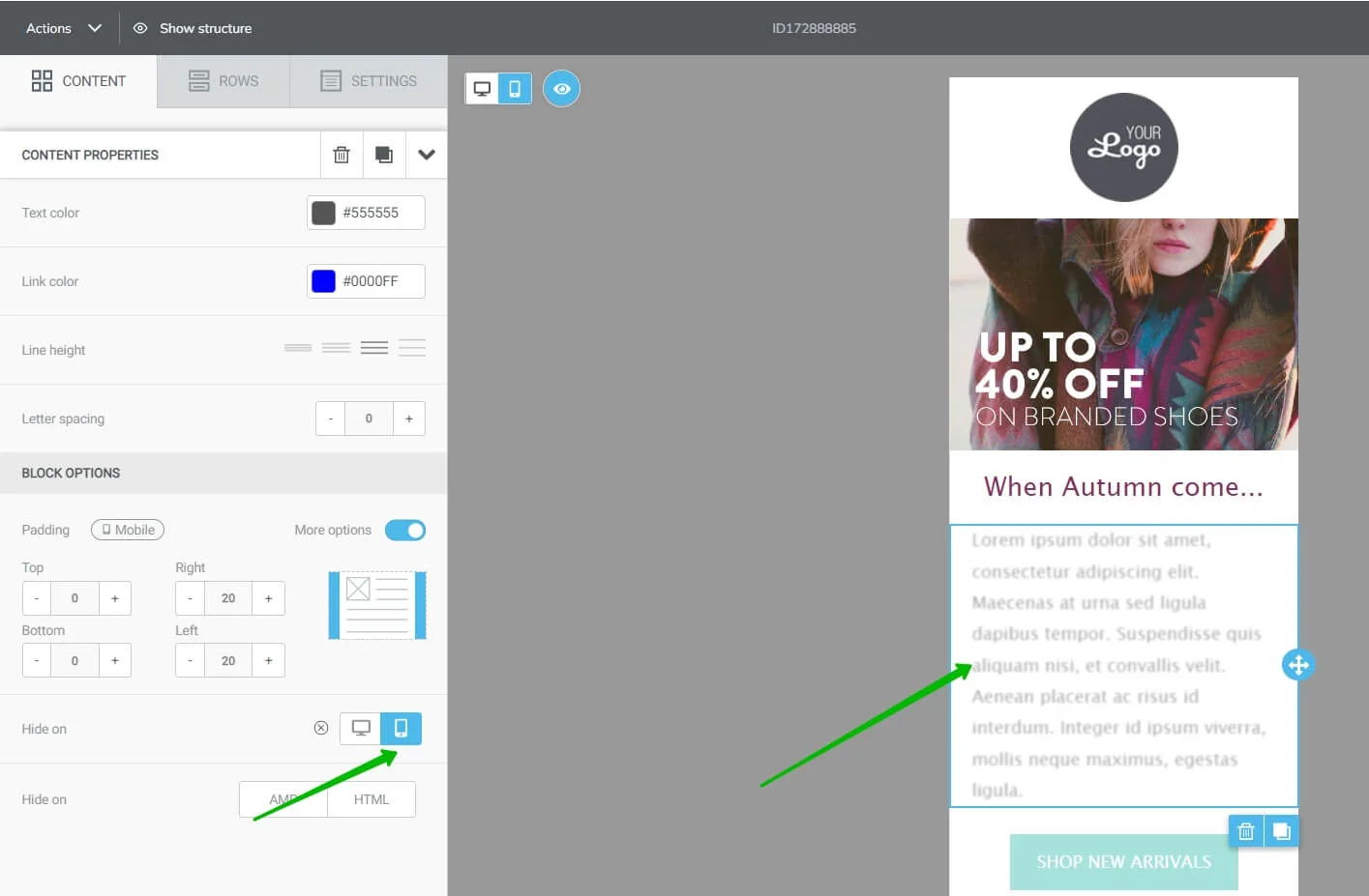
If you want to shorten your email for the mobile version, just hide a part of the text on mobile devices. To do this, choose the desired block and click on the respective sign in the settings on the left-hand side
Besides, you can set up alignments, padding, and font sizes separately for desktop and for mobile versions. Here is the list of ready-made blocks and settings available for them:
- Title, Paragraph, List, Button, Menu — you can set up alignment, padding, and font size.
- Image, Social, Spacer, Icons, GIFs, Stickers, Countdown Timer — you can set up alignment and padding.
- Text, Video, Carousel — you can set up padding.
To choose other settings for your mobile version, click on the smartphone sign and make the desired amendments.
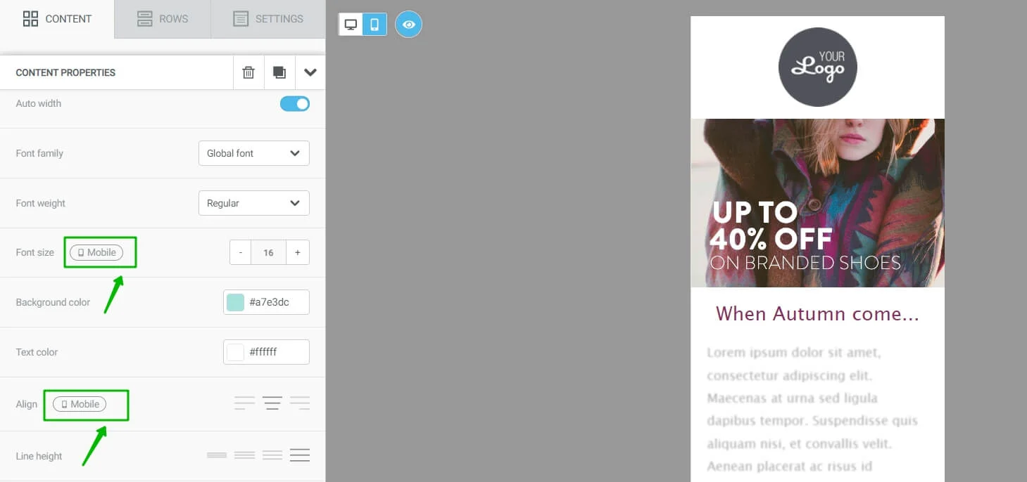
Next to the settings that can be changed for each email version, there is the Mobile sign
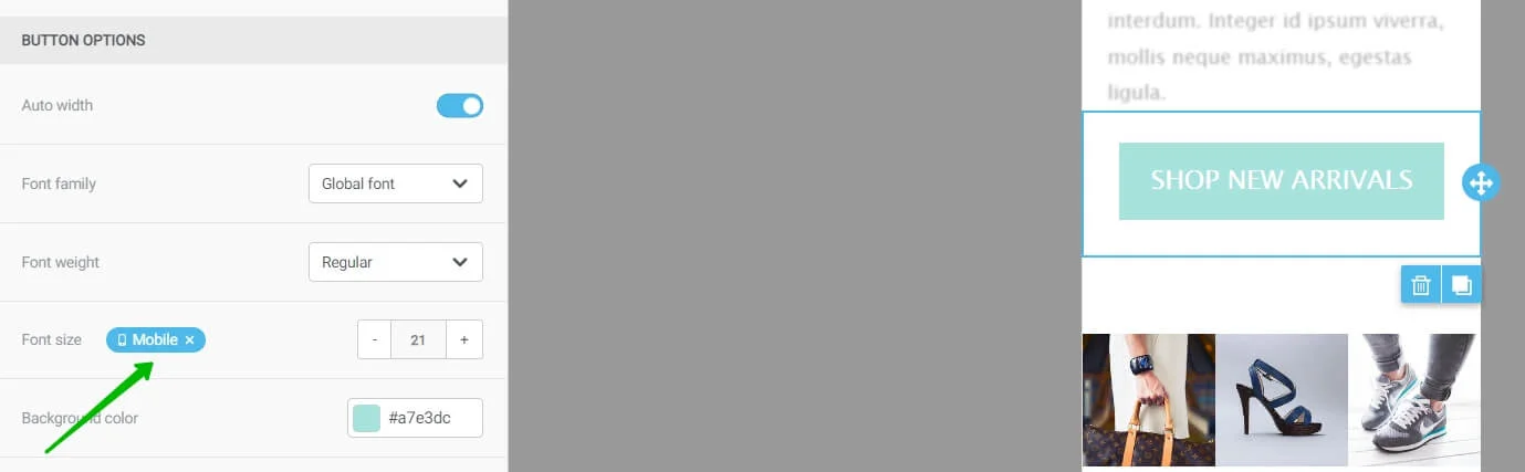
If the settings for mobile and desktop versions are different, the sign lits blue. In the example, the font size was changed to 21 for mobile devices, while for desktops it remained 16 like in the previous screenshot
Here we explain to you how to configure different email building blocks to create mobile-friendly layouts.
Optimizing images for mobile
The width and placement of images in the mobile and desktop versions vary.
Images in the mobile version should be displayed responsively, depending on the screen width or height. So, they need to be adjusted in size.
To resize images for mobile version, click on the image block.
There are 3 parameters in the block settings that affect the image view.
Adjusting image width. Move the slider to change the picture size. The screen resolution on your mobile device will also change.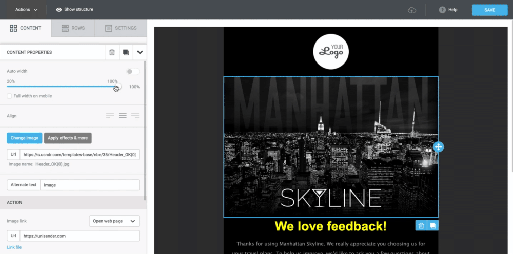
Auto width. Click this option and the picture will take up the maximum width property. It is used both for the desktop and mobile versions.
Full width on mobile. Select this option if you want the picture not to be fully displayed on the PC, but to take up full width on mobile devices.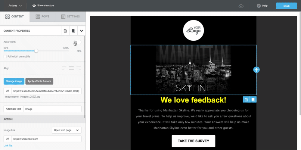
Collapse menu
There is a Menu block in Selzy service. It is used to duplicate a website menu in the email. If you don't switch the menu to mobile version, it will look like this on your smartphone:
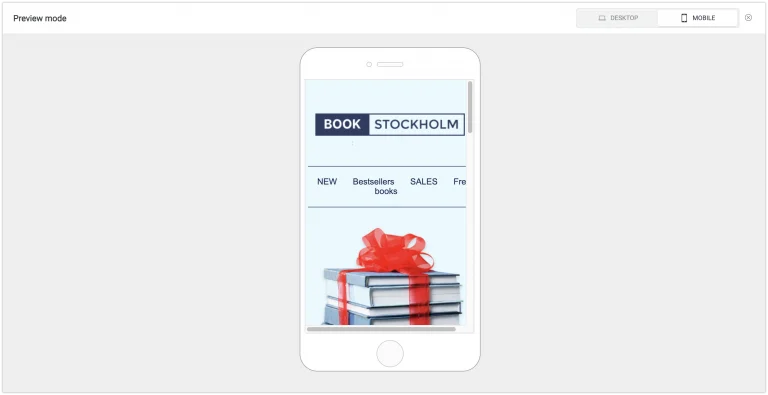
Menu is broken, the Free Books item is moved to the second line
To fix this, go to the Menu block settings and turn on the Collapsible Menu. Here's what it looks like:
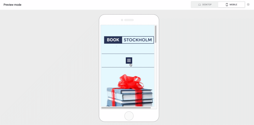
On the PC, the menu looks the same as before — as a list of items. But on the mobile device, it is displayed as a collapsible sidebar that opens with a click.
In the Collapsible Menu section, there are 5 block design settings:.
- You can adjust the icon size by selecting size options from the drop-down menu.
- The icon can be rounded or normal.
- The color of the stripes in the collapsible menu is set using the palette or HEX code in the Foreground Color parameter.
- The color of the collapsible menu block itself is set in the Background Color parameter.
- A preview of the collapsible menu block is always available in the settings block. You can see what this block will look like.
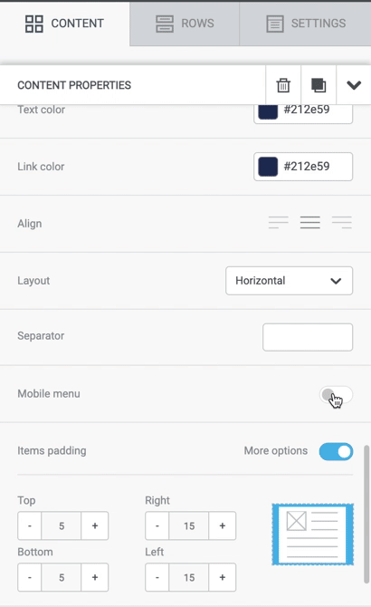
Click on the Collapsible Menu and change its settings
Align Fly Pages
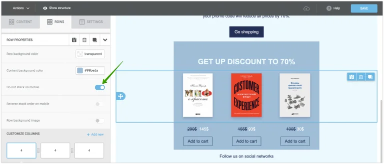
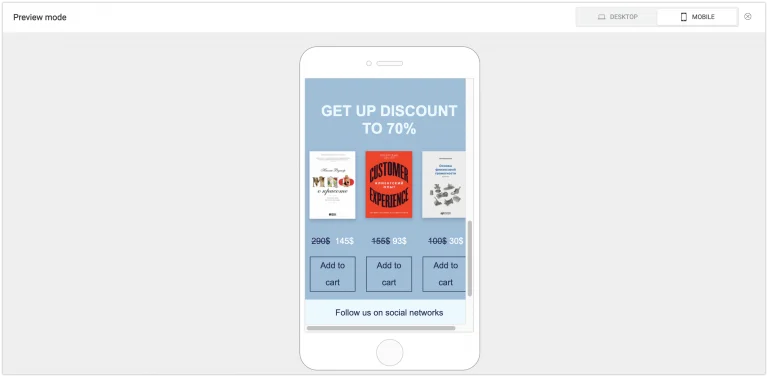
You can also customize mobile device layout for a block of several images in a row. By default, these rows are adaptive: each new block on mobile will automatically be placed under the previous one.
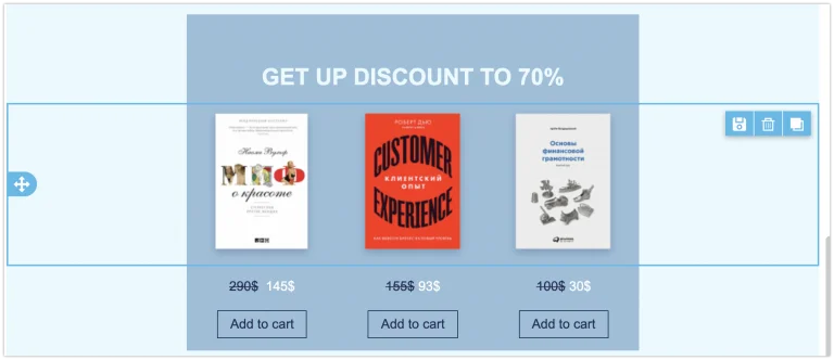
Three fly pages in a row. This is how they are displayed on desktop PC
Adaptivity can be disabled. Then, blocks on a mobile device will be not under each other, but in a row. You can do this by using the parameter setting Disable Adaptivity for Mobile Device in the Row Properties.
In some cases, this is useful: for example, when you need to compare several products with each other. But it is usually the default adaptivity that is more suitable for emails.
Adaptivity is disabled, so the buttons slightly "jump".
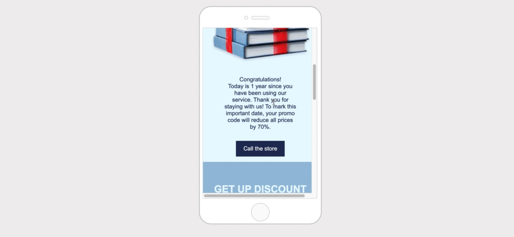
Hide blocks in the mobile version
Some blocks in the mobile version are displayed poorly and take up too much space. Other blocks, such as the Call button, are useless in the desktop version.
For this purpose, each block in Selzy new service has a Hide option. It is available in the Block Properties at the very bottom.
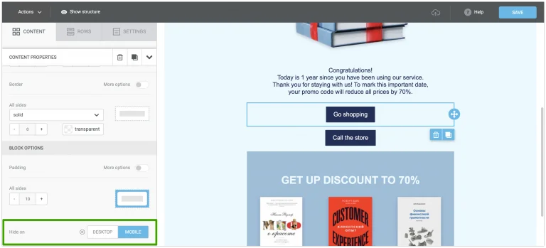
In the editor, create 2 buttons and mark for each one where to hide it — the first one on mobile device, and the second one on PC
You can choose which blocks to hide on your PC or on a mobile device. In one line, you can put 2 blocks: one can be displayed only on desktop PC, and the other — only on mobile device.
In the example, we demonstrated it with the order button. In the preview mode, you can see that each version has different buttons.
Please note that each version has its own button. And the editor has two buttons
Configure the Call Button
Each link when clicked can work in several ways: to lead the user to the website, to bring the user to the email creation form, to trigger a phone call or send SMS.
In the mobile version, you can set up a callback, rather than a click-through to a website. This works well if the website is not adjusted for mobile view and there is someone to answer the phone call.
To set up the Call Button, select Call Link Type from the drop-down menu. If you want a person clicking on the button to go to the website, set the Open Link.
Switching the order of blocks on mobile
When adapting an email to smartphones and tablets, blocks are read from left to right by default.
This means that if you have two blocks in your email: on the left - with an image, on the right - with text and a button, then on its mobile device, the user will first see the image, then the text, and finally the button.
When content is staggered in the email, the standard website adaptation for mobile devices will disrupt the logic of content submission.
To reverse the order of blocks when adapting an email to mobile devices, enable the Stack on mobile settings for the blocks. You can enable it for each line separately. This will help to correct the sequence of blocks in our example.
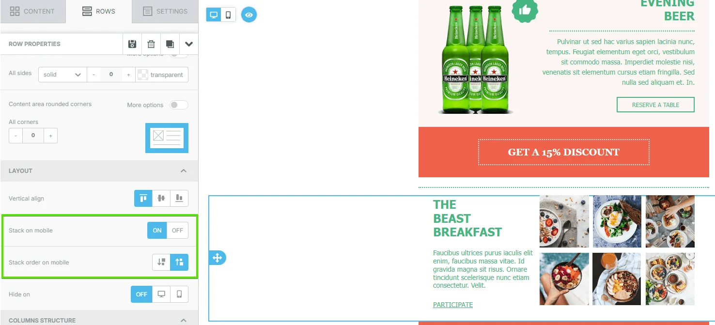
Now blocks in the selected line of the email will be displayed on a mobile device in the reverse order, that is, from right to left.
Useful links:
Key Features of the Selzy Builder
Customize Fonts and Colors in Your Email
Build a Layout Using Rows
Add and Edit Text, Insert Link
Insert an Image
Add Links to Social Media Websites
Embed a Video
Embed a Gif Image
Add a Preheader
Preview Emails Before Sending
