In the old email builder, you can add a menu block for navigating through website sections. As on the website, a menu in email can be made adaptive. In the desktop version, menu items will be displayed in a horizontal row, and in the mobile version — vertically, in a column.
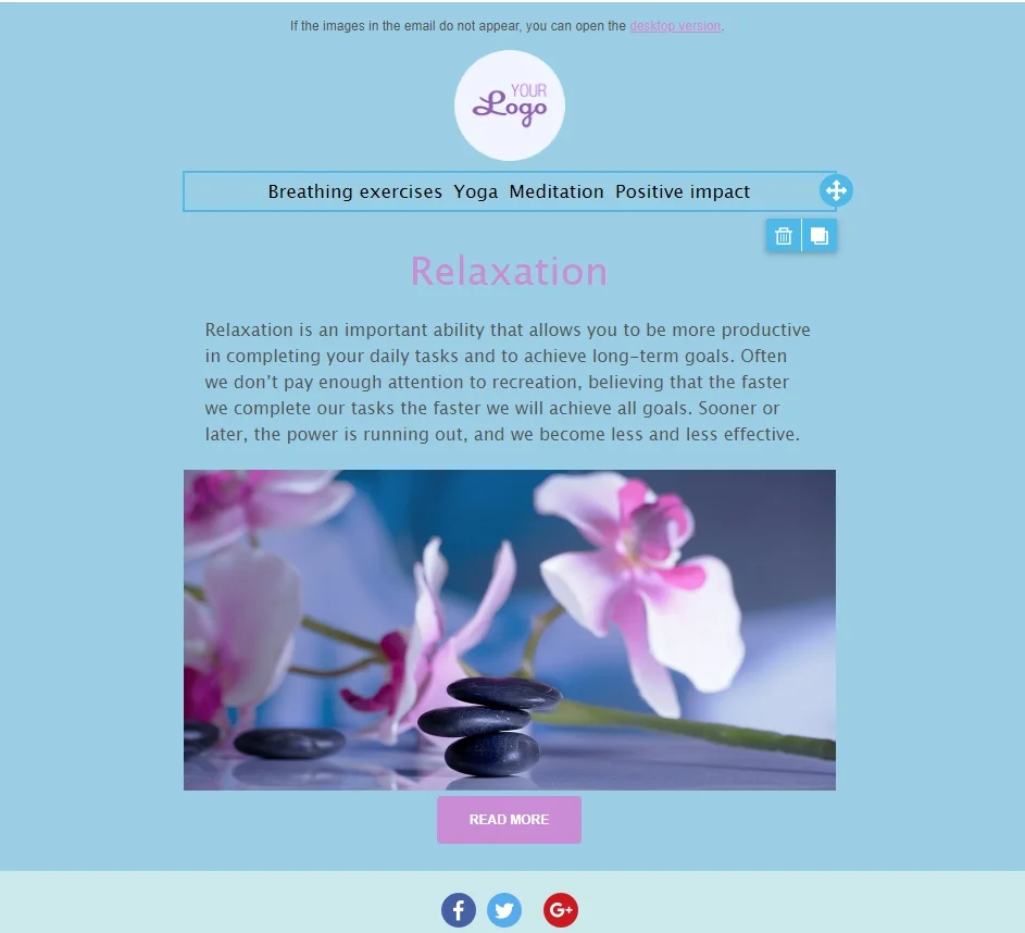
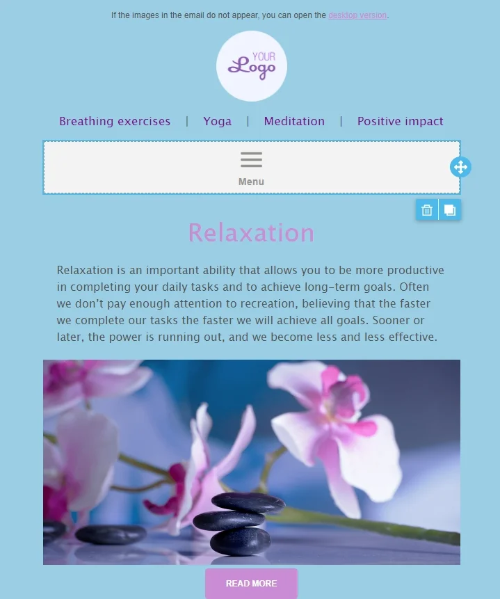
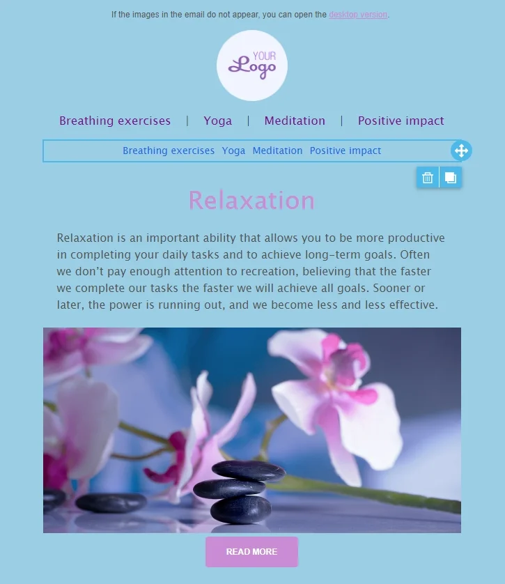
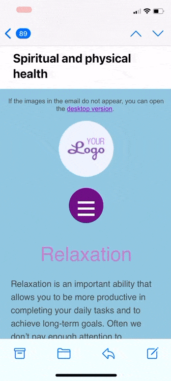
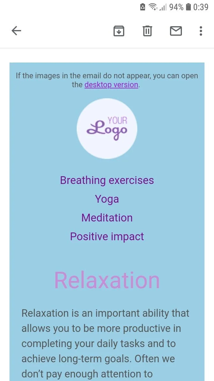
This is what it looks like in the email:
Menu in the desktop version

Menu in the mobile version
We will show you how to create two versions of the menu:
- Horizontal menu for PC (desktop version).
- Vertical menu for mobile phone (mobile version).
The email recipient will only see one version, depending on the device used to open the email.
PC version
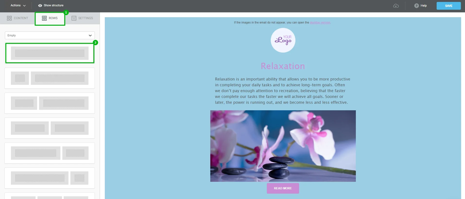
Go to the Rows tab and drag the row into the email.
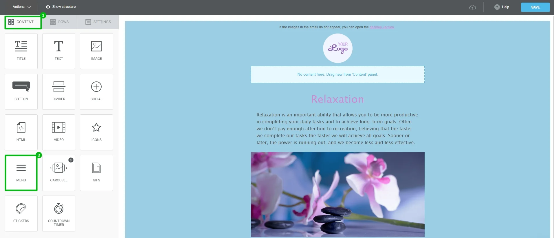
Now go to the Content tab and drag the Menu block from there to the row.
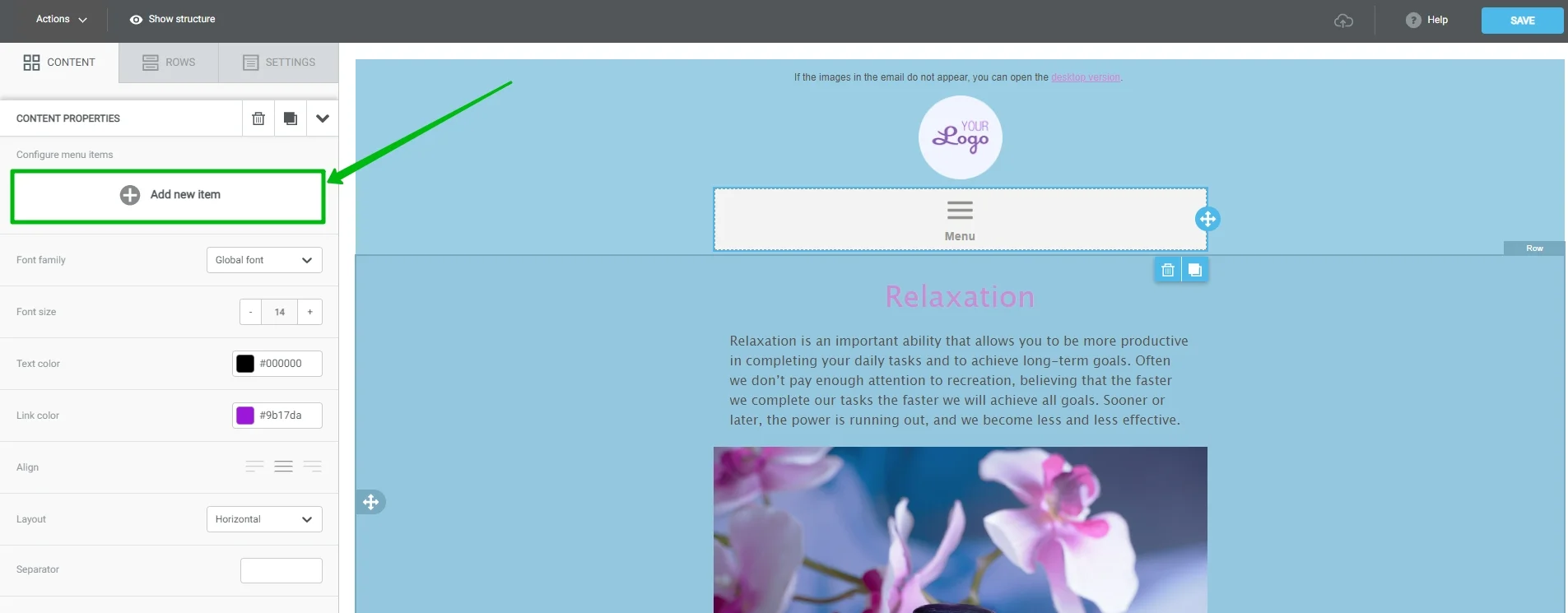
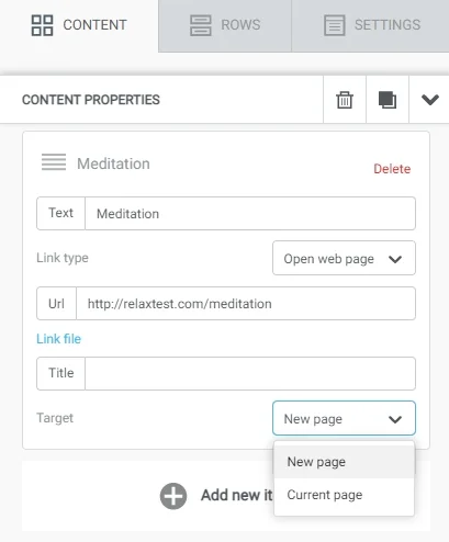
To create a menu item, select the added menu in the email and click "Add new item" on the left panel.
Enter the text of the menu item, URL and title. In the Link Type field, select "Open web page", and select "New page" in the drop-down list.
In the same way, we add three more menu items.
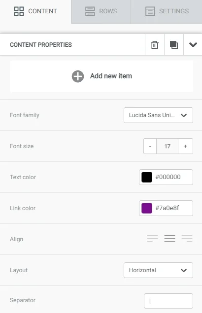
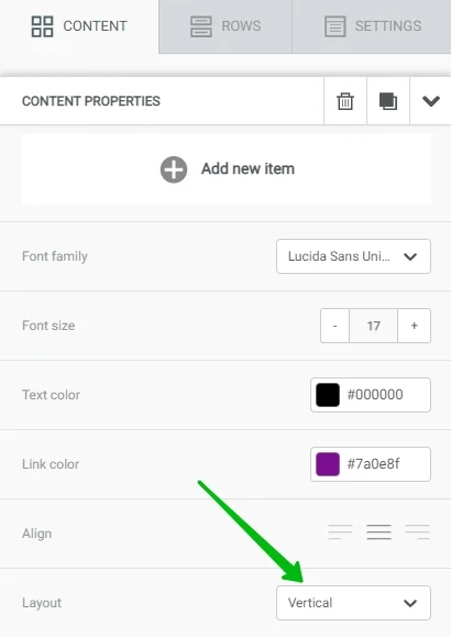
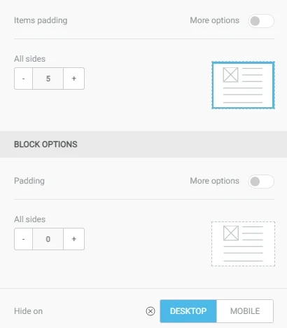
Now, go to the menu appearance settings. Select a menu block in the email, then scroll down in the "Block Properties" tab, and specify the properties:
- Font family.
- Font size.
- Text color.
- Link color. Since all menu items are links, specify their color here.
- Align. You can align it to the left, right, or center.
- Layout. For the desktop version, select "Horizontal", i.e. menu items in one row.
Separator. Specify "|" here. You can specify a different separator or leave the field blank. We set the color of the separator in the "Text color" item.
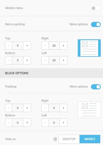
Add indentation to the right and to the left of each menu item, and at the very bottom of the tab select hide the block in the mobile version.
Mobile version
Add another row to the email with the Menu block inside. Now we have two menu blocks in the editor, but this is normal. Each of the blocks will only be displayed on its specific device — they will not be displayed together.
Select the added block. On the left panel, use the Add New Item button to add the same items as in the PC version of the menu.
Then, enter the properties.
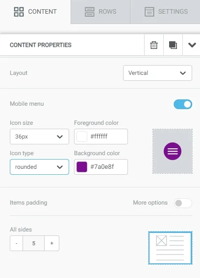
Here, in the Layout field, select "Vertical" — the menu items will be placed in one column.
Then, turn on the Mobile menu (also called "Hamburger"). This is the icon that will appear instead of the menu. When the icon is clicked, the menu will expand or collapse. Specify the properties:
- Icon size.
- Icon type. "Normal" - a square icon, "rounded" - a round icon.
- Foreground color. Here, set color for horizontal rows in the icon and for the text in the expanded menu.
- Background color. Here, set the background color for the icon and the expanded menu.
Hide the menu in the PC version.
Menu display on different devices
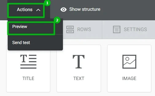
Preview in the editor
In the upper left corner, select "Actions" → "Preview".
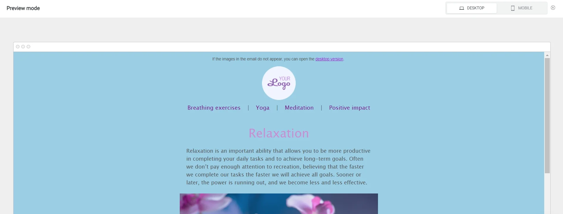
This is how the email looks like in the PC version.
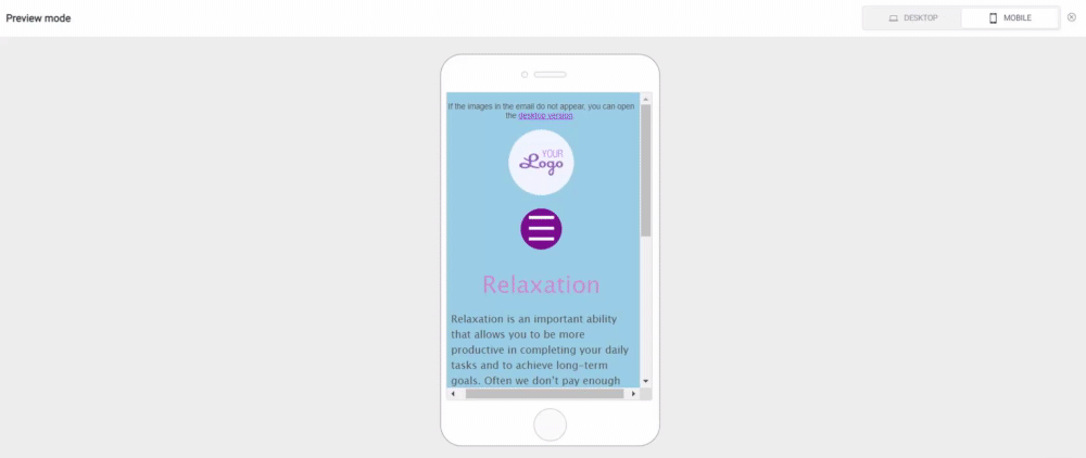
And this — how it looks like in the mobile version.
Hamburger menu icon
Important!
Menu Collapse Icon may not be displayed on all mobile phones. It depends on your mobile phone model, operating system, and the app you're viewing the email in. This functionality is best supported by Apple devices (iPhone, iPad).
Before starting email campaigns, we recommend that you test the email on different devices.
This is how the email looks like in the standard Mail app on iOS.
The hamburger menu icon is functioning.
And this is how the email looks like in the Gmail app on Android.
There is no hamburger menu icon here. Menu items are simply displayed in a column
Useful links:
Key Features of the Selzy Builder
Customize Fonts and Colors in Your Email
Build a Layout Using Rows
Add and Edit Text, Insert Link
Preview Emails Before Sending

