


Would you care for a genius marketing message that is unreadable? Of course, not!
That’s why fonts play a big role in the design of email marketing campaigns. Clear, legible fonts can help ensure that your subscribers will actually read the content of your emails line by line and not just look at the images. Height, width, color, shape, and spacing — all influence the appearance of your email.
Read this article to learn how to choose the best fonts for your emails and get tips and best practices on using them.
What are email-safe fonts and web fonts?
The best fonts to use for email marketing content are those that are email-safe. Email-safe fonts are preinstalled on many devices and in many email clients, so they will display correctly on any device and in any email client nearly every time.
Web fonts, on the other hand, are stored on servers, so they will need to be pulled from there to be displayed correctly in your subscribers’ inboxes. Web fonts may not be supported by some email clients and in turn may not always render correctly. In addition to that, using web fonts for email marketing purposes may require getting a special license depending on the fonts you use and the licensing agreement.
While it may be tempting to use unique or special fonts to make your content stand out, doing so can actually backfire. If a font isn’t supported by an email client, it may be replaced with a different font. This can change the appearance of your email and make the content less appealing or difficult to read. To avoid this, stick to safe fonts that are widely supported.
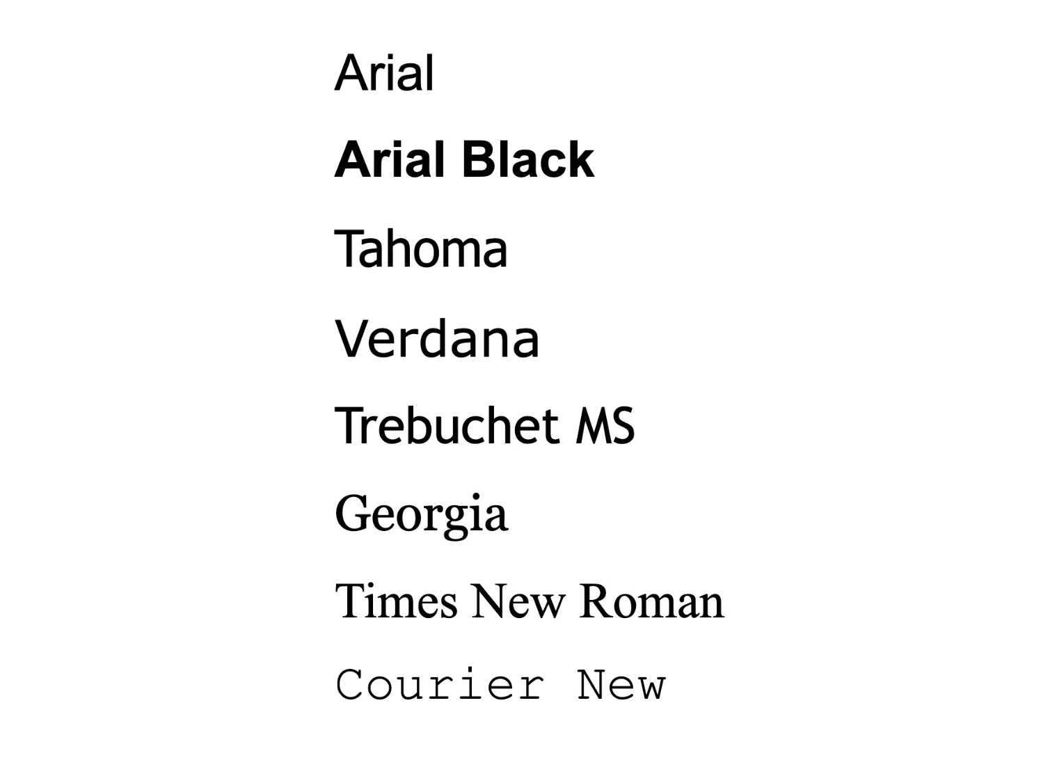
Some common sans serif fonts that can be used for email campaigns are Arial, Arial Black, Tahoma, Verdana, and Trebuchet MS. Common serif fonts are Georgia, Times New Roman, Courier New.
Why bother choosing email fonts
Knowing the email clients your customers use, you can choose an email font that will definitely be rendered correctly. If you don’t have this information, you can choose email-safe fonts that most email clients support. If a font you picked is incompatible with an email client, it can change how your message looks and harm the content readability and campaign performance. That’s why you need to take your time and work out the typography of your emails.
The next point — different fonts convey different meanings. The fonts you use in your marketing can affect how your brand is perceived. It’s important to choose fonts carefully to make sure they are in line with your branding and messaging.
There are several reasons you should be thoughtful about the fonts you choose:
- Fonts help create and reinforce brand identity. when recipients see specific fonts over and over in your email communications, they start to associate them with your company. Hence, it is important to maintain consistency in the fonts across all marketing materials, so that your audience has a clear image of your brand.
- Popular fonts can add to brand communication. For example, a trendy font can present your brand as current and in touch with the latest trends. This may attract customers who like trendy brands and products.
- The right fonts can increase conversions. Carefully chosen fonts can guide readers’ attention to the most important parts of the email like a call-to-action. This can help increase your conversion rates.
Your font choice can have an impact on your email marketing conversions in general. Make sure you carefully select the fonts to improve your results.
Different font types
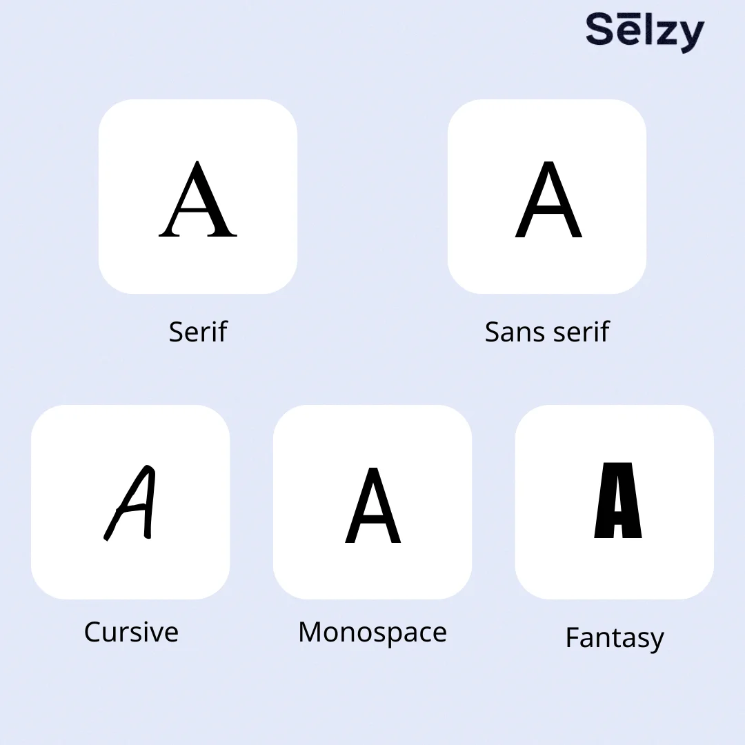
All fonts are unique, but they do fall under several categories depending on their style. These categories are called font types or generic font families. It’s worth looking into the font types to better navigate between different typefaces and find similar alternatives if a font you want to use keeps displaying incorrectly.
There are different classifications, but for this article, we’ll use types that commonly refer to fonts in HTML:
- Serif
- Sans serif
- Cursive
- Monospace
- Fantasy
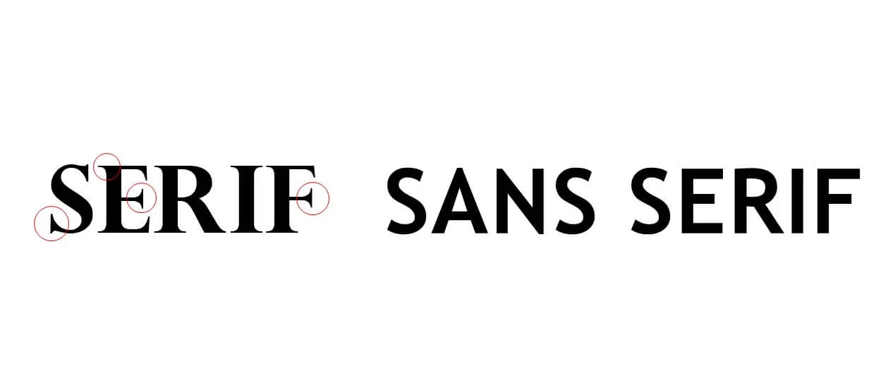
Serif
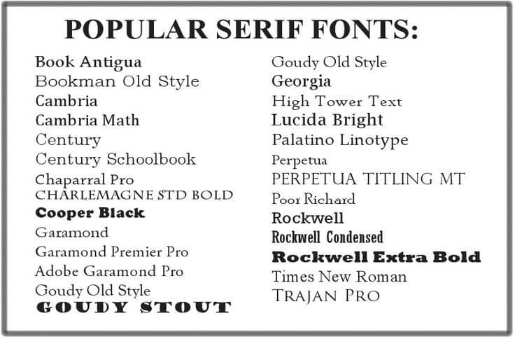
Serif is a font type that features letters with strokes or “tails”. Serif fonts are elegant and legible which makes them perfect for long-form content like books or magazines. Some popular examples of serif fonts include Times New Roman, Garamond, Georgia, and Palatino.
Serif fonts are the original typeface style, and as such, they are often seen as being classic, traditional, and trustworthy. When choosing a font for your business communications, consider using a serif typeface to convey a sense of dependability and authority.
Sans serif
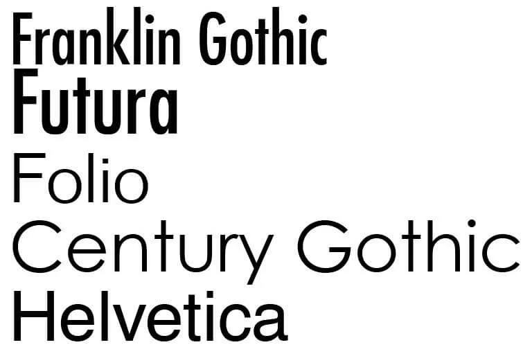
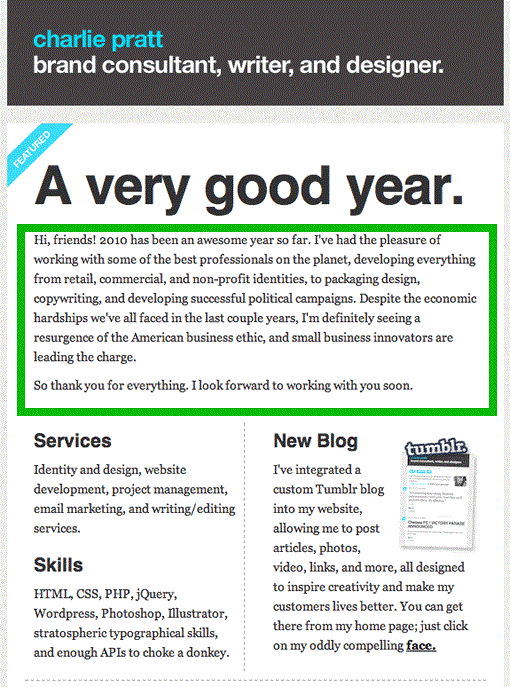
Sans serif fonts don’t have smaller strokes or lines coming from the main strokes that make up the characters. These fonts look clear and simple, and so they are readable even in smaller sizes. Sans serif fonts are usually used in apps, on websites, or in e-books. They are less common in print if not for headings. Some of the most popular sans serif fonts are Arial, Verdana, Geneva, Comic Sans, and Callibri.
Sans serif fonts look tidy and can be a great choice for a minimal design. They can also emphasize the user-friendliness of your service or product.
In contrast with a serif font, a sans serif font’s letters don’t have a smaller stroke, line, or “tail” coming off of a larger stroke. Sans serif fonts are very readable thanks to their simplicity and clearness. They are mostly used in digital media like on websites, in apps or e-books. In print, sans serif fonts are usually reserved for headings and not the rest of the text. The most popular sans serif typefaces are Arial, Verdana, Geneva, Comic Sans, and Calibri. If you want to use a modern font style, these are some good options.
In the example below you can clearly see the difference between serif and sans serif fonts:
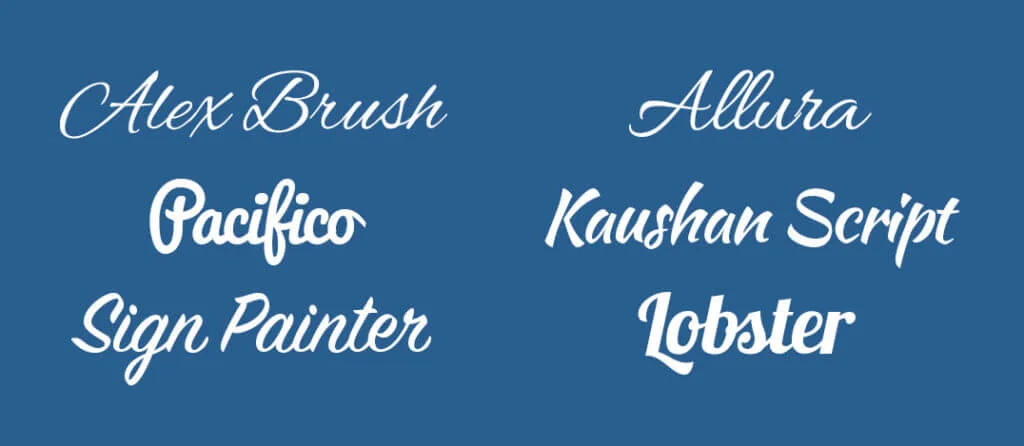
Cursive
Cursive or script fonts are designed to look like handwritten cursive which can give a unique look to your project. While they’re not typically recommended for email bodies or smaller text, they can be great for creative headings or invitations. One of the industries that widely use cursive fonts is the wedding industry with its many printed cards and other decorations.
As cursive fonts are based on handwriting, they may feel more personal. Some variations of cursive fonts are based on calligraphy masters’ works, so these may have an official, solemn feel. Some popular examples of script fonts include Lobster and Pacifico.
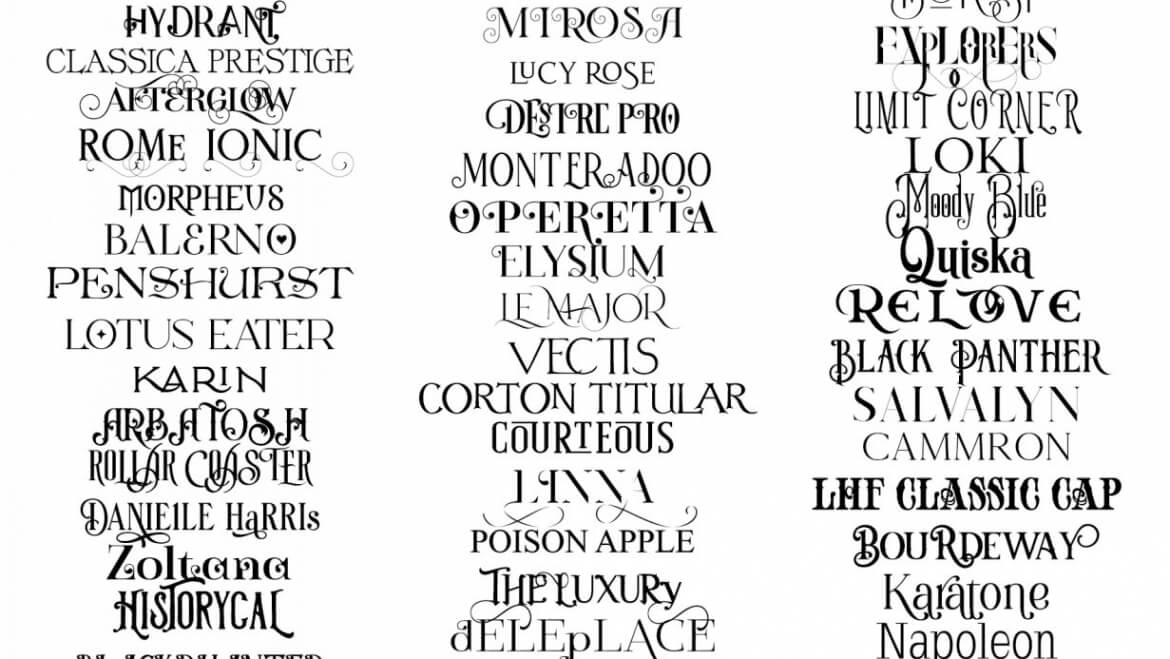
Fantasy
Unlike other font types, fantasy fonts (also called decorative) are visually diverse, with unique shapes, forms, and proportions. They can be used for headings and images to accentuate the message, add a certain flair, or complement the whole design of the message. They can also make the text more visually interesting and memorable. Some notable fantasy fonts are Fredericka the Great, Fredoka One, Lobster Two, and Bangers.
But don’t rush to use fantasy fonts everywhere. Because they are uncommon, they may not display properly or be hard to read.
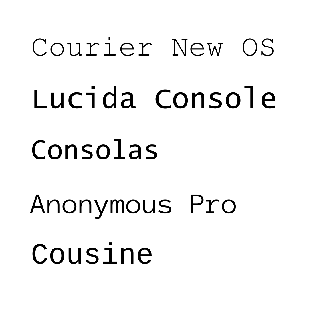
Monospace
As the name suggests, monospace (or monospaced) fonts have characters with the same width and spacing. Thanks to this feature, monospace fonts are easy to read and can be used for large amounts of text. Fonts of this type remind readers of typewriters and old tech, evoke a retro and industrial feel, and are great in contexts where consistency and width matter. Courier, Courier New, Consolas, Monaco, and Inconsolata are among the popular monospace fonts.
Summing up, there are five main font types, each with its own distinct personality. Serif fonts are classic and traditional while sans serif fonts have a modern look. Cursive fonts are elegant, fantasy fonts are unique and stylized, and monospace fonts have a retro feel. All of these font types can be used to create a beautiful design for your email campaigns.
Best font for emails to grab the readers’ attention
Fonts can be stored and accessed differently. System fonts are pre-installed on a user’s device and are mostly the same across platforms and email clients. Web fonts, on the other hand, need to be downloaded off of a server.
Let’s explore some of the most popular fonts of both types used in email marketing.
System fonts
System fonts come installed with your operating system. They’re web-safe and email-safe because they always render as intended. This makes them a good choice for email campaigns, as you can be sure recipients will see the email on their end just as you see it on your screen. Let’s explore some of the best system fonts you can use for your email campaigns.
Times New Roman
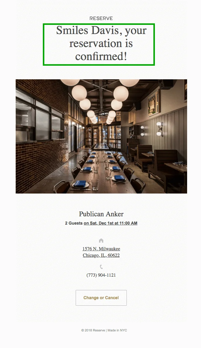
Times New Roman is one of the most popular system serif fonts, and it is perfect for headings and body text. In the example below, Publican Anker used the Times New Roman font to give the email heading a formal look. This also ensures great readability.
Arial
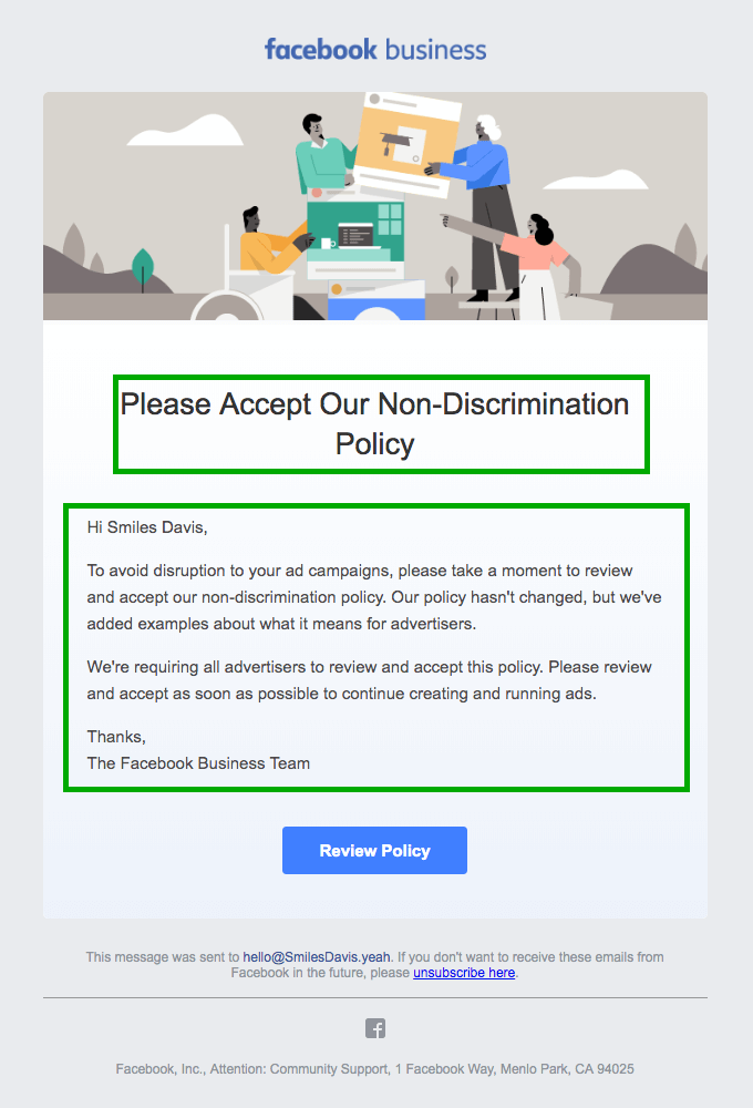
Another best font for emails is Arial which is often used as the default font for many campaigns. It works well for headlines as well as other small email elements since it was designed to be readable on computer screens. However, Arial might not be the best choice for lengthy email body copy as there are other font options with better readability. Keep in mind that Arial is the default font in Gmail, so if most of your audience uses Gmail to open your emails, you might want to stick to the standard font.
Arial is a popular choice for emails with shorter sections of text. In the email below, Facebook uses Arial for a short, impactful message.
Helvetica
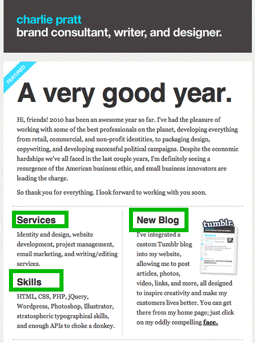
Helvetica (and Helvetica Neue) is a typeface that has a modern look to convey a professional yet trendy feel. Helvetica is also the default font in Apple Mail, so you can rely on it for Mac and iPhone users.
Here, Helvetica is reserved for clear, noticeable headings that give the email a clean and modern look to the email newsletter. Helvetica is balanced with other fonts, notably a serif one for the body copy. The combination makes the email visually interesting and easy to read.
Verdana
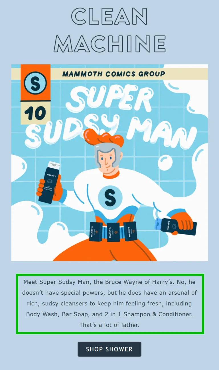
Verdana is a sans serif typeface that is easy to read because it has extra space between letters. This makes it a good choice for email campaigns that need to be legible and well-designed.
Harry’s font choices make for easy reading and a modern, playful feel. The brand uses Verdana for the body text and pairs it with Gill Sans (in CTA) to improve the reading experience. This also works well with the visuals.
Georgia
Georgia is a serif typeface that can add elegance to your emails’ headings. It is similar to Times New Roman but with a rounder and bolder font style. The typeface is also very accessible and web-safe making it a good choice for email body text.
The same email we showed as an example of Helvetica usage has Georgia font for the email body copy. This adds style and uniqueness to the text while also keeping it easy to read. The typeface remains legible and understandable to subscribers even in a smaller font size.
Tahoma
Tahoma is a great sans serif font option for emails and is a favorite among users of Windows operating systems. Tahoma also supports various Unicode characters, so you can create multilingual newsletters without switching the font.
Red Bull’s email marketing campaigns often incorporate the Tahoma font because of its legibility and minimalistic aesthetic.
Web fonts
While system fonts are installed on devices from the get-go, web fonts are designed specifically for use on websites and are not available on all devices and OS by default. The web font you choose for your email will only display properly if it is compatible with the email service provider your recipients use. If the font you choose is not compatible, they will see the default font for their email provider, or a fallback font that you specified when designing the email. Despite this limitation, web fonts can make your email campaigns stand out and allow for more visual branding.
Choose a web font only if you are aware of which email providers your recipients use. This way, you can avoid any potential font compatibility issues. According to Can I email…, web fonts (specifically pulled using @font-face CSS) are fully supported by Apple Mail, certain versions of Outlook, Samsung Email, and some other email clients. Other inbox providers including Gmail do not support web fonts or only partially support them. The situation may change with service updates, so we recommend you not only reference specific websites like Can I email…, but also always test your campaigns’ rendering in different clients.
Two of the most common web fonts are Open Sans and Roboto.
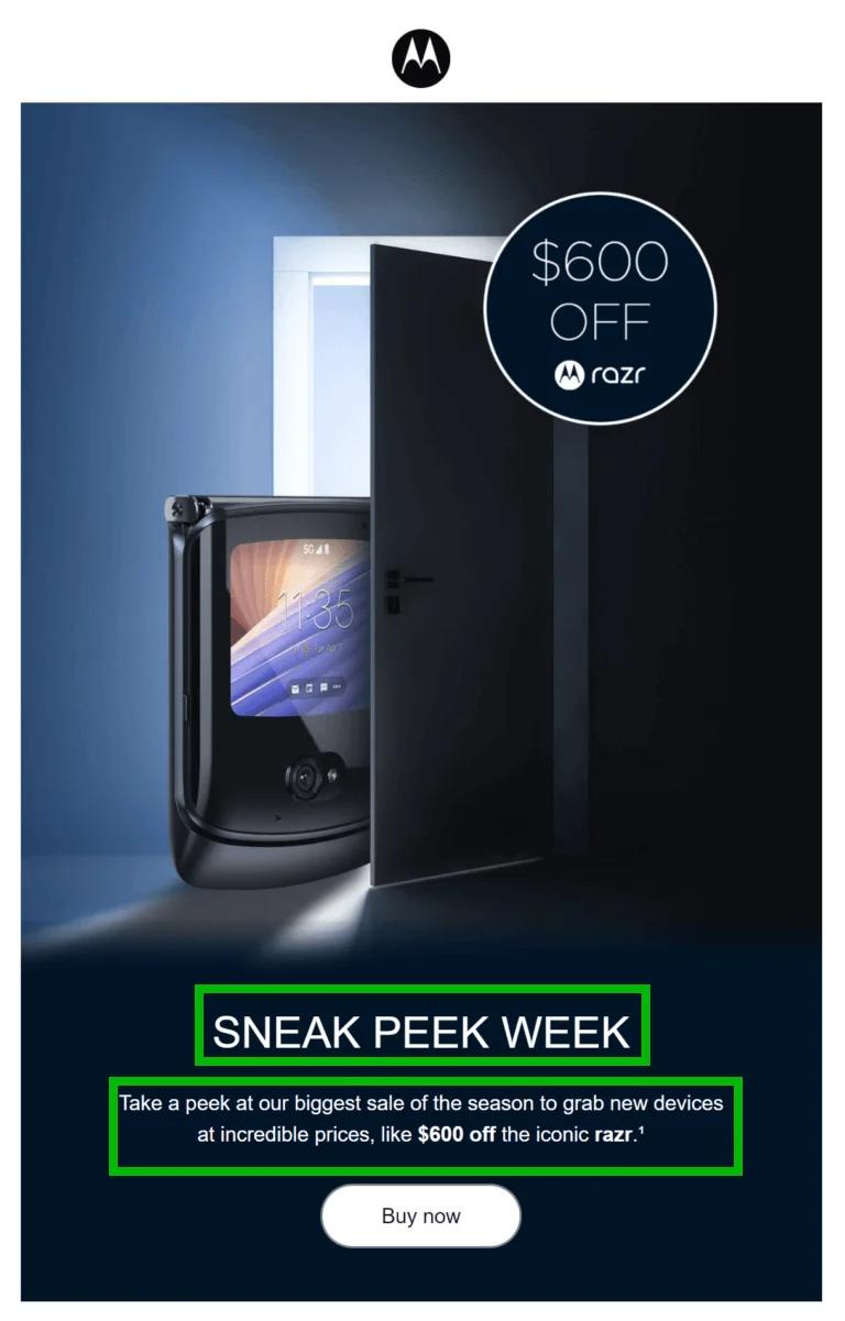
Open Sans
Open Sans is a typeface that was originally designed for mobile devices. It is easy to read and officially supported by Gmail, so it’s a solid choice for email campaigns with minimalistic design or those aimed at a mobile-first audience.
Here is an example of a good use of Open Sans in a Motorola email newsletter. The headline is eye-catching and allows the reader to understand the message quickly, while the body text underneath is easy to read. In addition to the headline and body text, Motorola also uses Open Sans for its CTA button to make it as clear as possible.
Roboto
The Roboto typeface is a sans serif font that was created by Google for the Android operating system. It has a modern geometric style that makes it look sleek and trendy. Since it was designed specifically for mobile devices, it is very user-friendly and easy to read on smaller screens.
Razer’s email campaign uses the Roboto typeface to create a modern and stylish look that also emphasizes that it is an electronics company. The brand uses both white and green font colors to make its message more unique and remind its subscribers of The Matrix. Razer also uses Arial Black for the email CTA which is complementary to the Roboto typeface.

Custom fonts
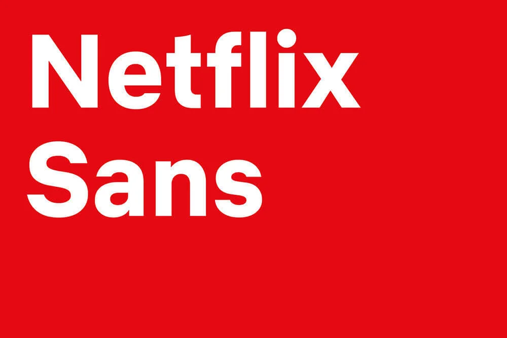
You can create your own personal font which is even more appealing than using the most popular typefaces. You need custom fonts to create a bespoke style for a particular brand, something you won’t find anywhere else. Custom fonts help you stand out from the competition and build a strong brand association.
Custom fonts are used by companies such as Apple, Nokia, IBM, BBC, Netflix, and many others. Below is an example of a custom typeface developed by Netflix:
If you want to use custom or premium fonts in your email template, you need to install them on the system server, embed them in the HTML, and make changes if necessary. This can be tricky because not all email clients support custom fonts. To be sure that the emails and fonts are displayed correctly, send test campaigns and open them in different environments.
Things to consider when choosing the typeface
The typeface you choose for your email can make or break it. To make the right decision for a newsletter font, keep a few things in mind.
The number of fonts you are going to use
Several fonts for different purposes (headings, body copy, CTA) can make an email visually engaging and interesting to look at. However, you should avoid using too many fonts as it can make an email appear over-saturated and annoy your subscribers. One or two fonts are enough to use in one email. You can also use different sizes and variations of one font.
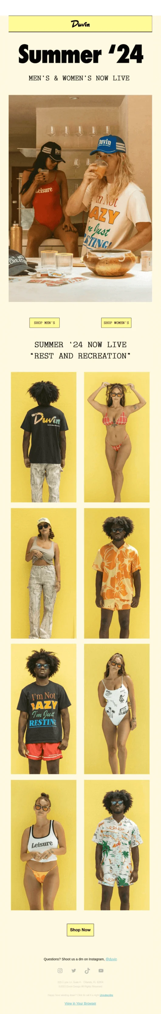
Take a look at this Duvin email. There are three distinctly different typefaces on top, but the campaign manages to look balanced. The email body also uses several fonts, but they all serve their purpose in the design.
Font size
The appropriate font size for headlines, body copy, and footer text depends on the overall design of the newsletter and the sizes of other email elements. A good rule of thumb is to use a font size between 10 and 14 pixels for body copy (and some experts even recommend a size of at least 14 pixels), and between 10 and 12 pixels for footer text.
Different fonts can look better or worse depending on the weight and size. Test out how a font looks at each size to make sure it won’t negatively impact the user experience.
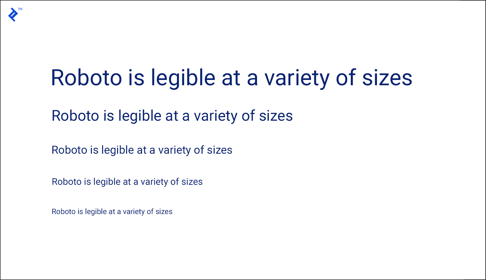
Roboto, for instance, is an effective typeface to use for both large and small text.
Font alignment
Text alignment can be different depending on your preference and the role of the text.. Left-side alignment is considered to be the most accessible and easy to read. It is easy to scan and has enough white space for the eyes to rest. For headings and CTAs, though, it’s common to use center alignment. These copies are shorter and need to stand out more, so in this case, the center alignment works well.
Below is a good example of text aligned to the left edge.
Colors
If the color of your font is unpleasant to look at, it won’t matter how good the font itself is. Make sure to choose font colors that go well with the email background images — light-colored fonts look good against dark-colored backgrounds and vice versa. Try to use no more than three colors in total and make sure they all work well together.
In this email, the brand uses at least 2 different colors. However, the font color is consistent across the heading, body copy, and CTA. This makes the design look cohesive.
Spacing
Different fonts have different character widths, so the spacing between letters (kerning) will vary depending on the typeface you choose. It’s best to avoid fonts that don’t have a wide range of positive or negative letter spacing, as this can make the text difficult to read.
Readability
Readability is one of the most important aspects of a typeface. If people can’t easily read the message, the typeface doesn’t fulfill its purpose. Readability refers to how easy it is to distinguish and read different words. Beyond the typeface itself, the size of the font can also have a big impact on readability. For example, a font that looks good at 18 pixels might be illegible at 10 pixels.
Another obstacle might be a long block of text without any subheadings, breaks, or sections. Even if you chose the right font, the message may still be hard to parse. To make your copy more readable, create different sections within the text with each one focusing on a specific idea or subject. This will help your readers follow along and understand your main points.
This message would be much easier to read if it had been divided into sections with headings and subheadings:
Clarity
The fonts that work best in email copy are those with clean lines and precise lettering. Generally, avoid fonts with flourishes or squiggles, as well as those with very thin or light lines. Larger font sizes are also generally more effective. When choosing a font size, make sure it is large enough to be easily readable but not so large that it appears too bold.
Email fonts to avoid in your campaigns
There are certain font styles that should be avoided in marketing emails, especially in B2B contexts, as they can come across as unprofessional.
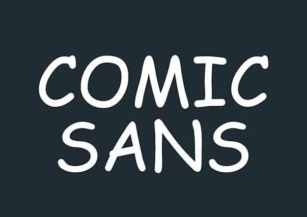
Comic Sans
It is generally best to avoid the Comic Sans MS font, as it has a bad reputation and can come across as childish. This font is often used for birthday invitations or other informal purposes, but not for business correspondence or genuine marketing emails. Using a more sophisticated font will help to reflect the image you want your brand to project.
Curlz
It’s better to avoid the Curlz font in email design as the extra curls on each letter can be visually distracting. Plus, it makes the text harder to read.
Curlz is not an appropriate typeface for any serious or formal text. It should only be used when playfulness is justified like on an invitation or in media addressed to children.
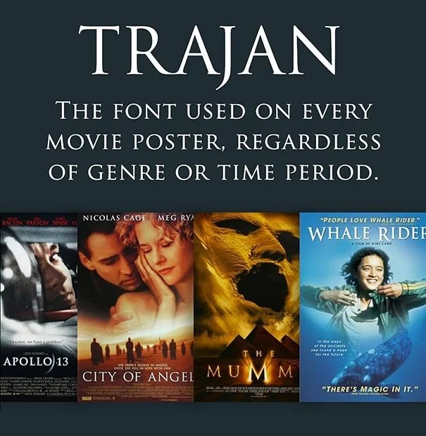
Trajan
Trajan is not a good choice for business communications or in marketing campaigns that aim to stand out. It may be okay to use on limited occasions in the entertainment industry, but it is not suitable for email marketing campaigns. The font is too dramatic and is better suited for movie posters than emails.
How to change the email font
To change/customize fonts and colors in an email in the Selzy email builder, follow this instruction. By default, the font of any text you add will be Mullish, sans serif. To change the font, click on the text you’d like to customize and select the necessary font on the right panel.
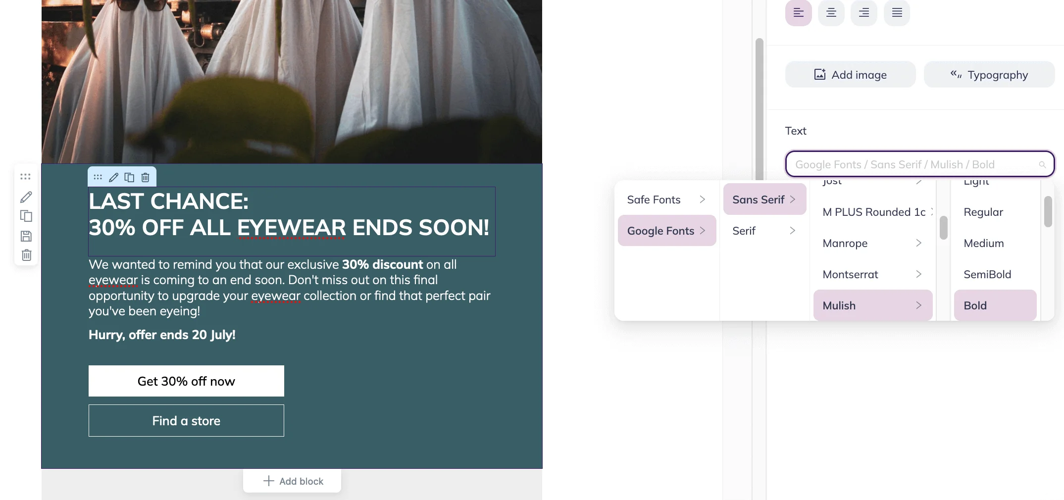
Here, you can choose the alignment of text, the font, its variation, and color.
The best option is to go with safe fonts, as they are displayed correctly in most email clients. You can choose the best font out of more than 10 options like Courier, Georgia, Trebuchet MS, Verdana, and more.
Conclusion
- There are five main font families: serif, sans serif, cursive (script), fantasy (decorative), and monospace. Each font family has its own distinct characteristics and feel.
- There are different types of fonts: system (or email-safe), web fonts, and custom fonts. For email campaigns, we recommend sticking with system fonts since they are compatible with a wide range of devices and are less likely to cause issues.
- Different fonts can create different effects. Choose the right one for your needs. For example, a decorative font might not be appropriate for a more serious message.
- Use readable and professional-looking fonts that will look good in different sizes. For example, Times New Roman, Open Sans, and Helvetica fonts.
- Optimize your design and template, so that the text is readable. We suggest using the font sizes between 10 and 14 pixels or even larger.
- Pay attention to colors. Too many colors can be overwhelming, so stick to three or fewer.
- Before sending out your message, test the display of the text in various email clients and on different devices to ensure that it looks OK.
- Always set fallback options that will work on devices that don’t support modern fonts. This way, your content will still be readable no matter the device.
