


Imagine the whole world suddenly switched to sign language and you are the only person who speaks. Will you feel lonely? Frustrated? Left out? This is how disabled people feel in the world that doesn’t cater to their needs — same goes for the digital world!
Although you can’t change the global situation, you can make your brand communications more friendly for customers with special needs. Keep reading to learn all you need to know about email accessibility.
What is email accessibility?
You’ve probably heard of accessibility in the context of urban design — it’s the practice of making public spaces more disability-friendly. It includes ramps, “talking” traffic lights, tactile road markings, and so on. But digital environments can be just as exclusive as our cities! That’s why accessibility in UX design has become the talk of the town.
Accessibility means designing and creating content in emails with disabled subscribers in mind, in other words, making sure these customer groups can have fun like everybody else. Digital accessibility includes a wide range of accommodations like colorblind-friendly color schemes, larger fonts and better contrast for visually impaired users, and more.
Why is email accessibility important?
According to the CDC, 27% of adult Americans live with some kind of disability, with 12.8% of US adults experiencing difficulties focusing and making decisions, and 4.8% of them having severe vision impairments.
The conditions mentioned above do not conclude the list. The Yale Center for Dyslexia and Creativity discovered that 1 in 5 Americans are affected by dyslexia, which is an unexpected difficulty reading despite the normal level of intelligence.
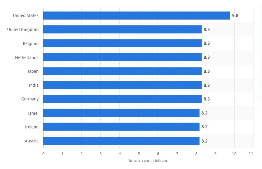
Meanwhile, almost 10 billion emails are sent every day in the US alone — and a lot of the recipients may be disabled.
So, email accessibility is an obvious choice, while the lack of thereof prevents a wide audience from engaging with your content. But there’s more to it — let’s dig deeper.
It benefits everyone
Have you heard of the curb-cut effect? It describes the phenomenon of disability-friendly adjustments benefitting a larger group of people. Subtitles are a great example. Closed captions were introduced as an accommodation for deaf or hard-of-hearing audiences. Today, subtitles are a great feature for many able-bodied people — for example, for those who learn foreign languages through watching films and TV shows.
The same can be applied to email design. Alt text is a neat adjustment for users with a poor internet connection — when images do not load, they will still see the descriptions. And adding a plain text option will help your subscribers with outdated devices and email clients that block “trendy” designs. That’s why, when you implement accessibility features, you help everyone, not just the vulnerable minority.
It improves your reputation
40% of people with disabilities would not choose or recommend a business if their communication is inaccessible. So, by overlooking accessibility, you lose customers — and, of course, money.
We get it, digital accessibility requires investments, especially if you’re starting from scratch. However, they will return and bring you more customers by word of mouth, higher brand loyalty, and more conversions.
It minimizes legal risks
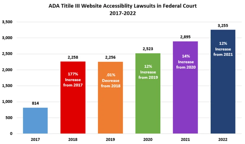
In 2022, the number of website accessibility lawsuits increased by 12% and reached its record high in the US.
In the US, the Americans with Disabilities Act (ADA) requires that every published website should be disability-friendly. So, it’s possible that you’ll end up in court if you choose to ignore email design accessibility — and a lawsuit like that will damage your reputation.
It makes you stand out from the competition
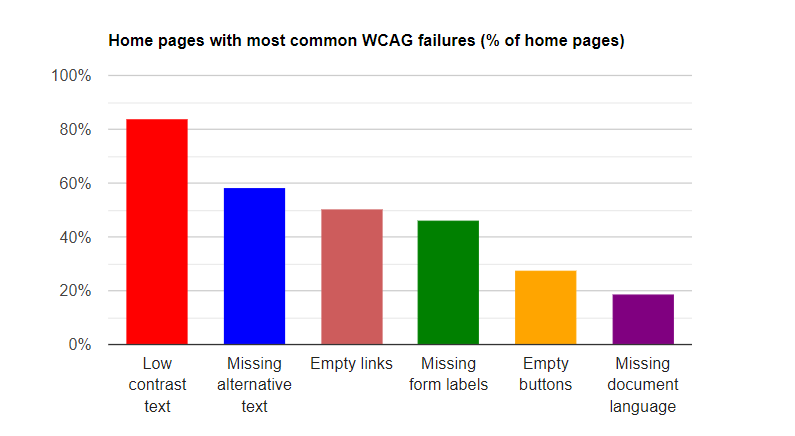
Accessibility is a legal requirement and a humane thing to do, so most content online should be accessible, right? Wrong! According to WebAIM, 96.3% of all websites don’t meet the requirements of Web Content Accessibility Guidelines, with low text contrast being the most common issue.
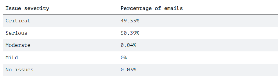
What about emails? The Email Markup Consortium studied 35,604 emails in 2022. Their analysis showed that 99% of these emails had serious or critical accessibility issues.
When you pay attention to accessibility, you’re not just doing the right thing — you’re doing the right thing most brands choose to ignore. If you start implementing accessible design, you’ll give yourself an edge over competitors.
Factors to consider when creating accessible emails
Digital accessibility is a humane choice and a reasonable decision for your business. But it’s more complex than including image descriptions or making bigger buttons. Let’s discuss two factors you need to consider while implementing accessible email design.
Human disabilities
Ideally, your emails should be accessible to everyone, so let’s have a look at accommodations for different kinds of disabilities:
- Vision impairments. These include vision loss, light sensitivity, color blindness, and so on. To cater to visually impaired users, use colorblind-friendly color schemes, larger fonts, and high contrast. It’s also important to take screen readers into account and use semantic markup in your HTML emails. To take light sensitivity into account, you can optimize emails for dark mode — use PNGs with transparent backgrounds and add meta tags to your email CSS.
- Hearing impairments. Accommodating to deaf and hard-of-hearing users is especially important if you embed videos or podcasts in emails. If you do, make sure to include closed captions and transcripts.
- Motor disabilities. Customers with paralysis, cerebral palsy, broken or amputated arms, or tremors may find it hard to scroll through your email. Make sure your email can be interacted with via a keyboard alone — tapping one arrow button is a simpler action than using a mouse or a touchpad.
- Neurological disorders and neurodiversity. People with photosensitive epilepsy may get a seizure from a GIF image with flashing lights. At the same time, customers with ADHD or autism may find your bright and colorful design overstimulating due to sensory processing issues. Opt for simpler designs, put flash warnings on certain types of content, and don’t auto-play animations in your emails.
Some might think that catering to every existing disability is too restrictive and robs one of fun in designing emails. It’s not entirely incorrect — but keep in mind that design goes beyond aesthetics. Good email design is not about bright colors, funky fonts, and cool layouts. Instead, it provides visual aid by structuring information, making your copy easier to read for all your customers, and directing their attention to CTAs. For example, email designs like the one below are definitely not a creative freedom exercise — they’re just bad.
Compatibility and email content support issues
Including customers with older smartphones is a part of accessible email design too. Here are two technical aspects of email accessibility that you should consider:
- Email clients. There are many apps for reading emails and each of them will render the same email code differently. To make sure your email displays correctly in Gmail, Apple Mail, and Yahoo clients, vigorously test your campaigns before sending. To do this, use email preview services like the one from Email on Acid — they show how your email renders in different clients. If your email features interactive content, offer a non-interactive alternative. Finally, to troubleshoot possible rendering difficulties, give a link to a web version of your email.
- Devices. Don’t design your emails with only desktops or only smartphones in mind! An accessible email displays correctly and looks good on all screens, big or small. Keep in mind that mobile optimization goes beyond layouts. For example, fonts that are smaller than 14px will be hard to read on smaller screens. And CTA buttons should be big enough for a thumb.
Psst… We don’t mean to brag but Selzy has 100+ free email templates that are responsive just like a good friend 🤫 If you wonder how to build picture-perfect and mobile-friendly emails with no coding skills, learn all you need to know about our template builder. And the best part is, this feature is available for free users!
Now that you know about all the important factors at play, let’s dig deeper into email accessibility. We’ve compiled a two-part checklist with recommendations on design and code accessibility. If you’ve never implemented accessible designs before, doing everything at once may be hard. But even adding proper alternative text to your images will be a massive improvement — starting small is still a start! 🙂
Email accessibility checklist: design
Let’s begin exploring accessibility from the part your end users see in their inboxes. In this section, we’ll discuss accessibility best practices in email interface and content design.
Use descriptive subject lines
People with visual impairments often rely on virtual assistants like Siri. Instead of reading push notifications, they listen to assistants reciting subject lines and preheaders. That’s why using crystal clear subject lines is important. It takes more time to read an email with a screen reader, so getting straight to business in an email subject line means respecting your subscribers’ time.
To make sure your subject line is clear, use instruments like Net Atlantic Subject Line Grader. Here’s what it looks like:
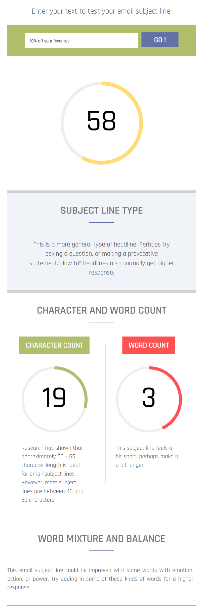
For the same reasons, use emojis with caution. Since some people rely on screen readers, be careful when replacing words with them — it reduces clarity for this customer group. Also, don’t use less common emojis that may not be present in older software versions — on such devices, they will display like ▯▯▯.
Maintain a logical structure
In email content, logical structure is important for clarity and readability — but there’s more to it. Screen readers usually read emails from left to right and top to bottom. If you don’t organize your content in that order, your email will be very confusing to visually impaired subscribers. Implementing subheadings and leaving enough breathing space will also help users with ADHD a lot.
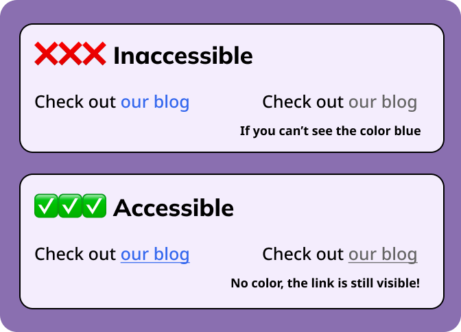
It’s also important to use more than one visual indicator for structural elements. For example, if you have a list of dos and don’ts, using only color to show the difference between right and wrong is not colorblind-friendly.
| Inaccessible | Accessible |
DO:
|
👍 DO:
|
DON’T:
|
👎 DON’T:
|
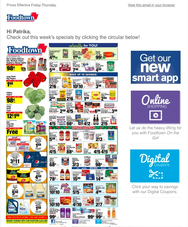
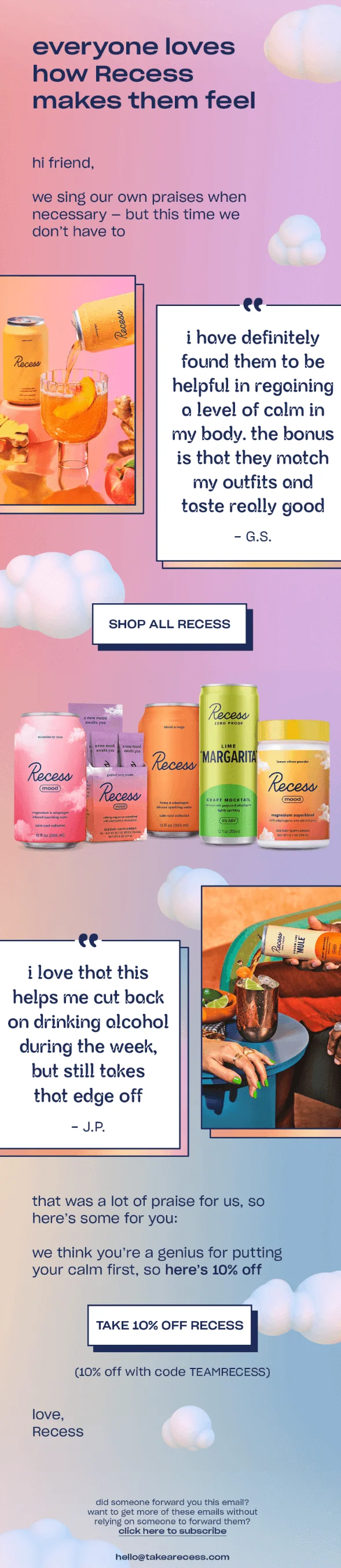
Here’s another example. This email from Recess looks awesome but the content structure could’ve been better. There are two CTA buttons with different incentives — just “shop” and “shop with a discount”. Leaving one button at the bottom of the email would be a better decision. All-lowercase text makes the copy look more chaotic as well — we know it’s the brand’s signature formatting but it does nothing for accessibility.
Avoid all-image emails
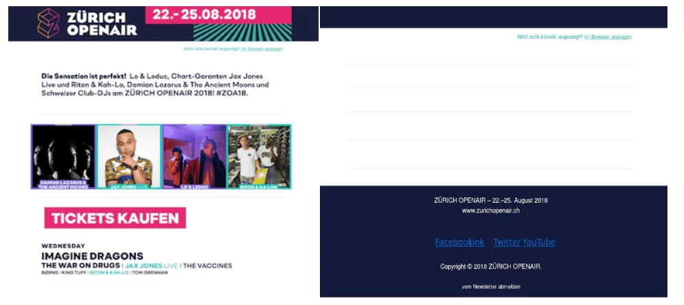
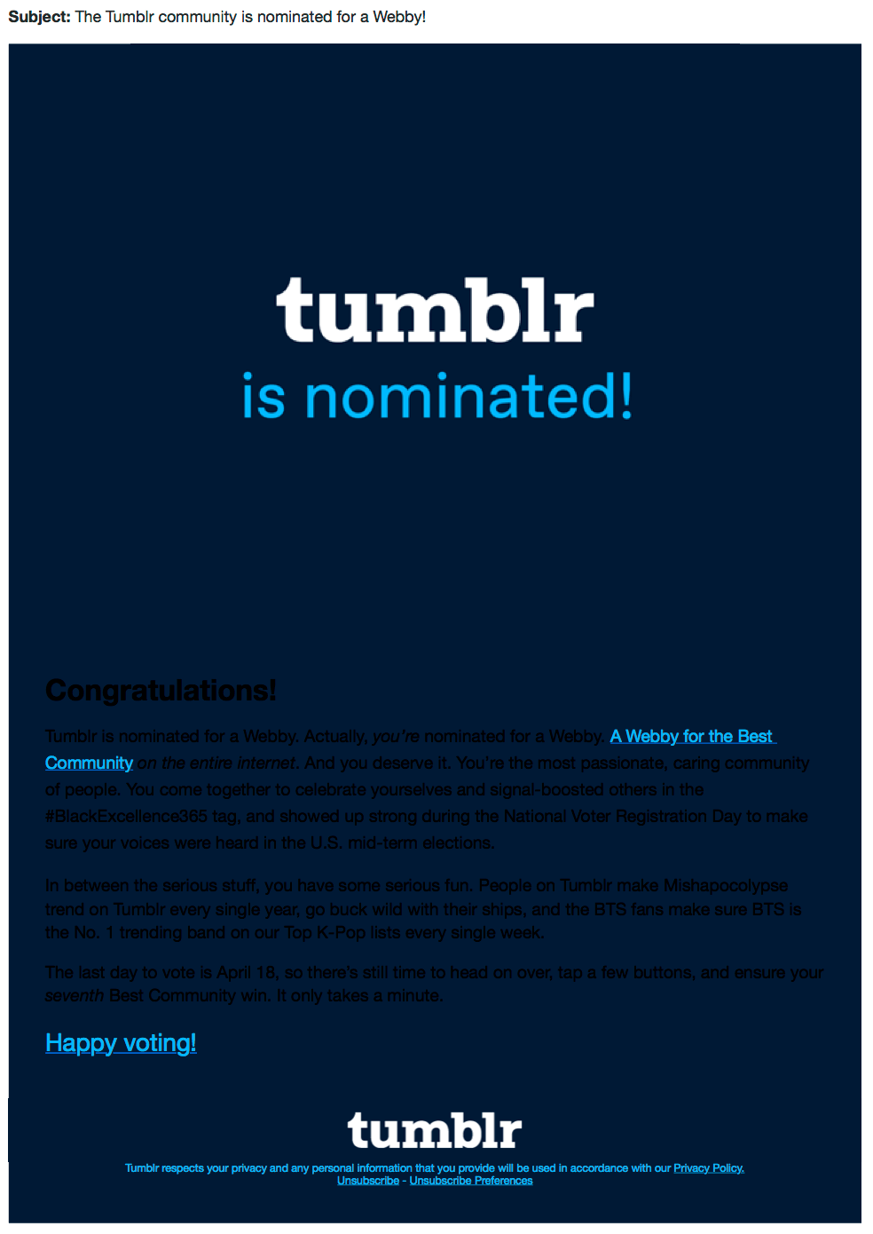
These are emails where text is put on images instead of being typed in your email builder. In this case, your email copy can’t be highlighted, copied-and-pasted, or recognized by a screen reader. That’s why sending image-only emails is a massive accessibility failure. What’s worse, if your subscribers have turned off images in their email clients to save money on traffic or decrease loading time, this is what they’ll see in their inboxes:
Finally, image-only emails can get you a one-way ticket to spam folders. Before, spammers often used them to bypass the filters that scan the text for trigger words. The filters learned it — so, now, image-only emails have a higher chance of being marked as spam by servers.
Ensure email readability
The first rule of commercial writing is that you’re not writing for yourself — a marketing copy should be easily understood by a 12-year-old. So, you’d want to keep your emails short and avoid long sentences, passive voice, jargon, and unclear messaging.
But readability is also about visuals. Take a look at this email:

White text on an intricate beige background with many details, thin typeface, a barely noticeable CTA — that’s a recipe for disaster. Learn from the others’ mistakes and consider the following when designing an email:
- Font size. Anything below 14px will be hard to read on mobile devices. Also, use different font sizes and typefaces for visual hierarchy — big and bold fonts work well for headings and accents.
- Font shape. There are 4 font families: serif, sans serif, script, and display. Here’s an example:
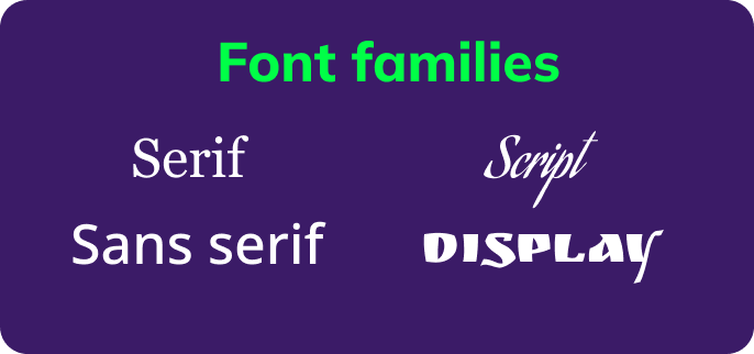
Although serif fonts, like Times New Roman, have become a standard for printed media, they’re not as legible as sans serif fonts, especially for people with dyslexia. And artsy script and display fonts are largely decorative — save them for logos!
- Alignment. Left alignment is the most popular format in web design and it’s the easiest one to read. Placing the entire long paragraphs in the center is inconsiderate, although it works great for headings. Right alignment is acceptable for sign-offs or navigation. But the one format you should avoid by all means is justified alignment. Justified alignment makes each paragraph look like a block with even borders. This is achieved by using white spaces of different sizes between words so each line has the same length. Although it’s great for printed media, don’t use it in emails — justified text confuses your dyslexic subscribers.
- Paragraph spacing. A wall of text with no images or breaks between them, especially if your email copy is long, is a snooze even for non-ADHD subscribers. Adding white space makes your copy more readable and creates a visual structure.
Use appropriate color contrast
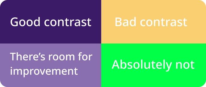
It’s easier to explain with an example — here’s what you absolutely should not do:
Even a magnifying glass won’t help you read the email above. This example is more of an extreme — there are more shades of bad than black text on dark blue background:
And here are some examples with dark text on light background:
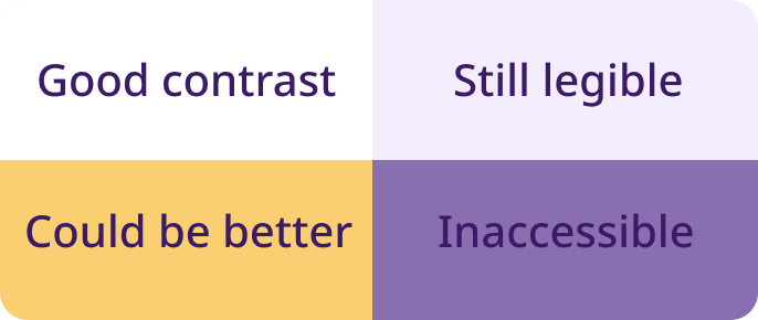
If you’re still confused, use tools like the WebAIM Contrast Checker that checks accessibility of different web design elements: headings, normal text, and interface components.
Another type of tool that can help you choose more accessible colors is color blindness simulators. Here’s an example of how Toptal’s web page filter works:
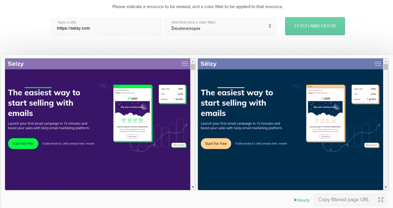
These instruments will help you a lot with testing the accessibility of your website pages and emails.
Add enough white space
Remember what we said about walls of text? It applies to walls of content as well. White spaces between paragraphs, images, buttons, and other content elements boost your emails’ cognitive accessibility up to 11. Overwhelming designs with many things cramped on one page can confuse subscribers with ADHD, and overstimulate people on the spectrum. Too much clutter around the text is also not helping your dyslexic subscribers.
What does “enough white space” look like? Here’s an awesome example.

Make links and buttons stand out
Clickable elements in your emails should be as different from the rest of the email’s content as possible. It’s not just a marketing trick — it’s an adjustment for visually impaired and colorblind subscribers. Here’s an example:
As for the buttons, they should be big enough for touch screens and the CTA should be clear without context. Some screen reader users prefer listening to the list of links instead of the whole email, so pay extra attention to your CTA copy.
Make your emails responsive
Responsive design means that your email layout responds and adapts to different screen sizes. It’s one of the components of email optimization for mobile devices. Here’s a side-by-side comparison of responsive vs. non-responsive design and what they look like in mobile email clients.
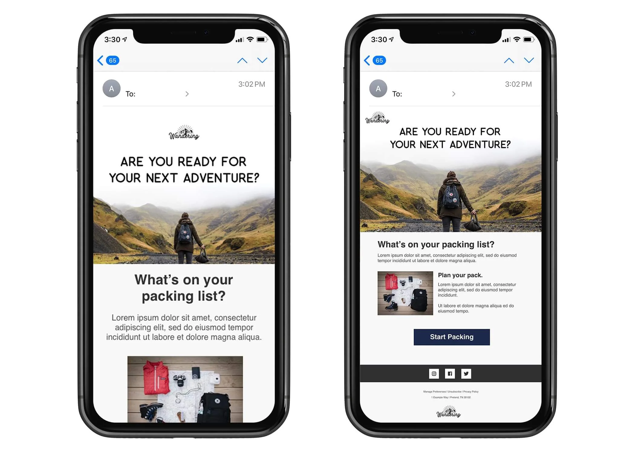
Notice how the non-responsive version on the right has smaller fonts and looks more cluttered. Meanwhile, in the responsive version, the same content is rearranged. The email is longer and requires scrolling but each element is large enough and can be read perfectly on a smaller screen.
Responsive email design is not just an accommodation for smartphone users. It’s also a great adjustment for visually impaired subscribers — since the fonts will be larger on mobile screens, the copy will be easier to read.
Email accessibility checklist: code
Email code is the part end users don’t see, that’s why it’s easy to forget about accessible adjustments. But it only takes developers to add just a couple of lines to drastically improve the experience for people who use assistive technologies. Let’s dig in!
Use headers and other semantic elements
Semantic markup is the use of HTML tags that convey the information about the structure and content of a web page. These tags are recognized and easily read by software, developers, and users. Here’s an example:
| Semantic HTML | Non-semantic HTML |
| <header> | <div class=”header”> |
Although invisible for regular users, semantic markup brings structure to your emails and improves user experience for those who rely on screen readers. Here are some semantic HTML tags that will make your emails more accessible:
- <p> — for marking paragraphs instead of line breaks <br>.
- <h1>, <h2>, and so on — for the structural hierarchy of email headings.
- <strong> and <em> instead of <b> and <i> — for emphasis. The end result is the same, but “bold” and “italic” tags only characterize what the end users see, while “strong” and “emphasis” tags convey why the text is bold or italic.
- <header> — for header content that is not mandatory to read.
- <figure> and <figcaption> — for images and captions that follow them.
- <nav> — for navigation links.
| <nav> <a href=”/updates/”>New in our blog</a> | <a href=”/news/”>News</a> | <a href=”/inspiration/”>Inspo</a> | </nav> |
Add the language attribute
Screen readers obtain the information about the email’s language from the HTML code. If you don’t specify the language, the generated voice’s pronunciation will get messed up and the end result will be confusing to the user. One short line of code can drastically improve the experience of your subscribers who use assistive technologies, so don’t overlook it!
Here’s what the language attribute looks like:
| <html lang=”en”></html> |
Use role=”presentation” attribute for all the tables
The <table> entity in HTML is often used for building layouts. But it’s a headache when it comes to screen readers — they recite each cell like “Row 1, Column 3” etc. It’s a convoluted way of presenting information and spoils the UX for people who rely on screen readers:
To solve this problem, use the role=”presentation” attribute. You don’t have to avoid tables altogether — just add it in the <table> tag contents, along with other characteristics:
| <table width=”98%” border=”1″ cellpadding=”0″ cellspacing=”0″ style=”width: 100%” role=”presentation”> |
Use proper alt text for images
Alt text is a short written copy that appears instead of an image if it failed to load or when you hover a cursor over an image — like this:
For websites, alt text is a great source of organic traffic — if you add it to blog illustrations, these pictures will appear among Google Images search results. Emails don’t need SEO optimization but it doesn’t mean you should ignore alt text. The main purpose of alt text is describing what’s in the picture — and these descriptions are recognized by screen readers. Use our tips on how to make accessible alt text for your emails:
- Don’t put “picture of” at the beginning of each description. It can be very annoying to users. Imagine having to perceive an entire image-heavy email with constant “picture of” bits. However, using more precise words like “portrait” or ‘infographic“ will help your visually impaired subscribers get a better idea of what’s in each picture.
- Be concise. A perfect alt text should give all the important details within two lines tops so visually impaired users don’t feel like they’re missing out. For example, if you show infographics, include the key statistics in the description unless you mention them in the text before or after the picture. However, you can provide longer descriptions if images are the main focus of your email. For example, if you show NASA’s pictures of space objects or describe the intricacies of art photography.
- Don’t repeat captions. Image captions are a visible part of your email and it will surely be recognized by a screen reader.
- Don’t describe decorative images. Branded graphics and other design elements don’t contain valuable information — only add alt text to illustrations.
- Include text that is in the picture. For example, if you include a picture of a poster, an accessible alt text will look like this:
| <img src=”http://www.coolmovieposters.com/darkknight” border=”0″ alt=”A poster for the movie “The Dark Knight” with a tagline “Welcome to the world with no rules””> |
- Don’t use the same alt text for similar images. For example, if you write an email focused on email marketing statistics and you use two infographics from the same study, don’t use the same “2022 survey results” description — be more specific.
Include a plain text version
It’s in the name: plain text emails only contain text — no images, no fancy formatting, no table layout, and standard links instead of buttons. On their own, these emails are perfect for confirming transactions. But when it comes to promotional emails, marketers stick to HTML. Why should they have a plain text alternative?
We already mentioned screen readers a lot. Plain text versions only contain the main message without image descriptions — so it will be easier for visually impaired subscribers to get the gist of what you want to say. Including a plain text alternative is also helpful for customers with low internet connection, old devices, and email clients. In this case, they’ll be able to read your email even if all of your intricate design is not loading.
Final thoughts
Designing your promotional emails with accessibility in mind is a good practice. Accessible design gives you a better reach, benefits all your subscribers — able-bodied or not — improves your reputation, minimizes the legal risks, and gives you a strong competitive advantage. Here’s what you need to consider if you want to make your emails more accessible:
- Pay attention to typography — use sans serif fonts, avoid justified text, and stick to the sizes not smaller than 14px.
- Be careful with color choices — make sure your copy is legible and use tools for testing the accessibility of your color schemes.
- Avoid all-image emails — text on images doesn’t get recognized by screen readers.
- Optimize for mobile devices — use responsive templates.
- Leave some breathing room — structure your content with white spaces between elements.
- Make links and buttons distinguishable — colorblind-friendly and large enough to tap on with a thumb.
- Optimize HTML code — regular users don’t see it but language attributes, proper alt texts, and semantic markup improve the UX for your subscribers who rely on assistive technology.
- Offer a plain-text alternative — so people get the gist without having to endure reciting the walls of alt text and tables.
