Mobile email templates


Other categories
- New Year
- Free
- Presidents Day
- Animated
- Drawing
- Gaming
- Valentine's Day
- Small Business
- Personalized
- Invoice
- Welcome
- Cyber Monday
- Birthday
- Small Business Saturday
- Responsive
- Office
- AI
- Giving Tuesday
- Password Reset
- Earth Day
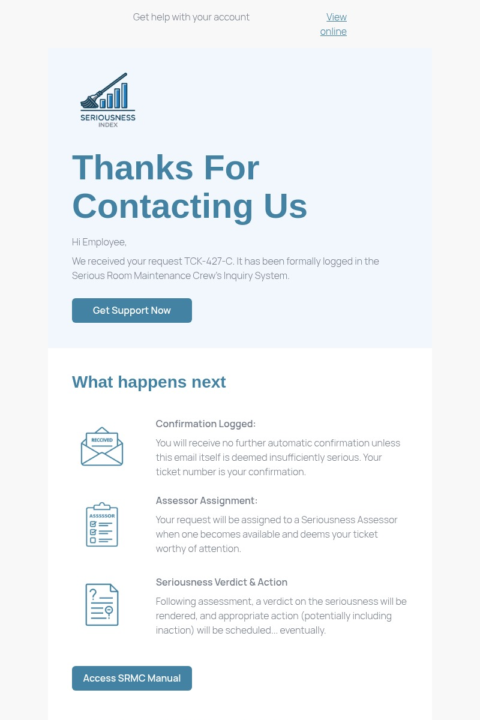
- Customer Service
- Halloween
- Education
- News
- Mother's Day
- Black
- Summer
- Black Friday
- Nonprofit
- Newsletters
- St. Patrick's Day
- Labor Day
- Thank You
- Christmas
- Veterans Day
- Custom
- Women's Day
- Wedding
- Business
- Thanksgiving
- Interactive
- Spring
- Holidays
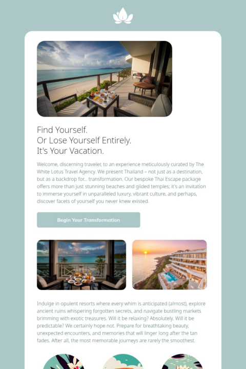
- Travel
- Design
- Blue
- Green
- Wellness
- Pink
- Webinar
- Chinese New Year
- Software
- Health and Wellness
- Video
- Promotional
- SaaS
- Memorial Day
- Health
- Ecommerce
- College
- Countdown Timer
- Real Estate
- April Fool's Day
- Human Resources
- Back-to-School
- AMP
- Healthcare
- Easter
- Food
- Digest
- Fundraising
- Medical
- Father's Day
- Fashion
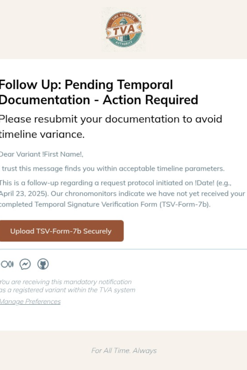
- Follow Up
- Transactional
- Dark Mode
- Emoji
- Beauty
- Orange
- Abandoned Cart
- Promo
- World Emoji Day
Some surprising stats about mobile email templates
Did you know that according to recent research from Litmus, not only can optimizing emails for mobile increase conversion rates dramatically, but emails designed specifically for mobile devices see engagement rates up to 70% higher than desktop-only designs?
Another statistics show that marketers who prioritize mobile optimization are likely to improve their click-through rates by 41% compared to those who don’t. This also applies to all types of campaigns, which makes templates for mobile email essential performance boosters regardless of the actual industry or purpose of your communication.
In fact, mobile email can significantly impact your overall marketing success. Think about how many of your subscribers check email on smartphones and compare it to these statistics from Forbes: mobile-optimized emails have been shown to increase revenue by 38% while reducing unsubscribes by 31%. Just wow!
If you can dramatically improve results while keeping your current subscribers happy, isn’t it worth designing all your communications with mobile users in mind? And with Selzy’s mobile email templates, it’s easier than you think!

How to ensure mobile responsiveness in email
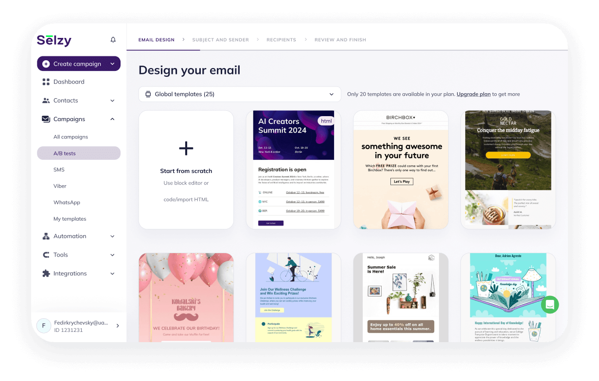
Yes, it is fair to say that statistics work wonders, but how do I make sure my mobile email templates actually perform well? The first and probably easiest way is simply using pre-designed responsive templates that automatically adjust to any screen size.
If you are in the consumer market, you are probably sending mobile emails to people constantly on the go, checking messages on various devices with different screen sizes, which demands flexible layouts that look perfect everywhere without any extra effort on your part.
That way, customers get a seamless experience regardless of where they’re checking your messages, which can be a crucial factor in whether they engage or delete. Let’s take a deeper look at why!
Boosting conversion rates via mobile email
If your mobile email has clear, easily tappable call-to-action buttons, then you’re setting yourself up for success because users won’t struggle to navigate your content on small screens. But it might not work well if your design requires precise clicking or includes elements too small for fingertip interaction.
Another important thing you should keep in mind, regardless of your goals, is that mobile email loading time must be under 3 seconds. Otherwise, you risk losing subscriber attention before they even see your content.
Best practices for mobile email design
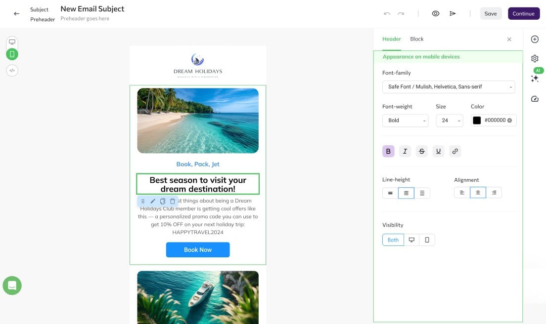
Speaking of optimizing mobile email performance: if your design is minimalist enough, you can create a single-column layout with the integration of large, touch-friendly elements right in the email body instead of complex multi-column designs. This will help you keep your mobile email “clean” and make sure that users can easily interact with it. Large, well-spaced buttons can also act as highly converting and attention-grabbing CTAs that, when tapped, take users exactly where you want them to go.
You can achieve similar results with properly sized images (typically scaled appropriately) or with simplified navigation elements that require minimal scrolling or zooming.
One thing about mobile emails they won’t tell you about
Okay, now let’s move on to the probably less obvious aspect of mobile email optimization (or at least you might think of it that way) — but potentially the most impactful one. It is designing for the “thumb zone.” Keep in mind here that most mobile users hold their phones in one hand and navigate with their thumb, plus people’s reach is constantly changing as phone sizes increase. So we suggest that you do your own research on what devices your subscribers are using, and make decisions on button placement based on accessibility for one-handed use.
Native mobile optimization in email (with Selzy’s editor!)
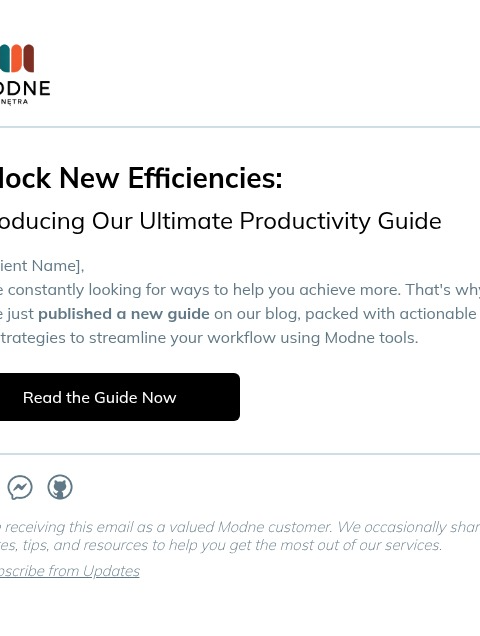
If you’re ready to create truly effective communications, consider your work simplified. Choose mobile email templates you like and customize them to the smallest detail within the intuitive interface of Selzy’s drag-and-drop email editor.
You can also create your custom mobile email design from scratch by simply adding the appropriate elements, setting up automated responsive behavior (which adjusts content based on screen size), and selecting one of the appropriate pre-made layouts — or leave it flexible and create your own unique mobile-friendly design.
Either way, our email design is mobile friendly by default, so you can send it out as is, or easily customize it with no HTML coding.