


Key takeaways
- Mobile email marketing is crucial due to the high percentage of emails opened on smartphones or tablets.
- Creating mobile-friendly campaigns is essential to cater to the dominant mobile usage and improve user experience.
- Optimizing emails for mobile involves using responsive design, optimizing the "From" name, keeping subject lines concise, and simplifying layouts.
- Top examples of mobile-friendly email marketing campaigns include Calm, Spotify, Grammarly, and Trello.
Email remains a popular avenue for marketers to reach their audience. However, not all marketers create mobile-friendly emails. Below we’ll explain why you should get into mobile marketing, how you can create mobile-friendly campaigns, and how it can help your business leave a positive impression. Let’s start at the beginning though…
What is mobile email marketing?
Mobile email marketing is simply a marketing campaign tailored to look good on smaller screens, too. It’s responsive meaning the images, fonts, CTAs, etc. adapt to a mobile layout automatically.
Over 70% of emails are opened on smartphones or other mobile devices like tablets. Not optimizing for mobile can cost you dearly. Just think about it: without responsive email design you risk getting only 30% of your potential profits!
Why you should create mobile-friendly marketing campaigns
Dominant mobile usage
9 in 10 Americans own a smartphone. Since 2011 this number has risen massively, from 35% to 91%. Americans spend at least 4.5 hours a day on their phones, calls notwithstanding. And we’ve already quoted statistics on how many open email inboxes on their phones. In short, mobile-optimized campaigns are a goldmine for marketers.
Improved user experience
People prefer to view emails from their smartphones. So when you make your email campaigns with a small screen in mind, you are catering to a big audience. Although people can view any email on their phones, a not mobile-optimized campaign will be less effective and hinder your customers’ viewing experience and your potential sales.
Your overall brand perception may be tainted by poorly optimized content. User experience is king, and people have a very short fuse when it comes to content optimization. They expect your content to be both tailored to their devices and personalized to their preferences. It might be just one poorly-optimized campaign for you, but it will stick with the user who opened it and didn’t fancy it.
Reduced unsubscribe rates
Some people will delete unoptimized emails quickly, as many as 2 out of 3 will set up a junk email account because they feel overwhelmed by the volume of brand emails, while 2% will simply hit “unsubscribe”. None of these actions are good for your business: they can hurt your sender reputation in the eyes of email service providers.
How to optimize your emails for mobile
There’s a series of steps you can take to adapt your emails for mobile devices. We’ll go over the most important ones.
Use responsive design
Responsive design means that your email will rearrange itself according to the screen it’s displayed on. Single-column layouts are the easiest when it comes to responsive design. Just like on desktop, on mobile, email content simply stacks itself and users see it as a, well, single long column.
However, keep in mind screen rotation. If someone flips their phone horizontally, your email should adapt accordingly. You have a lot of space on the desktop but not nearly as much on an iPhone, for example.
You can either code a responsive email template yourself or use one of the no-code email builders that optimize layouts automatically.
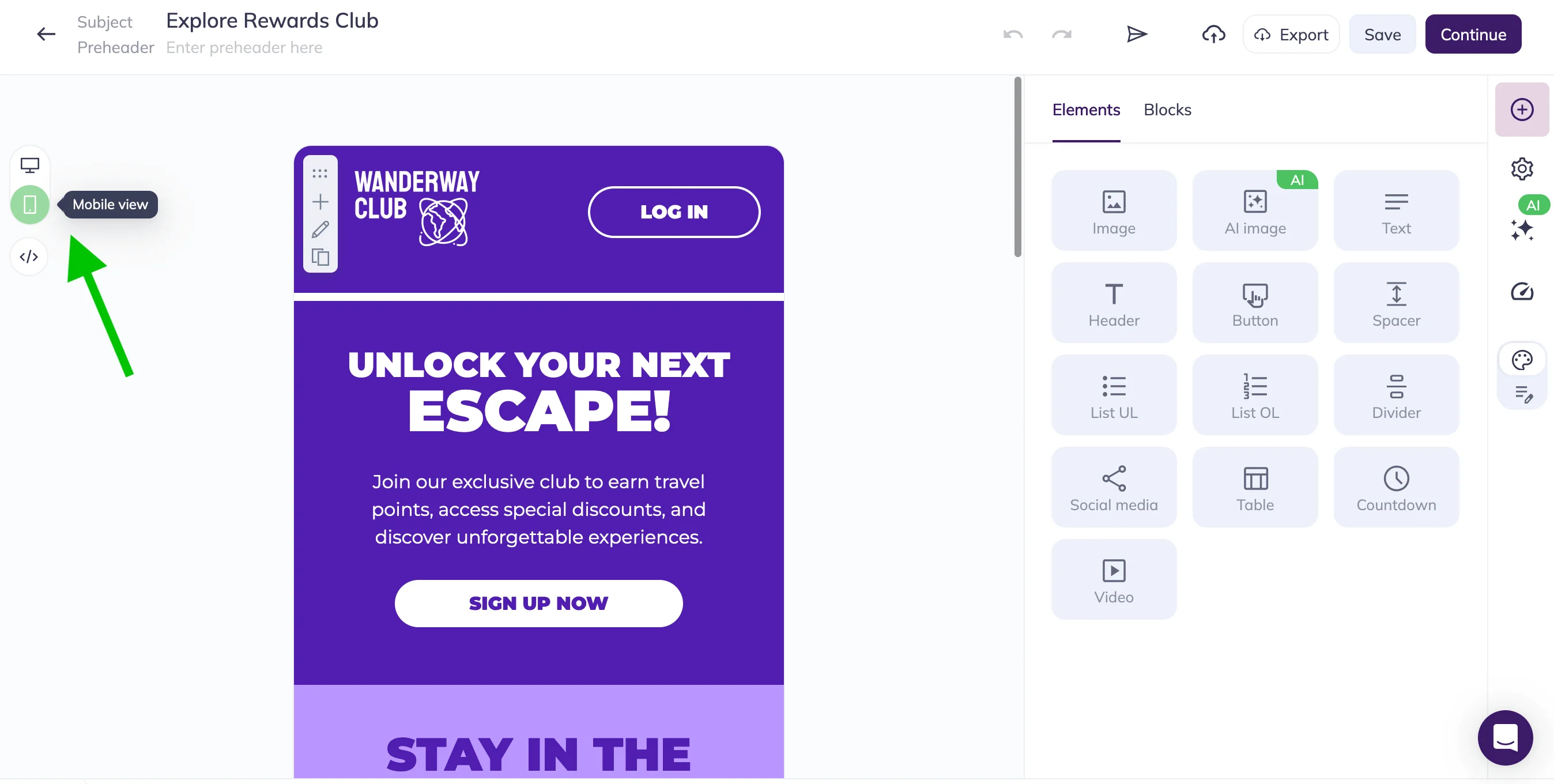
For example, all of Selzy’s email templates are already optimized for mobile. In the email builder, you can preview both mobile and desktop versions of your campaign.
Optimize the “From” name
95% of users say it’s important to recognize the email sender. There are two schools of thought here: you can go with your brand name in the “From” line, or with a person’s name AND your brand’s name.
The logic is simple: if someone subscribed to emails from Ahrefs, for example, they will be surprised to hear from a John Doe. Stick with “Ahrefs” therefore — or “John from Ahrefs” to add a personal touch and make the reader feel like there’s a person behind this email speaking to them, not a faceless organization.
There are no concrete guidelines, but the character limit still applies. Test different options in several mobile email clients and choose what works best.
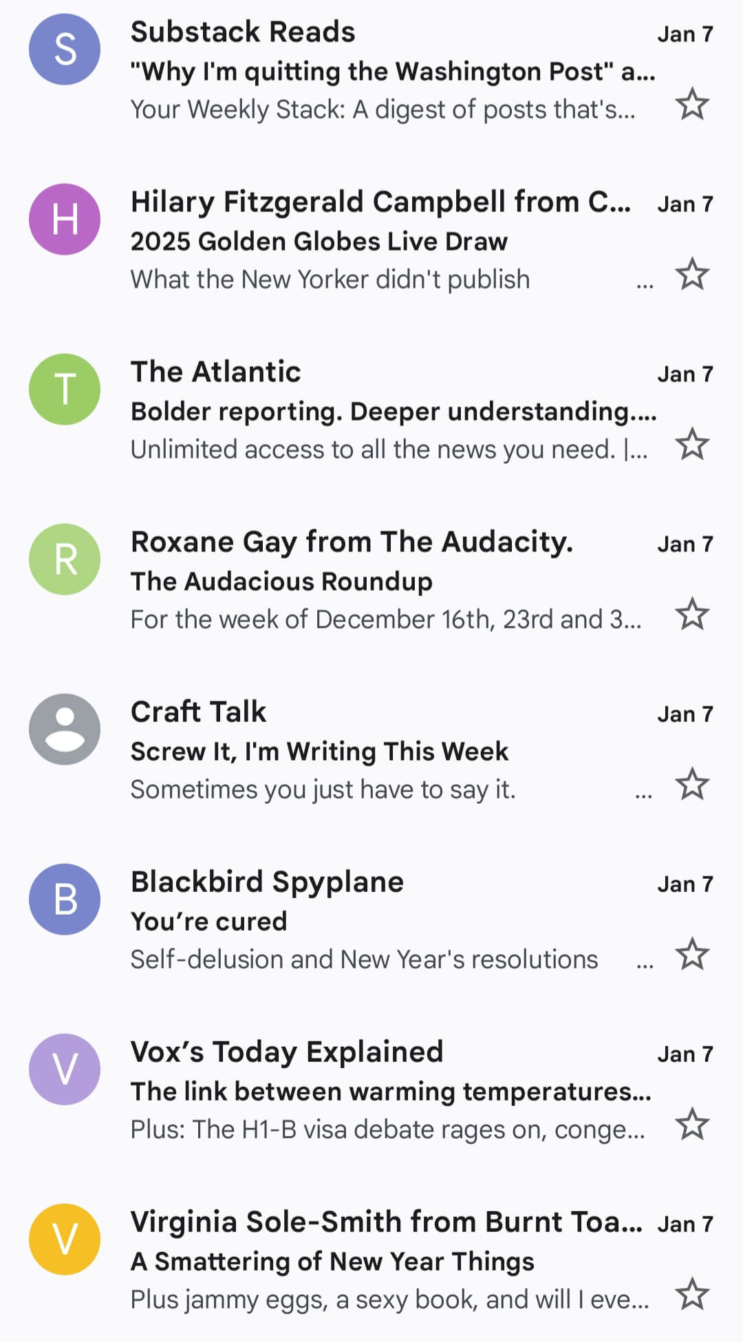
Here’s an example from the Android Gmail app. Sender names that are longer than 33-34 characters get cut off, so the best strategy here is to stick to 29-30 characters or fewer.
Keep subject lines concise
Depending on a phone’s screen size, you will have 30-35 symbols before your subject line gets cut off. It’s not the end of the world if the most important info is at the beginning and makes enough sense without the rest.
Here’s how two subject lines from different senders work on the desktop.

And here’s how they look on mobile. The one from BookBub was not optimized.
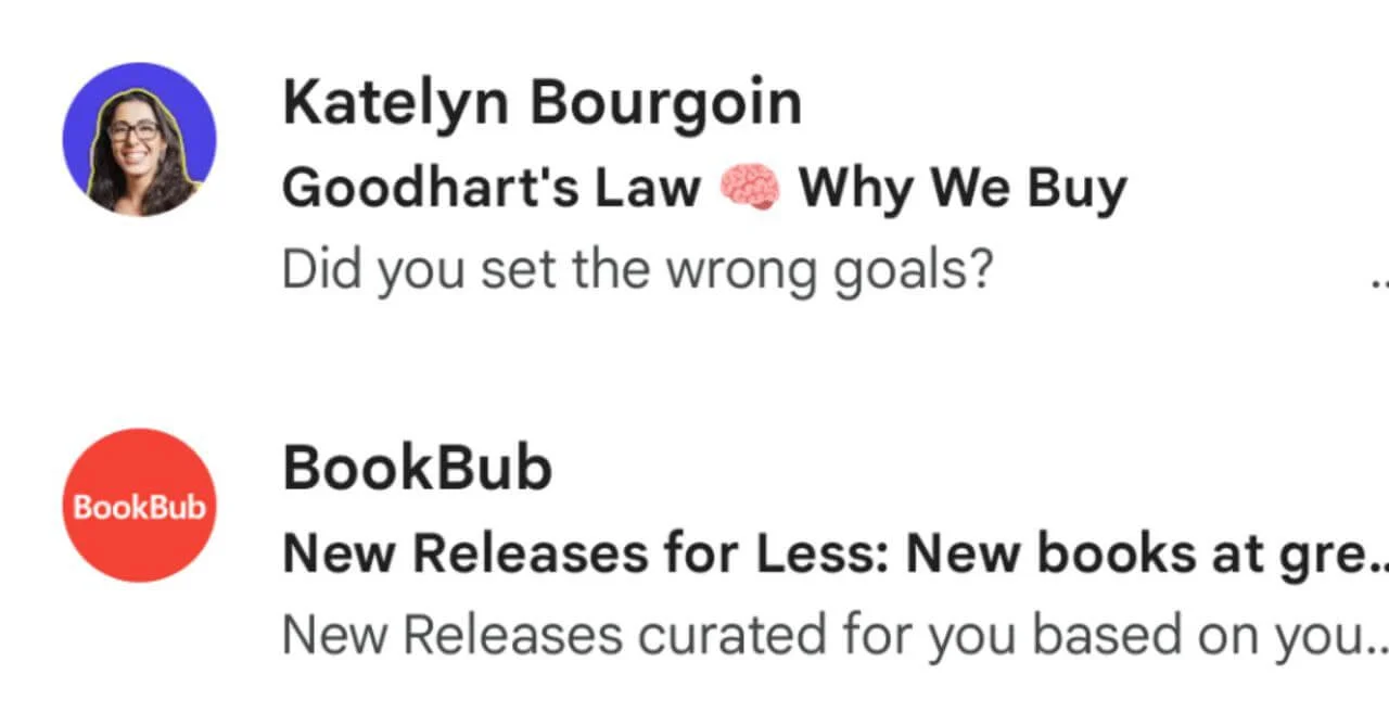
If you can’t pull off a subject line that works both ways, shorten it. Your best bet is to make a promise or trigger the reader’s curiosity to prompt them to click on the email. Need fresh ideas to craft catchy email subject lines — we’ve got you covered.
Most importantly, think of your subject line as the headline of a newspaper article which needs to motivate the viewer to read the first sentence. In your case, it will be the preheader text, which comes right after the subject line. So make sure you…
Optimize your preheader text
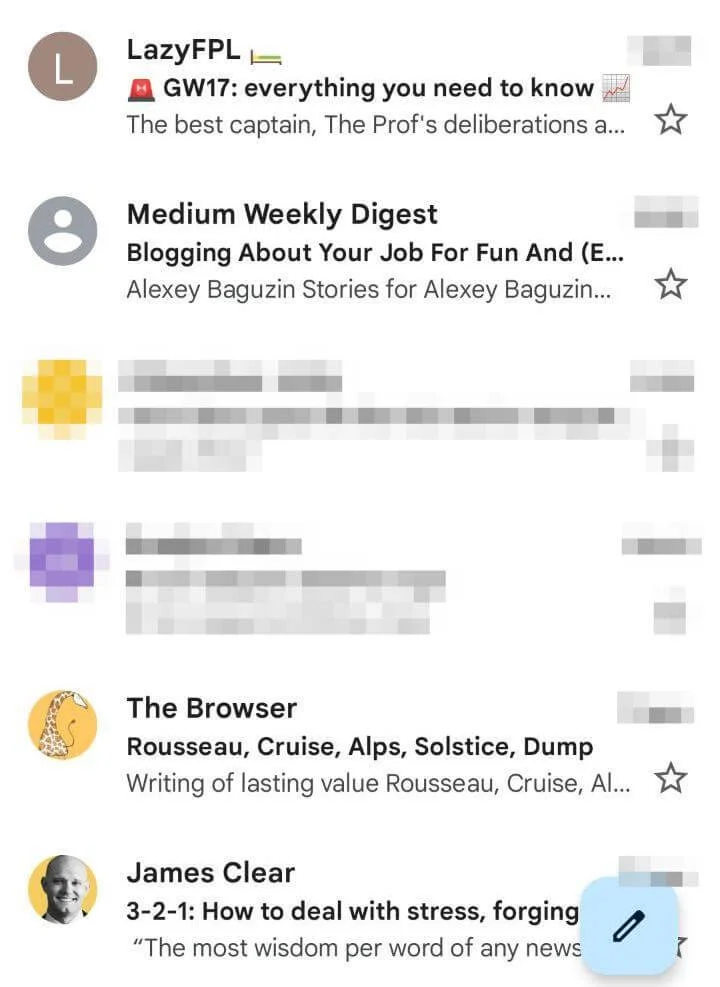
There are two points to keep in mind here: most mobile email apps will only show 40-50 symbols as preheader text (iOS native email app with 90 symbols being the outlier), and your preheader should organically complete the subject line.
So in your subject line, you tease your reader. In the preheader text, you pull back the curtain a little to hook them with curiosity and then continue your email in the same vein. I just checked my email inbox (Android Gmail user here) and guess what? There’s not a single preheader text that’s not cut off. Keep your preheader under 40 symbols and you’ll instantly stand out in inboxes.
Simplify your layout
What about the design elements of your email campaign for mobile devices? Read on for recommendations.
Use larger fonts
We’re sure you have run into emails with almost illegible texts. While smaller text looks alright on desktop, it won’t do so on mobile. The common consensus here is to make headings 22 pt and the text itself around 14-16 pt. And don’t forget about the text you have on images — try to avoid it for the sake of accessibility and ensure it’s big enough to make out what’s written.
Make CTAs finger-friendly
Much like you cater to making fonts bigger, do the same with calls-to-action (CTAs). Keep several points in mind: CTA buttons are better than simple links and CTAs have to be big enough themselves.
CTA buttons are 25% more likely to get clicked on than links. As for CTAs size, the average width of an adult index finger stands at 18-20 mm. That equates to 68-75 pixels. Stick to these numbers when designing your CTAs.
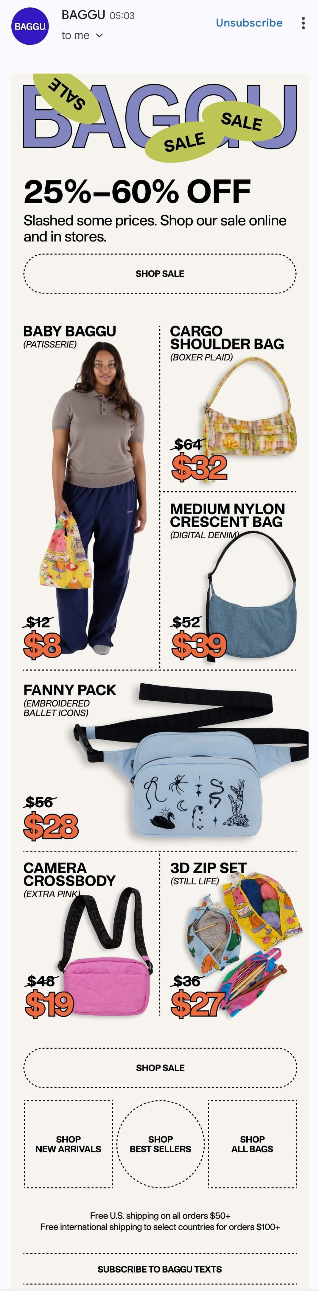
Alternatively, you can make CTAs screen-wide, as Baggu did in this email (opened in Gmail on an Android device):
Minimize the use of images
Or go without images entirely. Why? High-quality images will slow down loading times, can eat up a chunk of your users’ mobile data, and, worst of all, may end up not loading at all.
This is why you should carefully consider how many — if any — images you use and what information they contain. They cannot include vital information unless it’s also part of the email copy. If the image fails to load, your reader won’t understand everything — not the risk you want to take.
If you absolutely need to include images, go for the 450 to 650 pixels size. It’s large enough to show up properly on desktop devices, yet small enough to be viewed on mobile as well.
Reduce the scroll
Here’s a frightening bit of info: people spend around 10 seconds reading brand emails. Not a lot of time for you to make an impression. Your average reader will scroll your email once, maybe twice. So you have to make these scrolls count.
To achieve that, shorten your email content — quite possibly to an extent where your readers don’t have to scroll at all, with all the info located on one screen. Most of the time you’ll want to make your email under 120 words. Not much wiggle room, but we live in a world full of people with short attention spans.
Top examples of mobile-friendly email marketing campaigns
Calm
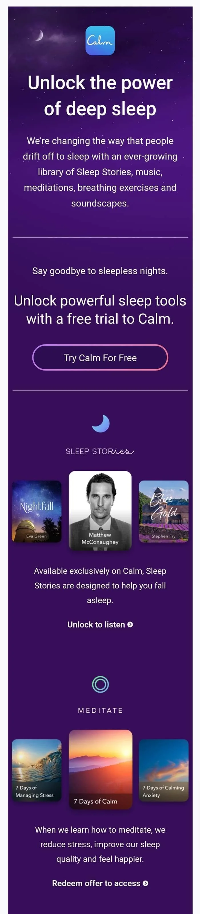
Calm is an app designed to help overcome insomnia. Here’s an email they sent to their top-of-the-funnel subscribers, i.e. those who are still considering whether they should fork out their hard-earned cash on this product.
What it does right
- There is not a lot of text — and the fonts are large enough to read effortlessly.
- There’s a concise intro with benefits, a prominent call-to-action, and Matthew McConaughey’s face is near the top of the email.
- Calm also doesn’t go heavy on images here.
What can be improved
- Some of the fonts are off (e.g. Sleep Stories). It was done this way deliberately and we think it’s a mistake: you have to really focus to read the part in italic.
- There are sleep stories from Eva Green and Stephen Fry too — but their faces are nowhere to be seen, meaning you can easily miss the fact both celebs basically vouch for the brand.
- Calm does not state in the copy itself that sleep stories are voiced by Hollywood celebrities: a mistake, should the images with this info fail to load.
- Finally, the email itself is long — we’ve only included about 30% above. Most people will not scroll to examine the other benefits and see another CTA buried at the bottom. But we suspect Calm knows that — that’s why they have a clear CTA at the very top, as well as Matthew McConaughey’s recognizable face.
Spotify
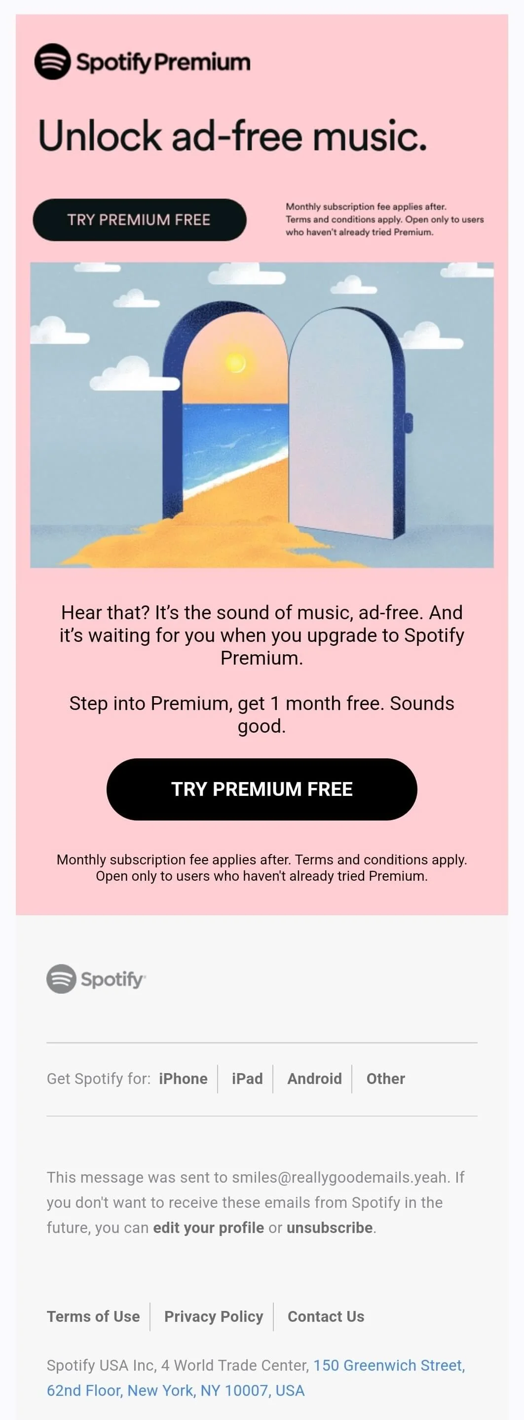
Spotify is probably the most famous music streaming service on Earth. They don’t rest on their laurels, however — and that is true for the emails they send as well.
What it does right
- Very few words: just 37, excluding the fine print at the top and the bottom. No one will likely read these bits anyway, we suspect Spotify was simply legally obliged to include them.
- Prominent CTAs: two, for good measure, even though there are very few words between them.
- The picture is clever: the sound of music is likened to beach sounds. However, even if you take away the picture, the message remains intact.
- All the info is inside just one scroll. These folks clearly know about short attention spans.
What can be improved
We’ll be completely honest here: ad-free experience is not the most obvious benefit to going for a premium Spotify subscription. The ads can get annoying, sure, but they are infrequent. Your inability to skip songs, put them on repeat, or download for offline listening are all potentially better pain points to address. Hell, even “get one month for free” is a better option. But moving on.
- The fine print at the top of the email is an eyesore. It takes away the reader’s attention from the CTA.
- “Sounds good” is a clever play on words — but perhaps too clever. Most will simply assume Spotify is patting itself on the back in a condescending way.
Grammarly
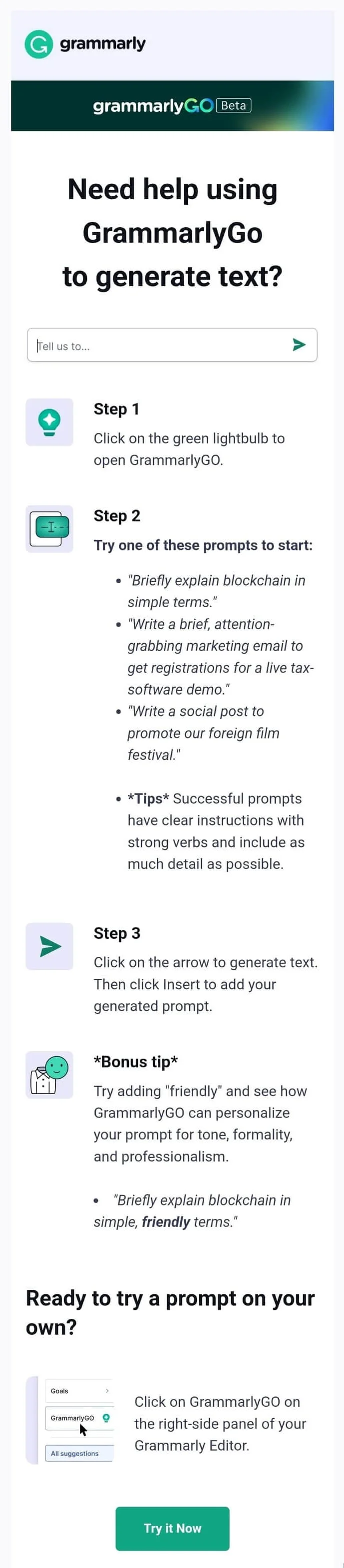
Last but not least. Grammarly started out as a kind of virtual editor, spotting mistakes, offering paraphrases, and the like. Then it added a plagiarism checker, before recently succumbing to the AI craze and implementing its own AI tool, GrammarlyGO. Here’s an email after GrammarlyGO went live.
What it does right
- The main benefit is stated at the very top: get help with generating copy.
- They include the interface of the tool itself: a simple step, but one that ensures customers know what to look for when they log in.
- The copy is structured, complete with bullet points, to explain how to use GrammarlyGO.
- There are also no images except for small emoji-like icons and a screenshot at the bottom — bravo.
What can be improved
- There is too much text, and the fonts are small(ish). Headlines are easy enough to make out — everything else is not.
- The CTA also looks tiny, but the main problem is that it’s at the bottom. People might simply not scroll all the way down there to find it.
- The email doesn’t have a lot of white space for the eyes to rest. We are curious to know how the campaign performed in terms of click-through rates.
Trello
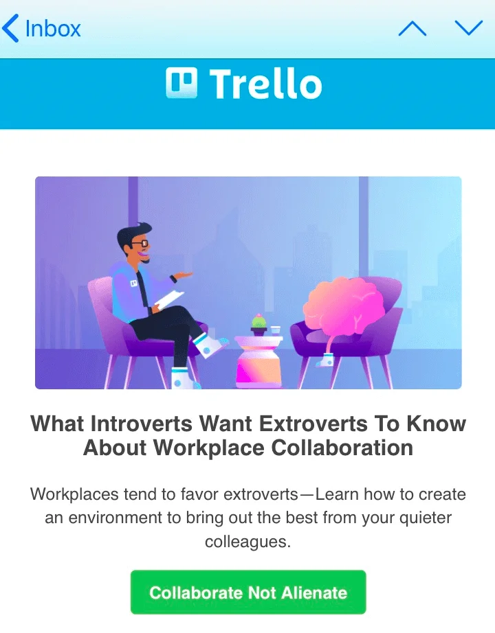
Trello is a well-known collaboration tool for teams, a streamlined version of Jira or Asana. In essence, it’s a Kanban board to help you create and track tasks. Here’s what an email they sent looks like on mobile:
What the email does right
- Large fonts: they are easy to discern on a small screen.
- Clever CTA: it continues in the overall tone of the email and is not bog-standard “Try now” or “Learn More.”
- Little copy, CTA high up: readers can get everything they need from just one scroll. They can continue exploring the email if they like, but Trello made sure the essence is captured straight away.
What can be improved
We are not huge fans of the image. It’s clever, like the CTA, but it’s not instantly obvious that an extrovert is chatting to an introvert in that picture. However, the header is right under the image and provides the necessary context to figure out what goes on. So it’s a small gripe really.
Wrapping up
Mobile email marketing means sending email campaigns optimized for smaller screens. It makes a lot of sense to optimize your emails for mobile: many people are using smartphones to access email inboxes and expect your emails to look good. Optimization strengthens your brand perception and reduces unsubscribe rates.
Use responsive email design to create campaigns optimized for mobile and pay attention to the sender’s name, subject lines, and preheader text. All of these impact open rates. As for the layout itself, stick to large fonts, prominent CTAs, few words overall, and minimum images — if you use them at all. We hope we’ve given you enough to chew on.
 New and noteworthy on our blog
