


A strong email call-to-action helps subscribers understand what to do next and why it is worth clicking. The wording, button design, placement, and destination page all shape whether a reader ignores the email or moves toward the campaign goal.
In this guide, we explain what an email CTA is, how primary and secondary CTAs work, which best practices matter most, and which mistakes to avoid. You will also find reusable CTA examples for content, shopping, events, seasonal campaigns, and social media.
Key takeaways
- A call-to-action (CTA) in email marketing prompts readers to take specific actions like buying a product, registering for an event, or downloading a resource.
- Primary CTAs are crucial for the main campaign goal, while secondary CTAs offer alternative actions for less interested users.
- Email CTAs should be clear, visible, and lead to relevant destination pages.
- Best practices for email CTAs include defining goals, using specific language, incorporating action words, creating urgency, choosing the right colors, using whitespace, optimizing for mobile, and A/B testing.
What is a call-to-action?
A call-to-action (CTA) is a short piece of text, a link, or a button that prompts the reader to take a specific action. In email marketing, it can invite subscribers to buy a product, register for an event, read an article, download a resource, start a trial, or visit a landing page.
An email CTA is a button, link, or short prompt that tells subscribers what to do next. The best email CTAs combine clear action, visible design, relevant placement, and a destination page that matches the promise.
Primary and secondary CTA
It is not uncommon for numerous calls-to-action to end up in a single email. In most cases, they are not equally important. Instead, some of them are more important than others.
The more important calls-to-action, also known as primary call-to-action, are meant to encourage the user to take the action that is the most important one in the entire campaign. In most cases, it leads the recipient towards converting into a website visitor, newsletter subscriber or a customer.
The less important ones are secondary call-to-action. They provide an alternative action for the email recipient to take, engaging users who are not interested in the main focus of the campaign. It tends to be smaller and less visible. Here is an example:

The big shop now button is the primary call-to-action. It is much larger than other calls-to-action in the email. On the other hand, the shop now buttons at the bottom are the secondary calls-to-action. They are much smaller and less prominent.
The importance of email call-to-action
There are plenty of email marketing campaigns that exist for educational or entertainment purposes only. However, most email campaigns are meant to move the reader toward a specific next step: buying a product, subscribing to a service, signing up for an event, reading a resource, or visiting a landing page.
A clear CTA connects the email message with that next step. It tells subscribers what will happen after they click and helps them decide whether the offer is relevant. CTA performance depends on the offer, audience, list quality, design, placement, and destination page, so treat case studies as examples rather than universal benchmarks.
Email CTA best practices
You know what a CTA is and why it is important. Now, read on for practical email CTA best practices you can use when planning, writing, designing, and testing a campaign.
Define the goal and value first
Before choosing button copy or colors, decide what the email should achieve and what the subscriber gets after clicking. A CTA should answer three questions quickly: what action should the reader take, why should they take it, and what will happen next?
Consider the language
Keep in mind that the language you use will have a huge impact. Generic copy like “click here” tells people where to click, but it does not explain the value. Specific copy such as “Get the guide,” “Reserve your spot,” or “Shop the sale” sets a clearer expectation.

It is also a great idea to tell the recipient what they are going to get. Better yet, it would be great if you were as specific as possible. If the size of the call-to-action button does not allow for a clear call-to-action, do not try to cram it in. Instead, place some explanatory text nearby.
Use action words
When writing a CTA, make use of action words in the form of command verbs. By doing so, you make it easier to understand what the recipient needs to do. The best and most commonly used command verbs are download, buy, discover, learn, watch, and read. Obviously, you can use a different verb if it would fit the context of the message better. Here are a few examples of what command verbs look like in action.

Create a sense of urgency
Create a sense of urgency when the offer is genuinely time-sensitive. Words like now, today, or limited-time can support an email’s click-through rate if they match the real deadline or scarcity behind the campaign. In the email below, the sense of urgency is all in the text directly above the CTA button.

Avoid fake urgency, though. If every email says an offer is ending soon, subscribers can learn to ignore the message. Use urgency for real deadlines, limited inventory, event registration, seasonal sales, or other situations where acting later changes the outcome.
Pick the right color
Make sure to pick the right color for your CTA buttons. You do not always have to use loud colors, such as neon pink or bright red. Instead, look at the background of the email. Then, pick a color that will make the CTA pop without making it appear out of place.
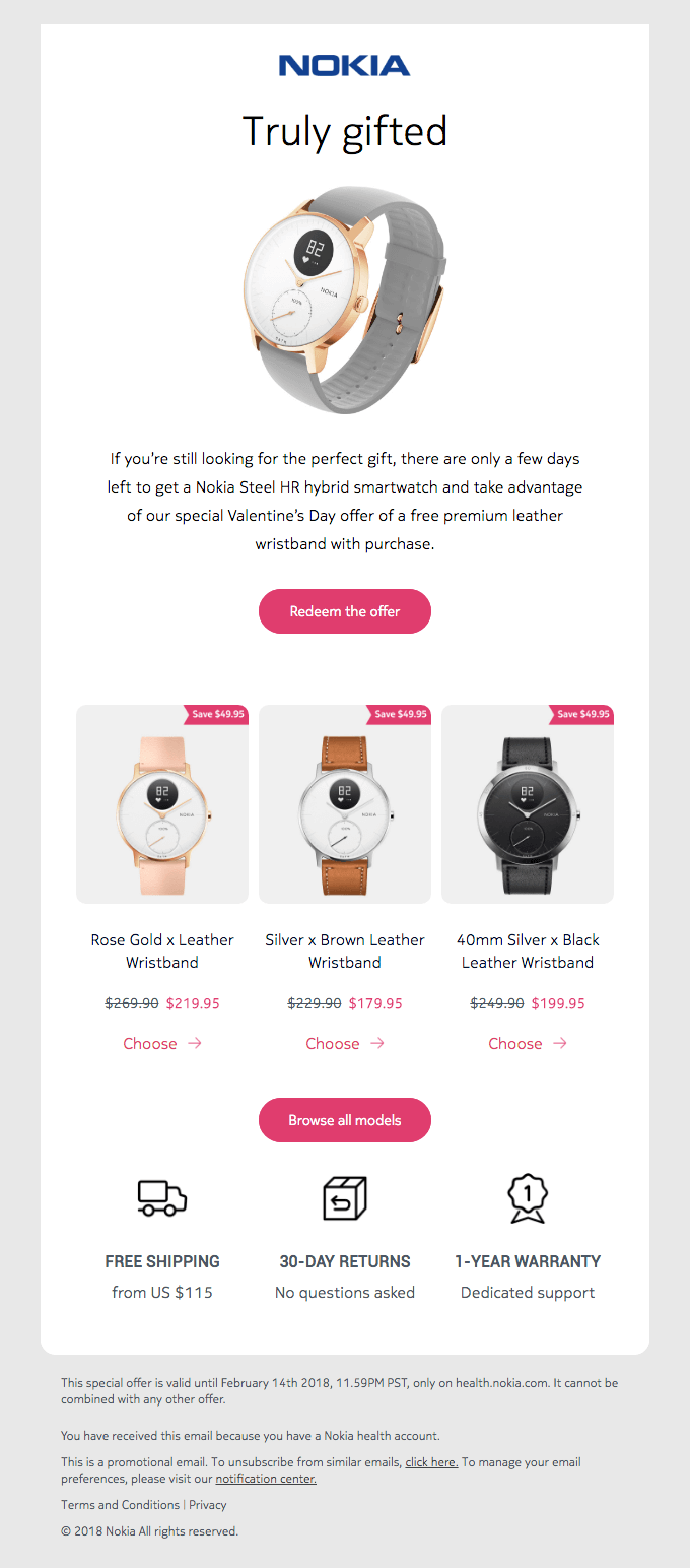
Here, Nokia went with a white background. To make the CTA stand out, Nokia made the CTA button bright pink. The color adds contrast to the message, ensuring that the CTA is easy to spot. To make CTAs more accessible, check the contrast between button text and button background, and do not rely on color alone to show that something is clickable.
If you find it difficult to pair colors with one another, you could use a special tool to do it for you. Here you can find an online contrast checker. There is also a contrast color finder here and here that you could use.
Use whitespace
Next, it is important that you use whitespace. In short, whitespace is the blank space between graphics, blocks, and images. It is left intentionally empty to help make certain things, such as specific images or text, more visible or distinct.
You could use whitespace to make CTA buttons more eye-catching, as well as to prevent the emails you send out from looking too overwhelming. After all, you do not want to end up with a horrible-looking and hard-to-read email like this one:

The email pictured above is difficult to scan because it contains almost no whitespace. Most of it is text, whether on the red background image or in the black bar at the top. That makes the message feel crowded and pushes the CTA into visual noise.
Next, have a look at a great example of how whitespace should be used. Below, you will find an email from Starry. It is about a Black Friday sale and contains just one call to action, which is surrounded by whitespace from three sides. The said whitespace makes the CTA eye-catching and easy to click on.

Optimize for mobile
Many subscribers read email on mobile devices, so your CTA should be easy to see and tap on a small screen. Use readable button text, enough padding, and enough space around the button so readers do not accidentally tap the wrong element.
You can ensure that in two easy steps. First, use a bigger font size for the button text. Second, surround the CTA with whitespace. Doing those two things will make the CTA more prominent and easier to tap on mobile devices.
If you do not know how to go about doing it, have a look at the following email from Codecademy. The dark CTA button stands out against the neon green background, and the font used is fairly big. It makes the CTA easy to spot and tap.

Don’t overdo it
A few call-to-action buttons can make sense when they support the same goal or repeat the same primary action in a longer email. However, too many competing CTAs can make the message feel overwhelming and dilute the main offer.
In order to prevent that from happening, you should make each CTA you use look different than the others. In addition, you should stick to a hierarchy. The most important primary CTA should be close to the main section of the email. On the other hand, the least important secondary calls-to-action should be at the bottom.
To illustrate our point, have a look at the following email from Lokai. It has several different calls to action, namely shop, shop bestsellers, learn more, and follow us. Each one looks different from the others, and the most important CTA is placed closest to the main offer.
Match the CTA with the destination page
The click is only one part of the journey. If a CTA promises a discount, guide, product page, or event registration, the landing page should continue that promise immediately. Use a destination URL that matches the CTA text, and track important links with UTM parameters or your email platform’s analytics so you can see which CTA drove the click.

Test it
Last but not least, start A/B testing each CTA you came up with. To put it simply, it is the process of dividing a mailing list into two randomly selected groups. Then, one email with one version of the CTA is sent to one group and another version is sent to the other group. After that, you compare the results.
The entire process will help you figure out which CTA works best and aid you in optimizing it for better conversion rates. To speed things up, an email marketing automation solution like Selzy can help you run the test and review the results in a clear report.
It is also worth noting that with Selzy, you actually do not have to send emails to two equally big sets of contacts. Instead, you can test a CTA on a very small fraction or several smaller fractions of a mailing list. Then, Selzy will send the best-converting email to the rest of the mailing list.
Common email CTA mistakes
Even a visually strong email can lose clicks if the CTA creates friction or confusion. Before sending your campaign, check for these common mistakes:
- Using generic copy like click here without explaining the value.
- Adding too many competing CTAs instead of emphasizing one primary action.
- Hiding the primary CTA too low in a simple offer email.
- Using low contrast, tiny tap targets, or crowded spacing on mobile.
- Sending readers to a page that does not match the CTA promise.
- Testing copy, color, placement, and audience all at once instead of isolating one variable.
120 email CTAs that you can use today
Below, you will find quite a few examples of calls-to-action you can use in email marketing campaigns. You could use each one as it is or treat it as a template for designing a more specific CTA. It is up to you!
Content-related
Have you recently published an interesting article, tutorial, or case study on the company blog? Or maybe uploaded a video about an event you have just been to? If you want to promote either of those things in an email, here are a few examples of a CTA you could potentially use.
- Read the full article
- Explore this topic
- Watch the tutorial
- Download our guide
- Find out more
- Read the blog post
- Get the report now
- Download the ebook
- Get the cheat sheet
- Read our case study
- Learn more about us
- Access our knowledge base
- Check out our webinar
- Learn more about the topic
- Download the whitepaper
- Download the template
- Get your free checklist
- Read the full story
- Keep reading
- Sign up to learn more
Shopping
If you are selling something, you need to encourage the recipient to actually make a purchase. Using a CTA from the list below should do the trick!
- Add to cart
- Buy now
- Shop the collection
- Shop this style
- Get the look
- Place your order
- Call now
- Order today
- Shop this look
- Get it now
- Get the deal
- Reserve yours now
- Buy before it’s gone
- Don’t miss out
- Secure your spot
- Shop the sale
- Join the waitlist
- Claim your deal
- Add to shopping cart
- Shop now
Feedback
Companies often use emails to gather feedback from customers. In case you intend to do the same thing, here are a few solid calls-to-action you can use to encourage your customers to share their thoughts with you.
- Share your feedback
- Leave a review
- Rate this product
- Tell us what you think
- Give us your opinion
- Let us know what you think
- Write a review
- Leave us a comment
- Share your experience
- Tell us your story
- Join the discussion
- Take the survey
- Share your thoughts
- Help us improve
- Vote now
- Rate us
- Leave a testimonial
- Submit your review
- Tell us how we can improve
- Give us your feedback
Event-related
Organizing an event is a huge initiative. Obviously, you want as many people as possible to show up. To achieve that goal, check out the calls-to-action below. They are perfect for promoting an event through email, whether it be a conference or a concert.
- Register now
- Sign up here
- Get your ticket
- Join us
- Reserve your spot
- Save your seat
- Attend the event
- Book your ticket
- RSVP now
- Claim your ticket
- Get your free pass
- Don’t miss out
- Secure your seat
- Register today
- Sign up for free
- Buy your ticket
- Be part of the event
- Get your invitation
- Get in on the action
- Claim your spot
Seasonal
The examples listed below are great for seasonal events, such as a winter or a Black Friday sale. They can get pretty specific. For instance, if you are promoting a Mother’s Day sale, it would be perfectly fine to use “browse Mother’s Day deals” as the CTA.
- Shop final sale
- Get 30% off
- Browse Mother’s Day offers
- Enjoy summer savings
- Get ready for winter
- Explore holiday deals
- Shop now and save
- Get 20% off today
- Shop the Black Friday sale
- Shop the limited edition
- Get ready for spring
- Shop the summer collection
- Explore our festive offers
- Shop the fall collection
- Enjoy Easter savings
- Get 50% off your order
- Check out holiday deals
- Get the winter look
- Start gifting
- Grab offer now
Social media
Building a following on social media is essential for staying competitive. You can use the following calls-to-action to encourage people to follow you on various social media platforms.
- Follow us here
- Join our community
- Get the latest updates
- Like us on Facebook
- Check out our Instagram
- Follow us on Twitter
- Let’s stay connected
- Join the conversation
- Watch our videos
- Share your story
- Connect with us
- Find us on LinkedIn
- Follow us on Pinterest
- Get more tips
- See what’s happening
- Discover new ideas
- Get exclusive offers
- Click to follow
- Tag us in your post
- Take part in the discussion
Top 5 email CTA examples
Apple

The email above contains one primary call-to-action and five secondary calls-to-action. The primary call-to-action read the interview is located at the top of the email, right above the main photo. The purple button it is on contrasts with the beige background. However, since purple goes well with beige, it does not look out of place.
The secondary calls-to-action are customize your social post, get started, become a partner, register today, and contact us. They are all located in separate sections of the email and appear as bare links, without any colorful backgrounds. As a result, they do not overshadow the primary call-to-action and do not make the email look too crowded.
Lucid Motors

Next up is an email from Lucid Motors. There, you’ll find two primary calls-to-action and two secondary calls-to-action. The primary ones are watch now and reserve now. They were put in framed buttons a small distance away from one another. One encourages you to watch a video about a car, while the other is meant to get you to place a reservation for it.
The secondary calls-to-action are close to the bottom of the email. The first one is visit our site, while the second is reserve yours. While their font size is bigger than the font size of primary CTAs, they were not put in any frames. As a result, they do not stand out as much.
Evergreen Juices

Here we have two good examples of two different types of a CTA. The first one is write a review and is meant to encourage the recipient to leave feedback. The second one is related to social media and prompts the recipient to follow Evergreen Juices on Instagram. Both were placed in dark-green buttons, which stand out against the white background and go well with the color scheme of the entire message.
Miles
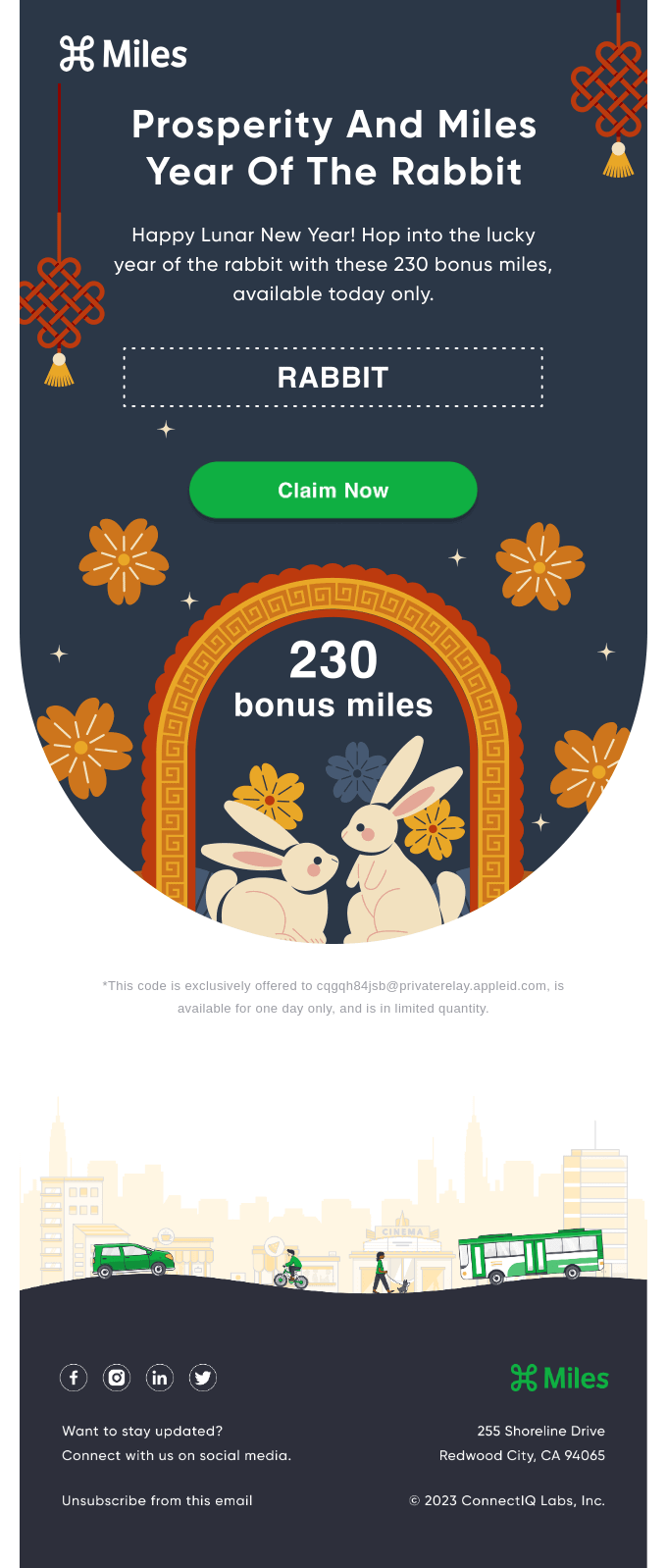
The example above is fairly simple. You are encouraged to claim 230 bonus miles with a green claim now CTA button. Again, it stands out against the darker background and is placed right above the main content of the email. Because of that, it is prominent and easy to click on should the recipient of the email want to take Miles up on their offer.
Babbel

Last but not least, we have an email from Babbel. It focuses on getting you to click through to their landing page with the help of a juicy discount. The CTA button with the text save now was placed on a bright orange background, which is the brightest part of the entire email. What is more, it is preceded by a big caption, which reads get 60% off. Both of these things combined result in a tempting and attention-grabbing CTA that is bound to boost Babbel’s click-through rate.
How to create an email CTA
Now that you have seen a few examples of what a typical CTA is like, it is time to figure out how to create one. Here are some of the most important steps that you need to follow to do just that.
Define the goal
Consider what exactly you want the user to do and how to indicate what that thing is. Then, try to come up with a valid reason why someone would want to take that specific action and its potential benefits.
If you do not know where to start, picture a potential customer and think about what they would possibly want. With that image in mind, craft a CTA that will present your product or service as a means of fulfilling that desire. Doing so should help you craft a CTA that is precise and genuinely worth clicking.
Come up with the text
Next, it is time to think about your call-to-action text. In general, you should stick to two or three short words. That way, the CTA should end up being concise, precise, and straightforward. It also makes the CTA easier to place in a button. You would not be able to place an entire sentence in there without making the CTA overly small.
Consider the size and placement
The size and placement of a CTA button matter quite a bit. The recipient should be able to spot it and click on it without difficulties. If possible, make it large and place it in a prominent location. In most cases, you should put it on one of the two first screenfulls of an email. According to a recent study, that is where 74% of people’s page-viewing time is spent.
However, if an email involves a complex offer that involves a serious investment, it might be better to put the CTA at the bottom of a message. That way, you give the reader enough time to process what the message is about. It makes them more likely to actually look into the details of what you have to offer.
In addition, place the CTA where it fits the natural reading flow. For a simple offer, that can mean a prominent button near the top. For a more complex offer, you may need to explain the value first and repeat the primary CTA after the main details. As for any secondary CTA, it should be smaller and placed some distance away from the primary CTA.
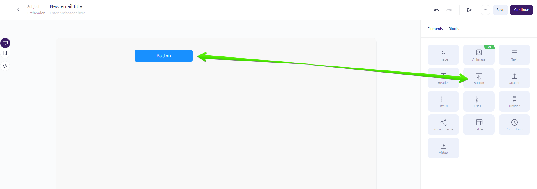
Did you know that adding a CTA into an email is incredibly easy? You just have to do it using Selzy’s email builder! First, click on the button content block in the menu on the left side of the screen and drag it into the email. Then, go to the block settings section and add in an URL address.
Last but not least, customize the CTA button by changing its colors, corner radius, and paddings. And that’s it! To add to that, all the links you add in are trackable, making it easier for you to monitor clicks and compare campaign performance.

FAQ
What is a good CTA for an email?
A good email CTA clearly tells subscribers what to do next and why it matters. It should use direct action wording, have visible design, and lead to a destination page that matches the promise made in the email. Strong CTAs can prompt actions like buying a product, registering for an event, reading an article, downloading a resource, starting a trial, or visiting a landing page.
How many CTAs should an email have?
An email can have multiple CTAs, but they should not all be equally important. Usually, one primary CTA should support the main campaign goal, while secondary CTAs offer less prominent alternatives for readers who are not ready for the main action. The primary CTA should be the most visible and most important choice.
Where should I place a CTA in an email?
Place the CTA where it best supports the email’s goal and is easy for readers to notice. The article emphasizes that placement matters, along with wording, button design, and the destination page, because all of these affect whether a reader clicks or ignores the message. The main CTA should stand out more than secondary ones.
Should an email CTA be a button or a text link?
An email CTA can be a button, a link, or a short prompt. The best choice depends on what you want the subscriber to do, but the CTA should always be clear, visible, and aligned with the email’s message. Buttons are often used for the most important action because they are more prominent.
How do I test email CTA performance?
The article notes that CTA performance depends on the offer, audience, list quality, design, placement, and destination page. Because of that, case studies should be treated as examples rather than universal benchmarks. In practice, test different CTA wording, design, and placement to see what works best for your audience.
Final thoughts
A call-to-action is one of the most important elements of an email marketing campaign because it connects your message with the next step you want subscribers to take.
To design an effective CTA, make it short, specific, visible, and easy to tap. Match the copy to the offer, use honest urgency when it fits, keep primary and secondary CTAs visually distinct, and make sure the destination page continues the same promise.
As for the types of CTAs, pick the ones that best suit the email marketing campaign you are planning. The examples listed above should give you a strong starting point, and testing will show which version works best for your audience.
