


Back in September 2021, the iOS 15 update put an end to email marketing as we knew it. Pixel tracking email was ceased for privacy protection and open rate became an unreliable vanity metric. How to estimate the effectiveness of email campaigns then? Clicks.
This article covers all you need to know about CTR. Whether you’re a newbie in the world of emails or you want to brush up on the basics, buckle up for a ride!
Why open rate is unreliable in 2023
In 2021, Apple released the iOS 15 update that included:
- Customizable Mail Privacy Protection that allows users to mask their IPs and block third-party sources from tracking email data. For email marketers, it looks like ridiculously high open rates — emails received via Apple Mail automatically count as “opened”.
- The Hide My Mail feature that allows users to give out fake email addresses to brands.
- The iCloud+ update that prevents tools for analytics from tracking Safari users’ website behavior.
These data privacy changes imply that the open rate has turned into a meaningless number. It doesn’t show how many people actually opened your email, especially if most of your subscribers use Apple Mail. So, you can’t estimate your effectiveness using this metric. Even worse, A/B testing subject lines is unreliable as well. You can’t attribute the differences in open rates to emojis, personalization, or whatever your hypothesis is.
How do email marketers cope with these updates? Let’s take a look at the HubSpot 2022 survey results:
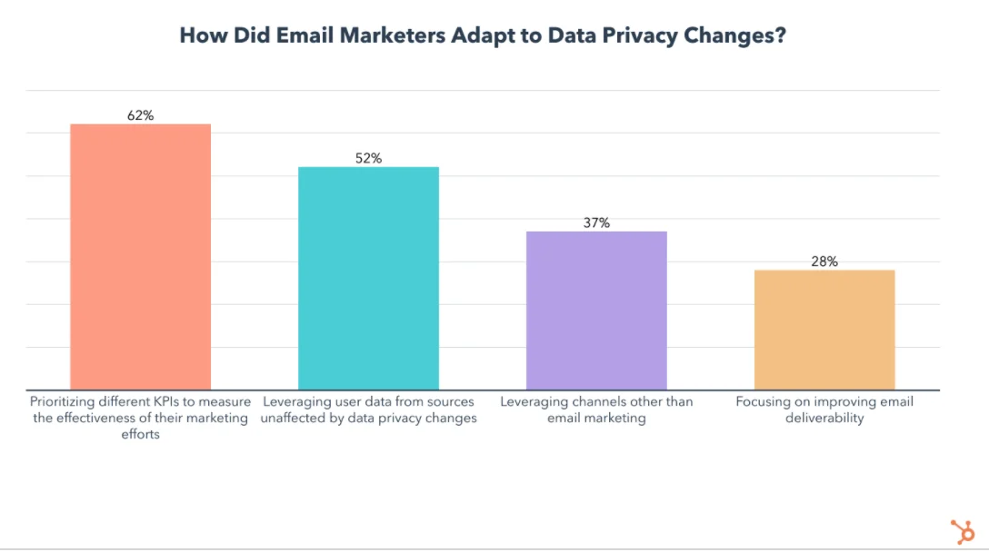
As you can see, most email marketers started using other KPIs to estimate the impact of their campaigns. And one of these more reliable KPIs is — you guessed it! — clicks.
What is email click-through rate and how to calculate it
What’s a perfect email campaign? Well, it’s when you send a message, people open it, click on a button, visit your website, buy/order/subscribe, whatever. Profit!
In a perfect world, maybe. In reality, only about 20% of email recipients would open your email, several times fewer folks will click, and still much fewer will buy or perform another targeted action.
So, before you get them to buy, you first need them to engage. The way to conversions basically looks like opens —> clicks —> purchases, and a marketer is always on the lookout for best practices to improve on every step of this way.
It’s natural to start with the opens, and the majority of email marketers do so:
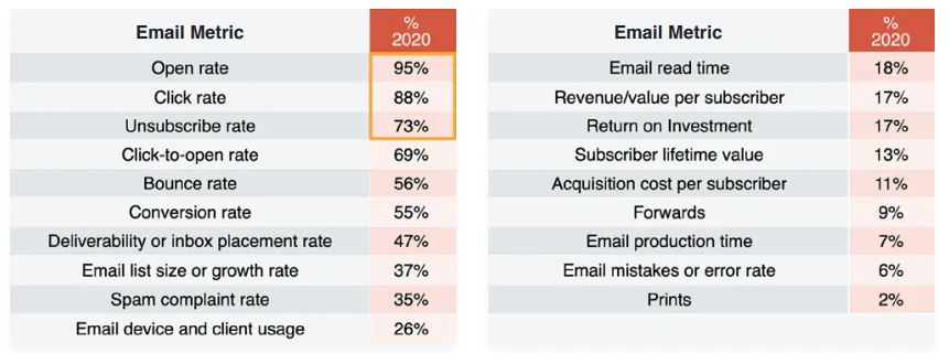
According to Litmus, in 2020, Open rate, Click rate, and Unsubscribe rate were the metrics used most often for tracking the KPIs of email campaigns. Source: Litmus
However, the study was conducted before the update — the data above is not relevant anymore, and open rates are not a reliable metric. That’s why email marketing managers are looking at clicks now. Standing between opens and conversions in this study, it’s a great indicator that tells you a lot about how healthy your campaigns are.
Formula explained
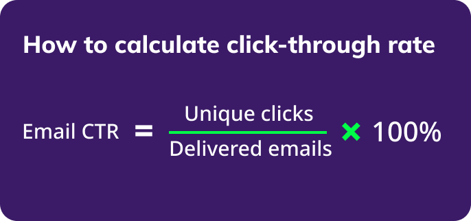
Email click-through rate (CTR) is a ratio of the number of unique clicks your campaign got to the number of times it was sent, as a percentage. You divide the number of contacts who clicked on a link in your email at least once by the total number of people who received the message, and multiply the result by 100:
If you haven’t already, add this formula to your toolkit.
Example
If your CTR is 5%, it means that for every 100 people who got your email, 5 of them opened and clicked a link there.
You don’t have to count it manually, though. Your email marketing software will do it for you.
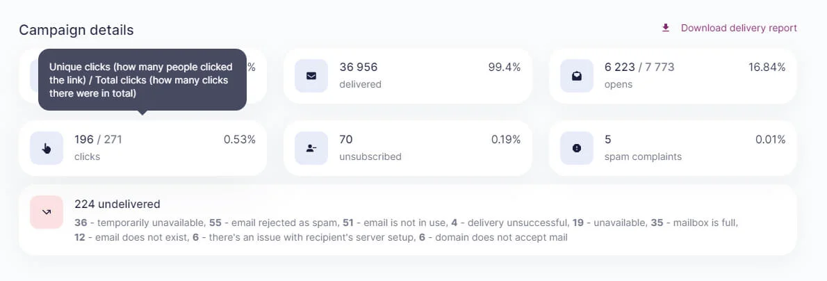
Here are some results from one of our own campaigns in the Selzy account:

If you hover over the results, you’ll see numbers, not percents:

Types of CTR
It would be fair to say that CTR comes in different varieties. 1% (or 192) of clicks you see in the above example is the number of unique clicks or UCTR. There’s also TCTR — the total number of clicks.
UCTR means how many unique clicks an email got. That is, one click/one person/one time. If you click a link twice, it won’t count. If you click the same link on a different device, it won’t count either.
TCTR is the total number of clicks, no matter how many devices are involved and everything else.
If you take the same campaign and go deeper, you’ll get to a page where you’ll see how many unique and total clicks an email got. Hover the mouse over the “clicks” results and you’ll see a tooltip:
There’s also the difference between CTR (click-through rate) and CTOR (click-to-open rate). CTOR is another, similar albeit distinct, metric that measures the comparison between the number of unique clicks and unique opens. It shows you how well your campaign performed among your audience that is already engaged enough to open your messages. That’s why it’s always several times higher than CTR. For example, if you sent an email to 100 people, 20 of them have opened it and 5 of that 20 have clicked, your CTOR is 25%.
Why click-through rate is important
Does CTR matter? It sure does, especially if you can’t count on open rates anymore. Before, many marketers would focus on the first stage of the conversion funnel — opens. If your open rate is above average, that’s good. That was enough for many. Now, your metric to go is the clicks.
Yet, the ultimate goal is to sell, so if few people went on to visit your website, it means you’re far from the goal. CTR measures engagement and is food for thought, whether it’s good or bad.
If your email click-through rate is good, it means your audience finds your offer interesting enough to make the first step to purchasing.
If your click-through rate is bad, it means that your campaigns aren’t living to their full potential. They can do better! And you can, too.
The point is, even if you have some sales, it doesn’t mean you’re doing OK. If your CTR is below average, it means you have opportunities to do better and explore your potential.
After all, not all clicks will bring you sales. But the more clicks you have, the more sales you might get from an email — the probability is higher. This is how the sales funnel works — fewer people stay with you at each stage.
Analytics helps you improve your marketing. Without it, you are blind. Without gauging your performance, all efforts are pointless.
What is a good and an average CTR for email in different industries and regions
OK, but what exactly is below average or above average? What are the benchmarks?
It depends on the industry. Plus, various ESPs have their own survey with similar though slightly different results. We’ve gathered several of them and made a list for you to better understand the situation.
#1 GetResponse survey
GetResponse analyzed almost 7 billion messages sent by their customers and had the following results:
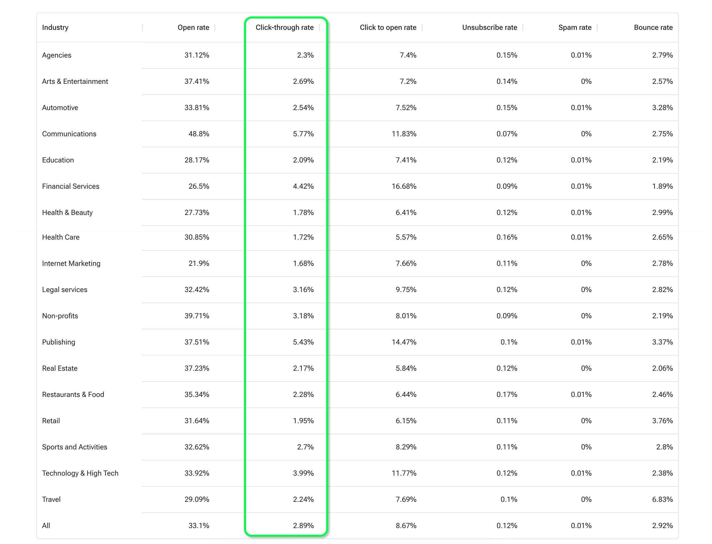
The average click-through rate across industries is 2.89%, with the highest rates in Communications (5.77%), Publishing (5.43%), and Financial services (4.42%). Internet Marketing, Healthcare, and Health & Beauty ended up underperforming with the lowest email click-through rates not exceeding 2%.
Pro tip
In Selzy, you can compare your campaigns’ results with how other companies are doing the industry right inside your personal account. It’s available for clients with Standard and Premium pricing plans. Read more about this feature’s benefits and where to find it.
#2 Constant Contact study
Each month, Constant Contact examines the data of over 200 million emails sent by their customers and updates the report on email metrics by industry. Here’s what it looked like in April 2023:
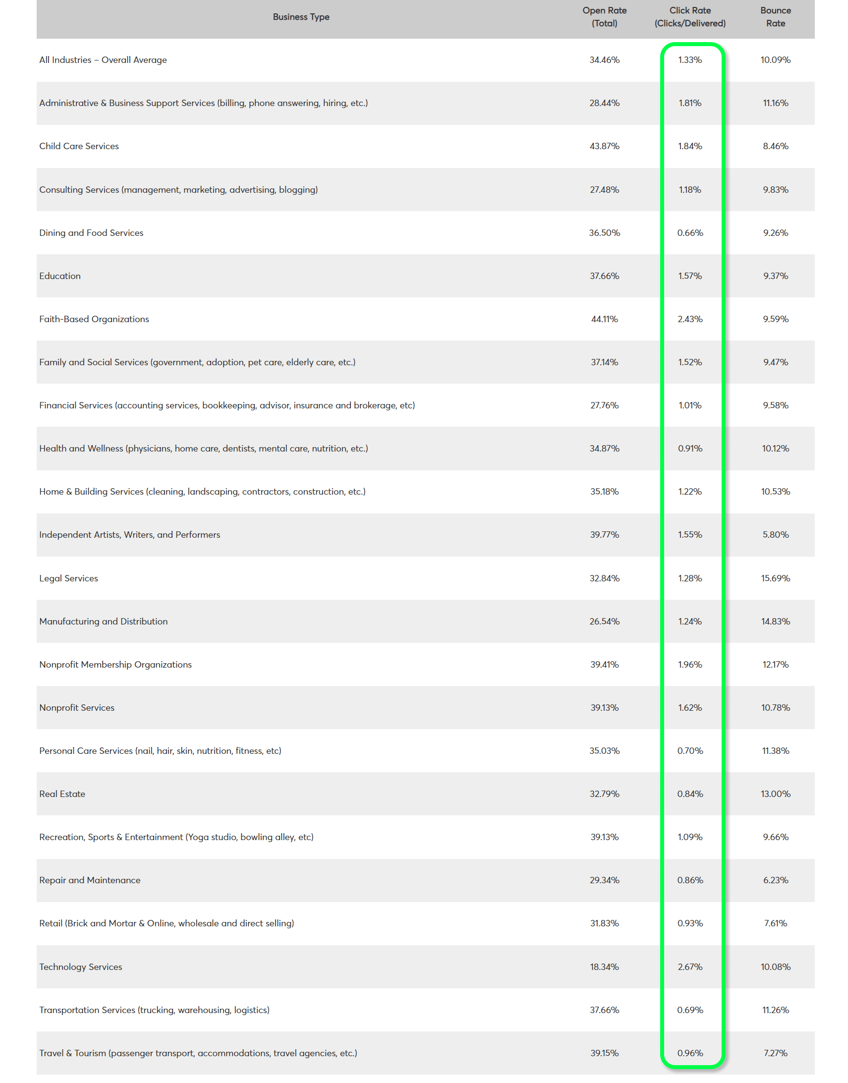
According to the data, Dining and food services, Personal care, and Transportation have the lowest CTRs below 0.85%. Their top-3 categories with the most clicks include Technology services, Faith-based organizations, and Non-profit organizations with a CTR slightly above and below 2%.
#3 Brevo survey
In 2022, Brevo (former Sendinblue) analyzed the campaigns of their users and shared a report with median email marketing KPIs instead of average numbers. The average is an arithmetic mean of all the numbers. It’s commonly used in such reports but it can be misleading — it’s influenced by outliers a lot. And the median is the number that separates the top half from the bottom half — it excludes extreme values from the data set. This implies that the median is closer to the real picture.
Now that we discussed math, let’s take a look at Brevo’s findings:
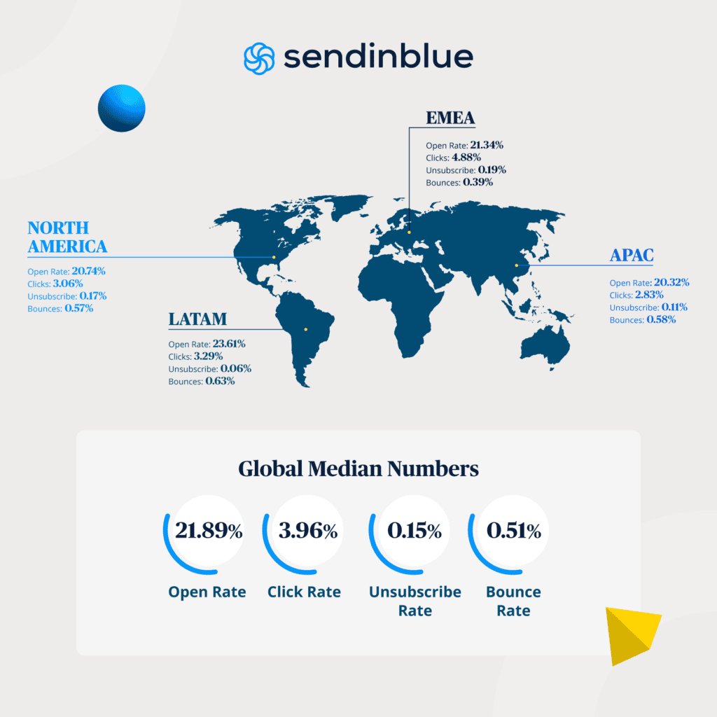
As you can see, their median CTR across all countries and industries is 3.96%, with the highest email click-through rate of almost 5% in Europe, the Middle East, and Africa.
Factors that affects email CTR
Now that you have a sense of direction, what to do if your click-through rate leaves something to be desired? The next step is to find out what factors affect this metric.
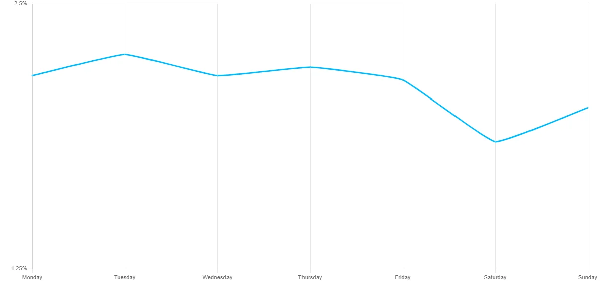
Days
What days of the week are best to send emails is an old question but one that every email marketer has to face. It turns out, there’s no big difference between days of the week, though Friday seems to be the day when people click more often followed by Wednesday. Saturday is the worst day CTR-wise:
It’s interesting that, according to the latest GetResponse findings, Tuesday also has the highest CTOR:
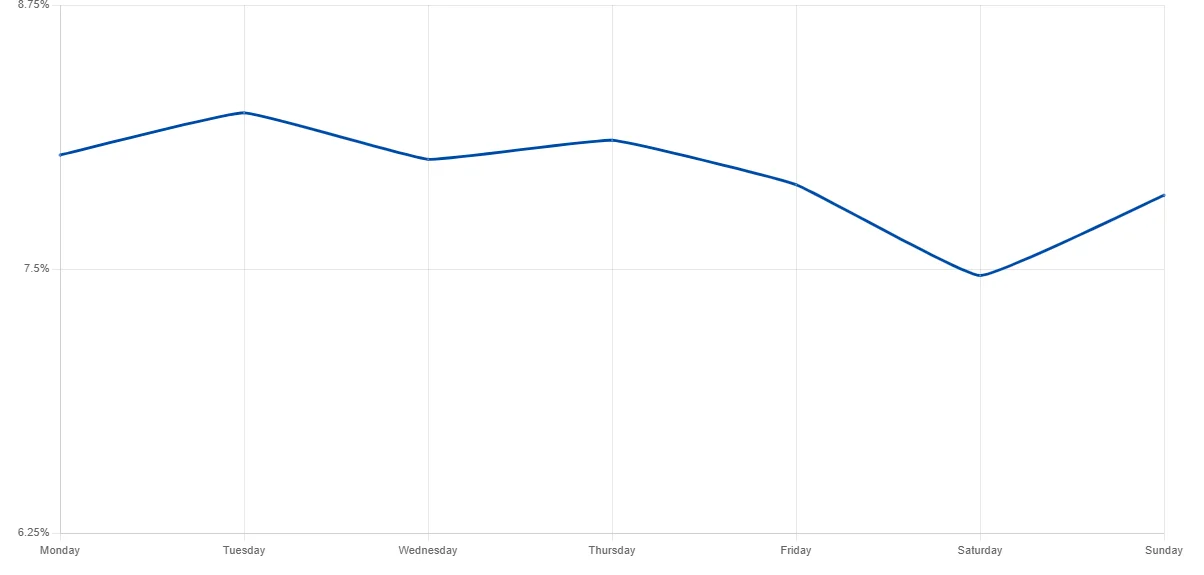
Does it mean that you should send all your emails on Tuesdays? Not really — however, this data gives some food for thought.
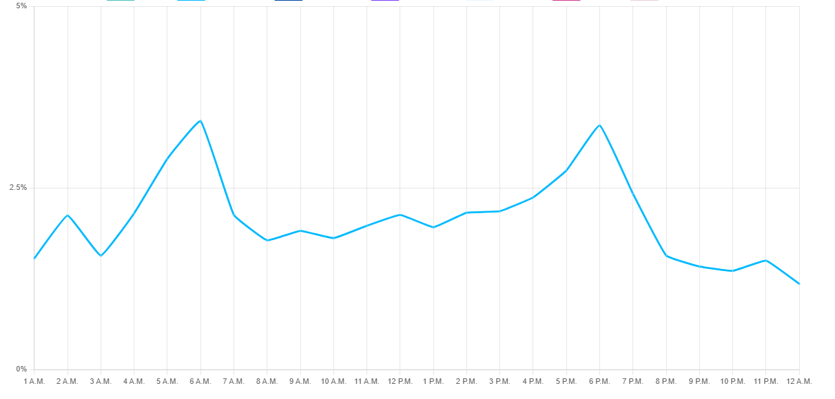
Hours
OK, we get it with days, now let’s look into hours.
According to the same study by GetResponse, subscribers click more often in emails sent in the early morning and the evening, with the highest clicks at 6 AM and 6 PM:
CTA placement
Next — the placement of your call(s)-to-action.
It may sound like a no-brainer, but the CTA placement directly influences how much attention it gets, and this basic idea often gets overlooked. So before you delve into more sophisticated marketing practices, check whether you at all have a CTA in your message and it’s easy to notice. Place the most important information on the first screen.
It’s important because CTAs affect click-through rate, and email click-through rates directly affect your revenue. For example, in this case study by Brafton moving a CTA closer to the top of the page brought an 83% increase in revenue. Consider this before running your next campaign!
Here’s the simplest success recipe. Tell what you offer and place a button right after. Don’t forget to make it contrast against the background and surround it with white space to distinguish it from other elements.
Images
In general, content with graphics works better than content without them, emails are no exception. Vero analyzed over 5,000 email campaigns and found out that campaigns with images had a 42% higher CTR than campaigns without images. These findings are backed by GetResponse, who say that image-based emails get 2.78% CTR vs text-based messages with 1.13% CTR.
If you heard that plain text messages are in fashion, that’s true too. The thing is, plain text is good for specific email campaigns where subscribers are used to this kind of messaging. Plus, technically, a plain text email not only contains no images and fancy design, but there are no hyperlinks also. So minimalistic emails with links that looks like this…
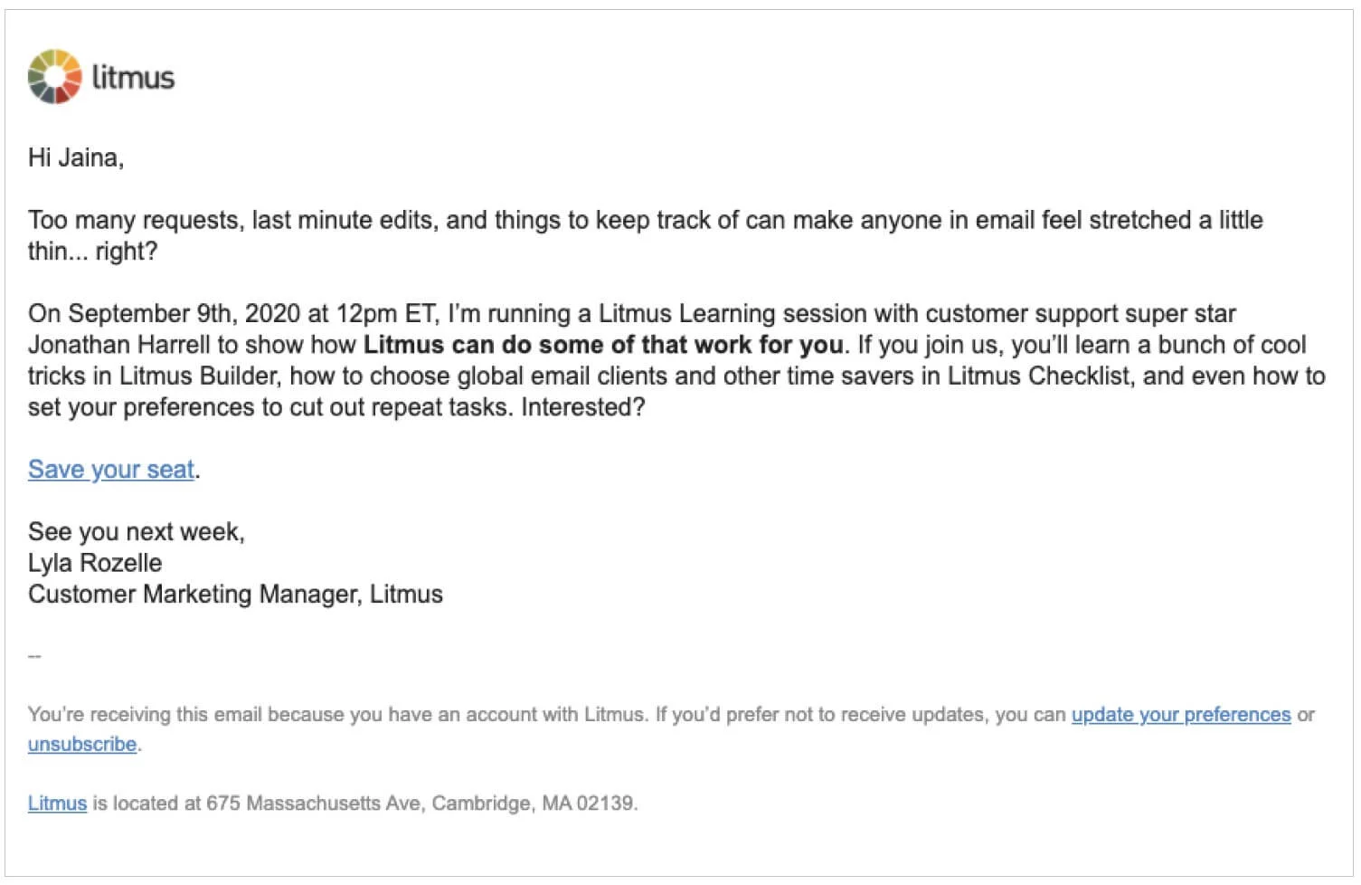
Source: Litmus
…are actually more appropriately termed as “plain text like” emails that are actually HTML emails. That’s a trend many brands are embracing, but in the great majority of cases, your email will benefit from having images.
Their number depends on the type of your email and your aim, there’s no ratio that guarantees success. The general rule is that the more images an email has, the more spam-like it looks to email services, so try to dedicate no more than 30–40% of an email’s real estate to graphics. Still, if your message is part of a promo campaign that advertises a line of products, there’s no way you can do it without some images:

Source: Email Love
Try different approaches and experiment with graphics. What’s important is that each one of them should be:
- Consistent with the branding and other marketing materials.
- Optimized for the web. Use tools like Optimizilla for image compression.
- Accompanied with Alt texts that provide your images’ context. It’s good for websites and critical for emails because many email clients and individuals disable the automatic loading of images in their emails.
- Of sufficient quality. It’s not really about whether you use photo stocks or not. Make sure the graphics look good and true to the product or service they depict so that subscribers are willing to visit your website for more.
Region
Click-through rate also differs from region to region. According to the latest data from GetResponse, the highest CTR is in North America (2.96%), followed by Europe (2.34%) and Oceania (2.15%). The most underperforming region is Africa with the average CTR of 1.16%. For you, it means that it’s reasonable to consider your market niche when you set email marketing goals.
Tips to increase email marketing click-through rate
And finally, a few practical tips to improve your email click-through rate.
Clean your list
Start with cleaning up your lists. If you haven’t done it for some time and your CTR has dropped, these things are most likely connected. The contact quality has a direct impact on how much engagement you receive.
If part of your audience is used to ignoring your messages, it’s hard to expect that they would click a button, let alone buy. Learn how to clean your email list for better engagement in our article. Check it out for actionable advice on making your contact base squeaky clean.
Add a strong subject line and a preheader
Make subject lines:
- Clean and honest. Promise exactly what you are going to offer. Failed expectations are part of life but it’s better for your brand to not multiply them.
- Useful and relevant. Any time a person sees another piece of content, they ask themselves consciously or subconsciously “What do I get from this?” That’s why subject lines with words like “newsletter”, “pdf”, “book”, “video” generate higher CTR.
- Intriguing and attention-drawing. It’s not like you have to spend hours inventing super-creative headings but sometimes it pays to put here and there little things like emojis, questions, or subscribers’ names.
- Play on emotions. Capitalize on human desires, curiosity, vanity, fears. Intrigued? We have an article that explores the emotional approach to email subject lines.
Don’t forget about the preheader. Statistics show that the click-through rate of emails with preheaders is 3.12% vs 1.97%% of emails without them.
Segment your audience and make your content more relevant
It’s difficult to please a large list with one message. Imagine you have dry skin. What feels better, to get an email that promotes the entire beauty parlor’s stock or the line of products for dry skin? Targeted messages naturally get stronger reactions.
Divide your list into several smaller ones using segmentation techniques and send separate emails to each group. Marketers with smaller lists are better at engaging their audiences, so their messages tend to get a higher click-through rate. MailChimp compared the results of segmented campaigns to the results of the same non-segmented campaigns and found out that segmentation yields 100.95% better CTR.
Reduce the number of CTAs
That’s right, with a lot of CTAs in front of them, readers’ attention gets diluted and it becomes hard to make any kind of choice. Take a look at this hardcore specimen found on the web:
Click… where? This is too much, I want out! Source: Medium
This is an extreme example, but the main point is that if you have several calls to action, try to reduce their number, especially if their messages are diverse. MarketingExperiments describes the case where the reduction of CTAs and making them more prominent got a 43% lift in CTR.
Create a sense of urgency
Good old FOMO (Fear Of Missing Out) makes people do things right there on the spot instead of putting them off for later never.
- Set the end date for the promotion and add a timer.
- Say that supply is limited.
- Use a combination of active and urgent words like “now”, “buy”, “free”, or “sale”. Only, don’t overdo it or you’ll draw the attention of spam filters.
- Avoid vague CTA texts like “Click here”. Add more action-oriented and specific “Get on the Guest List” or “Get My Free PDF” instead.

An email with a timer from Banana Republic. Source: Stripo.email
Optimize for mobile
According to Litmus, 42.4% of emails are opened on mobile devices. Back in the day, emails mostly opened via mobile devices had a lower CTR — but there’s no current data on this correlation. Still, it means that most of your marketing emails will be viewed on smaller screens. This implies that if you want more email engagement, optimize for mobile devices — here’s how:
- Adjust the size of the pictures so that they fit into smaller screens.
- Align product cards.
- Hide some of the blocks on the mobile version and add specific ones like the “Call” button.
- Send a test campaign and make sure the text size is OK, CTAs are discernable, and a layout hasn’t gone awry.
Automate for personalization
Email automation exists to help you get rid of the routine and set up personalized email flows. Messages are sent automatically in response to some event or subscriber action like making a purchase or registering with your service. And since all the emails in these flows are targeted and are a part of a larger experience, they always get higher CTR:
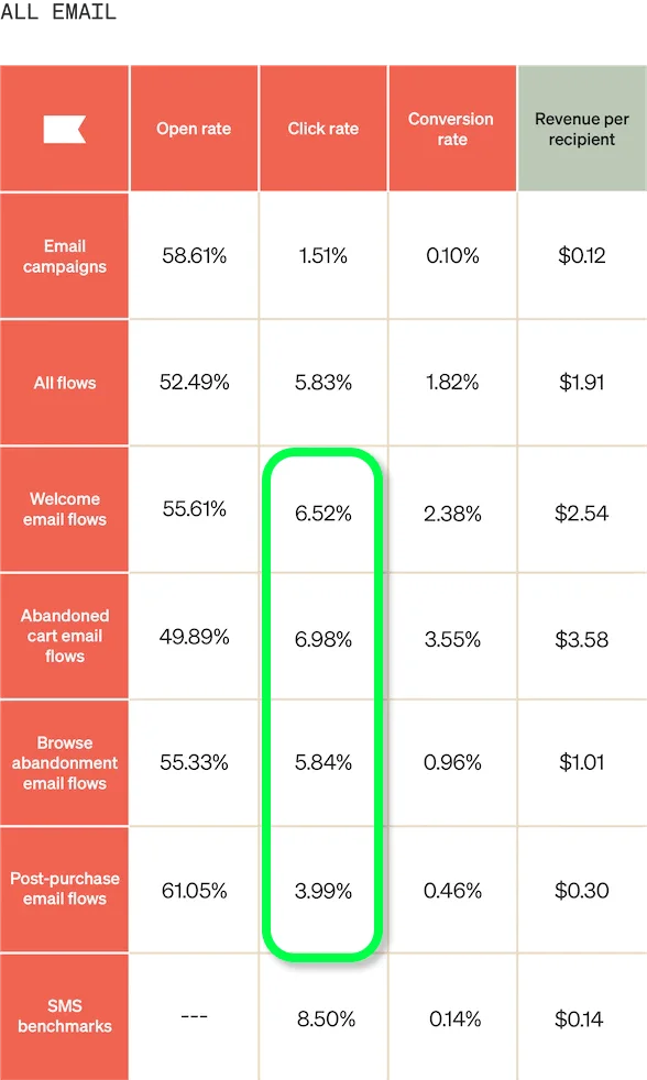
Klaviyo’s general click-through rate is 1.51%. Meanwhile, automated emails can yield up to almost 7% CTR. Source: Klaviyo
Find the right frequency
The click-through rate also depends on how often you send your messages. If you don’t know how often you should send, start with 1-2 emails a week. Statistics show that you get higher CTR if you send no more than 8 emails a week, and the second highest rate is 1 email per week:
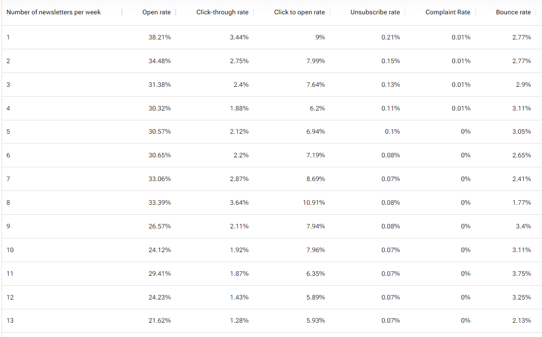
Source: GetResponse
Email marketing is super-adaptive
Email marketing has changed a lot — data privacy updates shifted the focus from opens to clicks. It was not extraordinarily new but it still took time to adjust to the new normal. The good thing is — email marketing has lived through a lot, and it’s only becoming stronger.
So, things to know about the click-through rate:
- You calculate CTR by dividing the number of contacts who clicked on a link by the total number of people who received the message and multiplying the result by 100.
- There’s UCTR which measures unique clicks, TCTR which measures the total number of clicks, and CTOR which measures the comparison between the number of unique clicks and unique opens.
- The average click-through rate is somewhere around 2% and largely depends on many factors from industry to region.
- If your CTR is below average, try cleaning up your lists and segmenting them, paying attention to the day and time you launch your campaigns, working on CTAs, images, and subject lines, and trying other tips from this guide.
