


Key takeaways
- Creating visually appealing emails is crucial due to the high volume of emails being sent and received globally.
- Good design in emails is not just about aesthetics but also functionality, engagement, and effectiveness in driving action.
- Six essential elements of great-looking emails include scannable copy, purposeful images, correct colors, clear call-to-action, well-thought-out layout, and mobile-friendliness.
These days, it’s barely possible to come across a plain text email. As companies compete for customers, even service announcements come with visuals and smart formatting.
So, what does it take to create good-looking emails? Let us show you the answer in this article.
Why it’s important to create good-looking emails
The number of sent and received emails worldwide is projected to reach 392,5 billion in 2026. Email marketing is a blooming channel which means you need to compete for the attention of your audience.
Your emails add on top of a never-ending inbox stack, and you should put in extra effort to stand out. This means paying close attention to the design and visual appeal of each campaign.
But good design isn’t just about how emails look, it’s also about how functional they are, how engaging, and how effective they are at making the audience take action. Perfecting email campaign design requires knowing the industry’s best practices, and we’ll cover everything in this article with tips and examples.
6 essential elements of a great-looking email
While there’s no formula for a good email, it’s easy to tell a visually great email apart from a mediocre one.
We pinpointed six essential elements of great-looking emails that are must-haves for perfect campaigns and email marketing success.
Scannable copy
In general, people want to finish their tasks as quickly as possible with the least effort. In addition to this, web users’ attention can be easily shifted as more and more channels compete for engagement. All of this especially affects text-based content. So, what can you do?
Web content is typically read in the F-pattern which explains the eye movement of people. The F-pattern is prevalent when it comes to large amounts of unorganized text that scare readers with their density. At first, users read horizontally (the upper and lower bars of the “letter F”) but as they scroll down, they read more and more vertically (the stem of the “letter F”). This means that people don’t read the text in full after the initial part and only scan it. A copy can have important information but if it’s buried deep in the text, few people will find it.
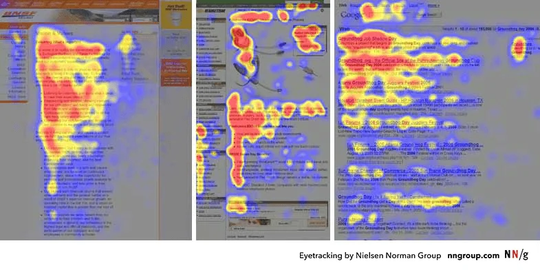
It’s important to keep the F-pattern in mind when designing emails. The issue isn’t even so much about the overall text length but the way it’s arranged — otherwise, the likes of storytelling emails would be a waste of time.
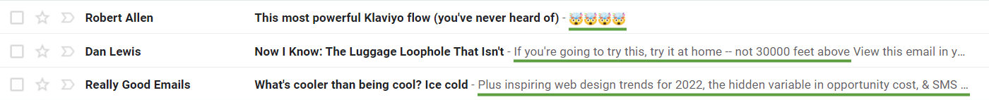
The good news is that most emails in email marketing strive for clarity and don’t have the F-pattern problem. Only very rarely can you run into similar to this email:

So, how to make sure your copy looks neat and engaging to read from start to finish?
Here are some proven practices to beat the F-shaped reading to get your message across faster and without much effort for the readers.
- Put the key info first. This tactic for email copywriting (and beyond!) is called the inverted pyramid and it makes sure that readers will at least see your main proposition.
- Add subheadings. Subheadings separate different parts of a text and make it easy for readers to scan and, like it or not, people don’t read on the web but scan.
- Bold key parts. Bolded text instantly attracts the eye. But don’t overdo it because there can only be so many key parts in a message.
- Use different font sizes. Subheadings that are larger than the regular email text create variety and draw attention. At the same time, some parts of the email like the footer can be smaller.
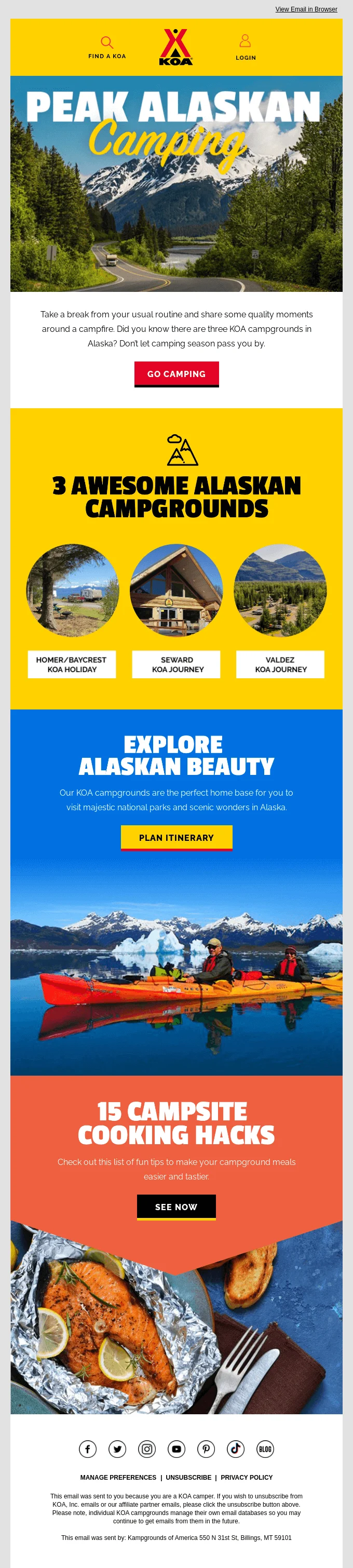
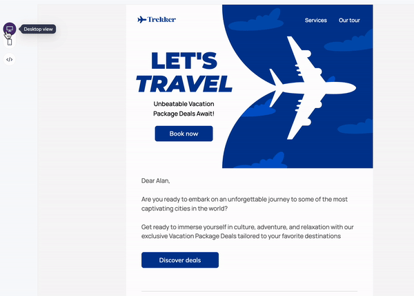
- Add illustrations. Illustrations instantly paint a picture in readers’ minds. If you add illustrations, make sure to do it with a purpose and not just fill the space.
How hard is it to follow those rules? Not hard. Email folks are usually well-versed in design and there are large databases of good-looking emails on websites like Really Good Emails (what a fitting name!).

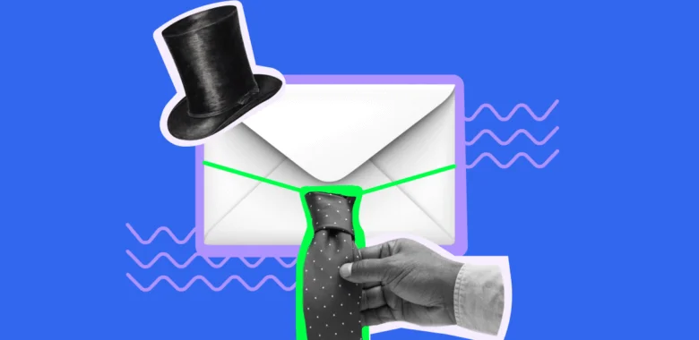
Images selected with a purpose
Visuals matter because a great picture is worth a thousand words. In email marketing, it’s not just about that — it’s also about key performance indicators. Image-based emails have a higher open rate (30.27% vs. 21.9%) and a higher click-through rate (2.78% vs. 1.13%) than text-based ones.
How to make sure you’ve got it spot on with illustrations and avoid email mistakes? Consider the following tips:
- Have a purpose for using an image. Everything in your content should have a purpose. Don’t randomly add illustrations just because large chunks of text seem boring.
- Show off your product. Since images attract the eye, use them to show your product from an appealing angle.
- Pick a high-quality image. If you want to advertise a product, a high-quality image will be more visually impressive to your subscribers than a grainy photo.
- Be wary of stock photos. Stock photos have a high quality but they don’t reflect your work. That’s why you don’t want them in a nonprofit email marketing campaign, for example.
- Combine images with text. Image-only emails can be considered spam by email clients and ruin accessibility. Also, it’s impossible to search for the contents of an image-only email in an inbox.
Correct colors to highlight the tone of a message
Colors affect people in different ways but typically, the most common colors have certain connotations and meanings.
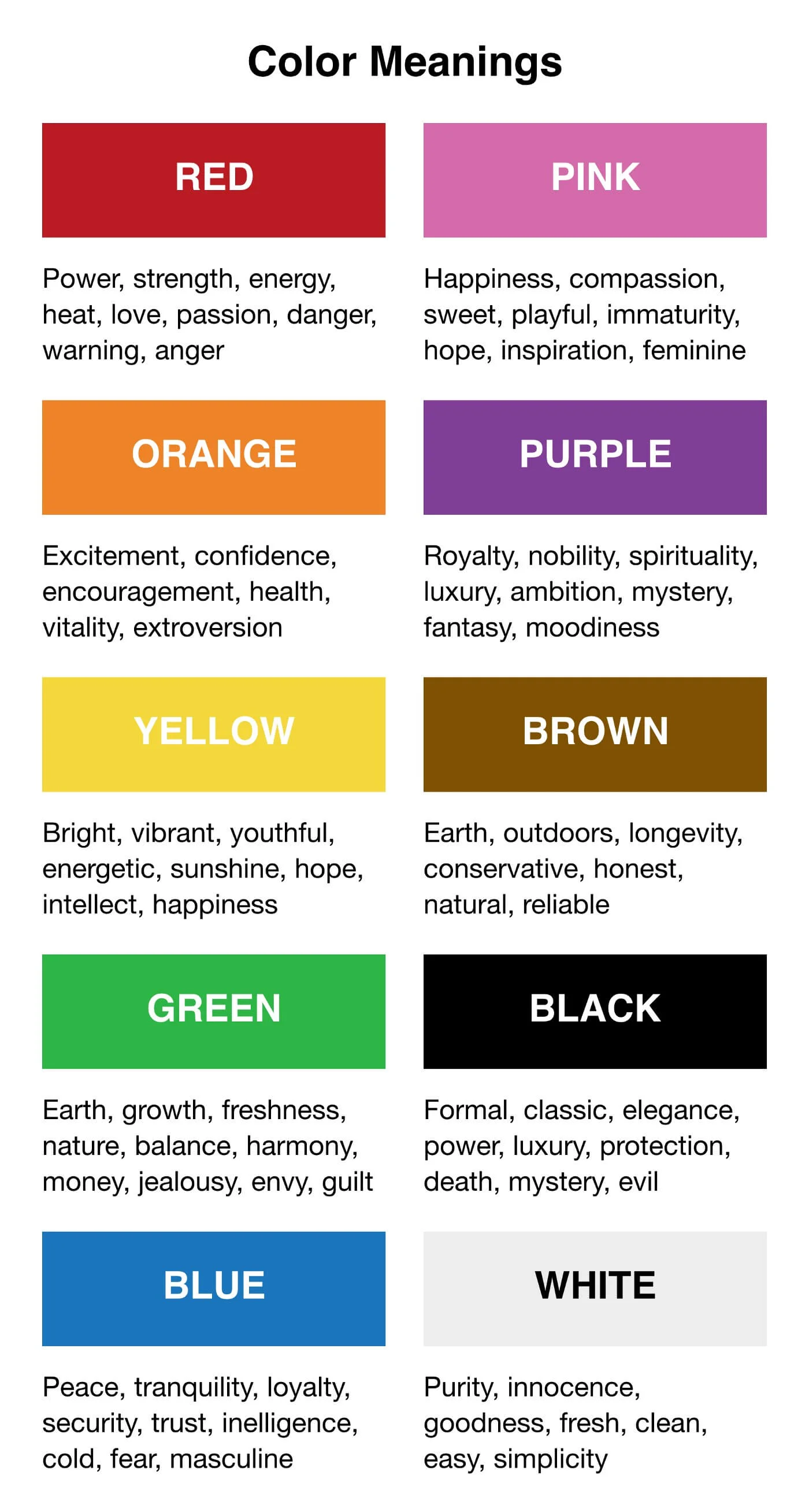
Please remember, that some colors have different symbolism across cultures, so learn about these differences before choosing a color palette for your campaign.
There are also traditional colors or color combinations for certain holidays that are often used in email marketing: red and green for Christmas, pink and red for Valentine’s Day, black for Black Friday (duh), and orange and black for Halloween.
Colors are also good for creating contrast. Contrast helps you highlight key parts of your email like a call-to-action and separate different parts.
Clear call-to-action
You need your audience to do something after reading your email campaigns, so a good design should include a call-to-action (CTA). A call-to-action is the purpose of your email.
The number 1 rule of a good CTA is it should be easy to spot. But that’s not all because you also have to write a clear message and correctly place it in the email.
The CTA copy should be simple with a clear command of what to do next and why it’s important for the user. Put a verb into your CTA because it propels action.
Be careful with the so-called friction words — words that force people to do things they may not be ready to do. Here are some of those:
- Buy
- Download
- Submit
- Donate
- Share
- Visit
These aren’t banned but they need special attention because these words are too forceful and explicitly ask for commitment.
Instead, consider low-friction words like those below:
- Get
- Discover
- Add to cart
- Try
- Save
These words are more customer-friendly, indicate a benefit, and don’t imply much effort.

Make sure your CTA button has an appropriate size. The famous Fitts’ law that’s widely used in designing user interfaces states that the target on the screen should be as big as possible and the distance to it as short as possible. If it’s too small, customers have to aim for it. This gets even worse on a mobile screen.
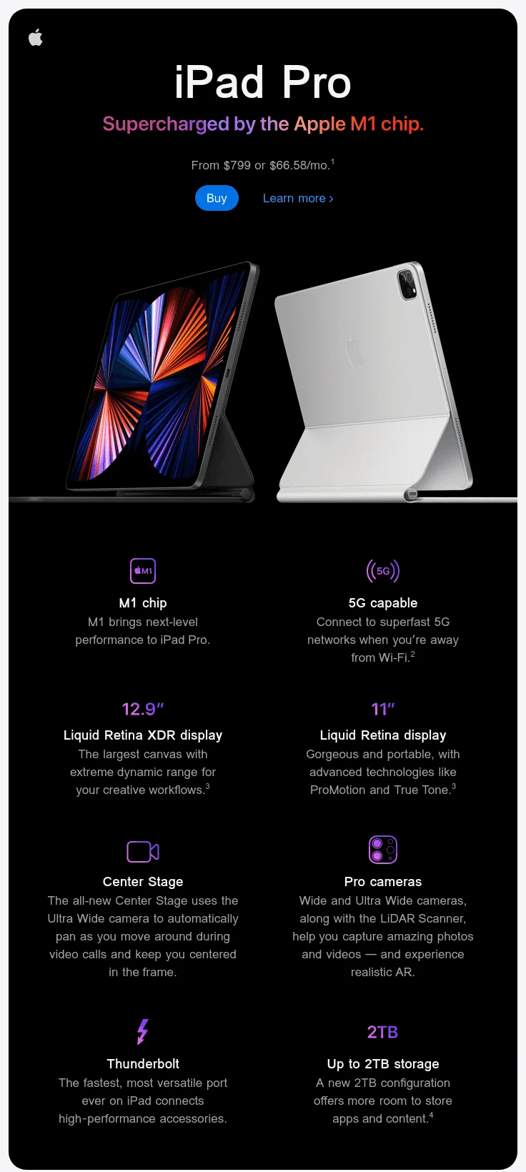
This email from Apple looks beautiful (Apple knows how to make its products and marketing materials look appealing) but the CTA should be better. The “Buy” button is small and difficult to notice. The “Learn More” caption next to it makes it likely for a user to click the wrong link.
Make your CTA a button rather than a link. According to one experiment, buttons convert 28% better. The explanation is simple — buttons are bigger and easier to notice. They also typically have distinct colors. Links and images can still be used as calls-to-action but not as your main ones.
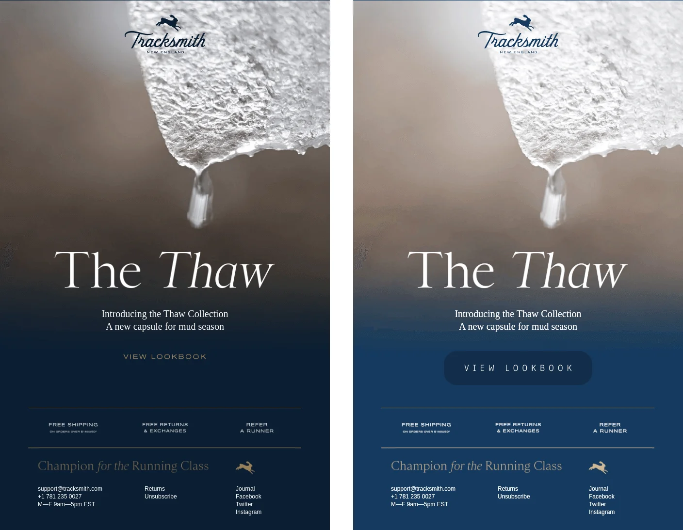
See how much difference a clearer, more identifiable call-to-action makes.
The original version
The CTA is a link written in dark letters against a murky background. The link is not even underlined 🔽
The edited version
The CTA is more pronounced thanks to a large button with a different color to the background and a white border around it 🔽
Well-thought-out layout
The layout determines a structure, how an email looks. This is the copy, images, colors, and a call-to-action combined.
How your subscriber base is going to read your email campaigns— and if it’s going to do it — is greatly influenced by the visual layout. Messy and disorganized emails won’t get much attention.
Here’s what you need to do to keep your subscribers reading your email till the bottom:
- Understand the hierarchy of elements. Images are the most powerful elements on a content page because they’re big and colorful. Headlines, subheadings, and regular text come next — in this order.
- Use white space. White is a great color for creating contrast. It spaces elements out on a page giving your subscriber’s mind time to relax a bit.
- Guide readers through an email. Use colors, contrast, and different blocks to direct your subscribers’ gaze across the email and nudge them into action.
- Tackle the layout repetitiveness. An identical block placement bores the eye, so don’t be afraid to freshen things up by rearranging your content.
- Place elements with purpose. For example, conventional wisdom states you should place your CTA up above — but what if in your case it makes more sense to put it at the bottom? Purpose first, common truths second.
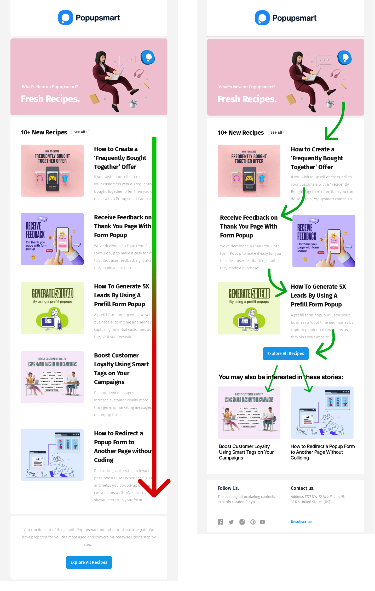
Knowing those tips, look at the original and edited versions of one email.
The original version
Enough white space but too many blocks follow the same pattern. Towards the end, the eye gets tired of the same structure which reduces readability 🔽
The edited version
A more energetic element placement keeps the eye focused. Less important content is placed below to avoid clutter and the CTA is placed higher 🔽
If you’re not going to study how content blocks look on a page, use an email service provider’s templates. Selzy has many options for different industries and occasions. Try out Selzy’s email builder and see for yourself!
A well-thought-out layout is just one aspect of good design. Read our guide on email design to learn how to craft stylish, enjoyable, and spam-proof emails.
Mobile-friendliness
Last but never least, your email should be optimized for mobile — the most popular email reading environment, with a 44.7% share.
Mobile optimization is mostly about making crucial parts of your email larger and throwing away less important bits. Here are the main techniques:
- Choose bigger fonts and images. Images that look big enough on the desktop may not look so big on the mobile screen. The minimum font size should be 14px.
- Make a big CTA button. It should be effortless for readers to click on the button, so make sure it stands out and users don’t have to aim to reach it.
- Space links out. When two links are too close to each other users may accidentally tap the wrong one.
The good thing is that with ESPs you can see how your email will look on mobile or make a separate mobile version altogether.
Once again, if you want to keep things simple, you should rely on your email marketing platform’s templates. In modern services, those are already optimized and designed to be responsive and good-looking in any reading environment.
Best practices to make your emails more appealing
Without further ado, let’s focus on techniques that will make your emails stand out in any inbox thanks to their design and purpose.
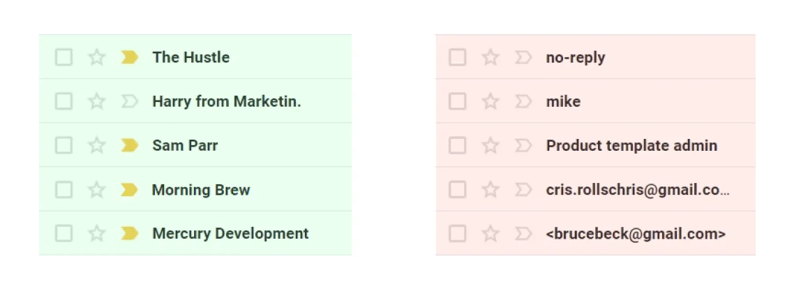
Use a proper sender name
A sender name is the first thing people see in an email — that’s why it’s crucial to get it right. The main function of the sender name is to show who the email is from. If it’s not someone from a list of contacts, there’s little motivation to open the message.
Brands can make their emails even more recognizable thanks to BIMI. Read our article on the topic to learn what BIMI is, why you need it, and how to implement it.
Make an attention-grabbing subject line
The second thing people see in an email is the subject line. This makes it one of the deciding factors for a subscriber to click on the email.
An attention-grabbing subject line should check these three boxes:
- ✅ Short. An ideal length is under 30 characters which is the most a mobile screen can fit. For desktop, it’s 60 but prioritize mobile as the most popular email environment.
- ✅ Inspiring. This is your subject line’s ability to draw attention and stand out in customers’ inboxes.
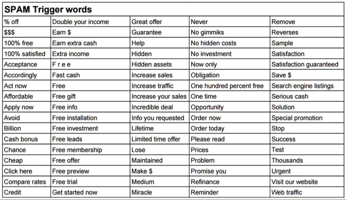
- ✅ Contains no spam words. Words like “free”, “success”, “guarantee”, as well as words in all CAPITALS and excessive punctuation make emails look suspicious to email clients.
Instead of those words, use personalization, questions, numbers, emojis to make a subject line stand out and pique customers’ curiosity.
There are a lot more ways to write a subject line that subscribers can’t wait to click on, so check out our article on writing catchy subject lines.
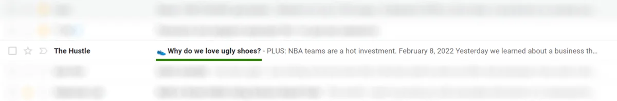
Add a punch through preheader text
A preheader or preview text is a piece of text that follows a subject line. If the subject line is Frodo Baggins, the preheader is Samwise Gamgee — they’re best friends.
The key purpose of a preheader is to preview email content or give it an extra teaser. And speaking of statistics, adding a preheader increases the open rate by 7%.
Get inspired by ready-to-use templates or design your own template
One solid reason to use an ESP is templates. If you’re used to assembling emails from scratch, try templates to save time. Selzy’s email builder, for example, provides you with many ready-to-use templates that you can sort by categories.
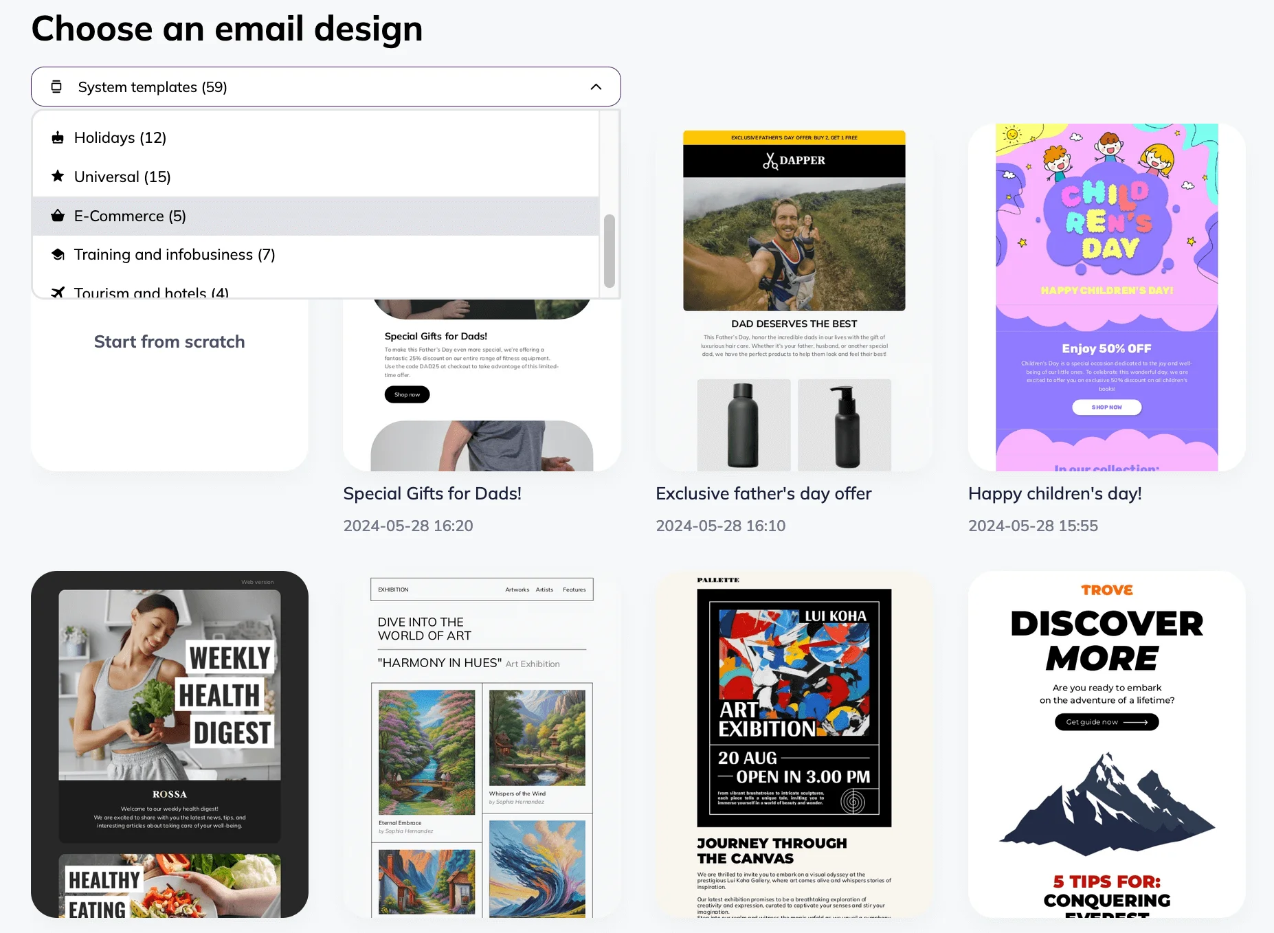
A great thing about templates is that they’re flexible. You don’t have to use what’s in front of you — you can rearrange blocks, change images, add your company logo, etc. Templates simply give you a great place to start.
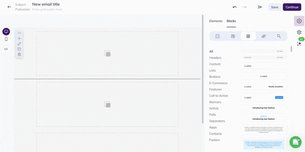
You can also design an email from scratch. Selzy’s drag-and-drop builder gives you lots of layout and customization options.
Don’t be afraid to experiment with colors
Changing colors every once in a while adds an element of surprise to your emails. Try it to break out of your routines and sprinkle new colors into your email.
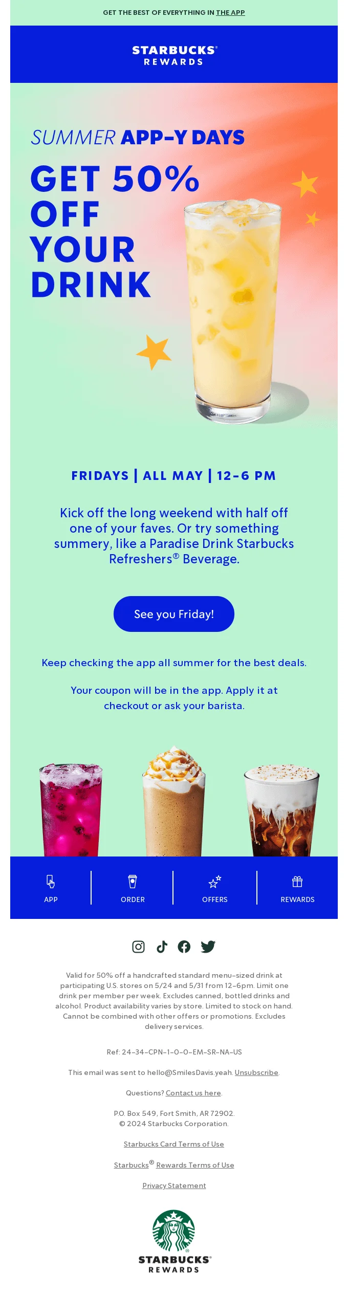
Let me ask you a question: what color is Starbucks? Dark green, of course.
But then look at this Starbucks email where the dominant colors are deep blue and mint. The change is unexpected but it’s a way to attract readers to the email and the special deal it promotes.
One more way to experiment with colors is to mix your brand’s palette with the colors associated with a special event or a holiday.
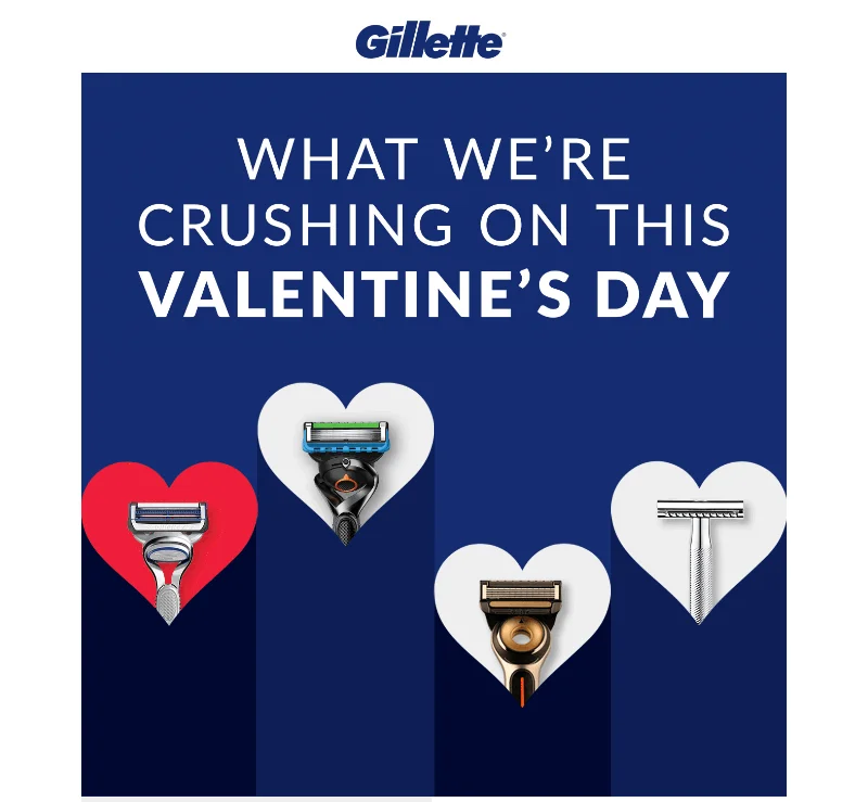
Here, Gillette keeps their traditional dark blue but adds red associated with Valentine’s Day.
Add GIFs
Moving objects tend to attract humans and GIFs in emails have a few practical uses. By adding a GIF, you can tease new products or show existing features, simplify complex ideas, and add a vibe. You can also make a simple email appear more interactive.
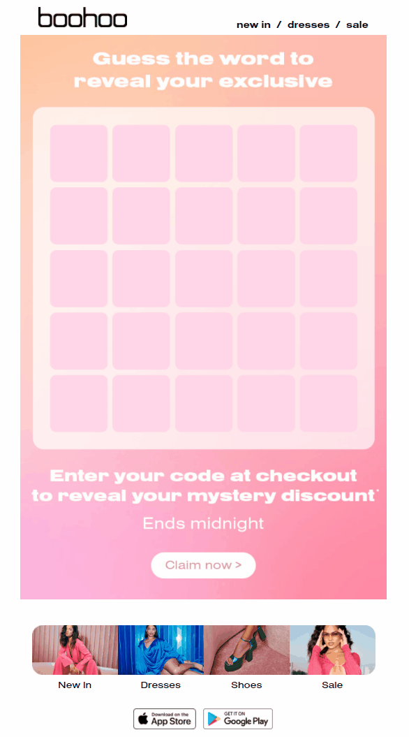
It lasts only a few seconds but there’s much to unpack here. First, the letters move and the reader never knows where it ends and how. Then there’s a certain vibe to it because Boohoo’s email is inspired by Wordle, a viral mobile game. Finally, the practical meaning of the email is to give customers a discount.
Dive deeper into the best animation practices with our example-laden guide to email GIFs.
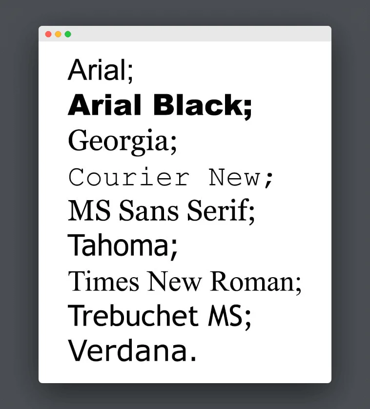
Use an appropriate font
If you send text-only emails, stick to the so-called safe fonts. These are the most popular fonts supported across all mobile and desktop clients.
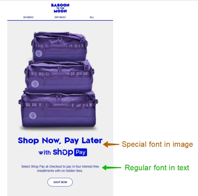
However, if you add images to your emails, you are free to choose all kinds of fonts in them. Use special fonts to highlight your message and create a mood. But don’t abuse this technique as image-only emails negatively affect accessibility.
Here’s an example of using a special font and a safe font in the same email. The special font is placed on an image while the message below is written in text.
Develop your brand style
A style makes your emails conform to one standard and some might argue that it’s boring. However, there’s merit in having a standard. One good reason is that it enhances brand recognition — it’s easier for customers to tell your brand apart from the crowd.
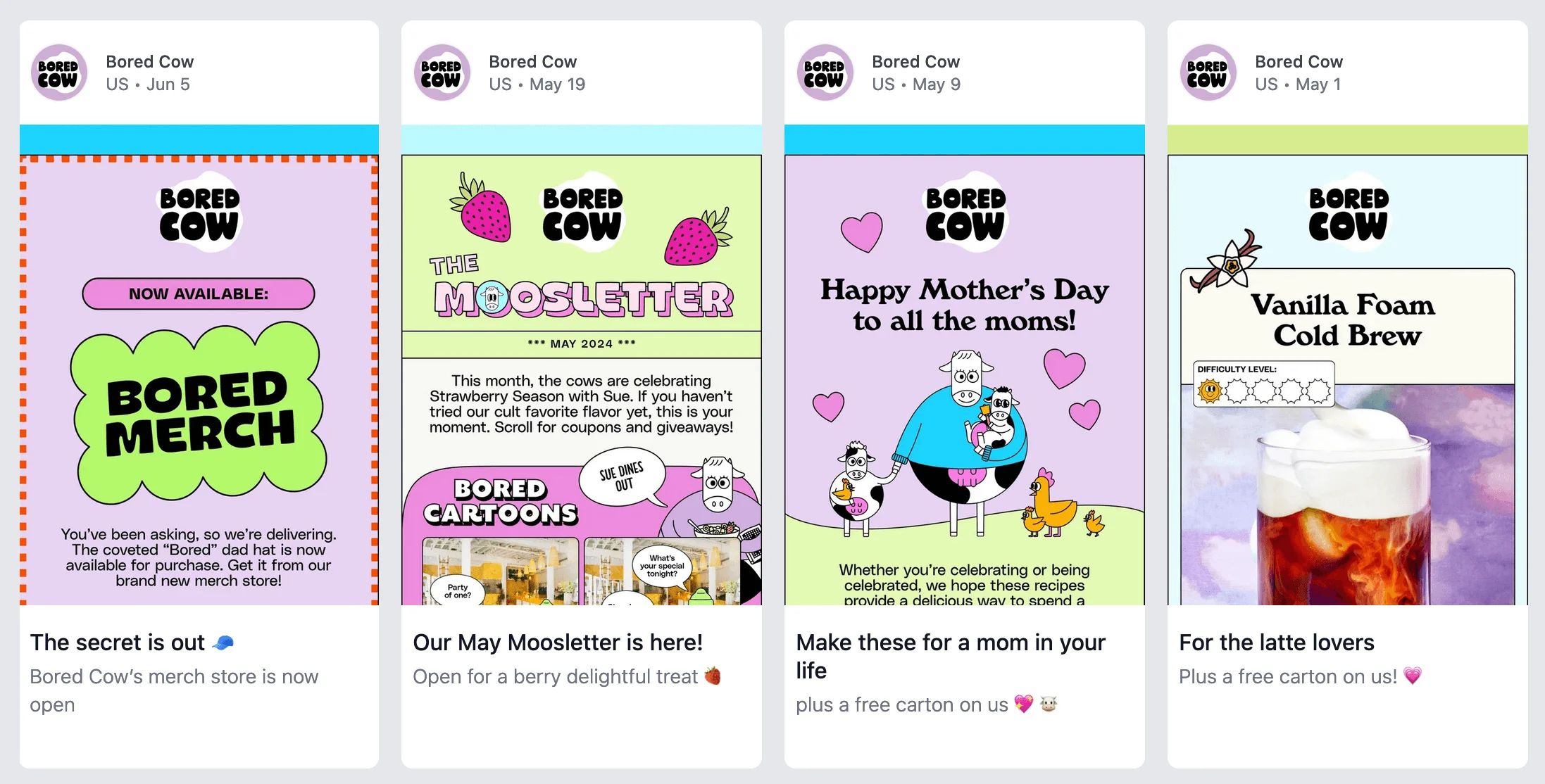
Look at these Bored Cow emails. They all have light colors, use the same fonts and illustration style, and have the same generally playful vibe.
Stick to one message in one email
A human mind can only hold a few things in mind at one moment. A famous study claims that most people can deal with seven chunks of information at once. We’re afraid seven big topics per email is too much, there’s just no time for it with customers’ inboxes overflowing and brands vying for attention.
Keep it simple and limit your email to one central message and if you need to say more, why not create another email?
Use contrast
Contrast is a great way to control someone’s attention. If you want a certain part of your email to be viewed first, make it stand out by using a contrasting color or font.
According to various color models, certain color pairs form the most contrast: red–cyan; blue–yellow; green–magenta. However, you don’t need to study the color spectrum to create a solid contrast in an email.
It’s enough to know that a darker color contrasts with a lighter background and that many colors stand out against white. Intense colors tend to attract attention, too.
See how the rich blue color dominates against the gray background and attracts the eye.
Contrast is often used to make a call-to-action button stand out. See how the dark green CTA is easy to spot against the orange background.
Be careful, however, with highly intense colors like cyan as well as extreme shades of green and yellow. They may look garish and if they contain white captions, those will be hard to read.
Design an irresistible CTA
Just like you can experiment with your subject line, colors, or fonts, you can play with your call-to-action. This is a good way to break out of routine and try something new.
“Get it while it lasts” reads the CTA from Attn: Grace. The brand emphasizes the sense of urgency even more by playing with words. It’s also a great call-to-action because it ticks all the boxes of an effective CTA.

How about this daring email from the coffee company Minor Figures: “What the f*ck it means” instead of a generic “Learn”?
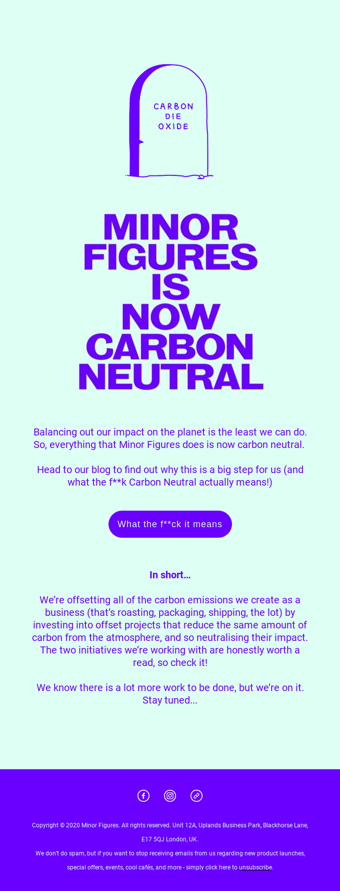
I’ve never seen anything like that before and am intrigued. Try something similar if you’re sure risky things will go down well with your customers
Focus on the details
Attention to detail makes a campaign coherent and motivates your audience to look closely at your every email.
Here’s an email from Candy Kittens. It is eye-catching and easy to read, but see if you can spot a detail we really appreciate:
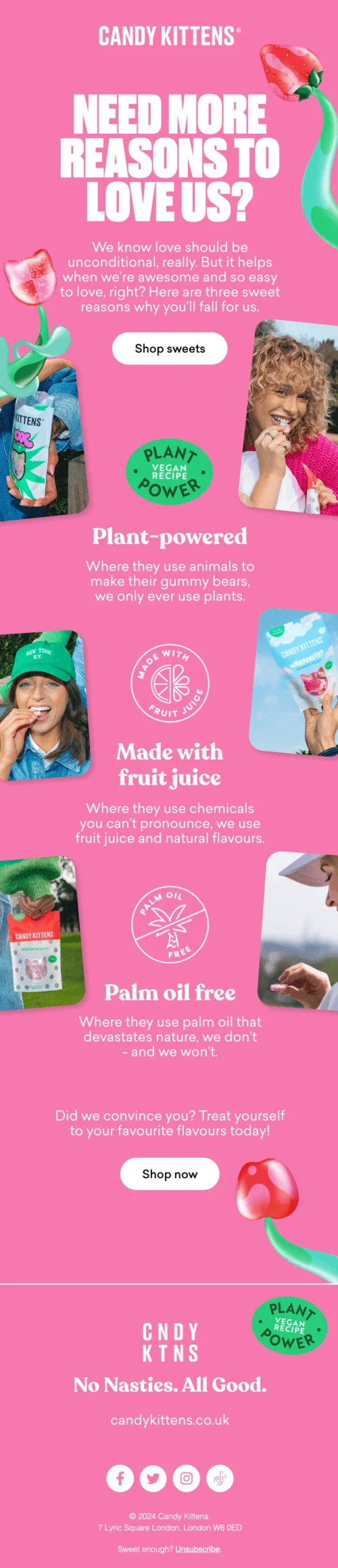
Did you place your bets? The actual impressive detail is the very last thing you see in this email — the text preceding the unsubscribe button. It says “Sweet enough? Unsubscribe”. This adds a playful touch and conveys the brand’s identity and tone of voice, and we love it!
Keep it simple
A well-designed email doesn’t have to be packed with many blocks, images, colors, calls-to-action… After all, often it’s the case of less is more.
Simple one-message one-color emails can be effective in email marketing. If you can get your message across in a succinct way and KPIs can prove it — that’s a job well done.

Conclusion
A good-looking email in email marketing should aim to have these six elements:
- ✅ A scannable copy. The readers look at an email and quickly understand the main message.
- ✅ Informative illustrations. Images are brilliant at showing and explaining things. The number 1 way to achieve that is to select images with purpose.
- ✅ Correct colors. Every color evokes certain associations. The “no-color” white is great at creating contrasts which helps in arranging a layout.
- ✅ A clear call-to-action. If you aim to persuade subscribers to perform a certain action — which is a given in email marketing — the CTA should be visible.
- ✅ A clever layout. This pertains to the overall look of an email, its scannability, and usefulness. If readers read (scan) your emails with ease, you did well with the layout.
- ✅ Mobile-friendliness. Larger fonts, images, and CTAs help subscribers make it a faster and more pleasant experience on mobile.
There are also best practices to craft a visually outstanding email:
- Work on the initial parts of the email. The sender name, subject line, and preheader are places where you can influence your readers’ decision to open an email.
- Use compelling imagery and colors. Add animation, unusual fonts in images, play with colors and contrasts to try new things. Developing a brand style and paying attention to detail are other solid tactics that reinforce brand recognition.
- Keep it simple. Avoid sending multiple messages in one email and instead devote your attention to one key topic. Your email doesn’t have to be long or go into much detail to be well received.
- Remember your call-to-action. Make sure your email is clear on purpose, so users don’t waste any time wondering how to perform an action.
