


If you’re looking for newsletter signup examples that actually convert, studying real-life designs is one of the fastest ways to improve your results.
In this article, we’ll explain what newsletter subscription forms are, what makes a form great, and hexplore a wide range of newsletter signup examples from real-life brands to inspire your own form-building.
What makes a great newsletter signup form?
Before we get into the best practices of email subscription forms, let’s discuss what they actually are. A marketing newsletter signup form is an interface element that website visitors can use to subscribe to your email newsletter. It can be a pop-up or an embedded box, or a standalone page. The signup form typically asks for a name, email address, and sometimes extra information like preferences or the visitors’ company name.
With signup forms, you don’t need to worry about coding. Many email newsletter software platforms include built-in tools to help you create effective forms, test different versions, and track performance over time.
Sounds simple, right? And it is — but that doesn’t mean you should treat your newsletter signup forms as an afterthought. In fact, according to Klipfolio, a 2%+ signup rate is generally considered healthy, though results vary depending on placement, traffic, and offer Think of it as a gateway to building your email list and establishing a long-lasting relationship with your subscribers. Let’s figure out what the qualities of an effective newsletter signup form are.
Clarity and transparency
A good signup form is direct and tells the potential subscriber exactly what they’re signing up for. This is one of the most important best practices for both embedded and pop-up forms. Clearly outline what kind of marketing emails your audience will receive (news, discounts, tips) and what to expect after they hit subscribe. It also helps to reassure people that their email is safe with you. A simple line like “We’ll never sell your data” or “No spam, ever” goes a long way.
Beyond that, you need to make sure that your signup form complies with legal regulations like GDPR or the CAN-SPAM Act. For example, the checkboxes can’t be pre-checked as the opt-in should be based on informed customer consent. Misleading claims and data mishandling can lead to fines, which we know you’d rather avoid!
Strong call-to-action (CTA)
Your call-to-action is a marketing staple — it’s the element that actually invites people to sign up. The wording here really matters. A lot of CTA buttons just say something like “Join now!”, but you can push it further. A good CTA is clear, direct, and makes the value obvious. Try something more engaging, like “Get your 10% off” or “Send me updates.” These phrases remind people what they’re getting.
Simple and user-friendly design
A good signup form should be easy to spot, easy to read, and easy to fill out. That means no clutter, no tiny text, and no confusing layout. Stick to a clean design with just the essential fields. If we’re talking pop-ups, add an (X) button in the corner to make them easy to close. pop-up examples to get inspiration!
Also, make sure the form works well on mobile. If it doesn’t load properly or the button is too small to tap, you’re losing potential subscribers.
Incentives and value proposition
Give people a clear reason to subscribe. In fact, they are much more likely to sign up if you provide them with a discount. Even if you’re not in e-commerce, you can still make value propositions. For example, offer early access, insider tips, or downloadable guides. Whatever you provide, make it clear and specific.
Trust signals and social proof
Do you know why many newsletters clearly state how many subscribers there already are? That’s because people are more likely to subscribe when they see that others have. This is what we mean by trust signals and social proof. If you have a hesitant visitor on your website, adding a line like “Join 5,000+ readers” can signal that your newsletter is valuable and appreciated by others, and help them make up their mind when it comes to subscribing.

Best newsletter signup examples by use case
Not all signup forms work the same way across industries. The best approach depends on your business model and audience. Here’s how different types of businesses typically use newsletter signup forms:
- E-commerce: Brands like Allbirds, Shein, and Bose focus on discounts and exclusive offers to drive quick conversions.
- Media and content platforms: TheSkimm, Morning Brew, and The New Yorker highlight content value and frequency to build long-term engagement.
- SaaS and B2B: Salesforce uses subtle, non-intrusive forms that fit naturally into content consumption.
- Lifestyle and DTC brands: Fishwife, The Oodie, and OddBalls use playful, interactive formats to increase engagement.
This breakdown can help you quickly identify which signup strategies are most relevant to your business before we dive into the full list of examples.
20 effective newsletter signup form examples
Now that we’ve covered what makes a great signup form, let’s look at some real-world inspiration. These 20 newsletter signup form examples show how different brands use smart design, strong copy, and clear incentives to grow their email lists.
Embedded signup forms
Embedded signup forms are built directly into a webpage, rather than popping up in a separate window. They’re always visible, and you’ll often find them in footers, sidebars, or as part of the main content.
1. theSkimm
Let’s kick it off with an embedded email signup form from theSkimm, an American media company famous for its newsletters.

TheSkimm’s embedded form is a great example of clean, minimal design. It’s placed near the bottom of the homepage, which makes sense for users who’ve already browsed and are ready to commit. But you don’t actually have to scroll all the way down to subscribe — they also have a subscription button in the right-hand corner of their website, which is a smart move for accessibility.
The form itself is simple and to the point, with a clear value proposition — subscribers immediately understand what they’re signing up for and why it’s worth their time. The form is designed the same way as the rest of the website, featuring the same colors, same typography, and the same tone, which builds trust and makes the browsing experience smooth.
2. Allbirds
Next up: an embedded form from footwear company Allbirds.
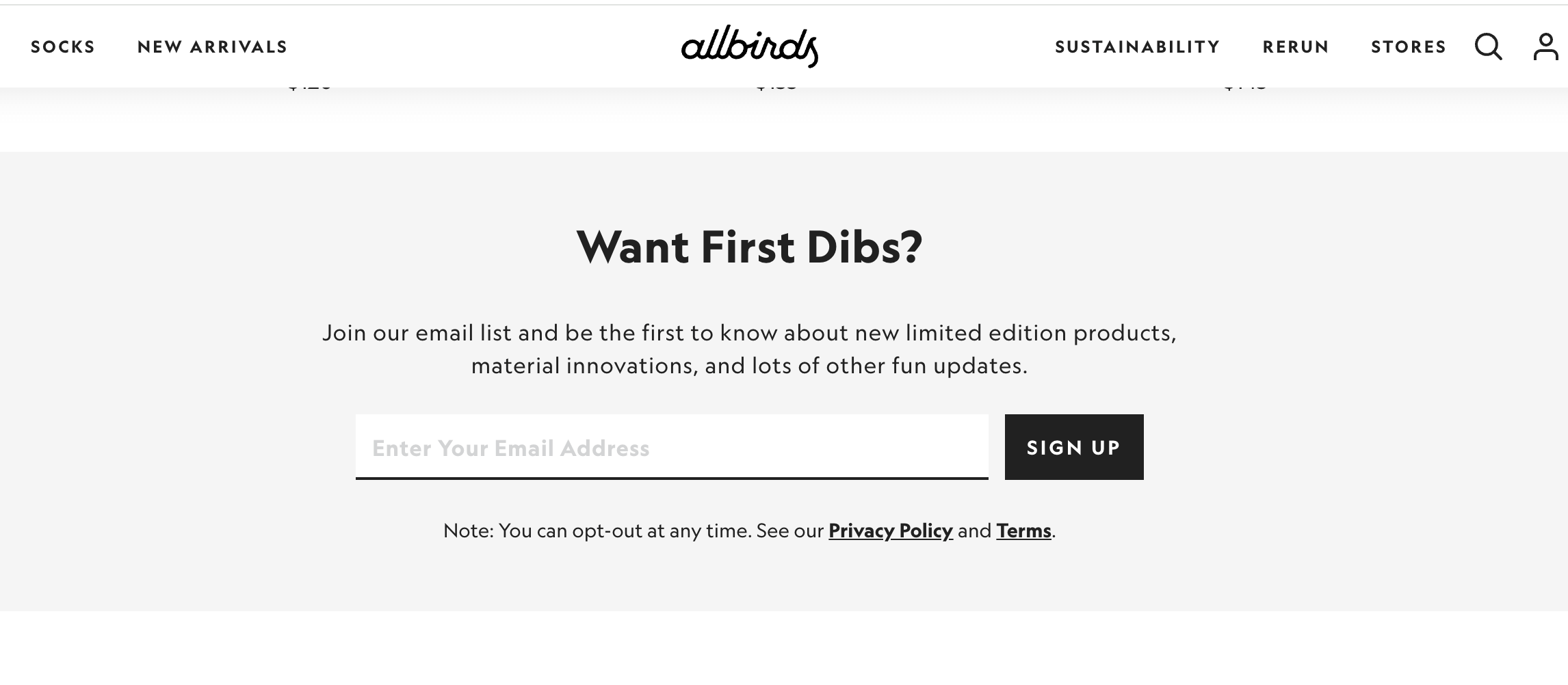
Allbirds keeps it casual with the embedded form copy. Phrases like “Want First Dibs?” set the tone and spark curiosity, while the rest of the form clearly signals the benefit of subscribing — early access to limited editions, product updates, and “fun” extras. The design is minimal, keeping the focus entirely on the offer and reducing distractions. This form is placed near the bottom of the page, targeting users who’ve already shown interest by scrolling.
The brand also included a privacy disclaimer just below the form — a subtle but important trust signal that reassures visitors they can unsubscribe anytime.
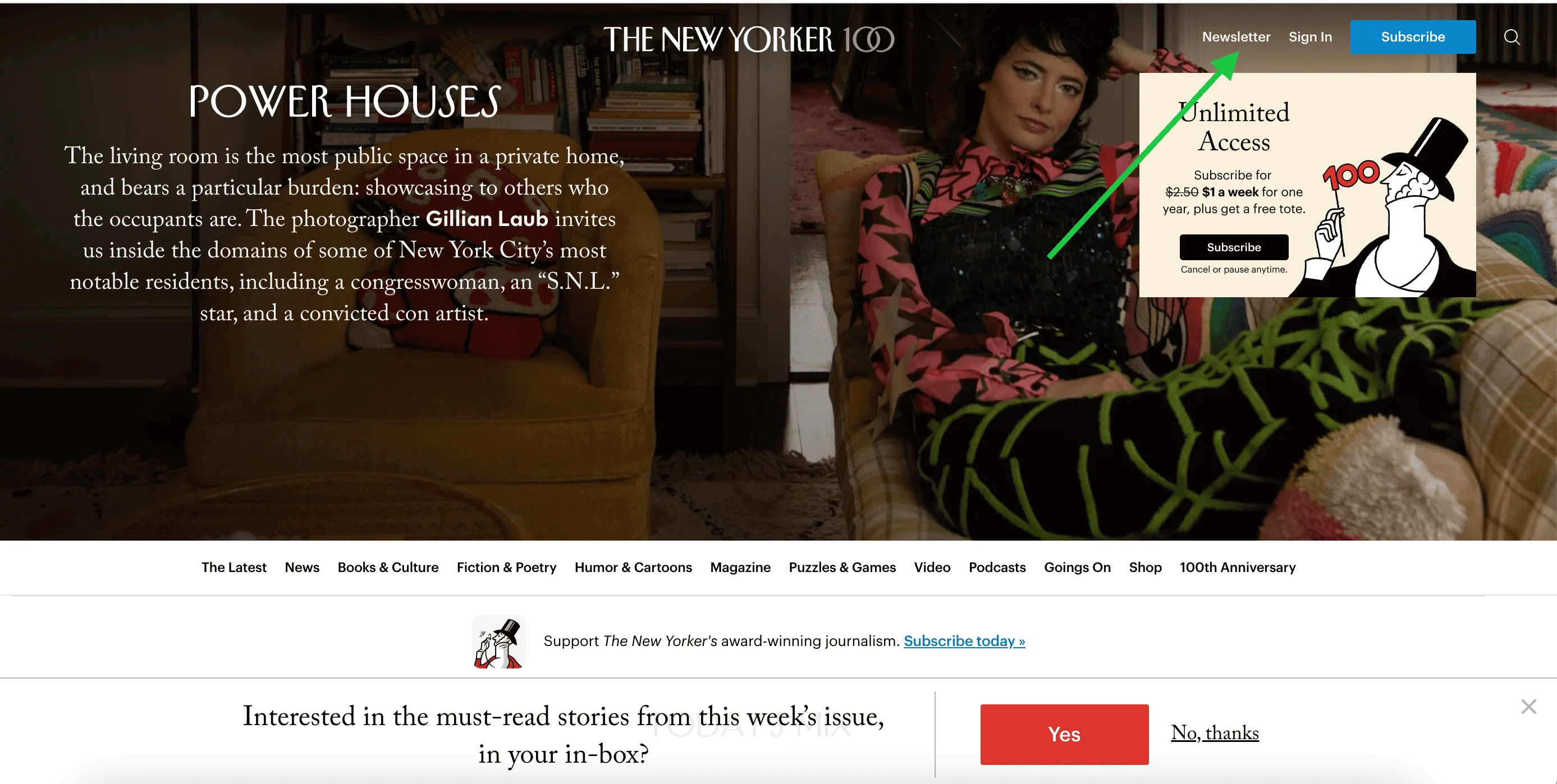
3. The New Yorker
The New Yorker is an iconic American magazine known for its in-depth journalism, essays, fiction, and cultural commentary.
The magazine has several newsletters corresponding to the topics and formats it covers. At the end of each article, The New Yorker includes an embedded newsletter signup form. These forms are styled consistently but vary in content. The choice of headlines, descriptions, and disclaimers depends on the article topic or section, which contributes to a more seamless opt-in experience.


Website visitors can also benefit from a subscription hub when they click on the Newsletter button in the header.
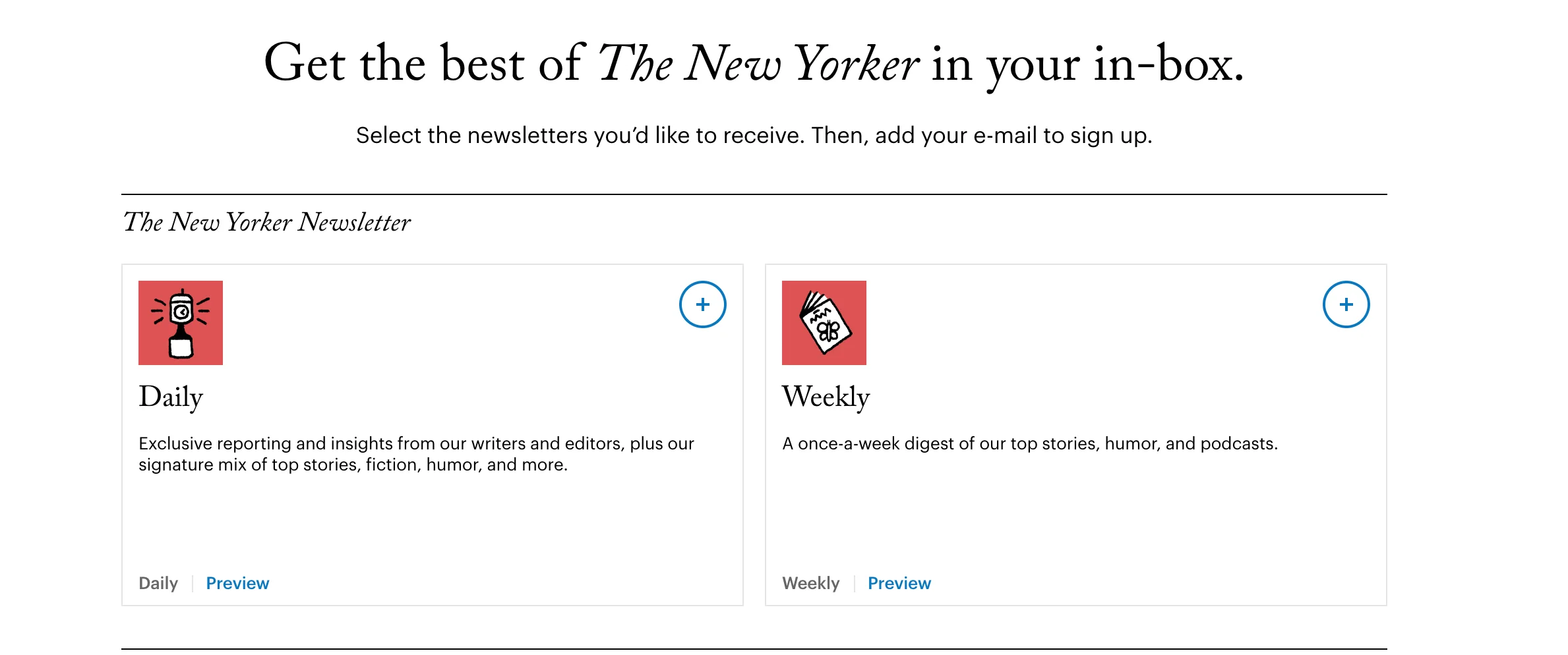
Once they get to the New Yorker’s newsletter menu, they can select the newsletters they like and enter their email addresses:
4. J.Crew
J.Crew is an American fashion retailer known for its classic, preppy clothing.
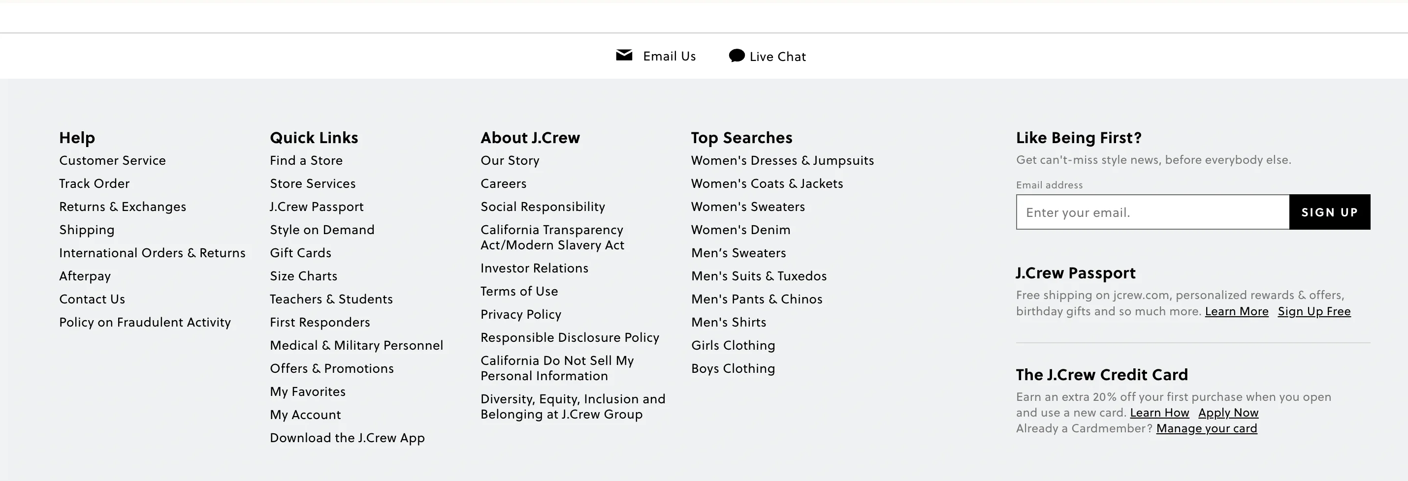
This embedded form from J.Crew is tucked into the footer of the website, but it’s still easy to find thanks to its bold, clear headline: “Like Being First?” The minimalist layout and monochrome design fit seamlessly with the rest of the site, making the form feel like a natural part of the user experience.
5. Qatar Airways
This one is pretty self-explanatory. Qatar Airways is the flag carrier of Qatar.
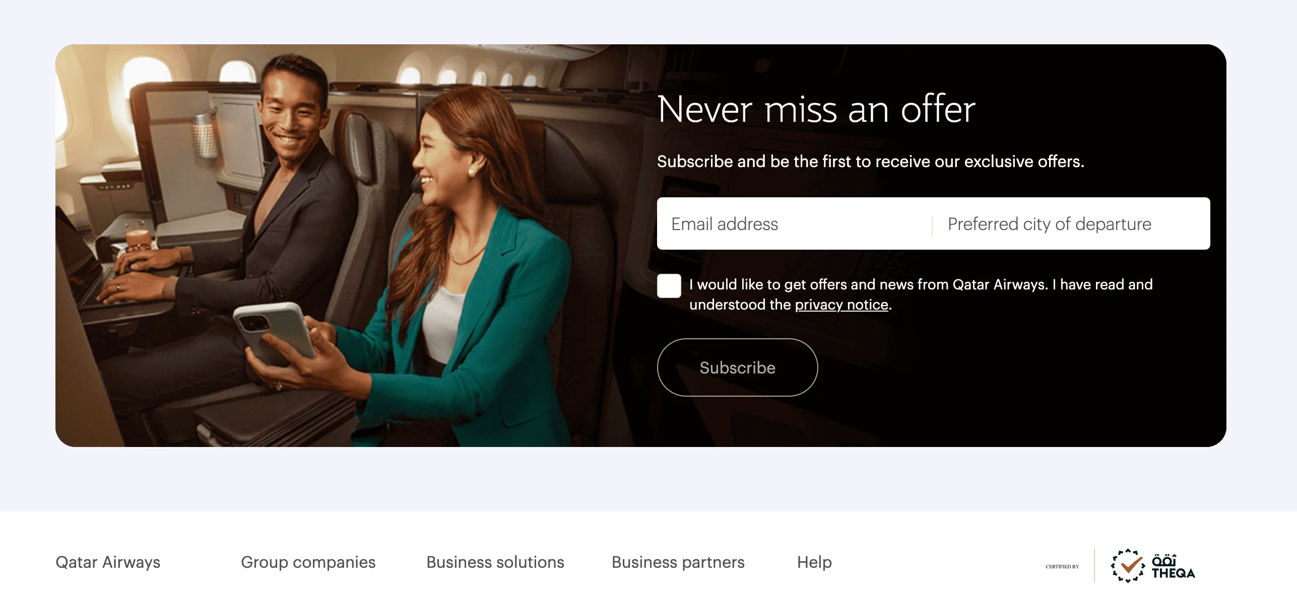
The design of Qatar Airways’ embedded form reflects the airline’s premium feel — it’s elegant, minimal, and clearly targeted at frequent travellers. This form creates an aspirational feel, reinforcing the aspirational appeal of premium travel. As far as copywriting is concerned, the headline is strong with sleek typography and layout. The two-field format (email + preferred city of departure) feels personalized, and the checkbox reinforces consent and trust.
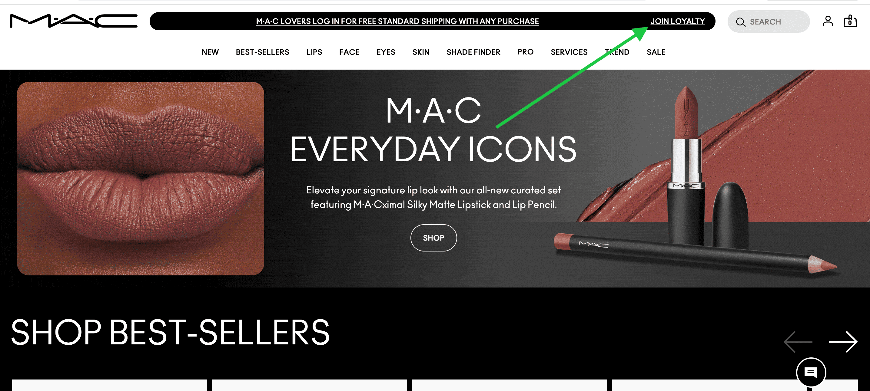
6. MAC Cosmetics
MAC is a cosmetics manufacturer. MAC takes a slightly different approach by linking its newsletter sign-up with its loyalty program. Instead of a traditional embedded form on the homepage, visitors to the MAC website are encouraged to click a prominent Join Loyalty button in the top navigation bar.
Once you’ve clicked on the button, you’re taken to MAC’s embedded form page. The design is bold and on-brand, with punchy colours and playful fonts. All the benefits of signing up are also outlined very clearly.
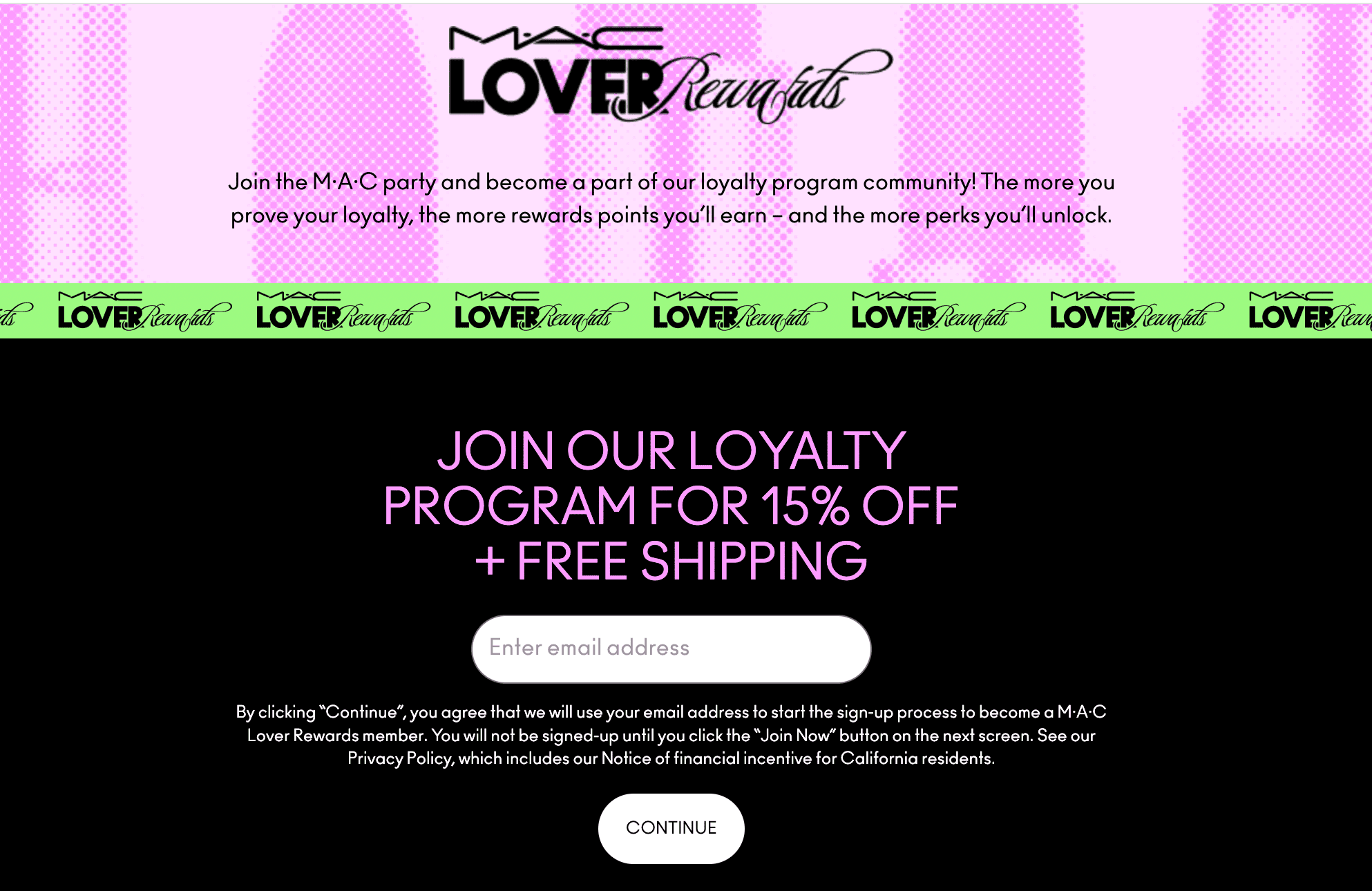
This kind of setup works well for online stores that want to offer a clear reward in exchange for signing up — it’s a smart way to grow your email list and keep customers coming back.
7. Urban Outfitters
Urban Outfitters is a lifestyle retailer, offering products like clothing and homeware.
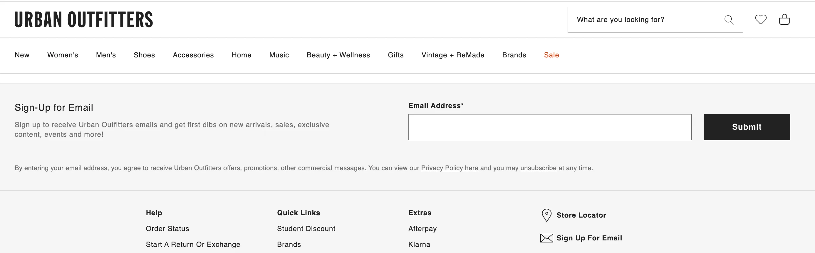
Urban Outfitters’ embedded form keeps things clean and minimal, and matches the rest of the website. It keeps things focused: one field, one button, and a short line explaining what you’ll get — early access to sales, content, and events.
Pop-up signup forms
Now, let’s shift gears and examine some examples of pop-up signup forms. This type of form appears in a separate window or box on top of the page content, often triggered by actions like scrolling, spending a certain amount of time on the page, or trying to exit. Pop-ups may interrupt the user experience, but they are also very effective and convert 4.65% of website visitors, according to Wisepops.
8. Morning Brew
First up, let’s look at Morning Brew — a media company known for its daily newsletters on a variety of topics. Morning Brew doesn’t actually have a regular pop-up on its landing page — instead, the company uses what’s known as an on-click pop-up. The form appears when you click the Subscribe button in the top right corner. In addition to this, Morning Brew also uses embedded forms, demonstrating that you don’t need to stick to just one signup form strategy.
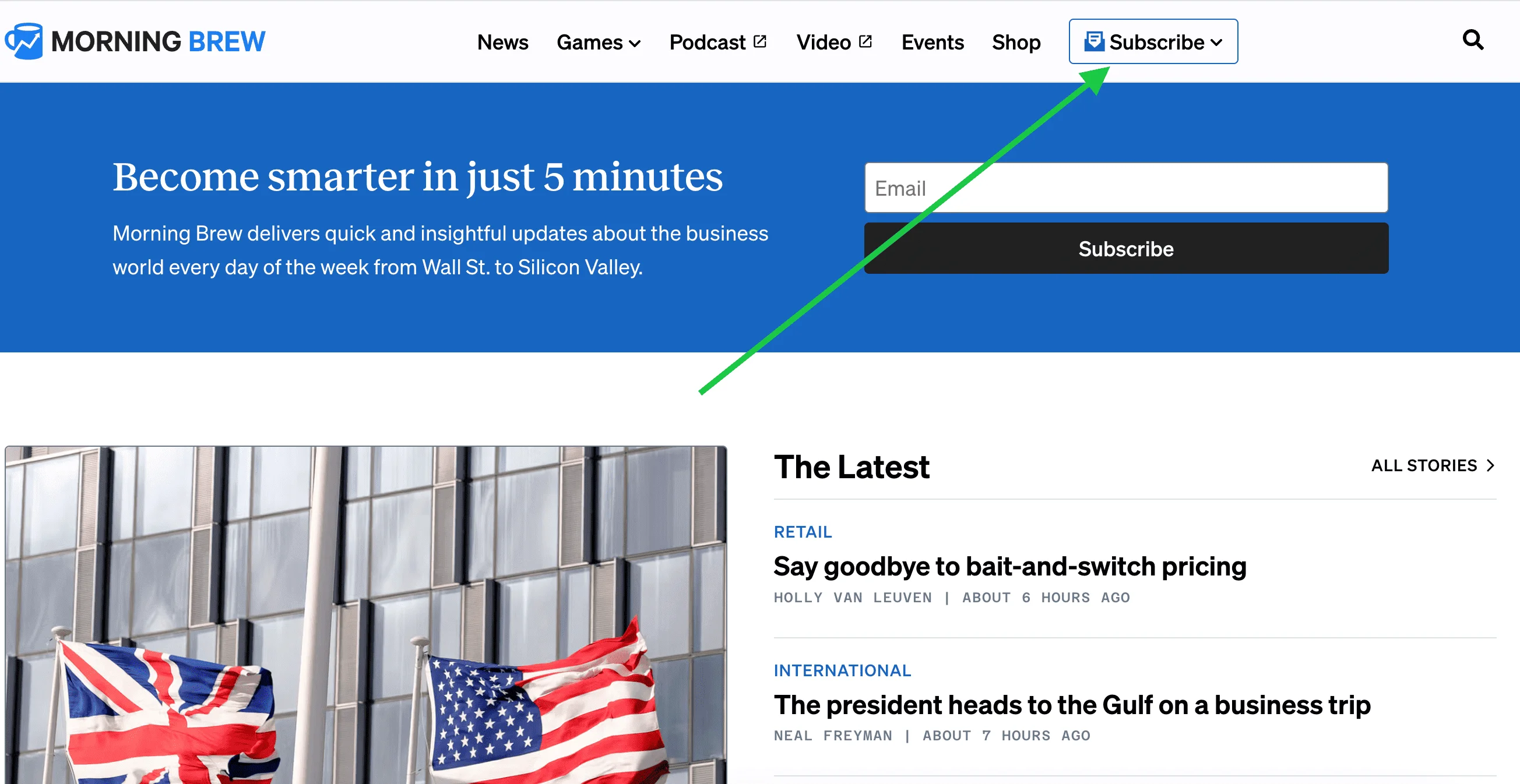
Once you click on the Subscribe button, a floating window opens with a clear, friendly invitation to subscribe, along with a quick preview of the newsletter content.
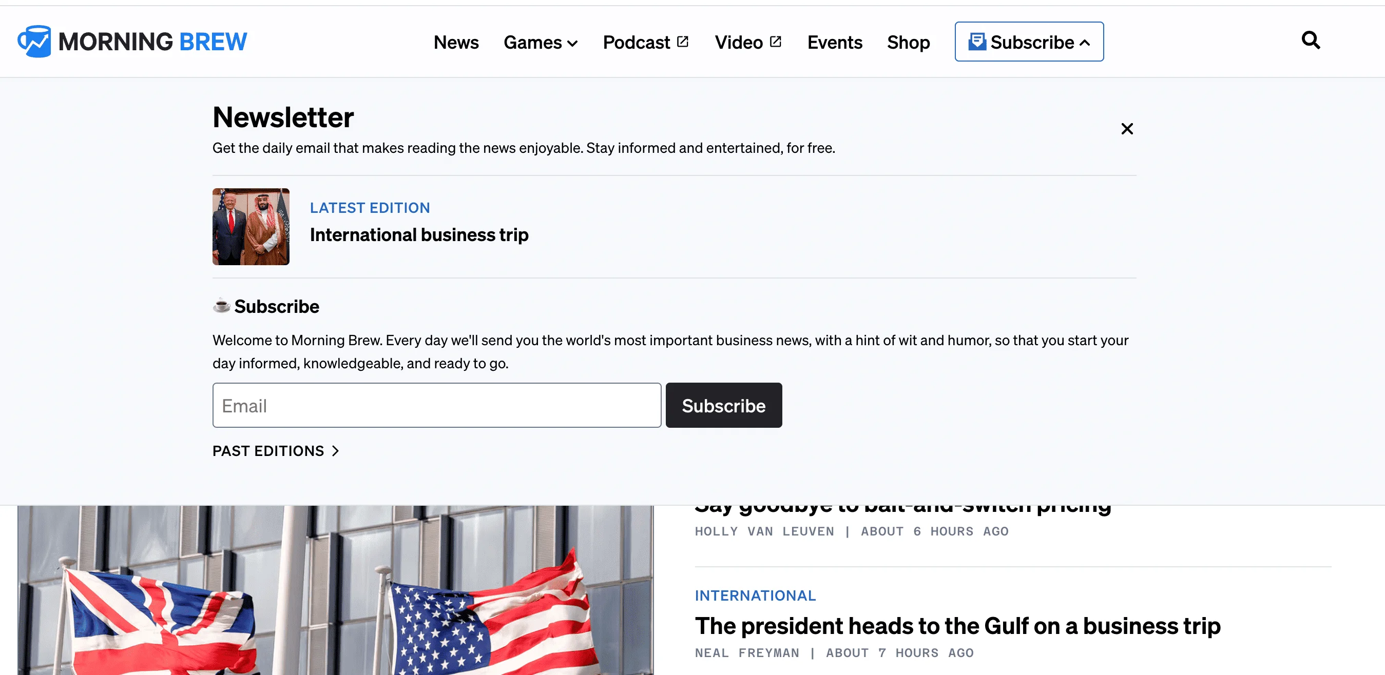
On-click pop-ups have one of the highest conversion rates — 25.24%, as per Wisepops. This works because it targets users who have already shown interest.
9. The GIST
Now, let’s take a look at the GIST — a women-led sports media brand. The GIST’s subscription system is the exact opposite of what we saw with Morning Brew (static button followed by a pop-up). When you land on the GIST’s page, you’re welcomed with a pop-up about subscribing straight away.
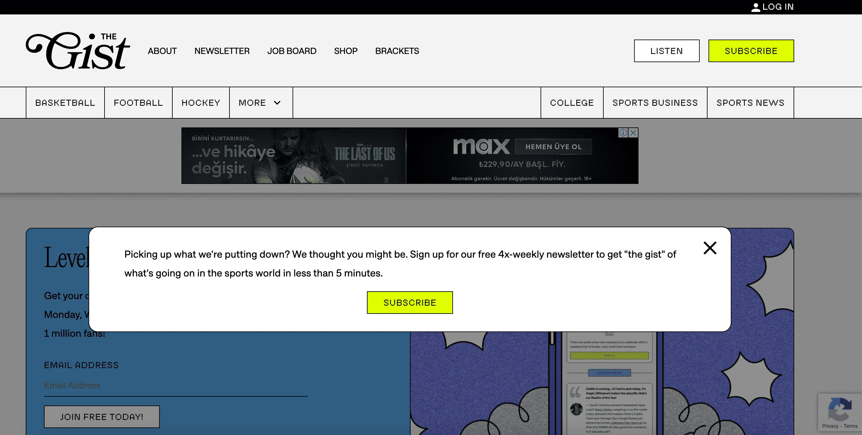
Once you click on the Subscribe button, you’re taken to a static page where you can leave your email address.

The tone is playful and casual, clearly tailored to a younger audience. The copy, which includes phrases like “Leveling the playing field,” reinforces the GIST’s focus on inclusive, accessible sports content. The brand also builds trust by highlighting the subscriber base of 1 million users.
Visually, the design leans toward bold fonts and a clean, colorful grid that keeps everything neat but energetic.
10. Bose
Bose is an American manufacturing company that specializes in selling audio equipment, such as headphones.
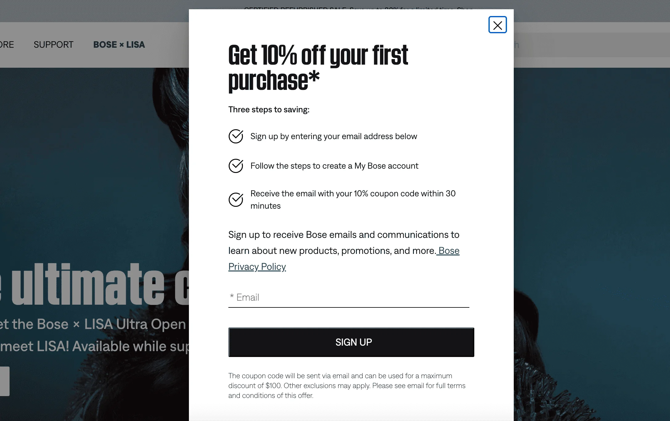
Bose uses a scroll-activated pop-up offering a 10% discount to capture email signups. It’s a clever way to catch website visitors’ attention once they’ve already shown interest by browsing. The tone is direct and practical. It focuses on the benefit, not the brand, and the message is very clear: just enter your email, create an account, and get a discount code within 30 minutes. This kind of pop-up works well for online shops because a discount gives people a reason to sign up, especially if they’re thinking about buying something anyway.
11. Shein
Shein is a fast fashion e-commerce brand known for selling trendy clothing and accessories at low prices. As soon as I landed on the Shein website, I was greeted with this pop-up:
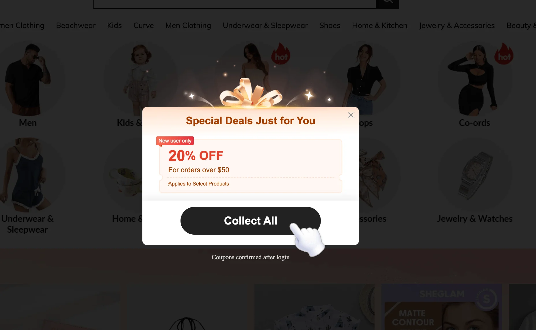
The design is flashy and animated, with sparkles and a giant gift ribbon to grab attention. It’s a direct, high-pressure strategy aimed at converting first-time visitors into buyers by offering them a 20% discount. As soon as I closed this pop-up, another one appeared.
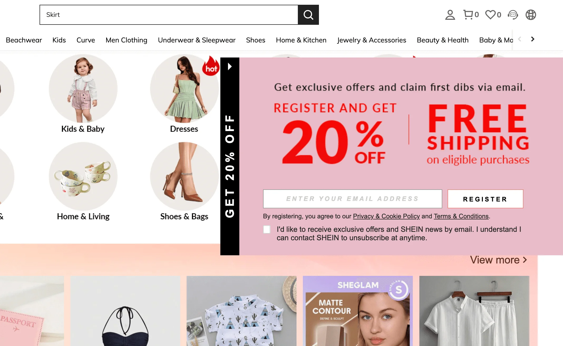
Here, Shein repeats the 20% discount offer from the previous pop-up. However, this time they’re also promising free shipping in exchange for an email address. The messaging is loud, urgent, and very sales-focused. While this strategy can be effective, it may feel overly aggressive.
Out of curiosity, I decided to browse the Shein website a little. As soon as I clicked on the Dresses category, yet another pop-up jumped out at me — same cheerful design as before, but this time offering an even bigger bundle of deals, each with its own minimum spend and ticking expiry date. This is what we call FOMO marketing.
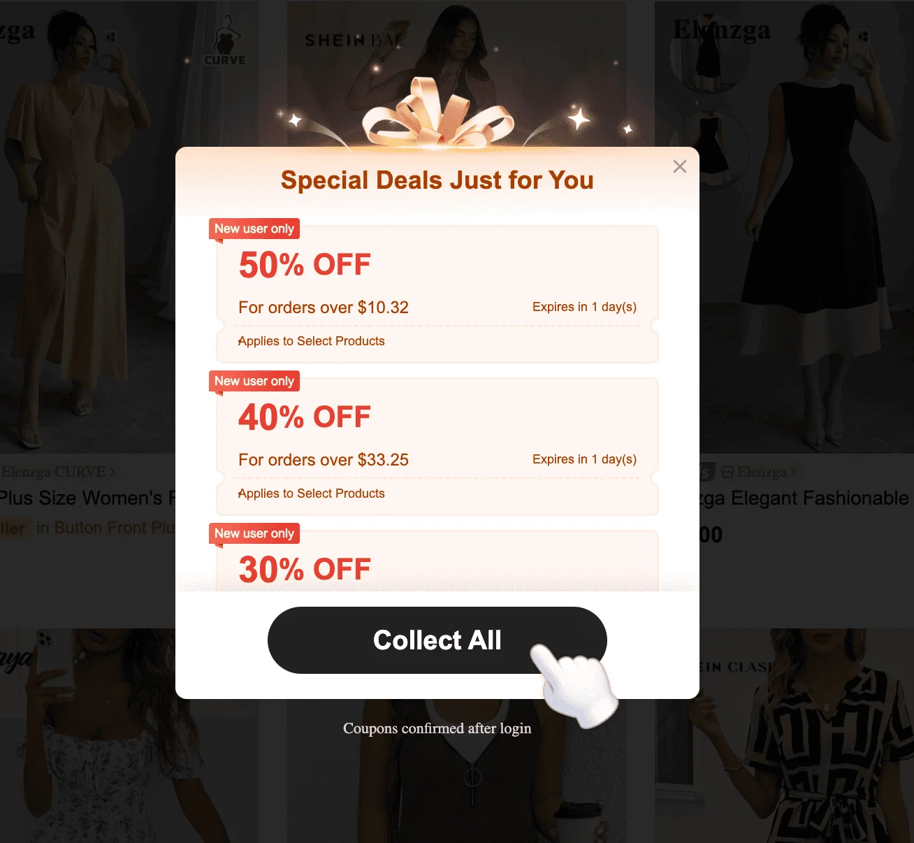
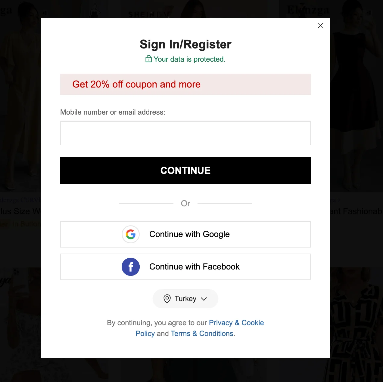
Once you click the “Collect All” button, you’ll see a fairly standard signup form:
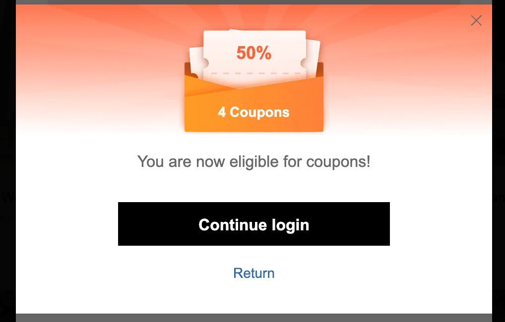
If you try to exit without entering your email, Shein doesn’t give up that easily — you’re immediately shown yet another pop-up. This one tells you you’re now “eligible” for coupons, in a last-ditch attempt to convert you into a customer.
You don’t have to be as forceful as Shein when it comes to pop-ups. In fact, you probably shouldn’t be! However, their approach shows that using more than one pop-up isn’t always a bad idea. For example, triggering a follow-up offer when someone tries to exit without signing up can be a smart way to give them a second chance to convert.
12. AliExpress
AliExpress is a massive online retail platform owned by Alibaba Group, where consumers can buy products directly from manufacturers and sellers. These pop-ups appeared primarily on mobile devices during testing.
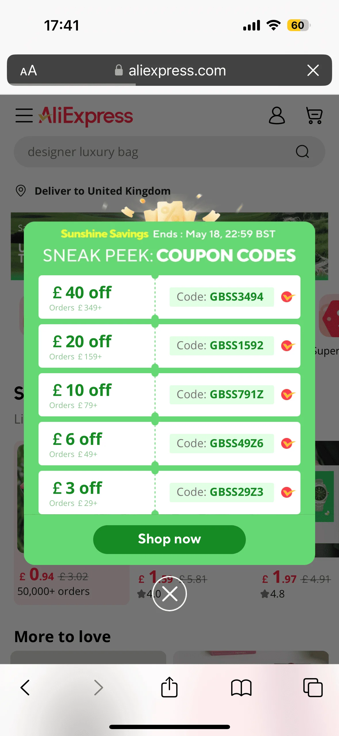
The visual design is bold but not overwhelming — a simple green background and a clean, coupon-style layout. Each code is tied to a minimum order value, encouraging higher spending. As soon as I clicked on the “Shop now” button, I was asked to register:
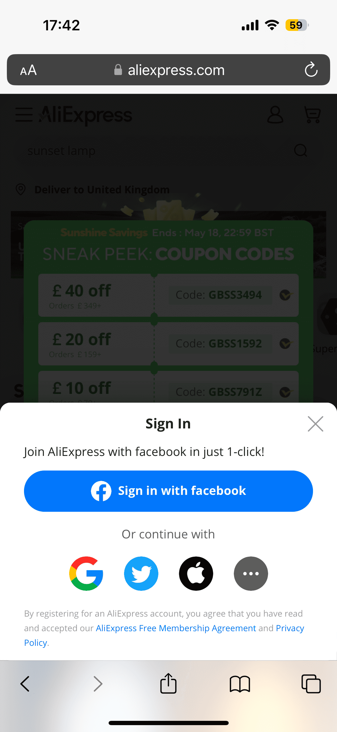
Instead of asking for email and password to create an account right away, AliExpress smartly presents multiple one-click options — Facebook, Google, Twitter, Apple — which lowers the friction and makes it more convenient. Like Shein, AliExpress hooks you in with the promise of savings, only to push you into account creation.
13. Fashion Nova
Fashion Nova is a fast fashion brand known for its Instagram-ready styles at affordable prices.
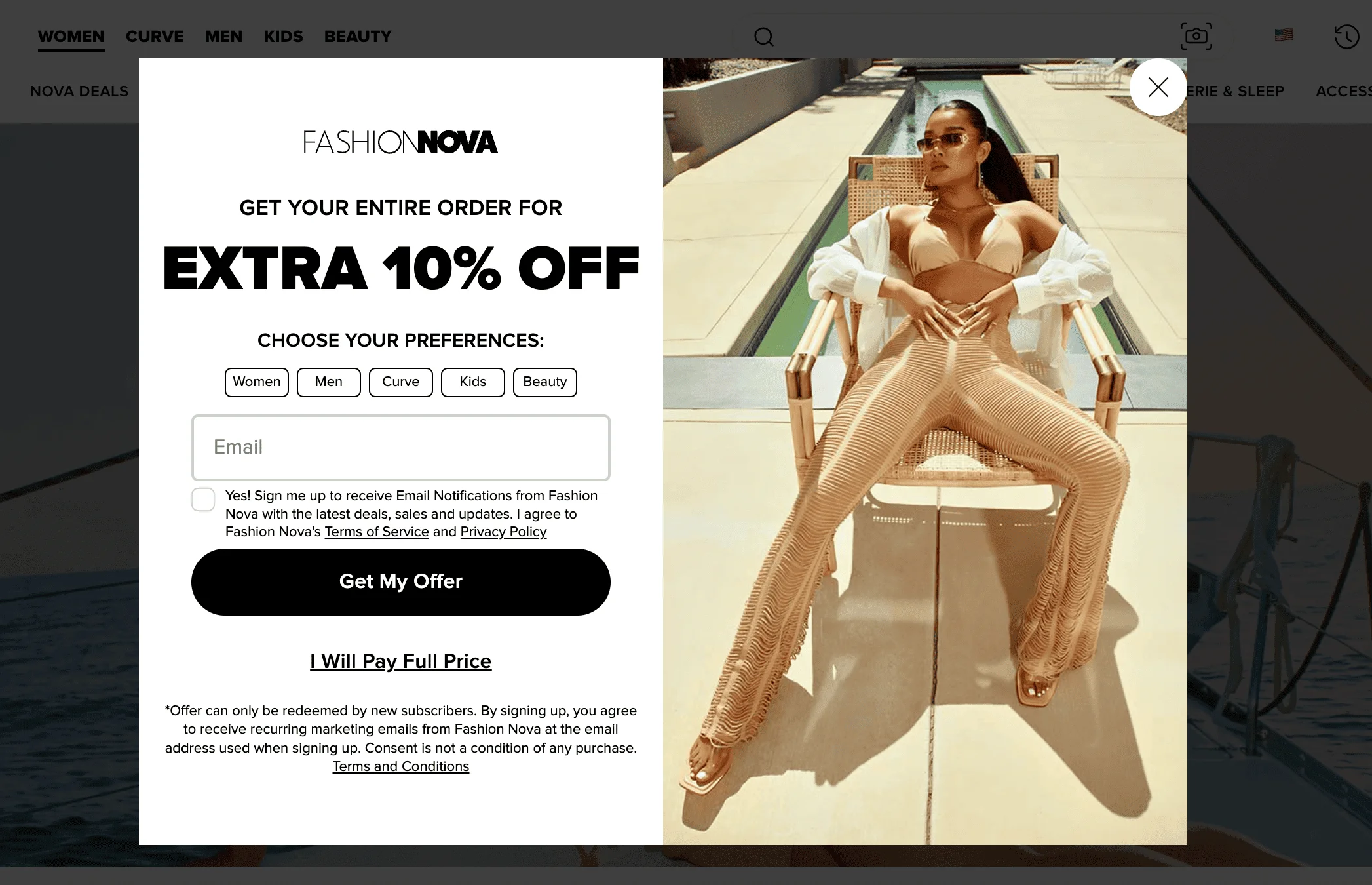
Fashion Nova’s pop-up appears automatically after a short delay and offers an extra 10% off your entire order. Aside from asking the visitors to enter their email address, it also prompts them to choose their preferences for shopping. The pop-up features an image of a woman wearing Fashion Nova products and a slightly cheeky copy. “Get My Offer” vs “I Will Pay Full Price” creates urgency and reinforces the brand’s high-energy, no-frills sales strategy.
14. Proozy (formerly known as Zulily)
Zulily, a flash sale site focused on moms and families, was acquired by Proozy, a discount e-commerce platform known for activewear and daily deals.
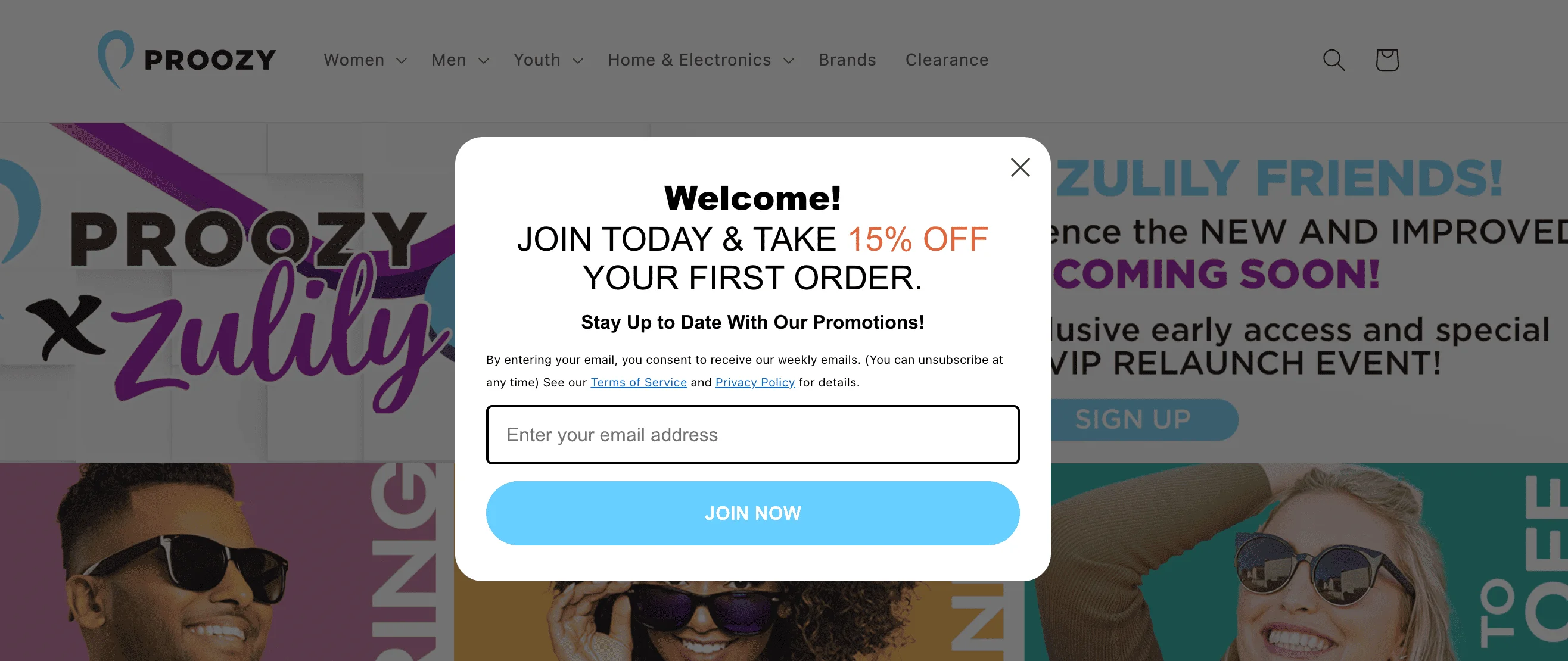
This is a welcome pop-up from Proozy offering a 15% discount on the user’s first order in exchange for their email address. The message appears automatically and includes a clear headline, offer, and a CTA button. The overall tone is upbeat and promotional, and the design is clean with a focus on the discount.
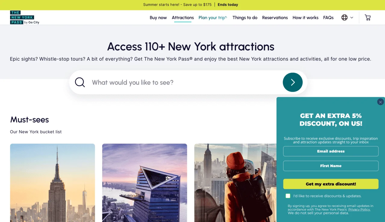
15. The New York Pass
The New York Pass is a sightseeing card that gives you access to dozens of popular attractions, tours, and experiences in New York City for a fixed price.
When you click on the “See all 110+ attractions” button on the homepage, a pop-up appears in the lower right corner. It offers an extra 5% discount for those who leave their email and first name, with an optional checkbox for marketing updates and a privacy disclaimer.
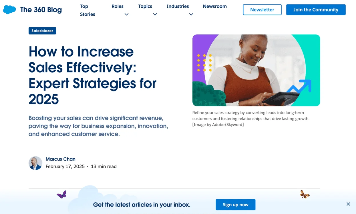
16. Salesforce
Salesforce is a SaaS company known for its CRM tools and enterprise solutions. For its marketing newsletter, Salesforce uses a simple strategy: as soon as you start browsing the blog, a pop-up appears at the bottom of the page, encouraging you to sign up. It stays in place as you scroll. This keeps the call-to-action visible without disrupting the reading experience.

Gamified and interactive signup forms
Not all signup forms have to be plain or serious: actually, making the experience more fun can lead to better results. That’s where gamified and interactive forms come in. These types of forms turn the subscription process into something fun, like a game. The gamification strategy includes adding elements like spin-to-win wheels, short quizzes, or progress bars. Now, let’s have a look at examples from real-life brands.
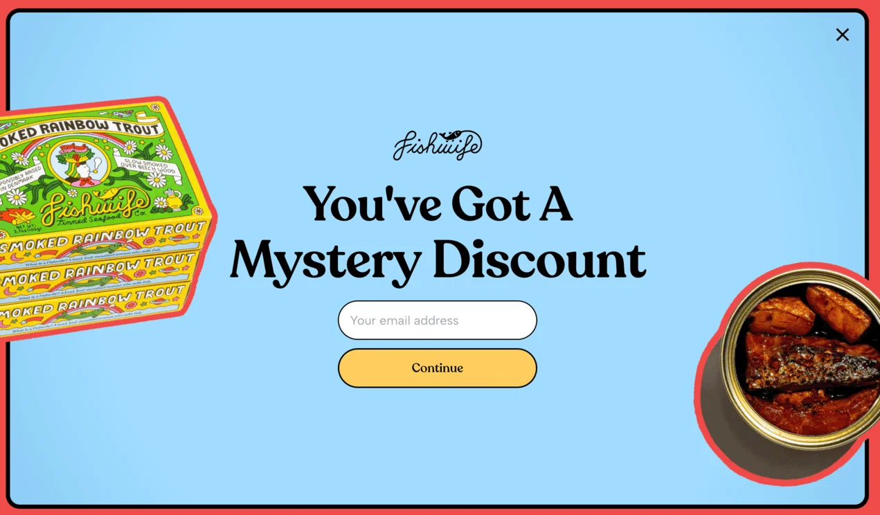
17. Fishwife
Fishwife is a trendy tinned seafood brand known for its bold design and playful voice. Its website pop-up adds a layer of surprise to the shopping experience. The full-screen pop-up asks users to pick their favorite flavor and also promises a mystery. It appears after you click on the product page.
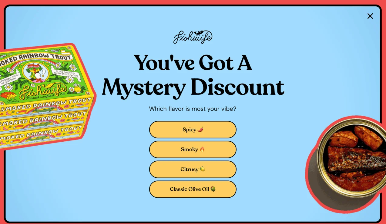
Once you’ve made your selection, a second screen invites you to enter your email to reveal the discount. The flow is simple, but the added curiosity and interaction can help increase sign-ups.
18. Perifit
Perifit is a health and wellness brand that offers smart devices for women’s postnatal health. At the bottom of Perifit’s website, you can find a standard-looking subscription form:
However, once you enter your email address, you’re taken to the gamified pop-up window:
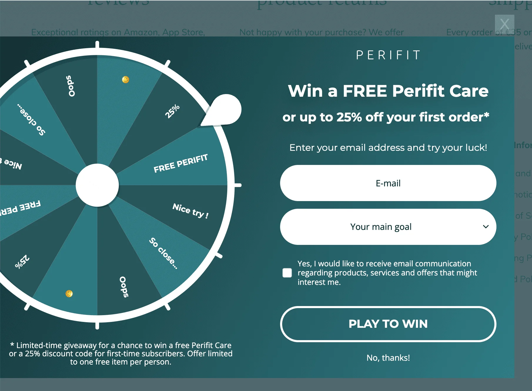
This is a “spin-to-win” style gamified pop-up from Perifit, designed to collect email addresses while adding a fun, interactive twist. Visitors are invited to spin the wheel for a chance to win a free Perifit Care device or get up to 25% off their first order. The experience mimics a game of chance, making it more engaging than a standard signup form.
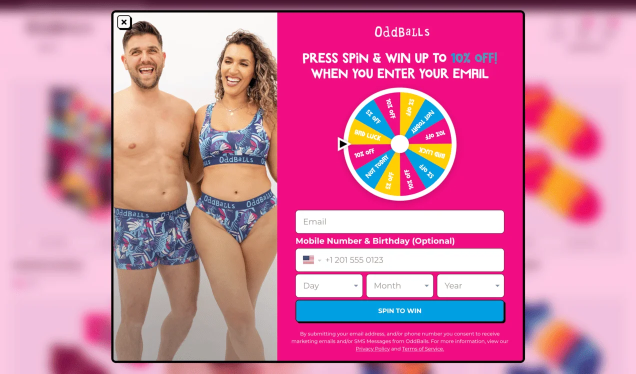
19. OddBalls
OddBalls is a UK-based underwear brand known for its bold prints and raising awareness for charity initiatives. As potential customers browse a product page, a spin-the-wheel type of pop-up appears, offering to “spin and win” up to 10% off. In order to unlock the wheel, you have to enter your email address, and also optionally your mobile number and birthday. This makes the subscription process feel like a game of chance. Another feature that adds to the gamified vibe of OddBalls’ popup is its design — it’s playful, the colors are bright, and the font is whimsical.
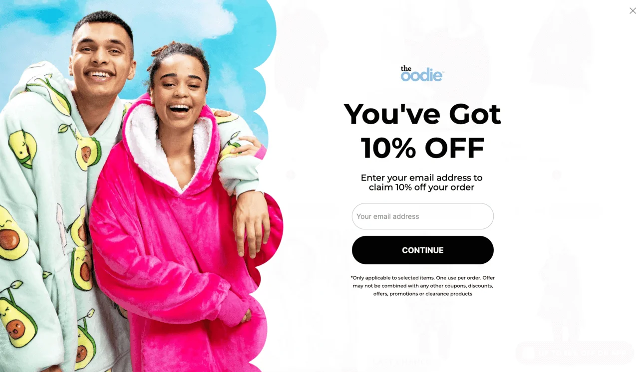
20. The Oodie
The Oodie is a brand that specializes in oversized wearable blankets and comfort-focused loungewear. After a few seconds of landing on their homepage, users see this interactive pop-up:
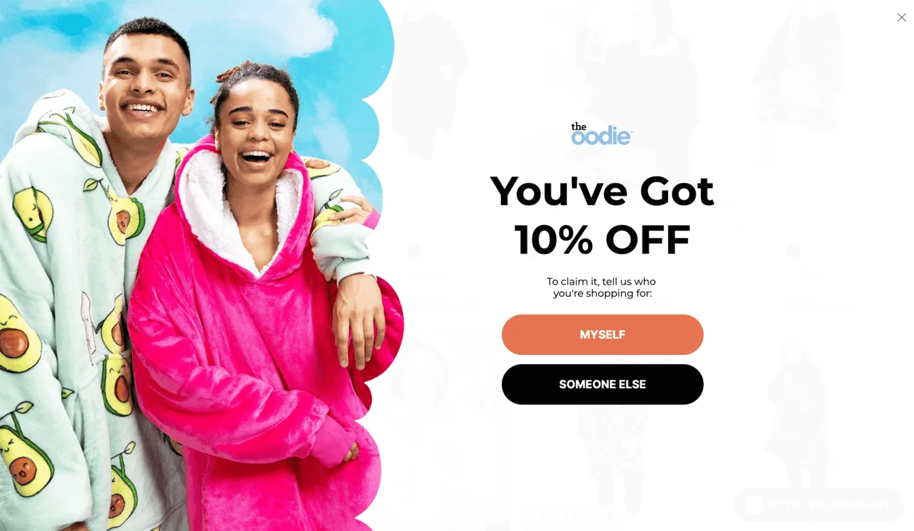
First, the pop-up asks who the users are shopping for (“Myself” or “Someone else”), and based on the answer, it reveals an email field to claim the discount. While not fully gamified, this pop-up adds interaction through simple cause-and-effect logic.
The two-step flow of The Oodie’s pop-up keeps users engaged and adds a surprise to improve conversion. The design is bold and playful, which aligns with the brand’s overall personality.
Common newsletter signup form mistakes to avoid
Even well-designed signup forms can underperform if they create friction or confusion. Before exploring real-world examples, here are a few common mistakes to watch out for:
- Asking for too much information. Long forms can discourage signups. In most cases, an email address — and optionally a first name — is enough to get started.
- Using vague or generic CTAs. Buttons like “Submit” or “Sign up” don’t communicate value. A more specific CTA, such as “Get 10% off” or “Send me updates”, makes the benefit clear.
- Being too aggressive with pop-ups. Multiple pop-ups or poorly timed triggers can frustrate visitors and increase bounce rates. Timing and frequency matter just as much as design.
- Not explaining what subscribers will receive. If users don’t understand what they’re signing up for, they’re less likely to convert — or stay subscribed.
- Ignoring mobile experience. Forms that are hard to close, read, or fill out on mobile can significantly hurt conversions.
Keeping these pitfalls in mind will make it easier to understand why some of the following examples work better than others.
Conclusion
To recap, high-converting signup forms combine clear value, strong design, and strategic placement.
There’s no size-fits-all solution here — from classic, subtle embedded forms to attention-grabbing pop-ups, to playful spin-to-win.
The best signup forms are the ones that feel natural to your site, speak to your audience, and make subscribing feel effortless. Whichever type of form you choose, remember to keep good timing, thoughtful design, and value to the customer at the forefront of your form-building to turn casual visitors into subscribers.
