


A high-converting popup does more than interrupt a page. It matches a relevant offer to the right visitor, appears after a meaningful trigger, asks for only the information the business needs, and makes dismissal easy.
This guide breaks down real popup form examples for email capture, ecommerce, content offers, cart recovery, events, and feedback. You will also learn how to choose a format, set timing and frequency, protect mobile user experience, and measure results.
Key takeaways
- Pop-ups are effective for starting conversations with customers, generating leads, recovering abandonments, boosting sales, and promoting campaigns.
- Pop-ups can increase email list subscribers by up to 11%.
- Different types of pop-ups include click, scroll-triggered, time-based, exit, and welcome mat pop-ups.
- Tips for effective pop-ups: highlight benefits, find the right timing, ensure relevance, focus on CTAs, make them easy to dismiss, experiment with formats, prioritize mobile optimization, and personalize when possible.
What are pop-up forms?
A pop-up form is a dialog or overlay that appears above a webpage and asks the visitor to take an action, such as joining an email list, claiming an offer, registering for an event, or answering a question. It may open after a click, a time delay, a scroll threshold, or an exit-intent signal.
Popups differ from inline forms, which stay inside the page layout, and from announcement bars, which use a small fixed area instead of covering the main content. The best format depends on the goal and how much interruption the message deserves.
Why use pop-ups?
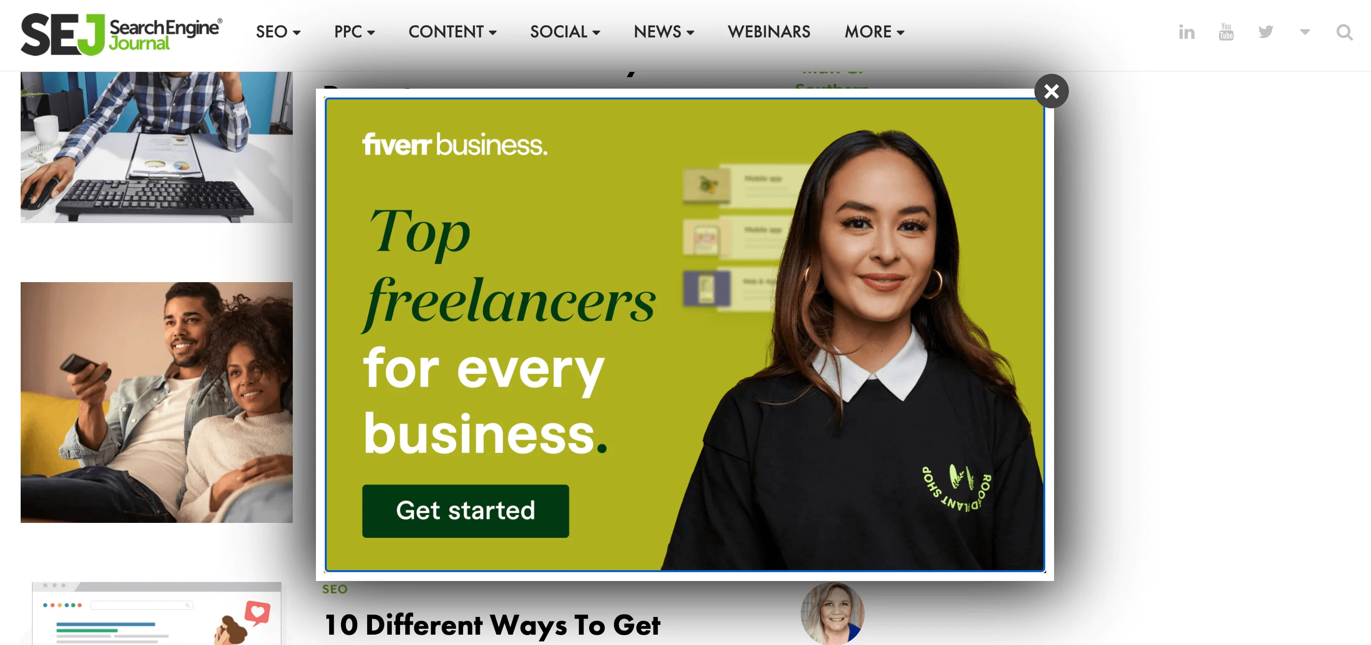
Popups can turn anonymous visits into measurable next steps, but there is no universal conversion rate. Results vary with traffic quality, offer strength, device, targeting, trigger, form length, and how the conversion is defined.
- Grow an email list: Offer a useful newsletter, guide, checklist, or first-order incentive.
- Promote an event or launch: Highlight a webinar, product release, or limited campaign.
- Recover high-intent visits: Use exit intent or cart context to answer an objection or preserve a sale.
- Collect feedback: Ask a focused question after a meaningful interaction.
- Qualify leads: Use a short multistep form when the additional information will change the follow-up.
For email acquisition, use a clear consent statement and an appropriate confirmation flow. Double opt-in can confirm that the address belongs to the subscriber and that they intended to join.
How to choose the right popup
Start with the visitor’s goal and the next useful action. This matrix provides a practical starting point.
| Goal | Recommended format | Best trigger | Offer | Primary KPI |
| Newsletter signup | Small overlay or slide-in | Scroll or engaged time | Relevant newsletter value | Confirmed signup rate |
| First purchase | Overlay | Engaged time or second page | Discount or free shipping | Revenue per popup view |
| Lead magnet | Click or scroll popup | Content engagement | Guide, template, or checklist | Qualified lead rate |
| Cart recovery | Exit-intent dialog | Exit signal with cart context | Objection help or relevant incentive | Recovered revenue |
| Event registration | Overlay or bar | Relevant page or return visit | Webinar or event access | Registration rate |
| Product announcement | Bar or slide-in | Relevant audience segment | Feature or launch details | Qualified clicks |
| Feedback | Small dialog | After task completion or exit | One focused question | Response and completion rate |
Pop-up form examples by goal
The examples below are useful as patterns, not as proof of performance. For each one, consider why the message fits the moment and what you would test for your own audience.
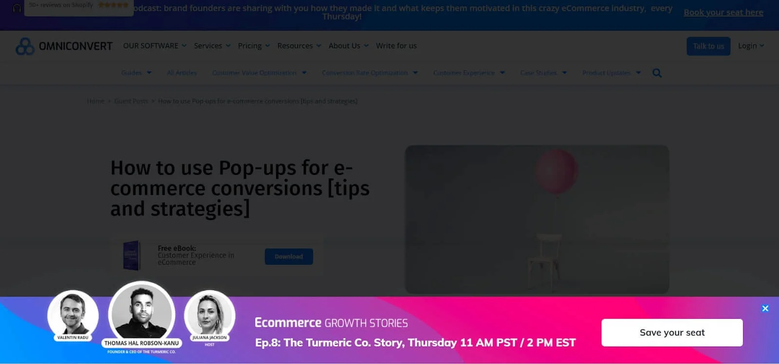
Announcement popup: Dashly
Why it works: The compact placement draws attention to an event without taking over the whole page. Best trigger and audience: Relevant visitors who have already shown interest in the event topic. What to test: A bottom banner versus a centered overlay.
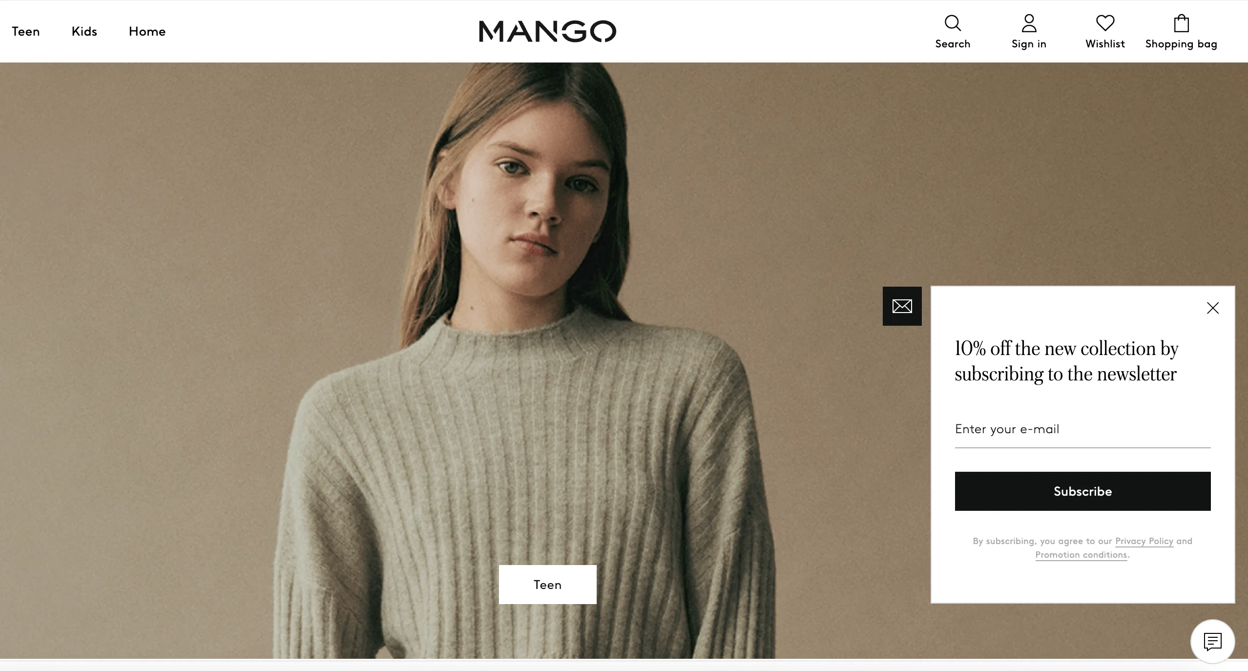
Email signup discount: Mango
Why it works: The first-order value is immediate and easy to understand. Best trigger and audience: New ecommerce visitors after they have viewed a product or category. What to test: Percentage discount, fixed-value discount, or free shipping.
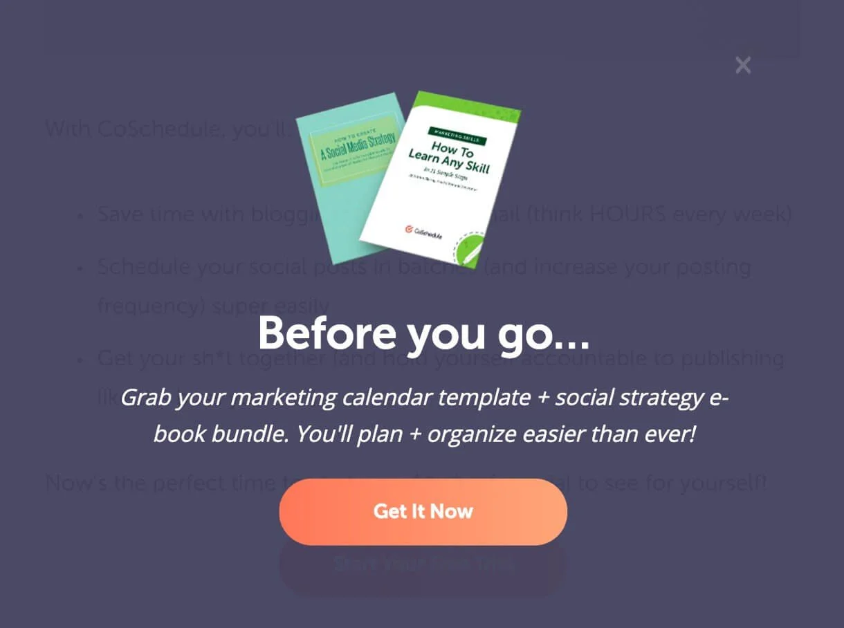
Lead magnet popup: CoSchedule
Why it works: The content offer is specific to the visitor’s marketing task. Best trigger and audience: Readers who engage with related educational content. What to test: The resource topic, headline, and number of required fields.
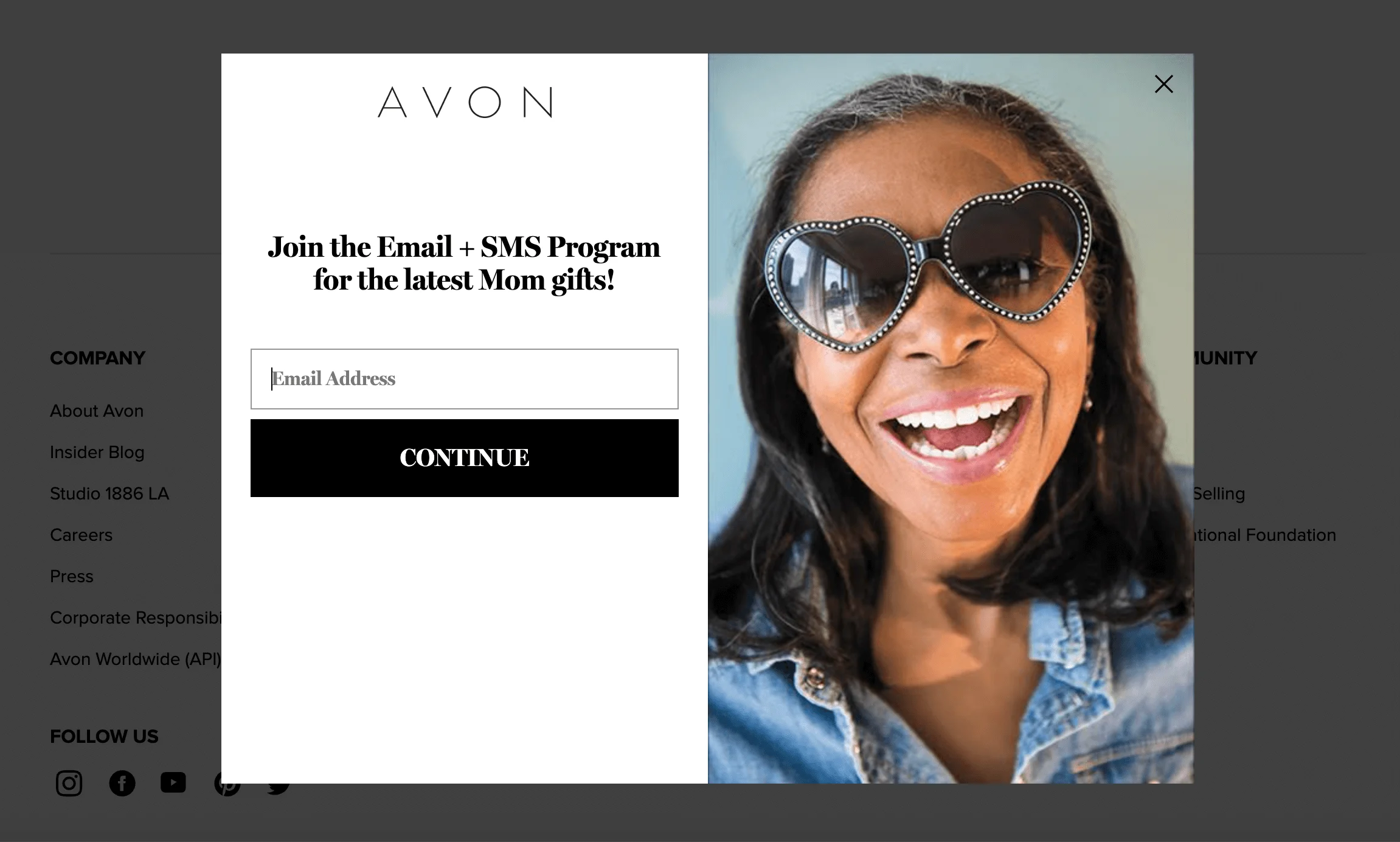
Promotion popup: Avon
Why it works: One email field keeps the commitment small while the loyalty proposition explains the benefit. Best trigger and audience: Shoppers who have explored products but have not joined the program. What to test: Full-screen treatment versus a smaller dialog, especially on mobile.
Pop-up examples by trigger and format
Click-triggered popup
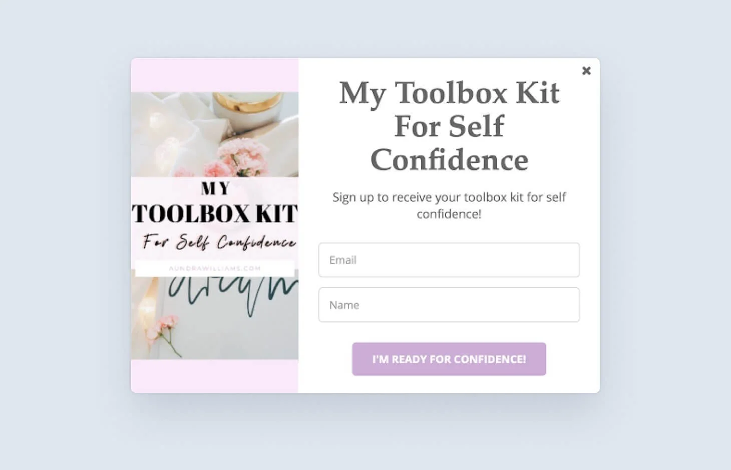
A click popup opens only after the visitor chooses a link or button. It is useful for warm leads because it avoids interrupting people who have not expressed interest.
Scroll-triggered popup
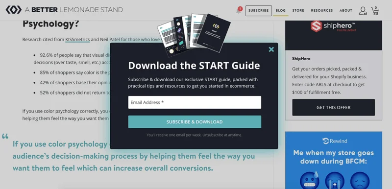
A scroll trigger waits until a reader reaches a meaningful point in the content. Match the offer to the page topic and test the threshold rather than assuming that one percentage works everywhere.
Time-delayed popup
A time delay can work on content and landing pages, but elapsed time alone does not prove intent. Combine it with page type, engagement, or repeat-visit rules where possible.
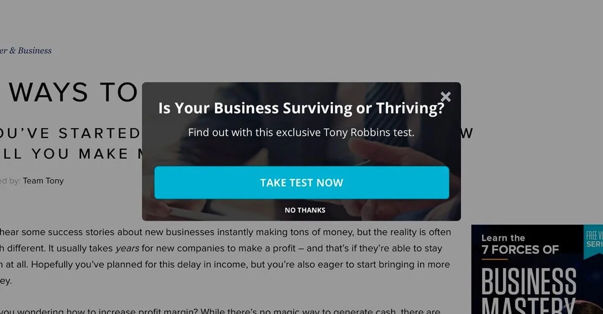
Exit-intent popup
Exit intent gives desktop visitors a final relevant option before leaving. Use it to address an objection or save progress, not to repeat the same message they already ignored.
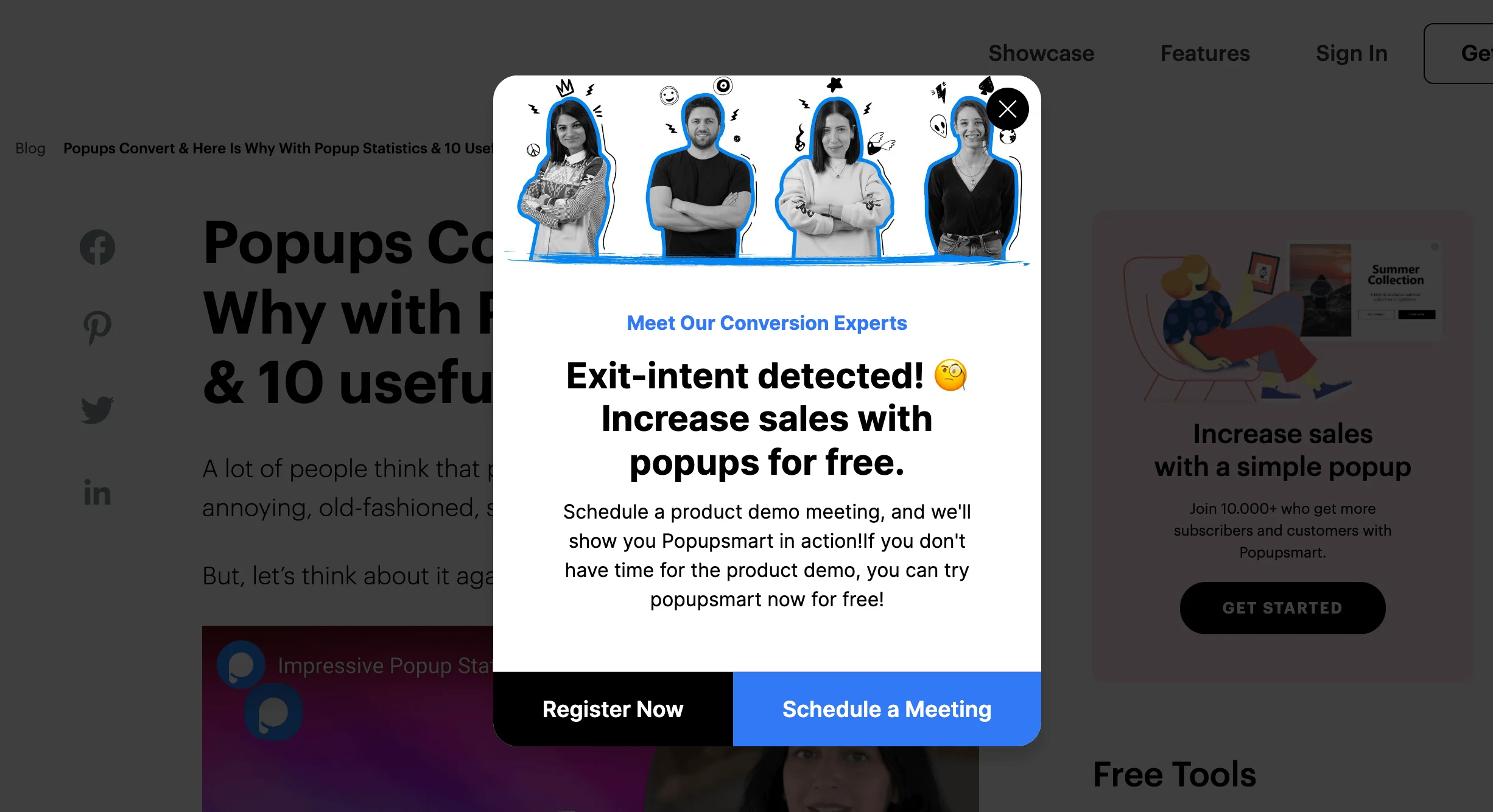
Welcome mat and full-screen popup
Full-screen formats command attention but carry the highest interruption cost. Reserve them for strong, relevant messages and avoid blocking the main content immediately after a visitor arrives from search.
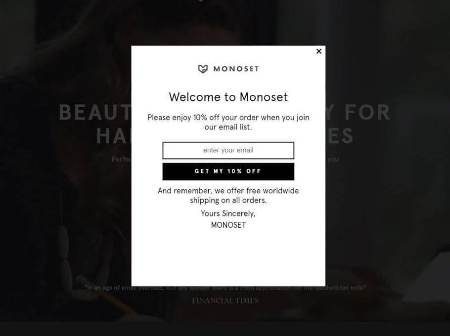
Popup form best practices
Lead with a concrete benefit
Explain what the visitor receives and why it is useful. One clear offer is easier to evaluate than several competing actions.
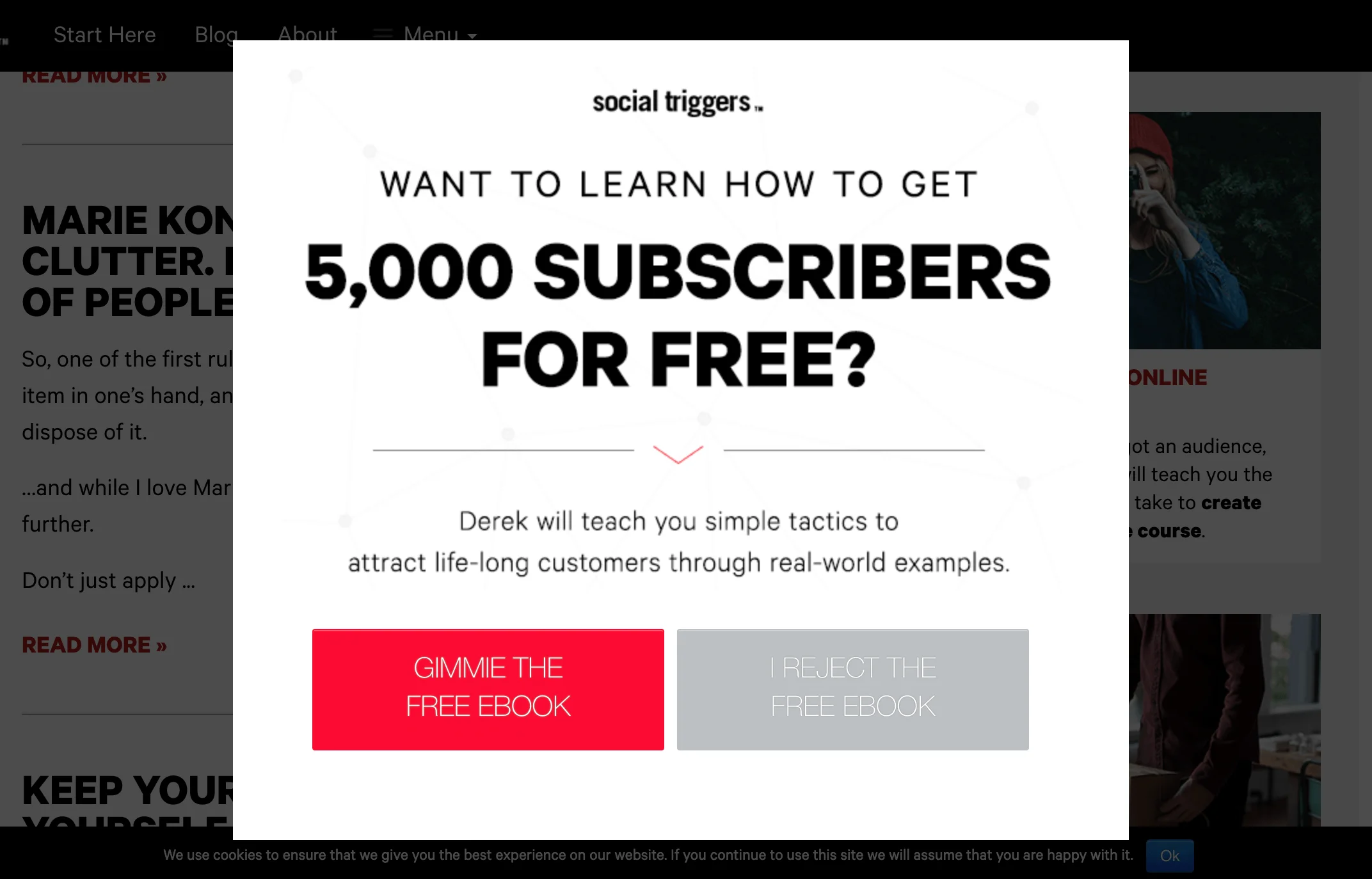
Choose timing from engagement signals
Use analytics as a starting point, then test timing by page type and audience. Scroll depth, repeat visits, clicks, product views, and cart status often reveal more intent than a fixed delay alone.
Keep the offer relevant to the page
A content upgrade should match the article topic, while an ecommerce offer should reflect the product or shopping stage. Page-level relevance usually matters more than decorative personalization.
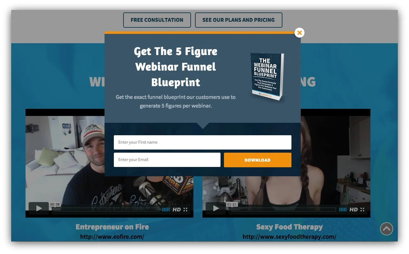
Use one clear CTA
Write the button around the result—such as getting the guide or joining the event—rather than a vague command. Keep a single primary action and make the next step predictable.
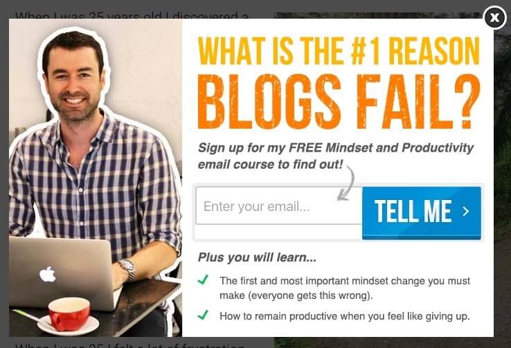
Make dismissal obvious
Provide a visible close control, support the Escape key, and avoid deceptive links or tiny tap targets. After dismissal, do not immediately show the same popup again.
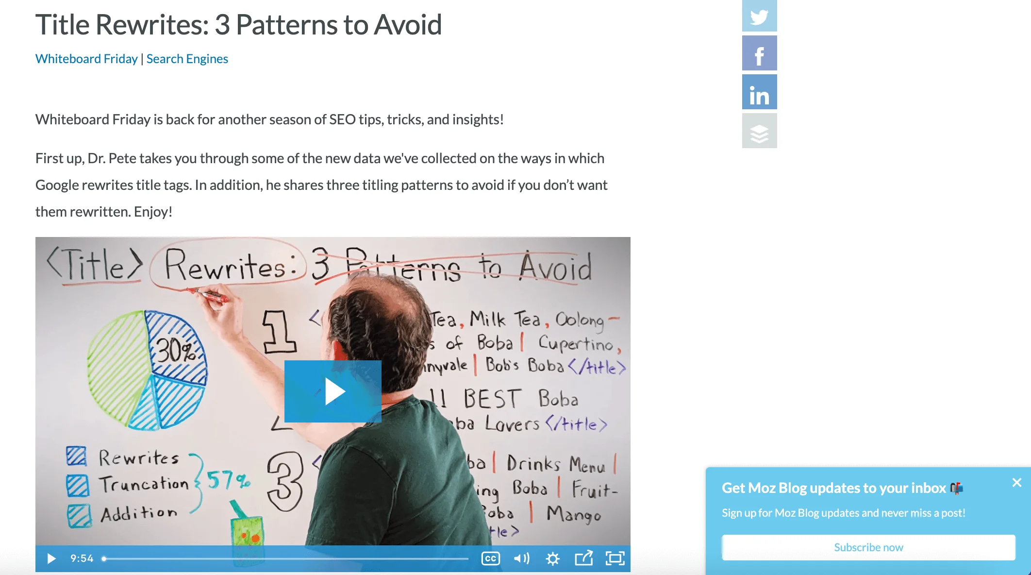
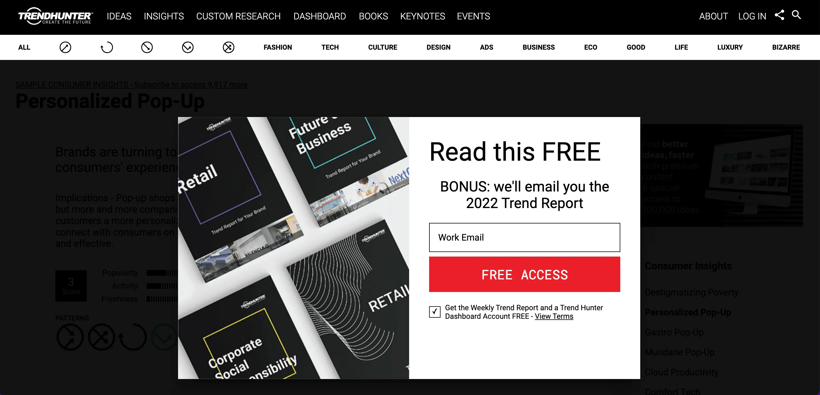
Use less intrusive formats when appropriate
Announcement bars, slide-ins, and click-triggered dialogs can communicate an offer without hiding the page. Match the visual weight to the importance of the message.
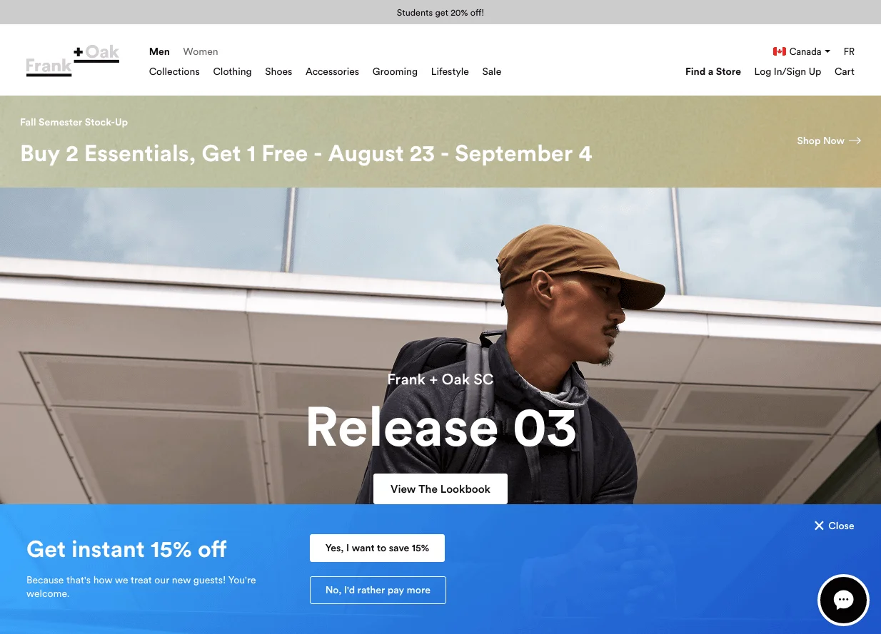
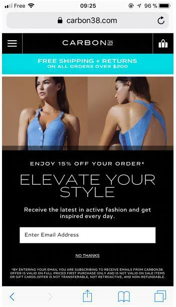
Design mobile popups separately
Use a compact layout, readable type, large tap targets, minimal fields, and a close control that remains visible. Test with the keyboard open and across common screen sizes.
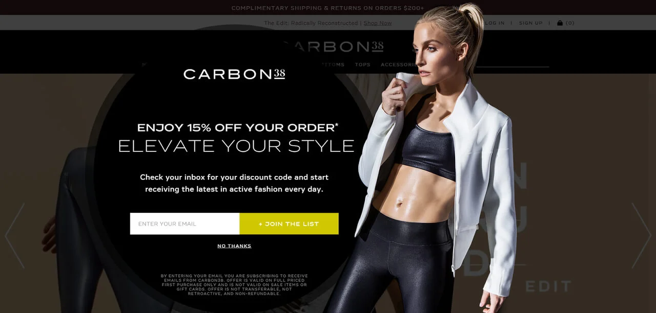
Personalize with useful context
Segment by page, lifecycle stage, purchase history, or expressed preference when that context improves the offer. Avoid personalization that feels invasive or reveals more tracking than the visitor expects.
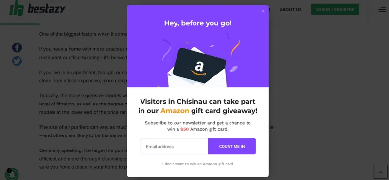
Control frequency and suppression
Set a frequency cap, distinguish new and returning visitors, and suppress the popup after conversion. Coordinate overlapping campaigns so visitors do not receive several competing dialogs.
Test in the right order
Test the offer first, then audience, trigger, format, copy, and visual details. Changing one meaningful variable at a time makes the result easier to interpret.
Mobile, accessibility, and SEO considerations
Promotional interstitials that obscure the main content on arrival can frustrate visitors and make the page harder for search engines to understand. On mobile, prefer a small banner or wait for a meaningful interaction before showing a dialog.
- Move keyboard focus into the dialog when it opens and return focus after it closes.
- Use a programmatic label, logical reading order, and clearly identified fields.
- Allow keyboard dismissal and keep the close control visible.
- Maintain readable contrast and sufficiently large tap targets.
- Do not force users to provide data before they can access ordinary page content unless the interstitial is legally required.
Google’s current guidance recommends unintrusive dialogs and warns against promotional overlays that block access to the main content. Small banners are often a safer alternative for immediate announcements.
How to measure and improve popup performance
Popup conversion rate is usually submissions divided by popup views, but it should not be the only success measure. Track what happens after the form is completed.
- View-to-submit rate: How often displayed popups produce a submission.
- Confirmed signup rate: How many submitted addresses complete confirmation.
- Qualified lead rate: How many signups match the intended audience.
- Revenue or progression rate: Purchases, registrations, demos, or other downstream outcomes.
- Guardrails: Dismissals, bounce or engagement changes, unsubscribes, and complaints.
Compare results by device, traffic source, page type, visitor status, and campaign. A popup with fewer submissions can be more valuable if it produces better-qualified leads or more revenue.

FAQ
What makes a popup form effective?
An effective pop-up focuses attention on one clear offer so the message does not get lost on a crowded page. It should match a specific goal, such as generating leads, recovering abandonments, boosting sales, or promoting an event. Strong examples offer something useful in return, like a discount, exclusive content, or access to a product or service.
What is a good conversion rate for a popup form?
The article says pop-up forms convert at about 3% on average, and some can reach up to 11%. Results depend heavily on when and where the pop-up appears. If your rate is lower, the article suggests adjusting timing rather than assuming the form is failing.
When should a popup appear on a website?
A pop-up can appear when a visitor lands on a page, clicks a link, attempts to exit, scrolls through an article, or stays on the site for a set period. The most effective timing depends on the page and the goal. The article notes that timing and placement can make a big difference in performance.
How can popups help grow an email list?
A pop-up can invite visitors to share their email in exchange for an exclusive offer. Examples from the article include a discount code, free access to products or services, or exclusive content like videos, guides, checklists, or an ebook. This gives visitors a clear reason to subscribe.
What are common uses for popup forms?
The article highlights three main uses: announcing news, growing an email list, and sharing promotions or new offers. Pop-ups can promote upcoming events, webinars, new products, or special campaigns. They are useful when you want to draw attention to one important message.
What should you use to get the best results from popup subscribers?
The article recommends using a double opt-in system for new subscribers. This helps confirm signups and supports better marketing results. It is presented as a best-practice note rather than a requirement for every pop-up.
Wrapping up
Choose a popup by working through six decisions: goal, audience, trigger, offer, frequency, and KPI. Then test the complete experience on desktop and mobile. A relevant popup that respects the visitor’s task is more likely to build a useful relationship than one that simply appears as early and as often as possible.
With Selzy popups, you can start from a template, collect subscriber data, and connect signups to your email campaigns.
 New and noteworthy on our blog
