


Key takeaways
- A landing page is a standalone web page with a single marketing purpose, unlike websites.
- Landing pages are designed for specific campaigns to drive traffic and maximize conversions.
- Landing pages eliminate choice paralysis and use storytelling to connect emotionally with visitors.
- Different types of landing pages include lead capture, conversion-driven, engagement, and event promotion pages.
- Essential components of a high-converting landing page include engaging headlines, clear CTAs, social proof, lead capture forms, and customer-focused messaging.
Have a clear campaign goal and need a web page for it? A landing page is a great tool to use, whether you plan on collecting emails, selling a product, or promoting an event.
In this guide, you’ll learn how to create a landing page step by step — from choosing a builder to publishing and optimizing a high-converting page. We’ll also cover what elements to include, and which design practices and optimization strategies to maximize conversions.
Ready to build your landing page? Then keep reading!
What is a landing page, and why create one?
A landing page is a standalone web page that serves one distinct marketing or advertising purpose.
What is the difference between a website and a landing page?
Unlike websites, landing pages are single-focused and have one call-to-action. They are typically created for a specific campaign that drives traffic, for example, a PPC, paid social, or email marketing campaign. The design of landing pages is functional and focused on maximizing conversions, whereas websites might have several pages with different purposes and are designed to explore.
Using landing pages is a marketing best practice for higher conversions. Based on common patterns across high-performing landing pages, removing distractions and focusing on a single goal significantly improves results.
There are psychological reasons for this. As landing pages have only one purpose and typically don’t include any navigation, they eliminate choice paralysis. Plus, a landing page can use storytelling to convince visitors and emotionally connect with them.
Landing pages are a versatile marketing tool, and you can create one for different purposes:
| Landing page type | Goal |
| Squeeze page or lead capture | Generate leads — collect contact information in exchange for a freebie or a discount. |
| Conversion-driven landing pages | Get direct conversions, like sales or registrations. |
| Engagement landing pages | Inform about launches, build excitement, provide social proof for brand trust. |
| Customer experience and unsubscribe pages | Get feedback, provide an opportunity to return. |
| Newsletter landing pages | Encourage subscriptions. |
| Event promotions | Get event signups. |
Elements of a high-converting landing page
Regardless of purpose, every landing page has the same set of components. They work together to drive the page’s message across and persuade the visitors to take the desired action and convert.
Based on best practices used by marketers, here are the building blocks of a good landing page:
- Engaging headline — this is the information a page visitor sees. It should be clear, punchy, and enticing to make them want to stay and scroll further. The headline can be complemented by a short subheading that goes into more detail about the offer.
- Clear CTA — a button or a link with action verbs that explain what to do. For example, “Sign up now”, “Join the waitlist”, “Get your copy”, etc.
- Social proof — reviews, customer testimonials, logos of client companies, or media coverage is great to provide more support for your marketing claims. They serve as trust signals, strengthening brand image.
- Lead capture form — a form to get contact information from the visitors is essential, especially if you’re building an email list. Don’t overwhelm your prospects, though, and only ask for the most important information, like email and name. You can get other personal details later, when the relationship is more established.
- Consistent and customer-focused messaging — maintain your brand voice throughout the page, describe your offer in the same transparent way every time, and write from the customer’s point of view. Explain what the prospect is going to get and how they will benefit from your product; don’t make it into a laundry list of features.
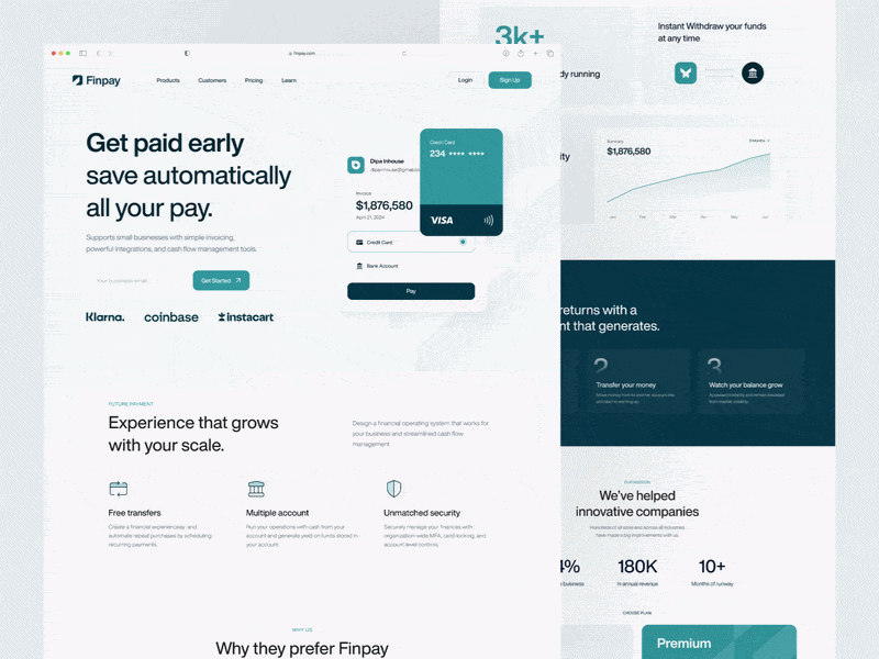
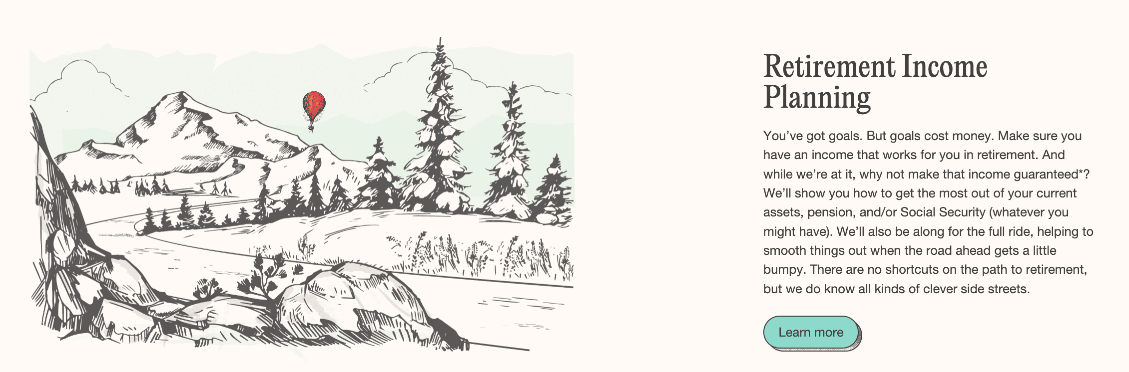
Here’s an example of a landing page design with the essential elements:
Step-by-step guide: How to create a landing page in 10 steps
Step 1: Identify your landing page’s objective
Step 2: Choose the right landing page builder or platform
Step 3: Plan your landing page structure
Step 4: Write copy that immediately communicates value
Step 5: Come up with a clear and persuasive call-to-actions
Step 7: Add trust elements and social proof
Ready to build your landing page? We’ll outline the basic steps of the process below, complete with screenshots and examples.
Step 1: Identify your landing page’s objective
A successful landing page isn’t just about design — it’s about guiding visitors toward one action and converting them.
If you want to create a strong landing page, don’t ignore the strategy behind it. As we’ve established, your page should have one goal, so before anything else, identify what that is.
Ask yourself:
- What is the objective of the page? Is it lead generation, conversion, engagement, subscriptions, event registrations, etc?
- What is the target audience of the page? Is it a subset of your existing customers (VIPs, at-risk customers, etc) or potential customers?
- Which campaign does this page belong to? Will the leads come from an email, a social media ad, or from another source?
Detail every important aspect of the landing page strategy from the start, as they’ll guide the rest of the process. High-performing landing pages always start with a clearly defined goal and audience. For example, both the messaging and design of a conversion-focused page and a lead capture page will be different.
Step 2: Choose the right landing page builder or platform
If you can’t create a landing page using your existing marketing stack, find a good platform for it. Take a look at our list of the best landing page builders, or do your own research.
When you’re choosing a landing page builder, pay attention to the following features:
- Drag-and-drop editor — with a no-code visual editor, you can build a landing page without coding. If you know HTML, look for a platform that offers both options.
- Templates — pre-made pages you can customize significantly cut the design time. Pick a platform that offers a good variety of templates for different purposes, like lead generation, event promotion, launch, etc.
- Pages’ responsiveness — your clients and prospects will likely access the landing page from several devices. Ideally, your landing page builder should automatically make the pages responsive. If you prefer to have more control, choose a platform that allows you to edit both views.
- Integrations — your platform of choice needs to work together with other tools, like your CRM, email marketing service, Google Analytics, or other data platforms.
- Built-in testing tools — real-time tracking, visitor behavior insights, heat maps, and performance metrics are key to making your page as effective as possible. Don’t forget about A/B testing — a useful platform should cover this feature, too.
Step 3: Plan your landing page structure
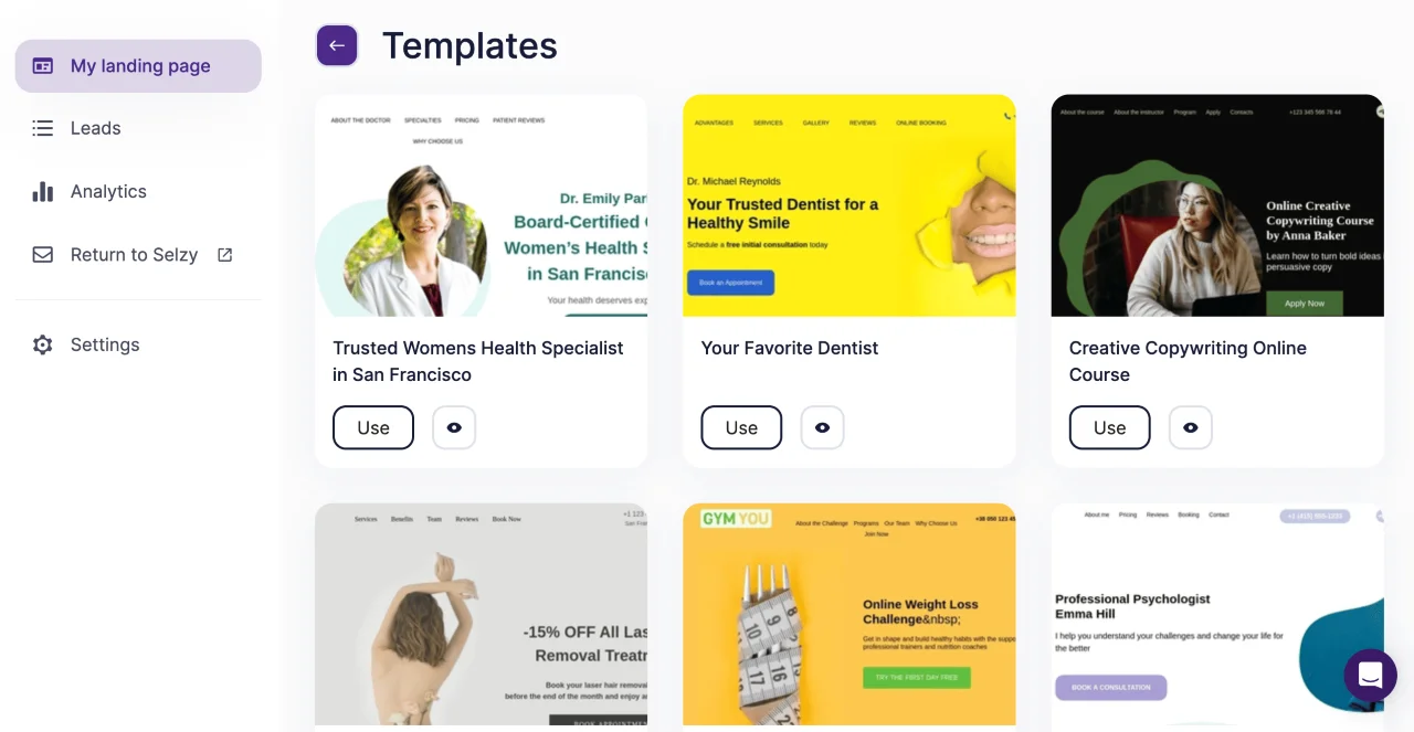
Get inspiration from your competitors or look at our newsletter landing page examples and choose which blocks you need to add to your page.
Alternatively, use a template. Selzy’s free landing page builder has 20+ templates for different purposes and industries. You can choose a webinar, course, or professional services template and customize it to suit your needs.
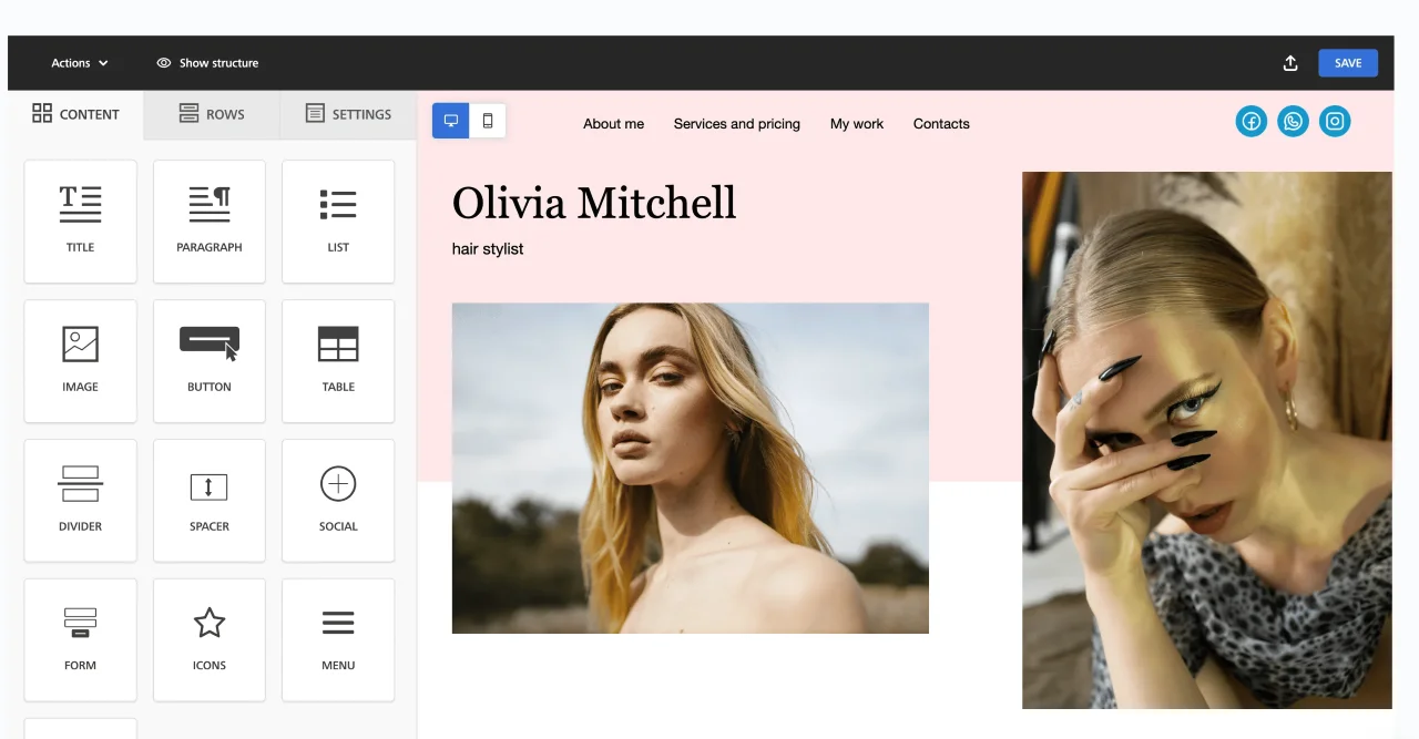
In Selzy’s editor, you can add elements, like buttons, tables, or images, and move them around. It’s also easy to switch between mobile and desktop views with one click.

Step 4: Write copy that immediately communicates value
From the headline to every point you’re making, the writing should be intentional and designed to drive conversions.
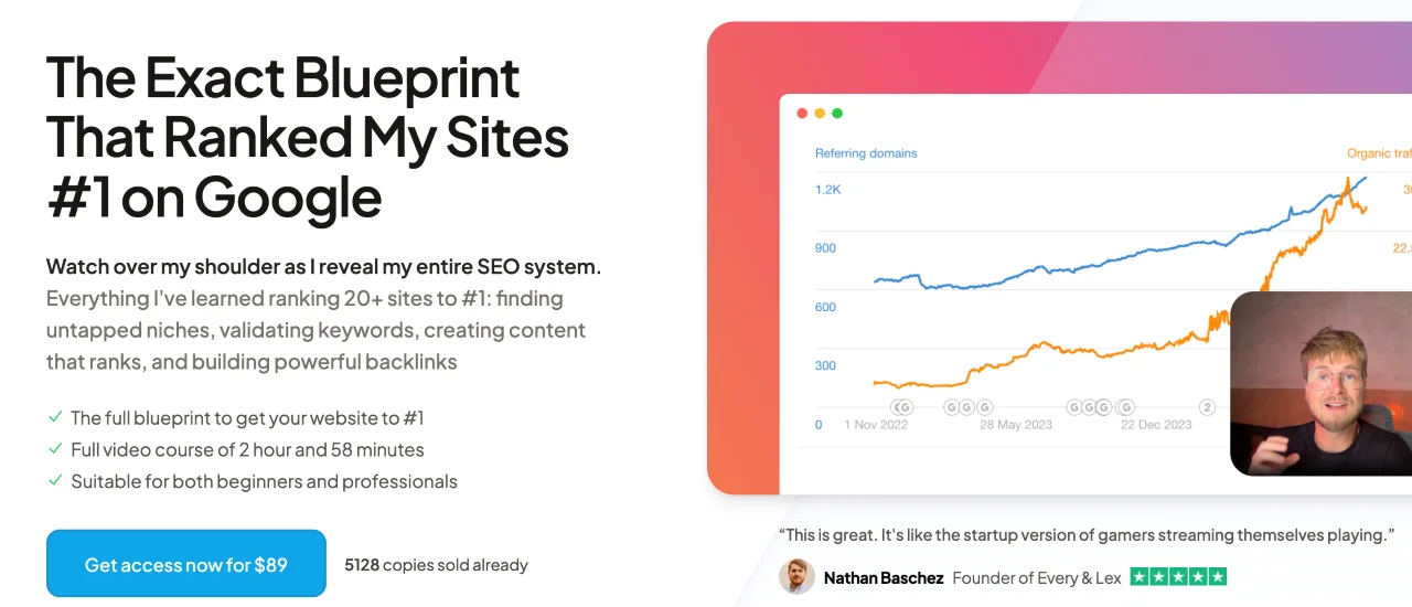
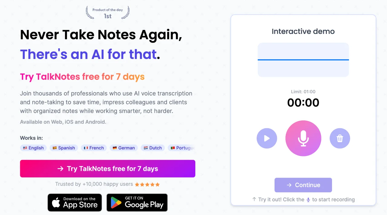
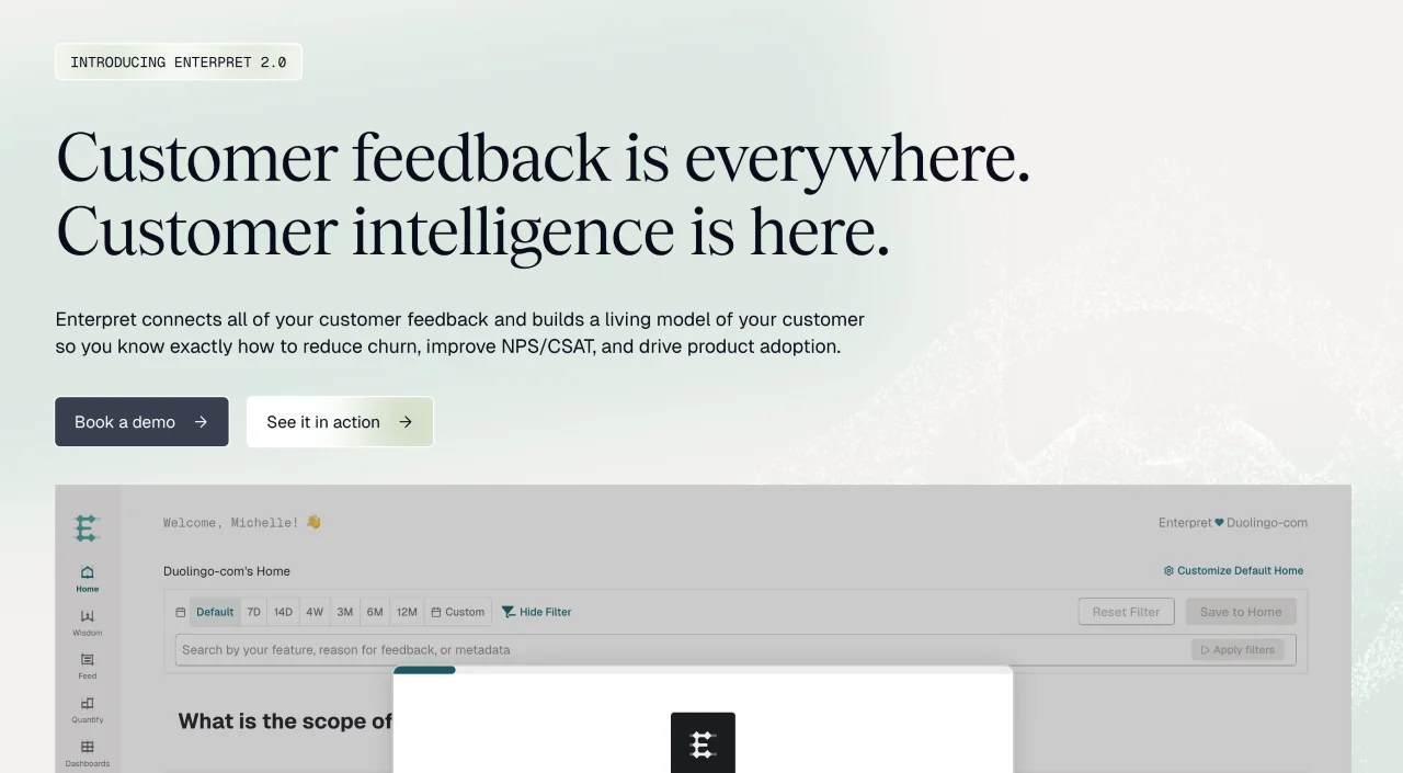
Start with an attention-grabbing headline. This is your first impression, and if the page visitors don’t get what your offer is about right from the start, they will leave, putting all of your efforts to waste. Make sure your headline complements your campaign’s message and gets the value across.
Here are some great examples to spark your inspiration (swipe to see all screenshots):
- “The Exact Blueprint That Ranked My Sites #1 on Google” (Danny Postma’s SEO Blueprint)
- “Never Take Notes Again, There’s an AI for that.” (TalkNotes)
- “Customer feedback is everywhere. Customer intelligence is here.” (Enterpret)
When it comes to the rest of the copy, communicate benefits, not features. What will the customer get out of your product? What’s its use for them? For example, instead of writing “8-unit, 1.5-hour course,” write “bite-sized lessons” or “understand AI implementation in less than 2 hours”.
Stay on brand and follow your style guidelines and make sure it still sounds like your company, through and through.
Last but not least, keep the content single-focused and clear. Every sentence of every paragraph should serve the landing page’s purpose. Don’t waste space on unnecessary content and stick to the message lest you lose your audience’s attention.
Step 5: Come up with a clear and persuasive call-to-actions
CTAs are your heavy-hitters, so use action verbs and give them a prominent design. High-converting pages rely on clear, specific CTAs that leave no doubt about the next step. Make CTAs clear and specific — instead of “Learn more,” write “Schedule the demo call”. Eliminate distractions and ensure that every CTA leads to one target action — if it’s registering for a webinar, every button should guide the user to it.
For longer pages, add several CTAs to capture leads when they are ready to convert. The first one should always be on the very first screen. Others might accompany important blocks, like social proof.
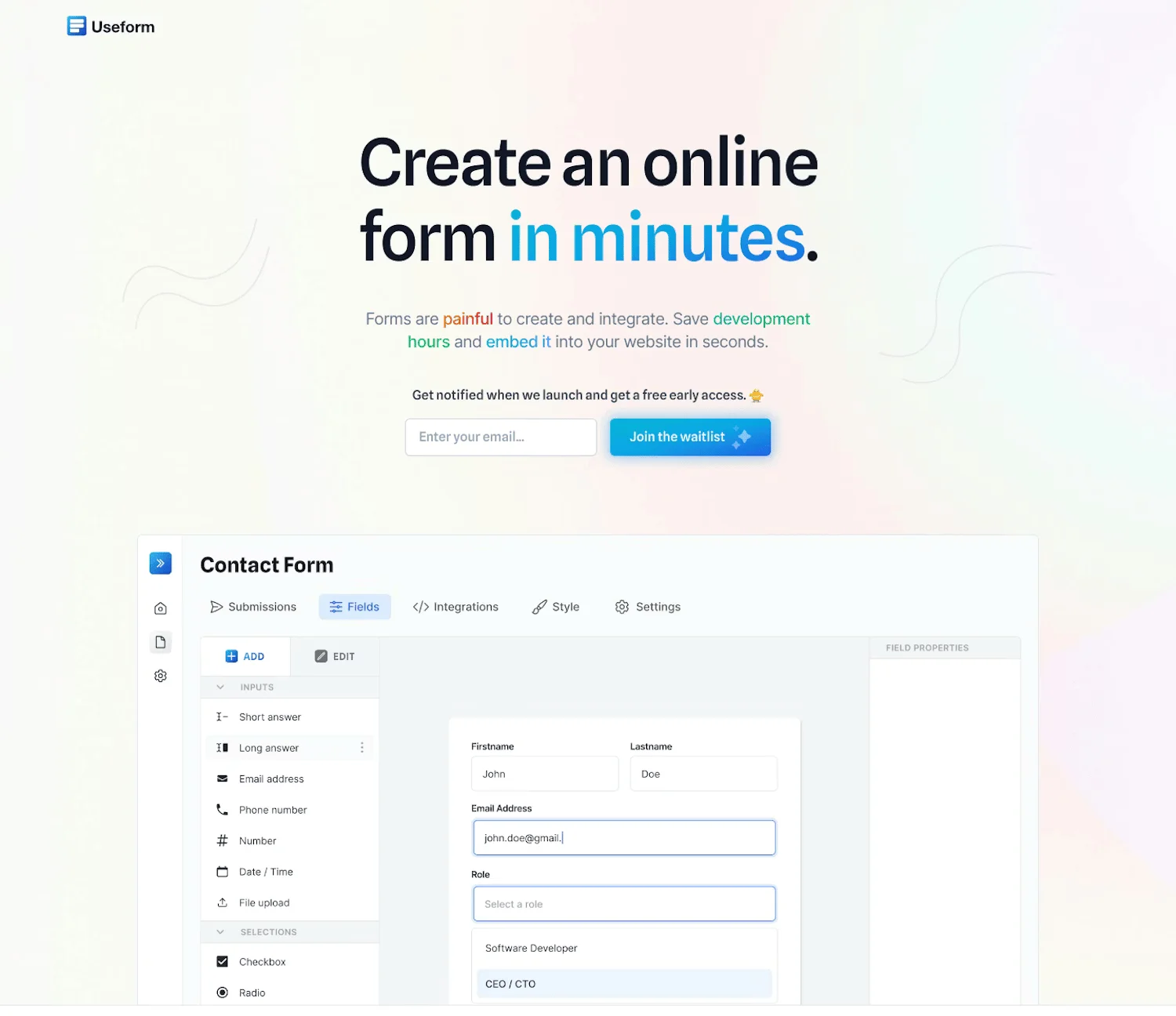
For example, Useform has a CTA to join the waitlist near the headline and one at the very bottom of the page:
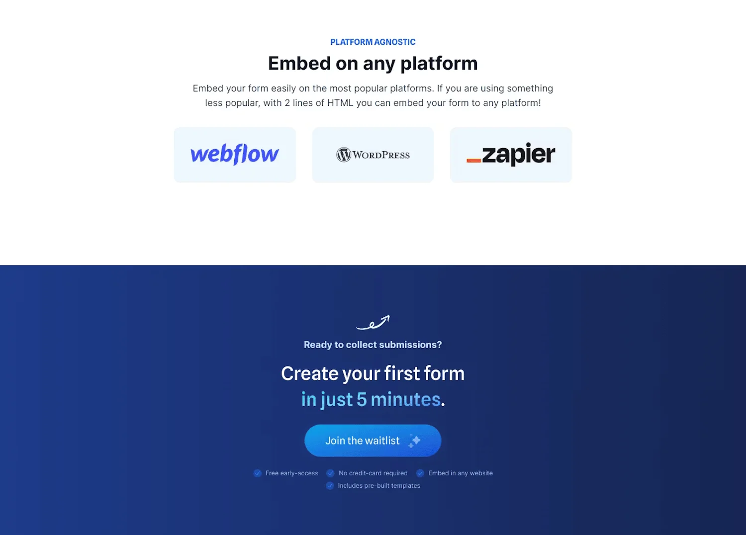
Pay attention to contrast and size and make them noticeable and easy to click.
Step 6: Use effective visuals
Copy is important, but visuals help to convince, too. Whether it’s showing the interface of your tool, your physical products in real life, or the final projects of your course’s students, be intentional about images.
Follow these recommendations for your landing page visuals:
- Keep your visuals big and high-quality. A pixelated image is worth a thousand words, but none of them are complimentary. So get professional visuals to impress your page visitors, especially on mobile.
- Add videos or GIFs to make pages more engaging, but don’t overdo it. They shouldn’t distract from the main goal of the page.
- Use product and company-specific visuals and be authentic. Avoid stock images as much as possible and stick to real photographs or screenshots of your products.
- Communicate product features visually. For example, for digital products, show how informative your dashboards are. For physical products, use lifestyle photography, showing the texture, color, and size.
Step 7: Add trust elements and social proof
Marketers know that people tend to trust other people and authoritative sources. This is why social proof is a standard element of high-converting landing pages. Use this and add real reviews and testimonials to your landing page.
Some companies opt for a simple comment and the reviewer’s photo style for this block, but you can be more creative, too.
For example, here’s the social proof part of a social media content-on-demand landing page:
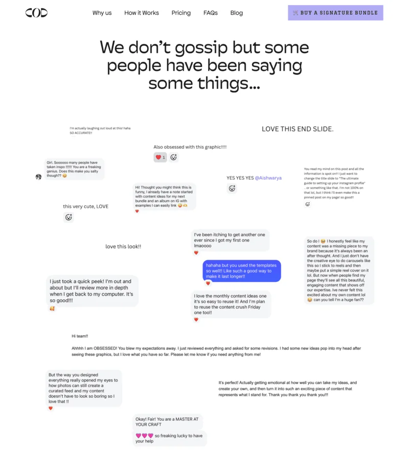
Adding award badges, product ratings, and client companies’ logos is another effective way of building trust. Choose whichever strategy fits you best or use both.
Step 8: Optimize for mobile
Mobile optimization has long been a part of marketing trends, so it’s now a staple for any customer-facing communication. Make sure your landing pages are responsive and look great on both desktop and mobile. You can either do this manually or use pre-made templates, most of which adapt to different devices by default.
Follow the best practice for mobile-friendly design:
- Make your buttons easy to click, meaning big enough and visible.
- Use a single-column layout on mobile or in general.
- Only ask for essential information in the forms — mobile users don’t have the patience to type everything about themselves, especially when it’s not necessary in the situation.
- Test your landing page across several devices and screen sizes, and make sure the page loads fast.
Step 9: Set SEO settings and add tracking
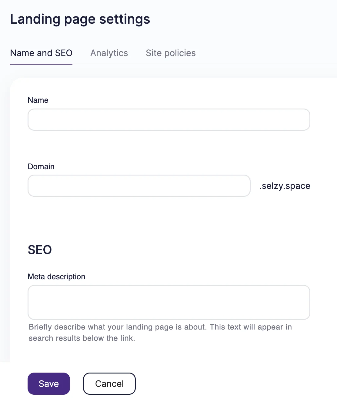
SEO settings are important for the discoverability of your page. Here, you need to choose your landing page’s name and domain and add a meta description.
This step might differ from builder to builder. Here’s what the process looks like for Selzy users. After you finish editing the landing page, you’ll see a handy checklist:
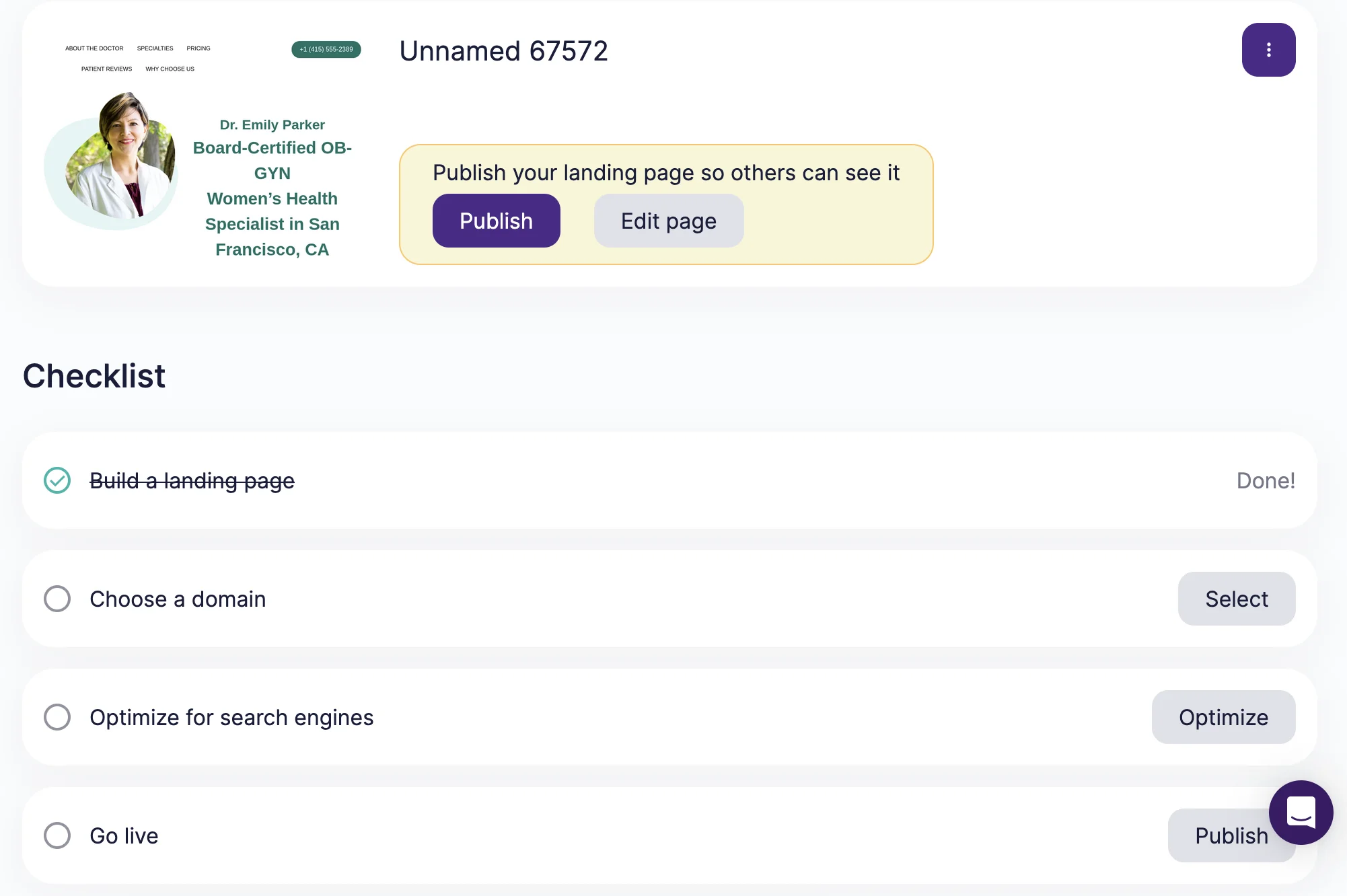
After you click on “Choose a domain” or “Optimize for search engines,” you can connect your custom domain or use Selzy’s free domain. You can also name your page and write a meta description for it. Meta description is the text that appears under the name of your page in search results.
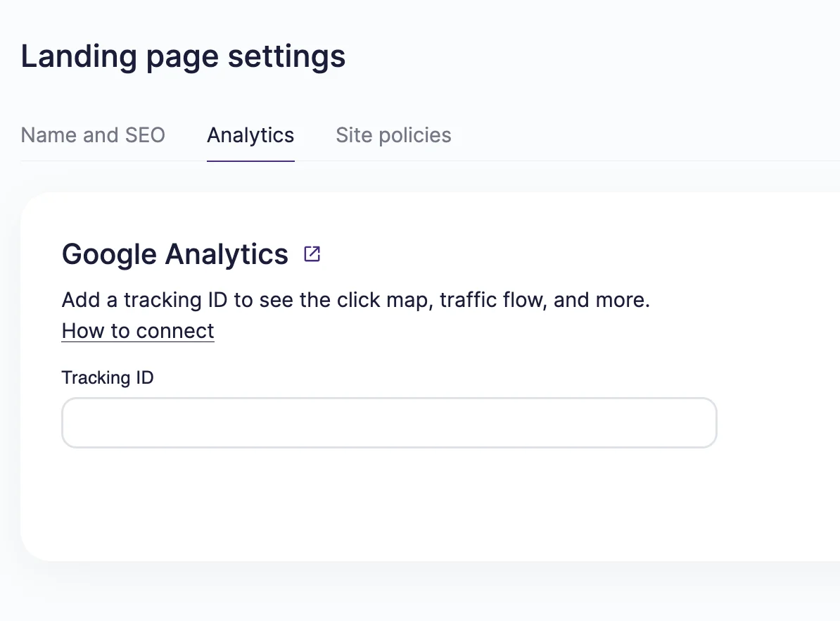
Once you do that, connect your landing page with Google Analytics to get the traffic information and keep track of your results.
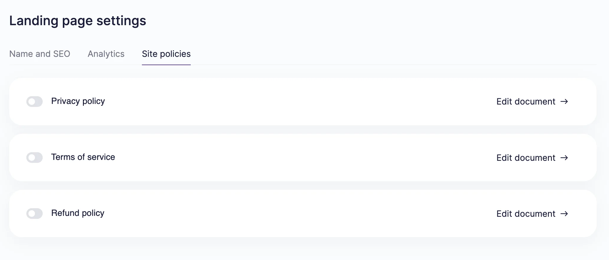
Finally, don’t forget to add the landing page policies: privacy policy, terms of service, and refund policy. These help you stay compliant with legal regulations and inform your page visitors.
Step 10: Preview and publish
When everything is ready for launch, thoroughly test your landing page and its functions across devices. Click on every button, try filling out the forms, reread the copy, and try all features you’ve added to the landing page.
When you’re sure every detail is correct, publish the landing page and link to it in your upcoming campaign.
Landing page design best practices and examples
Let’s examine what you should do to maximize your chances and take a look at other brands’ examples for inspiration. These approaches are commonly used in high-performing landing pages across industries.
Keep the design minimal and focused
Landing pages serve one distinct purpose, and their design should be focused and minimalistic. Don’t overcomplicate the layout or add too many CTAs. If your landing page announces one product launch, don’t try to squeeze in information about your whole lineup.
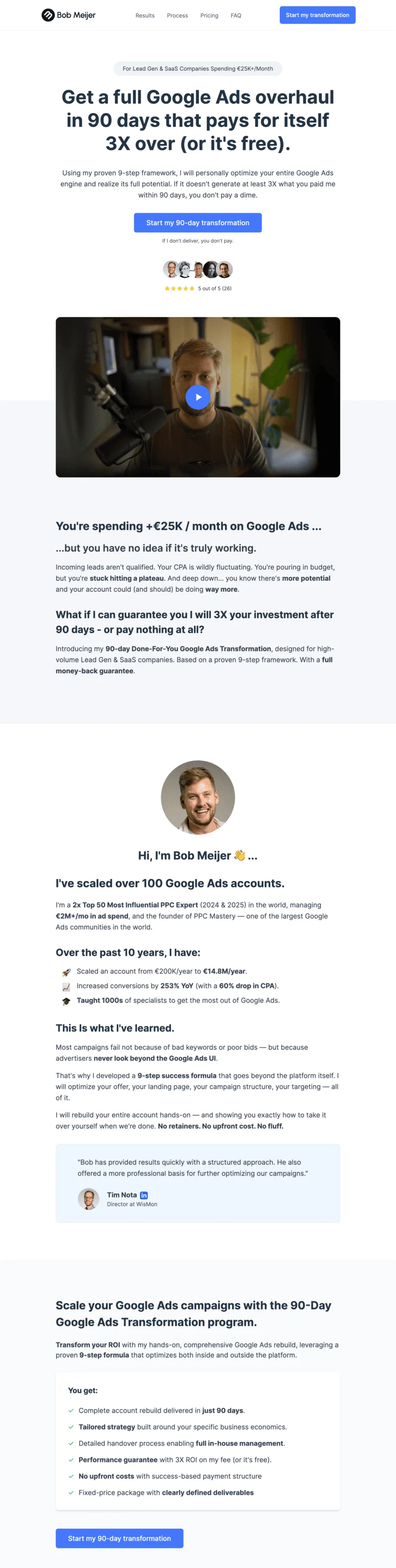
For example, Bob Meijer’s landing page only has one accent color, with the rest kept in a contrasting black and white. Clean and simple!
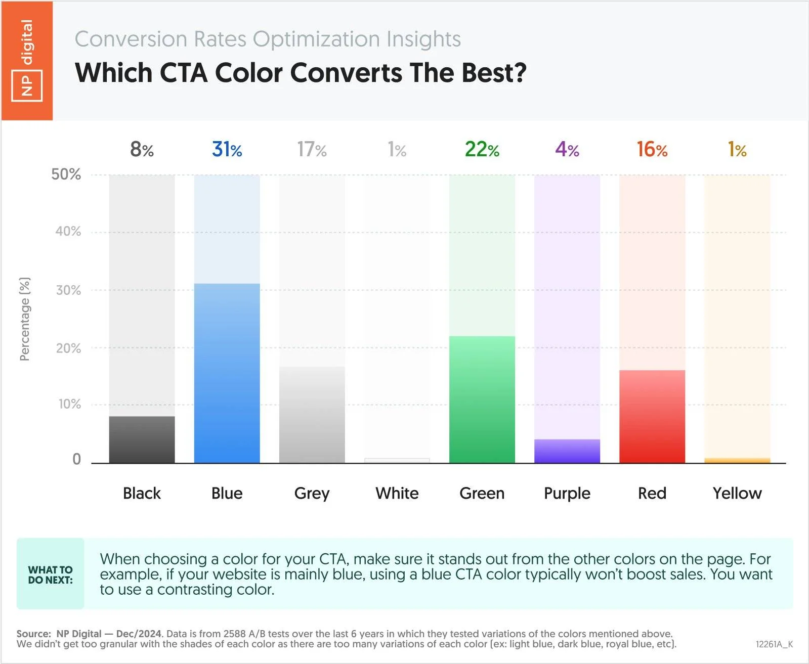
Use color psychology for CTAs
Color has a big influence on the perception of information. For example, blue usually brings up speed or technology, while red and pink are associated with urgency or passion. For CTAs, Neil Patel’s research revealed that blue, green, and red are the top three most converting colors:
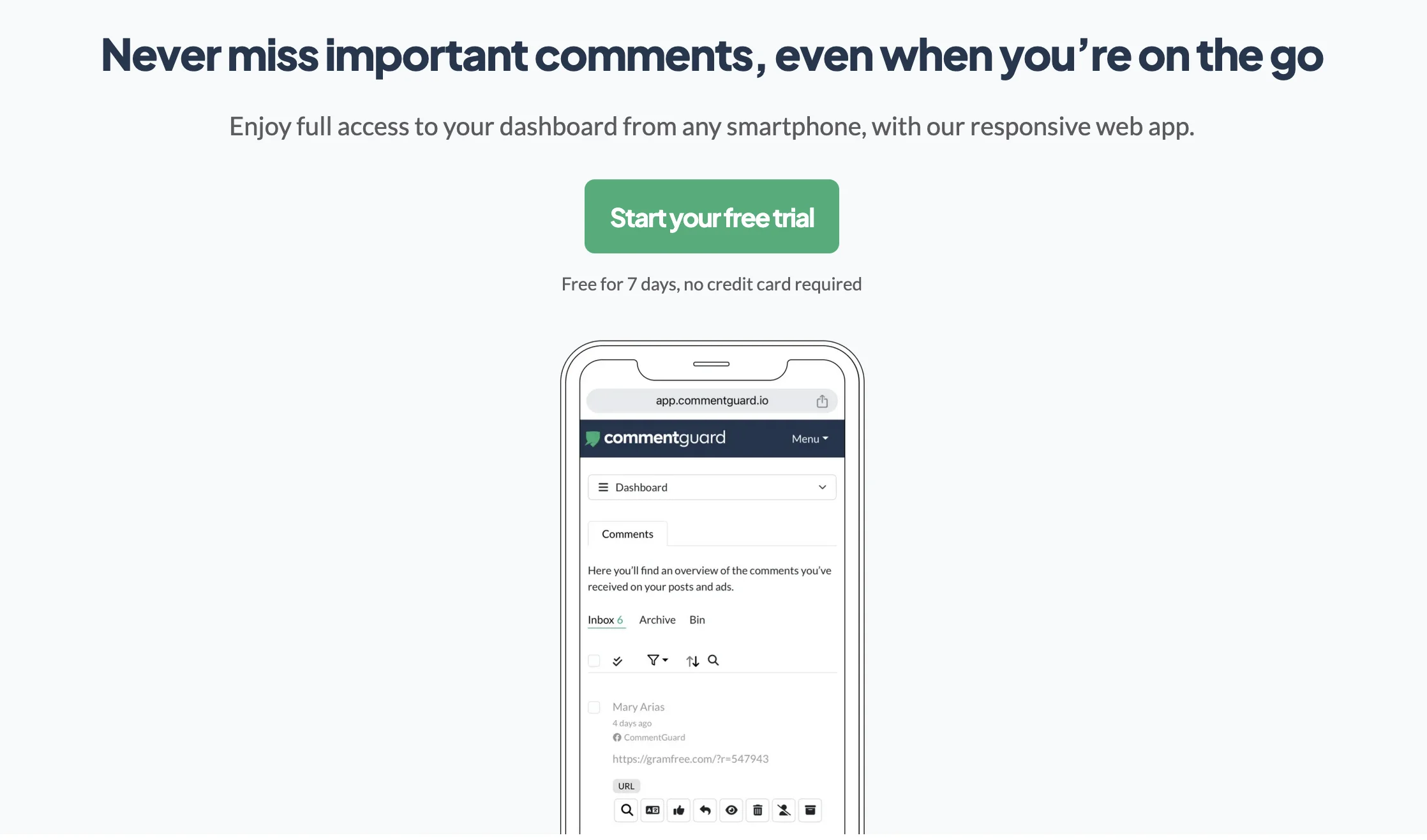
For some real-life examples, Five Pathways uses teal to signify calmness, while CommentGuard uses green for a free trial:
Reduce distractions and navigation
Unlike website pages, your landing page doesn’t need navigation. After all, it shouldn’t encourage exploration, but lead the visitors to take the desired action.
Other distractions include pop-ups and widgets, too many moving elements and interactive elements, or chatbots. If you really need to include these, you can, but keep in mind that the simpler your page, the more effective it is.
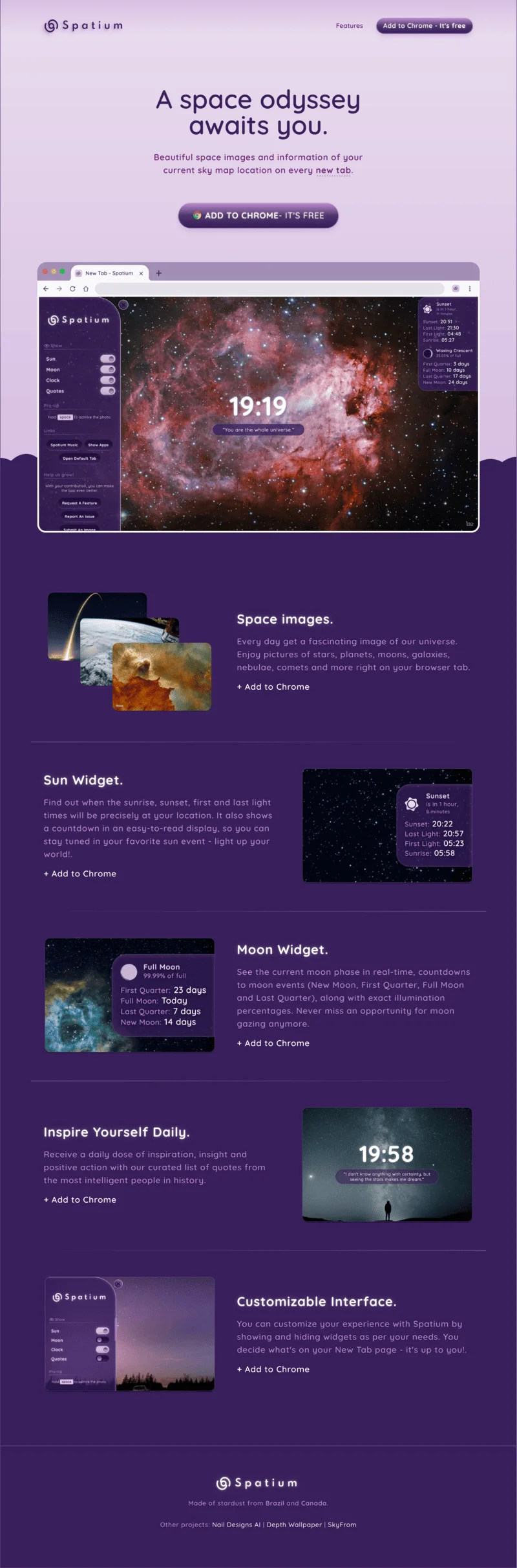
Take a look at the Spatium landing page below. The design is easy on the eyes and uses the shades of one color. All the CTAs are the same, and finish every item description. The page itself is short and gets straight to the point.
Create a strong visual flow
Every landing page, contrary to the name, is a journey. From the very beginning to the very end, it should guide the visitor and inform them. Visuals should bring every section of the landing page together into one coherent narrative.
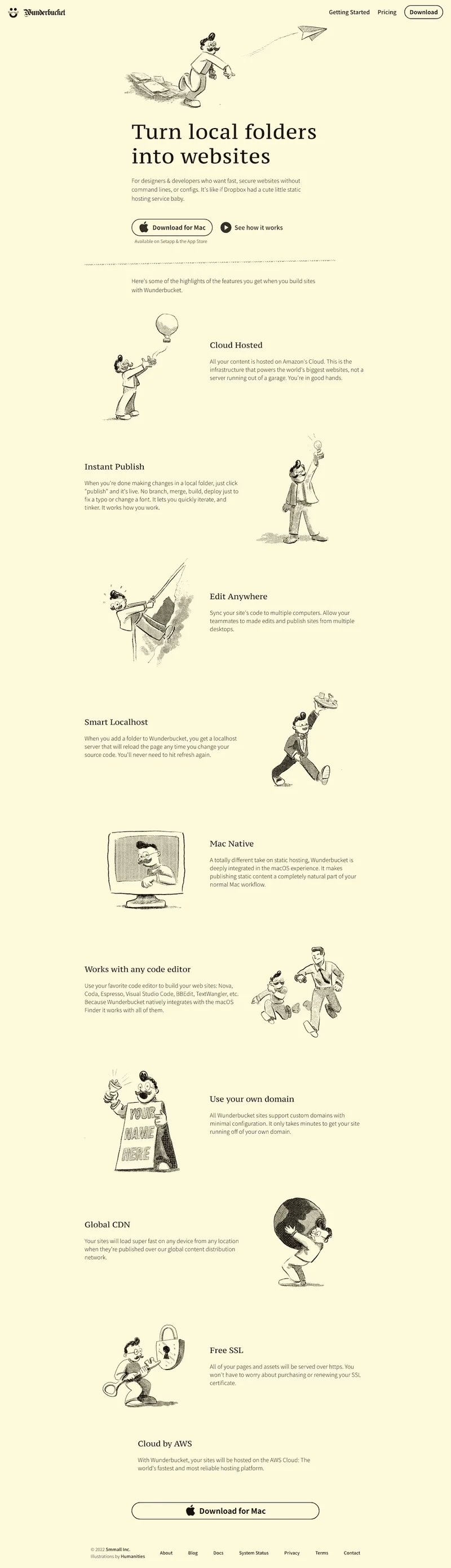
For example, Wunderbucket adopts illustrations that guide the reader through the feature list, making the experience memorable and engaging:
How to optimize a landing page for higher conversions
After you click publish, your work on the landing page is actually not done. Keep improving it to bring better results.
Improve page speed and technical performance:
- Compress images and use WebP or AVIF instead of PNG and JPG.
- Minimize code on your page.
- Reduce plugins and scripts.
- Host large images and videos externally (for example, on YouTube).
Slow loading time is a popular issue for landing pages. It can prevent the page from doing its work and frustrate the visitors instead of streamlining their experience.
Work on the key elements of your page:
- Continuously improve your messaging, visuals, and trust indicators.
- Pay attention to the above-the-fold content and make sure it’s as clear and persuasive as possible.
- Consider the rest of the page: can you add recognizable company logos of your clients? Increase the quality of visuals? Improve the flow.
To truly bring out the best in your landing page, use A/B testing and experiment:
- Get inspiration from your competitors or elsewhere and adopt the techniques you like.
- Come up with hypotheses about the elements of your landing page, the layout, or the messaging. Maybe a punchier headline could work better? Maybe the social proof block could bring more conversions if it’s placed higher?
- Make changes to your landing page and measure the CTR or conversion results. Implement the winning ideas and use these results to guide your next experiment.
FAQ
What’s the difference between a website and a landing page?
A website consists of several pages and can serve many purposes. A landing page is a separate webpage that has one objective and serves as a destination for social media, paid advertising, email, and other campaigns.
What are the elements of a high-converting landing page?
High-converting landing pages need a captivating headline, strong CTAs, social proof, a lead capture form, and consistent messaging that puts customer needs front and center.
Do you need a website to create a landing page?
You can create a landing page without a website using dedicated landing page builders, like Selzy. You can use them with a custom domain or host your pages on the platform’s free domains.
