


Key takeaways
- Having a separate newsletter landing page offers benefits like providing more information, showcasing credibility, driving organic traffic, and displaying branding.
- Elements of effective newsletter landing pages include a clear headline, engaging visuals, concise description, user-friendly opt-in form, and social proof.
- To create a successful newsletter landing page, use a no-code landing page builder, maintain separate branding if necessary, stick to one objective, add an archive section, experiment with calls to action, stay minimalist if needed, and A/B test and optimize.
Unless you’re one of the independent Substack content creators with no room for customizing stuff, you probably have a separate landing page to lure subscribers into your contact list. And if you don’t, it’s time to create one. In case you need guidance, that’s exactly why we wrote this article.
Keep reading for inspiring newsletter landing page examples and tips to make your own as efficient as your competitors’ ones.
Quick answer: A newsletter landing page is a standalone page built to turn visitors into subscribers. The strongest pages explain what readers will get, show proof that the newsletter is worth their inbox space, keep the opt-in form short, and make the CTA specific to the promised value.
Why newsletter landing pages are important for your business
Can content creators and business owners do without a separate page? Technically, yes, since sign-up forms and pop-ups on your main website get new subscribers just fine. However, a separate newsletter landing page has its benefits. It allows you to do more — like:
- Give a sneak peek. Pop-ups are designed to have multiple paragraphs, so you can only give an elevator pitch. Meanwhile, a newsletter landing page can even fit a log of previous issues! Or just a much longer description of what you have to offer.
- Provide more credibility. Landing pages can perfectly fit more info about your business or you as an author, the social proof section, and all it takes to convince your potential subscribers that you’re the real deal.
- Drive organic traffic. Pop-ups are a fleeting thing and a part of your website that is not indexed by search engines in most cases. Meanwhile, a landing page is a separate entity that will get indexed — so, you’ll end up getting free traffic with the right title, description, and the rest of the content.
- Showcase your branding. If you only use pop-up forms to promote your newsletter on a website, you technically can use the newsletter’s unique branding that matches its email template. However, pop-ups don’t have enough space — the branding elements will be more visible on a fullscreen page. Also, if you use third-party tools for pop-ups, you’ll deal with limited customization. Meanwhile, a landing page will let you design everything head-to-toe from scratch!
Key elements of effective newsletter landing pages
We figured out how a newsletter landing page contributes to your subscriber growth and benefits your business. But what makes a good landing page? Let’s take a deep dive!
A clear and compelling headline
The headline is the first thing you see when you visit a newsletter landing page, so it’s your chance to make or break the first impression. While it’s not the only variable that affects conversions, it’s still important. Think of it as an elevator pitch — a headline is a chance to briefly describe your newsletter’s content and why it’s worth subscribing to. If it is, visitors will at least scroll further to learn more.
For a stronger headline, combine the topic with the reader outcome: what they will learn, save, avoid, or become better at after subscribing.
Here’s one of the best examples from The Bagel. The headline briefly and beautifully conveys the newsletter’s value. Why subscribe? To be better than your friends. A bit manipulative, you might say, but it works.
Why it works: The page turns a vague promise into a memorable social benefit. The headline is short, emotional, and easy to understand before the reader studies the rest of the page.

Engaging visuals
If you ask us, we’d say that writing a killer copy is more important than fancy designs — images are simply not specific enough to fully convey the coolness of your newsletter. However, suitable visuals, along with a great copy, can increase your conversions to subscribers drastically.
Images on your landing page can illustrate the copy and become a part of your visual narrative, give a spoiler for the newsletter content, or even just express your brand’s personality — you can use visual content for either of those purposes. Here’s an example of the latter. Milk Road, the popular newsletter about cryptocurrency, has a milk carton mascot. It’s drawn in a style resembling Rick and Morty and [adult swim] cartoons in general, which is clearly a part of Millennial marketing.
![Milk Road newsletter landing page with an illustration of an anthropomorphic milk carton wearing a blue jacket, the drawing style of the illustration reminds the viewer of comic books and cartoons from [adult swim], which is a part of the stereotypical “Millennial culture”](https://selzy.com/en/blog/wp-content/uploads/2025/01/2.png)
By visuals, we don’t just mean illustrations — for example, you can play around with fonts and text layout. Check out this example from Enough Creativity. White stripes with text feel like a newspaper collage or a bunch of Google search inquiry screenshots, and the chaotic layout represents what being overwhelmed and burnt out feels like.
Why it works: The visual style supports the newsletter idea instead of decorating the page for its own sake. Visitors can feel the problem the newsletter promises to address.

A concise description
As we mentioned before, you can get away with simpler designs if you write a good copy. That includes your newsletter’s description. It should be informative enough so people know what to wait for but intriguing enough to spark curiosity in a reader.
A practical description should answer three questions: what topics the newsletter covers, how often subscribers will hear from you, and why the content is different from what they can already find on your website or social media.
Here’s a pretty neat example from People and Blogs.

A user-friendly opt-in form
Congrats, you did it! You caught the visitors’ attention with a catchy headline and great visuals and made them stay with an enticing description. They scroll your newsletter landing page down to subscribe… And that’s where you still have a chance to drop your conversions to zero.
Here’s what you definitely shouldn’t do with your newsletter opt-in form:
- Make it too long. We get it, you need more intel for email segmentation — but please refrain from it now. Would you subscribe to a newsletter that requires filling in a 10-page Google Forms survey just to get a confirmation email? Your potential subscribers wouldn’t do it either.
- Make it barely readable. Not enough contrast between the text and its background, wrong font choices for the sake of aesthetics, the unclear UI copy — all these make your sign-up forms less readable, inaccessible, and just not converting.
Most opt-in forms on landing pages look like this — the design is quite simple, and they don’t ask you for your mother’s maiden name or other too-personal information.
Why it works: The form keeps the decision small. When the page has already explained the value, asking for only essential information makes subscribing feel low-effort.

Social proof
Many people think the social proof is a bunch of positive reviews published on a landing page like this:

You’re not wrong if something like this is your first association. But it’s not the only way to show that your newsletter is legit and worth reading. Take a look at this newsletter landing page:

First things first, visitors will look at this number and think “65,289 people can’t be wrong, so this newsletter must be good!”. Secondly, the word “like-minded” creates the image of a community, and people like being a part of something bigger than themselves. So, if you have a decent followership but don’t feel like asking everyone for reviews, simply mentioning the number is social proof on its own.
Newsletter landing page checklist
Use this quick checklist before you publish or redesign a newsletter landing page:
| Element | What to check | Why it matters |
| Headline | It names the newsletter promise or audience in one clear line. | Visitors should understand the value before they scroll. |
| Description | It explains topics, frequency, and the benefit of subscribing. | Specific expectations reduce hesitation and low-intent signups. |
| Opt-in form | It asks only for the data you need at signup, usually an email address. | Shorter forms remove friction and keep the page focused on conversion. |
| Proof | It includes subscriber count, testimonials, issue examples, or brand credentials. | Proof helps visitors trust that the newsletter is worth joining. |
| CTA | The button copy reflects the value, not just the action. | Value-led CTAs can feel more persuasive than a generic “Subscribe”. |
One way to obtain social proof is by sending surveys to subscribers you already have. Learn how to embed a survey in an email in the Selzy blog.
How to create a newsletter landing page that works
Now that you know both mandatory and optional elements of a decent newsletter landing page, let’s figure out how to build one that will bring you hundreds of new subscribers.
Choose a no-code landing page builder
Similarly to no-code email builders, tools for landing pages allow you to build beautiful web pages by dragging and dropping headers and buttons — in no time! Even better, many tools have pre-made landing page templates that are already responsive, so you don’t have to do mobile optimization manually.
There are tons of amazing tools on the market, and a lot of them have seamless integrations with bulk email software. For example, Selzy integrates natively with Wix, WordPress, and Squarespace.
Use separate branding — if needed
Let’s say, your emails go beyond the “Grab your discount” type of messages. Aside from these, you also create long-form, content-heavy emails that include interviews with experts in your industry, case studies, and so on — it’s basically a magazine in the email format! In this case, using separate branding for all things related to your newsletter is a good idea since your emails are a standalone thing.
If you develop a separate design for your newsletter landing page, you’ll be able to:
- Make your newsletter landing page consistent with your email templates.
- Promote your newsletter as a thing on its own rather than a promotional tool for your main business.
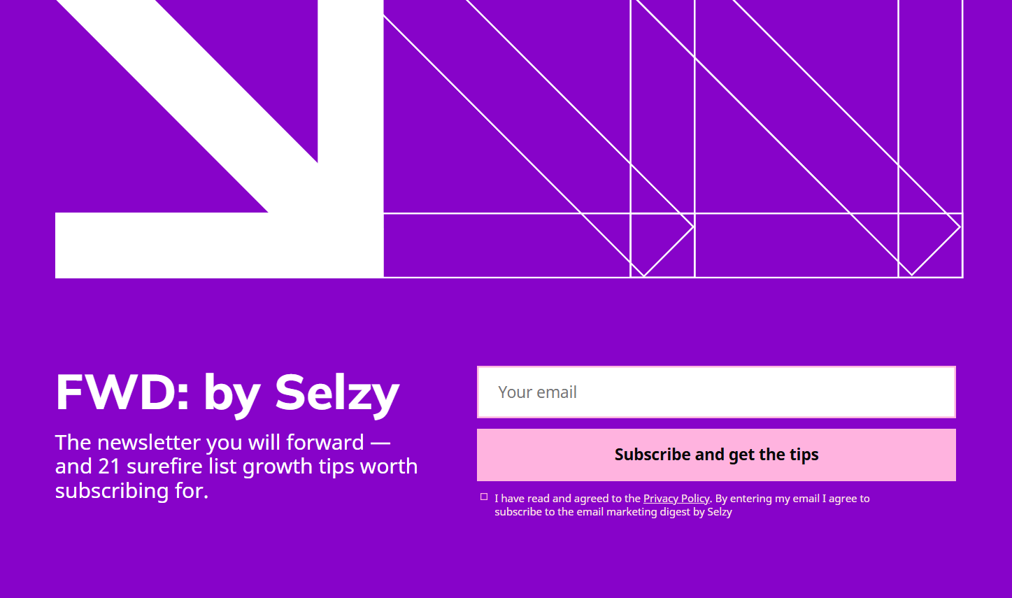
However, you can use your main branding as a starting point. For example, that’s what we did with FWD: by Selzy. One of Selzy’s main brand colors is purple, so we used purple in the landing page and email design, just a different shade.

Stick to one objective
The main goal of your newsletter landing page is to convert visitors into subscribers, and that’s it. Don’t try to sell anything in addition to your newsletter or add extra CTAs — too many messages will get your visitors confused and overwhelmed by your requests.
Another thing to remember in this regard is that every element of your landing page should work on that specific goal: from catchy headlines to reviews and credentials. So, before you even start creating the landing page content, think of what’s so special about your newsletter that will get people to subscribe — and don’t be afraid to show it!
Add the archive section
Some people hesitate to subscribe even when you offer them a lead magnet — what if your newsletter is not as good as you promised? To combat that hesitation, add the archive section to your landing page.
It doesn’t have to be large and fancy. For example, the FWD: by Selzy landing page only includes simple links to the web versions of the three latest issues. Large enough for a taster!

Experiment with calls to action
The no-brainer solution for a newsletter landing page CTA button copy would be “Subscribe” or something synonymous. While such CTAs are perfectly acceptable, making yours a bit more interesting and specific can lead to better results and more conversions.
One strategy you can use is to link your opt-in form CTA to getting a certain value out of a subscription instead of subscribing alone. In the case of the Design Hacks newsletter, the value is getting design hacks, hence the CTA.

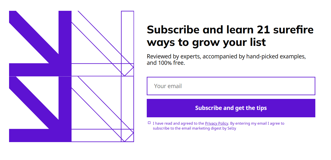
Another strategy is to link your CTA to getting a value out of the lead magnet. Here’s what we did with the FWD: by Selzy landing page CTA. The lead magnet is a list of 21 expert-reviewed tips to grow your list, so the call-to-action invites subscribers to get the tips in question.
Stay minimalist — if you want to
Before you start working on a newsletter landing page with a bunch of sections from social proof to past issues, ask yourself first: Do I need all these bells and whistles?
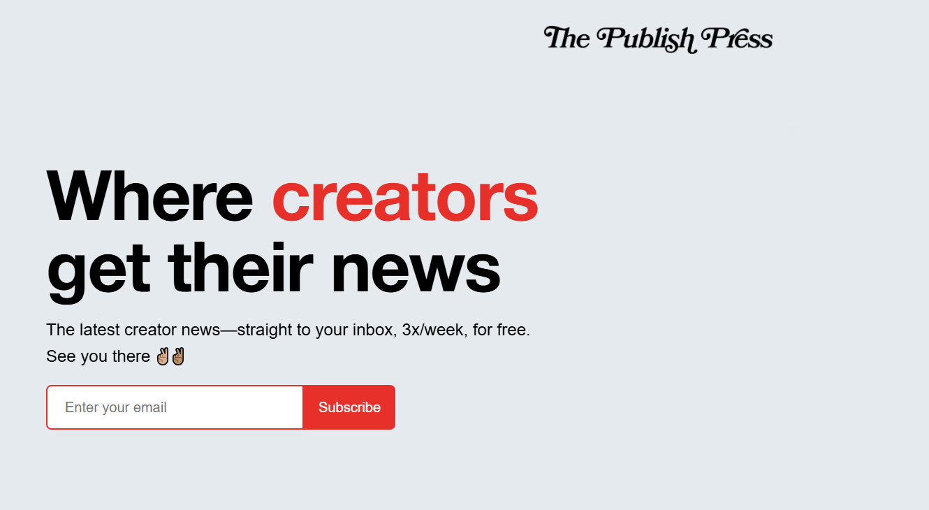
While all this extra content is good to have (we wouldn’t mention it otherwise), most newsletter landing pages you’ll find online are simple squeeze pages that only have a headline, an optional illustration of some kind, a brief description, and a sign-up form. Truly, that’s all you need for a newsletter landing page to function!
Here’s a great example from The Publish Press — yep, that’s the whole page.
A/B test and optimize
We wish we had a foolproof recipe for a perfect newsletter landing page. However, like many things in life and marketing, it all boils down to testing, testing, testing. On your landing page, you can test anything from headlines to CTA copies, and all sorts of designs and templates.
Testing landing pages is a bit trickier than A/B testing emails. Some landing page tools have an in-built testing feature — for example, Leadpages. Others will require you to use third-party software for that. AB Tasty, Optimizely, Contentsquare, and other apps with similar functionality will help a lot!
Newsletter landing page patterns to copy
Most good newsletter landing pages use one of several proven patterns. A squeeze page works when the newsletter promise is simple and the audience already knows the brand. A sample-issue page works when readers need to see the editorial quality before subscribing. A community proof page works when your subscriber count, expert contributors, or testimonials are strong enough to reduce doubt. And a lead magnet page works when the fastest path to signup is a useful downloadable resource, checklist, or email course.
How to choose a no-code newsletter landing page builder for your needs
Let’s say, you decided that your newsletter needs a landing page for promotion. While you’re thinking of the content, it’s time to find a landing page builder that will make your dreams come true.
Here’s what you should consider while choosing:
- The software you’re already using. The most important integration you’ll need is your email software — contacts from your landing page should transfer directly to your ESP so you don’t have to do this manually. Other useful integrations include analytics software, A/B testing tools if your builder doesn’t have this feature, a CRM system, tools for social media ads, and whatever else you may need.
- Features and templates. Maybe you have a very complex and artsy design in mind, so you may need a builder with a lot of customization options. On the other end of the spectrum, you may want to look for a builder that already has one or more newsletter landing page templates so you save time by not building everything from scratch.
- Form and ESP integration. Check how the builder passes new subscribers to your email platform, whether it supports double opt-in, and how easy it is to tag or segment people based on the landing page they used.
- Mobile editing and page speed. A newsletter landing page often gets traffic from social media and email links, so mobile layout and load speed matter. Make sure the builder lets you preview mobile pages and keep heavy visual elements under control.
- Analytics and testing. Built-in conversion tracking, simple A/B testing, and analytics integrations make it easier to understand which headline, lead magnet, or CTA actually brings subscribers.
- Pricing. Many tools have generous free plans that will allow beginners in email marketing to quickly craft a landing page for the very first subscribers. Others may have limited page design customization or other features, force you to include the tool’s branding on the website, or not allow you to change the landing page address. You should also consider your budget since you may be already paying for other marketing tools.
Can’t choose a landing page builder? Check out Selzy’s selection of the best landing page builders, all set and ready to boost your conversions.
FAQ
FAQ
What is a newsletter landing page?
A newsletter landing page is a separate page designed to persuade visitors to subscribe to your email list. Unlike a pop-up, it can include a longer description of what the newsletter offers, past issues, social proof, and stronger branding. It also gives you a dedicated page that can be indexed by search engines.
Why use a separate newsletter landing page instead of only a pop-up or form?
A separate landing page gives you more room to explain the value of subscribing, which can help convert visitors more effectively. It can also build credibility, showcase your branding, and attract organic traffic because it is a standalone page that search engines can index. Pop-ups can still work, but they are more limited in space and customization.
What are the key elements of an effective newsletter landing page?
The article highlights a clear, compelling headline as the first priority, since it quickly explains what the newsletter is about and why it is worth subscribing to. It also emphasizes engaging visuals that support the copy, show off the newsletter’s personality, or preview the content. Together, these elements help visitors understand the offer and keep scrolling.
Should a newsletter have its own brand and design?
Yes, a separate landing page makes it easier to showcase a newsletter’s unique branding from top to bottom. While pop-ups can match an email template to some degree, they usually do not offer enough space or customization to present the brand fully. A dedicated page gives you much more control over the look and feel.
What should you test on a newsletter landing page?
You should test the parts that affect first impressions and conversions most, especially the headline and the overall presentation of the offer. Since the headline acts like an elevator pitch, different versions can change whether visitors keep reading. Visuals and copy are also important to test because they shape how clearly and convincingly the newsletter is presented.
How do you choose a builder for a newsletter landing page?
Choose a builder that gives you enough flexibility to design the page from scratch and match your newsletter’s branding. The article stresses the value of customization, since third-party pop-up tools can be restrictive. A good builder should make it easy to create a full-page layout with strong copy, visuals, and supporting details.

 New and noteworthy on our blog
