Recap of Email Camp MessageMania 2024 — Highlights and Insights

Recap of Email Camp MessageMania 2024 — Highlights and Insights
01 November, 2024 • ... • 9 views
Selzy Team
by Selzy Team

Welcome to our recap of Email Camp MessageMania 2024! This year’s event brought together email professionals to explore the latest trends and strategies in email marketing.

From keynotes on what has been going on with email deliverability to getting down to advanced localization and multilingual campaigns, you can use this information to elevate your email campaigns. 

So, grab a drink and buckle up for a long (but insightful) journey!

The Prize Fight: Claim your winnings with email ROI

Jessica Best, Owner & Chief Strategist at Better Ave

A card with a quote saying “You could increase your ROI by 20%, just by getting to people you already thought you were sending to.”
Source: Selzy

Consider this: 17% of legitimate emails don’t make it to the inbox. 

Consider also: email has the highest ROI of any channel — $20-100 for every dollar spent (according to Jessica Best’s experience for the last 15 years).

How to explore its full potential?

  1. Improve inbox placement — to get results from subscribers you’re already sending to.
  • Get your authentication in order.
  • Make your templates meet CAN-SPAM and GDPR requirements.
  • Automatically unsubscribe those who opt out and remove hard bounces.
  • Throttle sending to safe levels.
  • Ask permission before adding subscribers to your lists.
  • DON’T BUY EMAIL LISTS.
  • Create good, consistent and valuable content. Avoid all-image emails and go easy on CAPS and !!!.
  • Don’t send too much (so that open/click rates dwindle) but don’t send too little (less than monthly).
  • Send at different frequencies to different types of subscribers engagement-wise.
  1. Reactivate or trim inactives — to reduce wasted spend/efforts.

When you spot inactive subscribers, re-engage them explicitly or subtly using a campaign that consists of three emails and send it every 3 months/6 months/20 sends, depending on your buying cycle. After that, remove those who didn’t engage to cut your losses, but send an “see you” note first (you might still retain some of your inactive subscribers!).

  1. Launch automated emails that drop at the most relevant time for each subscriber.

Introduce welcome emails or campaigns for when people are more likely to celebrate something or interact with your brand.

  1. Segment your audience — to send more of what subscribers want as often as each segment wants it.

Collect data and use it wisely to make your emails more relevant and raise response rate and ROI.

  1. Create a (feasible) testing strategy so you know which of your campaigns are the real champs and who should be cut from the team.

Test different marketing and messaging mechanisms, not just adjusting copy or button color. Test 10 things a year/one thing a month.

Knocked out of the inbox: Are you an accidental spammer?

Travis Hazlewood, Head of Email Deliverability at Ortto

A card with a quote saying ‘The spam folder isn’t your enemy. It’s a friend telling you the hard words you need to hear: 'You’re not doing your best’.”
Source: Selzy

Definition of spam has evolved over time. It’s now not just about unsolicited, but also malicious and even just irrelevant messages. It is anything that’s not explicitly asked for, what subscribers are no longer engaged with, or offensive and annoying. In other words, content that earns either apathy or outrage.

Are you a spammer? Even if you use double opt-in and send 100% legit emails, a lack of regular engagement from your audience can make you one. 

Spam folder red flags:

  • Positive engagement drop: open rates drop by 10% or are already below 18% + CTR rates drop by 1% or are already below 0.5%.
  • Negative engagement rise: unsubscribe rate averages above 1% + complaint rate averages above 0.1%.
  • Conversion drop: normal conversion trends drop significantly.

How to get back into the inbox:

  • Remove those without permission: anyone lacking consent needs to go. 
  • Set captchas on your sign-up forms: to protect your forms from spambots.
  • Send only to the most recently engaged: subscribers who either signed up or engaged in the last 90 days.
  • Later, ramp up to the less recently engaged: subscribers who either signed up or engaged in the last 180 days. 
  • Re-engage the longer unengaged afterward: subscribers who last engaged with an email between 180-365 days. 
  • Sunset the long-term unengaged: subscribers who have not engaged in 365+ days. 

How to stay in the inbox:

  • Honor preferences early: make sure audiences align with content expectations and build a robust preference system.
  • Engage subscribers meaningfully: personalize content and prioritize triggered content.
  • Maintain your lists proactively: build engagement-based audiences and automate subscriber lifecycle. 

List hygiene tactics for a clean sweep

Ashley Rodriguez, Deliverability Engineer at Sinch Mailgun

A card with a quote saying “Good email list hygiene is effective at helping with your costs.”
Source: Selzy

Think of email list hygiene as the practices you implement to keep your email list healthy and engaged. A well-maintained list is made up of people who actually want to hear from you, which is crucial for driving traffic and conversions.

When your email hygiene is poor, you might experience higher bounce rates, more spam complaints, and a drop in engagement. This not only affects your campaigns but can also put your domain and IP at risk of being blacklisted.

Good email hygiene leads to better deliverability, higher open rates, and an improved sender reputation. All of this translates into enhanced engagement and ultimately more sales.

Here are some effective strategies for cleaning your lists:

  • Regularly remove inactive users: if someone hasn’t engaged with your emails in a while, it might be time to say goodbye.
  • Use confirmed opt-in to ensure that the people on your list genuinely want to be there, reducing the chances of spam complaints.
  • Use verification tools help you catch typos or invalid addresses before they become a problem.
  • Re-engage at a later time: send customized and personalized campaigns to win back inactive subscribers. 

Best practices for list building:

  • Quality over quantity: it’s better to have a smaller list of engaged users than a massive list filled with unresponsive addresses.
  • Permission-based opt-in: always get permission before adding someone to your lists. It builds trust and reduces spam complaints.
  • Provide value to subscribers: make sure every email you send offers something worthwhile.

Segment your attack:

  • Personalize: tailor your messages based on user behavior and preferences.
  • Analyze: keep an eye on engagement metrics to see what’s working and what’s not.
  • Organize: group your subscribers based on their interests or preferences.

Maintain your victory list:

Finally, don’t forget to maintain your “victory list”. Tools like Google Postmaster can help you monitor your sender reputation and deliverability rates. And always keep yourself updated on legal requirements like CAN-SPAM and GDPR to ensure compliance.

Tag-team match up: Email marketing and spam filtering vs. scammers and spammers

LB Blair, Chief Strategy Officer at Email Industries

A card with a quote saying “Good spam filtering is what ensures email remains a relevant communications channel.”
Source: Selzy

Scammers are always there, aiming for maximum financial gain with minimal effort on their part. 

In fact, a staggering 91% of hacking attempts start via email. Scammers employ various techniques, including phishing, pre-texting (trying to infiltrate existing business communications), sketchy websites, infected documents, copycat sites, and even blackmail. 

So how do we protect ourselves? Enter spam filters.

  • Registrar: they check the age and reputation of a domain and see how similar it is to known abusive domains.
  • DNS host: if your DNS host is filled with domains sending spam emails, that’s a red flag.
  • Web host: a reliable web host should provide adequate security protections.
  • Trap networks: they consist of email addresses and domains that report unsolicited traffic.
  • Blocklists: these track IP addresses and domains considered untrustworthy based on spam traps and other signals.
  • User behavior: do your campaigns get positive or negative engagement?
  • Content analysis: if your content references or contains links to malicious sites, or has UX risks (like oversized images), that’s a concern.
  • Pattern matching: does your content resemble known malicious patterns?

How do spam filters benefit email marketers? 

  • Safety: they protect us from spam and scam attacks which is key to protecting user experience. 
  • Reliability: without effective filtering, users might abandon channels where they’ve had bad experiences, much like what happened with phone calls.
  • Relevance: by filtering out correspondence, users save time and enjoy a better experience.

What if you are falsely accused as a spammer? Don’t panic!

  • Collect data: use tools like Postmaster Tools, email hygiene tools, ESP bounce logs, and DMARC monitoring to gather information about the issue.
  • Assess: identify which providers are having issues and look for patterns or root causes.
  • Remediate: reach out to blocklists and relevant postmasters, fix any content issues, and collaborate with your design and IT teams to audit your infrastructure.

Spam filters might seem like our opponents, but they provide us with continual support. By understanding how they work, we can create a safer and more effective email marketing environment together.

3 Dos and don’ts for email geek heavyweights

Greg Zakowicz, Sr. E-commerce Expert at Omnisend

A card with a quote saying “Your email addresses are the legs that feed the wolf.”
Source: Selzy

Dos:

  1. Use email automation. In 2023, it brought 41% of sales while being only 2% of sends. With that, three automated email types are responsible for the majority of the sales: welcome messages, browse abandonment, and cart abandonment. Bonus type to use — back-in-stock emails.
  2. Use social proof and value-adds in all your messaging: star ratings, testimonials, top-rated products, featured best-sellers, back-in-stock products. Value-adds are qualities that separate your company from a competitor or draw your company on par with it: shipping cost and speed, return policies, satisfaction guarantees, product attributes (US-made, organic, etc.), loyalty programs, customer service.
  3. Grow your SMS list. Add SMS messages to your email automation, these channels complement each other well. SMS is a tool that can offset email unsubscribes and reduce retargeting costs.

Don’ts:

  1. Don’t tell your brand story in a welcome email. This was a best practice years ago, but people don’t care about it anymore, that’s not why people signed up, and long passages of text are hard to read on mobile. Apply the customer’s intent, focus on the sale, and introduce your products. If a story is important, link to it or use it as a value-add (family-owned and operated).
  2. Don’t buy email lists. Purchased contacts tarnish your brand’s reputation, tank deliverability, and open you to compliance violations. Instead, use pop-ups, advertise email or SMS-exclusive discounts, create back-in-stock signups on product pages.
  3. Don’t use large chunks of text. You’re selling products, not content, and people want to shop. Instead, keep your text short and sweet, use visuals and text inside images, focus on products and lifestyle, not long descriptions.

Signature moves: Cutting-edge email designs in 2024

Mike Nelson, Co-founder & Head of Growth at Really Good Emails / Beefree.io

A card with a quote saying “Trends are cool. Trends are what popular kids did in high school. But trends will not save your business.”
Source: Selzy

Trends won’t save your business, fix issues with your business before trying to apply trends. Still, trendy designs can help you better communicate your message. 

Principles to follow:

  • Focus on creating a message that is customer-centric and helps with the reader’s problem. Be clear about what email you’re making, why, and for whom. 
  • Make your email delightful and surprising, people should be happy they’ve read it and not annoyed.
  • Take consideration of accessibility on all devices and for all readers. 
  • Treat the inbox as a sacred, personal, and safe space.

Trends to make your emails stand out in 2024 and beyond:

  1. Go big or go home. Make the brand logo the main focus. It’s a way to be more memorable among competitors and have a modern look.
  2. Hard tables. Outline tables in your emails, embrace the boxy look. It might not make sense for minimalist brands, but it gives the message a clear structure.
  3. Celeb cameo. It’s instant access to credibility thanks to the halo effect and a way to make your brand more visible. However, it only works if your customers like this celebrity.
  4. Picture wall. A lot of images, stacked in different ways. This offers variety and exploration. For example, you can show your product at different angles.
  5. Raw and unfiltered. Snap-and-shoot camera style, unpolished, messy photos. This trend embraces authenticity and is deliberately non-AI, nostalgic, and different.
  6. Extra chunky. Make the header text large, bold, in your face. Brands also do this with weird fonts and 3D text. This is popular because a bigger text is easier to read.
  7. Deep and dark. Instead of pastels and colorful designs, use darker background colors. Plus, more people are using dark mode and adopting dark-mode-first design. 
  8. Color blocking. Make parts of content different colors to highlight them. This is now easier with modern email service providers.
  9. Styled letter. Emails that are HTML-designed, but don’t use visuals are a great option if you don’t have a designer or good visuals. It’s also a way to humanize a message.
  10. Hover effects. This brings interactivity, shows where to click, and increases engagement. It’s hard to pull off on mobile but good for web-client users.

Honorable mentions: choose your own adventure (non-interactive quizzes), blurred product photos before launch.

Scaling your email design system for inbox domination

Julia Papanek, Senior Email Developer & Designer at Hims & Hers

A card with a quote saying “Email has always been a space where teams have been asked to produce a lot with very little.”
Source: Selzy

A design system is a set of building blocks and standards that create a unified framework to maintain consistency, reduce errors, and streamline workflows. It offers a set of reusable visual elements that accelerate the design process and allow brands to scale.

Foundation elements often already exist in a digital design system:

  • Logo
  • Grid
  • Typography
  • Color
  • Iconography

Modules are building blocks that are specific to email:

  • Headers (logo and navigation bar)
  • Footers
  • Heroes (hero modules)
  • Secondary modules
  • Spacers

If you are only starting to fill your modules library, audit your top-performing email designs and look for common elements to convert to reusable modules.

After modules, come fully pre-made templates that act as wireframes for your most typically used templates. For example, you can have templates for a letter, reviews, simple reminders, zig-zag type designs, etc.

The last element of an email design system is documentation explaining how to use those elements.

Tips to make your email design system dominate inboxes:

  1. Include character counts in your modular library and pre-made templates. You can also negotiate those with the content team to prevent back-and-forth copy editing.
  2. Create dynamic modules. Use variables (like desktop vs mobile or light vs dark mode) and boolean properties (hide or display elements like image or text). These help to store modules as one dynamic module instead of several ones with slight variations. HTML can be dynamic, too, for example, a footer can have or lack an unsubscribe text thanks to pre-made content blocks in an email service provider. You can also apply Liquid logic depending on an ESP.
  3. Define different design styles for transactional vs marketing emails. Making these email types different improves engagement metrics and streamlines email creation. The differences can include the color scheme, urgency icon, and imagery. 
  4. Create a roadmap for refreshing the design system. For example, create quarterly brainstorming sessions to keep the design system fresh. Invite people from other teams for a new perspective on emails. 

Finding a winner: Experimentation in email A/B testing

Rob Gaer, Senior Software Engineer at Miro

A card with a quote saying “In terms of the process itself, A/B testing is not a straight line, it’s a cycle. There’s no one-and-done.”
Source: Selzy

Miro sends over 35 million transactional and marketing emails per month to over 70 million users. With its broad scope and reach, email is a good experimentation ground.

Why experiment:

  • Solve user problems and improve their experience.
  • Drive growth and business impact.
  • Optimize content for diverse audience segments.
  • Gain insights and learnings.

Why A/B test specifically:

  • To remove confirmation and selection bias.
  • To avoid seasonal discrepancies.
  • To achieve statistical significance which removes doubts from results.

The project team for such experiments includes two marketing managers, a designer, a copywriter, an analyst, a front-end engineer, and a back-end engineer.

The process for A/B testing looks more like a circle than a straight line: 

  1. It often starts with a reason to test — a problem to solve, a new idea, or an insight from a previous experiment.
  2. Hypothesize solution.
  3. Build the variant.
  4. Execute test.
  5. Analyze results, and back to the reason to test.

Miro has a diverse audience across different team roles (product management, marketing, IT, etc.), plan types (free/paid ones), seniority levels (executives, managers, etc.), and use cases (process mapping, strategy & planning, etc.). Each of these users receives a welcome email which makes it a great candidate for A/B testing.

Welcome email tests are based on two segments: new Creators and new Collaborators. Creators are those who create boards and invite Collaborators. They tend to have specific product use cases while Collaborators are using Miro because of the Creator’s use case. 

Many Collaborators don’t do anything in Miro within 24 hours after registration. The Miro team decided to create a welcome email to encourage this user segment’s engagement. 

  1. The first experiment consisted of an optimized CTA placement

The hypothesis was that a higher CTA placement would increase clicks.

This experiment was successful: the variant saw an 8% increase in new Collaborator activity but also a decrease in new Creator activity, and a 2% CTR uplift. The insight after this experiment was that new Collaborators react positively to a clear CTA higher in the email design.

  1. The second experiment was conducted with the hero section

The hypothesis was that a full-width hero design would increase clicks and user engagement on new Collaborators’ part. In the variant, the hero section was expanded and sprinkled with a confetti animation. 

The experiment email variant performed worse than the control version with a regular hero. New Collaborators’ activity decreased by 6% while new Creators’ activity actually increased. Every other metric including CTR, increased. Although a failure, it led to an understanding that the Creator and Collaborator segments behave very differently, so a split welcome flow might be effective.

  1. The third experiment was based on a clearer welcome email structure

The variant email was split into three steps, and the flow was designed differently for the segments of Collaborators and Creators. The success criteria remained an increase in new Collaborator activity on their first session in Miro.

This experiment was a success with both Collaborator and Creator activity increasing as well as a CTR uplift. The insight was that users responded positively to more personalized and simplified content.

How Miro builds these tests:

  • The design system is stored in a self-serve CMS platform.
  • 30+ design modules enable the team to build and test at scale without engineering support.
  • The CMS is directly integrated with the company’s ESPs of choice.

Occasionally, the team needs to test content that requires more customization. To understand whether this is worthy of engineering resources, the team assesses these changes using an effort vs. impact matrix.

The user journey test is set up using the ESP’s journey tool managing the user flow. The segments are randomized into a 50/50 split which is then broken down into subdivisions for each segmented content. 

To conduct transactional email tests, Miro uses Split.io to manage 50/50 audience splits. This service first gets API information from a notification email service, then does the split, then routes the API payload back to the notification email service. This allows for inline testing in real-time in a single transactional template.

The duration of tests depends on the statistical significance, so, essentially, on the sample size. For a larger audience, the run time is shorter, and for a smaller audience, the run time is longer.

When the test achieves statistical significance, the team closes it. Cohorts are analyzed based on activities during the experiment, recommendations are given for the next steps and hypotheses, and the experiment gets cleaned from the template.

  1. For the fourth experiment, the team incorporated Miro board UI elements in the welcome email.

The variant email was designed to have a grid background and cursor designs on the head module. The success criteria were the same — an increase in new Collaborators’ activity on their first session in the product.

The results again were different for new Collaborators whose activities decreased and new Creators, whose activities actually increased. The CTR slightly decreased while the CTR on the hero CTA increased by 14%. The insight showed that including Miro board elements in the welcome email motivates new Creators but creates friction for new Collaborators. 

By that point, the welcome flow was already split, so the experimental version of the email was pushed live for new Creators while new Collaborators continued to receive the original version of that email. 

During these four experiments, previous learnings directed further testing:

  1. The first one showed that users react both positively and negatively to design changes in the hero section.
  2. The second one foreshadowed the fourth one and how each segment might respond to an over-the-top design.
  3. The third experiment proved that branching the line of testing between these distinct audience segments is effective.

After these tests, the experimentation at Miro continues.

As open rates and click rates are unreliable, it’s better to find another metric that the email A/B test is trying to improve. In the case of Miro, this was board activity.

Tag-team Takedown LIVE: Email debrief with Megan and Julia

Julia Ritter, Sr. Email Marketing Manager at Sinch Mailjet and Megan Boshuyzen, Sr. Email Developer at Sinch Email On Acid

A card with a quote saying “People are only going to do what you hand feed them, what you spoon feed them. As long as you put it right in front of their face, they’re more likely to do it.”
Source: Selzy
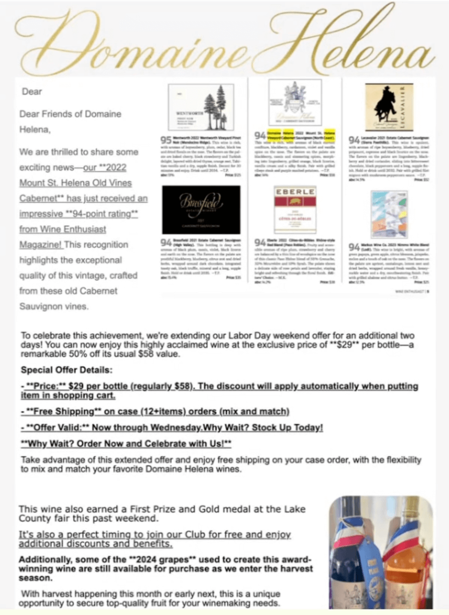
An example of an email by Domaine Helena
Source: Domaine Helena
  • Think about the goal of the email and how to simplify it. With that much text, some underlined, some bolded, it’s overwhelming. People who will receive this campaign won’t understand what to do. 
  • One email should have one goal. Less is more.
  • Segmentation would be a good idea. The email can be different for a segment of people who haven’t bought from the brand and those who did.
  • The email needs more white space. The images can be made horizontal.
  • The format should be more like: an image, some text, and a button CTA.
  • Even if this is a newsletter, break it up into different sections. 
  • The text is small which is inaccessible. The text should be at least 16 pixels.
  • The email’s language attribute should be properly set up (in the code or in the email template from an ESP).
  • The images should have alt-text. It is important not only for screen readers but also because emails being read out loud may become more pertinent with smart devices like Echo and Google Home. Alt-text also helps those users who don’t have their images turned on in the email clients. 
  • The links should be underlined and bolded.
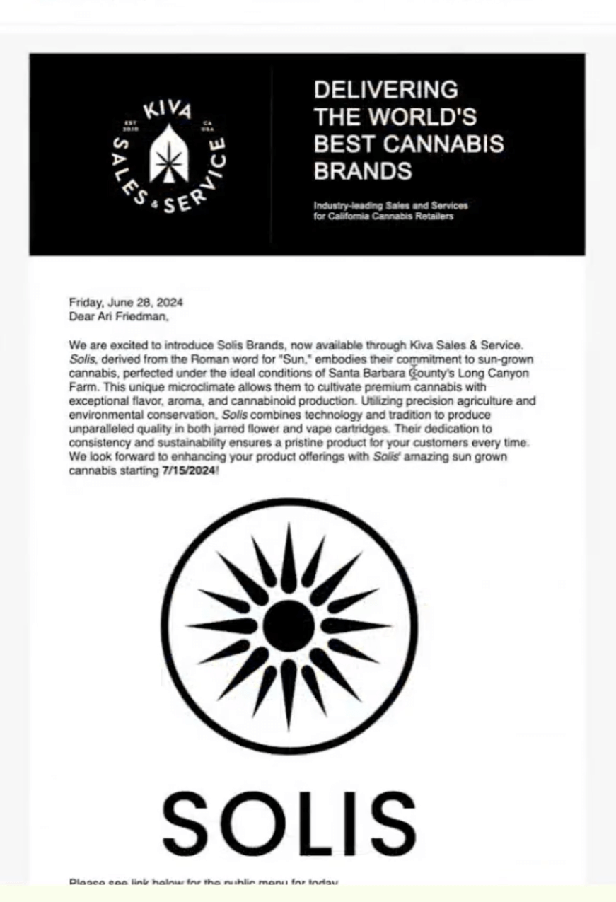
An example of an email by Kiva Sales & Service
Source: Kiva Sales & Service
  • The text needs to be bigger, and the line height needs to be greater as well.
  • A shorter copy is better at decreasing density. The division into paragraphs, bold text, or bullet points can also improve readability.
  • The logo is too huge, and the break between the two sections of the email is too big. 
  • The delivery information can be added to the footer to make it more accessible to people in any campaign they receive.
  • The email lacks presentation roles for the tables which prevents the screen readers from understanding that the tables are used for markup purposes and not to display data.
  • To correctly display the email in Outlook, the width attribute needs to be set.
  • The preheader needs to complement the subject line. 
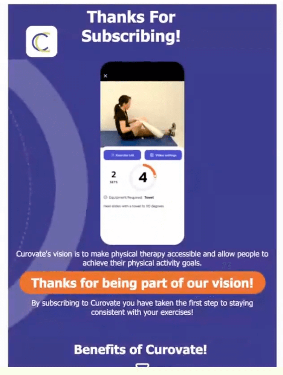
Curovate
Source: Curovate
  • Email code should be optimized to make it less clunky.
  • The heading should be below the logo and not to the side of it.
  • The image isn’t really needed or could be different.
  • The text in orange looks too similar to a CTA button but it isn’t, and that’s confusing to the readers. It should be styled differently. 
  • The copy may be shorter and less redundant. 
  • The three-column layout at the bottom may be broken down so that each column is a row and has a Z-layout: an image and some text to the side. 
  • Links in the footer are a good idea and help readers access different sections of the website more easily. 
  • Personalization in the subject line is a good idea.
  • The last part of the email (an upsell pitch) can be done in another campaign, targeted specifically at those who are the most likely to upgrade and are more active.

The 2024 Email Accessibility report: Championing inclusive communication

Naomi West, Administrator at Email Markup Consortium; Alice Li, Administrator at Email Markup Consortium and Megan Boshuyzen, Sr. Email Developer at Sinch Email On Acid

A card with a quote saying “We’re going to start to see accessibility be a core requirement, similar to how it’s becoming a core requirement on other digital channels.”
Source: Selzy

According to the Email Markup Consortium, in 2024, 99.9% of emails tested had “critical” or “serious” accessibility issues. Only 28 emails from 2 brands out of more than 400 thousand tested had no accessibility issues.

Accessibility was previously seen as an edge case. It seemed like marketers shouldn’t spend a lot of time making the emails accessible to a small percentage of the receivers. However, not only people with disabilities or those who face specific challenges use accessibility tools. For example, some just use a voiceover feature on their Macbooks to hear the emails read out loud because sometimes listening is easier than reading. Plus, as the digital native generation ages, we need to understand how we can continue to access web-based information like email. 

In 2024, the color contrast parameter was added to the Accessibility report. About 17% of the tested emails didn’t pass this test. This highlighted the amount of links that can’t be distinguished from body text because a lot of people rely just on color. At the same time, both types of text need to contrast against the background. An easy fix for that is to just underline the link texts to show that it’s clickable or add a hover effect. Dark mode needs to also satisfy this parameter. 

Two of the most common and most critical aspects to fix are also the easiest:

  • Adding “dir” (direction, like from left to right) attribute inside the body
  • Adding “lang” (language) attribute inside the container within the body tag

Even just adding alt text can easily improve the situation, as well as adding an alt-attribute to the tracking pixels. Read Sarah Gallardo and Dan Oshinsky about alt-text tips. 

Another easy thing to fix is to include a level one heading as a heading in the code. A lack of semantics in an email is easy to fix.  

To be an accessibility advocate, you have to “yell” about a problem. Show what percentage of the audience is affected and tie it back to business impact. You can also highlight potential legal issues other companies faced because of the lack of accessibility. 

The code clash: Wrestling with email development, dark mode, and code bloat in 2024

Luke Glasner, Consultant/Owner at Glasner Consulting

A card with a quote saying “Dark mode is not any harder than any other email coding that you do, don’t be afraid to try it out.”
Source: Selzy

Subscribers use dark mode to:

  • Reduce eye strain.
  • Suit their personal preferences.
  • Extend the battery life.

Out of Luke Glasner’s clients, 52% to 65% use dark more. 

Email clients that support dark mode:

Desktop/Web clients Mobile apps
  • Apple Mail
  • Outlook 2021 (MacOS/Win)
  • Outlook.com (Web)
  • Office365 (MacOS/Win) 
  • Windows Mail
  • iPhone Mail
  • iPad Mail
  • Gmail App (Android) 
  • Gmail App (iOS)
  • Outlook App (Android)

Check out the dark mode support table on Email on Acid for specifics.

Dark mode is enabled by adding meta tags to the header section, then adding classes to control colors and content. This works very similar to how you make design responsive, it’s all controlled in the header CSS. So, pro tip: when coding for dark mode, instead of making 10 new classes and then double-tagging everything, use the same names of classes that are used in the responsive design. 

Code separate different style blocks as sections. This way, if a specific style block isn’t working on Gmail, the email client won’t ignore the rest of the code and only skip a specific style section.

One way to deal with images is to enable image swaps for dark mode. It’s done in the CSS in the header section and then called in the body of the email. 

Tips for images in dark mode:

  • PNGs with clear backgrounds tend to work the best, especially for product imagery (or use GIFs if file sizes are too large).
  • Use stroke or outer glow effects to hide jagged edges, try different colors to make it pop.
  • Use image swaps for images that you need a background and have imagery ready.
  • Use AI tools to remove backgrounds on tougher images, for example, removal.ai.

Tips for dark mode in Gmail:

  • Depending on the environment, Gmail doesn’t support @media queries for dark mode well (or at all).
  • One hack is to use Blends which takes the difference between foreground and background to display the intended color.
  • Use two overlapping divs to set the colors.
  • Check out Fixing Gmail’s dark mode issues with CSS Blend Modes by Rémi Parmentier.

If your email gets too long, it may get clipped. One way to prevent that is to remove extraneous code aka reduce code bloat. For that, simplify your code, use as little of it as possible:

  • Ditch unused sections of the style sheet not used in the body.
  • Remove redundant declarations like this: <table width=”600″ style=”width: 600px;”>.
  • Avoid duplicate and dead tags <font></font><actual font used>some content</font><b></b>.
  • Border=”0″ is no longer needed, email clients no longer add borders.
  • Minimize the double or redundant nested tables.
  • Take out old Yahoo or old Outlook code, it’s not needed anymore.
  • Take out the webkit code in CSS animations.
  • No more HTML4 Doctypes, almost all email clients today use HTML5.

Simplifying the code also helps to prevent issues in edge cases. At the same time, focus on the top clients your audience uses and don’t worry about a 1% edge case. 

In the near future, legacy Outlook is expected to be retired, and Microsoft is going to release a new version of Outlook. It means that email coders may stop coding like it’s 1999 and start coding like it’s our millennium. 

Finishing moves: The power of stellar post-purchase experiences

Ralitsa Minkova, Email Strategist & Conversion Copywriter

A card with a quote saying “When empathy is at the core of every message and touch point we create, our customers feel truly cared for.”
Source: Selzy

When focusing on sales, you might forget about what happens after a purchase. Think about the post-purchase stage as less of a transaction and more as an experience, an opportunity to create more meaningful interactions with new or repeat customers.

Although emails are good for sales, it is also one of the most personal channels. The words we use really matter: they spark different associations, reflect brand values and culture, voice our perceptions and help shape the outcomes. A customer-centric approach anticipates the needs of customers instead of treating them just as order IDs to fulfill. 

After purchase, customers care about order updates, returns and exchanges, and delivery estimates. They may also feel buyer’s remorse, and it’s the brand’s job to ride the wave of excitement instead of one of regret.

To ace the post-purchase experience, combine these three:

  • Copy that meets the customers exactly where they are.
  • Design that is user-friendly.
  • Customer experience that is consistent throughout every interaction. 

Inspiration and opportunities for growth can be found outside a specific niche. For example, a typical onboarding is linked to SAAS products, but it can also be adapted for other industries. 

  • Understand how many emails are ideal for your audience. For buyers of a digital game, one email may be enough. 
  • Immersive sneak peeks or behind-the-process emails can build anticipation when the waiting time before a product’s arrival is long. 
  • Even digital products can benefit from an unboxing experience — messages unpacking the benefits customers receive.
  • Show genuine appreciation and make each email feel personal and relevant. You can knock out buyer’s remorse by making customers feel good about choosing you.
  • Aim for easy-to-read and act on and put the customer experience first. For example, build your review-ask email so that the customers can rate a product in the email itself.

Creating delight in customers’ experiences is about thinking and planning ten steps ahead, using collected data in a meaningful way, and keeping the customers in the spotlight. Genuine delight can only be achieved when we minimize customer effort.

The AI rumble: Separating the champs from the chumps

Ryan McCutcheon, Product Manager at Sinch and Joachim Jonkers, Director of Product — AI at Sinch

A card with a quote saying “When it comes to AI-generated images, you can create both a mess and a masterpiece.”
Source: Selzy

According to OpenAI, in 2023, over 80% of Fortune 500 companies had teams using ChatGPT or similar technology. 

🙋 Champs — know AI’s benefits and limitations and how to use it.

🤦 Chumps — use AI like a hammer, often resulting in worse results.

Copy

🤦 Chumps rely on AI for all their writing, copy and paste texts from ChatGPT.

🙋 Champs tailor AI to match their brand’s voice and use it for brainstorming and drafting and not the final versions. They also use more bespoke tools like Jasper.

Good example: dbrand probably uses human-written content. For example, “Always judge a book by its cover” for Macbook Air M3 covers.

Images

🙋 Champs know that AI can create both messes and masterpieces. AI-generated images tips:

  • Avoid AI images with the text already in them.
  • AI is great for generating simple objects like the ones you would use stock photography for (a photo of shoes, for example).
  • AI eases background removal and replacement to put a product or a person in the right context. 

Personalization

If you feed AI the right information, it can create bespoke messages for each individual customer.

🤦 Chumps hope that generative AI will save them from cleaning up their core data. Bad data can result in poor AI segmentation and erroneous messages.

🙋 Champs know that high-quality data is key to personalization. You can use generative AI to write unique messages to each customer and predictive AI to reveal valuable segments.

Experimentation

🤦 Chumps don’t experiment.

🙋 Champs use AI to quickly create quality variants for testing (e.g. subject lines) not only for email marketing but across channels.

Omnichannel Cage Match: Why email is not enough

Lee Munroe, Head of Design at OneSignal

A card with a quote saying “Just as Nick Fury uses a team of superheroes, combining different strengths and approaches often leads to more successful outcomes.”
Source: Selzy

Email faces many challenges and tough competition. Omnichannel messaging is one of the ways to differentiate and compete. According to OneSignal, using more than one messaging channel increases average engagement by 35%.

You need to think beyond one channel and create a unified customer journey across:

  • Mobile
  • Push
  • In-app messaging
  • Live activities
  • Email
  • SMS
  • Web push

Brands that do omnichannel right:

  • YourParkingSpace sends an email and a push notification when a promotion is launching. Once the customer is in the app, they get an in-app message about the offer. With this strategy, YourParkingSpace increased campaign net revenue by 1,090%.
  • Zenni sends an email, a push, an SMS, and an in-app message about a promotion, all personalized and not sent at the same time. Between campaigns, they check whether a user made a purchase before adding a message to another channel. This approach increased Zenni’s customer lifetime value (LTV) by 22%

According to OneSignal, 76% of people believe that push notifications are the highest-performing channel in the first month after an app download. Push also has a high opt-in rate (over 60% across iOS and Android), doesn’t require personal information, it’s cheap, and quick to send.

You can use push notifications for: 

  • Time-sensitive alerts and reminders.
  • Promotions, discounts, deals.
  • Driving engagement and conversions.
  • Transactional and account updates.

Best practices for push notifications:

  • Don’t immediately ask for permission. 
  • Don’t make it hard to opt-out.
  • Don’t overuse it.
  • Use pre-permission prompts (a detailed in-app notification before the actual permission request).
  • Be timely, relevant, and precise.
  • Use emojis to increase CTR.
  • A/B test.
  • Personalize.
  • Use urgency and FOMO.
  • Segment.
  • Schedule for different time zones.

RCS business messaging: It’s not just hype, it’s a knockout

Katie Brennan, Director of Marketing, NA at Sinch and Isabella Rahm, Product Marketing at Sinch

A card with a quote saying “RCS pushes the traditional boundaries of messaging and turns every text message into an experience.”
Source: Selzy

RCS stands for Reach Communication Services and is a messaging protocol. It’s like SMS, but with more advanced features. Until very recently, only Android supported it, but Apple included RCS in the iOS 18 version.

RCS business messaging (RBM) is a commercial version of RCS that enables communication between businesses and consumers. This is similar to A2P (application to person) SMS. Apple is expected to support RBM in a few markets by the end of 2024, and it will continue to grow in 2025.

SMS has the biggest reach and highest engagement among channels with a 98% open rate. RCS is meant to meet modern customer needs and business expectations that SMS can’t, having app-like capabilities combined with the reach of SMS.

RCS functions:

  • Branding (name, logo, color, and sender ID) and verified sender information
  • Better analytics
  • QR codes
  • Suggested actions (URL, map, contact, calendar, and dialer) and predefined replies
  • Fall-back to SMS

RCS values are trust, customer experience (CX), and efficiency:

  • Trust is ensured thanks to branding, verification, and encryption. With these protections, customers are encouraged and confident in taking actions that you want them to take.
  • RCS receivers have a better CX because it offers rich content (images, videos, cards, carousels), interactivity (buttons, actions, and replies), and two-way conversations.
  • RCS is efficient as it lives in native SMS applications, provides enhanced analytics (delivery, read receipts, and user interactions), and has a wide reach.

Masters of multichannel: Using a messaging matrix to create best-in-class campaigns

Cat Mears, Business Strategist at Stitch

A card with a quote saying “Your brand’s subscribers are unique to you, your message should be unique as well.”
Source: Selzy

Multi-channel (or cross-channel) is another term that describes omnichannel. According to Braze, when brands embrace cross-channel, they can increase users’ lifetimes by 76%

The messaging matrix explains which channels you should use to communicate to customers depending on the urgency and complexity of a message.

  • For simple and urgent messages, use SMS and push.
  • For complex and urgent messages, use email.
  • For simple and non-urgent messages, use paid search and social media.
  • For complex and non-urgent messages, use web content blocks.

To map your messages, start with either simplicity or urgency and move from there. When it comes to urgency, think about whether the message can potentially annoy your customers. 

Best practices:

  • Consider the customer journey — map out the funnel stages, messages, and channels.
  • Leverage push and pull (both active and inactive users, both in-app or on-site messages versus SMS or email).
  • Optimize content for each channel’s strength.
  • Test channel mix across subscribers, then test across personas. 
  • Invest in technology that makes the process easier.

Dating app Hinge used email, in-app, and push notifications about new matches. In emails, the winning strategy was to show a photo of a new match instead of blurring it like it was done before. The company saw a 200% click-through rate uptick thanks to a multi-channel approach.

Underdog uprising: SMS strategies to punch above your weight

Alfredo Salkeld, Brand Director at Sinch SimpleTexting

A card with a quote saying “Just because you can’t discount your products doesn’t mean that you can’t use texting.”
Source: Selzy

Text messages from brands were previously associated with spam. Now mainstream brands leverage SMS as a two-way communication channel. To compete in the realm of texting, you don’t need to offer a bigger discount than others, you don’t need to text more often. You need to stand out from the rest.

Every SMS marketing campaign consists of 3 elements:

  • Promotion: how and where you advertise your SMS marketing program (website, printed materials, etc.).
  • Incentive: what you give to your audience in exchange for their phone numbers.
  • Messages: the actual content you send to keep up engagement and retention.

Zesty Urban Farms used tiny billboards and the SMS program to advertise their tiny product with promotional but also educational messages. There are “Farm to Phone” updates about the growth process of microgreens and SMS with links to recipes people can try. 

Makers Collective encouraged their Craft Parade event attendees to sign up for SMS to get a map of the booths and information about future discounts, branded as an Indie artists’ insiders club. For example, some subscribers received invitations to become the event’s jury and decide what artists could attend. SMS was also used for two-way communication with artist takeovers. Subscribers were told to send their favorite photos to be speed-drawn by an artist taking over this channel for the next 30 minutes. In the first month of the SMS program, 491 people subscribed. The average opt-out rate was below 1%. 

Blue Barn Pet & Hobby Farm had a sizable but not segmented list, so different pet owners received generic messages. The company started to collect phone numbers by asking people to send photos of their pets in exchange for AI-generated poems about the pets and some exclusive deals (ChatGPT was connected to the SMS service via Zapier). This helped to collect customer data and was also a source of UGC for social media. 

Gramercy Atelier used SMS to follow up with leads who came in through the ads. The brand started using the channel to set up drip campaigns and educate prospects on unique aspects of the business.

Questions to stimulate creativity:

  • How can I turn my SMS campaign into an interactive experience?
  • What is the worst possible way to solve this problem?
  • How would [insert inspiring person] solve this problem?
  • How can I use storytelling to make my messages more engaging?
  • What would my messages be like if they were designed to create a moment of delight?
  • What can I offer my subscribers that no one else can?
  • How can I incorporate elements of play into my SMS campaign?

The ultimate tag team: Email and SMS

Elizabeth Jacobi, Founder at MochaBear Marketing

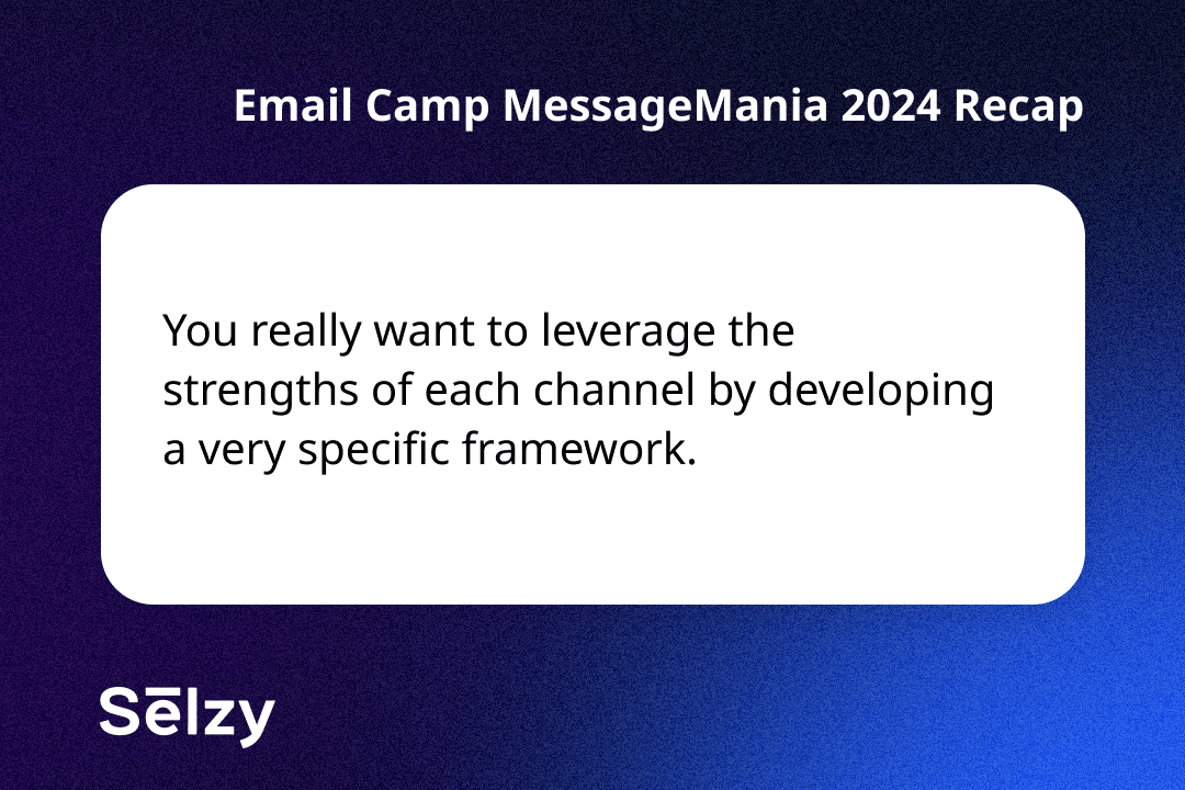
A card with a quote saying “You really want to leverage the strengths of each channel by developing a very specific framework.”
Source: Selzy

Both email and SMS are about the right message via the right channel at the right time. SMS has a 98% open rate, and 85% of those who opt in for SMS also opt in for email. 

Why use email and SMS together:

  • When people are subscribed to both channels, they are more likely to make a purchase. 
  • It creates stronger customer loyalty. 
  • It increases the conversation and segmentation.
  • You can send last-minute reminders. 
  • Together, these channels build the ultimate customer journey. 

Case study: a brand wanted to complement the email program by SMS but avoid batch texting. The email audience had strong engagement and conversion rates. At first, the SMS program was only advertised to email subscribers. After the launch, the SMS engagement was high, people were replying to messages. 

Among buyers:

  • 1% were only subscribed to SMS.
  • 24% were only subscribed to email.
  • 51% were subscribed to both channels.

The batch approach for both SMS and email no longer works. Instead, you need to focus on strategy, keeping your audience and the message types (abandoned cart, win-back, general marketing) in mind. For audience segmentation, coordinate both channels to complement each other using data from both. Make sure both channels work together on the same platform or via integrations. Consider automations, flows, and journeys in a unified way. Monitor your strategy, track results, and optimize.

  • SMS signup can ask for an email address again even from email subscribers to unite the customer profile data. The SMS flow can include a welcome message.
  • Send an abandoned cart email after 4-6 hours, abandoned cart SMS 12 hours late if there was no purchase.
  • Consider an email reminder about a sale. A day later — an SMS from a store manager inviting top clients to shop early during individually booked time slots.
  • You can send an email about a sale and then an SMS follow-up with early access.

Global Showdown: Multilingual email marketing campaigns and advanced localization

Anna Levitin, CRM & Lifecycle Marketing Lead at DoorLoop

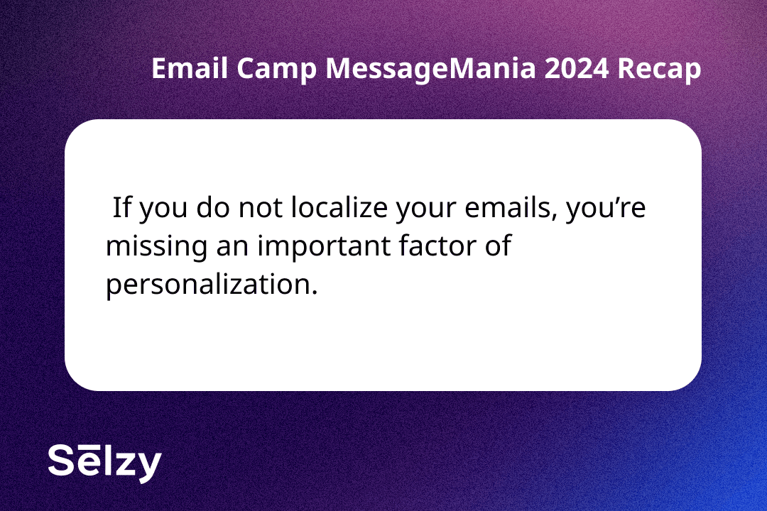
A card with a quote saying “ If you do not localize your emails, you’re missing an important factor of personalization.”
Source: Selzy

Localization is the key to personalization. 40% of consumers say they won’t buy in another language, and more than half of people prioritize content in their native language over lower prices.

If you want to create a perfect customer experience, there are more aspects to localization than mere content translation:

  • Accurate translation
  • Dialects and slang
  • Currency
  • Colors
  • Measurement units
  • Punctuation
  • Date and time format
  • Tone and formality
  • Time zone
  • Public holidays
  • Cultural norms and values
  • Images and icons

Other important elements:

  • Local testimonials and case studies
  • Avoiding offense
  • Privacy policy
  • Text direction (left to right or right to left)
  • Local events
  • Payment preferences
  • Contact information
  • Regulations
  • Subscription preferences
  • Device usage 

A safe date and time format you can use across different languages and markets is “September 26, 2024.”

Localization should extend beyond email:

  • Preference center
  • Option to change communication language
  • Form submission
  • Thank you message after the form submission
  • Landing page
  • Product
  • Footer
  • Legal content

How to begin the localization process:

  1. Contact your ESP or landing page platform and see if they offer a translation solution.
  2. Set a language option that users can change to see how many people want to receive communications in different languages.
  3. Break emails into blocks or snippets to reuse across emails.
  4. Use dynamic handlebars.
  5. Create a spreadsheet with frequently used phrases and CTAs.

To start localizing your emails, you need internal support. Build a case for your localization efforts by aligning it with company goals:

  • New market research thanks to localization will be relevant to marketing, sales, and product departments.
  • Localization improves performance which is important to the same three departments.
  • Localization ensures IP and domain reputation which helps the marketing and IT departments.
  • Localization increases sales which marketing and sales teams can benefit from as well.
01 November, 2024
Article by
Latest Articles
Selzy Selzy Selzy Selzy