


Once a novelty only a fracture of email readers used, dark mode gains more and more traction. And this brings new challenges to email marketers.
How to design and code emails so that the content is readable? What colors to use and to avoid? In this guide, we’ll explore dark mode in detail, give tips and advice on using it, and show you some dark mode email campaign examples for your inspiration.
What is a dark mode email and why you should use it
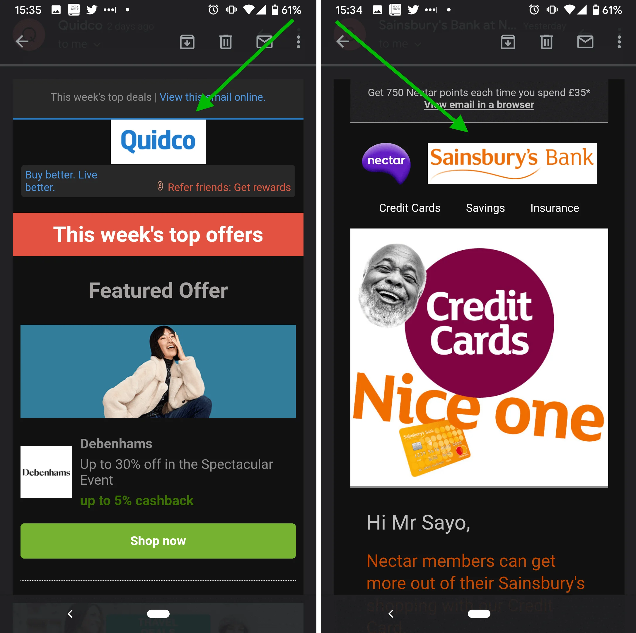
Dark mode email is one of the hottest digital design trends in recent years. It is a reversed color scheme in email clients like Google’s Gmail, Yahoo Mail, and others.
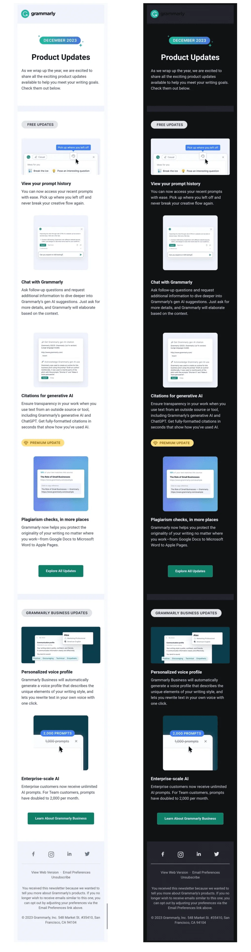
If your email originally had a white background and black text, and your subscribers have a dark mode setting on, the email might show up with a black background and white text. The specifics of the design flip largely depend on email clients, as you will see in the next section of this article. Here is an example of an email in both light and dark modes with partial inversion:
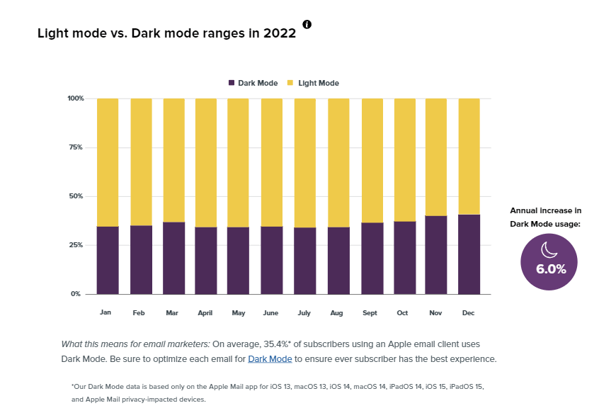
Users who prefer dark mode over the standard light one have different reasons for it. Some choose it to save their devices’ battery, others believe that it is easier on the eyes. Either way, the number of people reading emails in dark mode continues to climb. According to Litmus analytics, Apple family email clients combined took first place as the most popular ones in 2022 — they were used in 59.8% of email opens. At the same time, around a third of people using an Apple email client use dark mode.
What about the Android users? One survey showed that almost 82% of them turn dark mode on as much as possible. Based on these estimations, it’s safe to say that at least a part of your audience will be viewing the campaigns you send in dark mode, no matter the device.
Although analytics show that 29% of email marketers find it difficult to estimate the popularity of dark mode among their subscribers, 44% consider dark mode during email production. And if you are asking yourself: “Is adapting my emails to dark mode mandatory?”, the answer is “No”. You don’t have to do it. Your subscribers will still get your emails, open, and read them.
Dark mode for emails is more about convenience for your readers. If you don’t adapt your campaigns, part of your audience may see your emails incorrectly, get frustrated, and eventually unsubscribe. So the main reason why an email marketer would want to account for dark mode is to cater to a good chunk of their readers who use it over the light mode.
Which email clients support this feature
These popular apps can support dark mode:
- Apple Mail (MacOS, iPhone, iPad)
- Gmail (iOS and Android versions)
- Outlook (iOS, Android, web, and Windows versions)
- Yahoo Mail (web version)
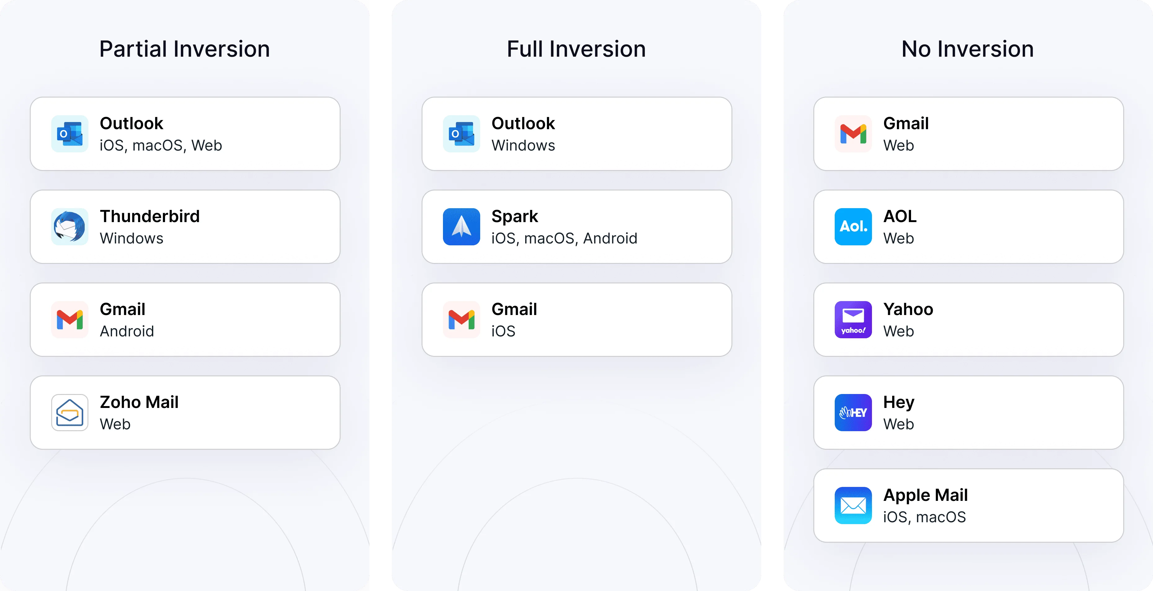
However, there is a difference in how email clients handle it. Some might not change the appearance of your HTML email, no matter if a device or an app is set to light or dark. Others might partially or fully invert the colors. The only way to find out and avoid email mistakes is to test before sending the campaign. 58% of email marketers preview or test emails in dark mode before sending them at least some of the time.
How does dark mode affect email design?
In general, you don’t have to design a separate email for the dark mode users. However, there are design aspects to keep in mind. Dark mode can change the look of your emails in a few ways:
- Color changes. Dark mode flips the colors on the screen. The simplest example is when a white background with black text becomes a black background with white text.
- A change in how images and graphics look. For example, images with white backgrounds might create too much contrast with the rest of the campaign when the background color is flipped.
- Readability. Light text on a dark background can be easier to read for some people. But many color combinations don’t work well — for example, dark gray text on a dark gray or black background, or red text on a blue background. If you do not account for the dark mode color changes, you risk sending an unreadable email.
- Email client differences. Some email clients change their user interface to dark mode, but wouldn’t change how your HTML email looks. Others may flip some or all of the colors in your email. It would be unrealistic to adapt to all possible email clients and devices, though. The best strategy is to fine-tune your dark mode design to the most popular apps only.
To make sure your emails look good in dark mode, it’s important to test your designs with different email clients and devices.
Advantages and challenges of using dark mode in emails
For marketers, the main advantage of adapting emails to dark mode is that it caters to their audience’s expectations. It’s the same reason why websites strive to have a well-crafted UX design — because a good UX design ensures that every aspect of the user journey is effortless, among other perks.
If done well, dark mode for emails can make customers more satisfied with the business and loyal. It shows that a company cares about the customer experience.
Challenges that email marketers might face when dark mode is not set up properly:
- Branding issues. If an email looks different in dark mode, it might not match a company’s branding. This, in turn, affects brand image and recognition.
- Worse readability. If not done right, dark mode can make an email hard to read. So part of your audience may not get valuable information like order details or the promotions you offer.
- Risk of less engagement. If an email doesn’t look good in dark mode, people might not want to read it.
- Logo issues. It can be hard to make logos and images look good in dark mode.
- More work. Designing emails for both light and dark modes can mean extra work.
- Different on every device. Every email client and device shows dark mode a little differently. Because of this, it might be tough to know exactly what an email will look like. Testing with the most popular apps can partially help, but surprises are still possible.
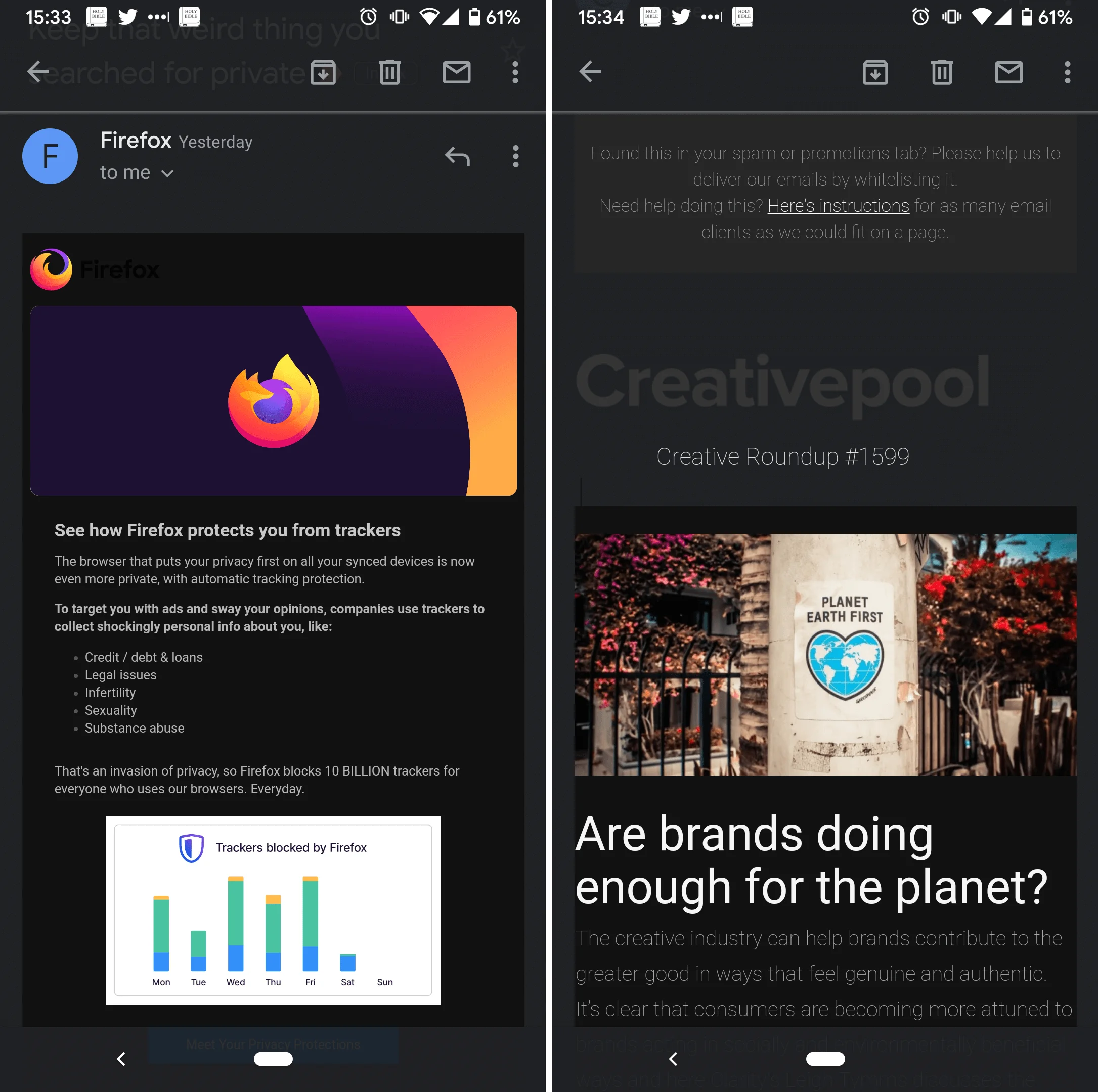
Below is an example of readability issues in dark mode:
And here you can see how logos and design can look off if dark mode isn’t accounted for:
Simple ways to make dark mode look good in any email client
The way you adapt your emails to dark mode is by tweaking the contents of your normal default email and by adding more settings on top of existing ones. There are a few simple things you can do, plus you can also dive into coding tips for more control and customization.
Let’s explore some of the simpler ways first.
Enable dark mode in your subscribers’ email apps
Make sure that dark mode is enabled in your email, for those readers that have it turned on. This allows the email contents to adapt to the dark mode settings of the email client, ensuring that your email is displayed correctly whether the user is in light mode or dark mode.
Add this code snippet between tags <head></head> of your email:
<meta name=”color-scheme” content=”light dark”>
<meta name=”supported-color-schemes” content=”light dark”>
These tags enhance the user experience by respecting the user’s preferred color scheme (light or dark) in their browser or email client.
The <meta name=”color-scheme” content=”light dark”> tag specifies that your email supports both light and dark color schemes. This tag helps web browsers and email clients render the page background with the desired color scheme.
The <meta name=”supported-color-schemes” content=”light dark”> tag has the same function. It is particularly useful in emails, as it can enable dark mode in email clients such as Apple Mail that don’t automatically invert colors when users turn on dark mode.
Use PNGs with transparent backgrounds
PNG is a type of image file that can have a transparent background. When you use a PNG image in an email, the email’s background color will show through the transparent parts of the image. In dark mode, this means your image contents can adapt to the dark background, keeping your design well put together.
Let’s take an image with a white background as an example. It would look good on a white background in light mode, but what if your readers have a dark mode on?
This is what could happen:
Compare this to the situation when the picture has a transparent background:
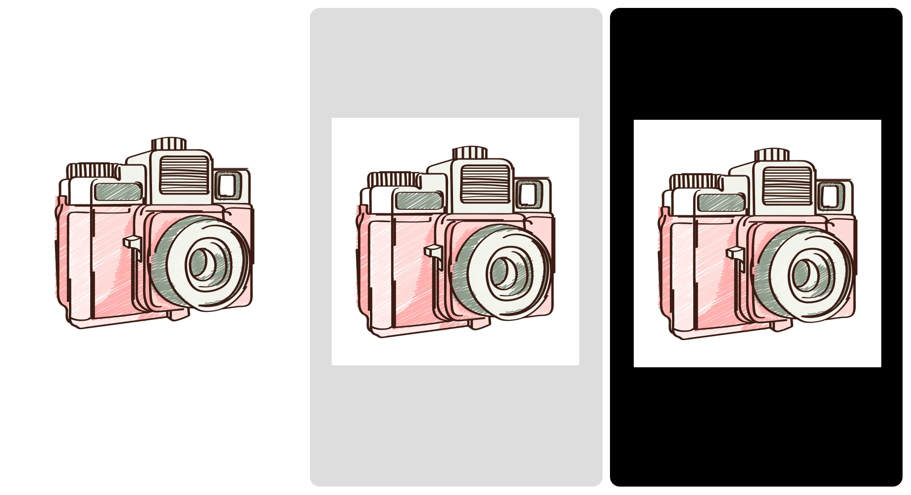
For images with non-transparent backgrounds, add enough padding around their focal point
What if the transparent background isn’t an option?
If your images are not transparent and include backgrounds, make sure there is enough padding around your focal point to avoid an awkward juxtaposition.
Compare the two examples below — the one on the left has no bottom padding at all, while the one on the right has an equal amount of padding.

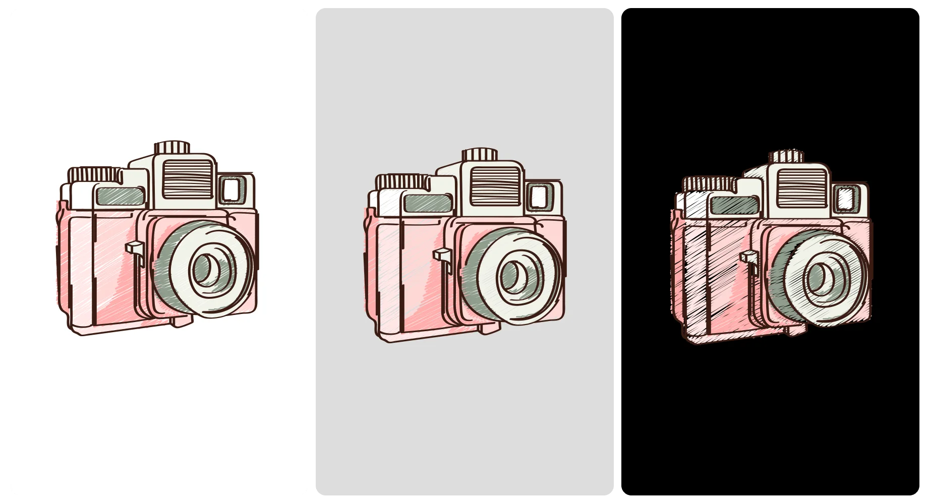
Use a white or translucent border around black design elements
What if you have text, logo, or other elements in a dark color on a transparent background?
If you have dark text on a dark background, it can be hard to read. One way to fix this is to add a translucent (partly see-through) or white outline to the text. This can make the text stand out against the background, making it easier to read.
The border is easy to add in a tool that works with images, like Canva, Figma, and of course Adobe Photoshop and the like.
Compare the contents of these two examples. The dark text without a border is practically unreadable on a black background:
A border around black text makes it readable:

Avoid using true black
The high contrast between true black backgrounds (HEX color #000000) and true white (HEX color #FFFFFF) will make things more difficult to read, defeating the purpose of dark mode altogether.
Instead, use dark gray (HEX color #121212) as the background color — this softens the contrast and can make your email easier to read.
These methods are simple enough but can make your emails look much better in dark mode. You can also take another step and consider advanced coding tips and solutions.
Advanced coding tips for dark mode email optimization
Here are a few advanced tips on how to create good-looking emails for the dark mode that go beyond just adapting the images and logos.
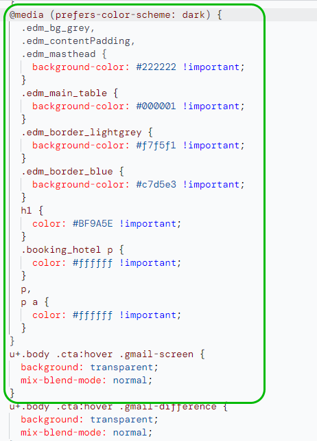
Add dark mode styles for @media (prefers-color-scheme: dark)
This is a CSS media feature. The role of this query is to detect which color theme a subscriber has on — light or dark.
You can use this feature to apply different styles to your email based on the user’s preference. For example, you might use light text on a dark background for users who prefer dark mode.
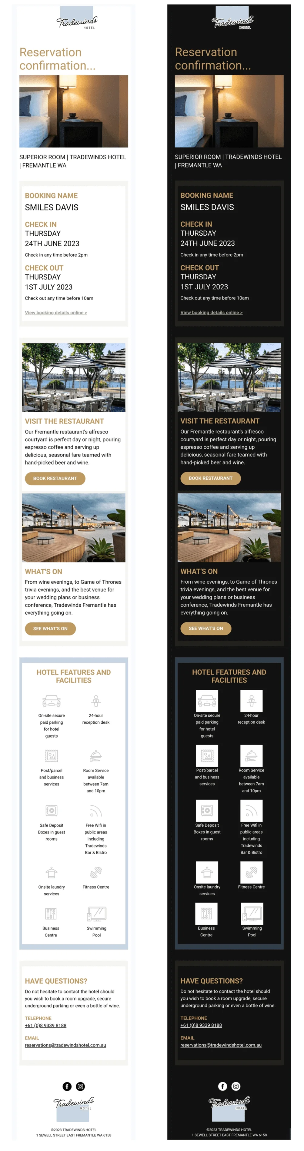
Here is an example of the code used in a reservation confirmation email from Tradewinds Hotel:
And here is what the email itself looks like with partial inversion in Gmail on Android:
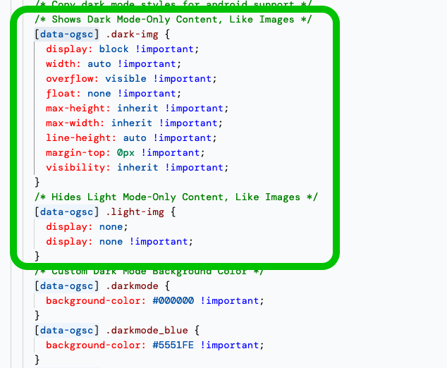
Add the prefix [data-ogsc] for duplication of dark mode styles
This is a method used to make the email compatible with dark mode in Android’s Outlook app.
You can use this prefix to apply the same styles you used for dark mode to this particular email client.
Here is the snippet of the code used for the Figma email below. Note the use of descriptions stating the purpose of each segment like “Copy dark mode styles for android support” which indicates that the code is needed for Android email clients such as Outlook.
![An example of [data-ogsc] code used in an announcement email from Figma](https://selzy.com/en/blog/wp-content/uploads/2023/12/13-2.png)
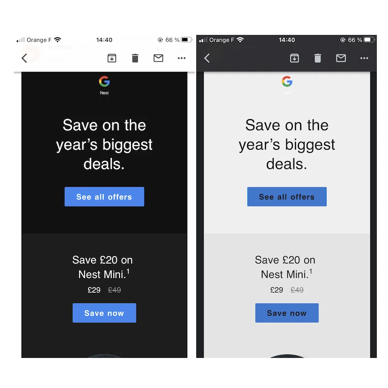
In this example, the email will have a black background and light text when viewed in Android’s Gmail app:
![An example of an email with the prefix [data-ogsc] used to make the email compatible with the dark mode in Android’s Gmail app](https://selzy.com/en/blog/wp-content/uploads-webpc/uploads/2023/12/14.png.webp)
Include dark mode-only styles in the email body’s HTML
This involves adding specific styles to your email’s HTML that will only be applied when the email is viewed in dark mode.
You can do this by adding a class to the HTML elements you want to only show in dark mode and then using CSS query to hide these elements in light mode.
The Figma email code and the example above are a good representation of how this would look in a real campaign.
Fix Gmail’s dark mode issues on iOS and Android with CSS Blend Modes
Dark mode for Gmail was introduced in 2019, but even four years after its release, some of its features put email marketers on the spot. For example, Gmail’s insistence on changing any light text color to a dark text color in iOS. The result of this is that an originally “dark” email with white text on a black background may turn into black text on a light gray background.
That’s what happened in the example below:
Web and email developer Rémi Parmentier came up with a solution to this using CSS Blend Modes. To use the method, read the full instructions on Rémi’s website.
Fix Microsoft Outlook’s dark mode problems with Microsoft Office (MSO)-specific gradient CSS properties and a VML
Outlook can have unpredictable text color changes when it comes to dark mode, including forcing an inversion that turns an originally dark email into a light-colored one. The result can be a bad-looking design and poor user experience where some parts of the email are ineligible.
Nicole Merlin came up with a solution to this Microsoft Outlook issue by using MSO-specific gradient CSS properties and a VML (Vector Markup Language) trick. See full details on how to do it in her tutorial.
Both Nicole Merlin’s and Rémi Parmentier’s methods make the email client display the original light mode colors. That works great if the original light mode email version was already using a dark theme.
However, if it had a light theme, then using these methods disregards your readers’ choice of using dark mode (since the email won’t turn dark). And that goes against your goal and the principles of email accessibility.
Use these techniques only when you really need to like when switching to dark mode makes the text difficult to read.
Stunning examples of dark mode emails and what you can learn from them
Let’s take a look at some examples of how brands handle the switch between light and dark modes. Note that the screenshots in this section are made in Gmail on an Android device which supports only partial inversion.
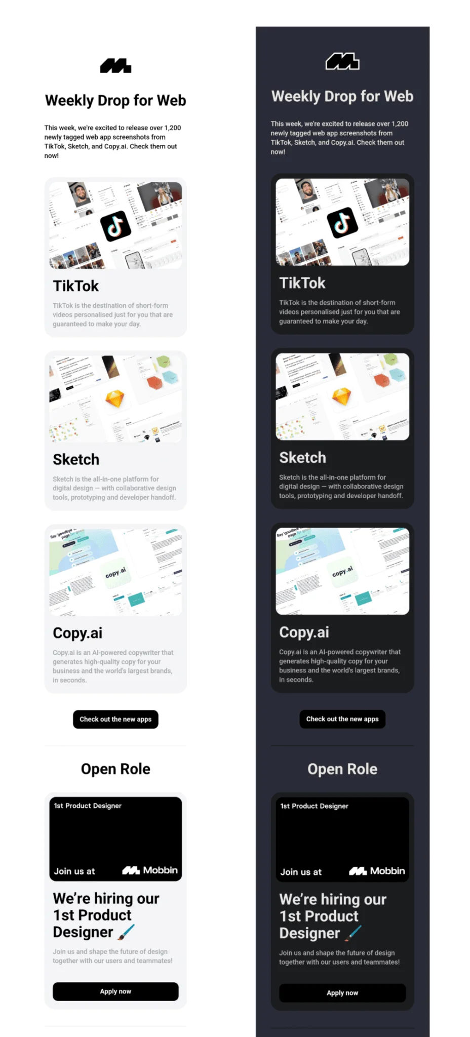
In light mode, Mobbin’s email above has very clean, white, and light gray background colors with black text. It also has a few light images. The black mode reverses the text color to light gray, while the backgrounds are set to dark gray and black. The dark mode leaves the images and buttons untouched, but black buttons are still visible and clear thanks to their dark gray background.
The minimalist black logo in the email’s dark mode is still visible thanks to a white/light gray border around it, which harmonizes nicely with the color of the text.
Overall, both light and dark modes look professional and well-designed.
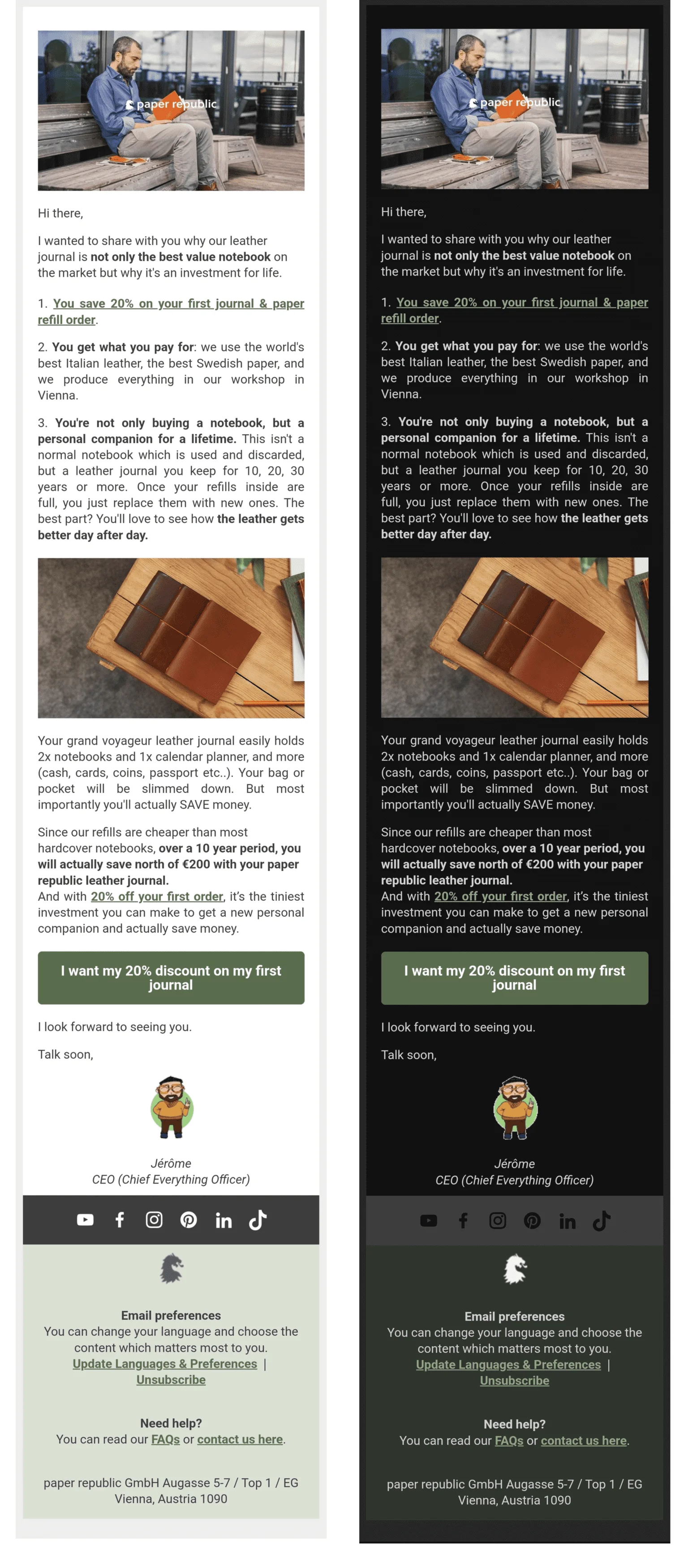
This email changed its background, its text color and adjusted the footer colors to accommodate for dark mode. The color of choice for the button looks good in both versions and it stayed the same.
Notice how the small drawing of a person in the signature has the same color, but there is a thin light outline around it in the dark version. It helps keep the image figure’s shape clear and prevents it from being lost in the background, despite some parts of the image (like shoes or hair) being dark.
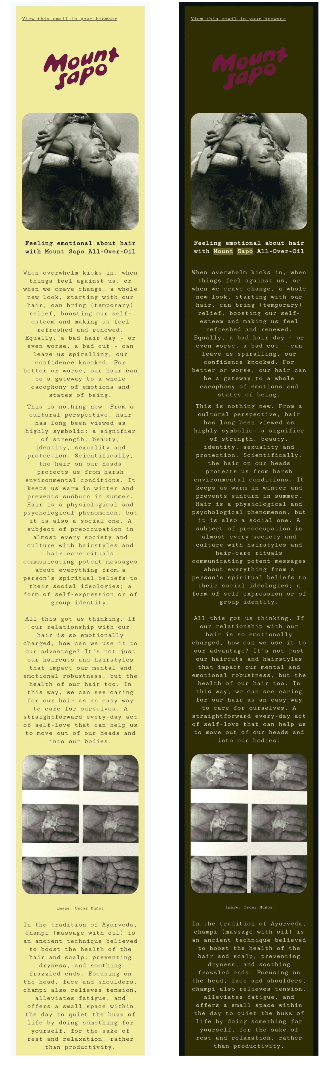
This email from Mount Sapo follows the brand’s website’s beautiful and minimalistic design, and it managed to keep the same feel in the dark mode, too. The light yellow background in light mode became olive, while the text turned from dark gray to white and light yellow.
The email handled the logo by using a transparent background in both versions. However, instead of adding a white or translucent outline to it, the team behind the brand made its color brighter — which nicely matches one of the colors used on their website and keeps the whole campaign in line with branding.
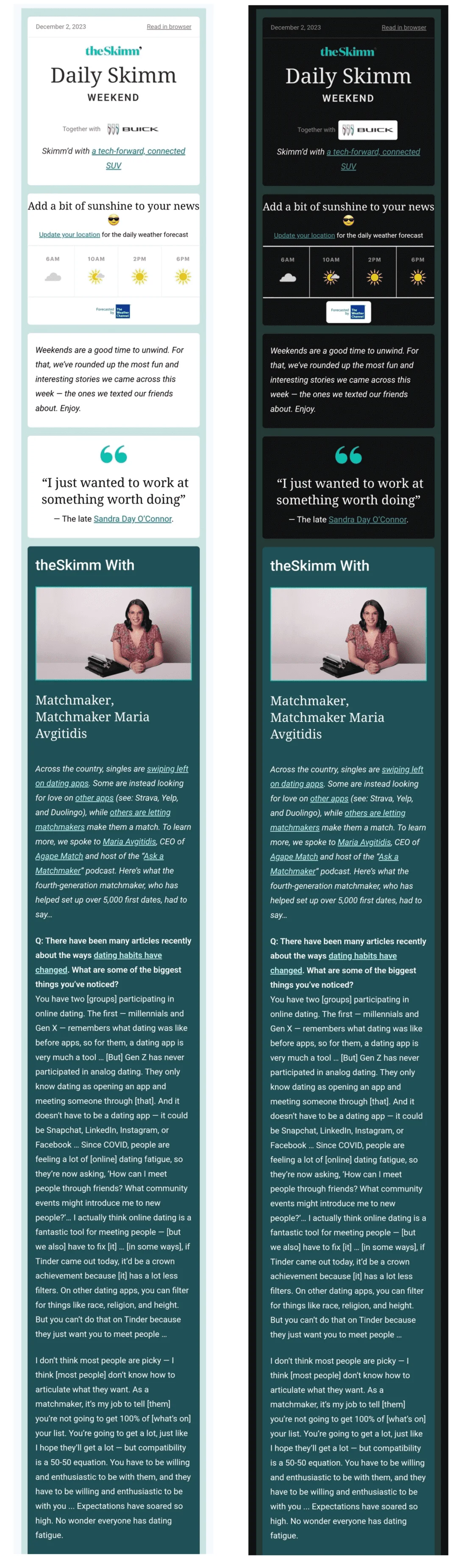
theSkimm went for a simple switch of light to dark, with some minor adjustments. The white background and dark text of the first half of the email turn into a black background and white text in dark mode. The original design of the second half already fit with the dark mode so it stayed as is.
Some of the logos in the email showed up with white backgrounds. This is a deliberate choice by the team behind theSkimm. The white “backgrounds” of the logos have rounded corners, which means the white color is part of the logo, and the actual background is transparent. This design decision makes logos very clear and keeps them the same in both versions, preserving brand identity and recognition.
Final thoughts
For email marketers, it’s crucial to stay on top of trends, and dark mode is already widespread enough that it can’t be ignored.
There are a few simple tweaks that can help you adapt your emails for it:
- Enable dark mode in your subscribers’ email agents.
- Use PNGs with transparent backgrounds to maintain the integrity of your design.
- For images with non-transparent backgrounds, ensure there is enough padding around the focal point.
- Add a white or translucent border around black design elements for better visibility.
- Modify your email design elements to ensure they display correctly in both light and dark modes.
- Avoid using true black as it can make your email harder to read. Opt for dark gray instead.
You can also use HTML and CSS code, such as adding dark mode styles for @media (prefers-color-scheme: dark) query, adding the prefix [data-ogsc] for duplication of dark mode styles, and applying fixes published by Nicole Merlin and Rémi Parmentier to Gmail and Outlook.
