Cyber Monday Email Ideas: When You’re Not Sure What To Send

Cyber Monday Email Ideas: When You’re Not Sure What To Send
11 October, 2023 • ... • 4836 views
Kate Shaw
by Kate Shaw

With Thanksgiving and Black Friday past and gone, the next comes Cyber Monday. It happens a few days after Black Friday, so the lines between these two events are blurred. Cyber Monday is special in its own way though, so let’s look at some of the most successful Cyber Monday emails and best practices. Make this year’s sales season extra successful!

Why Cyber Monday email marketing matters

Cyber Monday is a great chance to shop for everyone who didn’t have time for it during the Black Friday weekend. Historically, the difference was that Black Friday was all about physical sales, hustle and bustle, and standing in lines whereas Cyber Monday has always been a digital event and happened online, hence the name.

Consumer behavior changed though. Even before the pandemic and thanks to worldwide progressive digitization, Cyber Monday was gradually taking first place in terms of revenue. And ever since the holiday season of 2020, Cyber Monday has been bringing more revenue than Black Friday. According to Adobe Analytics, in 2022, shoppers spent $11.3 billion on it out of $211.7 billion of total spending on the holiday season October 1-December 31.

Cyber Monday Email Ideas: When You’re Not Sure What To Send 1
Gadgets and video games are traditional products on Cyber Monday but you’re not limited to them, any brand can take part. Source: Adobe

Not even the best Black Friday marketing campaigns can change the trends. In 2023, Cyber Monday will continue to be extra-popular too since its entire concept is built around being online and favors e-commerce shopping, away from the Black Friday crowds. Salesforce predicts that this year global sales will continue to grow, up to 4% for the November-December holiday season. So the stakes are high. Shoppers aren’t just ready to spend money, they’re actually excited to do it.

If you want a piece of this holiday shopping pie too, then your task is to prepare a decent Cyber Monday email marketing campaign.

Tips for a great start

Before you begin creating your holiday marketing campaigns, you need to do a few things with your list of contacts.

Clean it up. You might want to tidy up your email list first before you engage in important campaigns to get rid of inactive contacts, duplicates, and other stuff that’s toxic to your business. It’ll save your money and minimize the risk of running into a spam trap and getting banned by email providers.

Segment it. Typically, brands send the same e-commerce sale announcements to all clients. But if you know which product categories your potential customers like the most, you can use segmentation to make your Cyber Monday emails more relevant to increase conversions. You can study the results of your Black Friday emails and sales to determine how and who to target.

Cyber Monday Email Ideas: When You’re Not Sure What To Send 2
A VIP Cyber Monday email campaign that Lovisa sent to some of the clients only. Source: Milled

Create a list of new customers. For example, you can add an extra Cyber Monday-only subscription form to your website and make a special offer to new customers.

Re-engage old customers. If you haven’t connected with your customers for a while, first you’ll need to launch a win-back campaign to make sure they expect your offers and will not report your emails as spam, spoiling your reputation as a sender.

Cyber Monday email best practices: A step-by-step guide to making your emails rock

Email marketing is a great tool that can help prepare subscribers for the day of big discounts, spark interest, and make them count the days until they can finally take part in your grand Cyber Monday e-commerce sale. Let’s see what you need to do for your holiday campaigns to go as planned.

Write a catchy subject line

What do you do if you want to choose a movie but you have no time for trailers? Well, you make a decision based on titles, and it’s a marketer’s job to create a title that represents the subject, attracts the right audience, and sounds interesting and promising.

The same goes for email subject lines. A study shows that 33% of recipients open emails based on their subject lines.

So a subject line must be:

  • Clear. Stay true to the email’s main message and don’t sound ambiguous. It might go well with campaigns like re-engagement where it’s sometimes OK to give people a bit of a shock but major events like Black Friday or Cyber Monday are not the place for experimenting with subject lines.
  • Attracting attention. To make your subject lines catchy, use emojis, personalization, and get emotional.
  • Promising value. List any incentives that might capture the client’s attention like discounts, bonuses, or free shipping.

Here are some of the examples of successful holiday subject lines by real brands:

  • 🔥 It’s CYBER MONDAY & jeans are 40% OFF!
  • Cyber Monday: Free Masks With Purchase!
  • Cyber Monday DEALS now LIVE
  • Fall Cyber Monday: 40% OFF ENTIRE SITE!
  • LAST CALL! The Cyber Monday Sale Ends in Hours
  • 💻Cyber Monday Starts TODAY! 60% OFF!
  • New styles added to our Cyber Monday Sale!
  • You have VIP Access to Cyber Monday 🎉
  • OFFER UPGRADED: 30% OFF⚠️Cyber Monday is here!⚠️
  • [Name], your Cyber Monday code inside
  • Best. (Cyber) Monday. Ever.
  • Score! It’s Cyber Monday: Mystery deal revealed!

You can also draw inspiration from Black Friday email subject lines and repurpose the effective ones.
Choose the right email template

The design of an important email campaign, one such as Cyber Monday, should be memorable.

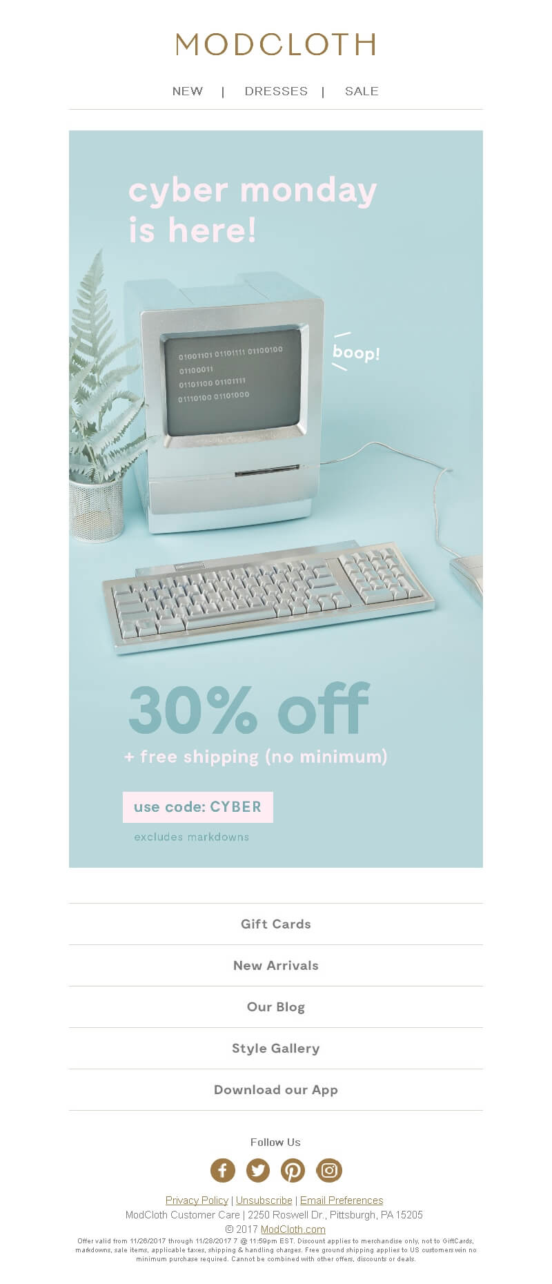
What’s special about Cyber Monday is that there are no clear requirements in terms of design — no bunnies or candy canes like other holidays have, no immediately recognizable colors, no special phrases or traditions. Except perhaps for the elements of techno-style like in this example:

A Cyber Monday campaign with a retro computer displaying binary code and a word boop! near it.
Boop! Source: Email-Competitors

The absence of traditional elements is both good and bad. On the one hand, you don’t have much to go off, and it’s more difficult to create an instantly recognizable design associated with Cyber Monday. On the other hand, you’re free to express yourself. It all depends on your imagination and the skills of a designer.

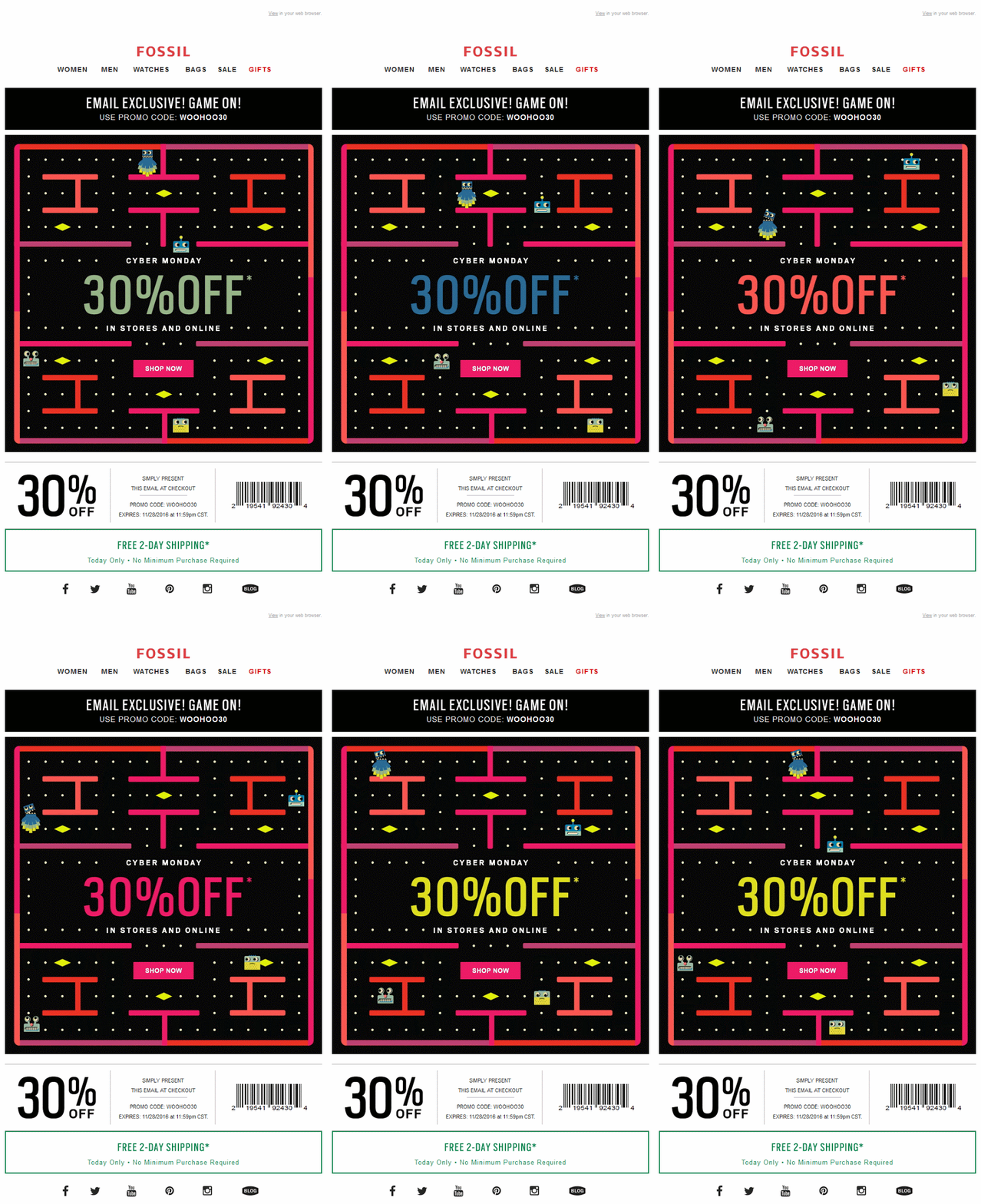
Just look at this imaginative Cyber Monday holiday email by Fossil:

A Cyber Monday email with a GIF showing a Packman-like game
Source: MailCharts

Another point is that your template should be clear. As beautiful as the message is, the main rule of any design is not to prevent a person from taking the required action. Make sure your email template has a clear structure, enough white space, and a coherent hierarchy. Highlight the CTAs — they should encourage a reader to go to your site and make a purchase. Read more about email design in one of our other articles.

A Cyber Monday email with a white background and several products around a banner saying Cyber Monday Sale Save 25% in black.
This email by the Guggenheim Museum Store nicely features some of its products, has a modern look and palette with distinct CTAs. Source: MailCharts

Write a clever Cyber Monday email copy

Give out a discount

Just giving a discount is a simple but effective technique. After all, what everybody waits for at this time of the year is a discount — Cyber Monday and Black Friday are the days of the biggest sales. And people actively use these e-commerce sales to buy holiday gifts. So the easiest and most reliable option not to fail Cyber Monday is to meet customer expectations and lower your pricing.

You can also give a promotional code or indicate a lowered price using the concrete figures. What’s more effective — dollars off or percent off? There’s an opinion that giving an actual dollar amount off is better because a $10, or a $35 benefit is easier to imagine than a 10% or a 35% one.

Consider the rule of 100 — it says that with products or services over $100 a dollar discount is more effective. And with products under $100, things are reversed and a percentage discount is likely to be more effective.

A Cyber Monday email with a 20% off all shoes offer
Source: MailCharts

Make a gift

Thanksgiving holiday emails (and even those dedicated to e-commerce sales) can showcase your company’s generosity and appreciation toward clients. Another good way to delight customers on Cyber Monday and drive sales is to offer a gift — make customers feel special. And don’t forget to mention it in your subject line.

A couple of ideas to make your gift offer even better:

  • Prepare several gift options and let subscribers choose a present to their liking.
  • Gifts fit well with various game mechanics. For example, you can offer customers to spin the wheel of fortune before placing an order and receive a guaranteed prize.
A Cyber Monday email with three different gift options and the offer’s conditions
Source: Milled

This email by a clothing brand is great for several reasons. First, the brand’s customers can choose their gift which makes the offer resonate more. Second, the banner states that this is a once-in-a-year opportunity to stress the urgency and exclusivity of this e-commerce promotion. And lastly, the email has a thorough How it works section to explain the mechanics in detail.

Include multiple offers

Shoppers love discounts, and yet the price isn’t the only thing that interests them. People also care about the speed and methods of delivery, payment options, terms of return, or any other feature. A useful service in addition to the main product is another way to stand out from the competition.

What to offer:

  • Free or fast shipping
  • Extended return periods
  • Free postcard
  • Special packaging
  • Additional loyalty program points
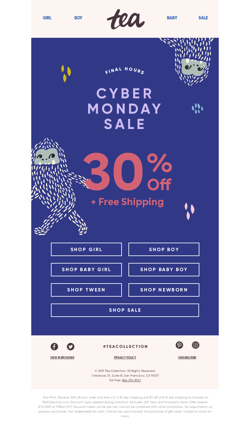
A Cyber Monday sale email with a discount and free shipping promotion
30% off AND free shipping is better than just 30% off. Source: MailCharts

Use urgency

Statistics say that 68% of consumers have made an impulsive purchase after learning about someone else’s experience. If you’ve ever found yourself holding two cans of Coke, one of which you hadn’t intended to buy at all, you know what we’re talking about. This is called “FOMO” and it stands for Fear Of Missing Out — a feeling when a person worries that they might (have) miss(ed) something.

When it comes to effective e-сommerce strategies, FOMO marketing is a great technique because fear is a very powerful motivator. It may sound like something manipulative at first but it’s really not as long as you stay true to your offer and don’t hide the fact. It just provides hesitant buyers with a little urge.

Cyber Monday emails are a perfect place to use some urgency to illustrate e-commerce offers that have deadlines. Emphasize that time is running out and that your subscribers will have to wait a whole year for a similar holiday sale.

You can show urgency in emails using several methods:

  • Using time-sensitive words: “Last day!”, “Hurry!”
  • Playing on scarcity: “They’re going quick!”, “Today only!”
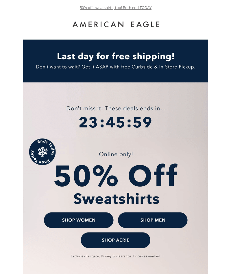
  • Setting deadlines: countdown GIF timers are a very popular way to do it.
A Cyber Monday email with a Last day sign and a countdown timer
American Eagle uses all 3 of the above techniques. Source: MailCharts

Add animation

Moving pictures are great for setting the mood and drawing attention to a specific part of an email. Use GIFs in emails when you need to astonish, amuse, show your brand personality, show an assortment of goods, or replace a video.

The key is to follow the best practices for animations in emails:

  • Use them purposefully to communicate information, but don’t go overboard and don’t distract.
  • Stick to the one scroll/one GIF rule.
  • Make sure that a GIF is no more than 200 KB because the animation plays only after it is fully loaded. And the total weight of an email affects the load time.
A Cyber Monday email with a GIF of an inflatable tube man moving
Hey! Come on in to J.Crew Factory! Source: myEmma
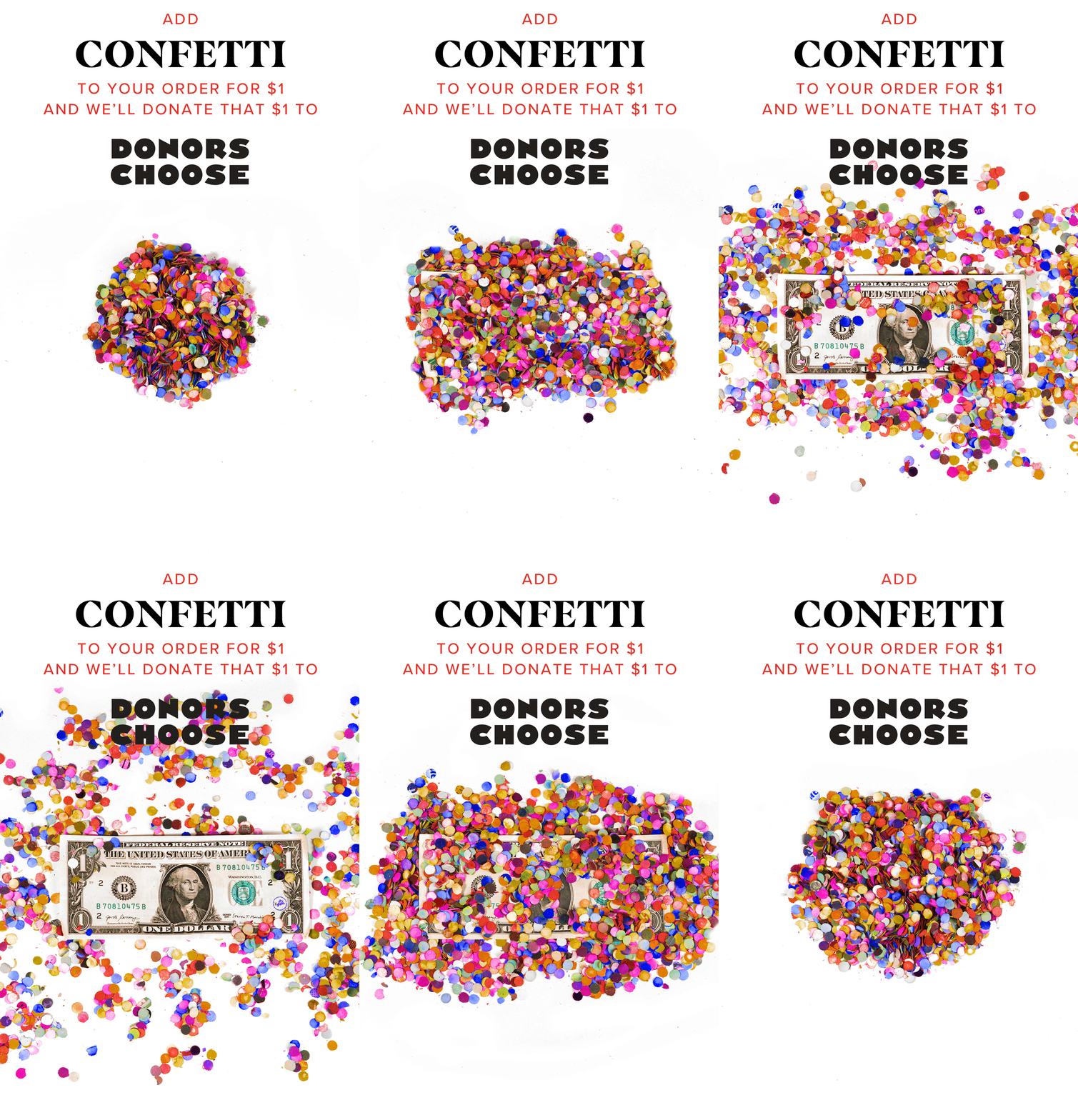
A Cyber Monday email with a GIF showing confetti spread out to reveal a $1 bill
A part of a very engaging Cyber Monday campaign by Tattly. Source: Really Good Emails

Do not avoid making jokes

GoDaddy analyzed 4 studies on why people unsubscribe, and guess what, very often people do it because the content is boring and not interesting to them.

Jokes in email subject lines and email bodies:

  • Entertain.
  • Create a friendly mood.
  • Help to convey important information in a relaxed way.
  • Increase sharing.
  • Make a brand more memorable.

Entertainment content is tricky though because the sense of humor is extremely subjective. To avoid sounding offensive, do not write what you would not say to an unfamiliar person in a real-life situation. In the case of massive sales, stick to kind humor and leave the dark and surreal one for another time.

A Cyber Monday email with a banner text reading How to cure a case of Mondays …Add to cart text and a suitcase with cereal photo.
A case of… 😄 Source: Really Good Emails

Use emojis

You’ve already seen the example of emojis in the subject lines. It’s a popular way to make messages stand out in inboxes, especially in e-commerce. Still, only a minority of senders do it, so you can try it too to improve open rates and overall email marketing results. A few tips to help you make better use of emojis in your subject lines:
  • Don’t overdo it.
  • Choose emojis according to the topic of your message.
  • Use one emoji per line, two at most to avoid a spam-like look.

You can also use emojis in the body of a message, like this:

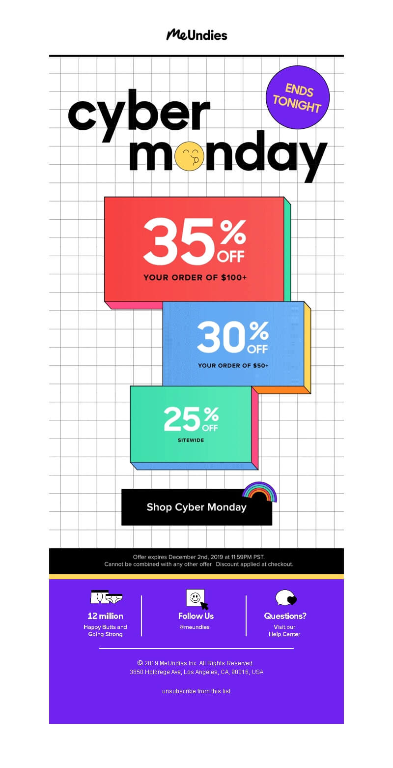
A Cyber Monday email with a whistling face replacing the letter o in the word Monday
Source: Email-Competitors

Be mobile-friendly

42% of users read emails on mobile phones with Apple iPhone being the most popular mobile email viewing platform. So with almost a half of users reading emails from mobile phones, it’ll be a shame to include unreadable text or unadapted pictures in the mobile versions of your email.

Thankfully, many of today’s e-commerce email templates are so mobile-first and minimalistic that practically nothing changes when you compare their desktop and mobile versions:

A desktop version of a Cyber Monday email with a minimalistic one-column layout
A Cyber Monday email campaign by Cienne for desktops
A mobile version of the same email with a larger banner photo and larger text, otherwise unchanged.
And this is its iPhone X-adapted version. Source: Really Good Emails

The easiest way to make sure your emails are responsive is to use email service providers with email builders that have this feature by default. For example, Selzy has a powerful email builder that’s responsive.

Make a series of emails

With inflation and economic crises, consumers are likely to be extra eager for holiday pre-sales and extended sales this year. Make a series of emails to lead a person to purchase. Create a chain of emails to gradually raise their level of tension before the final sale and make a more confident inbox presence.

Here is one of the examples of a basic mailing plan:

  1. The first message announces that the Cyber Monday sale will start soon — right after Black Friday.
  2. The next message is on Cyber Monday itself.
  3. The third message reminds that there is very little time left until the end of the holiday e-commerce sale.

Another thing many retailers do? Extend your sales and promotions.

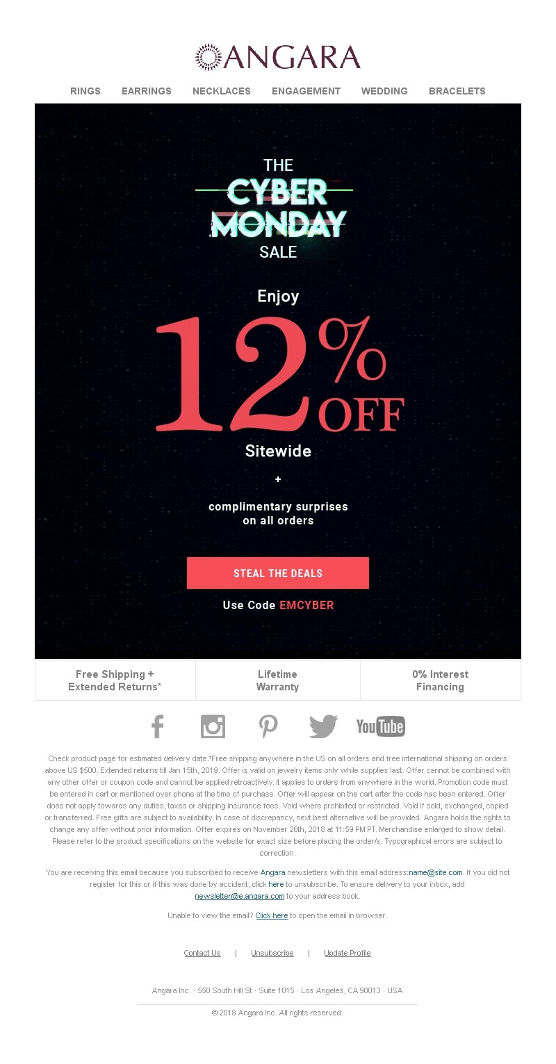
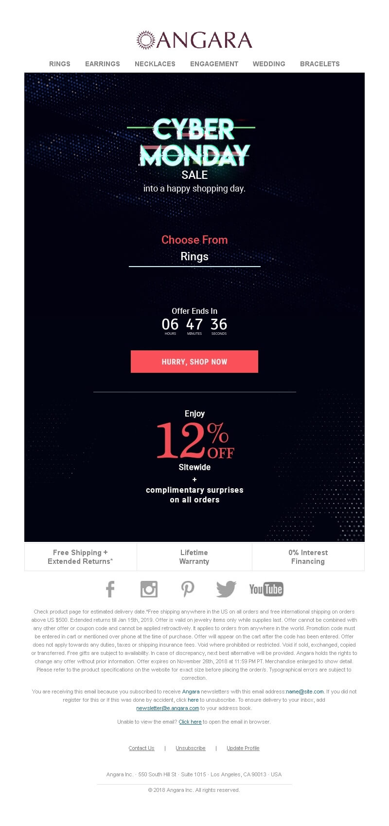
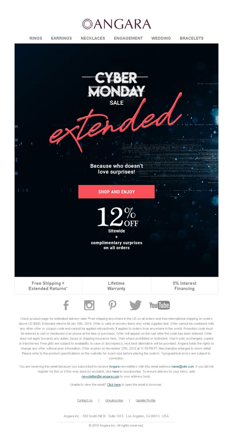
Here’s a Cyber Monday email campaign by Angara from the pre-sale to the extended sale:

An email about early access to the Cyber Monday sale
An email announcing the Cyber Monday deal: 12% off sitewide
An email reminding customers that the sale will end in 6 hours with a countdown timer
An email announcing that the sale has been extended
Source: Email-Competitors

Schedule your emails wisely

One last pro-tip: use email automation to make sure your emails are sent on time. Plan everything in advance, and when the holiday sale starts, relax and enjoy the hands-off process.

Cyber Monday email design: Best email examples from previous years

Want to see some design inspiration? Then you’ve come to the right place! Here are some of the Cyber Monday design ideas you can use in your campaigns.

Matrix green (or just light green)

When you think of technology and cyber reality, you probably think of the Matrix movies and the green digits on retro computers’ screens.

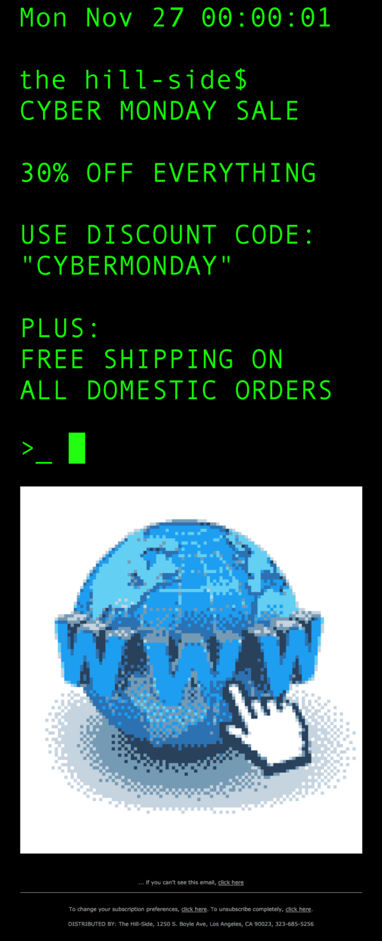
This email below feels very Cyber Monday appropriate with bright green on the black background, almost everything written in uppercase, and a pixelated internet image:

A Cyber Monday sale email with neon green text on a black background
Source: Really Good Emails

The email above feels like too much? You can always use a light green shade as an accent color for just a touch of the holiday theme:

A Cyber Monday email with lime-green reserved for buttons, discounts, and other details
Source: Milled

Neon and retro-futurism

It’s hard to pinpoint the retro-futurism aesthetic, you just know it when you see it. Think Drive movie, disco, pixelated sunsets, and such.

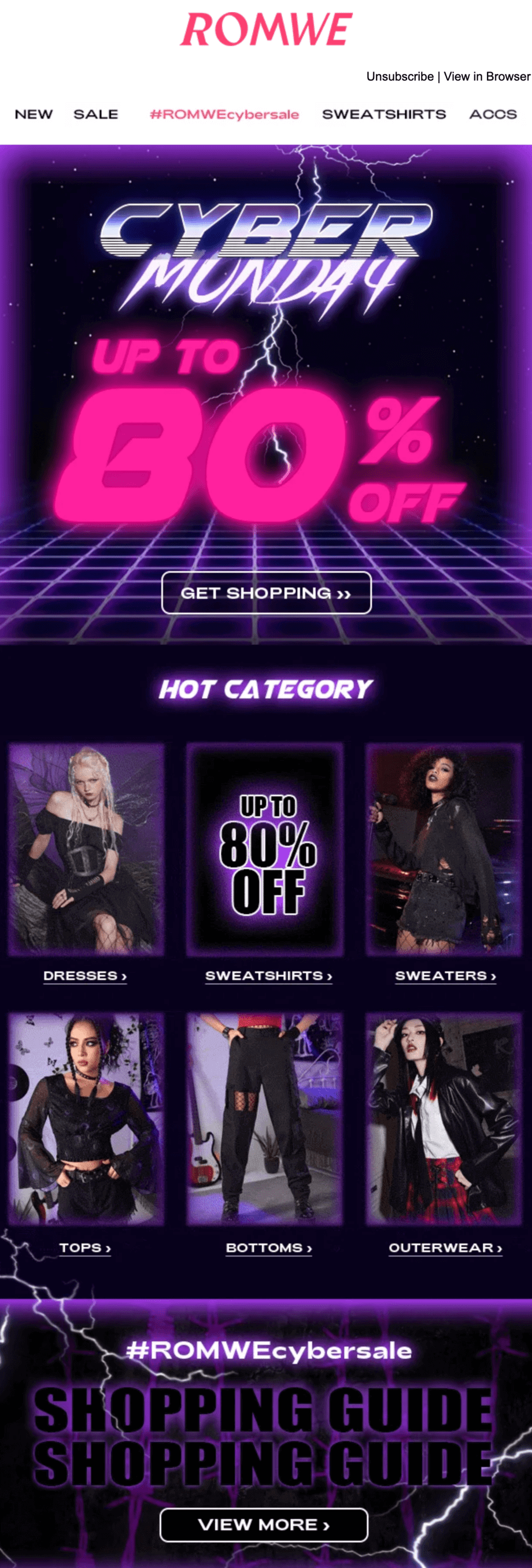
This campaign uses pink and purple-tinted visuals to convey a retro feeling:

A Cyber Monday campaign with a retro-feeling font, video-game-esque backgrounds, and blue and purple-pink accents
Source: Milled

If you like this idea but want to make it a little simpler, here is another example. This email banner cleverly combines stylized fonts and soft colored shadow effects to make a Cyber Monday sale look interesting:

A Cyber Monday email with pink and purple accents and a black background
Source: Milled

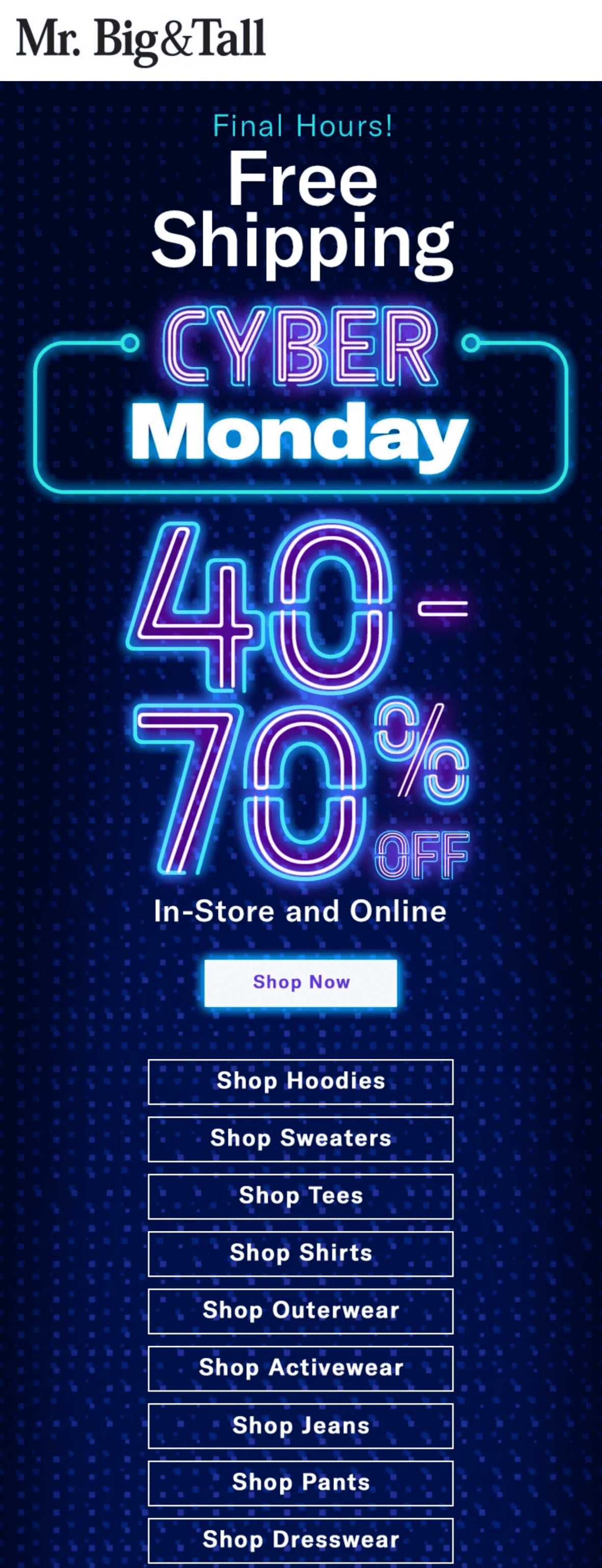
You can also just opt for neon:

A Cyber Monday email with text imitating neon signs
Source: Milled

Pixels and computers

Another spin on the Cyber Monday email design is to include pixelated fonts, computers, or windows.

Here is an example with little playful animations:

A Cyber Monday email with GIFs of blinking pixelated smiley faces
Source: Milled

This banner with stylized windows and a cursor can be a template for your campaign:

A Cyber Monday email with a banner with several windows detailing the promotion
Source: Milled

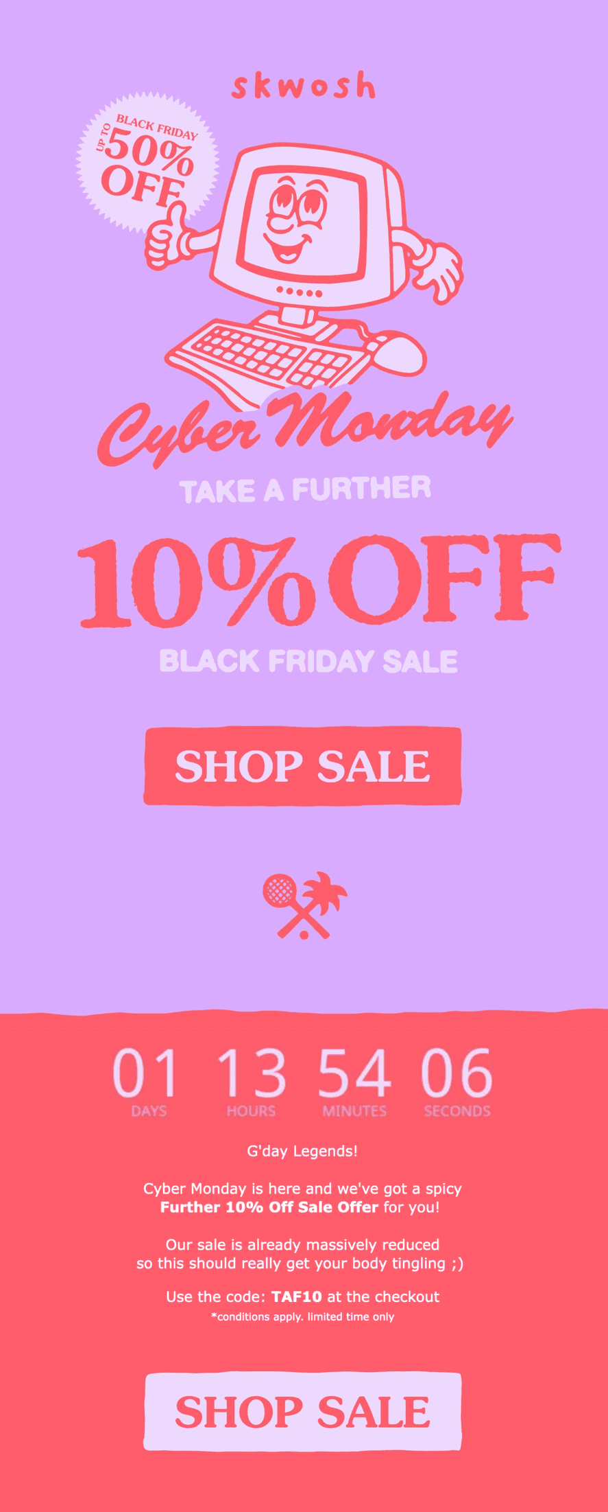
You can also go all out and prepare illustrations, like this brand did for its Cyber Monday campaign:

A Cyber Monday email with an illustration of a retro computer with a thumbs up
Source: Milled

Something completely different

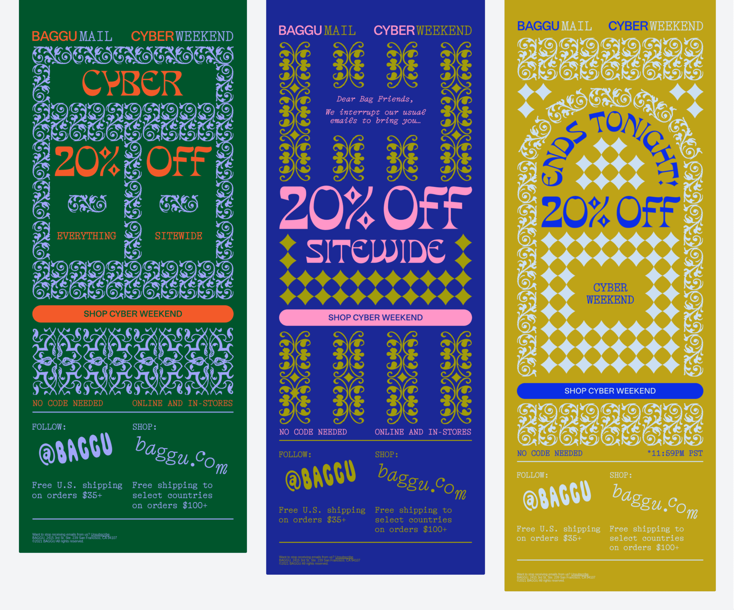
Adopting a holiday theme can be great, but you don’t have to. Sometimes the most effective and memorable campaigns are the ones that go against the grain. Like this beautiful ornate email series from Baggu:

A Cyber Monday email series with repeating fonts and ornaments in different colors
Source: Really Good Emails

You can also send an email not about the sale and cut through the discount buzz while reminding your customers about the Cyber Monday offers:

A Cyber Monday email with a GIF of dogs sliding down a hill and a promotion reminder below
Source: Milled

The best time to send emails on Cyber Monday

If you plan to give a sneak peek, it is better to launch an email chain dedicated to the Cyber Monday sale at least a month in advance. Then follow the advice from the previous point.

As for the best hours, consider these findings:

A chart detailing the open rate, CTR, CTOR, and the percent of messages by hour of day
Source: GetResponse

Early morning seems to be the best time for sending emails in every respect, but you can also try experimenting with evenings. For more information and different studies, check out our article on the best time to send emails.

This will also help:

  • Keep an eye on the number of your email. Mail services get suspicious when there’s a sharp increase in mailing frequency and mark your emails as spam. Increase the number of messages gradually.
  • Tell your audience what to expect. Subscribers will know that you are planning something big on Cyber ​​Monday.

Bottom line

Cyber Monday is the biggest online shopping day in the U.S.

To prepare a decent Cyber Monday email campaign follow the best practices:

  • Put your email list in order. Clean it up and segment it, run re-engagement campaigns.
  • Write a catchy subject line. Find ways to make it appealing but stay true to the email’s message and your brand’s tone of voice.
  • Pick the right template. Your goal is to choose something memorable but clear and coherent.
  • Write a clever copy. Offer a discount, a gift, or combine the two. Think about other services you can provide as an incentive.
  • Use urgency. Indicate that your offer has a deadline using countdown timers, time-sensitive words, and situations of scarcity.
  • Add animation. Use the benefits of animated GIFs to showcase your products and create the mood.
  • Use humor. Entertain to break the ice and build a better relationship with subscribers.
  • Use emojis. They increase opens and clicks.
  • Be mobile-friendly. Make your campaigns look good to those who only use mobile devices to read emails.
  • Make several emails. Don’t expect that people will search for your message in their inboxes. Launch a series of emails.
  • Use email automation. Schedule your campaigns in advance so that the promotion runs as smoothly as possible.

This article was originally published in October 2021 and was updated in October 2023 to make it more relevant and comprehensive.

11 October, 2023
Article by
Kate Shaw
With a passion for exploration and an eye for detail, I am a seasoned writer with over a decade of experience in the field. Alongside my writing career, I have delved into various facets of marketing, using my skills to create engaging content that resonates. I take pride in simplifying complex marketing and design concepts into easily digestible materials. When I'm not immersed in words and strategies, you can find me hiking, taking photos, visiting theaters, or getting lost in the pages of a good book.
Visit Kate's
Selzy
Selzy
Selzy
Selzy
Selzy
Latest Articles
Selzy Selzy Selzy Selzy