


Do you like Spotify Wrapped or year-in-review campaigns? We do too! But great email marketing doesn’t stop at trends or calendar years.
In this article, we’ve curated some of the best email marketing examples of recent years from leading brands and picked them for exceptional copy, design, and strategy. These campaigns stood out not just because they were timely, but because they solved real marketing problems: onboarding new subscribers, driving conversions, building trust, and strengthening brand voice.
How we decided on the list
For this list of best email examples, the Selzy team browsed 4 major galleries of real-life email marketing examples and ended up with hundreds of contenders. We then narrowed the selection to just 26 examples, which you will find below.
Of course, this list is subjective, but who has a better taste for emails than people working with an email service provider?
TL;DR: Best email marketing examples that actually work
This is a comprehensive curated collection of the best email marketing examples of standout campaigns across welcome emails, promotions, newsletters, storytelling, interactive formats, and more.
We broke each example down to what makes the email effective, be it something very concrete, like copy, or something more abstract like vibe, so you can adapt the ideas for your own campaigns, regardless of industry or business size.
- The most poetic: Aesop
- The most edutaining: Airtasker
- The most conscious email: United Sodas
- The most proactive email: Pit Viper
- The most celebratory email: Fellow
- The most autumnal email: Sweetgreen
- The most cartoonish email: Bored Cow
- The most historical email: Vacation
- The most scient-mythic email: ARMRA
- The most casual ask email: Sundays
- The most affectionate email: Graza
- The looooongest email: Minor Figures
- The most love-induced email: Goop
- The most convincing email: Columbia Sportswear
- The coolest email: Fashion Nova
- The most demonstrative email: Zales
- The most interactive email: Aura Bora
- The most musical email: Bubble Skincare
- The most inviting email: Firsthand
- The most “hardworking” email: Mugsy
- The most communal email: Paravel
- The cheekiest email: Rooted
- The most progressive email: Warby Parker
- The most mysterious email: Back Market
- The most educational email: Brez
- The most personal email: Craighill
1. The most poetic: Aesop
Email type: Brand storytelling email
Best for: Premium brands, beauty & wellness, emotional brand positioning
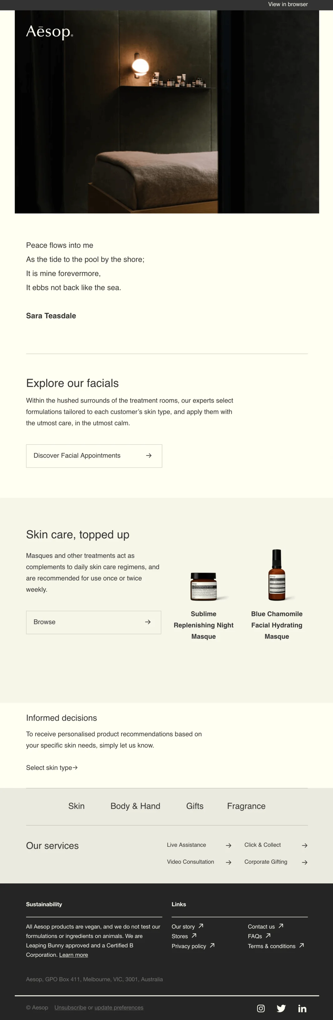
The best part: Despite seeming non-promotional, the poem conveys the emotional state of peace customers will feel after the brand’s facial appointment. It’s a novel strategy and makes the email content shareable.
And also… The design is nice and minimalistic and works great in combination with the message about calm and relaxation. We especially like the hero image which is a dark yet inviting photo of the treatment room.
How to use this idea in your campaigns
Use non-promotional storytelling to associate your product with an emotional outcome, then place the CTA subtly at the end.
2. The most edutaining: Airtasker
Email type: Product education email
Best for: Marketplaces, SaaS platforms, products that need explanation
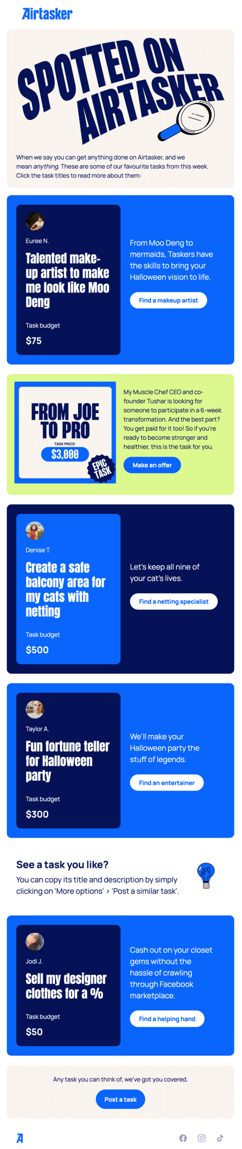
The best part: This email succeeds on two levels: it explains how to use the service while also being fun. That’s what we call edutaining — educational and entertaining! We especially liked the little light bulb section in between tasks. It is relevant to the content of the campaign and also highlights a useful mechanic.
And also… The content is divided into bright colorful sections which makes it easy to read and nice to look at. Notice also how there’s only one green block for an epic task from a startup CEO which breaks the repetition and stands out.
How to use this idea in your campaigns
Combine education with entertainment to show how your product works without sounding instructional or sales-heavy.
3. The most conscious email: United Sodas
Email type: Brand values/social awareness email
Best for: Mission-driven brands, community-focused companies, value-led marketing
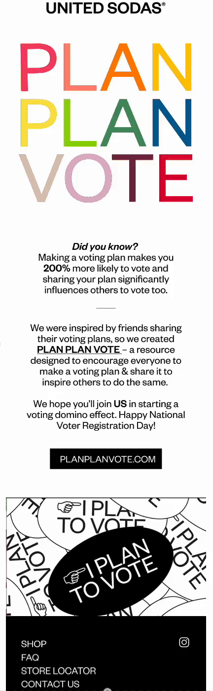
The best part: How do you address something like presidential elections as a brand without alienating parts of your audience? This campaign is the perfect answer! Just as the brand name suggests, it unites the subscribers with a simple message to plan and vote.
And also… The GIF captures the attention and also provides essential information. Plus, the company itself created the promoted voting resource. This makes the campaign more authentic and impactful.
How to use this idea in your campaigns
Address social or cultural moments carefully by focusing on shared values rather than opinions or products.
4. The most proactive email: Pit Viper
Email type: Cart abandonment email
Best for: E-commerce, DTC brands, playful or bold brand voices
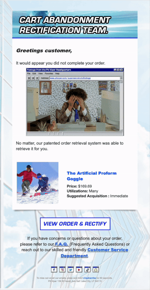
The best part: This is a cart abandonment email with a twist. The idea of a special team responsible for retrieving unfinished orders makes the message fun and on brand. The product description is also unique, stating that there are many use cases for the product, and the suggested acquisition is immediate.
And also… Retro, nostalgic design with a GIF reminiscent of an old Windows interface is very charming. The order details are also all there with a big CTA button and product information — win-win!
How to use this idea in your campaigns
Turn routine emails like cart abandonment into brand moments by adding humor and personality without removing clarity.
5. The most celebratory email: Fellow
Email type: Brand anniversary/milestone email
Best for: DTC brands, long-term customer relationships, brand storytelling
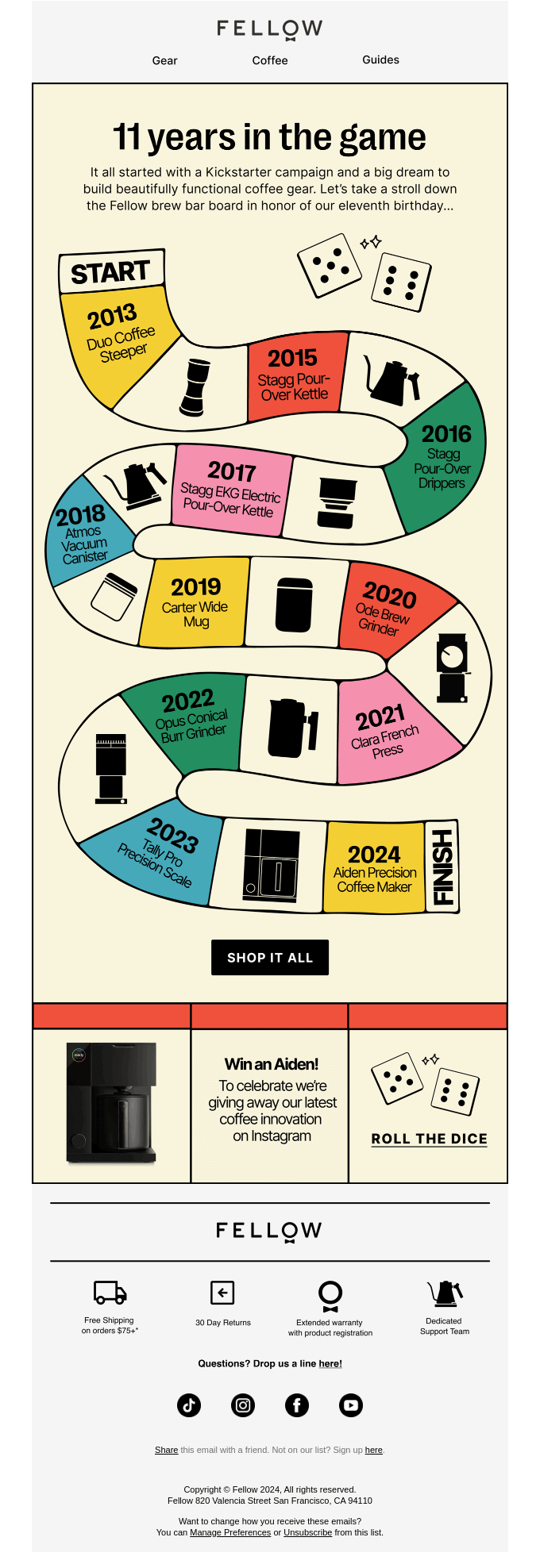
The best part: This celebratory email has an exceptional concept. From the game-style layout to dice that in combination make up 11, the company’s age, — everything is engaging and on-theme.
And also… The short copy relays all important milestones in Fellow’s history while elegantly promoting the products. The campaign establishes credibility and creates an emotional connection with subscribers.
How to use this idea in your campaigns
Use milestones to reinforce credibility and emotional connection while softly showcasing your products.

6. The most autumnal email: Sweetgreen
Email type: Seasonal promotional email
Best for: Food & beverage, retail, seasonal product launches
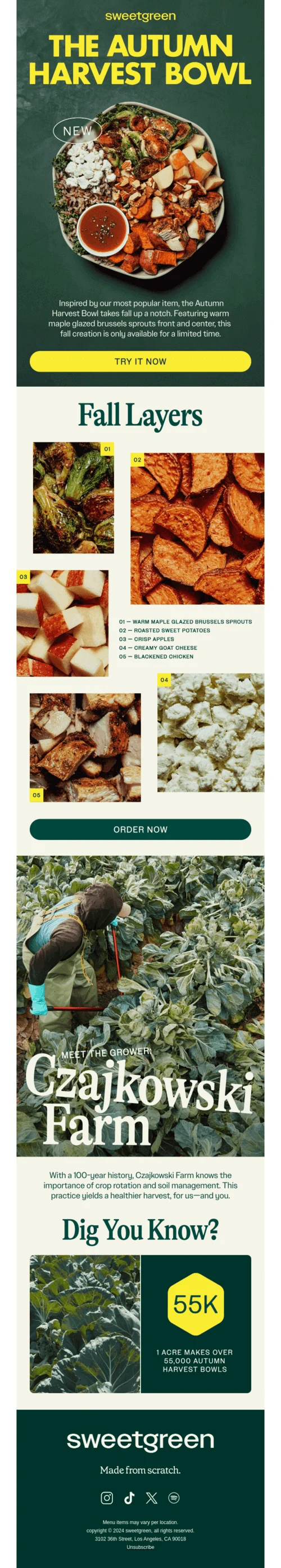
The best part: This email looks like a magazine page. Rich, contrasting colors, an interesting layout, and beautiful photos in combination with a unison of fonts make our mouths water!
And also… This campaign gradually convinces the readers to try out the seasonal bowl. First, there’s a picture of the dish, next — information about its components, and last but not least, a section showing where the vegetables came from. Each of these steps adds different arguments for purchase.
How to use this idea in your campaigns
Layer persuasion by first appealing visually, then logically, then emotionally — especially for seasonal products.
7. The most cartoonish email: Bored Cow
Email type: Seasonal promotional email
Best for: Brands with mascots, lifestyle brands, playful visual identities
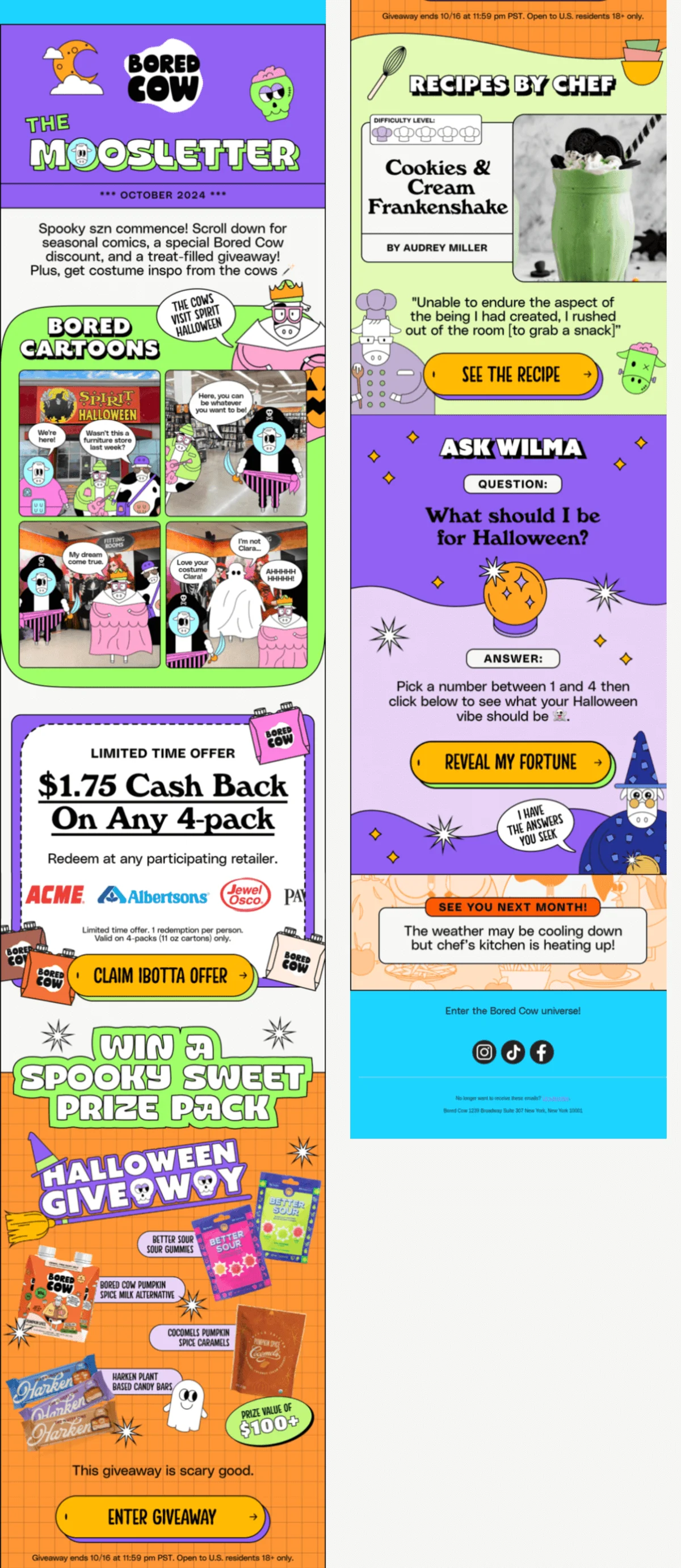
The best part: We absolutely knew we should feature a Bored Cow email and chose this one because it unites the cartoonish charm of the brand’s style and seasonal illustrations. It’s also a great example of working with a brand mascot: the cows are featured throughout the campaign, but it’s the message that is the main focus, and they don’t detract from it.
And also… The design is very colorful and unique, but the same orange color of the CTA buttons ties everything together.
How to use this idea in your campaigns
Lean into mascots or illustrations to carry the narrative, but keep the message and CTA easy to follow.
8. The most historical email: Vacation
Email type: Product storytelling/brand heritage email
Best for: Lifestyle brands, products with a strong backstory, relaunch campaigns
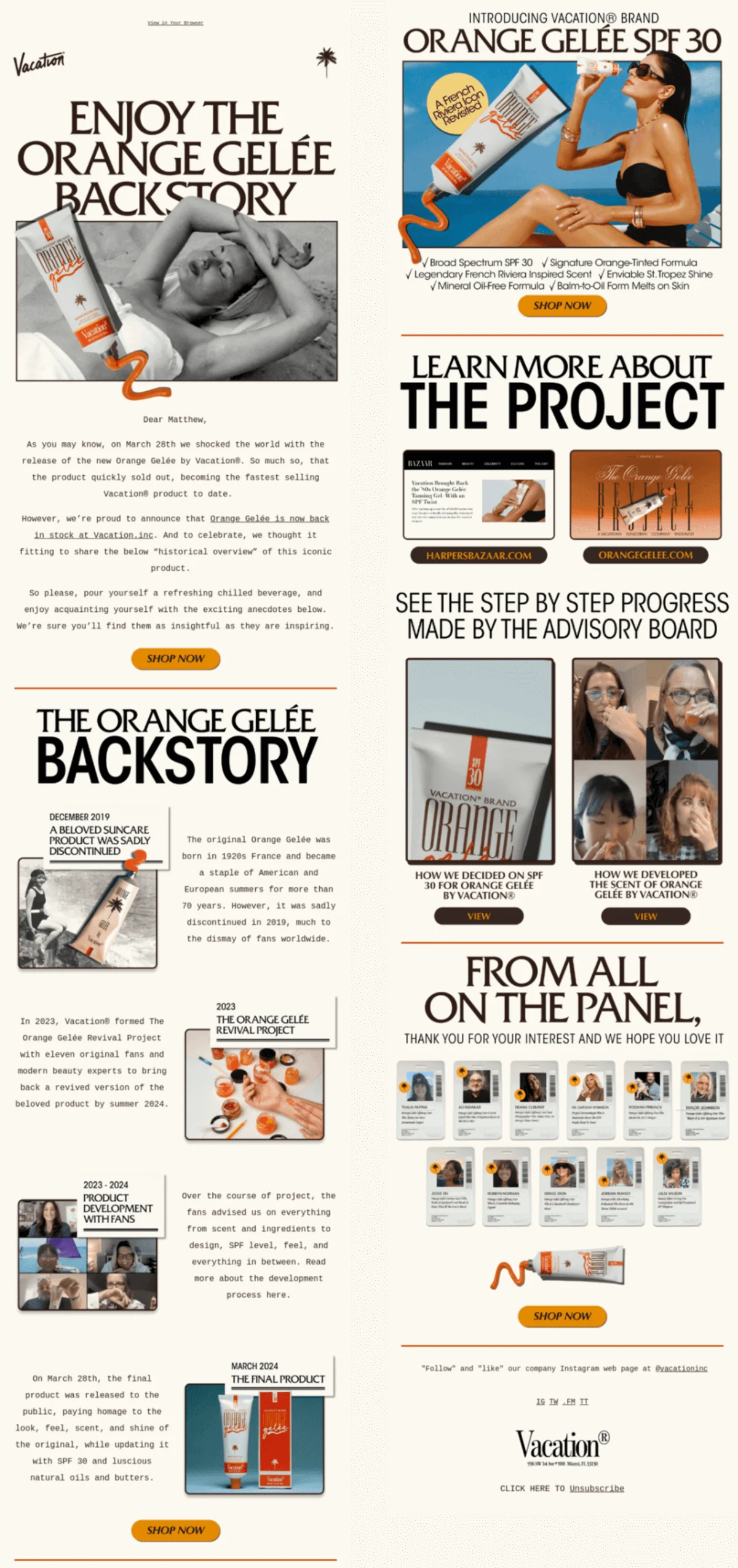
The best part: Authentic and engaging storytelling! Although this email isn’t about the product’s launch, the fascinating history behind its creation is worth repeating. This shows that an interesting content project can not only end up on the news but be relevant more than one time.
And also… The design has variety which makes it so that this long-ish email is engaging to read. The text in each section is short and quickly gets to the point, and the thank-you message at the bottom is a great finishing touch.
How to use this idea in your campaigns
Repackage strong brand stories to extend the lifespan of past launches or press moments.
9. The most scient-mythic email: ARMRA
Email type: Educational/myth-busting email
Best for: Health, wellness, science-backed products, trust-building campaigns
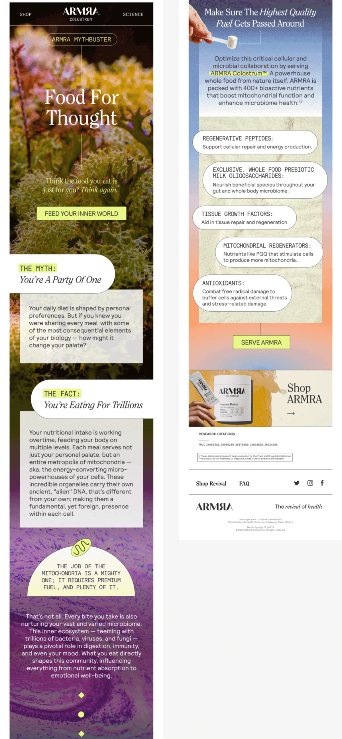
The best part: Science talk that reads like a sci-fi and spiritual short story. The email content is based on scientific research (that is also cited in the footer) but the myth-busting format and plain word explanations make it approachable.
And also… Email background images here look truly magical and help convey that every human being is a whole ecosystem.
How to use this idea in your campaigns
Simplify complex or scientific topics through metaphors and storytelling while backing claims with sources.
10. The most casual ask email: Sundays
Email type: Review request/referral email
Best for: Subscription brands, pet brands, community-driven businesses
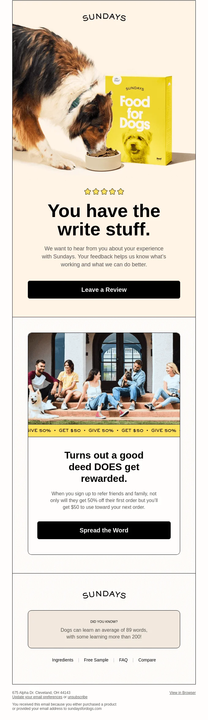
The best part: This email’s charm lies in the details: a pun in the heading, a reference to a popular saying, and an interesting fact in the footer.
And also… Rounded corners, black frames, and beige and yellow colors make the design look modern and friendly. In combination, all of this probably convinces the brand’s subscribers to do what they are asked for — leave a review and participate in the referral program.
How to use this idea in your campaigns
Lower the barrier to action for reviews or referrals by keeping the tone casual and friendly.
How to use these email marketing examples
These email marketing examples aren’t meant to be copied word-for-word. Instead, focus on the underlying mechanics:
- What problem the email is solving (conversion, engagement, trust, education)
- Where it fits in the customer journey
- How copy, visuals, and timing work together
- What emotion or motivation the email taps into
When adapting these ideas, align them with your audience, brand voice, and email marketing goals.
11. The most affectionate email: Graza
Email type: Survey/feedback email
Best for: Brands with a strong tone of voice, audience research, retention
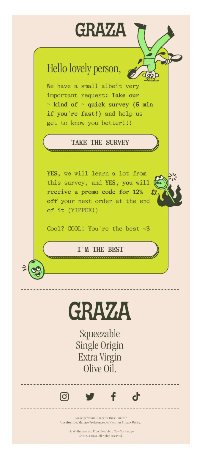
The best part: This email is the definition of effectively using a brand’s tone of voice. From the word choice to the use of punctuation and typography, it is as friendly and conversational as possible. The copy is also that sweet for a very good reason as its goal is to get survey answers.
And also… The design and fun illustrations add to the overall style and ~ vibe ~ of the campaign making it cohesive.
How to use this idea in your campaigns
Use warmth and conversational copy to increase response rates for surveys or feedback requests.
12. The looooongest email: Minor Figures
Email type: Promotional brand campaign email
Best for: Bold brands, creative launches, brands that break design conventions
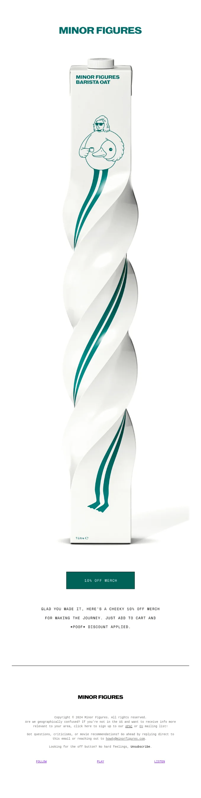
The best part: Sometimes, even the rules of good email marketing design are meant to be broken (if you know what you’re doing). In this campaign, the CTA and discount information are at the very bottom, probably two to three scrolls down on mobile. However, this is done intentionally and makes the email fun and unlike any other straightforward marketing message.
And also… Although it’s not that noticeable, we really like the customized email footer. It’s very customer-focused and ensures subscribers can choose a newsletter that matches their location, know how to contact the brand, and can easily unsubscribe.
How to use this idea in your campaigns
Break design “rules” intentionally to surprise subscribers — but ensure the CTA remains discoverable.
13. The most love-induced email: Goop
Email type: Seasonal promotional email (Valentine’s Day)
Best for: E-commerce, curated product recommendations, editorial-style promos
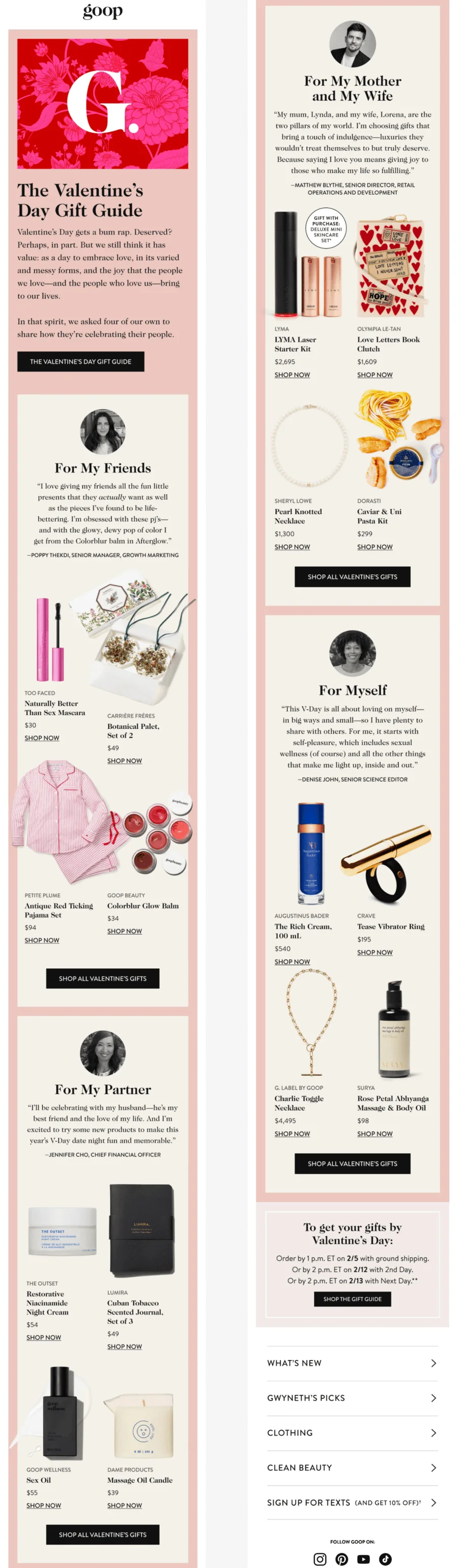
The best part: Brands now compete not only with other brands but with people, too. While it might be less noticeable in the inboxes, it’s generally important to humanize your business, at least sometimes. You can copy this email’s example: it’s genuine, interesting, and useful to the readers.
And also… We liked how the brand addressed Valentine’s Day’s reputation. It reads as an empathetic and, well, human message instead of a robotic e-commerce one.
How to use this idea in your campaigns
Humanize shopping holidays by reframing them around people and relationships, not urgency alone.
14. The most convincing email: Columbia Sportswear
Email type: Channel expansion/SMS opt-in email
Best for: Retail brands expanding into omnichannel marketing
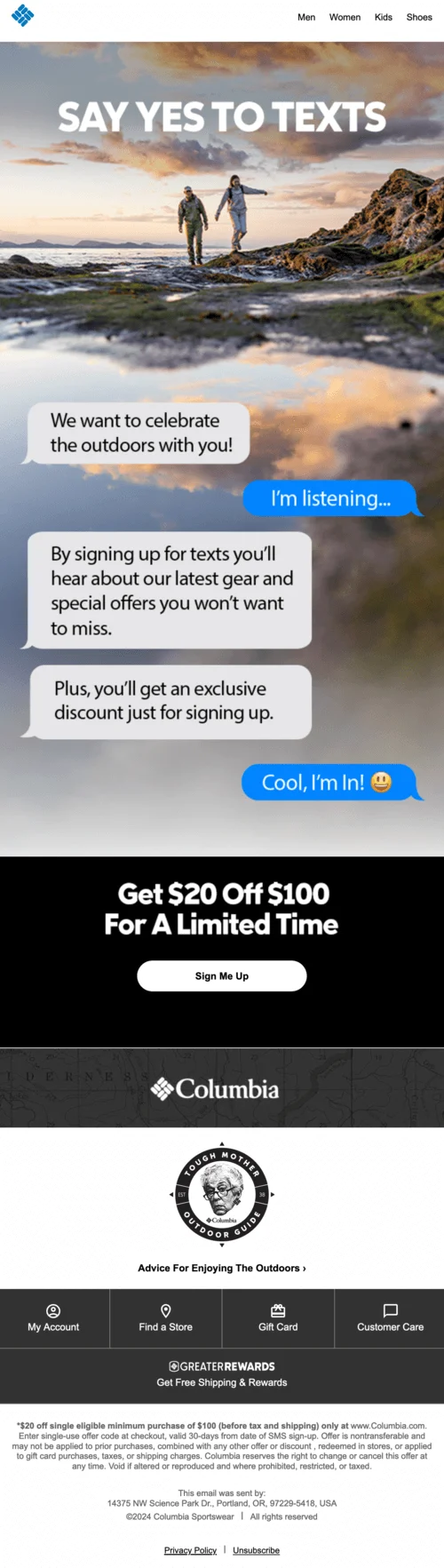
The best part: How do you promote the benefits of a new channel? By showing what the experience will be like and putting the value upfront. The SMS imitation makes the email engaging to read and explains the benefits of the subscription visually.
And also… The newcomers’ deal at the bottom makes the pitch ever so convincing!
How to use this idea in your campaigns
Demonstrate new channels or features visually so subscribers immediately understand the benefit.
15. The coolest email: Fashion Nova
Email type: Promotional product showcase email
Best for: Fashion ecommerce, trend-driven brands, visual-first campaigns
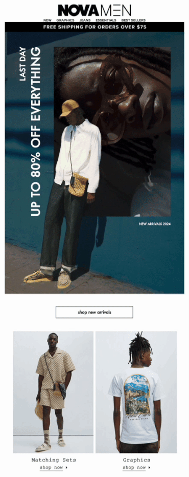
The best part: The design of this email is unique and modern, and the photograph of a model being slightly in the frame of the GIF on which they lean, creates a multidimensional effect.
And also… The use of vertical text nicely adds to the stylish look of the email.
How to use this idea in your campaigns
Use motion and layered visuals to create depth and stop-the-scroll impact in promotional emails.
16. The most demonstrative email: Zales
Email type: Product demonstration email
Best for: Customizable products, high-consideration purchases, education-driven sales
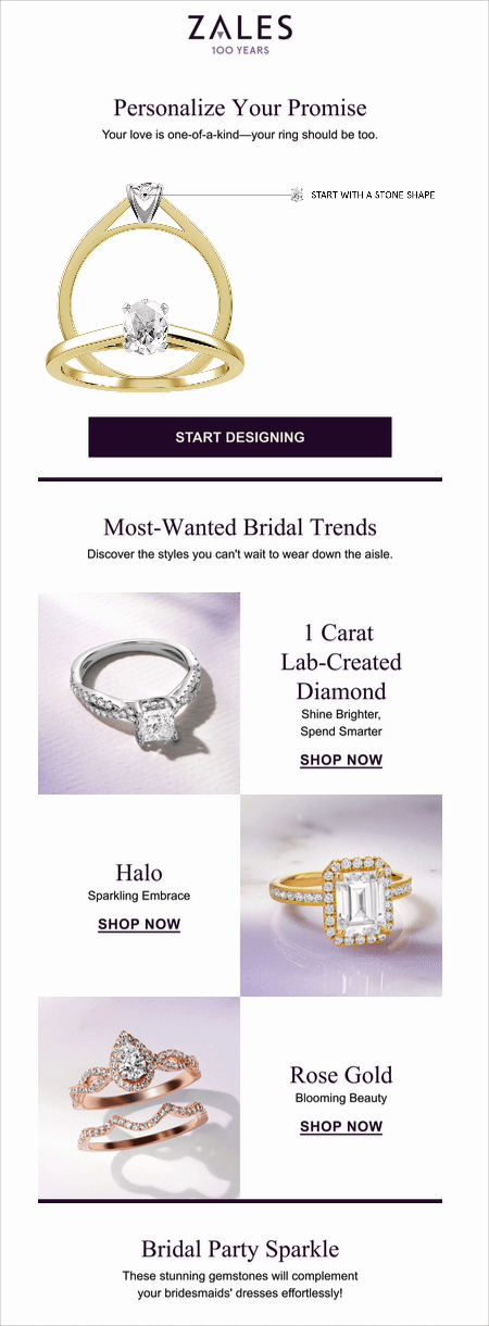
The best part: Throughout this article, you saw a lot of great GIFs in email examples, but this one might just be the most user-focused one. It shows several stages of a process without taking a ton of space in the design. Here, the function prevails over pure decoration, and we love it!
And also… The whole email layout is pleasant to look at, and the slight violet tint of the ring photos’ background complements the accent dark purple color well.
How to use this idea in your campaigns
Show complex customization or processes through GIFs instead of long explanations.
17. The most interactive email: Aura Bora
Email type: Interactive promotional email
Best for: Engagement campaigns, gamified offers, audience reactivation
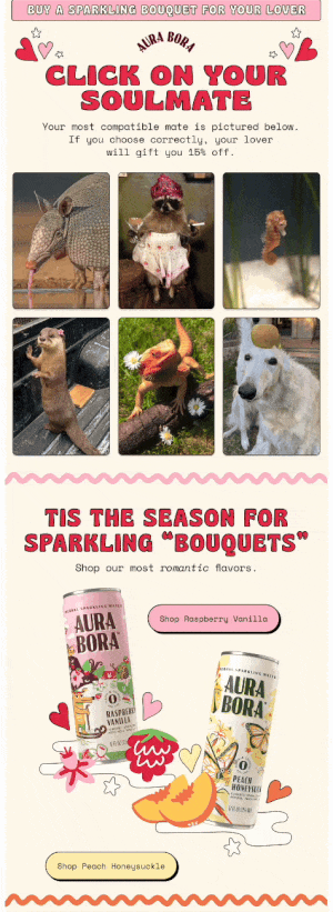
The best part: This Valentine’s Day email is just so loveable! It’s fun and interactive and makes you work to get a reward, but not too hard. If you’re curious, check this email out on Milled.
And also… We also like the cutesy animal photos and the word “bouquet” at the bottom referring not to classical flowers but to flavors.
How to use this idea in your campaigns
Add light gamification to promotions to increase engagement and make discounts feel earned.
18. The most musical email: Bubble Skincare
Email type: Trend-based promotional email
Best for: Youth-oriented brands, pop-culture-driven marketing, timely campaigns
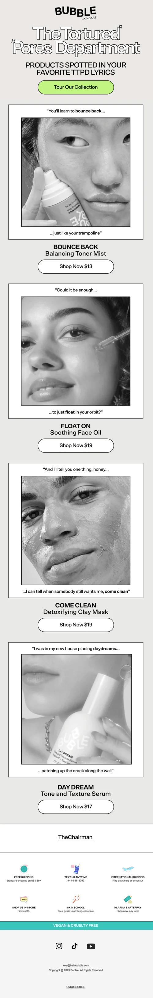
The best part: Appealing to email marketing trends and recent events can easily appear forced, but not in this case. Plus, we’re pretty sure the brand’s customers are exactly the type to enjoy the music referenced, so it’s a perfect harmony.
And also… Usually, Bubble Skincare emails are colorful, but for this one, the brand fully committed to the bit! This goes to show that if your style and branding are well thought-out and recognizable, you can depart from them once in a while to create variety.
How to use this idea in your campaigns
Tie campaigns to cultural moments or trends only when they align naturally with your audience.
19. The most inviting email: Firsthand
Email type: Brand update/announcement email
Best for: Community-led brands, upcoming launches, transparent communication
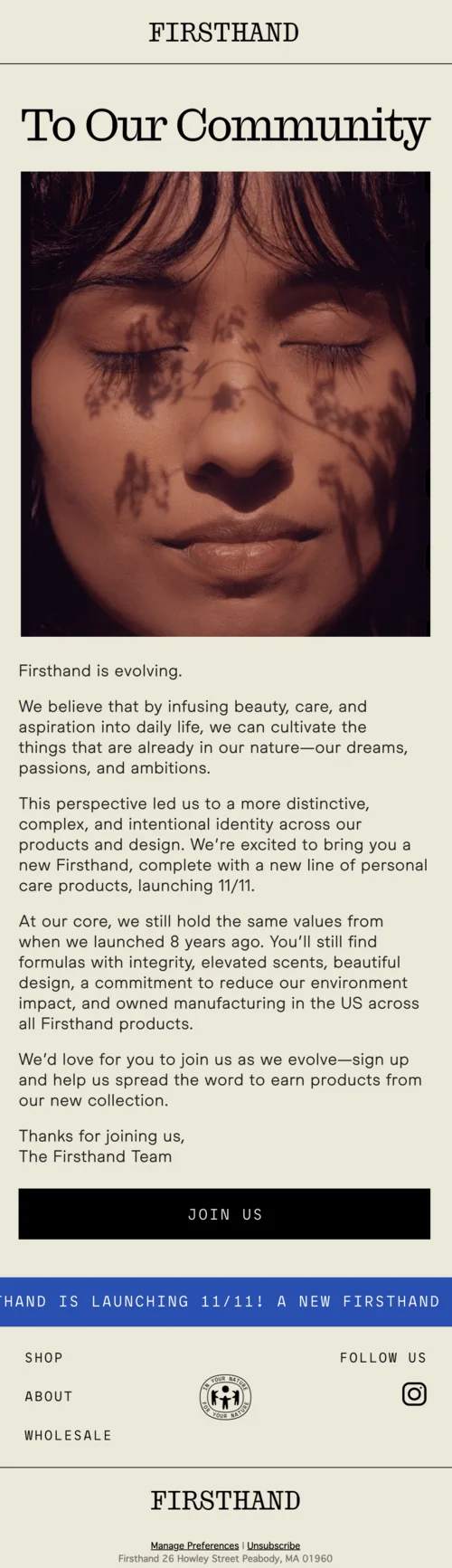
The best part: Transparent communication about upcoming changes is important to maintain a lasting connection with customers. We like how this message manages to reinforce the brand mission and keep the email subscribers excited for what’s to come.
And also… The dreamy banner photo perfectly captures the moment of anticipation: the model’s eyes are closed as if they are about to wake up and look around, but it’s not the time yet.
How to use this idea in your campaigns
Use brand updates to build anticipation and trust rather than pushing immediate sales.
20. The most “hardworking” email: Mugsy
Email type: Relatable promotional email
Best for: Apparel brands, lifestyle e-commerce, humor-driven messaging
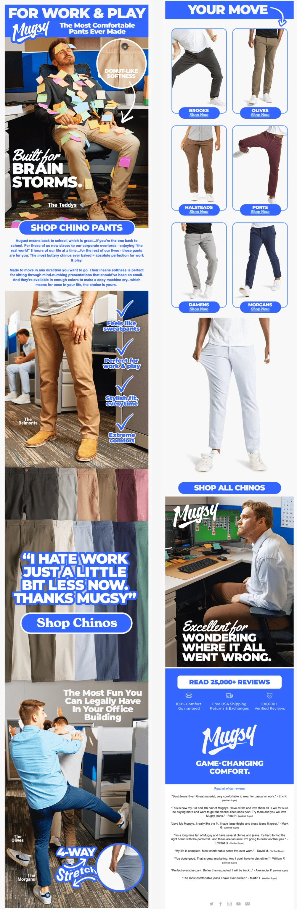
The best part: The email is fun and relatable (doesn’t existential dread just make you want to cry laugh out loud?!) and appeals to the beginning of the school year while staying relevant to the brand’s older audience. You can use any holiday or occasion for an email if you ground it in your customers’ reality.
And also… The photos, seemingly made for this campaign specifically, make the witty copy even more fun. The last one with an old-style computer card game is our favorite of the bunch!
How to use this idea in your campaigns
Anchor humor in relatable everyday situations your audience actually recognizes.
21. The most communal email: Paravel
Email type: User-generated content (UGC) email
Best for: Travel, lifestyle brands, community building and social proof
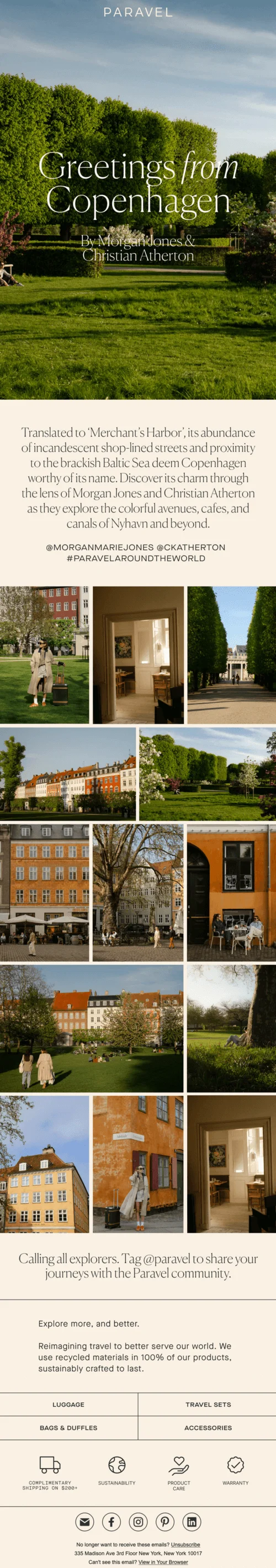
The best part: Email is a two-way communication channel, and user-generated content is one of the best ways to show that your brand is attuned to its audience. The email design is beautiful, with the brand’s customers’ photos laid out in the form of a picture wall — another visual trend of recent years.
And also… The combination of serif and non-serif fonts is very elegant and helps to visually separate different parts of the email.
How to use this idea in your campaigns
Feature user-generated content to reinforce community and social proof without heavy copy.
22. The cheekiest email: Rooted
Email type: Seasonal promotional email (Valentine’s Day)
Best for: Brands with bold copy, playful humor, personality-driven campaigns
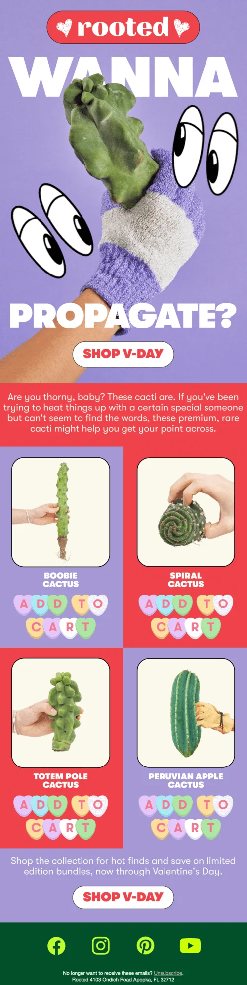
The best part: This cacti-vating campaign isn’t afraid to make suggestive jokes. It manages to not be explicit, though, which can be a hard balance to strike.
And also… The candy heart “Add to cart” CTAs are perfect for Valentine’s Day and add to the playful feeling of the email.
How to use this idea in your campaigns
Use suggestive or playful copy carefully to stand out while staying brand-appropriate.
23. The most progressive email: Warby Parker
Email type: Product explainer/feature education email
Best for: Innovative products, simplifying complex features, conversion support
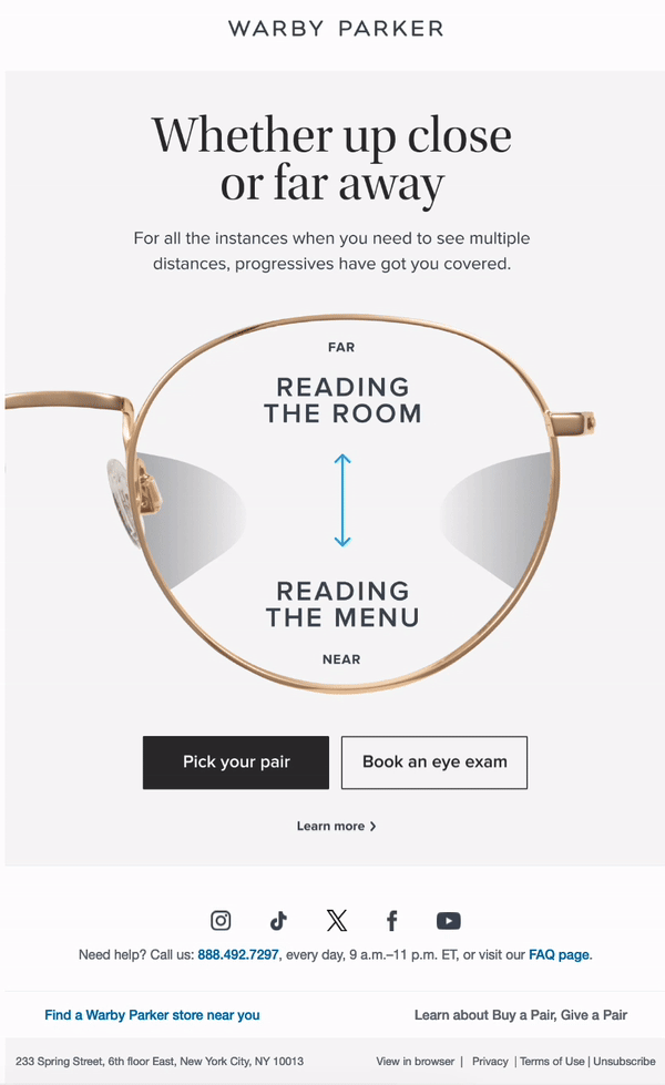
The best part: This email shows another great example of a functional GIF. It acts as an explainer of the progressive glasses product and makes the email ever so concise.
And also… The copy is clever: it highlights the routine needs of the customers while staying entertaining with expressions like “reading the room” or suggesting that a person is simultaneously watching TV and scrolling on their phone.
How to use this idea in your campaigns
Turn product features into everyday scenarios to help subscribers quickly grasp value.
24. The most mysterious email: Back Market
Email type: Gamified promotional email
Best for: Engagement-focused campaigns, reactivation, creative storytelling
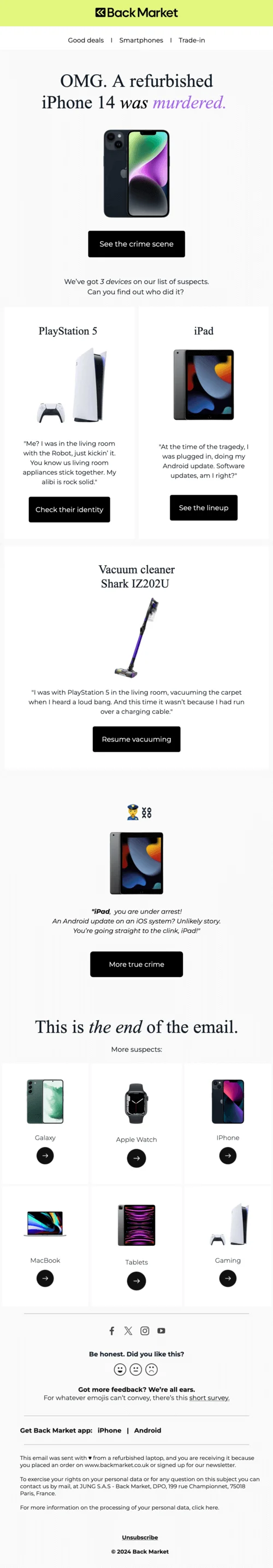
The best part: You don’t have to use AMP for email gamification. A simple story and text-based clues worked out great for this fun Back Market campaign!
And also… We like the emoji footer and a link to a survey as an easy way to get audience feedback, no special occasion needed.
How to use this idea in your campaigns
Use narrative or mystery-driven formats to make promotions feel like entertainment.
25. The most educational email: Brez
Email type: Educational product email
Best for: Health and wellness brands, complex products, science-backed offerings
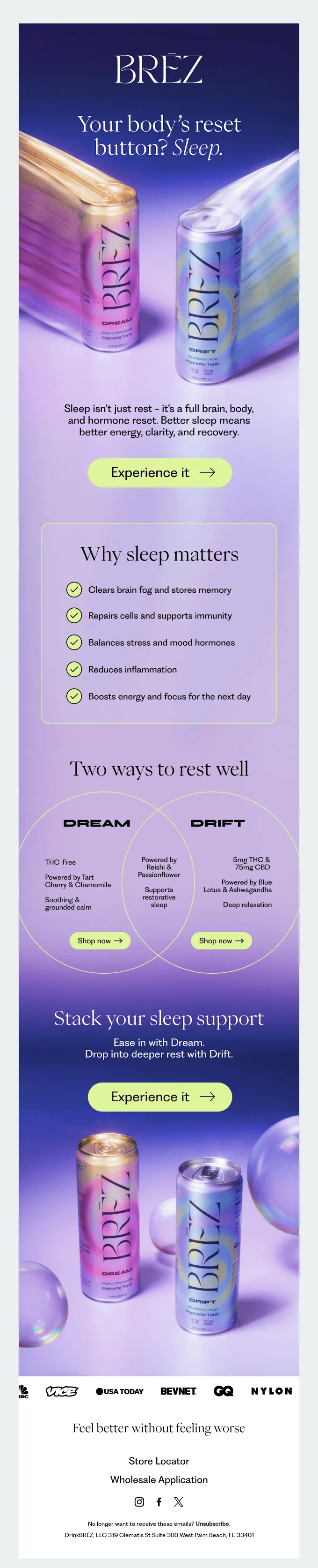
The best part: This email doesn’t try to sell immediately, but teaches first. The “Why sleep matters” section breaks down the science in digestible bullet points before introducing the products, which makes readers feel informed rather than pitched to.
And also… See just how masterful the visual hierarchy is. Soft purple gradients create a calming mood that reinforces the sleep message, while the side-by-side product comparison makes choosing between options simple and clear.
How to use this idea in your campaigns
Lead with education before promotion. Help subscribers understand the problem they’re solving, then position your product as the natural solution.
26. The most personal email: Craighill
Email type: Founder’s note/product story email
Best for: Design-focused brands, artisan products, community-building campaigns
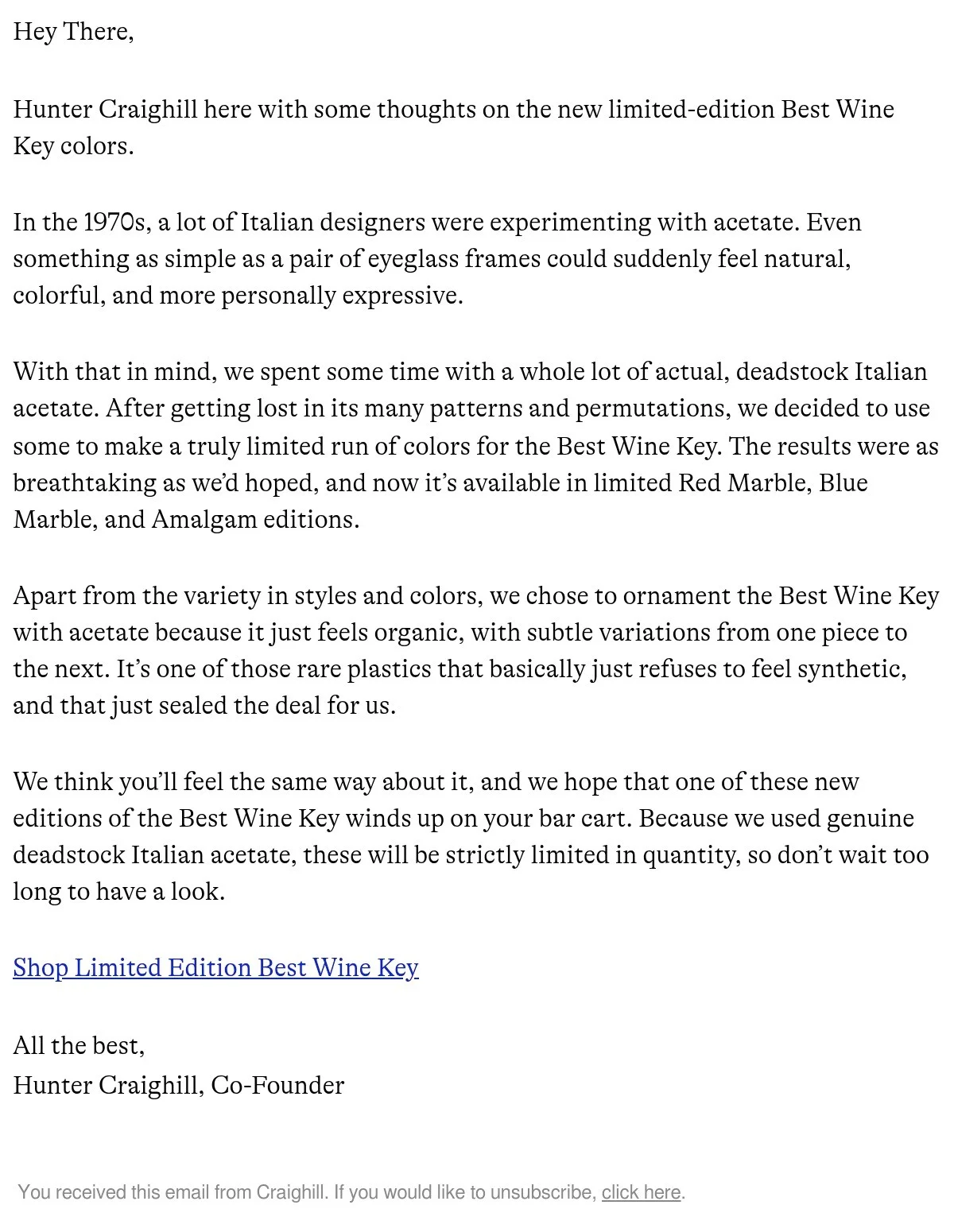
The best part: Hunter Craighill’s plain-text, first-person storytelling creates intimacy that no designed template could match. By sharing the design journey, he humanizes the brand he co-founded and makes the product launch feel like an invitation, not a sales pitch.
And also… The scarcity mention ) feels earned rather than manipulative because it’s rooted in the authentic story about using genuine vintage materials. The casual sign-off “All the best” reinforces the personal, conversational tone.
How to use this idea in your campaigns
Strip away the design occasionally and write as a real person: share your process, inspirations, and “why’s” behind your product, especially for limited releases or craft products.
Final thoughts: How to apply these email marketing examples
The best email marketing examples don’t rely on gimmicks, they combine clear intent, thoughtful design, and an understanding of the audience. Whether you’re building your first welcome email or refining advanced campaigns, the ideas in this list can help you create emails that get opened, read, and acted on.
If you want more real-life email marketing examples, practical tips, and design inspiration, explore Selzy’s email marketing blog and subscribe to our newsletter for regularly updated insights you can actually use.
FAQ: Best email marketing examples
What makes a great email marketing example?
A great email marketing example combines a clear goal, relevant timing, strong copy, effective design, and a compelling call to action. The best campaigns also feel authentic to the brand and useful to the reader.
What types of email marketing examples should I study first?
Start with welcome emails, cart abandonment emails, and promotional campaigns. These have the biggest impact on engagement and revenue and are easier to adapt.
Are these email marketing examples suitable for small businesses?
Yes. While some examples come from large brands, the core ideas like storytelling, clarity, personalization, and relevance, work just as well for small and mid-sized businesses.
How often should I update email marketing inspiration content?
High-quality email examples stay relevant for years. Refresh the article periodically with new examples or trends, but focus on timeless strategies rather than dates.
