Top 23 Emails of 2023, Selzy’s Choice: Best Copy, Design, and More

Top 23 Emails of 2023, Selzy’s Choice: Best Copy, Design, and More
27 November, 2023 • ...
Diana Kussainova
by Diana Kussainova

The year 2023 draws to a close, and it’s a great time to look back and reflect. We at Selzy decided to dive deep into the internet’s collective inbox for the best emails of the year. Check out the top 23 emails of 2023 and keep your eyes peeled for inspirational examples and interesting copy. And get ready to be amazed 23 times in a row!

How we decided on the list

While this top is obviously subjective, it is a collective effort of the Selzy content team. We started at 80 (yes, 80!) emails and worked our way from there. We carefully considered each campaign and settled on the 23 top emails you see in this article. 

And before we move on to the list, please share this collection if you think we did a good job! After you have your email inspiration and make a top-tier email campaign for your audience, try Selzy for free and send 1,500 emails to your subscribers.

1. The meatiest email: Wonder Valley

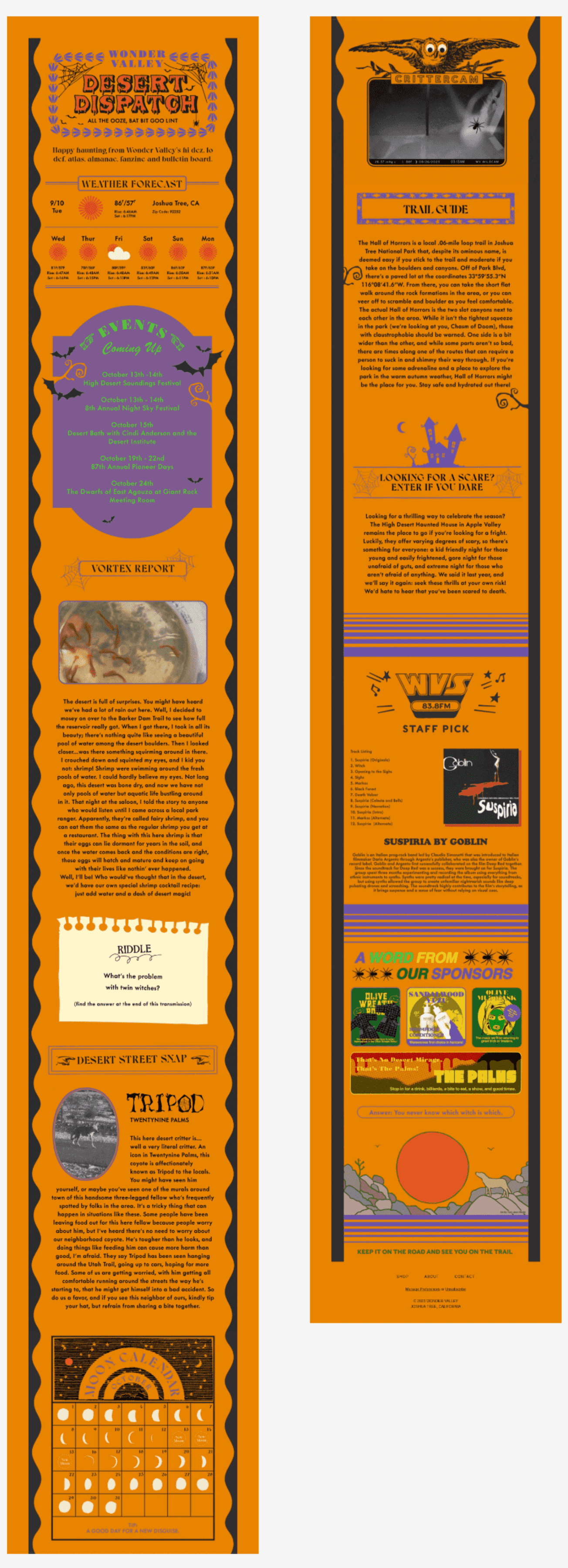
Starting off strong with the most content-heavy email on this list. Have you ever reminisced about the monthly paper magazines of semi-recent or even historic times? Well, look no further than the Desert Dispatch by Wonder Valley. 

It is a monthly digest filled with anything and everything from the weather forecast to upcoming events and music recommendations. From the looks of it, you could think this is an email by an online media or maybe a local tourist guide. But Wonder Valley is actually a natural skincare brand centered around olive oil. Surprisingly, this newsletter makes sense for them: it focuses on nature with critters descriptions, a moon calendar, and a trail guide. This is in perfect harmony with the slow self-care rituals of oil-based products. Plus, it reinforces the brand’s connection to Joshua Tree, California, where the company is based. So it all makes perfect sense!

This particular email impressed us with the retro-feeling design and a nice combination of warm orange and purple for the spooky season. Despite being quite lengthy, it also has a good structure with each part of it in a separate block. The copy is personal and empathetic which makes the reader feel curious about nature around them and inspires exploration.

2. The most versatile email: Ace Hotel

An email with a GIF promoting hotel shop items by placing different hotels, adjectives, and items into a phrase I went to [hotel location] & all I got was this [adjective] and product photo
Source: MailCharts

Promoting different products and places in one email is a tall order. But not for Ace Hotel Shop, of course. In this email, the hotel chain’s shop managed to include 24 different items while keeping the email design and layout beyond minimalistic — it’s just one banner! How did Ace Hotel Shop pull this off? By using a GIF in email

But the GIF itself isn’t all that simple or we wouldn’t have chosen this email for the list. The GIF features the meme phrase “I went to [place] & all I got was this [adjective] item”. Each product photo in the email gets one of the hotel chain’s locations and its own unique adjective. This promo encourages subscribers to shop the souvenirs from their travels without leaving the hotel. This cool concept also creates a sense of playfulness and fun that can be so rare and precious in marketing campaigns that flood our inboxes every hour. 

And the cherry on top? The copy below the GIF banners (come to think of it, there are 24 different banners in this email, crazy, right?) also plays up the above-mentioned phrase. How creative is it to write “Our [adjective] collection of [nouns] just [verb]”! This way each reader will use their own imagination to fill in the gaps and create a unique advertisement in their head!

3. The most mysterious email: Aura Bora

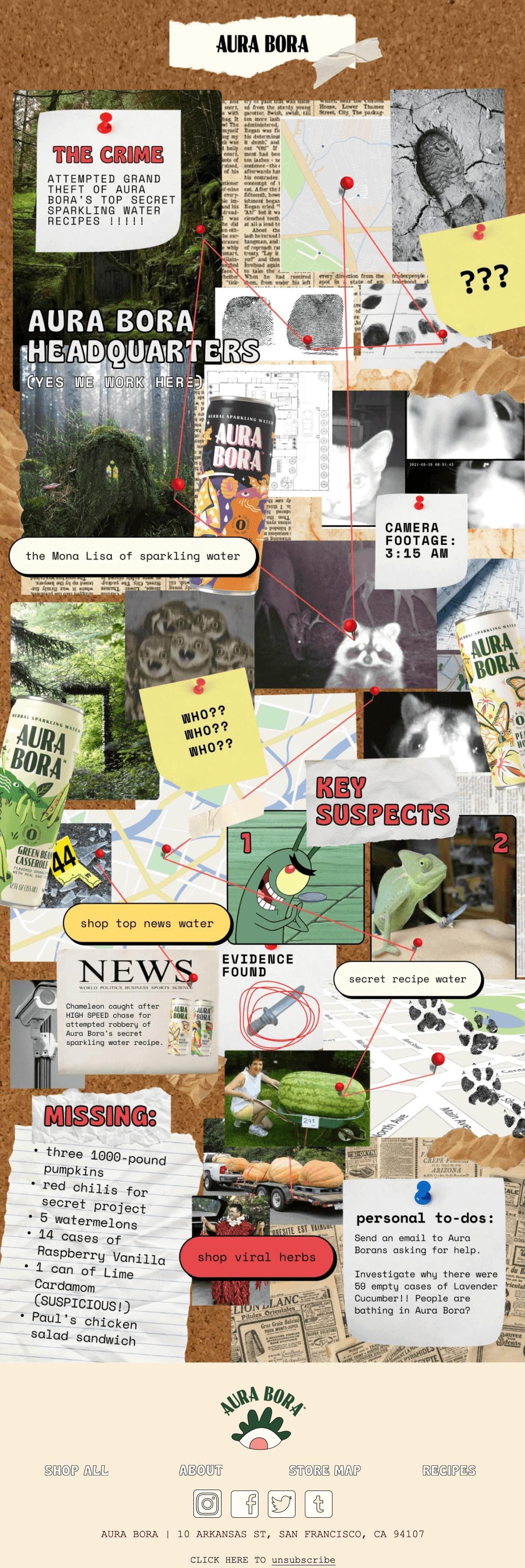
An Aura Bora email imitating a corkboard with clues and red strings connecting them. The clues include photos, sticky notes with texts, key suspects, personal to-dos, and three buttons leading to the company’s website.
Source: Milled

We imagine that Aura Bora’s marketing department made this campaign wearing their detective hats 🕵️ This email uses classic corkboard with evidence imagery. We could probably spend hours studying the clues the brand left and trying to get all the references infused into this email. 

The design is fun and engaging with key suspects in the attempted recipe theft being Plankton from SpongeBob SquarePants and a chameleon with a plastic knife. But the campaign is not only about fun and games. The email has four buttons with different CTAs. Despite the intentionally cluttered design, the buttons are noticeable thanks to bold outlines and different colors. The CTAs’ copies vary from obvious (“shop viral herbs”) to imaginative (“the Mona Lisa of sparkling water” and “secret recipe water”) so that they can interest different readers. Moreover, the copy variation is useful to test which approach is the most effective. 

By the way, judging by the evidence found on paper clipping, it was actually a chameleon. Or is it a misdirect?

4. The sneakiest email: Nuform

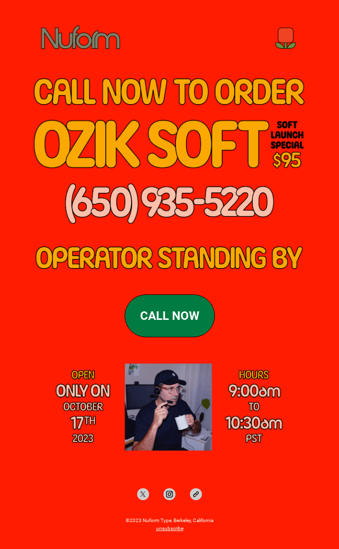
This email simply looks amazing, even without context. It has a bold retro and cartoonish charm to it. The orangey-red background reminds us of ketchup and in combination with nostalgically pale yellow and green, it creates an image of a fast-food restaurant. This is further supported by the copy offering a soft launch special, mentioning the standing by operator, and open hours. A photo of the said “operator” wearing a uniform and a headset ties everything together. 

But this email doesn’t actually promote fast-food or any food, and neither is it a restaurant promotion. Nuform self-describes as a “design practice” and it creates and sells fonts. Ozik Soft is not an ice cream special, it is the studio’s newest font. This email shows the interconnection of the form and meaning. Using the retro fast-food aesthetic to promote the font showcases its best use case. Ozik Soft is a great option for nostalgic design, bold promotions, and, well, fast-food!

The soft launch promotion also deserves recognition. To get the font early and for a special price, the newsletter subscribers had to literally call using the number in the email. And the “call now” button automatically fills in the number on the users’ devices. Who answered those calls? The “operator” was actually the Nuform founder, designer Erik Marinovich. 

Ozik Soft might not be the font for every company or every email, so read our article on newsletter fonts to learn about other options. And if you liked this email, we highly recommend you to check out Nuform’s website, it’s an eye candy!
5. The yellowest email: Brooklyn Museum

The color yellow isn’t the only asset of this campaign by the Brooklyn Museum. It is stylish and thanks to the one-column layout and a pleasant mix of fonts (including one resembling a typewriter’s font), this email looks like an event ticket. 

The copy is to the point and short with a focus on being useful. Yet the event seems exciting because of the bold headings signifying various activities happening at the museum. We can talk design and copy all day, but the illustration is the star of the show here. It is bright, playful, and fun. It also effectively conveys that the museum isn’t a solemn unapproachable establishment (at least, not this Saturday!). The characters disturb the usual orderliness of the art space and make it more friendly. This, in turn, makes the offer inviting to the readers.

6. The most stylish email: GRAZA and Aura Bora

You probably can’t stop looking at all the emails in this article, but this one is especially captivating. First off, you might want to ask: Didn’t you folks use an email from Aura Bora already? Yes, we did. And we will actually do it again 😅 Their campaigns are just that good! 

But also, this is an email about a collaboration between Aura Bora and GRAZA — an olive oil manufacturer. This campaign impressed us with funky illustrations, especially a sophisticated-looking olive with either lime green lashes or brows that sips the martini. The color and font work are immaculate. Lime green and peach go together greatly, creating contrast and focusing the attention where it is needed. The mixture of fonts creates variety and fuels visual excitement.

The email tone of voice is informal and helps to convey the joy of the collaboration. Reading this email, the brand’s subscribers might’ve felt like it was their friend sharing their dream project. At least, we definitely felt this way!

7. The most grounded email: Allbirds

This email is also about a collaboration, but it’s very different from the previous one. The color scheme is grounded and the colors are muted to reflect the featured footwear design. Visually and copy-wise the email screams nature (for being relatively short, the copy mentions nature three times).

This campaign has a good structure focusing on every aspect of the product. First, it describes the project and encourages readers to act fast. Next, there is a brief artist introduction. And last but not least, the email showcases the footwear up close focusing on three different aspects of it. Unlike the rest of the email, this part has a two-column layout making it attention-grabbing. Overall, this is a perfect example of a reserved promo campaign that nails the product presentation.

8. The most glowing in the dark: Experiment

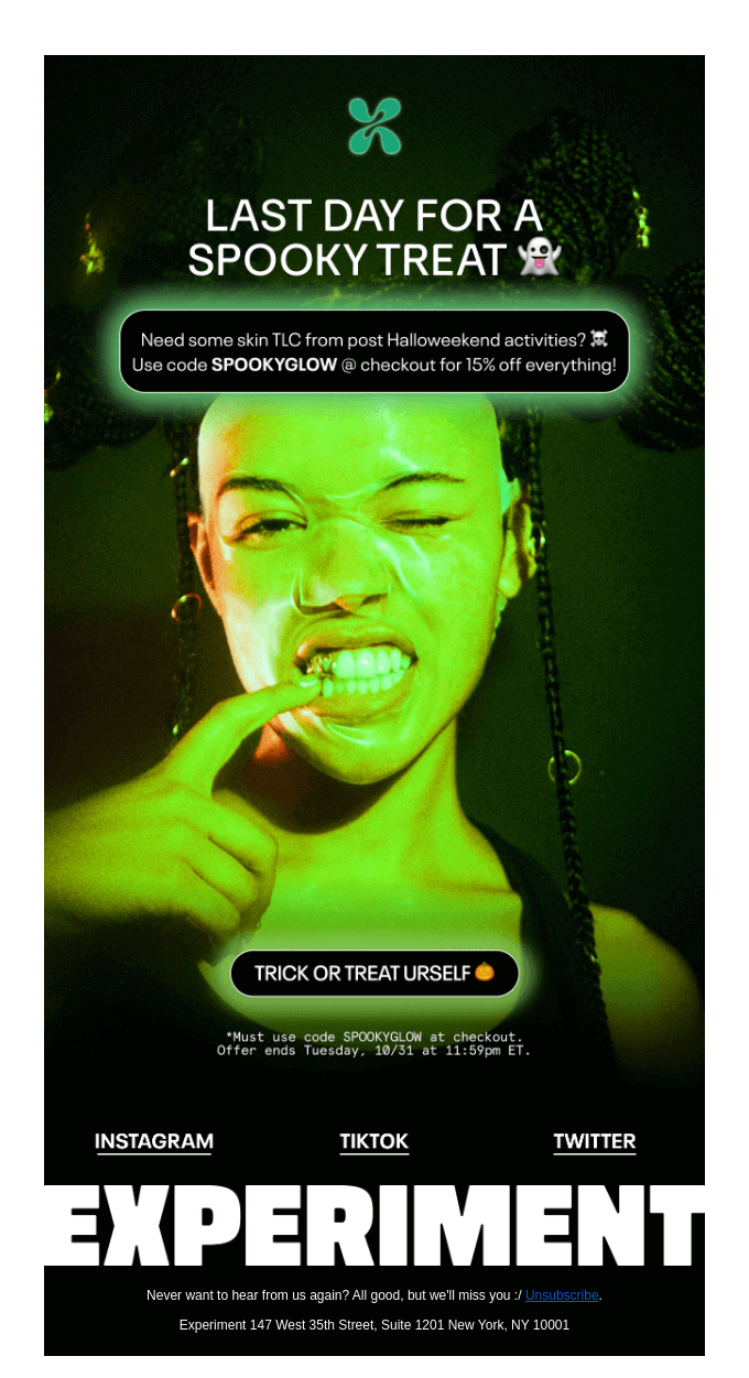
This email’s title could have also been “the coolest banner photo”. The focus of the entire campaign is on the photo of a model wearing the brand’s glow-in-the-dark mask. The photo is actually so bright and spooky that it feels like it literally glows before your eyes. 

The green glow is carried over to the button and text bubble outlines. The copy is short and on point with the focus being on the promotion itself, not its description. The tone of voice is friendly, and the copies all end with Halloween-appropriate emojis.

The text on top of the email (Last day for a spooky treat) answers the intrigue of the subject line that promised “the scariest short story… 🫣”. Connecting your sales subject line to the contents of the email is an effective tactic to engage subscribers and motivate them to open the email. Last but not least, the copy by the unsubscribe link adds a nice touch and follows the tone of voice.

9. The sincerest email: Everyday Oil

Can a marketing email be sincere and at the same time to the point? This email is your answer. Everyday Oil is a skincare brand, and in this campaign, the brand announced a new product — a hairbrush.

The email design is minimalistic and the gray-yellow color scheme reflects the colorways of the two available versions of the product. The focus of the campaign is definitely on the copy. It starts off on a personal note — “We made a brush for you!” This phrase creates a connection with the reader and focuses their attention. After such an introduction, the subscribers are going to read the next paragraphs thinking about the brush as it can be used in their lives. The following copy is a customer-focused, on-point product promotion, but the last sentence isn’t. The final phrase of the copy relates back to the personal beginning and ties the purchase of the brush to acts of love and self-care. How can people resist buying it after this compelling argument? And the button is so warmly yellow it makes it irresistible!

10. The most flowery email: Goshen Coffee

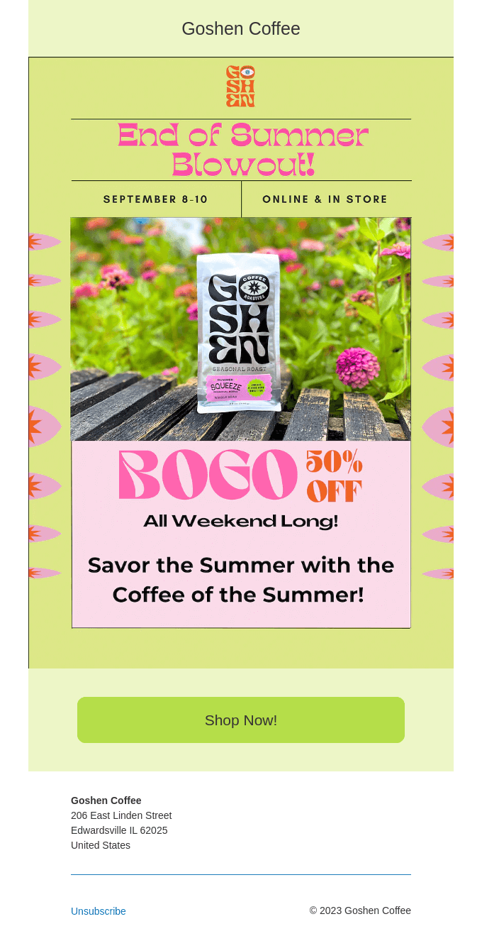
It goes without saying that marketers need to make the promotions season-appropriate. This means sending summer emails from June to August. But exceptions can be made. This Goshen Coffee campaign screams summer, but it was actually sent in September. This is a good tactic as many people miss summer in the first days or even weeks of fall. 

The idea of this email is clever and so is the design. Green and pink are bright and exciting and provide great contrast to the mostly white coffee bag in the photo. Flower borders look fresh (double-reading intended!) and cute. The font work is also great. 

The only thing we would probably change about this campaign is the CTA button placement. We would suggest putting it higher to increase the click-through rate. As is, the button is an additional scroll away (and this is a recipe for decreasing mobile conversions).

11. The biggest comeback email: Fishwife

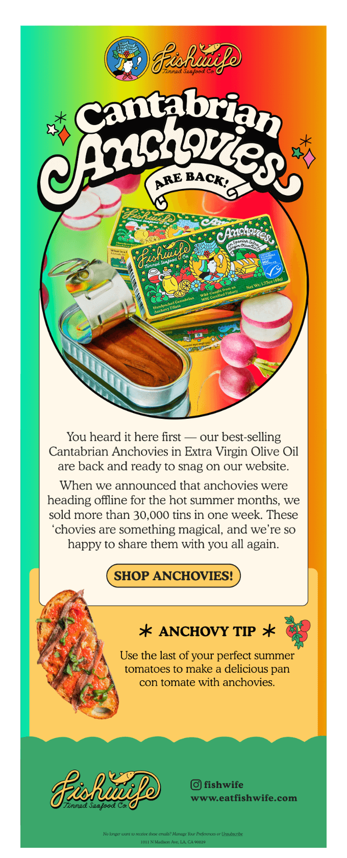
An email announcing that the brand’s anchovies are back online and recommending eating them on a slice of bread with tomatoes
Source: Milled

Fishwife is a tinned seafood manufacturer that is actually female-founded and led (although we aren’t sure whether the founders are wives or perhaps fish). This email is the announcement the brand’s customers were anticipating — the comeback of the anchovies! 

The campaign reflects the excitement of the news — it is vivid and colorful, even technicolor. The green to orange gradient is a bold choice yet the design doesn’t look chaotic or messy. The feel of it is cartoonishly fun and we really love it! The structure and copy are simple but the added “anchovy tip” is a nice touch at the end to make the readers drool and want to shop the comeback right away.

12. The most clever email: Warby Parker

We really enjoy data visualization, especially when the data in question is fun or presented in a fun way. This Warby Parker email is a great example of both. The glasses brand cleverly tied in their products and services with seasonal Halloweeny activities and experiences like making a last-minute costume or haunted hayrides. The pumpkin illustrations are also a nice replacement of the usual Venn diagram circles and convey the spirit of the season.

The other great thing about this campaign is three CTAs that address different customer pain points. This multi-directional approach makes the email effective as it can target several customer groups at once. 

Overall, this campaign is unique and fun and can hopefully motivate you to try something different in your next email. Maybe adding a touch of gamification or interactivity?

13. The most reptilian email: Aura Bora

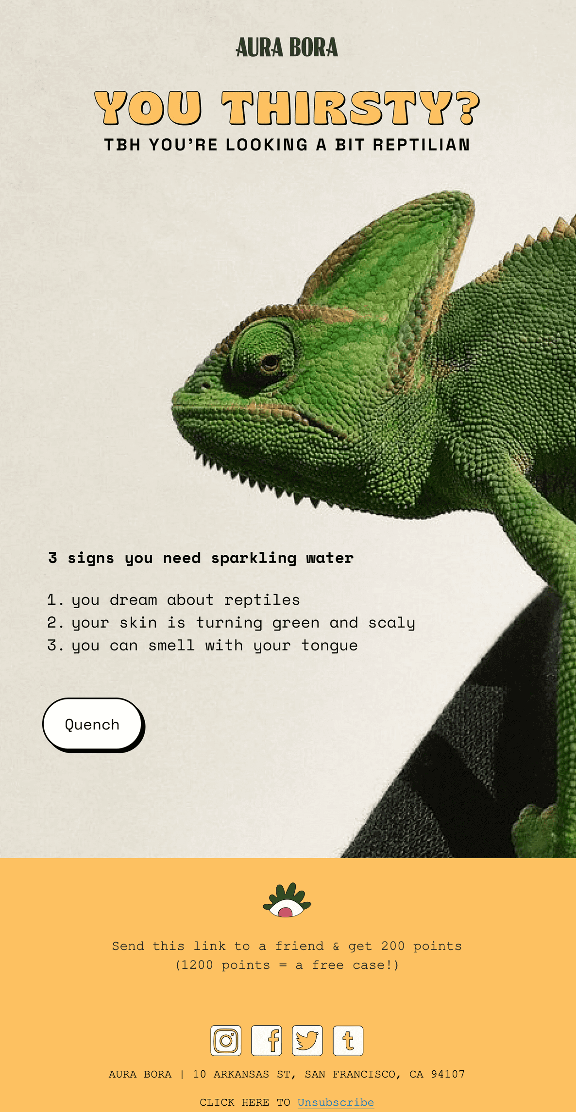
An email with a big photo of a chameleon and 3 signs that the reader needs sparkling water
Source: Milled

We promise this is the last Aura Bora campaign on this list *sigh* This email is fun in a special way — it mocks educational content with its “3 signs” copy. The parody is easy to get and friendly which is important if you want to make jokes. Plus, the copy works great with this email’s funny subject line — “thirst trap attached”. 

The humorous copy is followed by a short and unique CTA that is just the word “quench”. Besides the perfect copy, there is a large photo of a chameleon to show how thirsty email readers must be looking. The reptile also stares directly at the email readers to make the impression even stronger.

There’s just one question left unanswered — is this the same chameleon that probably stole secret sparkling water recipes? We’ll never know 🦎

14.  The most delicious email: Woon

What can be more delicious than an email about restaurant food? Only the email about restaurant food that you can make at home (or buy frozen)!

This email from a Chinese restaurant Woon has a white background to make the red photographs and orange text pop. The background also has blue leaves subtly placed on the sides. These remind us of the decorations seen on the white dumpling plate in one of the photographs. This detail can be easily overlooked yet it adds a nice touch showing that this email is like a plate of dumplings itself (life is like a plate of delicious Chinese dumplings…).

The photos themselves are the main attraction of the campaign. Not only do they showcase delicious dumplings, but they also convey a familial, nostalgic feeling. They have faded, retro colors as if you were looking at them through the steam in the kitchen. And Chinese characters on the bottom of each photo add to the atmosphere. 

As for the rest of the campaign, using videos in email is an effective way to engage the audience.

15. The most competitive email: The Farmer’s Dog

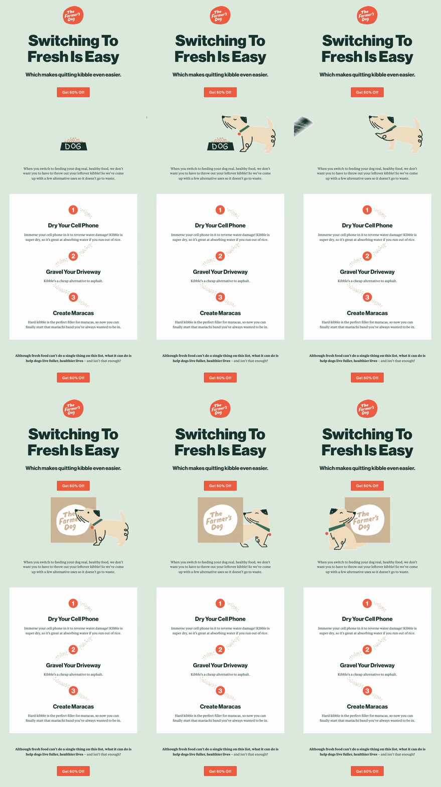
An email with a GIF of a dog kicking a bowl of kibble food off frame to eat the brand’s organic dog food and 3 use cases for the readers’ leftover kibble
Source: Email Love

What can crush your competition harder than explaining to readers what they should do with their products when they decide to switch away? Only a GIF showing the competitor’s product kicked off. That’s what The Farmer’s Dog — a natural dog food manufacturer — did. This sarcastic, confident email makes a compelling case for readers to switch to the brand’s product and shows what exactly they should do with the leftovers. The copy is very funny and merciless to kibble — an alternative to The Farmer’s Dog food. Comparing actual dog food to maracas stuffing and even asphalt shows the brand’s attitude toward the alternative product options.

The last part of the email saying that the brand’s product cannot be used in any of the ways described above makes it the superior option. The Farmer’s Dog food is meant to make the pets “live fuller, happier lives” which is the true purpose of the food in the first place. 

The design of the email is lovely, we especially adored the little dog kicking its bowl filled with kibble. There are also two CTAs placed at the top and bottom of the email to catch readers’ attention. Plus, the CTA copy mentions the great 60% off deal to drive more conversions.

16. The boldest email: XXIX

Some shady email marketers make the unsubscribe link as invisible as it gets to try and retain subscribers. Unlike them, XXIX — a design and technology studio — put the unsubscribe link as the first word in the email. It’s also the most noticeable thanks to the blue color and underlining. This is a bold choice as is the rest of the email.

The design is brutally bare bone and that’s what caught our attention. Large text scattered across a white background is strikingly different from anything you can find in an inbox on any given day. A small section where the white background has dots and a film photo along with the text on a gray square reminds us of a notebook page and creates a nice variety in the design.

The copy is short and personal. The first bold phrase “Unsubscribe if you don’t like parties” catches readers off guard and interests them in the rest of the email. And for those who read till the end, there is a sweet thank-you note and even an “xo” sign-off.

17. The most science-defying email: Surreal

As Selzy’s content team, we are so happy we decided to become editors since we appreciate good copy so much! Here Surreal — a cereal manufacturer — wrote an engaging and fun copy about infinite cereal. But the way the company solved this problem isn’t through a science breakthrough, but with a simple cereal subscription. 

This copy is great not only because it is clever, but it also addresses the customers’ pain point — when their favorite breakfast suddenly runs out. Other great aspects of it include a bright design with contrasting black buttons. The email is quite lengthy, so it has four buttons in each significant part. A stellar campaign through and through!

18. The cutest email: Bored Cow

There are a lot of cute emails on this list, but this one from Bored Cow — an animal-free milk manufacturer — won. Not only is the pastel violet and peach color scheme adorable, but it also has nice little illustrations that remind us of stickers. And some of these even have tiny faces! What can be more cute than a little sun and a little ice cream cone with little smiles?

The copy is simple and intriguing, making the reader want to check out the recipe. There is sort of a mystery with the rest of the ingredients that “you may already have at home”. This simple omission tickles curiosity and makes the nice oval “Get the recipe” button more enticing.

19. The most solution-forward email: K18Hair

Halloween emails are one of our favorite campaigns all year. Most of them are about fears and monsters, though, and not a lot feature Ghostbusters — ways to deal with the issues described. This email from a hair repair brand K18 Hair is different. It addresses subscribers’ pain points (which, we won’t stop repeating, is key to conversions) and offers compelling solutions. 

Apart from the idea, the layout is simple and clear with each “scary hair issue” being in a separate colored block and having its own separate CTA. The design is sleek and fun with vivid colors and spooky elements that complement the copy. The most interesting detail in this email is the “wavy” typography. To convey the spook, K18 Hair didn’t use a special font or even a simple gothic one. Instead, the brand made the text wavy reminding us of a mysterious gust of wind or a lingering Boo from a ghost.

The copy is simple and product-focused. The last part of the email stands out as the brand recalls the “isn’t hair dead” question that sounds especially spooky during Halloween. The “find out if you dare” line is playful and makes the email even better.

20. The most empathetic email: Really Good Emails

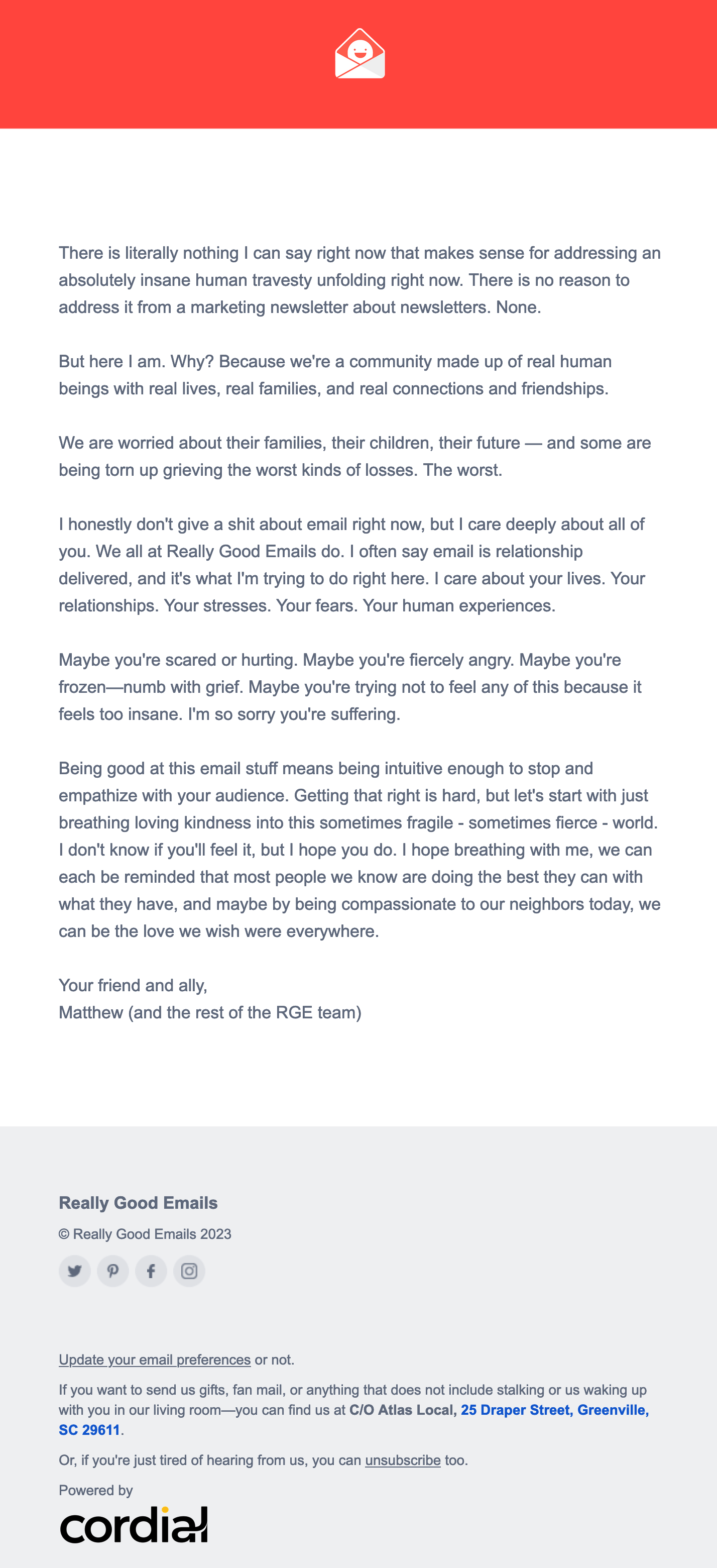
An email describing strong emotions people feel concerning the recent news and empathizing with the audience

In light of the recent tragedies (which sadly don’t stop from happening), companies and influencers questioned whether they should speak up and how they could do that without alienating their audiences. The pressure to address the events led to hasty statements and conflicts for those who did speak and to boycotts for those who chose to be silent. 

Really Good Emails (RGE) sent a message that managed to make their connection with the audience even stronger. It is an empathetic, kindness-based statement without picking up sides. For brands and companies that otherwise don’t follow any political agenda (which is getting harder and harder by the moment), it’s probably best to stick to universal values like love and kindness. This statement by RGE acknowledges the mixed feelings and sufferings of people without alienating anyone. 

What is also remarkable is the last sentences of this email. They give hope and show what the digest’s subscribers can do in their day-to-day lives to make sense of the crumbling world around them. The human connection this message creates is unparalleled and commendable. 

21. The most positive email: Earthfolk

Earthfolk is a weekly newsletter with more than 220 thousand subscribers. And who can do emails better than a literal newsletter? This email describes brands, companies, and initiatives that are worth supporting. The ecological, sustainability-focused point of view makes subscribers feel better about the world and the choices they can make. Also, notice how each section uses the word “good” in the heading! Plus, the copy is very positive and friendly. It is also easy on the eyes: the orangey-red cursive text draws attention to the most important parts of the text and makes the email skimmable.

The layout of this campaign is also pleasant with variations of two images side by side and one bigger image. It is a simple and nice concept. 

Enjoyed reading the Earthfolk email? Check out our collection of 40+ newsletters you can subscribe to!

22. The most conceptual email: SIDIA

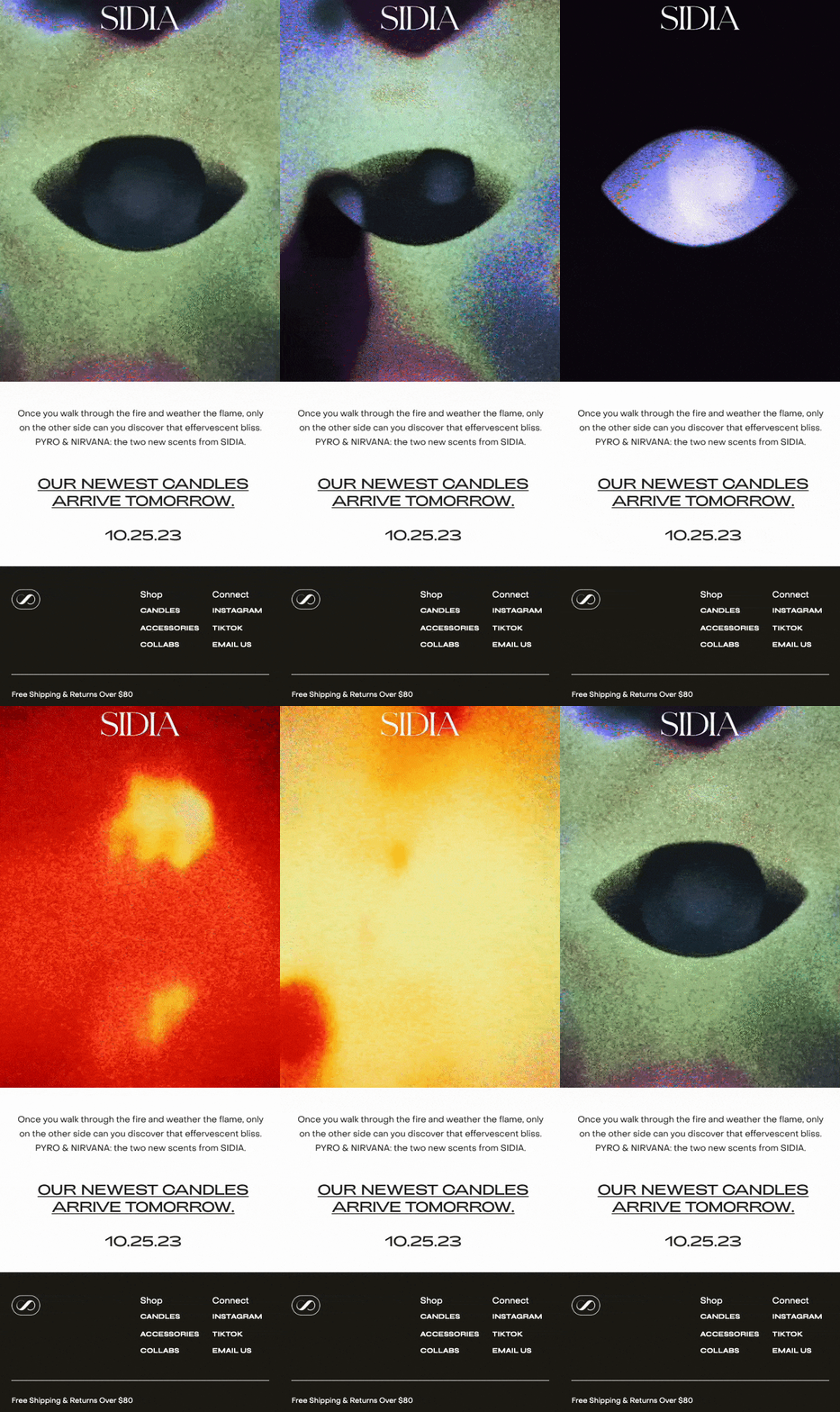
And now, to something sensual and metaphorical. SIDIA — a body care and fragrance brand — announced the arrival of the new candles with a minimalistic email that doesn’t offer any concrete product description. Instead of writing about the aromatic composition of the candles’ scents or their other characteristics, SIDIA gave the newsletter subscribers an imaginative line. This sentence captures the feeling and mood of the scents without necessarily describing them. 

A large GIF at the top of the message does exactly the same. It doesn’t showcase the products and instead creates visual associations and inspires viewers to draw their own conclusions. The combination of elusive copy and GIF intrigues and excites. And for those who are captivated by this marketing message, there is a link to the website that is elegantly just underlined text instead of a button.

23. The goofiest email: SAXX

An email with a happy birthday message and a personalized promo code for 10% off
Source: MailCharts

If there ever existed a website called Really Goof Emails, this email from a men’s underwear brand SAXX would definitely be there. This is a cheeky and punny birthday message with a personal promo code.

Of course, the first thing that jumps to the eye is the copy. The banner text wishing a “willy great birthday” sets the tone for the rest of the email. The featured print with birthday cakes with candles attacked by fire extinguishers is a perfect addition to the campaign. 

The design is a classic marketing campaign design with several photos and a CTA button at the end. The copy and products are so good, though, that we couldn’t help but to include this email in the list for a good time!

Final thoughts

This email inspiration filled adventure is coming to an end, but you don’t have to stop here. Check out the Inspiration section in Selzy’s blog to see more beautiful campaigns and subscribe to our digest for bi-weekly email tips and examples.

And who knows, maybe your next campaign will be so great it will make it to one of our lists!

27 November, 2023
Article by
Diana Kussainova
Writer, editor, and a nomad. Creating structured, approachable texts and helping others make their copies clearer. Learning and growing along the way. Interested in digital communications, UX writing, design. Can be spotted either in a bookshop, a local coffee place, or at Sephora. Otherwise probably traveling. Or moving yet again.
Visit Diana's
Latest Articles
Selzy Selzy Selzy Selzy