Top Winter Emails To Send Out This Year

Top Winter Emails To Send Out This Year
07 November, 2024 • ... • 2156 views
Sara Kurczyńska
by Sara Kurczyńska

Winter can be an incredibly profitable season, no matter what kind of company you are running. Before the new year comes around, you get to make thousands of dollars during the holiday season. But keeping the momentum going in January and February can be a hassle. The best way to do something about it is to launch winter email marketing campaigns.

If you do not know where to start, keep reading! You’ll find a few reasons why you should send out winter emails, learn best practices, and see examples of other brands’ winter email campaigns.

Why send out winter emails

If you are not convinced that you should use winter emails, here are a few benefits of doing so. First, it will help you increase sales. Winter is the biggest shopping season of all. According to statistics, consumers planned to spend an average of $1,638  on gifts, travel, and entertainment in 2024 alone. Spending is once again growing yearly, so in 2025, people are probably going to spend even more. For any marketer,  it would be insane to miss such an opportunity!

Second, the holiday season is all about giving. Why not use this sentiment to build relationships with your customers? Sending out winter emails can be a great way to show that you care about them and that your customers can trust you. After all, consistent communication is the basis of loyalty and retention.

Winter email types to include in your campaign

November emails

BFCM weekend

Black Friday and Cyber Monday are among the most important shopping events of the year. You can benefit from both by sending out emails that offer special discounts and coupon codes.

Many customers shop for Christmas gifts during the sales season, so you can extend the special offers or discounts to the beginning of the winter or even further.

If you are working for a small business, you can take advantage of the Small Business Saturday which takes place on November 25th. This event is aimed at drawing attention to small businesses and encouraging people to shop with them more.

Want to create an unconventional email campaign? Check out our November newsletter ideas article.

December emails

St. Nick’s Day

St. Nick’s Day (December 6) is a day dedicated to giving, so why not use it to kick off a holiday email marketing campaign? You could create a festive email template filled with discounts and gifts. Just make sure to include images of snow and winter-themed decorations!

Green Monday 

A recently created e-commerce occasion that happens on the second Monday of December. It was coined as the last day customers could place an order that would be delivered before Christmas. You don’t have to stick to this name, though, or use shades of green in your email design. But it’s still important to notify your clients about the last day you offer before Christmas delivery. You can also mention this in your holiday abandoned cart emails.

Christmas countdown

Christmas is just around the corner, so why not get people in the holiday spirit? One idea is to create a countdown email that highlights your brand’s products, together with any interesting discounts or the latest promotion.

You can also create your business’s version of an advent calendar offering a new deal each day before Christmas.

Christmas Day

Christmas Day is the perfect time to send warm and heartfelt Christmas emails to your customers. Let them know that you appreciate each and every one of them and wish them holidays filled with fun and laughter.

Tip: Don’t include any important updates or announcements since the engagement for a Christmas Day campaign may be significantly lower than usual. Remember that your customers are actively preparing for a celebration and probably won’t have the time or desire to check their inboxes.

New Year’s Eve

The end of the year is usually a time of reflection. You can use this to your advantage by sending out a New Year’s Eve email that recaps the year.

There are two options for a year-round-up campaign like this: an email about your business (how many customers you gained, what products you developed, how many stores opened, etc.) or about a particular customer’s engagement with your product or service (achievements or loyalty points accumulated, miles run, bookings made, etc.). Choose any of these two that makes the most sense for your company and industry.

January emails

New Year’s resolutions

January is the perfect time to help your customers stick to their New Year’s resolutions. With that in mind, put together an email that highlights products and services that can help your newsletter subscribers reach their goals.

Blue Monday

Blue Monday is said to be the most depressing day of the year. It falls on the third Monday of January and is usually a time when people feel like they have not achieved as much as they intended to. So, make your customers feel better by sending an email filled with discounts!

February emails

St. Valentine’s Day

This is the perfect time for a Valentine’s Day email that focuses on romance and love. Send out a February email with discounts on gifts for couples, as well as products that your subscribers can give to their significant others.

You can, of course, target singles too. Check out our article on Valentine’s Day marketing for inspiration and campaign examples.
Winter email design best practices

If you want your winter email campaign to work, you need to make sure that it looks good and that its content is eye-catching and well-written. Here are a few tips that should help you achieve this goal.

Subject line

Make sure that the subject line of your winter email is short, to the point, and attention-grabbing. This will increase the open rate and, in turn,  the sales. If you want your catchy email subject line to contain an emoji, stick to just one. More than that will make the subject line too cluttered. Here are a few examples of good winter email subject lines:

  • Holiday deals are here 🎁
  • Happy Valentine’s Day! 💕 Get 15% off our gift selection.
  • Make 2024 the best year yet! 🔥

Color palette

Since winter is a cold season, stick to cool tones like blues and purples, as well as whites and grays. It will make each email you send out more winter-themed. Alternatively, you could also use a combination of reds and greens for a more festive look.

Tone of voice

Make your winter emails sound friendly and welcoming. Make sure to use words that convey warmth, such as welcome and appreciate. Doing so will make it easier to build a better relationship with your customers and improve your brand image.

Visuals

Remember to add some visuals to every message. If you are not an experienced graphic designer or want some email design inspiration, be sure to check out custom Christmas email templates and New Year ideas. With a great template, you are guaranteed to save plenty of time and energy.

Responsive design

If your email is not responsive, it is unlikely to help you achieve the results you need. Make sure to design responsive emails that look great on both desktop and mobile devices. That way, you will reach a larger audience and increase your sales. You can use specially created templates to ease your work.

Personalization

Personalization is key when it comes to email marketing. Make sure to use the data you have collected about your customers to create personalized emails that are tailored to their needs and interests. 

The easiest ways to do this are to use the customer’s name in the subject line and to send them suggestions based on their past purchases. This will make them more likely to open and click on your emails, as well as actually purchase something from your store. 

Keeping it brief

As with most email marketing campaigns, winter emails should be brief and to the point. Your customers are busy people and they do not have time to read long emails. Get your point across in as few words as possible to make your campaigns effective.

CTA

If you send an email about your seasonal sales or other deals and discounts, make sure to include a good CTA that complements the email contents. If you don’t know what works best, try out different options with A/B testing. For example, you can send some customers an email with a CTA on a button, and others — with a link CTA. You can also test the link or button colors or copies.

Happy holidays

Last but not least, make sure to wish your subscribers happy holidays instead of Merry Christmas. Why? Well, not everyone celebrates Christmas. Wishing them happy holidays is a great way to be inclusive and respectful.

Best winter email examples from your favorite brands

Anthropologie: A cozy mood

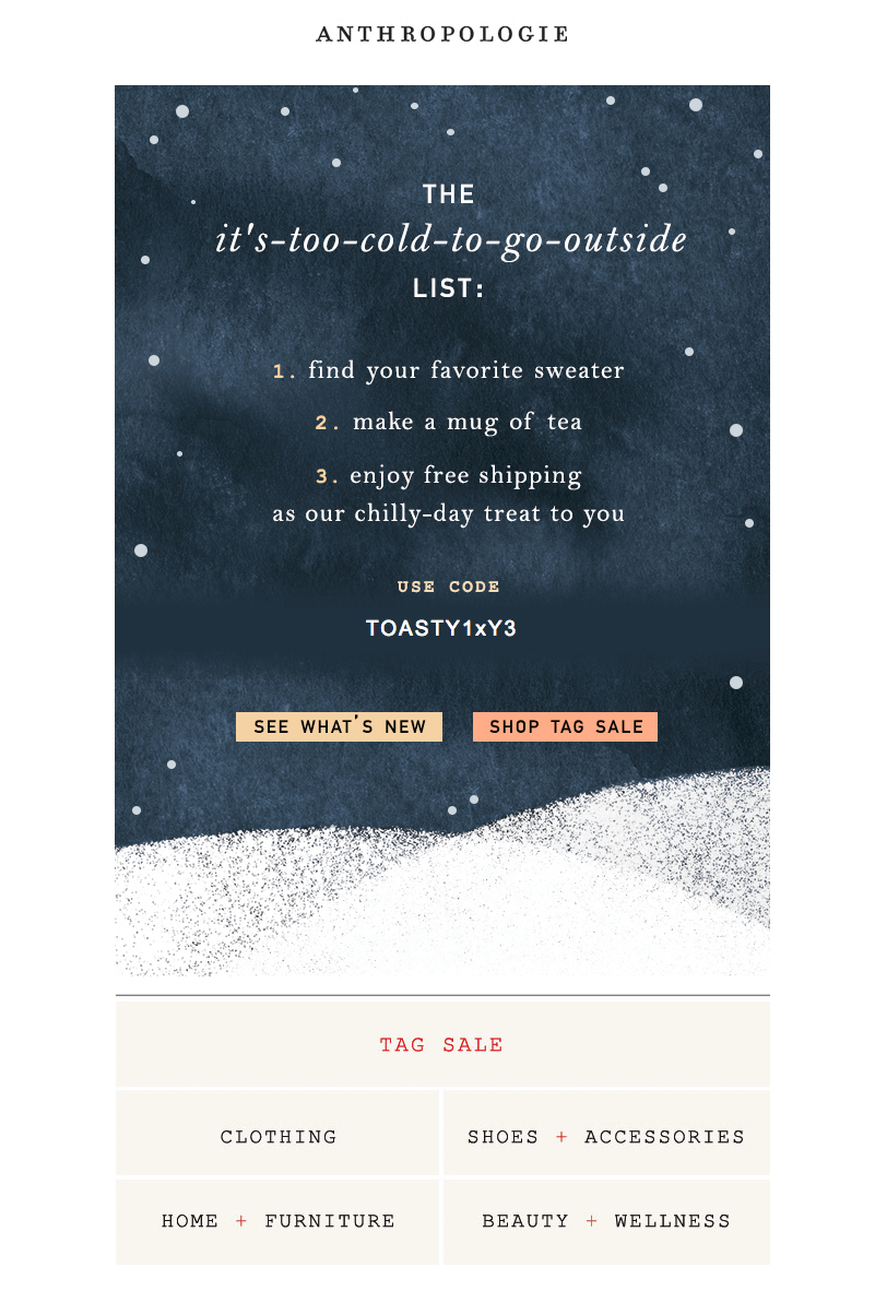
An email with an it’s-too-cold-to-go-outside list and a free shipping promo code
Source: Anthropologie

Anthropologie is a clothing retailer that offers an assortment of not only clothing, but also jewelry, beauty products, home furniture, decoration, and gifts. One of their winter email marketing campaigns included this relatable email. 

The email lists things that you should do when it is too cold outside. The two most obvious points were finding your favorite sweater and making a mug of hot tea. The last one encouraged readers to accept their gift of free shipping and do some shopping at the brand’s online store.

Notably, the email is very simple and minimalistic. The cold winter color palette is easy on the eyes, and so is the background image. The font is pretty, easy to read, and stands out against the dark background.

Verve Coffee Roasters: Colorful and informative

An email with the three best-selling coffee roasts of the year with customer reviews under each one of them.
Source: Milled

Internal data is a source of content not many brands take advantage of. Sales statistics, details of the development process, or some other insider’s perspective information is interesting to your customers just as much as your products. Verve Coffee Roasters, a California coffee company, shared the best-selling blends of the year alongside the customer reviews.

This email newsletter works great as an end-of-the-year promo. Some customers will be motivated to taste the blends they haven’t tried, and others will be glad to learn their preferences are recognized.

Beyond just the content, this email has an exquisite design with bright, exciting colors and short and engaging copies.

Sephora: Customer-centric approach

A Sephora email with a one-time discount code, product recommendations, and the shop’s advantages listed.
Source: Milled

Sephora is an international retailer of beauty products. In this holiday email marketing campaign, the focus is clearly on the promotion. The color scheme of the hero section is festive red and gold, and images of presents in the corners add to the theme of celebration.

The campaign is packed with information that can help customers shop and puts convenience front and center. There is a loyalty program status up top to remind email subscribers about their benefits. Next, there is a time indication with the “ends today” text and the shipping information. A contrasting black section below the sale banner indicates various advantages of gift shopping at Sephora. Lastly, there is the nearest shop location and open hours for customers who want to visit the store.

While this isn’t one of the most visually pleasing email templates, it does get the job done.

Elf Cosmetics: Attention-grabbing GIF

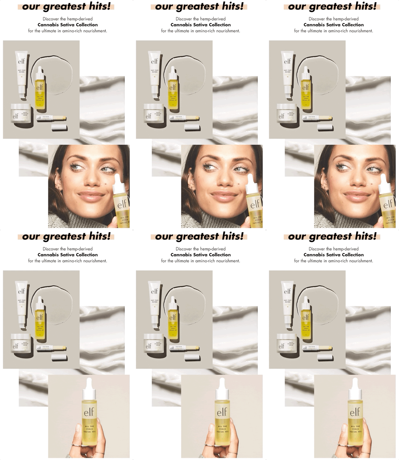
An email promoting the brand’s greatest hits with a GIF with two pictures interchanging: a photo of a product and a photo of a model holding it.
Source: Elf Cosmetics

Elf Cosmetics is a brand that specializes in skincare and makeup products. This winter campaign example features a cozy color palette with light shades of brown.

Aside from that, the email includes a simple GIF that serves two purposes. First, it grabs the viewer’s attention. Second, it emphasizes both the product that the company is trying to sell and the model. The model is wearing a comfortable and soft sweater which adds to the cozy vibe of the message.

Old Navy: Big numbers, lively colors

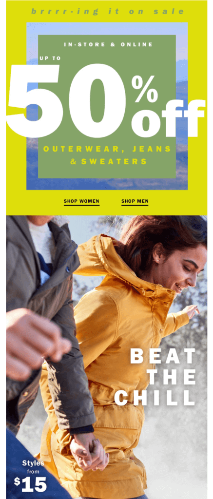
An email with a bright banner with different shades of green and a white 50% discount text.
Source: Old Navy

Old Navy specializes in clothing, ranging from jackets to pajamas. Their winter email’s subject is a huge sale on outerwear, jeans, and sweaters. The 50% off text is really big and stands out against the green background. As a result, it effectively catches the recipient’s attention.

Below, you see a picture of two models running through snow. The caption reads “beat the chill”, which is short and to the point.

Rooted: Ins and outs for the new year

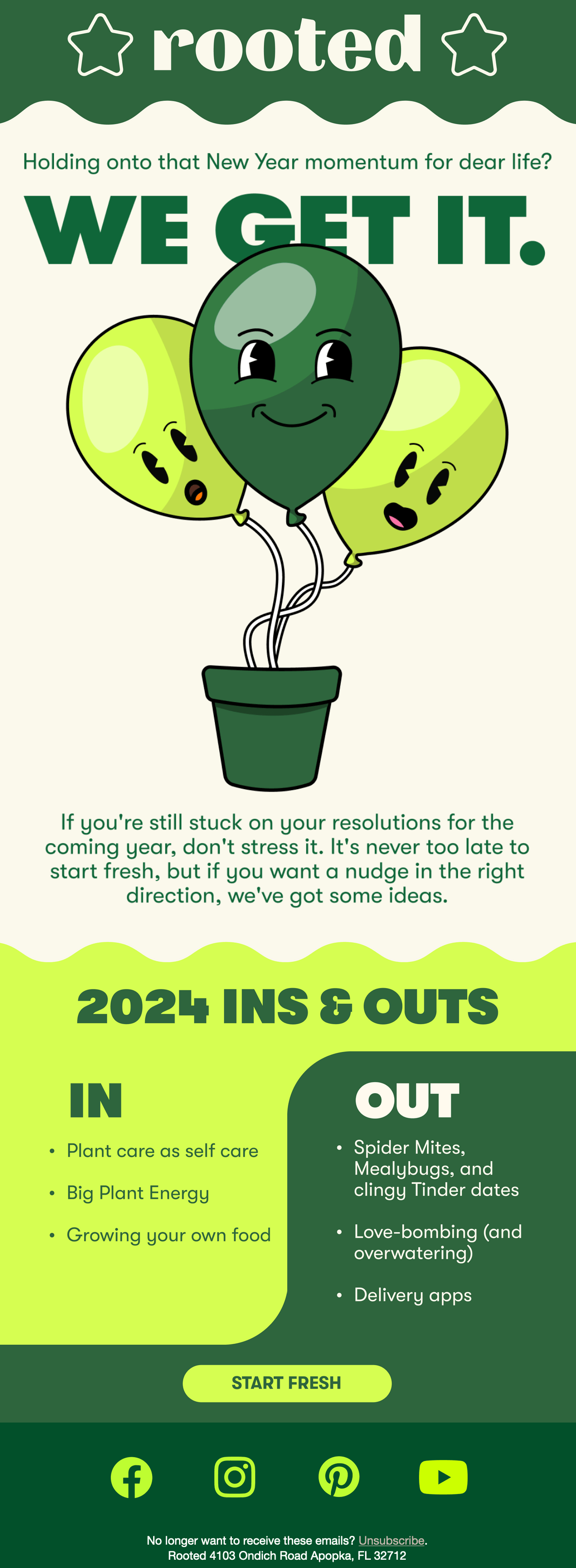
An email in shades of green with an illustration of a potted plant with balloons for buds and the heading “Holding onto that New Year momentum for dear life? We get it.” Below is a list of ins and outs for the New Year.
Source: Milled

Rooted is an indoor plant retailer. In this winter email, the brand stated the ins and outs of the year. The format is clear and engaging, it promotes the brand’s products while being relevant to subscribers who are still in the New Year mood.

The color scheme isn’t very wintery, but the email is on-brand and well-structured, so it comes together nicely and fulfills its purpose.

Simon Pearce: New Year inspiration

An email with a banner featuring a glass rabbit photo and the text Positivity+wit above a Year of the rabbit button.
Source: Milled

Simon Pearce is an American glassware and pottery manufacturer. With this January email campaign, the brand shared New Year inspiration and warm wishes. The email copy is short and the fresh start message is encouraging.

The email features two white and beige photographs. Both pictures showcase the brand’s home decor — a rabbit reminding about the year’s symbol, and a pine tree to tie in the winter holidays theme. Images are full of light and air, showing that Simon Pearce products are a great addition to the home decor. This is a subtle yet effective promotion.

Banana Republic: GIF with a black background

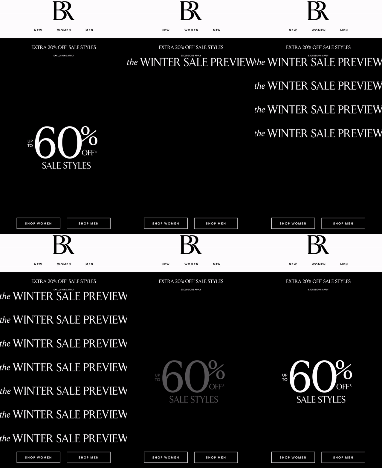
An email banner with 60% off text changing into winter presale texts.
Source: Banana Republic

Banana Republic is a luxurious clothing brand. The entire banner in the brand’s email is a GIF. As mentioned above, GIFs are really effective at grabbing people’s attention. Aside from that, the information about how big the sale is really stands out against the black background. 

Sure, that kind of background might not be directly winter-related. Still, it features cozy, weather-appropriate clothing recommendations at the bottom to draw attention to the season. It is an effective campaign designed to motivate people to shop the sale.

The Novelty Shop: Pink dinosaurs

An email with a GIF of textile pink dinosaurs chasing each other and a text all work and no play make January dull.
Source: The Novelty Shop

January can be a tough month for retailers and newsletter subscribers alike. Luckily, you can always use this subject to cheer up both sides with an engaging email. The team behind Novelty Shop did just that using an animated GIF and one of its most popular products. 

Take note of the colors, too. In the middle of January, you might be feeling a bit sick of whites and dark blues. A brighter shade of pink here really saves the day (and design).

Rifle Paper: Santa is here!

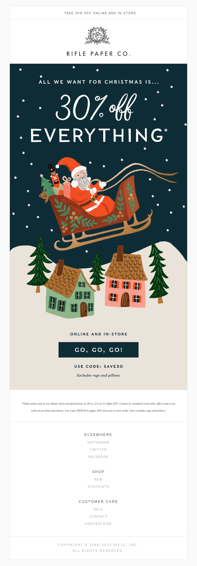
Rifle Paper Co. is a lifestyle brand that sells a wide range of items, from stationery to home decor and gifts. In the Christmas email newsletter, the brand decided to use an adorable illustration of Santa. Thanks to it, the design feels festive and friendly.

The illustration is paired with a big discount on everything the store has to offer. Below it, you can see a CTA with the “go, go, go” calling, which instantly grabs the reader’s attention.

Magic Spoon: Bubbly feelings

An email with bright pastel colors and a text Get ‘em while they’re hot.
Source: Milled

Magic Spoon is a company that makes healthy cereal. For the festive winter campaign, the brand opted for a striking pastel color scheme. Bright pink, orange, and blue used in the email design remind the readers of bubble gum or cotton candy. Even the snowy tree branches and icicles by the corners of the banner are colorful. This makes the email campaign magical and exciting.

The email copy is playful and friendly, and the slightly different CTAs make this campaign even better.

Paravel: Shared mission

An email expressing gratitude and sharing the important environmental and ecological impact of the brand, such as the number of recycled plastic bottles turned into suitcases, trees planted, etc.
Source: Milled

Paravel is a travel accessories company that uses recycled materials in all its products. This year-in-review email clearly showcases the brand’s positive environmental impact and reinstates the values and mission of the company. At the same time, it thanks the customers and invites them to continue the journey together with the “Let’s keep going” heading.

An email like this one helps to show the unique selling proposition of your company and create a deeper connection with the audience.

Mugsy: Meeting the needs of the customer

An email promoting the brand’s jeans with inner padding for extra heat and comfort for “when you slip on the ice”
Source: Milled

Mugsy is a clothing brand that chose to keep up with the customers by sending a promotional campaign for winter jeans. This email anticipates the customers’ seasonal needs and answers with a relevant product.

Winter emails are great for promoting products your customers may need when it’s cold outside. Think of the situations your audience faces in their day-to-day lives and come up with solutions to their problems.

Bloom and Blossom: New Year’s resolutions

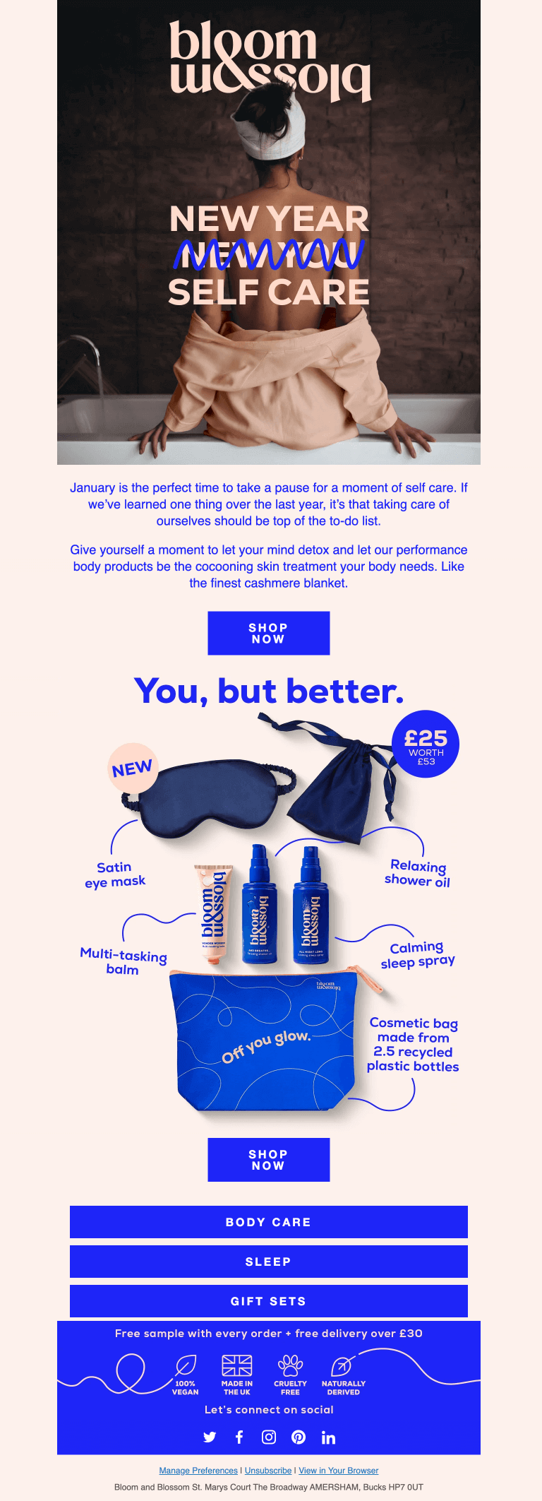
An email with a banner text New Year self-care and the words new you scribled over.
Source: Milled

Bloom and Blossom is a skincare and wellness brand. Its email puts a new spin on the popular “new year, new me” phrase. Instead of building a new you, you are encouraged to focus on taking better care of yourself. What’s more, the company’s products are just what you need to make it happen.

What stands out in this email is the color palette. The hot blue stands out against the beige background, but it doesn’t seem out of place. Instead, the two colors blend well, which makes the entire email design pretty aesthetically pleasing.

Pfaltzgraff: Shades of red

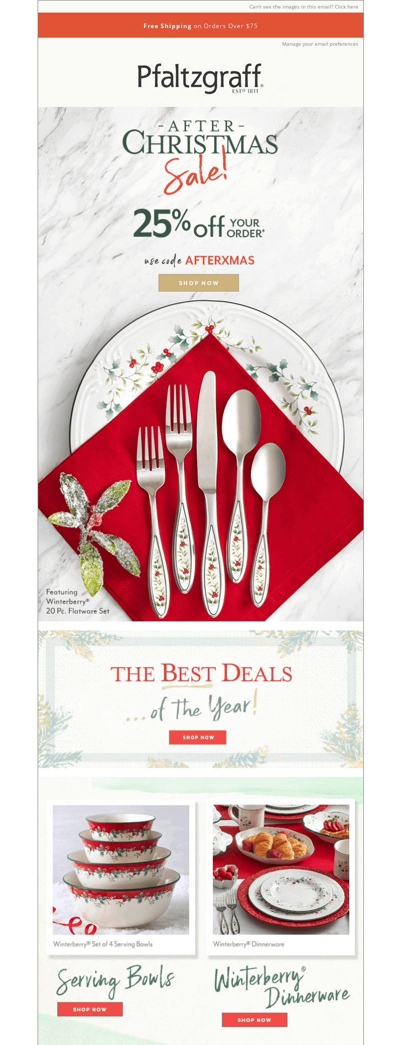
An email promoting festive dinnerware with photographs of the products along with red napkins.
Source: MailCharts

Last but not least, there is Pflatzgraff, which is a popular American kitchenware brand. Its email grabs the recipient’s attention in two ways. First, there are these splotches of red spread out throughout the photographs it contains. Second, there are four calls to action underneath each set of kitchenware that’s put on display.

Overall, the email conveys a festive feeling while showing the elegance and quality of the products.

Conclusion

To sum up, winter emails can be incredibly effective when it comes to increasing sales and building relationships with customers. However, for such emails to be successful, you will need to keep a few things in mind.

First, remember to send out messages related to popular holidays. That way, you can cater to customers’ demands much more effectively. Check out our e-commerce holiday calendar to get ready in advance.

Second, stick to the winter email design best practices listed above, including catchy subject lines, festive color palettes, and responsive design.

Last but not least, use the examples we provided here as a source of inspiration. With so many different winter email campaigns to look at, you should be able to design an interesting email marketing campaign in no time!

This article was originally published in December 2022 and was updated in November 2024 to make it more relevant and comprehensive.

07 November, 2024
Article by
Sara Kurczyńska
Sara Kurczyńska is an experienced content writer from Poznań, Poland. She enjoys writing about digital marketing, as well as playing video games and petting her fancy rats. In her spare time, you can find her birdwatching and taking long walks around the local parks and forests.
Visit Sara's
Latest Articles
Selzy Selzy Selzy Selzy