A Step-by-Step Guide to Creating Responsive Email Templates

A Step-by-Step Guide to Creating Responsive Email Templates
14 August, 2024 • ... • 195 views
Doris Day
by Doris Day

Your email software probably offers responsive templates for every occasion — but what if you want to do something unique? Then stay here, keep reading, and enjoy your newly found freedom 😉

This guide will teach you how to make a responsive email template with a custom layout and everything — from scratch!

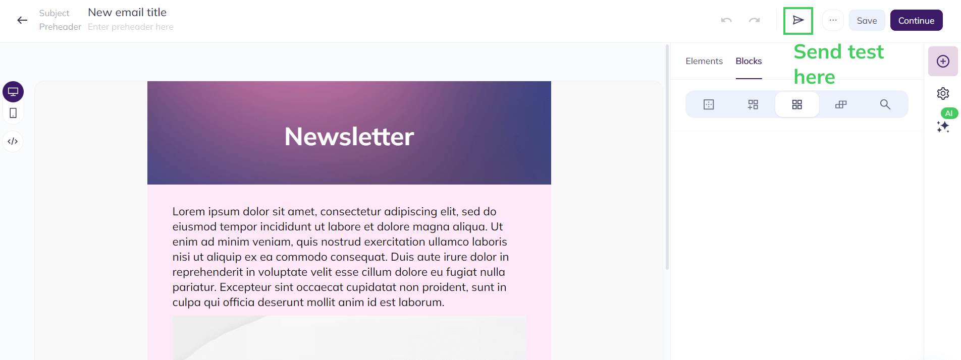
Why create responsive email templates?

As we mentioned, almost every paid or free email marketing tool has a builder with responsive email templates — why not take one of those and customize them to the moon? While it’s a quick and easy way to build your emails if you’re a newbie, it has its drawbacks.

Here’s why you may want to build a responsive email template from scratch:

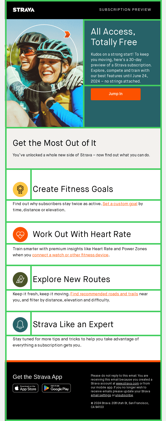
  • You need a unique layout. Maybe you’re working on a complex gamified email campaign, exercising your brand’s creative and bold personality, or using a builder that is not very template-rich — in all these cases, building your own template with custom styling may help. 
  • You want less generic-looking emails. If you keep using the same default template from your builder for all campaigns, you’ll end up with boring emails that look the same — and lose subscriber engagement in a month or two.
  • You need a reliable email template. If you use one of those default templates that come with your builder, they may be gone forever with the next software update. Also, you may want to change an ESP, and your new tool may have a different builder without the template you’ve been using. Meanwhile, your unique template is not vulnerable to software migrations or updates.

Creating a responsive email template step-by-step

Did we convince you to build your own responsive email template? If yes, keep reading — here’s a detailed guide on creating an email template from scratch.

Here’s a thing. You likely won’t be coding a template with all the styling in a text document, since most people use email editing software that may or may not give you access to code. That’s why we won’t show you the code alone — we’ll also use the Selzy builder as an example. Also, since our builder offers no-code previews, it will be easier for you to see how the code renders. 

Keep in mind that you’ll be able to repeat the same steps in any no-code email builder — their user flows are quite similar.

1. Get the basic HTML code

When you start building an email from scratch, the code looks like this:

Empty email template in Selzy, code mode, the code for an empty email is shown

Wait, this email is empty. Why do we see so many lines of code then?! Let’s do a quick rundown of all the basic elements. You should keep them in and build upon them.

<!DOCTYPE html PUBLIC “-//W3C//DTD HTML 4.01 Transitional//EN” “http://www.w3.org/TR/html4/loose.dtd”>

This “epigraph” instructs email clients how to render your email — if you remove it, the page will display weirdly. For example, the code above means that this is an HTML email that specifically uses HTML 4.01, and includes the link to a web page that explains this document type in English. We’re not going into heavy details here — check out this website if you’re interested in why HTML 4.01 is cool.

Let’s examine the rest of the code, piece by piece.

<html>

<head>

  <meta http-equiv=“Content-Type” content=“text/html; charset=utf-8”>

  <meta name=“viewport” content=“width=device-width, initial-scale=1”>

  <link rel=“stylesheet” href=“https://fonts.googleapis.com/css2?family=Mulish:ital,wght@0,400&display=swap” em-class=“em-font-Mulish-Regular”>

  <link rel=“stylesheet” href=“https://fonts.googleapis.com/css2?family=Mulish:ital,wght@0,500&display=swap” em-class=“em-font-Mulish-Medium”>

  <link rel=“stylesheet” href=“https://fonts.googleapis.com/css2?family=Mulish:ital,wght@0,700&display=swap” em-class=“em-font-Mulish-Bold”>

  <link rel=“stylesheet” href=“https://fonts.googleapis.com/css2?family=Mulish:ital,wght@0,800&display=swap” em-class=“em-font-Mulish-ExtraBold”>

  • <html> and <head> are simply the opening tags for the default HTML document elements. The first one indicates where the whole HTML piece begins, and the second one contains metadata.
  • <meta> entities are metadata records that live within <head>. Here, we have two records. The first one indicates that the document uses the UTF-8 encoding for text. The second one tells the browser that the page width is the same as the device screen width. 
  • A bunch of <link> tags are importing different Mulish font variations from Google Fonts. Mulish is the default font in the Selzy builder. That’s why you might see these tags in empty templates. You may or may not see these tags in other builders — and you may not need them if you just code without a builder.

 <title>New email title</title>

  <style type=“text/css”>

    html {

      -webkit-text-size-adjust: none;

      -ms-text-size-adjust: none;

    }

    @media only screen and (max-device-width:640px),only screen and (max-width:640px) {

      .em-narrow-table {

        width: 100%!important;

        max-width: 640px!important;

        min-width: 320px!important;

      }

    }

  </style>

</head>

  • The <title> tag is just your email subject line.
  • The <style> tags set styles for the HTML content for your email. The first one prevents text from going smaller on smaller screens. The second record allows you to customize what your email looks like on desktop and mobile screens separately.

<body style=“margin: 0; padding: 0;”>

  <span class=“preheader” style=“display: none !important; visibility: hidden; opacity: 0; color: #F8F8F8; height: 0; width: 0; font-size: 1px;”>&nbsp;‌&nbsp;‌&nbsp;‌&nbsp;‌&nbsp;‌&nbsp;‌&nbsp;‌&nbsp;‌&nbsp;‌&nbsp;‌&nbsp;‌&nbsp;‌&nbsp;‌&nbsp;&nbsp;‌&nbsp;‌&nbsp;‌&nbsp;‌&nbsp;‌&nbsp;‌&nbsp;‌&nbsp;‌&nbsp;‌&nbsp;‌&nbsp;‌&nbsp;‌&nbsp;‌&nbsp;&nbsp;‌&nbsp;‌&nbsp;‌&nbsp;‌&nbsp;‌&nbsp;‌&nbsp;‌&nbsp;‌&nbsp;‌&nbsp;‌&nbsp;‌&nbsp;‌&nbsp;‌&nbsp;&nbsp;‌&nbsp;‌&nbsp;‌&nbsp;‌&nbsp;‌&nbsp;‌&nbsp;‌&nbsp;‌&nbsp;‌&nbsp;‌&nbsp;‌&nbsp;‌&nbsp;‌&nbsp;&nbsp;‌&nbsp;‌&nbsp;‌&nbsp;‌&nbsp;‌&nbsp;‌&nbsp;‌&nbsp;‌&nbsp;‌&nbsp;‌&nbsp;‌&nbsp;‌&nbsp;‌&nbsp;&nbsp;‌&nbsp;‌&nbsp;‌&nbsp;‌&nbsp;‌&nbsp;‌&nbsp;‌&nbsp;‌&nbsp;‌&nbsp;‌&nbsp;‌&nbsp;‌&nbsp;‌&nbsp;&nbsp;‌&nbsp;‌&nbsp;‌&nbsp;‌&nbsp;‌&nbsp;‌&nbsp;‌&nbsp;‌&nbsp;‌&nbsp;‌&nbsp;‌&nbsp;‌&nbsp;‌&nbsp;&nbsp;‌&nbsp;‌&nbsp;‌&nbsp;‌&nbsp;‌&nbsp;‌&nbsp;‌&nbsp;‌&nbsp;‌&nbsp;‌&nbsp;‌&nbsp;‌&nbsp;‌&nbsp;&nbsp;‌&nbsp;‌&nbsp;‌&nbsp;‌&nbsp;‌&nbsp;‌&nbsp;‌&nbsp;‌&nbsp;‌&nbsp;‌&nbsp;‌&nbsp;‌&nbsp;‌&nbsp;&nbsp;‌&nbsp;‌&nbsp;‌&nbsp;‌&nbsp;‌&nbsp;‌&nbsp;‌&nbsp;‌&nbsp;‌&nbsp;‌&nbsp;‌&nbsp;‌&nbsp;‌&nbsp;&nbsp;‌&nbsp;‌&nbsp;‌&nbsp;‌&nbsp;‌&nbsp;‌&nbsp;‌&nbsp;‌&nbsp;‌&nbsp;‌&nbsp;‌&nbsp;‌&nbsp;‌&nbsp;&nbsp;‌&nbsp;‌&nbsp;‌&nbsp;‌&nbsp;‌&nbsp;‌&nbsp;‌&nbsp;‌&nbsp;‌&nbsp;‌&nbsp;‌&nbsp;‌&nbsp;‌&nbsp;&nbsp;‌&nbsp;‌&nbsp;‌&nbsp;‌&nbsp;‌&nbsp;‌&nbsp;‌&nbsp;‌&nbsp;‌&nbsp;‌&nbsp;‌&nbsp;‌&nbsp;‌&nbsp;&nbsp;‌&nbsp;‌&nbsp;‌&nbsp;‌&nbsp;‌&nbsp;‌&nbsp;‌&nbsp;‌&nbsp;‌&nbsp;‌&nbsp;‌&nbsp;‌&nbsp;‌&nbsp;&nbsp;‌&nbsp;‌&nbsp;‌&nbsp;‌&nbsp;‌&nbsp;‌&nbsp;‌&nbsp;‌&nbsp;‌&nbsp;‌&nbsp;‌&nbsp;‌&nbsp;‌&nbsp;&nbsp;‌&nbsp;‌&nbsp;‌&nbsp;‌&nbsp;‌&nbsp;‌&nbsp;‌&nbsp;‌&nbsp;‌&nbsp;‌&nbsp;‌&nbsp;‌&nbsp;‌&nbsp;</span>

  <!–[if !mso]><!–>

  <div style=“font-size:0px;color:transparent;opacity:0;”>⠀⠀⠀⠀⠀⠀⠀⠀⠀⠀⠀⠀⠀⠀⠀⠀⠀⠀⠀⠀⠀⠀⠀⠀⠀⠀⠀⠀⠀⠀⠀⠀⠀⠀⠀⠀⠀⠀⠀⠀⠀⠀⠀⠀⠀⠀⠀⠀⠀⠀⠀⠀⠀⠀⠀⠀⠀⠀⠀⠀⠀⠀⠀⠀⠀⠀⠀⠀⠀⠀⠀⠀⠀⠀⠀⠀⠀⠀⠀⠀⠀⠀⠀⠀⠀⠀⠀⠀⠀⠀⠀⠀⠀⠀⠀⠀⠀⠀⠀⠀⠀⠀⠀⠀⠀⠀⠀⠀⠀⠀⠀⠀⠀⠀⠀⠀⠀⠀⠀⠀⠀⠀⠀⠀⠀⠀⠀⠀⠀⠀⠀⠀⠀⠀⠀⠀⠀⠀⠀⠀⠀⠀⠀⠀⠀⠀⠀⠀⠀⠀⠀⠀⠀⠀⠀⠀</div>

  <!–<![endif]–>

  <table cellpadding=“0” cellspacing=“0” border=“0” width=“100%” style=“font-size: 1px; line-height: normal;”>

    <tr em=“group”>

      <td align=“center” bgcolor=“#F8F8F8”>

        <!–[if (gte mso 9)|(IE)]>

        <table cellpadding=”0″ cellspacing=”0″ border=”0″ width=”640″><tr><td>

        <![endif]–>

        <table cellpadding=“0” cellspacing=“0” width=“100%” border=“0” style=“max-width: 640px; min-width: 640px; width: 640px;” class=“em-narrow-table”></table>

        <!–[if (gte mso 9)|(IE)]>

        </td></tr></table>

        <![endif]–>

      </td>

    </tr>

  </table>

</body>

</html>

  • The <body> tag is literally the body of the HTML document — it’s where you’ll do the layout of your email. This element has a pre-written style that sets the paddings around the whole email. This is what it looks like:
Demonstration of what margin and padding mean in HTML email markup
Source: Email on Acid

In our case, both margins and paddings are set to zero, which means that the email “occupies” the entire space available for it.

  • The <span> tag is a text section created for a certain purpose — in this case, it’s a hidden preheader. By hidden, we mean that you won’t see it in the email itself but it will be visible in the inbox, near the subject line. Also, you can see a bunch of non-breaking spaces (&nbsp) after the preheader — you need those so there’s nothing unwanted displayed in it. Without them, your subscribers will see the email content after your customized preheader. And, if you don’t customize one, non-breaking spaces ensure that the preheader will stay empty in the inbox.
  • The <table> tag and everything inside it describes an empty spreadsheet. This is where your email template content will be.
  • The commented conditions are specifications for certain email clients. For example, “mso” means Microsoft Outlook, and the <div> style descriptions after it instruct this email client to render the hidden preheader a certain way.

Even though this is the baseline code, it already has records indicating the responsiveness of your future email template. Don’t remove these!

Now, once we have the baseline, let’s alter it to our liking.

2. Create the template structure

You may ask: why is there a table in an empty email template? It’s because tables are the baseline of any email — every content element is placed in a table cell. Here’s a demonstration.

Email from Strava with a table drawn over it to demonstrate how table layout works
Really Good Emails

This is called a table layout — and, to define your email template structure, you need to come up with your own. As you can see in the picture above, your table doesn’t have to be a very even grid with the same amount of cells in each row and column. It can actually be as complex as you want! If you’re using a no-code builder, you can drag and drop your template structure using premade empty blocks. And if you’re coding, you need to mark up the structure using a lot of <td> and <tr> tags within the <table> tag.

In Selzy, you can create a unique table structure with pre-made empty Blocks. To do this, go to Blocks and click Empty. Here, you’ll have several layout options for rows — feel free to stack them in your email template.

Selzy builder Blocks menu, the Empty part that has different empty row options

For demonstration, I created a relatively simple email structure. It has three identical blocks that will become the hero section, the main text, and the footer with the unsubscribe link.

Selzy empty email template with three one-column rows. The builder is in Code mode, you can see the code on the right part of the screen

As you can see, although the email is still empty, there’s a lot more code now. Let’s break it all down using the Selzy builder navigation. When you click on a certain element in your preview, the coinciding code part is highlighted. 

Here’s an example:

Selzy builder code navigation example: the one-column row is highlighted, and the code piece that describes the element is highlighted in gray as well

<td align=“center” style=“padding: 30px 40px;” class=“em-mob-padding_left-20 em-mob-padding_right-20”>

  <table border=“0” cellspacing=“0” cellpadding=“0” class=“em-mob-width-100perc”>

    <tr>

      <td width=“560” valign=“top” class=“em-mob-wrap em-mob-width-100perc”></td>

    </tr>

  </table>

</td>

  • The <tr> and <td> tags indicate the new row and the new cell in a row, accordingly.
  • These entities have parameters like width, padding, and alignments. The valign variable means “vertical alignment”, by the way.
  • You can also customize the mobile view using the class parameter. For example here, the mobile left and right paddings are 20 pixels. However, if you want such classes to work, you need to pre-write them in the <head> of your email template — otherwise, you won’t be able to use such classes in the first place.

But why is every block a nested table? This is simply what pre-built Selzy blocks look like — they’re built like tables inside tables.

Selzy builder screenshot with a highlighted empty block and the corresponding HTML code which shows that the block is built like a nested table

The highlighted table (the inner one) is where you will put all your email content. Technically, you can do a layout without tables inside tables — the Selzy builder blocks are made this way for more email customization options. For example, you can set up separate background colors for the “main” cell and the “second” table, add frames, and other stuff. When you’re coding emails from scratch, you can even build the table inside this table for more complex layouts and more customization — it depends on your creativity.

What will the two-column block look like in this case? Here’s an example:

Selzy builder, the empty block with two columns is highlighted, so is the code piece describing it

This block is also a table inside a table. However, unlike the previous one-column block, the “second” table has three instances of <td>. It means three cells — the first (smaller) column, the space between the columns, and the second (larger) column.

Once you create the empty table, it’s time to bring some life into it — starting with the visuals.

3. Customize the design and fonts with CSS

CSS stands for Cascading Style Sheets, and it’s a code piece that describes the styling of HTML elements of a web page — for example, an email. There are several types of CSS:

  • Inline — you describe the design of each element separately. It’s used for everything in emails: frames, backgrounds, text formatting, and more. 
  • Embedded —  instead of describing, for example, the font for each text block, and other styling elements separately, you add a couple of lines in your HTML document’s <head>. The idea is that this set of rules applies to the entire document by default unless you customize certain elements. In emails though, embedded CSS is not used for design in the aesthetic sense — only for setting up the responsiveness of your email template like separate paddings for the mobile version.
  • External — instead of describing the CSS style in the document, you refer to a separate CSS file with the style record you need. It’s only used for website design though, never in emails.

Let’s take a closer look at the embedded CSS we previously added. The styling info is stored in the <style> element of your template’s <head>, which is the metadata haven of your email template.

<style type=“text/css”>

  html {

    -webkit-text-size-adjust: none;

    -ms-text-size-adjust: none;

  }

  @media only screen and (max-device-width:640px),only screen and (max-width:640px) {

    .em-narrow-table {

      width: 100%!important;

      max-width: 640px!important;

      min-width: 320px!important;

    }

    .em-mob-padding_left-20 {

      padding-left: 20px!important; 

    }

    .em-mob-padding_right-20 {

      padding-right: 20px!important; 

    }

  }

</style>

Let’s take a closer look at these records:

  • All the width-related settings define your email template’s width in pixels and percents, and the min-width setting defines the email template size on mobile devices.
  • The mob-padding parameters set up the paddings on the right and left sides specifically for the mobile version. You don’t have to make these separate classes, by the way — in Selzy, they are separate in case someone wants to make an asymmetrical layout.

And here’s what the inline CSS looks like — here’s how you will customize the design of every single element in your email:

Header text in the Selzy email builder, code mode, the code has the CSS style record of what the header should look like

Here’s the text version (we’ve already added this code previously):

<div style=“font-family: Helvetica, Arial, sans-serif; font-size: 28px; line-height: 34px; color: #000000;” class=“em-font-Mulish-Bold”><strong>Header text</strong></div>

As you can see, this inline CSS style prescribes everything from font to line height. This code also has a semantic markup tag: “strong” is not just “bold”, it also highlights importance. Semantic markup tags are important for email accessibility.

We’ll use some of these later — now, let’s build a responsive email template from scratch.

4. Create a header with text

The first element your subscribers will see is the header or hero section. Let’s create a hero section with text and an image in the background. The hero section is the first row in our table layout — so that’s where we’ll add the necessary code for the background image. Here’s what it will look like:

Selzy builder code mode showing the code for a header block with a background image

Here’s the text version of the code:

<td align=“center” style=“padding: 50px 40px; background-color: #2E3255; background-repeat: repeat;” class=“em-mob-padding_left-20 em-mob-padding_right-20” bgcolor=“#2E3255” background=“https://marketing.selzy.com/en/v5/user-files?userId=4959513&resource=himg&disposition=inline&name=6tungekmpdi9e344ff496w9eqebpzoo4z1mbe99ngrnh6yiif831jzhg4jyqekerub9umub64q38z7qqqrw9wcrg8m3nedynwrfimpy8d9paibe3ots5iucdr96s5fqi4jtc59t8jb6nbd9raeajizzos1o”>

  <table border=“0” cellspacing=“0” cellpadding=“0” class=“em-mob-width-100perc”>

    <tr>

      <td width=“560” valign=“top” class=“em-mob-wrap em-mob-width-100perc”></td>

    </tr>

  </table>

</td>

You already know that this block is a table cell. As you can see, I increased the top and bottom paddings to 50px so the hero section looks larger. Here’s what’s new:

  • bgcolor and background attributes describe your table cell’s background. In this case, I chose a dark blue color similar to the background image I added. If you upload an image using Selzy’s no-code interface, it will end up in Selzy’s dedicated storage. Then, it will display in the email code as a link to the said storage.
  • style is a CSS style description that now has some information on the background. For example, background-repeat is a parameter that shows whether the background image should repeat, creating a tile. By default, it does. However, if the background image of your choice is big, you won’t see the multiplication.

Now that the empty header is ready, let’s add text to it.

Selzy builder screenshot, header with white text saying “Newsletter” in Mulish font, background image is a blue-pink gradient

Here’s what the code looks like:

<table cellpadding=“0” cellspacing=“0” border=“0” width=“100%” em=“atom”><tr><td style=“padding: 20px 0 10px;”>

  <div style=“font-family: Helvetica, Arial, sans-serif; font-size: 40px; line-height: 34px; color: #FFFFFF;” class=“em-font-Mulish-Bold” align=“center”><strong>Newsletter</strong></div>

</td></tr></table>

<div> stands for “division”. It’s an HTML element styled with CSS. You can see the style record right next to <div>. Let’s break down its attributes:

  • style includes font family, line height, size, and color.
  • class has specific font data. In this case, it’s Mulish Bold.
  • align describes text alignment. Since it’s a header, I opted for “center”.

Why do you need the “font-family” parameter and store the specific font info separately? You need this so your newsletter looks close enough to your original design in case some fonts are unavailable. For example, if Mulish is unavailable, your subscribers will see Helvetica or Arial instead. Mulish is sans-serif too, so, these fonts are the closest approximation.

5. Customize the main content area

Now, it’s time to customize the rest of the table! I can’t give definitive instructions here since you may have a different template structure. So, keep in mind that this is just an example. The template I’m making for the demonstration consists of three table rows. We already customized the hero section, which is the first row. The second row will be our main content area. It will be quite simple — I’ll add the placeholder “Lorem Ipsum” text and change the design a little bit.

Here’s what it looks like in the Selzy builder:

Selzy builder screenshot with two email blocks: header and main text block, the main text block has a placeholder Lorem Ipsum text

Time to look at the code!

<td align=“center” style=“padding: 30px 40px; background-color: #FFE8F8; background-repeat: repeat;” class=“em-mob-padding_left-20 em-mob-padding_right-20” bgcolor=“#FFE8F8”>

  <table border=“0” cellspacing=“0” cellpadding=“0” class=“em-mob-width-100perc”>

    <tr>

      <td width=“560” valign=“top” class=“em-mob-wrap em-mob-width-100perc”>

        <table cellpadding=“0” cellspacing=“0” border=“0” width=“100%”><tr><td style=“padding-bottom: 10px;”>

          <div style=“font-family: Helvetica, Arial, sans-serif; font-size: 18px; line-height: 24px; color: #000000;” class=“em-font-Mulish-Regular”>Lorem ipsum dolor sit amet, consectetur adipiscing elit, sed do eiusmod tempor incididunt ut labore et dolore magna aliqua. Ut enim ad minim veniam, quis nostrud exercitation ullamco laboris nisi ut aliquip ex ea commodo consequat. Duis aute irure dolor in reprehenderit in voluptate velit esse cillum dolore eu fugiat nulla pariatur. Excepteur sint occaecat cupidatat non proident, sunt in culpa qui officia deserunt mollit anim id est laborum.</div>

        </td></tr></table>

      </td>

    </tr>

  </table>

</td>

Here’s what I did:

  • I added a background color to the “main” table cell using the bgcolor attribute.
  • Then, I added the <div> element to the nested table and removed the <strong> tag since it’s not a header. Here’s where our main text will be placed.
  • In the CSS record, I customized the font, the size, and the color.

6. Add an image

Now that we have the main text, let’s add an image. I want it placed under the main text but within the same main content block, which is the second main table row of our email. For each new element in a block, Selzy creates a new nested table automatically. So, since we’re adding an image to the second table row, the row will get another one-cell nested table specifically for the image. As I mentioned, it’s the Selzy builder quirk for more design customization options — you don’t have to do this but this type of layout has its benefits.

Here’s what it looks like:

Selzy builder screenshot, the main content block has a placeholder image, code mode, the HTML code piece describing an image is highlighted in gray

Here’s a quick code rundown:

<table cellpadding=“0” cellspacing=“0” border=“0” width=“100%” em=“atom”><tr><td>

  <img src=“https://cdn.useblocks.io/1865/230630_18_LNUn9UT.png” width=“560” border=“0” alt=“” style=“display: block; width: 100%; max-width: 560px;”>

</td></tr></table>

  • <table> is a “container” for the image element. You don’t have to do this though, unless you’re planning to set paddings, background, or frames for the image. If you don’t need to set up anything like this, you can just create a new cell using <tr> and <td> tags.
  • <img> is the image element with a bunch of parameters. 

Now, let’s take a closer look at these parameters:

  • src is the source of your image, the file on a server. The link in this code is the link to the default image — it will change once you upload something else. We’ll leave it as default for now since it’s a template.
  • width is the width of the image. There’s also a CSS style prescription that limits the image’s width so it doesn’t get too big and interfere with responsiveness. 
  • border, if set to something other than 0, creates a frame around the image. Also, if you don’t set the zero border and add a clickable link to a picture, it will have a blue frame in Outlook.
  • alt is a place for alternative text that will be shown instead of an image if it fails to download. 
  • style is a CSS record. The property we haven’t seen in CSS style records yet is display. Long story short, it creates a hierarchy of elements. However, what’s more important is that “block” or “inline-block” values ensure that your image will have correct paddings in all email clients.

7. Create a footer

Now that we have our header and main content blocks set up and ready to go, let’s finish it off by customizing the third row of the table layout — it will be the email footer with the mandatory unsubscribe link. The process won’t be that different from customizing the hero section. All we need to do is change the background color and add a short text with the unsubscribe link.

Start by changing the background color — I used a dark blue shade, similar to the header background image.

Selzy builder screenshot code mode: the empty footer block with the customized background color

Now, let’s add a short text to the nested table in this block.

Selzy builder screenshot code mode, the email footer demonstration: the footer itself on the left, the code is on the right

You’re already familiar with most of the tags so we’re not repeating those. Here’s what’s new in this code piece:

<div style=“font-family: Helvetica, Arial, sans-serif; font-size: 16px; line-height: 24px; color: #FFFFFF” class=“em-font-Mulish-Regular” align=“center”>You received this email because you’re subscribed to Newsletter.<br>Hate our emails? <a href=“{UnsubscribeUrl}” target=“_blank” style=“text-decoration: underline; color: #ffffff;”>Unsubscribe</a>.</div>

  • <a href> is a tag that turns a piece of text into a clickable link. 
  • {UnsubscribeUrl} is a merge tag that stands for a dynamic unsubscribe page. Different ESPs have different merge tag syntax — this is what it looks like in Selzy. If you want to learn more about Selzy’s merge tags, check out our Help Center.
  • The link’s formatting is set up in, you guessed it, another style record.
  • The target parameter indicates where the hyperlink will open — for example, the “_blank” parameter indicates that the link will open in a new browser tab.

And there we go! Here’s a simple responsive email template I built:

Email template that consists of three blocks: header, main text with an image, and footer

Now, it’s time to test the email template to avoid issues while sending real campaigns.

8. Test the responsive email template

When testing the responsive email template, it’s important to check the following:

  • The responsiveness. The code snippets we mentioned above already have the pre-written attributes that make your email responsive. However, sometimes things can go wrong. For example, suppose you set up the image width incorrectly. In that case, it will “expand” the entire email and make it unresponsive — other columns and rows won’t be able to narrow down automatically.
  • The links. Check out if the links work. However, it can get tricky with merge tag links like the unsubscribe link or the web version link — we’ll talk about that later.
  • The rendering. Check out what your email looks like in different email clients and on different devices. You can also check out your email design in dark mode. You can’t affect the dark mode look your email will have in different email clients even via HTML. However, you can make little changes to make your design more dark mode-friendly.

And here’s how to test all these characteristics:

  • In the builder. The Selzy builder allows you to check the template’s responsiveness right away — just click the smartphone icon at the left part of the screen.
Selzy email builder template mobile view example

Don’t know where to build and test your email templates? Check out Selzy’s list of the best email template builders on the market and choose the right tool for you.

  • By sending a test email. To check the links, the dark mode design optimization, and what your email looks like in different email clients, send a test email to yourself and your colleagues. In Selzy, you can do it without leaving the builder, so you can tweak the design right away. Just click the paper plane icon, type in the addresses that will receive the test email, and you’re done.
Selzy email builder, the Send test button is highlighted
  • By sending a “real” campaign to a test list. Test emails are different from “real” campaigns. Their metrics are not monitored by ESPs, and you won’t get charged for them if you’re on the pay-per-email plan. Merge tags are also not functional in such emails. So, if you want to check if email personalization works okay, send a “real” campaign to a small test list you can compile manually. However, it will affect your monthly email limit if your plan imposes it.
  • By using a third-party testing tool. Platforms like Email on Acid allow you to see how your email template design is rendered on dozens of different devices and email clients. So, if you don’t have a friend who uses Outlook, email testing tools will do the job just as well!
Email on Acid multiple device rendering demonstration GIF
Source: Email on Acid

Useful tips for building responsive email templates

So, you know how to build a simple responsive email template using HTML and CSS, and you know how to test it. But simply knowing how to do something is not enough to do it well. Here are some tips that can help your email look great on any device:

  • Use larger font sizes. Anything below 14pt will be unreadable on a smartphone. We suggest using 16pt and larger for the main text and anything above 20pt for headers and other important — sorry, <strong>! — elements.
  • Opt for simpler designs. Don’t overuse complex multi-column layouts. These will adapt to mobile screens if you set them up the right way. However, multi-column layouts turn to single-column layouts on smaller screens, making your emails much longer. So, if you don’t want that, don’t overload your layout with content.
  • Use compiling software. If you’re not using an email builder and just coding instead, use tools like OneCompiler. A compiling tool will notify you if something goes wrong in the code so you fix it at the writing stage. You can also quickly render the HTML template to see if everything’s right and quickly make necessary changes.
  • Struggling? Get a pre-made HTML mockup. If you’re a newbie at coding, you can get a pre-written blank HTML structure from Antwort or another source. You’re free to edit it however you want, except for the baseline HTML document entities like <body> or <head>.

Wrapping up

Creating responsive email templates via HTML is a bit harder than only using your favorite no-code builder without peeking under the hood. However, it can give you a lot of creative freedom and independence from your email software changing or going out of business. And, if you remember the basic principles, creating responsive emails won’t be as tedious anymore!

Here’s how to build a responsive email template from scratch:

  • Get the basic code — the blank HTML document structure with the <doctype> set up, the pre-written responsive features, and the CSS style attribute.
  • Create the structure — every web page is a table, so your email template structure will be an empty HTML table created with <td> and <tr> tags.
  • Customize the design and fonts using embedded and/or inline CSS.
  • Create a header — it’s the first row of your table that can include logos, text, and other elements.
  • Customize the main content area by adding text and images.
  • Create a footer with an unsubscribe link.
  • Test the template by sending test emails, sending campaigns to a test list, or using a third-party email testing tool.
Article by
Doris Day
An experienced writer and editor with a degree in theoretical linguistics and a specialization in B2B/IT/SaaS marketing copy. I see my mission as an educator who explains complex phenomena using simple terms. My favorite show is "What We Do in the Shadows" and I usually spend my weekends somewhere in nature.
Visit Doris's
Selzy
Selzy
Selzy
Selzy
Selzy

Latest Articles

Selzy Selzy Selzy Selzy