Practical Guide on Email Conversion Rate, How to Calculate and Improve It

Practical Guide on Email Conversion Rate, How to Calculate and Improve It
16 October, 2024 • ... • 72 views
Arina Topoleva
by Arina Topoleva

In this guide, we will explain what the email conversion rate is, why it is important, and how to calculate it. But it isn’t just about theory. The email conversion rate shows the effectiveness of your campaigns and whether they bring your business money or not. So if you’re sending email campaigns and wondering why your subscribers aren’t taking any action, we have some useful tips on how to increase conversion and avoid common mistakes.

What is email marketing conversion rate

Email marketing conversion rate is the percentage of email recipients who complete a desired action after receiving your email. The desired action here refers to a campaign’s goal and call-to-action (CTA). It can be anything from making a purchase to signing up for a webinar to simply visiting a website. 

Email conversion rate is one of the key metrics in email analytics, and it’s closely connected to return on investment (ROI). It’s like the ultimate scorecard for your email campaigns, showing you what part of the audience you contact actually does what you want them to do.

How to calculate email conversion rate

Time for some math. To calculate the email conversion rate, you need to divide the number of people who completed the desired action (that’s your conversions) by the number of emails delivered, then multiply by 100.

Here’s the formula:

Email conversion rate =
(Number of conversions / Number of delivered emails) x 100

Let’s take a look at the example:

You send 1,000 emails about a new vegan cookbook. Your goal is to sell the book, so each person who buys it counts towards the number of conversions. 50 people end up purchasing the book. 

The calculation would look like this: (50 / 1,000) x 100 = 5%

So your email conversion rate for this campaign is 5%.

Why does email marketing conversion rate matter?

The email marketing conversion rate is like the pulse of your strategy and one of the staples of a data-driven email marketing approach. It tells you how effective your campaigns are at driving real results. 

The conversion rate reflects the overall quality of the campaign. A high conversion rate indicates that your entire email marketing campaign is working effectively — from themes and content to design and calls-to-action. 

Tracking email marketing conversion rate is important for: 

  • Email campaign performance. Higher conversions mean a greater return on your marketing investments (ROI). It shows the stakeholders that the efforts you put into the work are paying off, literally.
  • Email design effectiveness. Knowing the conversion rate for your campaigns helps you understand which email designs and layouts are working for your marketing purposes and which are not. You can also compare design or branding variations to each other. 
  • Audience analysis. Conversions clearly show which content resonates with your subscribers and what they are interested in. 

The email conversion rate is also connected to other email campaign metrics, such as click-through rate (CTR), revenue per email, customer lifetime value (CLV), and others. Knowing each one can help you understand how to improve your overall strategy and what to focus on.

What is a good email conversion rate

Now, you’re probably wondering, “Is my conversion rate any good?” Let’s look at some benchmarks to give you an idea.

Average figures

On average, in 2024 email conversion rate is 0.07 or 0.09%, with 0.47% for top performers. 

Conversion rates for automated campaigns are higher and reach 1.9%.

Knowing the baseline can be useful, however, it is important to consider a variety of factors when evaluating email conversion rates. The conversion rate may vary depending on the industry, audience, and type of email. 

Conversions can also shift based on the quality of content, changes in consumer behavior and market conditions.  

By industry

Different industries see different conversion rates. Based on Klaviyo’s Email Marketing Benchmarks 2024, here are the average numbers for regular and automated campaigns:

Industry Average conversion rate Average conversion rate

(automated emails)

Clothing & Accessories 0.08% 1.77%
Automotive 0.06% 1.74%
Electronics 0.05% 1.49%
Food & Beverage 0.18% 1.99%
Hardware & Home Improvement 0.06% 1.67%
Health & Beauty 0.12% 1.62%
Home & Garden 0.06% 1.65%
Jewelry 0.05% 1.48%
Mass Merchant 0.05% 1.31%
Office Supplies 0.09% 1.74%
Specialty 0.10% 1.69%
Sporting Goods 0.06% 1.77%
Toys & Hobbies 0.10% 1.81%

Regardless of the email type, the Food & Beverage industry has the highest conversions while the Mass Merchant has the lowest conversions for automated campaigns and one of the lowest for regular email blasts.

Omnisend’s report has slightly different industries and numbers:

Industry Conversion rate
Adult 0.01%
Antiques & Collectibles 0.15%
Arts & Entertainment 0.18%
Auto 0.07%
Beauty & Cosmetics 0,07%
Books & Literature 0.08%
Consumer electronics 0,05%
Fashion & Apparel 0.05%
Firearms & Weapons 0.09%
Food & drink 0.16%
Games 0.18%
Gifts 0.06%
Health & Wellness 0.18%
Holidays & Seasonal 0.05%
Home & Garden 0.05%
Pet supplies 0.13%
Tobacco/cannabis products 0.13%
Sports 0.08%
Toys & Hobbies 0.10%
Travel 0.07%
Wedding 0.07%

Based on these results, the industries with the highest conversions are Games, Arts & Entertainment, and Health & Wellness. The lowest conversions are seen in the Adult industry.

By email type

Different types of emails have different conversion rates, as each of them has its own purpose and audience. Understanding the conversion rate differences based on email type allows your brand to adapt email marketing strategies and maximize the overall effectiveness of each campaign.

Here are some numbers on conversion rates for different email types based on Omnisend’s report:

Promotional emails
Back-in-stock 5.84%
Birthday 0.72%
Browse abandonment 0.43%
Cart abandonment 2.56%
Cross-sell 0.53%
Lapsed purchase 0.50%
Post purchase 1.09%
Product abandonment 1.02%
Product review 1.17%
Welcome 2.74%
Transactional emails
Order confirmation 1.70%
Shipping confirmation 1.58%

By quarter

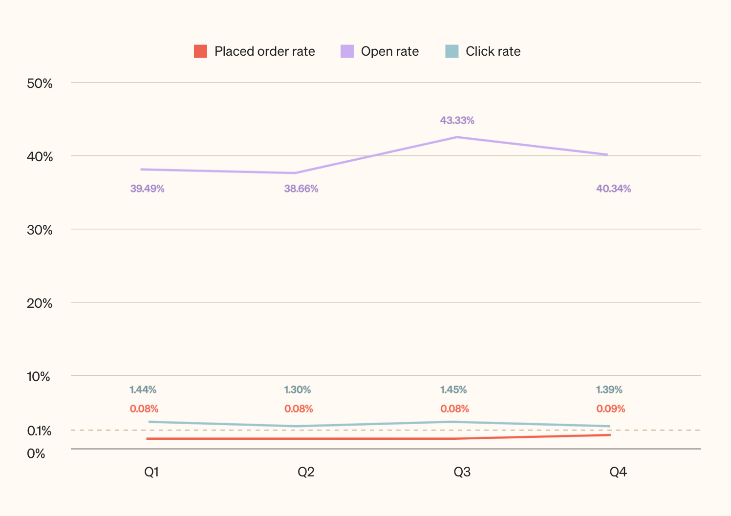
Email activity changes over the course of a year, but does it affect the conversion rate? In their 2024 benchmark report, Klaviyo demonstrates quarterly email performance to show whether the time of year has any effect.

The graph below shows one of the most prominent subcategories of conversions — placed orders. The placed order rate is consistent throughout the whole year and stays at 0.08%, except for Q4 when it increases slightly to 0.09%. 

Practically, this means that you can keep your conversion rate benchmarks and KPIs the same between quarters, maybe raising those a little for the last months of the year when people shop on Black Friday and Cyber Monday.
A graph showing the placed order rate, open rate, and click rate throughout year’s quarters. The placed order rate is consistently at 0.08%, except for Q4 when it is at 0.09%. The open rate varies slightly starting at 39.49% in Q1 to 38.66%, 43.33%, and 40.34% in Q4. The click rate starts at 1.44% in Q1 and continues to 1.30%, 1.45%, and 1.39% in Q4.
Source: Klaviyo

Average numbers can be informative to your long-term goals but for short-term improvement, each company needs to calculate its own average figures to use a reference point.

Common mistakes that lower conversions

Before we get to recommendations, let’s discuss what not to do. Avoid these conversion stoppers: 

Lack of mobile optimization

Over 40% of emails are opened on mobile devices. If your emails aren’t mobile-friendly, you’re wasting your money and time. 

Key aspects of mobile optimization:

  • The subject line must be fully displayed on the mobile screen, aim for 30 characters.
  • Images should have no distortion on different devices.
  • Navigation: call-to-action (CTA) buttons and links are easily clickable.
  • Visual content: less text, priority to photos and illustrations. 

Here’s an example of a non-optimized email by Knotably Creative House: 

An email with the heading “Do you have too much on your plate, Smiles Davis?” and small text, with no clear CTAs and buttons
Source: Really Good Emails

Even if a user opens this email, it’s not very clear what exactly the brand is offering. Too much text, too many highlights, too many links — what to click on? Where to go? For a mobile device, it really is “too much on the plate.” 

Failing to grab attention

The subject line affects more than just your open rate. If it’s boring, no one will open the email, hence no conversions. Craft subject lines that make people curious or offer clear value.

Subject lines like these ones will kill your conversion rates:

  • “Check this out!” — this subject line lacks context, making it easy to ignore.
  • “Important update!” — too generic and may trigger skepticism about its importance.
  • “Don’t miss out!” — overused phrases feel insincere and spammy.

Sending to the wrong list

Segmentation is simply the key to higher conversions. Nobody wants to get info that is not relevant to them.

Email segmentation examples that can decrease your conversions if done wrong:

  • Age-based segmentation. For example, grouping all customers over 50 into a single segment and sending them the same content is a huge mistake. Do not ignore vast differences in lifestyle, interests, and tech-adaptation even within the same age group.
  • All-time purchase history segmentation. Sending promotions for products similar to what the customers bought years ago is not the right strategy. Check if those interests are still relevant and keep your audience’s preferences up to date.

Not understanding the audience

If you don’t understand your audience, your audience won’t understand you. To make your customers convert, you need to present them with an offer that will entice them enough. If you don’t know your audience’s preferences, lifestyle, etc., your campaign will likely miss the mark.

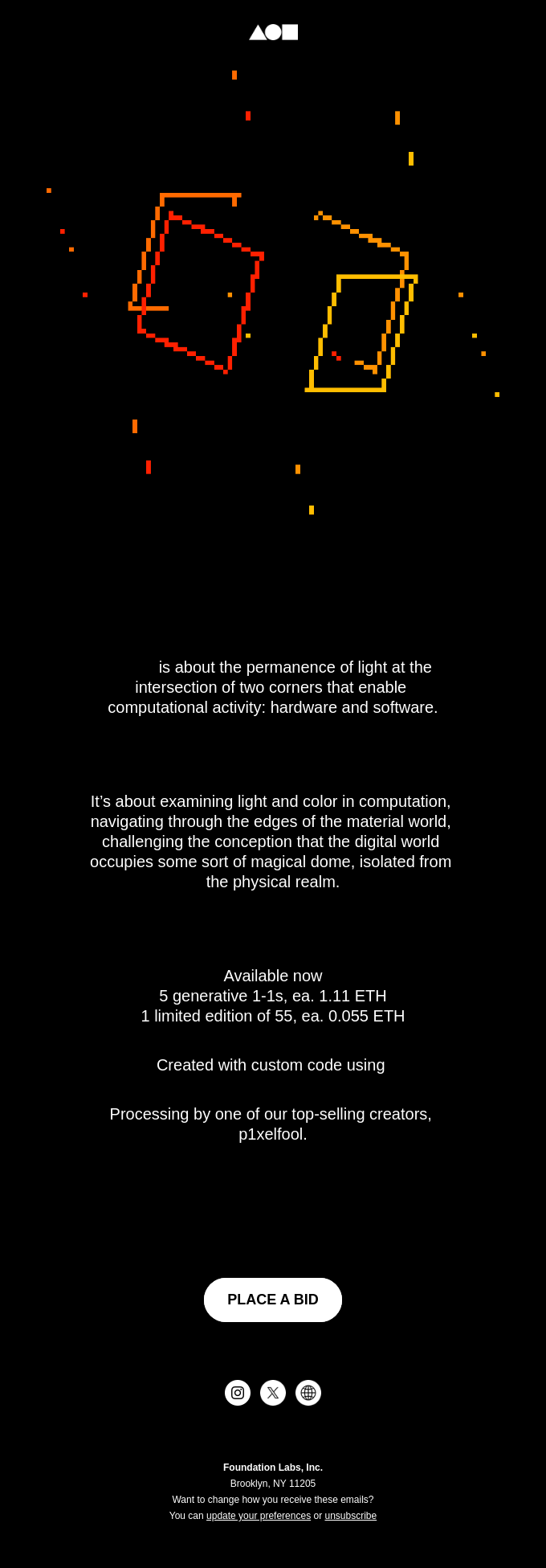
The same goes for the language you use including specific terminology and product positioning. The email example below isn’t bad from the design or content point of view, but it has a very unique copy.

An email with the first sentence being “is about the permanence of light at the intersection of two corners that enable computational activity: hardware and software” and a CTA “place a bid”
Source: Really Good Emails

Did you understand anything from the context? If yes, you are exactly the target audience of this campaign. But send it to anyone other than the people who get these expressions, and you risk not getting any conversions.

Creating content that looks like spam

Spam-like emails risk lower conversions and engagement. They typically have vague or misleading subject lines, excessively use capital letters and punctuation, unusual formatting and design. The other characteristics that may trigger spam filters are poor personalization, unnecessary attachments, and too many links. 

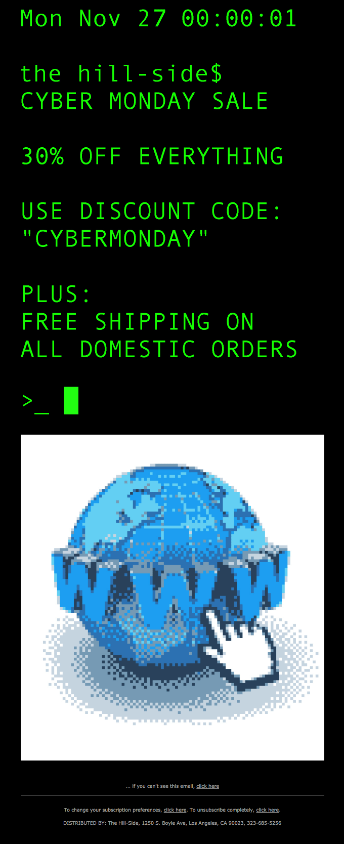
Here’s an example of a newsletter that has a chance to end up in the spam folder. 

The biggest problem with this email is that it is image-based. All the text you see above a web browser illustration actually isn’t live text, it’s part of one long image. On top of violating accessibility guidelines, image-based emails trigger spam filters.

But even if this campaign makes it to the inbox, some customers may mark it as spam anyway. This email is dedicated to Cyber Monday which explains its design. However, the image is intentionally of poor quality, as if straight from the cyber-unsafe 00s. Email and web users are still recovering from somewhat similar endless viral messages that filled their computers and mobile devices and may find this campaign spammy.

If you’re going to boldly experiment with design in your newsletters, make sure that this design doesn’t trigger customers and doesn’t create a desire to quickly close the email.

Tips on improving conversion rate for email marketing

Now, to the positive part. Let’s discuss how to boost conversion rates and make your email campaigns more effective.

Organize your list

Quality over quantity. Make sure your subscribers are engaged, and your list doesn’t contain any spam traps or inactive email addresses. This way you will improve deliverability and get your offers in front of the people who are interested in them and will likely convert.
Here are some tips on how to organize your email list:

  • Clean your list. Review your email list to remove inactive subscribers and old email addresses. 
  • Use double opt-in. This industry best practice ensures that you end up with quality leads and comply with regulations.
  • Re-engage dormant subscribers. Try a win-back campaign to get the attention of the customer who lost interest in your products. And if it’s not successful, you can always remove their email addresses from your list.

Segment thoughtfully

Categorize the customers you contact into smaller groups. This allows you to send targeted content that resonates with each group, increasing engagement and conversion rates.

You can segment by:

  • Demographics.
  • Past purchase behavior.
  • Engagement level.
  • Interests or preferences.

Personalize content

Email personalization goes beyond just using the customer’s name. Use recent purchase data to create content based on their interests, behavior, or the stage of the customer journey.

For conversion, you need to hit the target of the customer’s desires. If you don’t have enough information, it’s time to get to know them better. Don’t be shy to ask directly about what your customers like and what their hobbies or preferences are. 

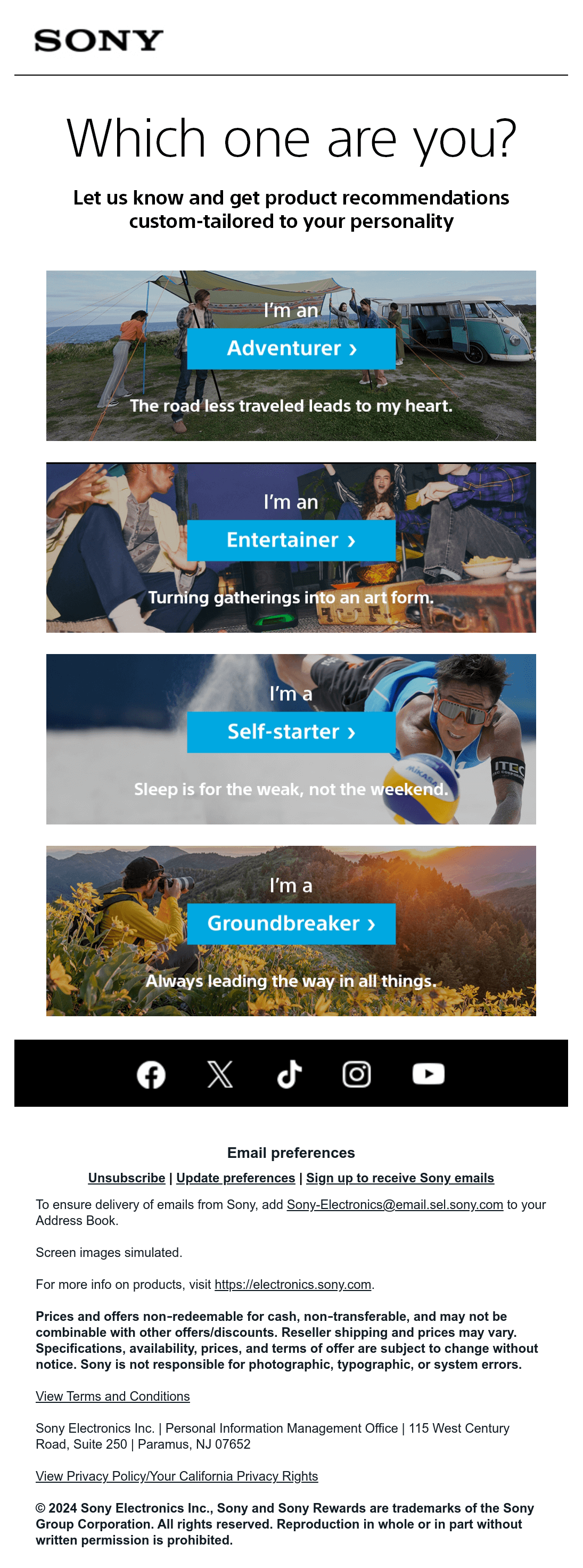
For example, Sony asked their audience to identify themselves:

Sony newsletter with the headline “Which one are you?” and four types to choose from: an adventurer, an entertainer, a self-starter, and a groundbreaker
Source: Email Love

This approach highlights the importance of gathering customer insights to make your marketing efforts effective. Targeted email campaigns ultimately lead to better conversion rates.

Optimize frequency

Find out how often you should send emails. Too much, and you’ll annoy people. Too little, and they’ll forget about you. Make sure that your emails arrive to users at a convenient time and with a comfortable frequency.

Make emails mobile-friendly

Design your emails with mobile in mind. When emails are optimized for mobile devices, it’s easier for recipients to click on links, call-to-action buttons, and interact with your content. This leads to an increase in the number of clicks and conversions.

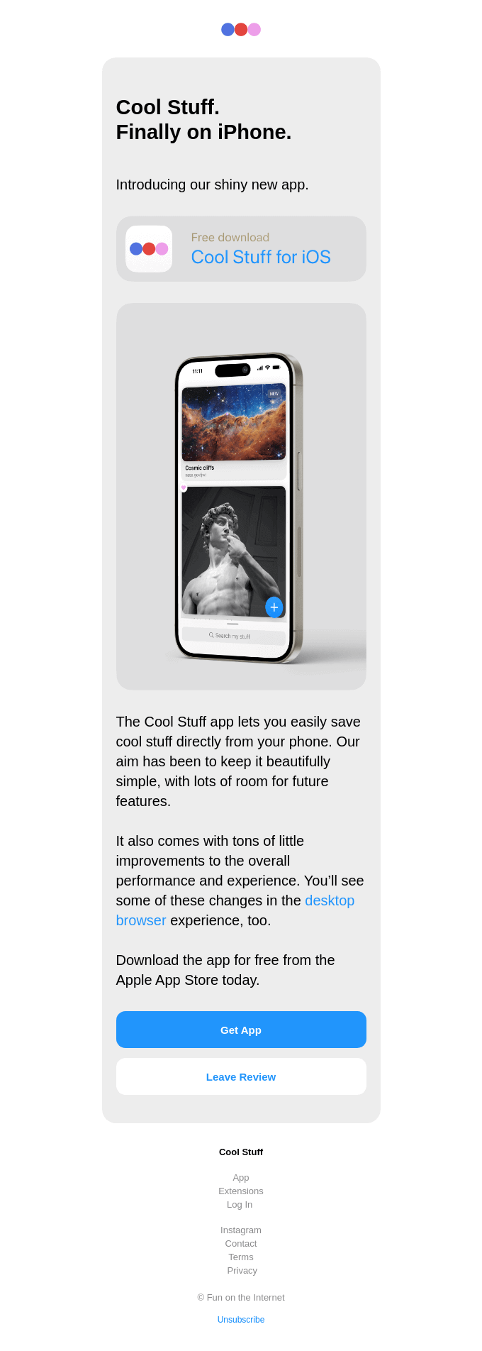
Let’s see an example. Here’s how the company Cool Stuff decided to present its mobile application. The single-column layout looks minimalist and trendy. The email is not oversaturated with text and links and has a very clear CTA — to download the app or leave a review (in case someone has already used the app). All of this makes this campaign mobile-friendly.

An email campaign with the headline “Cool Stuff. Finally on iPhone”, three short paragraphs of text, and two large CTA buttons at the bottom
Source: Really Good Emails

Write powerful subject lines

Your subject line is your first impression. Catchy subject lines that are clear and highlight the value of the email right away have better chances of being clicked on. This, in turn, leads to more conversions. 

Let’s take a look at some examples that highlight the importance of clarity, personalization, and value in subject lines to drive conversions.

  • “Unlock 20% off your next purchase – just for you!” — this subject line creates a sense of exclusivity.
  • “Kate, welcome to the family! Here’s what to expect” — engaging and friendly.
  • “Last chance ends tonight: your cart awaits!” — a gentle reminder that creates a sense of urgency.
  • “Your personal style guide inside!” — invites curiosity and offers value.
  • “Mickie, you deserved a free gift!” — expresses gratitude and piques curiosity.

Create urgency

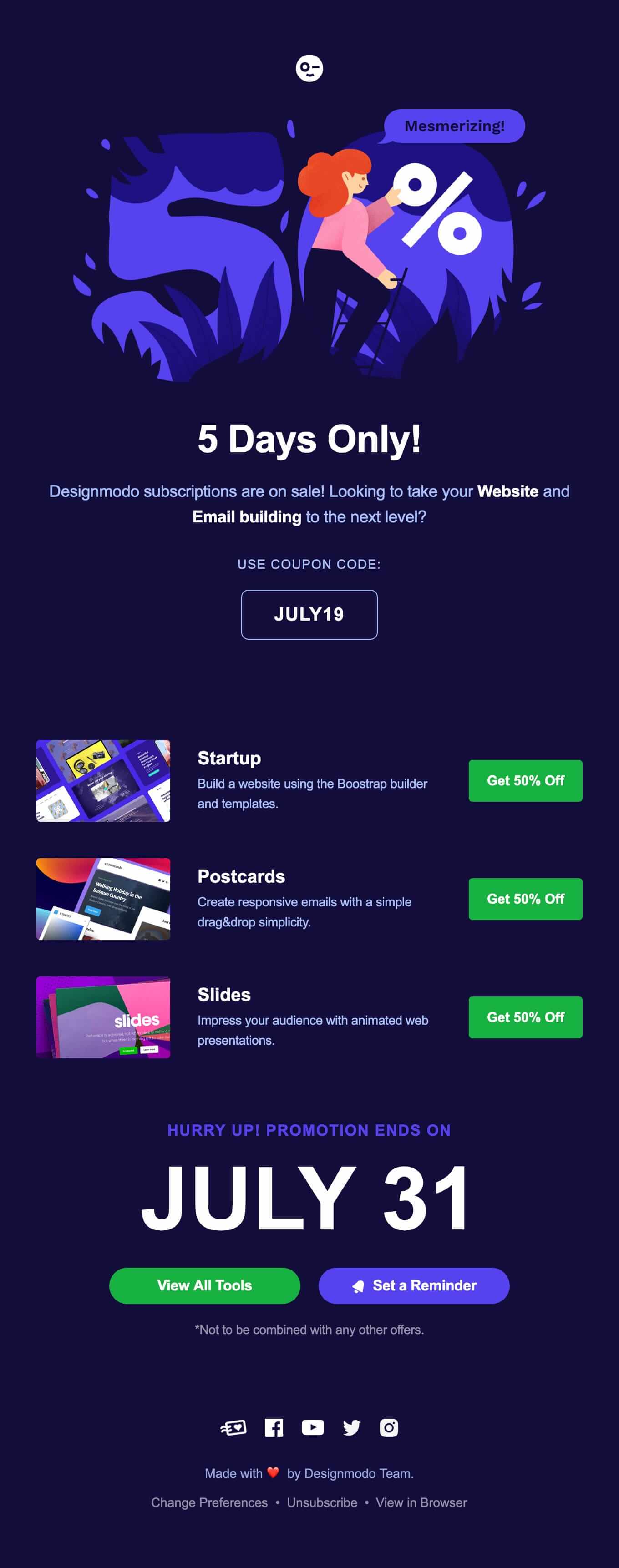
FOMO exists. Use time-limited offers, countdowns, timers, or special deals to motivate your customers to act right away.

In this example, the headline “5 days only!” shows that the offer is urgent and stimulates conversions.

An email from Designmodo about a subscription sale with the headline “5 days only!” and a large text saying that the promotion expires on July 31 (the date is the biggest element of the email, second only to the hero image)
Source: Email Love

Craft strong CTAs

Your CTA should be clear and easy to click. The more people see it, the more actions they are likely to take. 

For best effects, use precise and clear language, opt for strong verbs like “get”, “start”, or “join” and add time-sensitive phrases like “last day” or “limited.” From the design standpoint, place your CTA above the fold (visible without scrolling), repeat it closer to the end of the email, and choose contrasting colors and bold fonts, so it’s easily noticeable within the email layout.

A clear call to action doesn’t have to be related to a call to buy or subscribe. It can be any action that you want to offer to your subscriber. The banking company Wise offered their clients to sort out their finances with a clear CTA  “Sync your finances now.” It works better than a simple “Learn more.”

A newsletter by Wise with the heading “Link up your business in seconds” and a clear CTA “Sync your finances now” motivating the audience to integrate Wire Business with accounting apps
Source: Email Love

This example illustrates that effective CTAs can be creative and specific. By offering a clear, actionable step that addresses a common pain point (in this case, managing finances), the business is more likely to engage users and make them take the desired action, increasing conversion rates. 

Build dedicated landing pages

Don’t just send people to your homepage. Create specific landing pages that match the email content for a seamless experience. For example, if you offer a discount on household goods, take the user not to your general website, but to a separate discount page. Or, if you want to receive feedback, add a link directly to the feedback form from your website.

A/B test relentlessly

Test and try different subject lines, CTAs, layouts, or sending times. See what works best for your audience.

When you conduct A/B testing, remember to only change one variable at a time, have measurable goals and ways to analyze the results. For example, compare the conversion rates of two email campaigns with different CTA button designs. When you’ve tested one element of the email, go on to the next one, form new hypotheses, and continue experimenting.

Final thoughts

Email conversion rate is an essential metric that shows the effectiveness of your campaigns. It is directly connected to ROI, so you should definitely track it and try to improve your results.

To increase conversions, learn more about your audience and create well-designed and impactful campaigns with relevant offers. Keep in mind that there’s no one-size-fits-all approach — try different strategies to find what is right for you.

16 October, 2024
Article by
Arina Topoleva
At the core of my professional identity is a passion for global connections, communications and digital marketing. With a vision based on an inspiring aesthetic, I am trying to bring a unique flavor to all my projects, creating content that would contribute to a user-based perspective in content marketing.
Visit Arina's
Latest Articles
Selzy Selzy Selzy Selzy