Anne Tomlin on Email Development and Accessibility

Anne Tomlin on Email Development and Accessibility
03 September, 2024 • ... • 236 views
Diana Kussainova
by Diana Kussainova

With so many no-code builders, ready-made templates, and AI tools, it seems like there’s no need for email development, and the design is easy and universal. However, many email clients have differences in rendering, and accessibility and dark mode optimization still need to be hand-coded. 

To figure out the best email development practices and why it is as relevant as ever, Selzy interviewed responsive HTML email developer Anne Tomlin.

Anne Tomlin is the owner and HTML Email Developer at Emails Y’all.
Anne Tomlin portrait photo with the speaker smiling and looking at the camera
Source: Anne Tomlin

Career path

Tell us about your career path. How did you become interested in email development?

I was in customer service till my brother suggested I learn PHP. I didn’t like it but enjoyed front-end web development. One day, my manager asked me to build an email. I loved it immediately. It made more sense to me spatially, and I loved the challenge of all the constraints. After that, I only coded emails.

What do you enjoy most about your job?

The sense of accomplishment. Email coding is so hard, so when I’m able to code new structures and get it to look right on all major email clients — including Outlook — I feel like an email development demigod.

What are some parts of an email developer’s job that people don’t realize exist?

Math! There’s so much math. If you told me I’d be multiplying fractions every day of my life when I was 16, I would have laughed at you, yet here I am.

There’s also a lot of spatial reasoning and problem-solving. There are a lot of different ways to code structures, and you need to think of the right one that will allow a desktop email to decrease in width to a mobile view with as much grace as possible with the least amount of code due to Gmail’s 102 KB cap. It’s definitely not easy, but you get used to it.

What resources can you recommend to people who want to learn email coding?

My course, Email Coding Fundamentals, is an excellent resource for learning to code emails. You’ll learn not only how to code, but why you are coding that way. I walk you through the different techniques for coding emails, best practices for text, images, and CTAs, as well as how to code for accessibility and dark mode. I finish it all up with a few videos of me coding and explaining as I do so, so that you can watch how it’s done from beginning to end. I also provide you with a boilerplate that you can use in all your future email development. I will be releasing my Intermediate/Advanced course in 2025.

I also recommend Email Resources — it lists other email development courses, but it also lists tools, people, communities, etc. that will help you learn and support your future development skills.

Email development and design

How important is it for a business to code an HTML template instead of using pre-existing ones?

It’s most important to send emails that are accessible to all your subscribers and that render the best they can on all major email clients. While you can get the best results when coding your own emails, there are tools out there that can help.

There is room for all kinds of email creation in this industry. WYSIWYGs (What You See Is What You Get) and pre-existing templates are great if you’re looking for a relatively simple design and/or don’t have access to an email developer. The downside to using those tools is that you are relying on: 

  • The original coder to have coded everything correctly so that it looks good in all major email clients.
  • The original coder to have incorporated all the necessary accessibility markup that is essential for the email to be consumed by everyone it is sent to.
  • The marketplace where you get the templates or the WYSIWYG creators to keep them up-to-date with the newest coding techniques and hacks since email clients change support periodically with no warning.

Additionally, when you use pre-existing templates, you can’t customize dark mode for webkit clients or use hacks to keep certain dark mode background colors and text colors on top of background images unless you can access the head and know how to code. And you usually have to make text on top of images part of the image, which is against accessibility.

You can do a lot more and sleep better at night knowing your email was consumed by the most people via accessibility in the best way possible when you have an email developer. 

But we all work within the confines of our jobs, so you use what you have and advocate for better tools when you can.

Do you use AI tools in your work? If so, how and which ones?

I do not use any AI tools in my work. AI cannot code an email that is accessible, responsive, and looks the best it can on all major email clients. I actually address that in this short video.

Not using AI tools is also in line with my coding values. I hand code only — I don’t use inliners and I don’t take shortcuts of any kind. That’s how I ensure my code renders the best it can in all major email clients. Some might think that’s too difficult or a waste of time, but it’s been working for me since 2010, my client list is long and varied, and I never have to look for work — all my clients come to me.

What are the essential elements of a responsive email design?

I see a lot of mockups in my line of work. I’m not a designer myself, so I rely on in-house designers or trusted email designer freelancers to do it for me. 

I find that it’s easiest for a designer new to email to think of the email as a bunch of rectangles. You have 1 large rectangle, and you put rectangles inside other rectangles to make elements of the design. When you think about it like that, it’s easy to visualize what the mobile view will look like — it’s your rectangles stacked on top of each other. When you use that type of mental framework, you usually end up with a series of columns and rows, which is exactly how I approach coding the design. That’s pretty much my job — putting rectangles inside other rectangles.

What’s your approach to email accessibility?

I am an accessibility drill sergeant! It is such an important topic. You need your message to get across to all of your subscribers and the way to do that is to include accessibility markup and follow accessibility best practices. Parcel.io has a great tool for accessibility markup

As for best practices, you need to think about all the people who may have disabilities who are going to consume your message. And that doesn’t just mean blind people — we’re talking neurodivergent people, colorblind or dyslexic people, people with motor impairments. There are things you can do using code and design to make the consumption of your message easier, and because it is easier, it is more likely to convert!

The major accessibility point I wish more companies followed is the use of live text. You should be using real text in your emails, not using images that have text as part of them. When you make text a part of an image, people who use screen readers or have images turned off will never be able to consume your message! Alt text is for look and feel, not reiterating text locked up inside an image. It’s not okay to rely on alt text to get your message across. 

You must use live text so that everyone can understand your message. Otherwise, you’re just leaving money on the table. The more people who are able to consume your message, the more conversions you will get. You can put text on top of images in emails with very little effort for all major email clients these days, so there’s no excuse for using baked-in text if you have the tools to use live text.

What’s your opinion on AMP and interactivity in emails?

AMP is cool, but there are so many hoops to jump through to use it that it never caught on for the great majority of companies. You had to register with Google to even use it. Plus, the AMP version of an email expires after 30 days, and all you’re left with is the HTML version. If it was going to be a thing, it would have been a thing by now. The good news is that developers can still do a lot of the things AMP was used for using the checkbox hack — no registration or expiration dates.

What’s your opinion on dark mode in email? Do you think it’s necessary to optimize emails for dark mode?

I personally use dark mode on all my devices. I think it’s an important tool for people with vision differences and those who want a break for their eyes. 

While most email clients implement dark mode for you without giving you an opportunity to customize it, there is still plenty you can do to optimize your email for dark mode via code. Apple Mail and iOS Mail give you 100% control over dark mode, so you can completely optimize for those clients. There are also hacks you can implement in both Gmail and desktop Outlook to force the color of your text in dark mode. There’s even a hack for forcing background colors to stay the same in dark mode for Gmail! 

Since we don’t know how many people use dark mode, and we know that we can totally customize Apple Mail & iOS Mail dark mode, there’s really no excuse for not optimizing for it.

What are some of the email coding or design trends everyone should follow?

Progressive enhancement is a “trend” that never goes away, is always in style, and should be practiced by every developer. You should always ensure that your fallbacks for Outlook and other limited email clients are clean, accessible, look good, and are easy to consume. That’s the baseline. Then you add in some cool stuff for the people who are using email clients that have the ability to render it.

Want a gradient? Awesome — do it for those people using Gmail & Apple Mail and iOS Mail, but still make sure your fallback for the rest of the email clients is on brand. Want to add interactivity to your email? Even better! Those using Apple Mail and iOS Mail (and some other email clients depending on the type of interactivity you’re using) will be able to see it and they’ll be wowed — but, those that can’t see it are still easily able to consume your main message. 

There are many designs that can be done in email using the right techniques, but support for them does range in different email clients. So, we do what we can for those that can see it, but always ensure a good rendering fallback for those that don’t.

What email design or HTML email development issues do your clients need help with the most often?

Most of my clients bring a design for me to code. I have to use my experience and knowledge of email development to figure out the best way to code that email so that it seamlessly transitions from desktop to mobile, is accessible, uses the least amount of code possible, and renders well in all major email clients.

When clients have specific issues they need help with, usually they ask me to either find and fix a specific issue or to clean up an existing template, add dark mode, and include accessibility markup. Those are fun because I get to go through the code line by line to ensure compliance with all of the above. It feels like I’m a detective trying to locate all the little clues so I can resolve the issue or make the code better.

I love my job.

Future of email marketing

How do you see the future of email design and development?

I see the future of email development and design making steady progress toward standardization. If we can get all the email clients to support the same stuff in the same way, it will become easier, because we won’t have to ensure that the email looks good in all 40,000 different ways it can render when you factor in all the email clients and ESPs. I think we’re on the way there, but we’re still in the first few chapters of the email design & development’s story. We now have the Email Markup Consortium that is championing standards, so we’re on our way. However, it will take a lot of work and therefore a lot of time to get every email client on board with standards, so we’ve still got job security for quite a while. 

And if you’re worried about AI taking your email coding job, go ask it to code a responsive email that uses all the accessibility and best practices that will render well in all major email clients — you’ll be refining that prompt for way more time than it would take you to code the email yourself. Then you would have done all that extra work for someone to just duplicate a template within an ESP.

Email marketing best practices

What are some of the best brands in terms of emails they send? What makes them stand out to you?

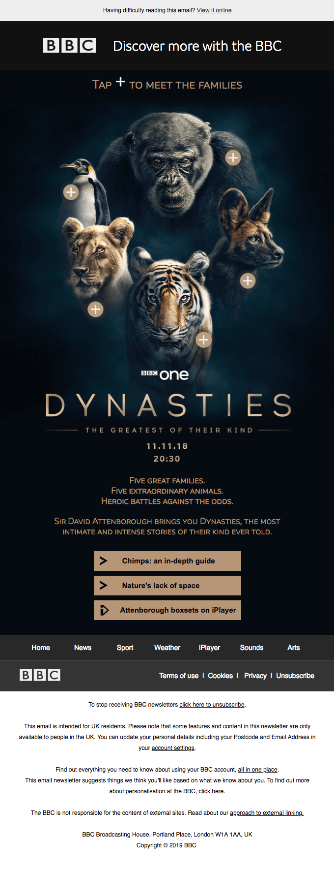
The BBC has some of the most engaging, visually magnificent, solidly coded emails. They use ActionRocket, so I would expect nothing less.

An email encouraging readers to discover more from the BBC and promoting a show called Dynasties and other programs
Source: Really Good Emails

H-E-B, a grocery store here in central/south Texas, has excellent emails. Both their marketing and transactional messages are on point and easy to consume even without images turned on. They always use live text and HTML CTAs. Their designs are very clean and crisp, which is my kind of aesthetic.

An email the new credit card with special conditions on shopping from H-E-B and a button with the CTA “Apply now
Source: Deal Town

What’s one thing every email developer should or should not do?

I’m gonna get back up on my accessibility soapbox here. Every email developer should be including accessibility markup and following accessibility best practices. a11y.email is a great resource for this. And of course, every email developer should be using live text 100% of the time.

03 September, 2024
Article by
Diana Kussainova
Writer, editor, and a nomad. Creating structured, approachable texts and helping others make their copies clearer. Learning and growing along the way. Interested in digital communications, UX writing, design. Can be spotted either in a bookshop, a local coffee place, or at Sephora. Otherwise probably traveling. Or moving yet again.
Visit Diana's
Latest Articles
Selzy Selzy Selzy Selzy