Subscribe to the FWD: by Selzy email marketing digest and get actionable tips, trends, and 21 growth ideas to try today.
Pop-ups are everywhere, whether you love them or hate them. It’s no surprise, given that they bring in new subscribers, drive sales, and improve websites’ performance when designed thoughtfully.
In this article, we’ll describe how pop-ups work, examine pop-up best practices, and share some of the methods to analyze your pop-ups’ success.
How do pop-ups work?
Imagine you’re doing online shopping, when all of a sudden a form jumps out, asking you to fill in your email address. This is what a pop-up is: a small message that appears on a website while someone is browsing.
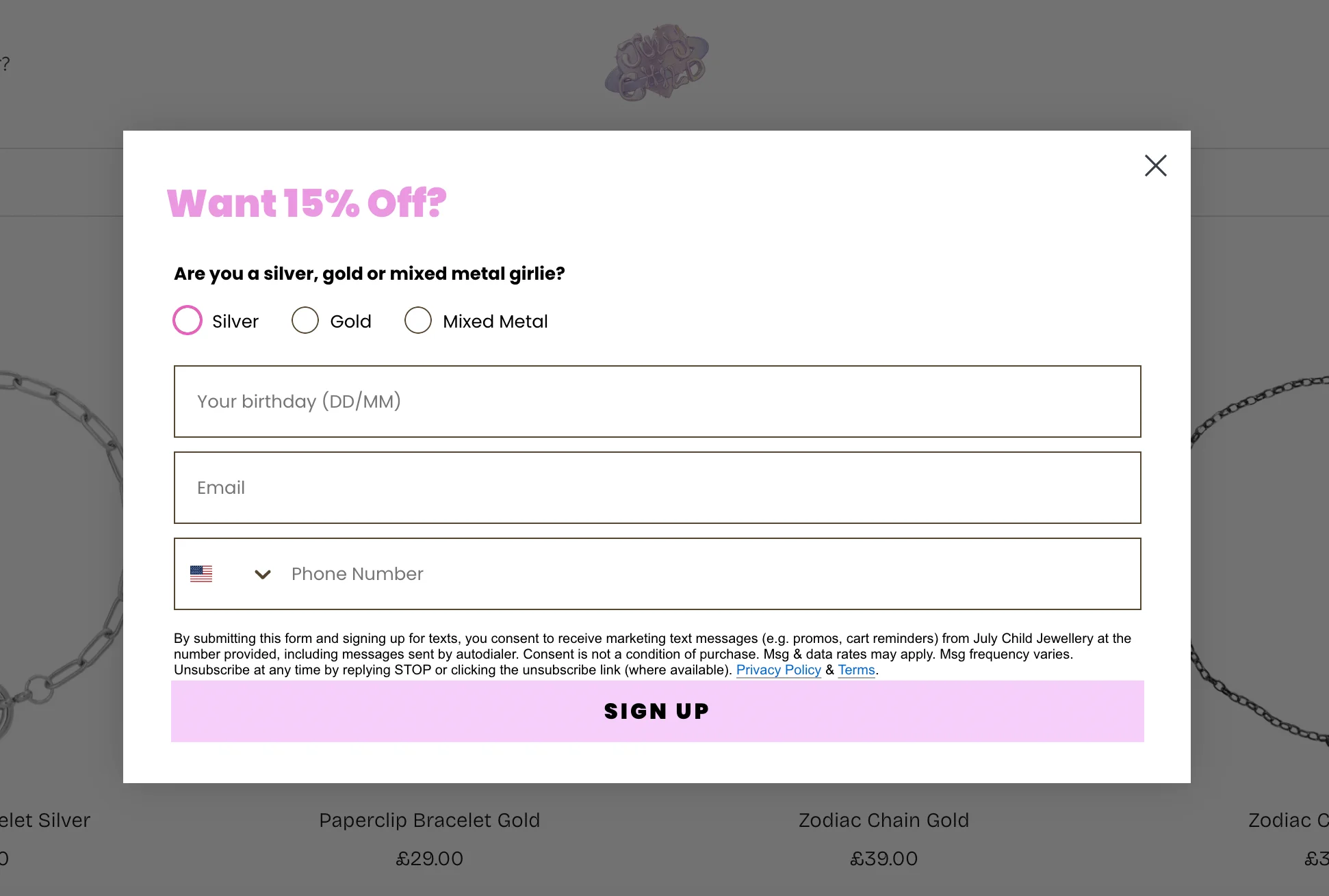
Most commonly, these forms ask visitors to sign up for a newsletter, get a discount, or download something for free. Here’s an example of a pop-up form I encountered on the website of a UK-based jewellery designer, July Child:
Source: July Child
Pop-ups usually show up when a visitor does something specific. For example, to trigger the pop-up above, I had to scroll a little on the landing page. Other triggers include spending a bit of time on the site or moving the mouse toward the top of the screen to close the tab or window. The goal is to catch people’s attention and get them to do something.
Pop-ups can be really effective when done the right way — they can help businesses grow their email lists, improve sales, and keep website visitors engaged.
Launch effective pop-ups with Selzy
With Selzy, you can easily create pop-up forms and get new subscribers for your newsletter. On top of that, you can use the AI assistant, email automation, and analytics — all for free! Register today and reap conversions tomorrow!
Pop-ups are one of the main methods websites use to collect email addresses — the other common option is static subscription forms. If you want a breakdown of how the two compare, check out our article on the difference between pop-ups and embedded forms.
Best practices for effective pop-ups: 15 essential tips
According to research by WisePops, the average website pop-up conversion rate is 4.65%, up from 4.01% in 2024. However, you can go wrong with pop-ups, too — if they’re too aggressive or annoying, or there are too many of them, it can drive visitors away. Follow these 15 simple tips to make pop-ups that boost signups, sales, and engagement without annoying your customers.
1. Target the right audience
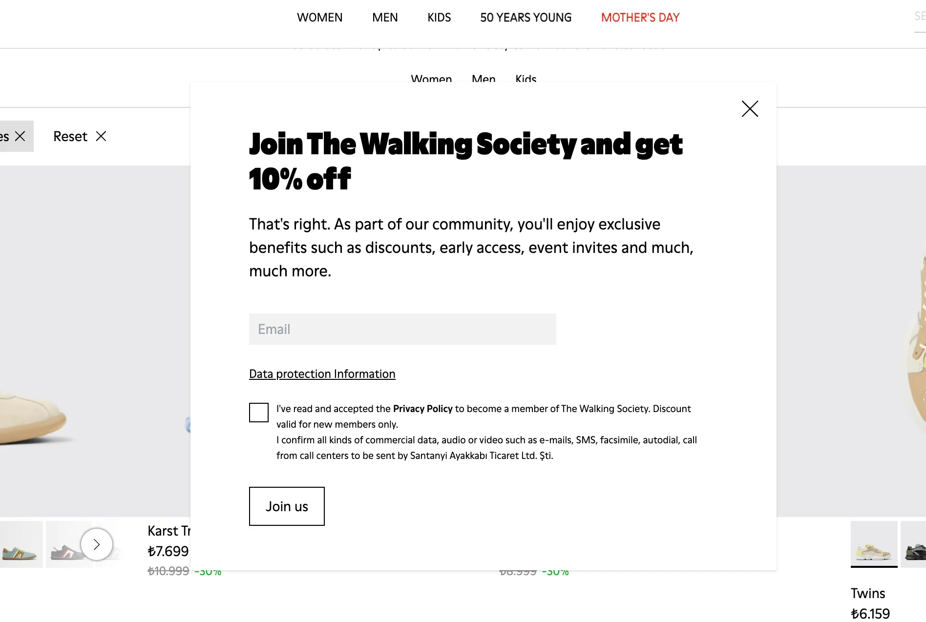
Not every pop-up needs to appeal to every single visitor to your website. Most pop-up tools let you tailor who sees what — you can show different messages to new users, returning customers, and people who came from a specific ad. For example, the pop-up below from shoewear brand Camper is targeted at first-time visitors:
Source: Camper
Here’s an idea for a pop-up for a visitor who’s already got an account on your website.
Source: Firebox
You can even set pop-ups to trigger only for people in certain countries, on certain devices, or after specific actions (like viewing three pages). This kind of targeting makes sure customers don’t find your pop-up interruptive, but personal, relevant, and helpful.
2. Define clear and specific goals
Before you start designing your pop-ups, you should define your goals. Ask yourself, what exactly do I want people to do? Sign up for a newsletter? Download a freebie? Finish a purchase? The more specific your aim, the better your future pop-up will be.
Try to avoid doing too much at once. It’s okay to offer a small discount in exchange for an email address because ultimately, you’re focusing on one goal: collecting their email. But if you try to ask for an email, promote a sale, and link to your blog all in the same pop-up, it can get messy and off-putting.
3. Choose the right pop-up format for your goals
Pop-ups come in different styles — modals, slide-ins, banners, and more — and each one works best in different situations. For example, a modal (a pop-up that appears in the center of the screen and dims the background) might be suited for a newsletter signup, while a slide-in works better for blog readers who’ve already scrolled partway down the page. Check out some more pop-up form examples to see which one would best suit your needs.
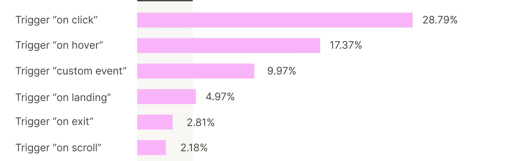
But you should bear in mind that performance also varies — according to the WisePops study we cited earlier on, on-click pop-ups (where users trigger the pop-up by clicking a button or link) had an average conversion rate of 28.79%. This is much higher than other types of pop-ups:
Source: WisePops
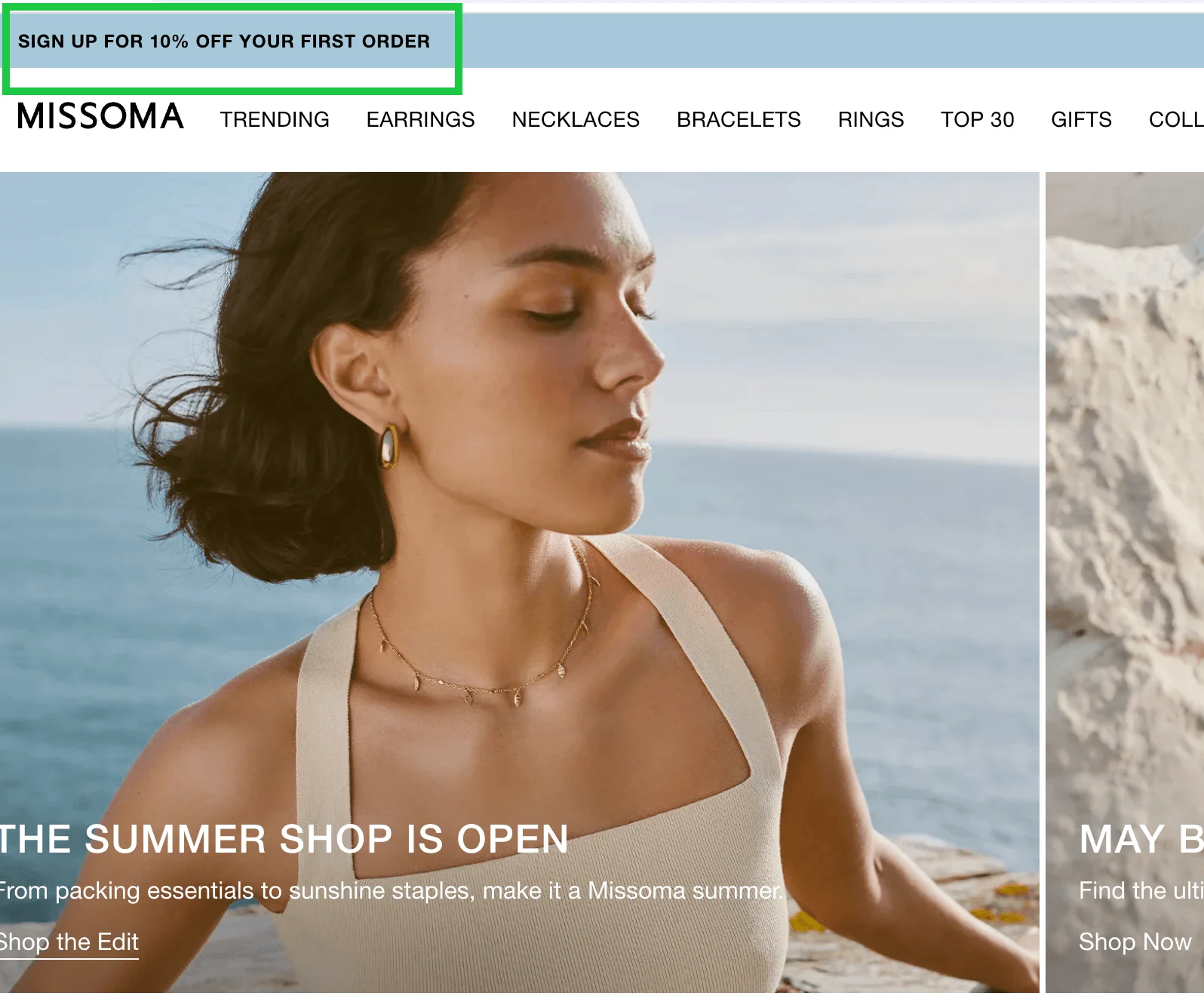
Here’s an example of an on-click pop-up from jewellery brand Missoma:
Source: Missoma
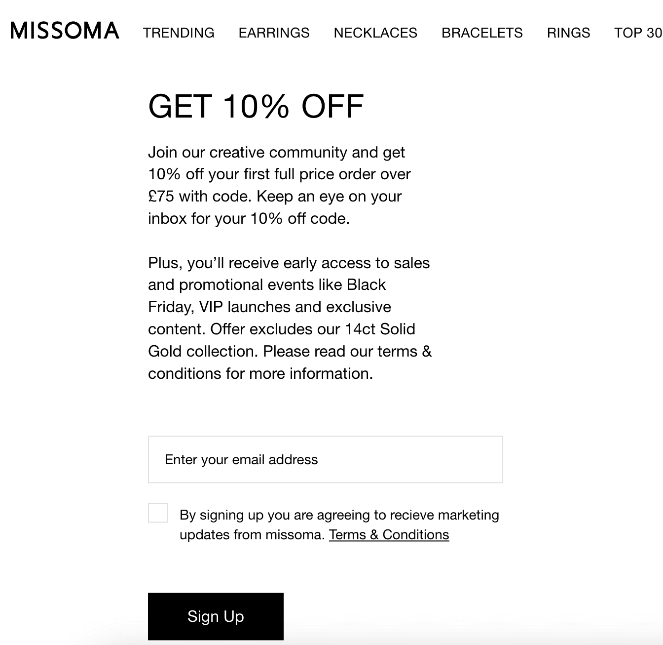
Once you click, you can leave your email address and get a discount for signing up:
Source: Missoma
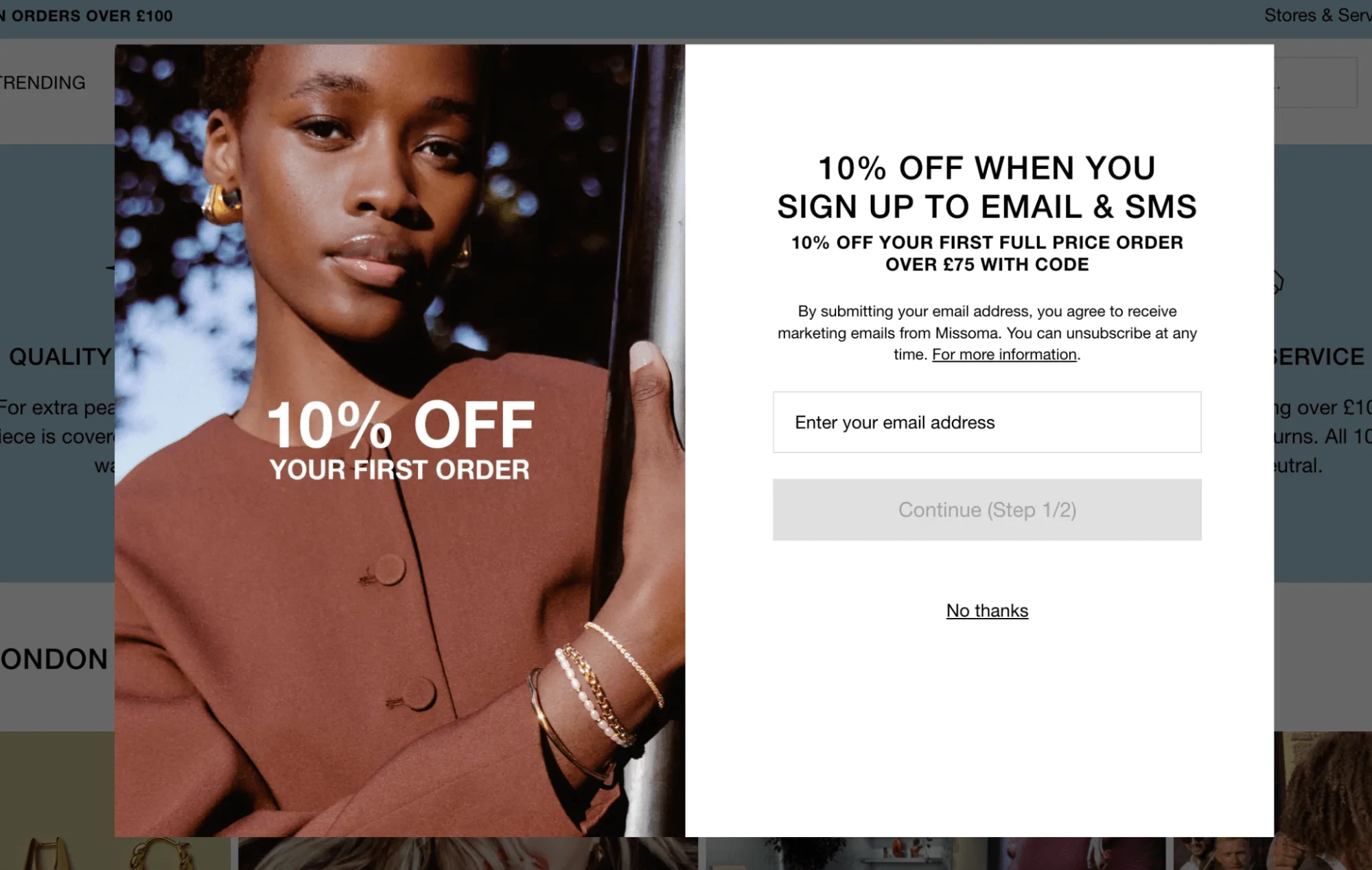
It’s worth noting that this brand also uses pop-ups that appear automatically, showing that you don’t have to stick to just one strategy. Combining different formats can help you reach different visitors based on their behavior.
Source: Missoma
4. Keep pop-ups user-friendly and non-intrusive
If your pop-up feels like an interruption to the visitor, it’s unlikely to be effective. To keep the experience smooth, make sure your pop-ups appear at the right time and don’t block important content. For example, avoid showing a pop-up the second someone lands on your site — give them a chance to look around first.
5. Design pop-ups that match your website aesthetic
Pop-ups shouldn’t feel like they were copied and pasted from somewhere else. To keep your branding consistent, build trust, and improve user experience, make sure your pop-ups match the look and feel of your website. Use the same fonts, colors, and tone of voice as you do everywhere else. Basically, it should feel like a fully-fledged part of your brand, not an afterthought.
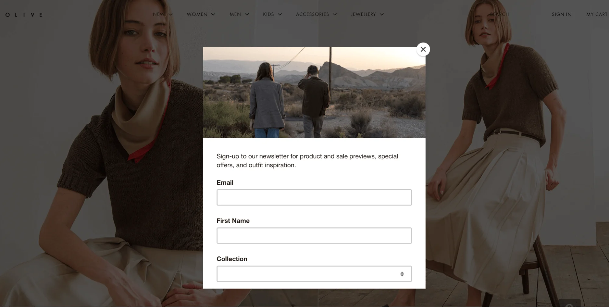
Source: Olive
The example above from clothing brand Olive shows how a pop-up can match the overall brand aesthetic. The muted colors, clean layout, and soft imagery of the pop-up all reflect the minimalist, editorial tone of the website itself.
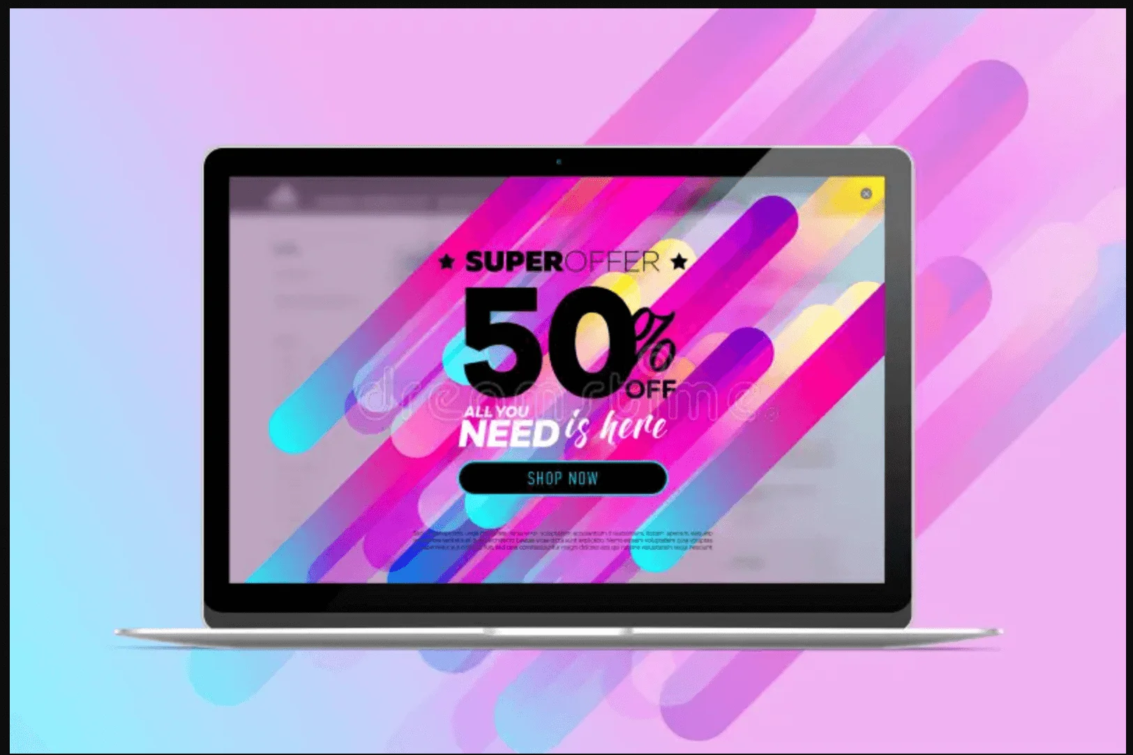
Now, imagine if Olive used this pop-up instead. The neons, variety of fonts, and flashy graphics would definitely be eye-catching, but this pop-up would completely clash with Olive’s branding and might even feel untrustworthy or spammy.
Source: Dreamtime
6. Make your сall-to-action (CTA) stand out
Your call-to-action (CTA) is the most important part of your pop-up because it’s what you actually want people to do. Use short, clear, action-oriented language that focuses on the benefit. This can include something like “Get 10% off” or “Download for free.”
You can also play around with the design — try to use a bold color for the button or add extra white space around it. Just don’t overdo it — you want to draw attention, not overwhelm.
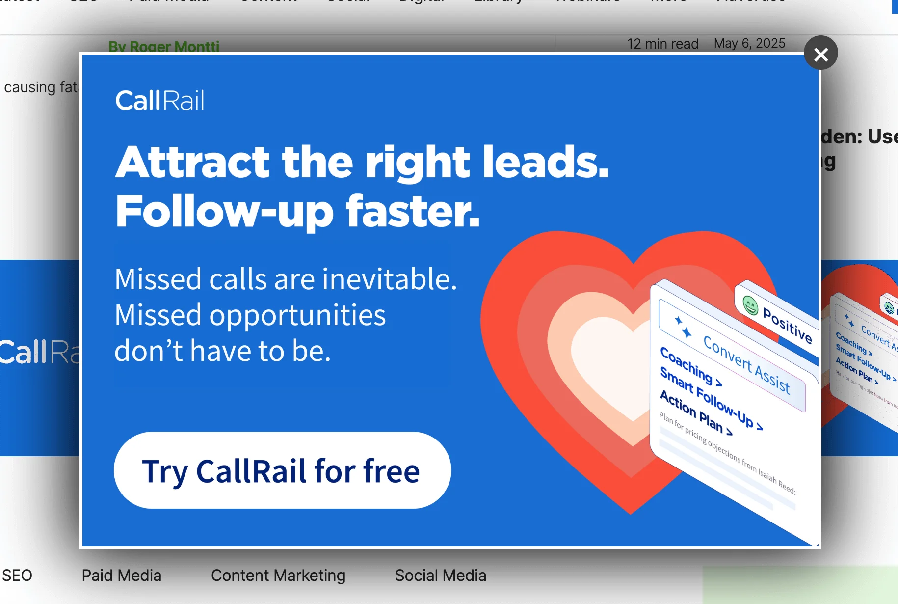
We’ve focused on e-commerce examples, so here’s one from a SaaS company instead. Notice the prominent and direct CTA:
Source: Search Engine Journal
7. Use short, compelling copy
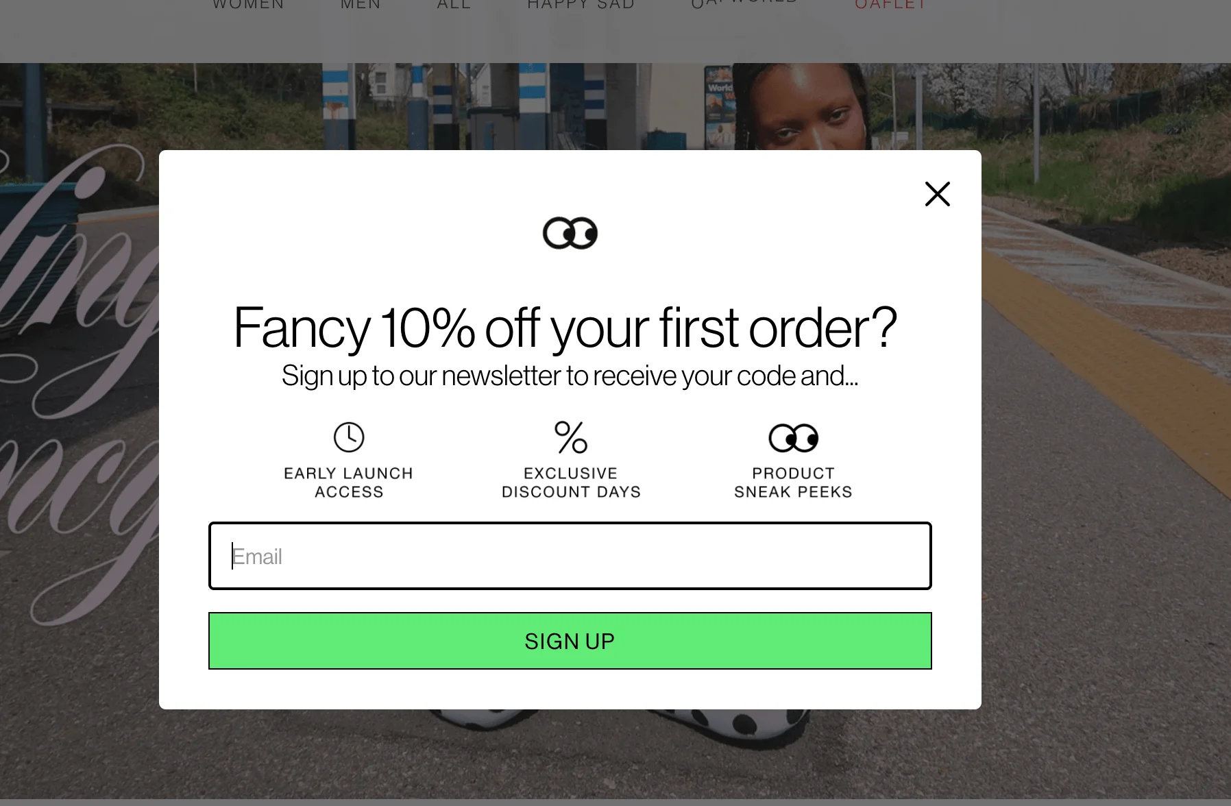
Let’s be honest — nobody wants to read an essay in a pop-up form. Your messaging should be short and clean. That doesn’t mean it should be vague, though — think about a phrase like “Sign up for updates.” Updates about what exactly? Be specific and let the customer know what they’re in for. Something like “Subscribe to get weekly style tips” or “Sign up for early access to our sale” would suffice.
The pop-up below, from UK clothing brand Lazy Oaf, only uses 25 words (if we don’t count the CTA button and the word “email”), yet the potential subscriber gets a very clear message of the benefits they’ll receive upon signing up.
Source: Lazy Oaf
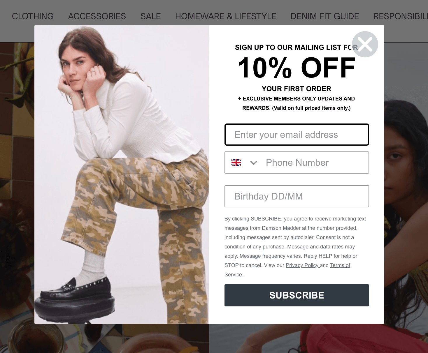
Even though your copy should be short, it’s still worth including a quick note about GDPR or privacy. After all, collecting email addresses means collecting personal data, which falls under data protection laws. You don’t need to paste in your entire privacy policy, but adding a short line like “We’ll never share your data” or “Unsubscribe anytime” might be a good idea. This pop-up below, from a UK clothing brand, Damson Madder, includes a lot of detail about its privacy policy and terms of service.
Source: Damson Madder
8. Offer value in your pop-ups
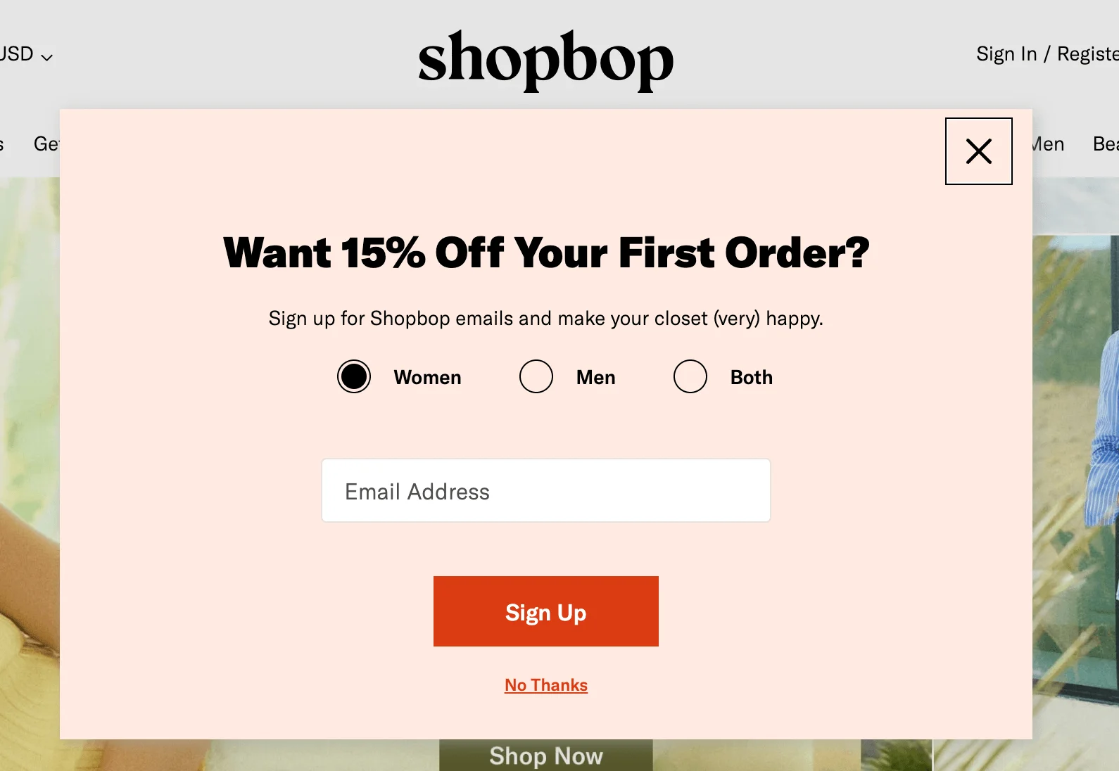
Quite a few examples of pop-up forms we’ve seen so far offer discounts for first-time customers for signing up. These brands are playing smart. According to WisePops, offering a discount can nearly double your signups. Pop-ups with discounts are converting 98% better than those without — wild, but true. It’s a simple best practice that can lead to better engagement.
Source: Shopbop
If you’re not in e-commerce, don’t worry. There are other ways you can offer value to potential subscribers. Think early access to content, a helpful resource, or a behind-the-scenes look at your process. Just make sure it feels like a reward.
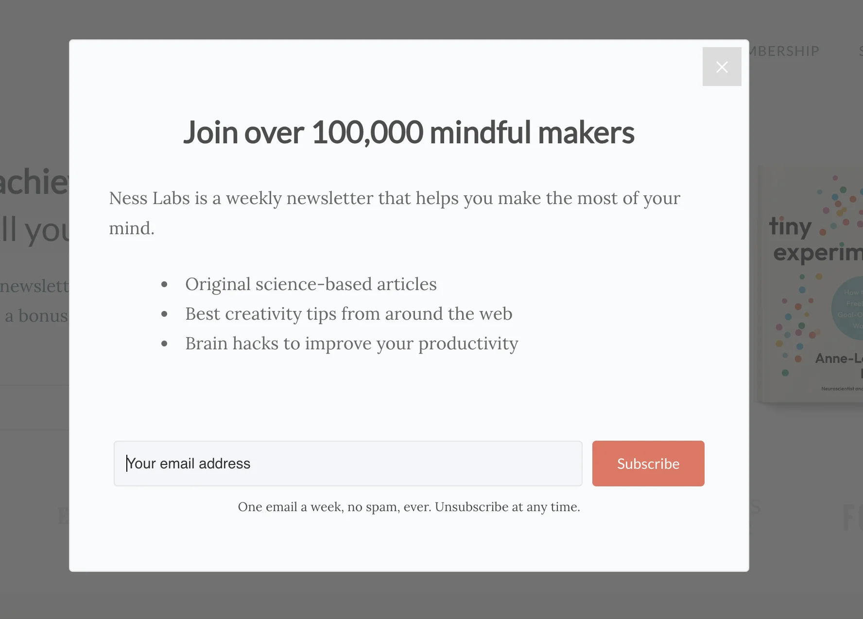
Here’s a good example of a pop-up form you can use for your blog. It highlights the types of content subscribers will receive and entices with the number of people who are already on board:
Source: Ness Labs
9. Use original visuals to capture attention
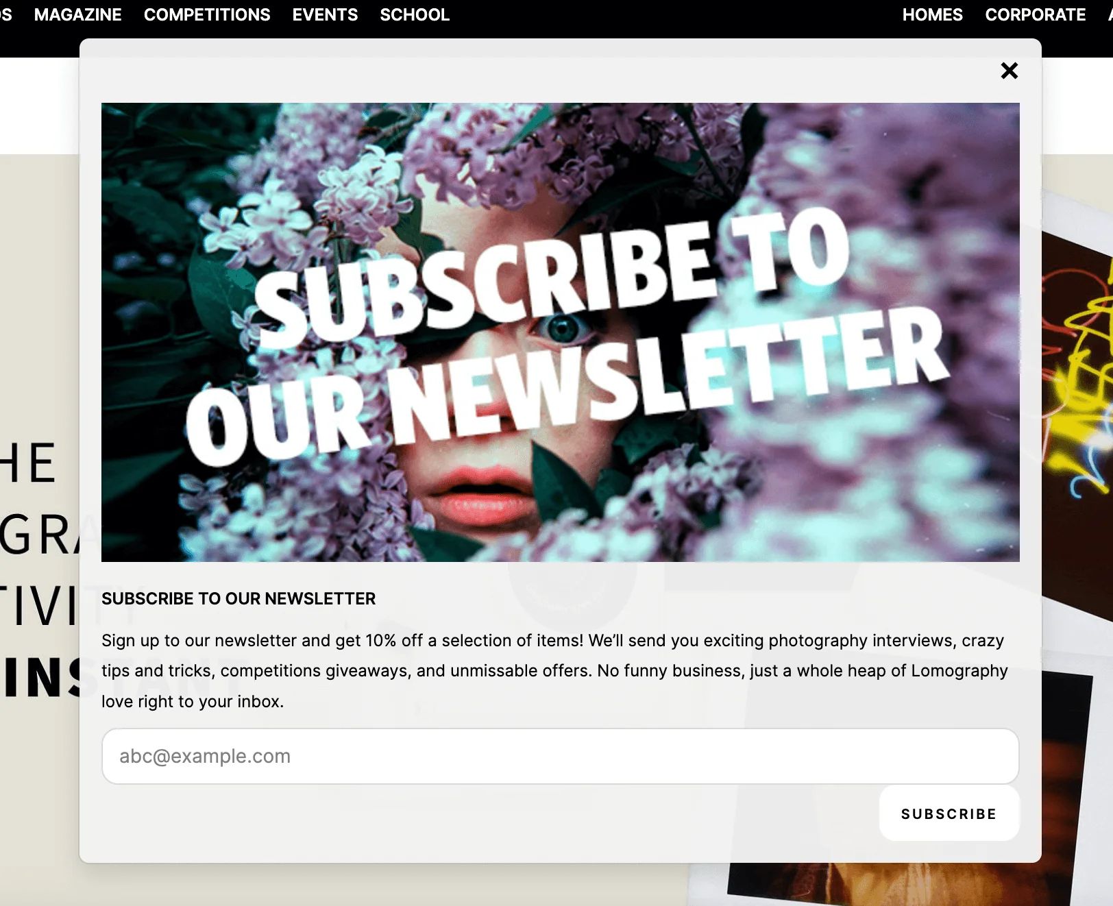
A good image can stop the scroll — or in this case, the click away. There’s actually research that suggests that pop-ups that include visuals tend to perform better — according to Wisepops, pop-ups with images convert almost 70% more visitors than those without. That’s the kind of simple visual boost that can make a big difference to your sign-up rates.
Source: Lomography
Let’s look at the example above from experimental film photography brand Lomography. The dramatic, film-inspired image not only catches your eye but also reflects the brand’s creative personality.
10. Ensure pop-ups are mobile-friendly
Loads of people use their phones or tablets to browse, so your pop-ups need to look good and be functional on smaller screens. That means no cut-off buttons, no overflowing text, and definitely no pop-ups that are impossible to close.
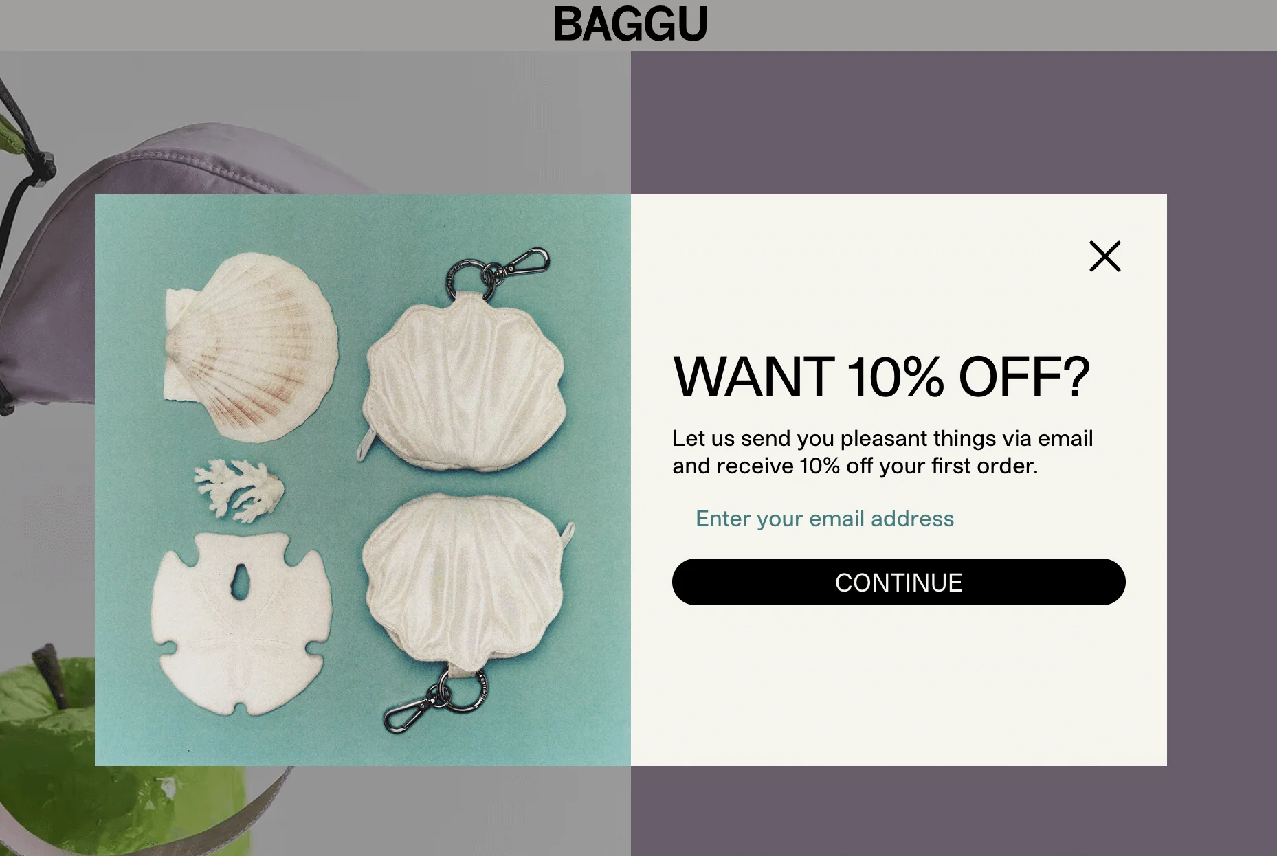
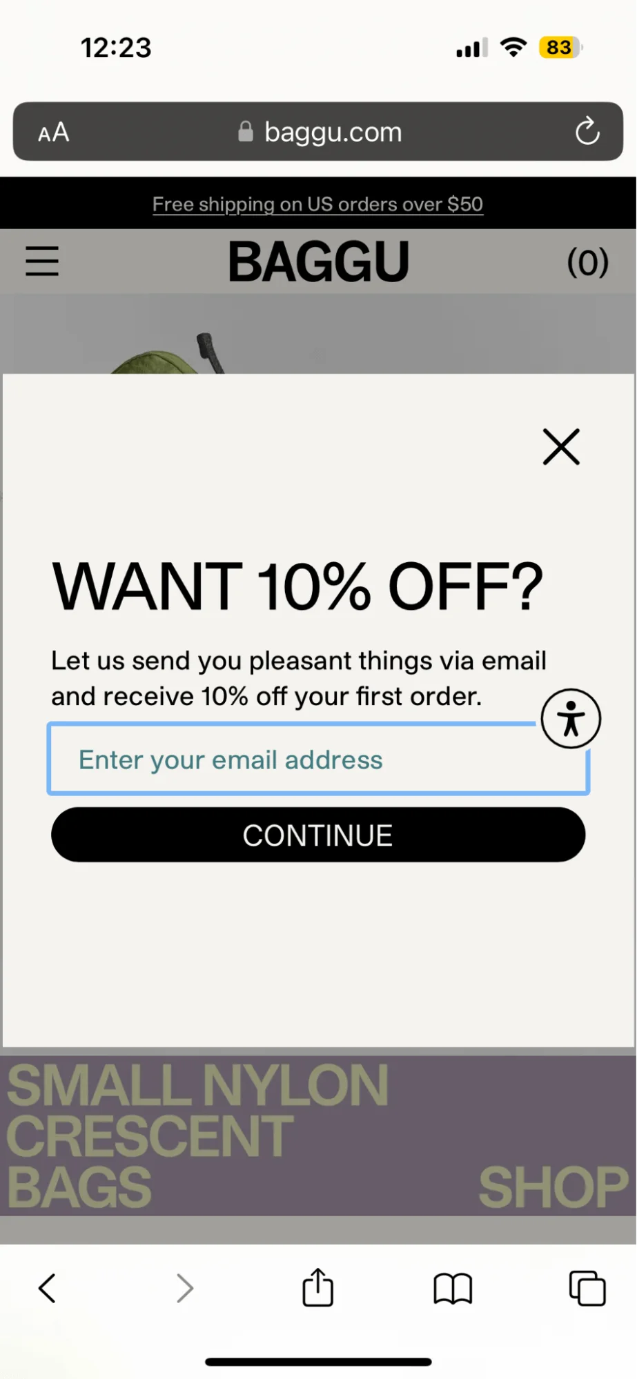
Let’s compare the way a pop-up looks on a computer and on a phone, on the website of the bag brand Baggu.
Here’s what it looks like on Google Chrome on my laptop:
Source: Baggu
And this is the same pop-up when viewed on Safari on my iPhone:
Source: Baggu
You may notice that the mobile pop-up doesn’t have an image. Why is that, you ask? Because mobile screens are small, and performance matters. Getting rid of the visual element keeps the layout clean and readable and helps the website load faster, which is a smart example of mobile optimization.
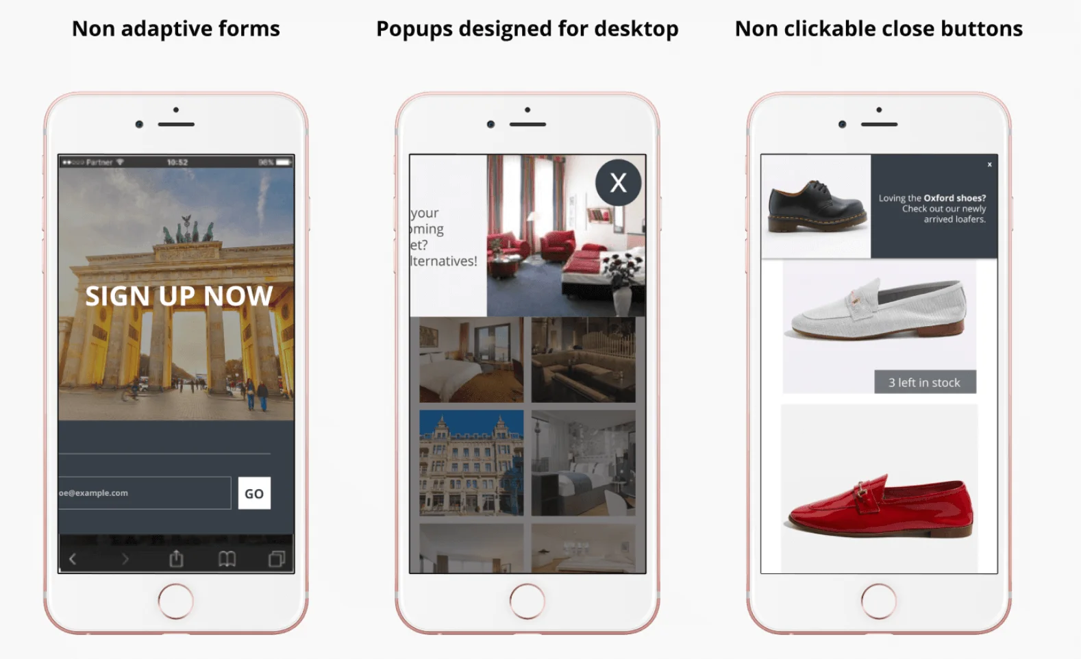
In fact, Google has made it clear that intrusive pop-ups on mobile can hurt your SEO. If your pop-up gets in the way of the actual content or is hard to dismiss, your search rankings may take a hit. Here are a few examples of pop-ups that are not optimized for mobile:
Source: Insider
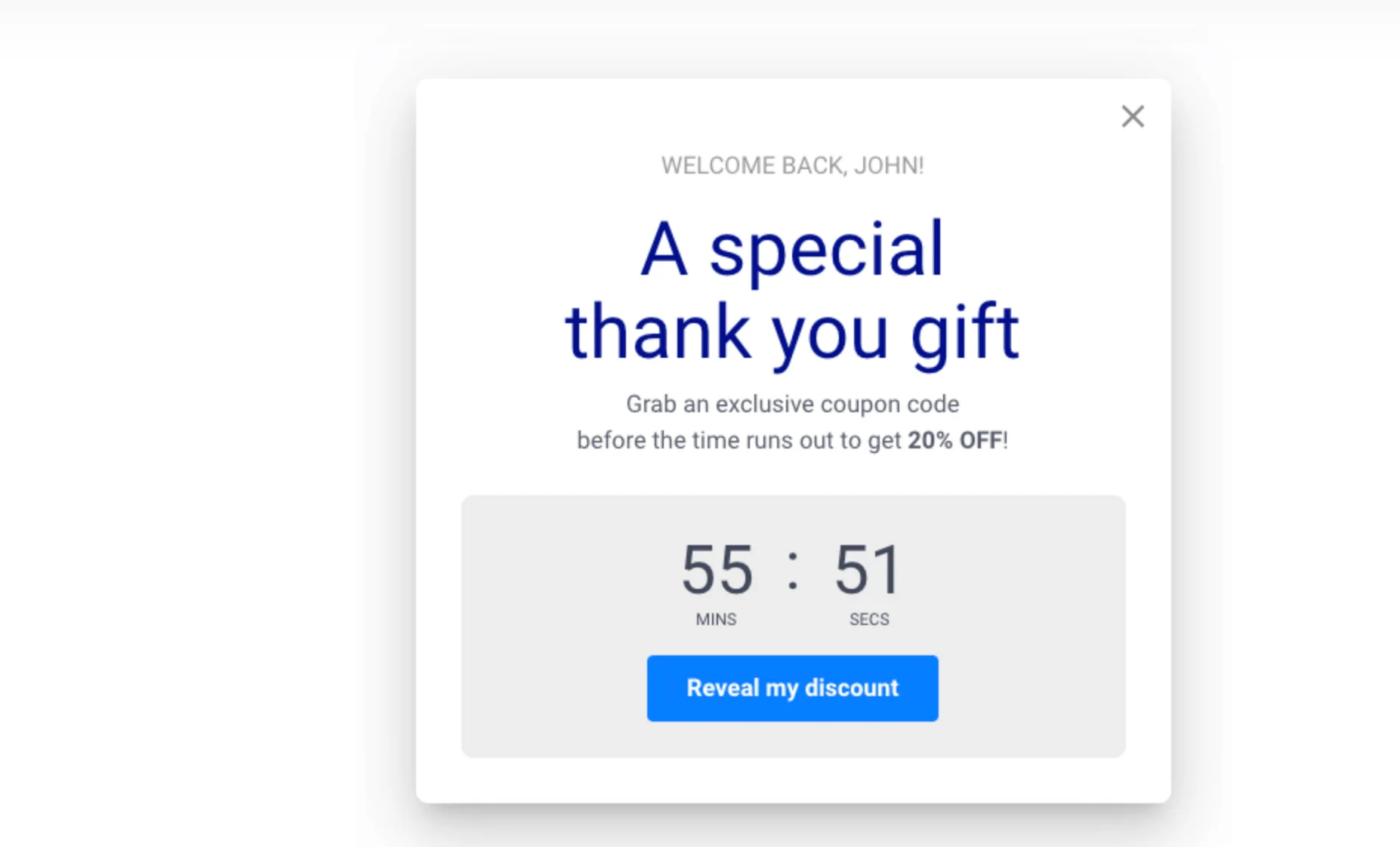
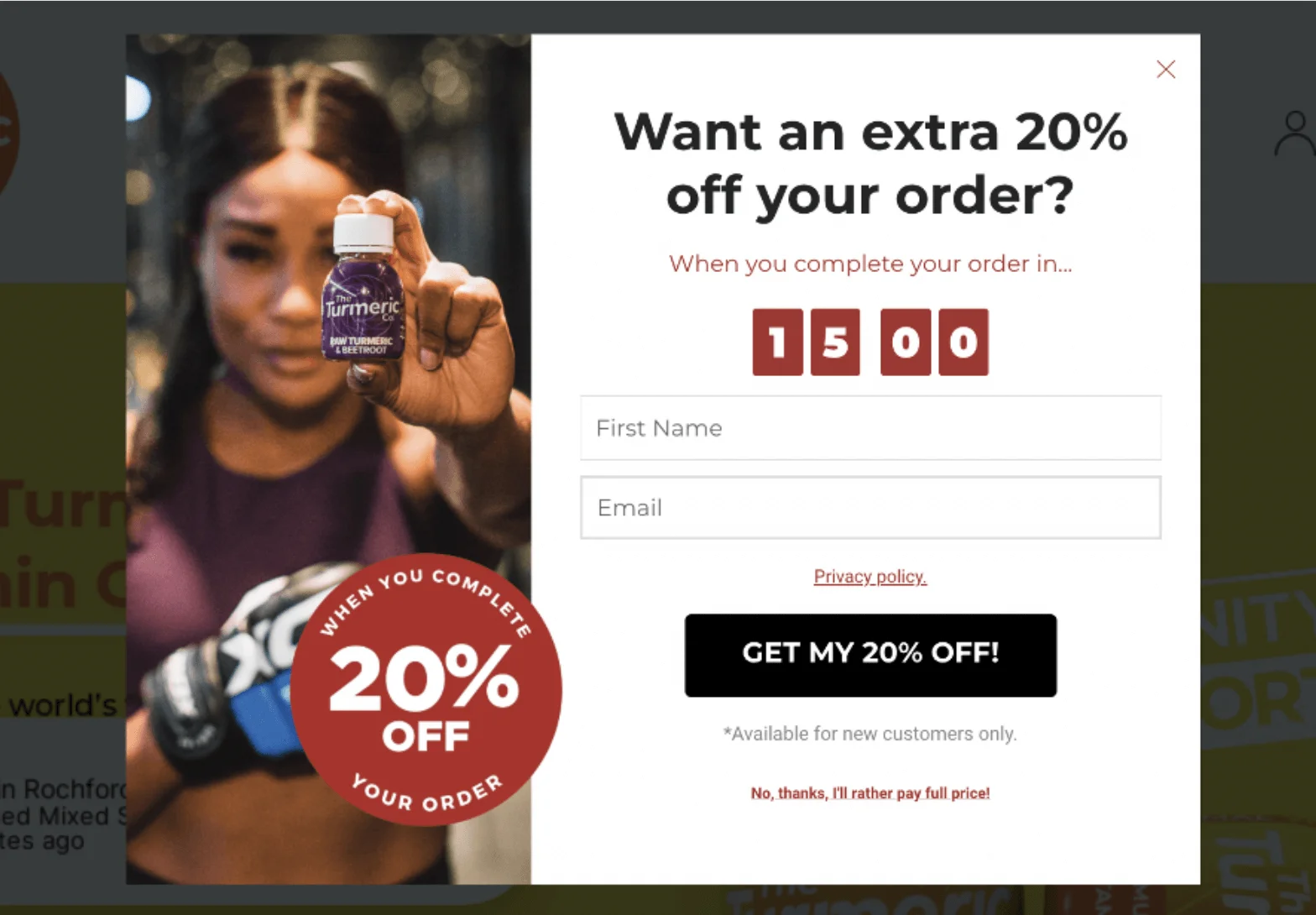
11. Add a countdown to create urgency
Pop-ups are a great place to use FOMO marketing — in other words, a strategy that taps into people’s fear of missing out to drive quick decisions. One of the simplest ways to do that is with a countdown timer. An example of this type of pop-up could be a flash sale, an early-bird offer, or a limited sign-up bonus. Countdowns add a sense of urgency and encourage users to act fast.
Just make sure your deadline is actually real — false urgency can damage trust!
Source: OptiMonk
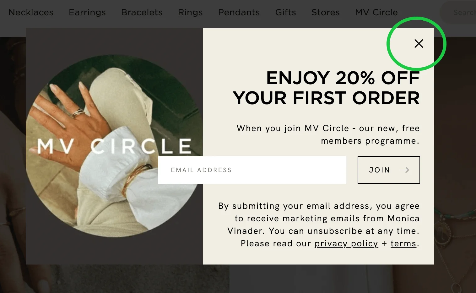
12. Allow users to close pop-ups easily
How annoying are pop-ups that just won’t go away? When it happens, sometimes, users may even close the website altogether out of frustration.
A good idea would be to add a clearly visible (X) button in the corner. Don’t try to hide it with clever designer tricks — it’ll just annoy the potential subscriber. Another approach you can take is to add a “No, thanks” link or button, or allow visitors to close the pop-up by clicking elsewhere.
Source: Monica Vinader
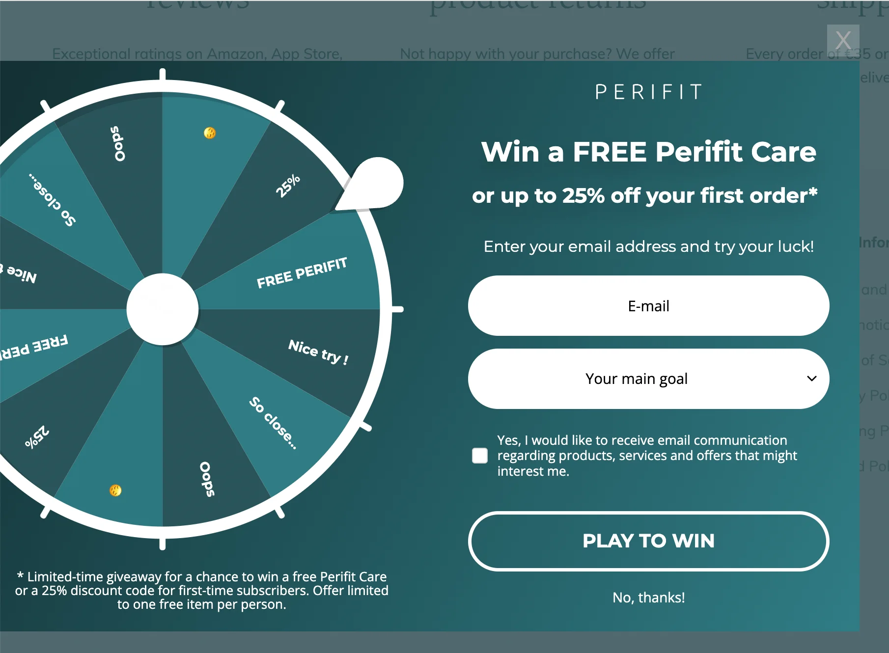
13. Gamify your pop-ups to boost engagement
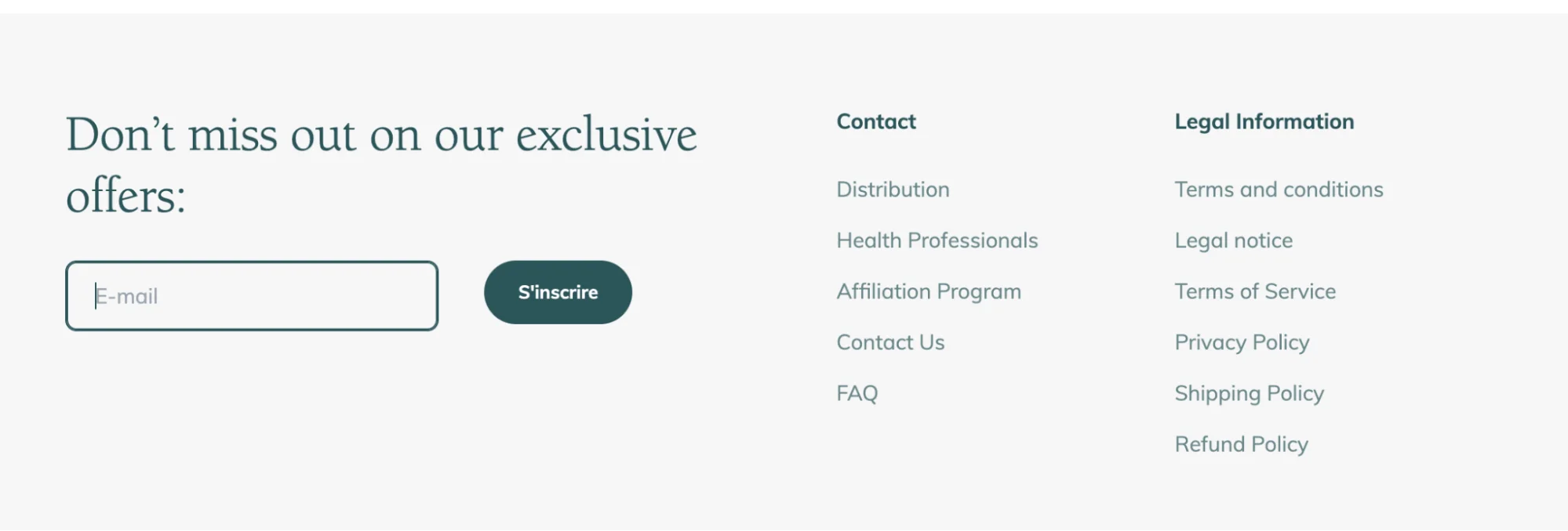
Pop-ups don’t have to be all serious. In fact, adding a bit of fun can go a long way in driving conversions. Gamified pop-ups turn email capture into something interactive, like a game or a lottery. Let’s have a look at Perifit, a health and wellness brand for women.
On their website, you start with a pretty standard-looking email form in the footer:
Source: Perifit
But once you submit your email, you’re taken to a spin-to-win style pop-up where you can try your luck at winning a free product or a discount:
Source: Perifit
If you like the idea of this, but spinning wheels aren’t for you, there are other games you can try, such as mini quizzes or scratch cards.
14. Continuously test and optimize your pop-ups
Make sure your pop-ups display smoothly across various browsers, devices, and screen sizes. As we already saw in this article, what looks great on a desktop might be unreadable or awkward on a phone — the font might be too small, images could fail to scale, or the close button may get cut off.
It’s also worth having a look at how your pop-up interacts with other elements on the page. You don’t want it blocking navigation, overlapping with the footer, or disrupting checkout flows.
15. Monitor performance and adjust accordingly
Your website, your audience, and your goals aren’t static — your pop-ups shouldn’t be, either. Rather than setting them up and forgetting about them, build a habit of reviewing your pop-ups regularly. Update the messaging to reflect seasonal campaigns, refresh the visuals to match your latest branding, or swap in new offers when the old ones get stale.
How to analyze and optimize your pop-ups for success
So, since we mentioned monitoring the performance of your pop-ups, you may be wondering how to do that systematically and how to implement data-driven improvements. In this section, we’ll look at the key metrics to monitor, how to test new ideas, and how to use actual visitor behavior to refine your pop-up strategy over time.
Track performance metrics
Tracking key performance metrics helps you understand whether your pop-ups are doing their job and where they’re falling short. If you have experience with email marketing, you’ll be familiar with many of the key metrics for pop-ups, too. They include view rate, click-through rate, conversion rate, close rate, and bounce rate.
Most pop-up forms are created using tools like Selzy, Klaviyo, Privy, Sleeknote, or OptinMonster, which don’t just build forms — they also track how people interact with them. For deeper insights into the way people are acting on your website, you need to connect your forms to platforms like Google Analytics or Hotjar.
A/B test for continuous improvement
Sometimes small changes make a big difference, and one of the best ways to find out what works is through A/B testing. A/B testing, also known as split testing, is the process of comparing two versions of something — a pop-up, in our case — to see which one performs better with real users.
Some of the aspects you might want to test include your headlines or CTAs, visuals vs no visuals, highlighting a specific product, timing or triggers (for example, after 5 seconds vs on scroll), and different kinds of incentives like discounts.
According to Wisepops, A/B testing your pop-up content and design can increase click-through rates from 4.9% to 5.15%. That’s a significant potential gain for just a few tweaks.
The good news is that most pop-up builders include built-in A/B testing features, so you can set up variations and track results without coding anything.
Use visitor behavior data to tailor pop-ups
No two people are the same, and this also reflects the way they behave on your website. By using behavior data, you can trigger pop-ups based on how someone interacts with your site, making the message more relevant and timely.
Use the tools we mentioned above, like your pop-up builder and Google Analytics, to see what users are doing — how long they stay, where they click, and where they drop off. Use this information to make your pop-ups more relevant and timely.
Some of the ways you can use behavioral data include:
Showing a discount pop-up after a user views multiple products
Offering a content upgrade partway through reading a blog post
Offering help when someone lingers for too long without taking action
Conclusion
Let’s recap the pop-up best practices we’ve discussed:
Target the right audience.
Define clear and specific goals.
Choose the right pop-up format for your goals.
Keep pop-ups user-friendly and non-intrusive.
Design pop-ups that match your website aesthetic.
Make your сall-to-action (CTA) stand out.
Use short, compelling copy.
Offer value in your pop-ups.
Use original visuals to capture attention.
Ensure pop-ups are mobile-friendly.
Add a countdown to create urgency.
Allow users to close pop-ups easily.
Use targeting to deliver relevant pop-ups.
Continuously test and optimize your pop-up.
Monitor performance and adjust accordingly.
And that’s all there is to getting started with designing the best pop-up forms possible. Don’t just think of them as one-and-done boxes you slap on your website — you know they’re a powerful tool for engagement! Keep testing, refining, and checking the data. Start bringing even more conversions by building pop-ups with intention.
Anastasia is a bilingual writer and former breaking news editor with a background in mathematics. She specializes in digital content and copywriting for SaaS companies, with a focus on making complex ideas clear and accessible. Her interests include fashion, travel, art, and trying to learn everything at once.
Others just make a list of ways. We actually explain how to make the most of each way.
Subscribe to the FWD: by Selzy email marketing digest and get 21 ways to grow your email list with explanations and examples.
Based on research and 10+ years experience.
Thank you!
Check your email — the guide is on it’s way to your inbox.