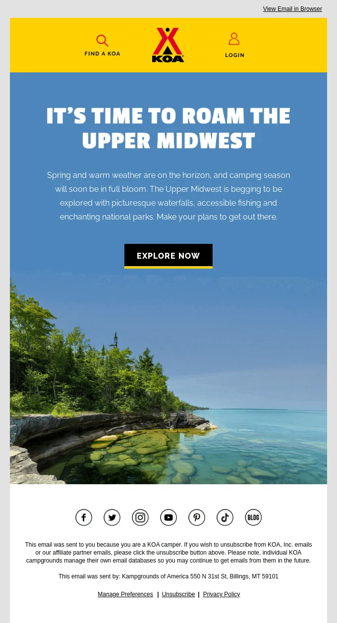
Subscribe to the FWD: by Selzy email marketing digest and get actionable tips, trends, and 21 growth ideas to try today.
We humans appreciate beauty: everything looks more attractive to us if it’s aesthetically pleasing. Marketers leverage this human trait in all their activities, including digital marketing and, specifically, email campaigns. The more visually appealing your emails are, the higher your brand’s chances of catching the readers’ attention and sticking in their memory.
In this article, we’ll explain how to make an email more attractive and show some best-looking examples for inspiration. Get ready for lots of beautiful emails ahead!
Quick answer
A pretty email is easy to scan, visually consistent with your brand, readable on mobile, and focused on one clear action. Start with a simple responsive layout, a limited color palette, readable fonts, high-quality images, enough white space, accessible contrast, and a CTA that stands out. Then test the email in different inboxes before sending, because a beautiful design only works if it renders correctly.
Key takeaways
Marketers leverage human appreciation for beauty in digital marketing, including email campaigns, to catch readers' attention and stand out among competitors.
Subject lines and preheaders are crucial for email success, with concise, attractive lines being preferred.
Layout, logo, color palette, fonts, images, and CTAs are key elements in creating visually appealing emails.
Mobile design is essential as emails are increasingly opened on mobile devices.
Use ready-made templates or design emails from scratch, considering ease of creation and customization.
Why it’s important to create beautiful emails
Email marketing is one of the leading marketing channels worldwide. But with over 361 billion emails sent and received every day, to remain a staple in the subscribers’ inboxes is becoming harder. To stand out among competitors, email marketers use an arsenal of tactics, from dealing with spam filters to leveraging personal data for improved targeting.
Yet all this might be in vain if the emails just don’t look good enough. While some argue that value is more important than looks, this isn’t always the case. It’s especially true for the more competitive industries where information is not exclusive, and the products are often interchangeable (sorry, folks). In this situation, creating visually stunning newsletters is one of the most effective ways to set your brand apart.
Ready to learn how to beat the competition? In the next sections, we’ll explain what makes an email pretty and how to create emails your subscribers will want to see more of.
The key elements of effective aesthetic emails
Before choosing colors or images, decide what the reader should notice first, second, and third. A good email design usually guides attention from the subject line and preheader promise to the main message, then to supporting visuals, and finally to one primary CTA. If several elements compete for attention, the email may look busy even when each element is attractive on its own.
Just a quick reminder before we move on: this article is focused on email aesthetics first and foremost. For a more comprehensive overview on all aspects concerning not only the looks, but the functionality of your emails, check out our email design guide. With that in mind, let’s dive in.
Subject line and preheader
A subject line and a preview text, or a preheader, are the two essential elements of each and every marketing email. What is more, they are crucial to the success of the entire email campaign because of how dramatically they affect open rates.
But turns out, subject lines and preheaders can look attractive, too. Let’s compare:
1.
🚨💣💥NEW ARRIVALS! CHECK THEM OUT NOW! | Here Is A Selection Of Our Best New Items We’ve Picked Especially For You!
2.
😍New arrivals you’ll love | We’ve picked some just for you
While tastes differ, it’s safe to say that most people would choose the second one because it doesn’t overwhelm them with too much of everything as the first one does. Besides, the second line is under 40 characters long, so it won’t get cut off, even on mobile devices.
Tip
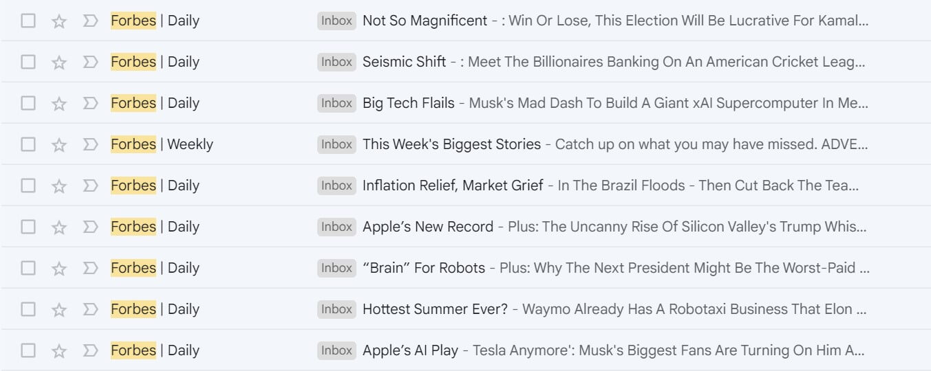
You can use media outlets’ newsletters as a model to learn how to write concise yet catchy subject lines. For example, Forbes manages to consistently come up with effective clickable lines that are just 2-4 words long:
Newsletters from Forbes have subject lines that are short but compelling. The preview text gets cut off most of the time, but all the essential info is in the first few words, so the reader gets the overall meaning anyway
And don’t forget about the sender name, too: use your brand name in the “From” field. Plus you can also use BIMI to display your brand logo in the recipients’ mailboxes:
Tip
If you’re unsure how your sender name, subject line and preheader will look in an actual mailbox, use an online test tool like this one from Zurb (which is a design company, by the way). Sending a test email to your own address is also an option.
Layout and logo
An email layout is how the elements within an email, such as text, visuals, CTAs, etc., are arranged. A well-designed layout makes the content easy to navigate and helps guide the readers toward taking the desired action. While this is more a matter of user experience than aesthetics, making your email feel and also look good is just as important.
One is hardly possible without the other: the neater the layout and the more structured the content, the better your email looks. So make sure you don’t overstuff layouts with unnecessary elements or create chaos by placing these elements in random order.
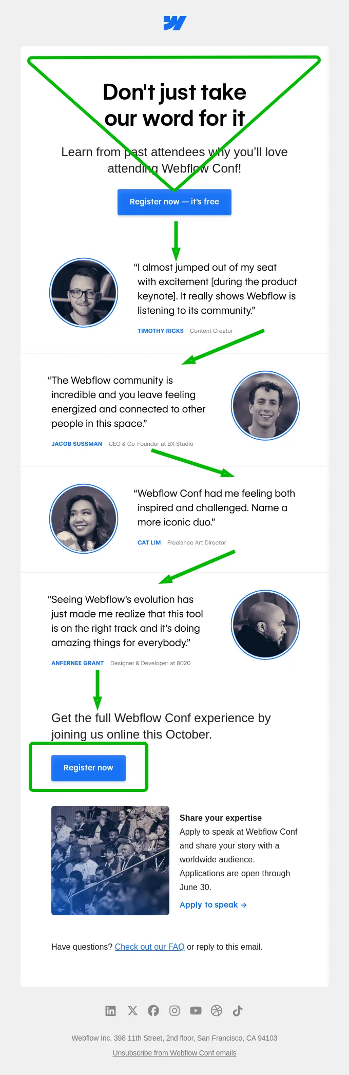
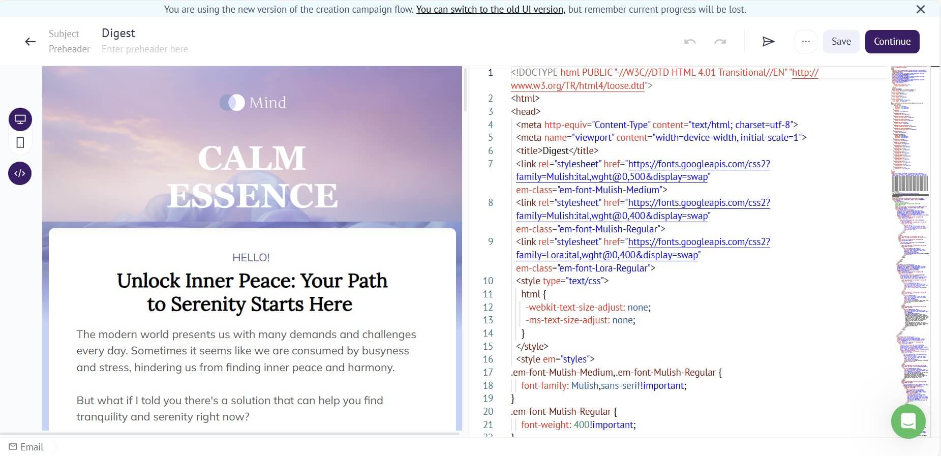
Here’s an example of a layout that is both functional and aesthetic:
In this email, the headline and the text below it lead to the main CTA button which is clearly visible and placed above the fold (i.e. the reader doesn’t need to scroll down to see it). Below are the four short blocks of text with small illustrations, placed in a zig-zag order. Such placement helps avoid repetitiveness and ensures the reader doesn’t get bored. Next, there is another CTA button for those who didn’t click on the first one. Finally, there is a short announcement with a secondary CTA that is noticeable yet less prominent than the primary one, a line with a FAQ link, and a footer. Source: Really Good Emails
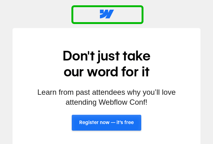
Notice the element at the very top of the email:
Source: Really Good Emails
The brand logo is almost always the very first element at the top of the email, but it is not the only component of branding that should be present there. This leads us to the couple of next points.
Color palette
Chances are, you’ve heard about color theory. In a nutshell, it is a theory that explains how to create harmonious color combinations based on the spectrum known as the color wheel. Using an online color wheel tool, you can make a variety of beautiful color palettes for your emails in a few clicks, or even extract colors from any images you like to replicate a certain look. Sounds enticing!
But that’s easier said than done when you’re not a designer. Luckily, it might not be necessary if your brand already has a distinct visual identity. In this case, you can simply stick to your brand book. This will not only save you time and trouble, but will also ensure the brand’s visual style remains consistent across all your marketing assets such as websites and social media pages.
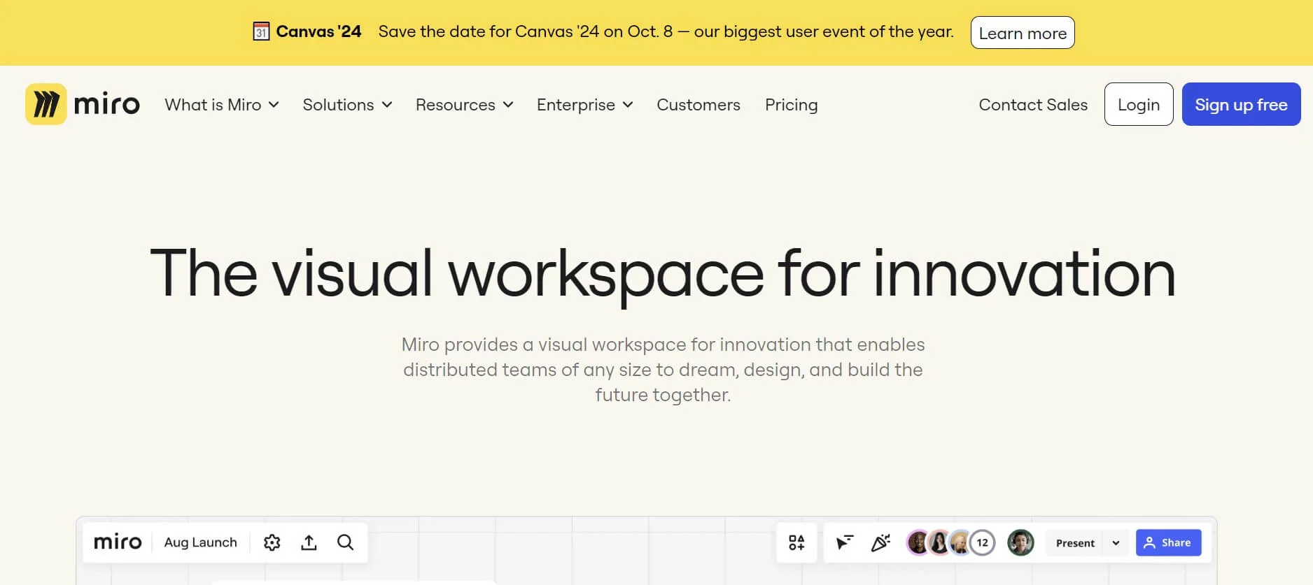
For example, newsletters from the popular online collaboration tool Miro utilize the same colors that you can see on its website:
Source: Really Good Emails
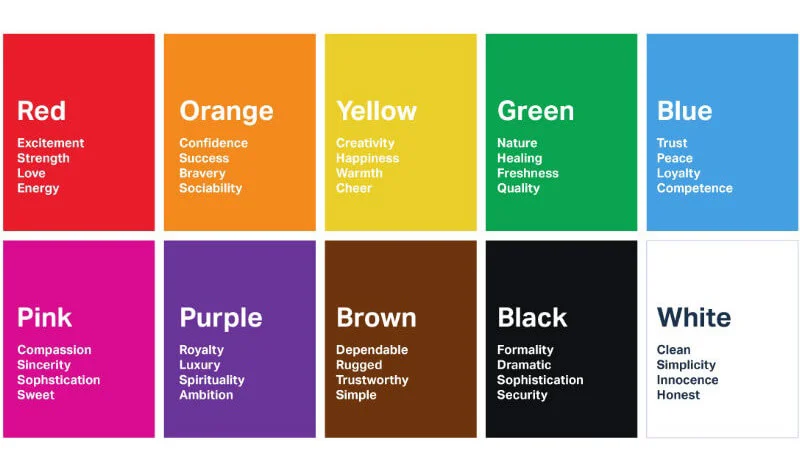
Moreover, psychologists believe that different colors evoke different emotions, so there is a whole field of knowledge known as color psychology. While the descriptions of each color’s meaning vary across sources, there are some common guidelines you can use, such as these:
Source: London Image Institute
The key takeaway is that the color palette you use for your marketing emails should be based on your brand identity. You cannot simply pick random colors because you like them or think they go nicely together.
Also check contrast and dark mode. Some inboxes can invert colors, adjust backgrounds, or make logos and icons harder to see. Avoid relying on color alone to explain meaning, use transparent images carefully, and test the final email in the clients your audience uses most.
Fonts
Fonts play a big part in the overall look and feel of an email. Besides being crucial to the readability of your message, the right email font can make your message either good-looking and memorable, or generic and inexpressive.
Since fonts are the elements of branding just like colors are, use your brand book as a reference when putting together your newsletter to create an eye-catching and instantly recognizable look.
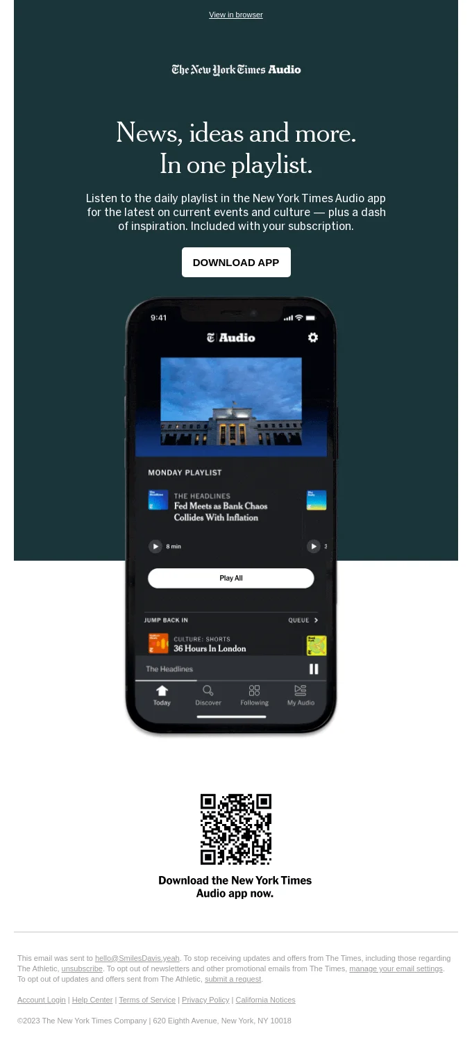
For example, this newsletter from The New York Times features one of the newspaper’s signature fonts:
As fonts are concerned, the same advice as for color palettes applies: don’t pick random fonts (and font colors) just because you feel like it.
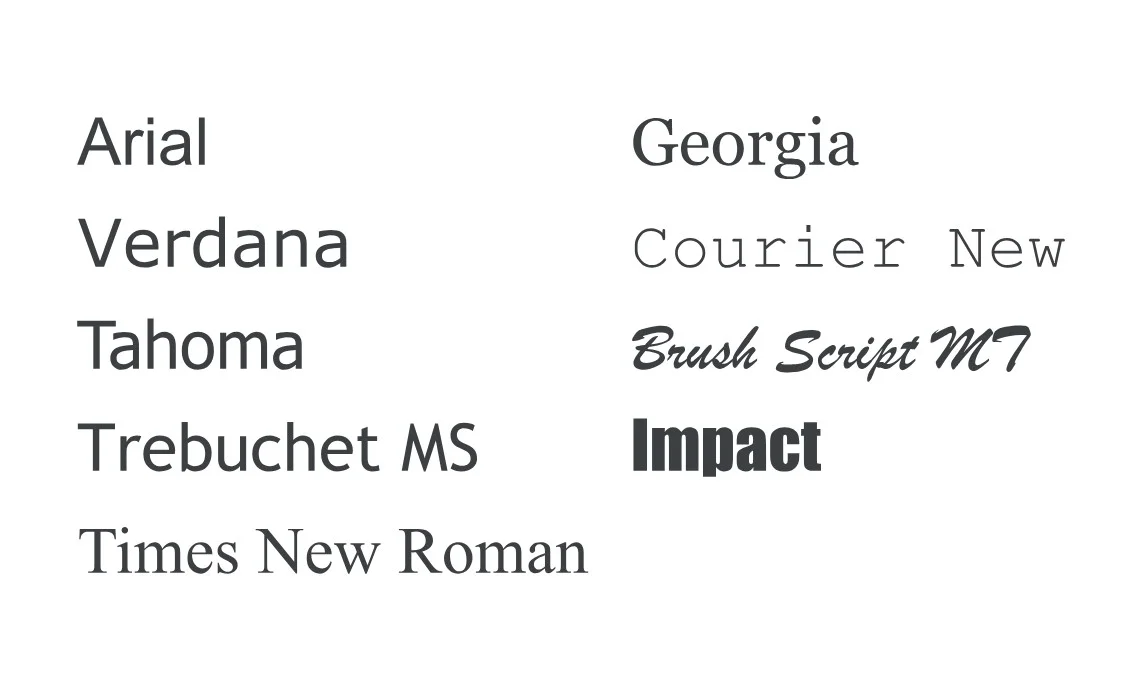
Another important thing to remember is that not every font will render properly in all email services. To avoid problems, choose the so-called system, or web-safe fonts that display correctly in most cases, or specify a font family in the source code to provide a backup.
These web-safe, or system fonts display correctly on most devices. Source: Google Fonts
Readable typography matters as much as style. Keep font sizes large enough for mobile reading, avoid using too many font families, and make sure the contrast between text and background stays comfortable in both light and dark environments.
Images and other visuals
Have you heard that the human brain processes visual data 60,000 times faster than text? While the accuracy of this claim is debatable, there is still plenty of evidence that people do process visuals more quickly.
You can even run an experiment: head to your inbox and examine some random newsletters. Chances are, the largest visual element will be the first you notice in most cases. That means visuals — especially large, high-quality images — can make your email more appealing to the readers, compelling them to read the message and click on the CTA to check out your amazing product.
Here’s a good example of a promotional email where the image takes center stage:
Source: Really Good Emails
Pro tip
Instead of simply showcasing a product, you can feature an illustration of a “use case”, especially if you sell physical items. This gimmick will help subscribers imagine themselves owning the product, leading to increased conversions.
Source: Really Good Emails
However, remember that designing an entire email as an image is a dangerous practice. Some email clients might block images, or other technical issues might occur that will prevent images in your email from loading properly. If your entire email is an image, your recipients will see nothing at all.
For accessibility, add descriptive alt text to meaningful images and make sure the message still makes sense if images are blocked. Decorative visuals can stay minimal, but product photos, infographics, and offer images should not carry essential information by themselves.
CTAs
Talking about email calls to action, make sure they are both well-formulated and easily noticeable. To make your CTAs more attractive, try the following techniques:
Use colored CTA buttons instead of links.
Choose contrasting colors for your CTA buttons and background images to make the buttons more prominent.
Pay attention to the fonts and font colors: a different font or font formatting, as well as a different font color, is a good way to make the call to action stand out.
Don’t overdo it: make sure that while the CTA is more visible, the overall look still remains consistent throughout your email.
Here’s an example of an attractive, well-placed CTA button:
Source: Really Good Emails
A strong CTA should be recognizable even without relying only on color. Use clear button text, enough surrounding white space, and a tap-friendly size so the next step is easy to notice and easy to click.
The good news is that you can prevent this scenario by making sure your emails are mobile-friendly and look well across all devices before sending them out. With email service providers like Selzy, it only takes one click to switch to mobile view and see your email the way it will be displayed on your subscribers’ mobile screens:
Use a single-column layout when possible, keep body copy readable without zooming, make buttons large enough to tap, put the main CTA above long secondary content, compress images, and preview the email on both narrow and wide screens.
In Selzy email builder, you can switch between the desktop and mobile view in one click
For more information on these and other essential elements of attractive emails, also check out our article on how to create good-looking emails.
With that in mind, let’s talk about how exactly you can make your emails look pretty.
How to make emails look pretty
Technically, there are only two ways to create aesthetically appealing emails: you can either use ready-made templates or design yours from scratch. Let’s look at these options more closely.
Use ready-made templates
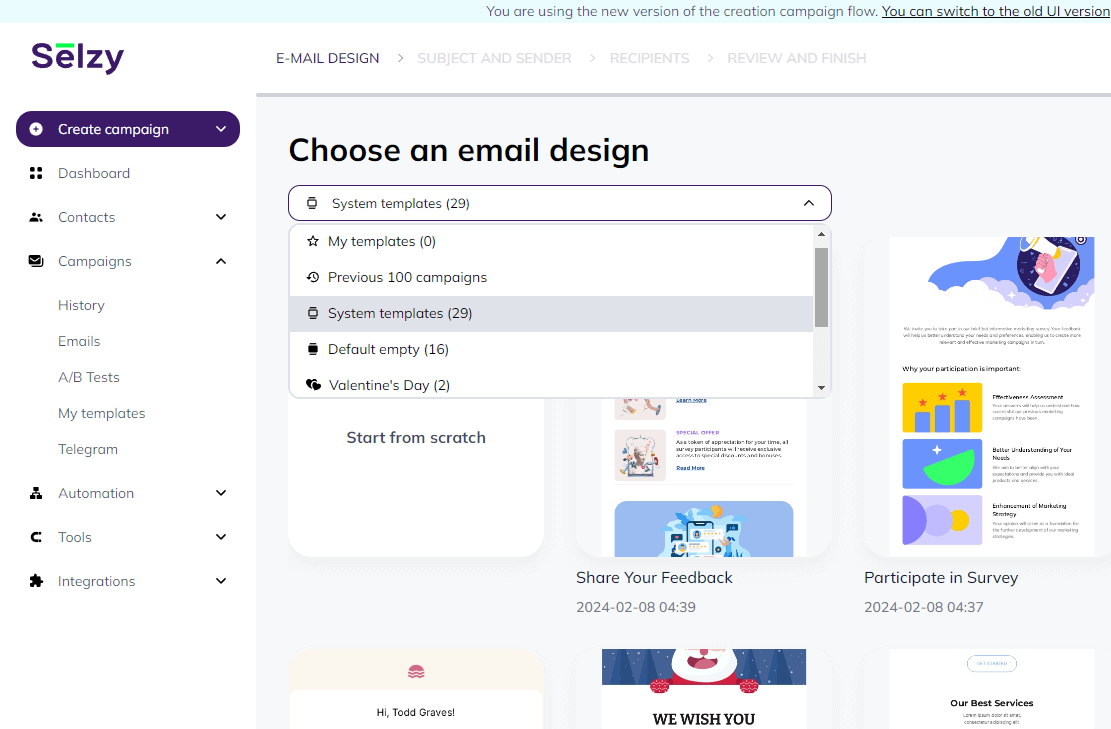
The easiest way to create professional emails that are both effective and pretty is by using ready-made templates and an email builder. Such builders are available as standalone tools or may come with your email service provider (ESP) as a built-in feature.
For example, Selzy comes with a beginner-friendly AI-powered email builder that is available on all subscription plans including the forever-free one. With this intuitive tool and our rich template library, you can create attractive emails quickly and easily, even if you have zero coding skills.
In Selzy’s template library, you can find multiple options for various types of campaigns
You just need to pick the template that fits your campaign type, and replace sample content with your own using a visual editor. You can also rearrange blocks, change colors, fonts, and any other elements you want to customize — all in just a few mouse clicks.
What is more, you can use the builder’s AI functionality to quickly generate content such as copy and illustrations. This can come in handy when you need some specific image you cannot find in the gallery, if you’re experiencing writer’s block, or when you are just short on time.
For those looking for more flexibility, the builder also has an HTML code editor available in the same window. All you need to do is switch to code view. Now you can edit any template, be it a ready-made one or your own, and instantly see the result in the preview section of the window:
Templates are a shortcut, not a one-click design fix. Adapt them to your brand style, audience expectations, content length, and campaign goal so the finished email feels intentional instead of generic.
Design a template from scratch
Customizable templates are convenient and easy to work with, which makes them the best solution for most email marketing campaigns, particularly for small businesses. But sometimes you’d want something unique. In this case, you can design your email template from scratch. That way, there won’t be any limitations on what you can do.
Yet, while this approach has certain advantages — mainly, that custom-tailored designs will help set you apart from competitors — this isn’t always the optimal choice. Remember that creating unique email designs requires coding skills, so it won’t be nearly as easy as dragging and dropping and clicking in a visual editor. To create an email template from scratch, you will need to hire design professionals unless you already are one yourself. This will call for additional spending, and the process will be longer than if you simply use a block email builder.
The good news is that Selzy’s email builder allows for writing an email code right there in the HTML editor. Alternatively, you can write it elsewhere and paste it into the builder. Then, you’ll be able to edit it quickly and conveniently, just as you would when using a ready-made template from the library — provided you know some HTML, that is.
If you design from scratch, start with reusable modules: header, hero or content block, product or offer block, CTA block, footer, and optional social proof block. Reusable modules keep future campaigns visually consistent and make production faster.
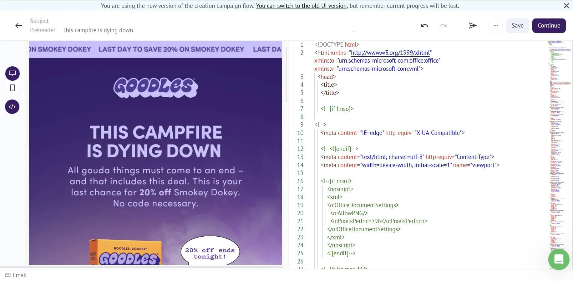
Here’s an email from Goodles, displayed in the Sezy email builder. We simply copied the source code provided by Really Good Emails and pasted it into the builder using the HTML editor view. Source code: Really Good Emails
Whichever option you choose, you might want to brush up on some fundamental info on how to create an email newsletter before you get down to work.
Pre-send visual QA checklist
Before sending a design-heavy email, check these basics: the first screen communicates the main message, the CTA is visible without searching, text remains readable on mobile, images have useful alt text, links and buttons work, the design still makes sense with images blocked, dark mode does not break key elements, and the email has been tested in the main inboxes your subscribers use.
Mistakes to avoid when designing an email
Ready to polish up your emails and make them look prettier than ever? Here are some common bad practices to avoid.
Ignoring the subject lines
As mentioned earlier, catchy subject lines and preheaders are inherent parts of a marketing email. Moreover, the success of the whole campaign often depends on how attractive these elements are. Let’s revise the key recommendations for creating attractive subject lines:
Keep them short — no longer than 40 characters or less.
Don’t overuse emojis — one is usually enough. Also, make sure you only add emojis with relevant meaning.
Steer clear of all-caps words. If you use capital letters, do it with a purpose and not just to attract attention.
Make your subject lines meaningful. Ideally, they should serve as a teaser for your email content.
Using too many images, colors, or fonts
In an attempt to make a newsletter as informative as possible, it’s easy to go too far and include so much information that the readers will get overwhelmed. And adding too many elements or using too much variety can make your email look like a colored patchwork quilt.
Unless that is exactly your idea with a purpose behind it, it is best to avoid such designs and opt for a few strategically placed accents instead. This will ensure the readers focus their attention on the right elements and head straight to the CTA. Besides, excessive elements, especially combined with the lack of a clear hierarchy, may make your email appear unprofessional and reduce its readability.
Writing excessively long emails
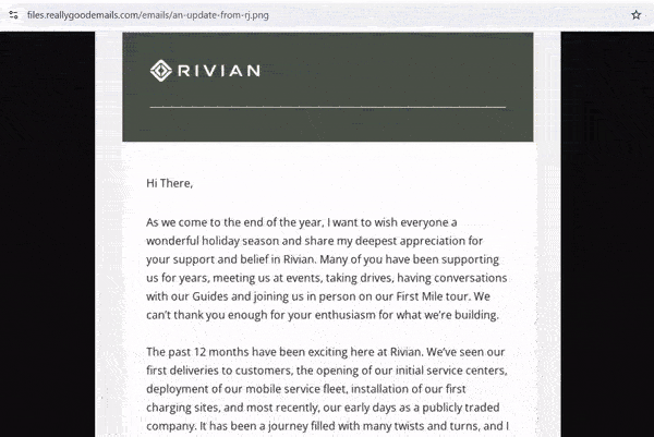
The 8-second attention span might be another myth, but the fact that it’s still very short — and keeps shrinking — is already common knowledge. That’s why you don’t want to make your emails excessively long. The question is, how long is too long? According to one research, the average email length is 434 words and requires around 3.3 minutes to read. However, other data indicates the perfect email length is just 50-125 words.
It all comes down to your email type and purpose: for example, storytelling emails for non-profits will likely be longer than seasonal greetings in e-commerce. In any case, you probably don’t want to send emails that look like this unless you know exactly what you’re doing (these guys from Rivian probably do):
Source: Really Good Emails
Neglecting the CTAs
The ultimate goal of all marketing emails is to prompt readers to take action. That means the CTA is the most important, if not the most instantly noticeable, element of such emails. Neglecting the CTAs — in this context, the look of them — is a mistake that can undermine your whole email campaign.
Here are some common pitfalls to avoid when it comes to CTA design:
Making the CTAs too small in size
Not adjusting the look and size of the CTA buttons according to their placement
Using the same colors and fonts (or font formatting) for CTAs as for the rest of the copy
Choosing colors and fonts that don’t fit the overall look of the email
Making too many adjustments — for example, picking a different color, font, and formatting all at once
Failing to proofread
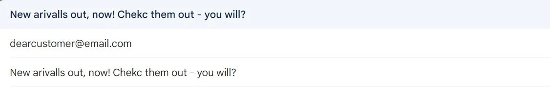
An email that has clearly not been proofread and corrected makes the sender look incompetent, but what is more — such an email simply looks unattractive. To those who notice the errors, it will cause discomfort from seeing something that is obviously wrong and out of place.
If you don’t believe it, just take a look at the example below. Would you click on this subject line?
Not testing for mobile devices
You might be already running A/B tests to improve your email marketing campaigns for desktop. However, as mentioned earlier, many emails are opened on mobile these days, and you may get a different picture there. Luckily, you can also split-test specifically for mobile devices, and you shouldn’t overlook this opportunity to fine-tune your email campaigns for recipients who read emails on smartphones.
Technically, the process might differ across ESPs, but most of them allow you to segment audiences by preferred platform, and design tests targeted at mobile users only. As a result, you will get an accurate picture of which mobile version of your email works best, and make the necessary adjustments before sending out the campaign.
Design emails that are easy to love and act on
Use Selzy’s email builder and ready-made templates to create responsive campaigns with clear layouts, branded visuals, and buttons subscribers can actually notice.
8 attractive email design examples to inspire your own
Now, let’s take a closer look at some of the best-designed emails that we could find. Some designs are quite elaborate, and others could have also been put together using a standard template. All the same, they all look great.
Pattern: photo-led travel email.
1. Essential Costa Rica: Focus on the photos
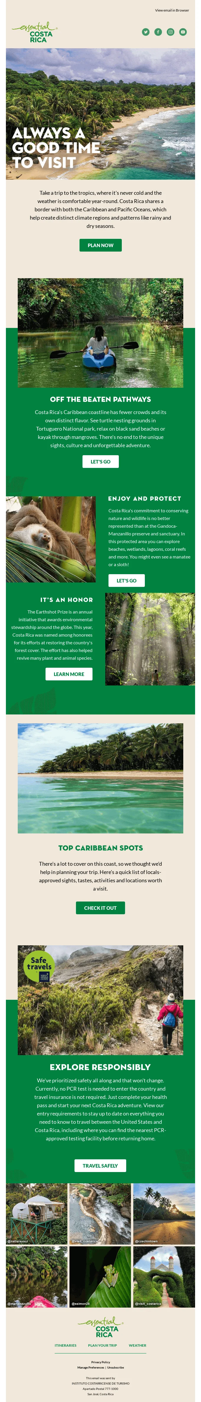
Lush photos of scenic landscapes are perfect for capturing the reader’s attention, especially when offering tourist services. And Essential Costa Rica leverages this human longing to connect with nature masterfully in its newsletter. The images make you want to teleport to the place all at once, and the green and warm sand background colors perfectly complement the shots. Even being long doesn’t hurt this email thanks to its beautiful look and clever layout!
Source: Really Good Emails
Pattern: animated product story.
2. Penny Australia: Animation rules
Showcasing several products — or product use cases — in one email is a common practice in e-commerce. But unfortunately, images use up too much precious space that could have been put to better use. On top of that, you cannot risk making your e-commerce newsletter excessively long because no-one will probably read it then. This email from Penny Australia offers a perfect solution: an animated image where you can display several product variations and create a vibe without wasting a single pixel.
Source: Email Love
Pattern: color-blocked retail offer.
3. Myers: Clever color blocking
Color blocking is a technique that is most popular in fashion. There, it is defined as combining large blocks of bright colors to create a bold look that catches the eye. In email design, this approach helps to create a clear structure and highlight areas you want the readers to focus on. This is exactly what Myers uses it for in this remarkably concise and irresistibly attractive newsletter — and you can replicate the look.
Source: Really Good Emails
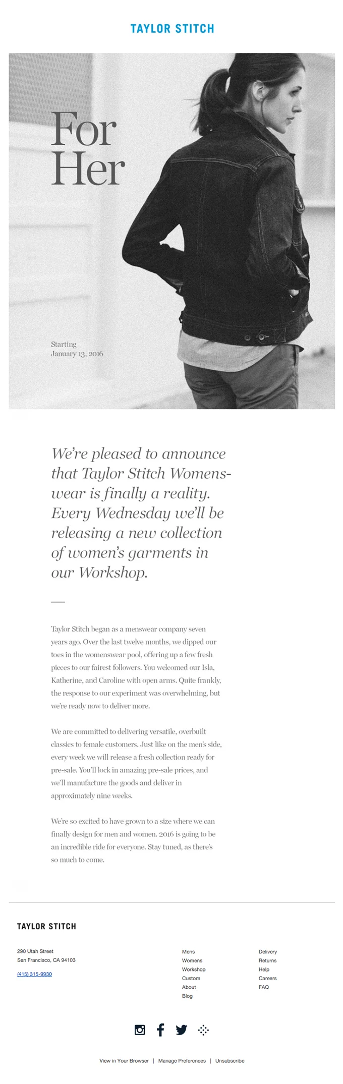
4. Taylor Stitch: Shades of gray
When everyone’s crazy about color, stripping down to grayscale can be a great strategy to make yourself noticed. This is exactly the approach Taylor Stitch takes in this minimalistic newsletter with a lot of white space. The email looks like a page from a high-profile fashion magazine, which aligns with the brand’s image. TS even goes as far as sending a newsletter without a CTA: here, the main goal is to inform, not to sell.
Source: Really Good Emails
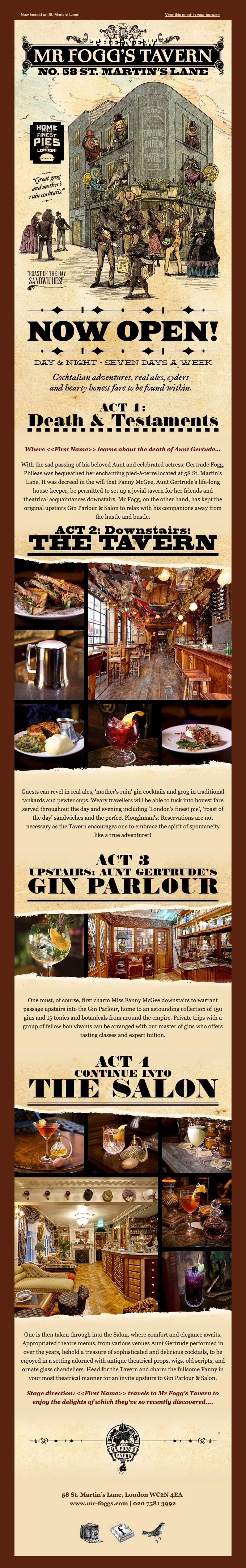
5. Mr Fogg’s: It’s all about the style
A tavern. What associations does this word bring up? In this newsletter from Mr Frogg’s, you get exactly the visual image you are expecting because it looks like it came straight out of a Western movie. While there is a lot of text in this beautifully stylized email, it is well-structured and divided with headings that guide you through step by step. Plus there are plenty of lush images to complement the copy.
Source: Really Good Emails
Pattern: minimalist product launch.
6. Apple: Less is more
This brand is famous for its minimalistic yet functional product designs. Being consistent, Apple extends its approach to marketing assets, including emails. In this example, there are very few elements — but these are just enough to make the reader want to click on the CTA. However, minimalism doesn’t equal simplicity here: just notice how detailed the image of the apple is and how delicate the gradients are!
Source: Really Good Emails
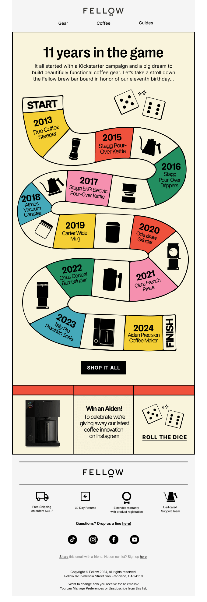
7. Fellow: Unique infographic
Infographics can be a good alternative to photos, especially when they are as creative as the one in this email from Fellow. The colorful timeline evokes associations with both children’s board games and long winding roads, luring the readers in and keeping them interested from start to finish. What is more, the game allusion pays off when the reader is offered to click to roll the dice.
Source: Really Good Emails
Pattern: brand-first luxury email.
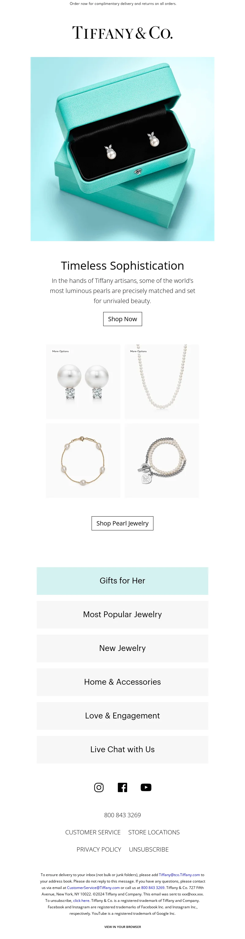
8. Tiffany & Co.: Immaculate branding
This luxury jewelry brand has its signature color known as “Tiffany blue” — and this hue alone is enough to make the email instantly recognizable. In this instance, it is used not only as the main color accent, but also as the background color in the hero image and as the color of the CTA button. Other elements are minimal: the fewer distractions, the better.
Source: MailCharts
FAQ
What makes an email look pretty and effective?
A pretty email is visually appealing, easy to scan, and not overloaded with too much information. The article emphasizes that subject lines, preheaders, and overall presentation all contribute to how attractive an email feels and how likely it is to catch attention. In competitive industries, a polished look can help your brand stand out when products or offers are similar.
How can I make my marketing emails look more professional?
Keep the subject line and preheader concise, catchy, and clear so they look clean and don’t overwhelm readers. Use your brand name in the sender field, and consider BIMI to display your brand logo in inboxes. The article also suggests studying well-crafted newsletter examples, such as Forbes-style short subject lines, for inspiration.
What colors and fonts work best for email design?
The provided content focuses on overall email aesthetics, but it does not give specific color or font recommendations. Its main guidance is to keep emails visually pleasing and uncluttered so the design supports attention and readability. For broader design choices like colors and fonts, it points readers to a more comprehensive email design guide.
How do I make emails look good on mobile devices?
Use concise subject lines and preheaders, because shorter text is less likely to get cut off on mobile. The article gives an example of a subject line under 40 characters that stays readable across devices. Keeping the message brief also helps prevent the inbox preview from feeling crowded.
Should I use templates or design emails from scratch?
The article focuses on making emails aesthetically pleasing rather than comparing template use versus custom design, so it does not recommend one approach over the other. Its practical advice is to prioritize visual clarity, strong branding, and concise messaging no matter how the email is built. If you want broader guidance on full email structure and functionality, it refers readers to an email design guide.
Summing up
So, let’s sum this up. Here’s what you need to know on how to create good looking emails:
Keep in mind the key elements that define the email’s look. These include the subject line, the preheader, and the sender name; the layout and logo; the color palette and fonts; the images and other visuals; and the mobile version.
Choose the most optimal version for creating pretty emails in your particular case. You can either utilize ready-made email templates from your ESP’s template library, or design your own ones from scratch.
Avoid the common mistakes that can make your emails look worse. These are ignoring subject lines and preheaders; using too many images; making your emails excessively long; neglecting the CTAs; failing to proofread for errors and typos; and not testing for mobile devices.
Get inspired by examples from popular brands and adapt their ideas for your own campaigns. In this article, you can find some of the best-looking and most original email examples.
And remember: in email campaigns, the way your emails look can be just as important as any other aspect. So make sure your emails look pretty!
I’m a qualified journalist with expertise in writing, editing, and marketing and over 15 years of professional experience. Throughout my career, I’ve worked across various kinds of media, including print, online, and broadcast. Currently, I write and edit content for brand blogs and other media and teach English online part-time. My other interests include music, cinema, literature, and environmental conservation.
Others just make a list of ways. We actually explain how to make the most of each way.
Subscribe to the FWD: by Selzy email marketing digest and get 21 ways to grow your email list with explanations and examples.
Based on research and 10+ years experience.
Thank you!
Check your email — the guide is on it’s way to your inbox.