Use Selzy’s intuitive email builder! It comes with a ton of responsive templates for any occasion. Plus, you will never run out of ideas thanks to our AI assistant that can generate entire email layouts in an instant. Need we say more?
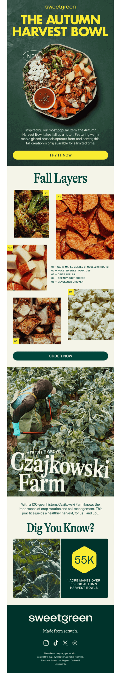
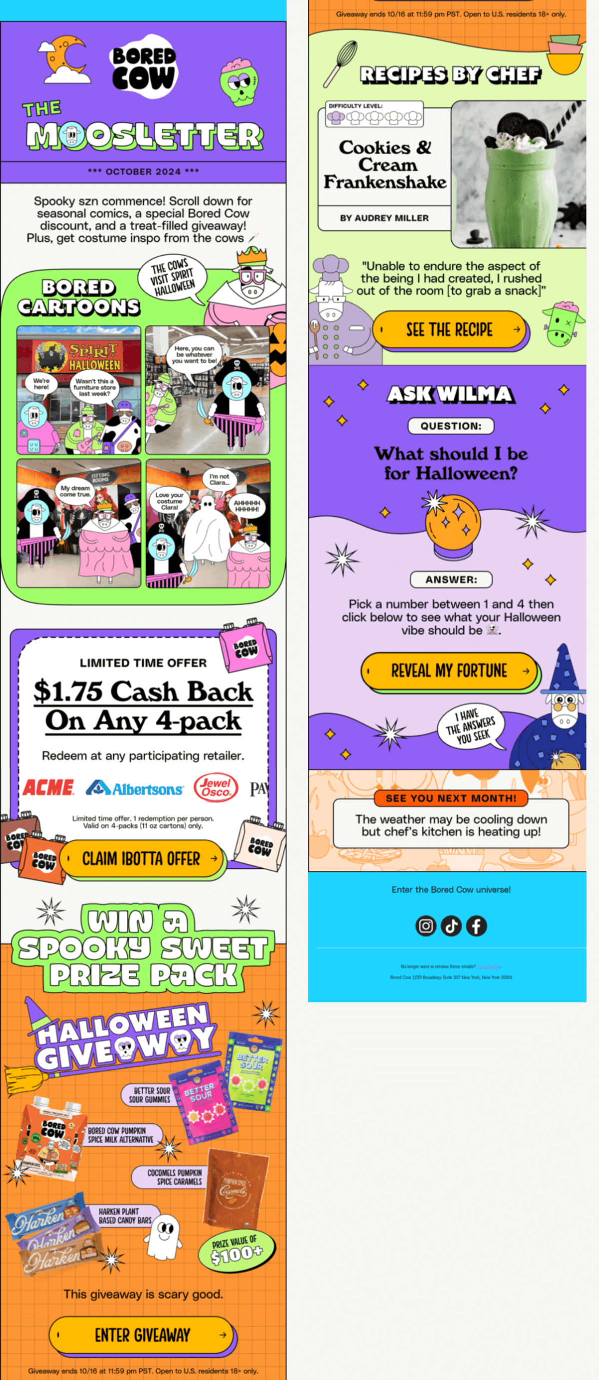
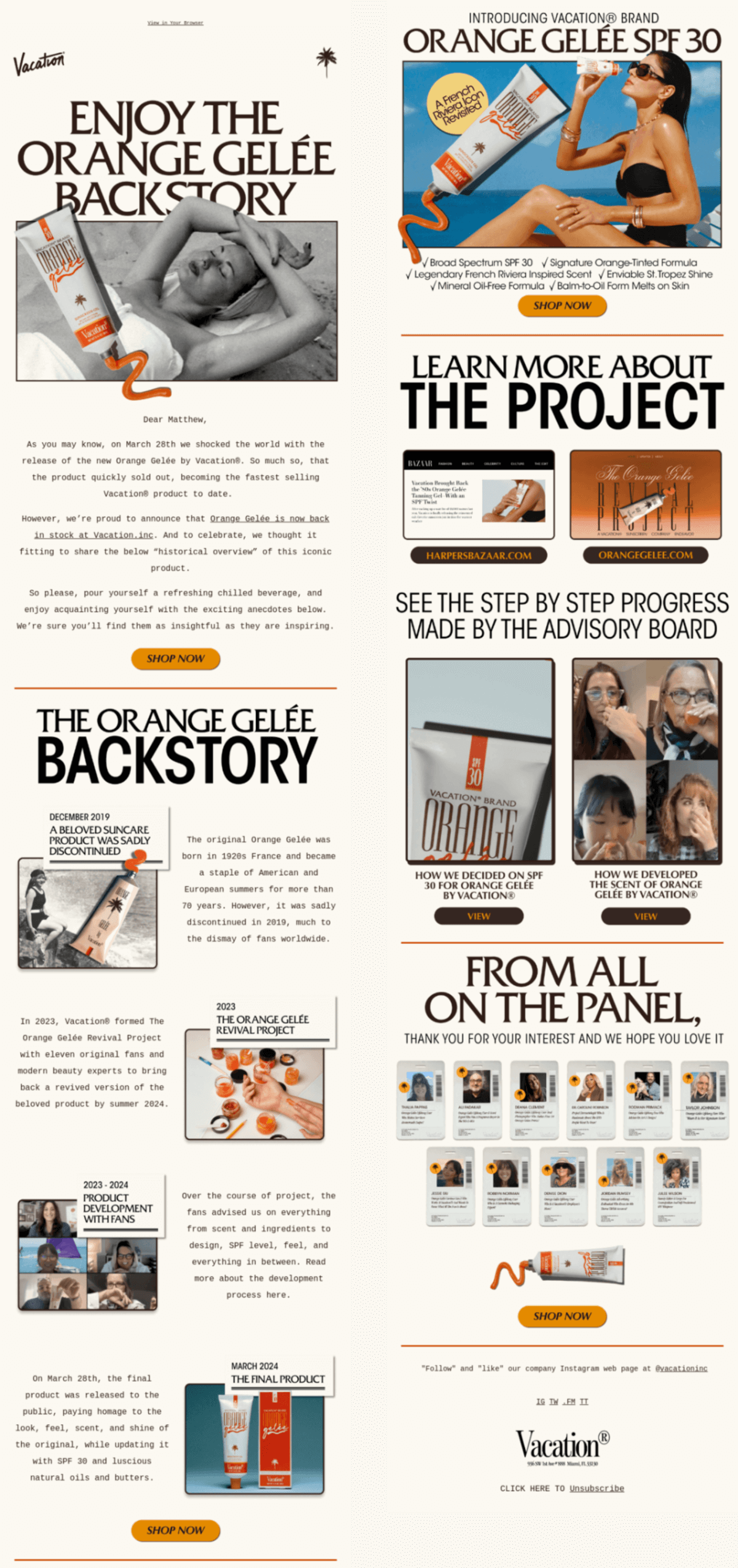
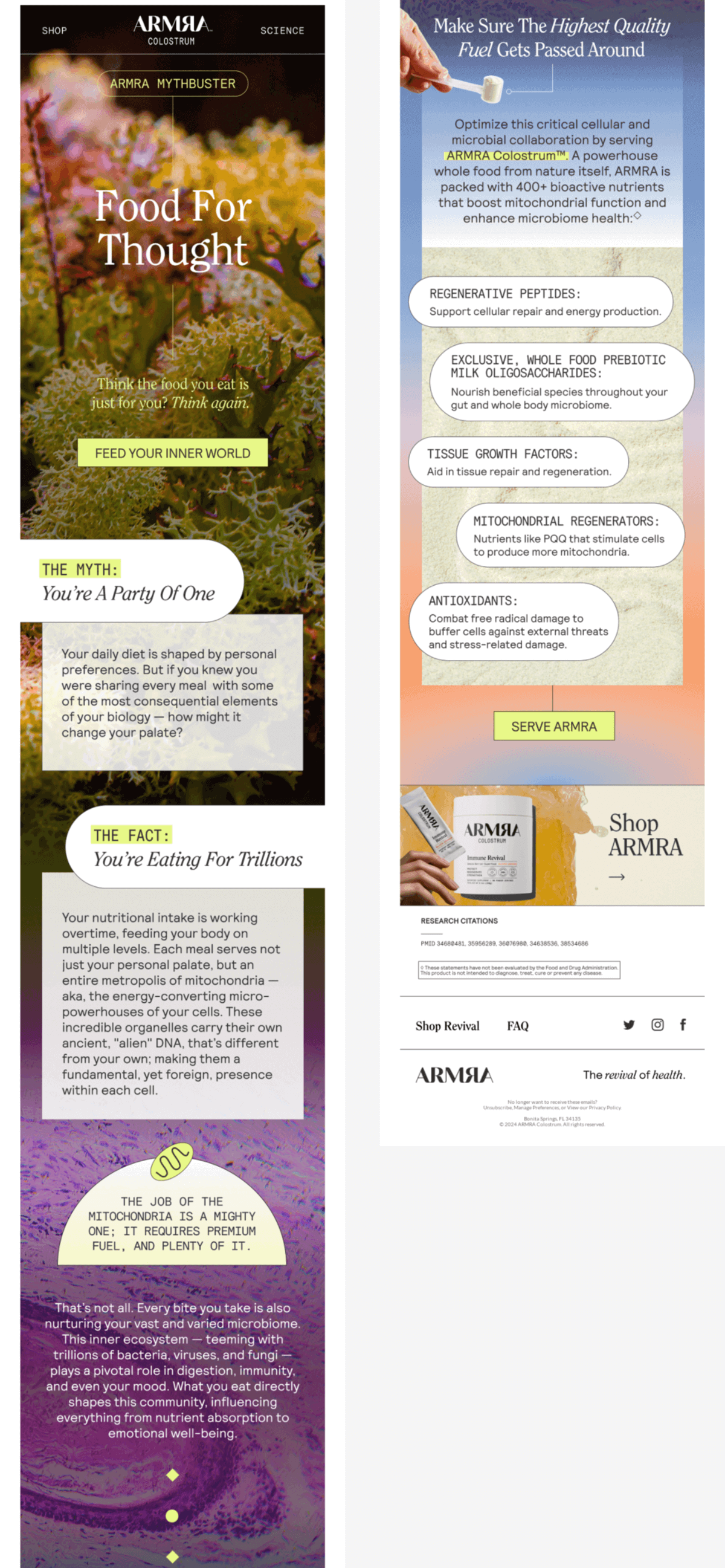
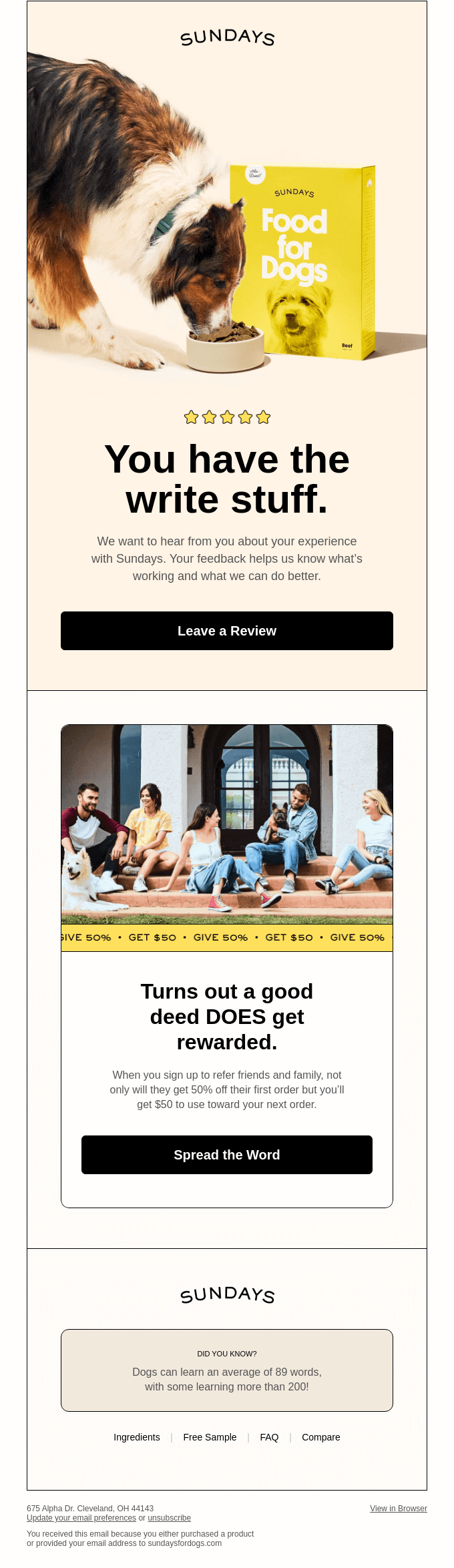
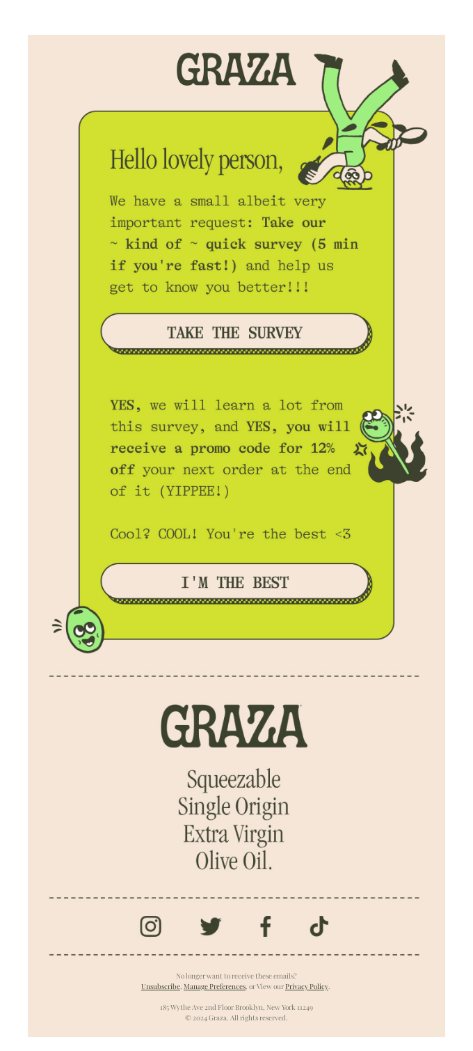
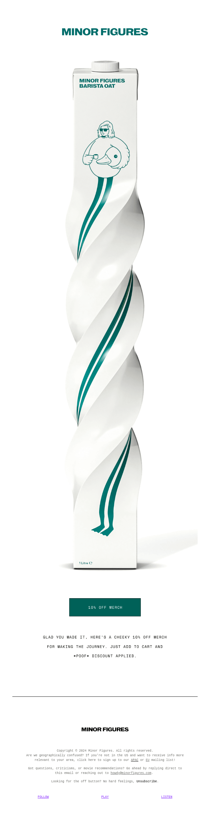
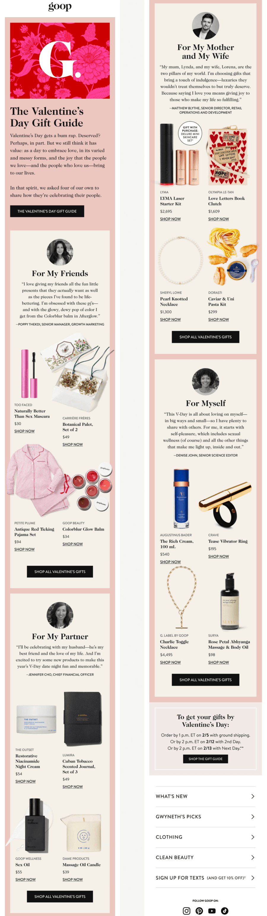
For this year’s list, the Selzy team browsed 4 major email galleries and ended up with almost 90 (!) contenders. We then narrowed the selection to just 24 examples which you will find below.
Of course, this list is subjective, but who has a better taste for emails than people working with an email service provider?
Speaking of which…
The best part: Despite seeming non-promotional, the poem conveys the emotional state of peace customers will feel after the brand’s facial appointment. It’s a novel strategy and makes the email content shareable.
And also… The design is nice and minimalistic and works great in combination with the message about calm and relaxation. We especially like the hero image which is a dark yet inviting photo of the treatment room.
The best part: This email succeeds on two levels: it explains how to use the service while also being fun. That’s what we call edutaining — educational and entertaining! We especially liked the little light bulb section in between tasks. It is relevant to the content of the campaign and also highlights a useful mechanic.
And also… The content is divided into bright colorful sections which makes it easy to read and nice to look at. Notice also how there’s only one green block for an epic task from a startup CEO which breaks the repetition and stands out.
The best part: 2024 was the year of the presidential elections in the US. But how do you address the occasion as a brand without alienating parts of your audience? This campaign is the perfect answer! Just as the brand name suggests, it unites the subscribers with a simple message to plan and vote.
And also… The GIF captures the attention and also provides essential information. Plus, the company itself created the promoted voting resource. This makes the campaign more authentic and impactful.
The best part: This is a cart abandonment email with a twist. The idea of a special team responsible for retrieving unfinished orders makes the message fun and on brand. The product description is also unique, stating that there are many use cases for the product, and the suggested acquisition is immediate.
And also… Retro, nostalgic design with a GIF reminiscent of an old Windows interface is very charming. The order details are also all there with a big CTA button and product information — win-win!
The best part: This celebratory email has an exceptional concept. From the game-style layout to dice that in combination make up 11, the company’s age, — everything is engaging and on-theme.
And also… The short copy relays all important milestones in Fellow’s history while elegantly promoting the products. The campaign establishes credibility and creates an emotional connection with subscribers.
The best part: This email looks like a magazine page. Rich, contrasting colors, an interesting layout, and beautiful photos in combination with a unison of fonts make our mouths water!
And also… This campaign gradually convinces the readers to try out the seasonal bowl. First, there’s a picture of the dish, next — information about its components, and last but not least, a section showing where the vegetables came from. Each of these steps adds different arguments for purchase.
The best part: We absolutely knew we should feature a Bored Cow email and chose this one because it unites the cartoonish charm of the brand’s style and seasonal illustrations. It’s also a great example of working with a brand mascot: the cows are featured throughout the campaign, but it’s the message that is the main focus, and they don’t detract from it.
And also… The design is very colorful and unique, but the same orange color of the CTA buttons ties everything together.
The best part: Authentic and engaging storytelling! Although this email isn’t about the product’s launch, the fascinating history behind its creation is worth repeating. This shows that an interesting content project can not only end up on the news but be relevant more than one time.
And also… The design has variety which makes it so that this long-ish email is engaging to read. The text in each section is short and quickly gets to the point, and the thank-you message at the bottom is a great finishing touch.
The best part: Science talk that reads like a sci-fi and spiritual short story. The email content is based on scientific research (that is also cited in the footer) but the myth-busting format and plain word explanations make it approachable.
And also… Email background images here look truly magical and help convey that every human being is a whole ecosystem.
The best part: This email’s charm lies in the details: a pun in the heading, a reference to a popular saying, and an interesting fact in the footer.
And also… Rounded corners, black frames, and beige and yellow colors make the design look modern and friendly. In combination, all of this probably convinces the brand’s subscribers to do what they are asked for — leave a review and participate in the referral program.
The best part: This email is the definition of effectively using a brand’s tone of voice. From the word choice to the use of punctuation and typography, it is as friendly and conversational as possible. The copy is also that sweet for a very good reason as its goal is to get survey answers.
And also… The design and fun illustrations add to the overall style and ~ vibe ~ of the campaign making it cohesive.
The best part: Sometimes, even the rules of good email marketing design are meant to be broken (if you know what you’re doing). In this campaign, the CTA and discount information are at the very bottom, probably two to three scrolls down on mobile. However, this is done intentionally and makes the email fun and unlike any other straightforward marketing message.
And also… Although it’s not that noticeable, we really like the customized email footer. It’s very customer-focused and ensures subscribers can choose a newsletter that matches their location, know how to contact the brand, and can easily unsubscribe.
The best part: One of the takeaways from Litmus Live 2024 was that brands now compete not only with other brands but with people, too. While it might be less noticeable in the inboxes, it’s generally important to humanize your business, at least sometimes. You can copy this email’s example: it’s genuine, interesting, and useful to the readers.
And also… We liked how the brand addressed Valentine’s Day’s reputation. It reads as an empathetic and, well, human message instead of a robotic e-commerce one.
The best part: How do you promote the benefits of a new channel? By showing what the experience will be like and putting the value upfront. The SMS imitation makes the email engaging to read and explains the benefits of the subscription visually.
And also… The newcomers’ deal at the bottom makes the pitch ever so convincing!
The best part: The design of this email is unique and modern, and the photograph of a model being slightly in the frame of the GIF on which they lean, creates a multidimensional effect.
And also… The use of vertical text nicely adds to the stylish look of the email.
The best part: Throughout this article, you saw a lot of great GIFs in email examples, but this one might just be the most user-focused one. It shows several stages of a process without taking a ton of space in the design. Here, the function prevails over pure decoration, and we love it!
And also… The whole email layout is pleasant to look at, and the slight violet tint of the ring photos’ background complements the accent dark purple color well.
The best part: This Valentine’s Day email is just so loveable! It’s fun and interactive and makes you work to get a reward, but not too hard. If you’re curious, check this email out on Milled.
And also… We also like the cutesy animal photos and the word “bouquet” at the bottom referring not to classical flowers but to flavors.
The best part: The brand tied Taylor Swift’s new The Tortured Poets Department album into an otherwise regular promotional email. Appealing to trends (by the way, you can test your 2024 trends knowledge in our quiz) and recent events can easily appear forced, but not in this case. Plus, we’re pretty sure the brand’s customers are exactly the type to enjoy the music referenced, so it’s a perfect harmony.
And also… Usually, Bubble Skincare emails are colorful, but for this one, the brand fully committed to the bit! This goes to show that if your style and branding are well thought-out and recognizable, you can depart from them once in a while to create variety.
The best part: Transparent communication about upcoming changes is important to maintain a lasting connection with customers. We like how this message manages to reinforce the brand mission and keep the email subscribers excited for what’s to come.
And also… The dreamy banner photo perfectly captures the moment of anticipation: the model’s eyes are closed as if they are about to wake up and look around, but it’s not the time yet.
The best part: The email is fun and relatable (doesn’t existential dread just make you want to cry laugh out loud?!) and appeals to the beginning of the school year while staying relevant to the brand’s older audience. You can use any holiday or occasion for an email if you ground it in your customers’ reality.
And also… The photos, seemingly made for this campaign specifically, make the witty copy even more fun. The last one with an old-style computer card game is our favorite of the bunch!
The best part: Email is a two-way communication channel, and user-generated content is one of the best ways to show that your brand is attuned to its audience. The email design is beautiful, with the brand’s customers’ photos laid out in the form of a picture wall — another visual trend of 2024.
And also… The combination of serif and non-serif fonts is very elegant and helps to visually separate different parts of the email.
The best part: This cacti-vating campaign isn’t afraid to make suggestive jokes. It manages to not be explicit, though, which can be a hard balance to strike.
And also… The candy heart “Add to cart” CTAs are perfect for Valentine’s Day and add to the playful feeling of the email.
The best part: This email shows another great example of a functional GIF. It acts as an explainer of the progressive glasses product and makes the email ever so concise.
And also… The copy is clever: it highlights the routine needs of the customers while staying entertaining with expressions like “reading the room” or suggesting that a person is simultaneously watching TV and scrolling on their phone.
The best part: You don’t have to use AMP for email gamification. A simple story and text-based clues worked out great for this fun Back Market campaign!
And also… We like the emoji footer and a link to a survey as an easy way to get audience feedback, no special occasion needed.
Have you saved any of these emails to reference later? Or maybe you want to find more campaign examples? In that case, browse the Inspiration section in Selzy’s blog and subscribe to our bi-weekly newsletter to get curated design samples, tips, and email marketing insights.
Have a fun and wholesome 2025 and go make emails so breathtaking that they make it on our next year’s list!