Andy King on Email Design, Trends, and the Future of Email Marketing

Andy King on Email Design, Trends, and the Future of Email Marketing
02 August, 2024 • ... • 12733 views
Diana Kussainova
by Diana Kussainova

What do most Selzy readers have in common? The love for emails and email marketing! And that’s also something that connects us to Andy King. 

We asked the Co-Founder of EmailStack & Email Love about his career in email marketing that started more than a decade ago, the trends, good email design and brands that excel in it. Andy King also shared his vision for the future of email marketing and the role of AI in his day-to-day work.

Andy King is the Co-Founder of EmailStack & Email Love.

Andy King’s profile photo
Source: Andy King

Email marketing and career path

Tell us about your career path. How did you become interested in email marketing?

I studied Marketing and International Business at University in New Zealand. I landed a job as a Marketing Assistant at Kia Motors in Auckland but spent all of my time printing flyers and other physical direct mail collateral. I strongly felt like this was a waste of time and money and knew that I wanted to focus on digital marketing in some way.

After a year at Kia, I moved from Auckland to London on my OE (Overseas Experience), a rite of passage for many Kiwis. It was in London that I landed a job on a small marketing team at the Institute of Directors (IoD), an organization aimed at providing education and services to Directors of companies. It was in this role that I learned how to manage a website, as well as SEO, PPC, and email marketing. This was back in 2007, and we used Dreamweaver to edit the newsletter directly in the code — No one wanted to do this, so it was given to me, and for some reason, I loved it! 

It was challenging, creative, and fun to see the opens and clicks soon after you hit send. I think I also liked the element of danger as I would inevitably miss a typo or run into some issue in Outlook that I would need to research how to fix.

After about three years at the IoD, I knew email was what I wanted to do full-time, and I decided to try and get a job at an ESP. I remember interviewing for deliverability, design, and coding roles at ESPs like ExactTarget, Emailvision, and DotMailer. Somehow, I ended up at a company called Lyris which had a small but mighty UK-based team. My job was primarily to manage our full-service customers — building, designing, and sending campaigns. It was great because I got to work with loads of different brands, and the team was super fun. Eventually, my boss from the US came to visit and asked if I wanted to work on the US-based Professional Services team. I felt like I was ready to leave the UK and jumped at the opportunity – I’ve been in San Francisco and the Bay Area ever since. 

In the last 10 years, I’ve had the pleasure of working in sales engineering, product marketing, and competitive intelligence at a range of ESPs including Campaign Monitor, Emma, and Sailthru. 

Today, I’ve joined forces with one of my colleagues from Lyris — Matt Hayes. We’re building EmailStack — a group of email marketing brands and products with the mission of helping marketers craft impactful emails that reach the inbox.
You’ve been working in the field for over a decade. In what ways did email marketing change? And in what ways did it stay the same?

When I first started, responsive design wasn’t a thing! Emails were more text-heavy and longer. Today, due to the changes in how we consume emails and other digital media, emails are much more visual and often have shorter paragraphs and large buttons to drive people somewhere else. 

Why did you decide to create Email Love? What does this project add to your professional life?

Actually, I bought Email Love from my friend, Rob Hope. Rob runs another website called onepagelove.com and decided to focus on that. At the time I was running a smaller site called bettr.email and Rob asked if I was interested in buying Email Love from him. I thought about it for a day or so and decided it was a great opportunity — Although my wife had been laid off from her job and I have two kids in daycare, so it wasn’t a super easy decision to make. 

Rob helped me get up and running with the site and I found a developer to help me add new features like search, collections, a Like mechanism, and advertising slots. In the last year, I’ve added over 1,000 emails, brought on five sponsors, and also launched a Figma Plugin. This month I left my full-time job and am now focused on building Email Love and EmailStack.

On Email Love, each email has a description which is a unique feature of your project. Why is it so important that you take your time to add one?

I think it’s important to articulate why I’m adding an email to Email Love. If I can’t easily explain why I’m adding an email to Email Love, then it probably doesn’t belong there. This forces me to post only the very best emails, and I hope my descriptions provide some useful insights for the Email Love audience.

Why did you develop the Figma plugin? In which ways does it help email marketers in their work?

Many of the emails I feature on Email Love are image-only designs. These emails are visually stunning but are often not as responsive or accessible as an email that uses HTML text. Marketers and designers rely on image-only emails because it’s easy and fast. I wanted to create a tool that would make it just as easy and fast to design an email that uses HTML text inside of my favorite tool, Figma. 

Yes, there are other plugins that do similar things. What differentiates the Email Love plugin:

  • Built by a team that has spent 17+ years designing and coding emails.
  • Deep integrations that enable you to edit your designs inside of your favorite ESPs.
  • Easily manage your email design system in one place.

Basically, our Figma Plugin bridges the gap between the email design process and your ESP, saving marketers multiple hours every week.

Email marketing design

How many submissions to Email Love do you get? How do you pick what emails to feature?

I receive 10-20 per week. The selection process isn’t super scientific, but a couple of things I look for include:

  • An attractive and eye-catching design
  • Engaging copy
  • Interesting content
  • A customized CTA
  • Accessible — Meaning it uses HTML text, alt text on images, and can easily be read on mobile and in dark mode
  • Striking subject line and preview text

Not every email I post has all of these things, but most have a handful. 

According to you, what makes a good email campaign?

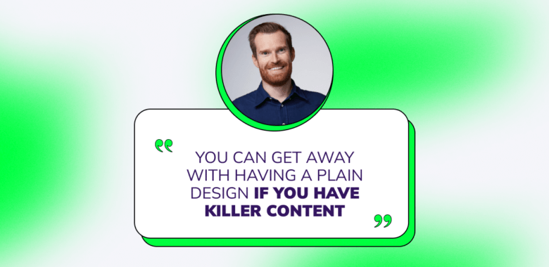
I know I post a lot of beautiful email designs, and people might think I’m more focused on that aspect of an email, but I think the most important thing is to have fun, engaging, and interesting content. You can get away with having a plain design if you have killer content. And if you can combine the things I listed above with great content, then I think you’ve nailed it.

What are some of the design trends you think everyone should follow?

Here are a few trends that I think are worth checking out:

Dark mode optimized images

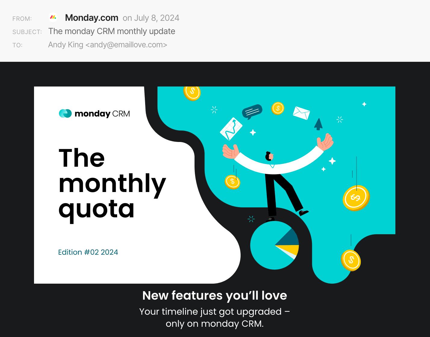
I’m a fan of dark mode, but many brands still haven’t optimized their emails for darkness. One simple way you can enhance your emails for dark mode is to use transparent PNG images. These can really pop in dark mode and make a huge difference in my opinion.

An email banner in dark mode: the image seems integrated into the rest of the email because it has a transparent background.
Source: Email Love

Rounded corners

I’m not sure why, but I love rounded corners! I think emails have often had blocky layouts and design patterns, so it’s nice to see softer edges making their way into emails. I’m seeing these used quite a bit in image-only emails, but you can also round the corners of your HTML tables with border-radius.

An email banner with a photo with a black line around it and rounded corners
Source: Email Love

Functional animation

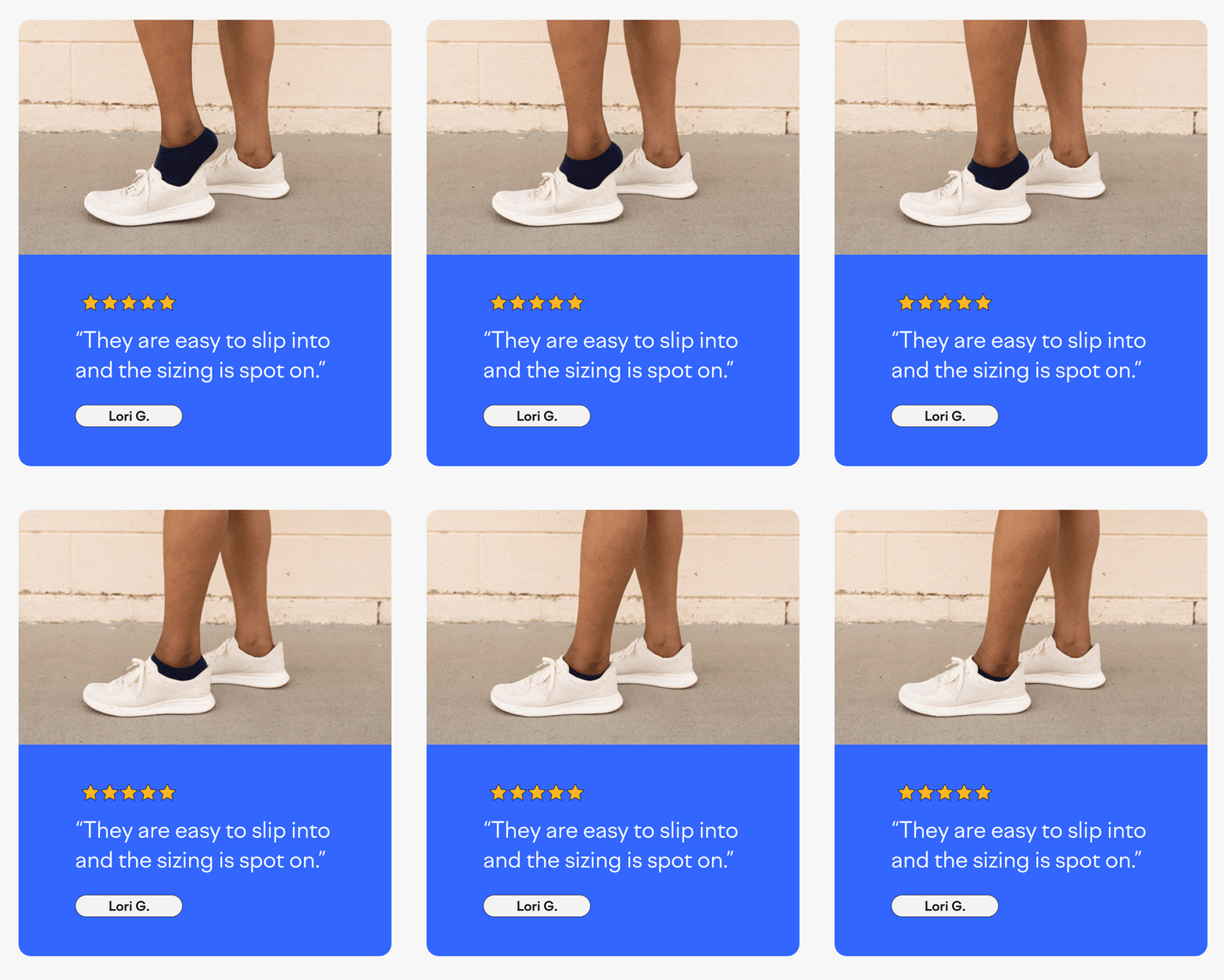
I’m a big fan of animation that shows you how a product works or showcases different colors or options. Kizik does a great job of this by showing subscribers their primary differentiator with animation. 

A GIF from an email with a person’s leg smoothly slipping into a shoe and a 5-star user review about the product
Source: Email Love

Seamless transitions

This is when you have an image that seamlessly transitions into HTML text, typically using some kind of gradient that fades into a solid color. This gives the look and feel of an image-only email but enhances accessibility with HTML text. 

An email banner with a photo of a person swimming underwater and the tagline “We make moving pictures.” on the photo seamlessly blending into the email background
Source: Email Love

How does email design play into a brand’s overall email marketing strategy and content? What makes a brand email design effective?

I think design enhances your strategy and content. There are plenty of brands out there that have gorgeous email designs, but lack substance when it comes to strategy and content. Your email design should help get your message across to your subscribers in a fast and effective manner. That means it should be easy to read on desktop and mobile, in dark mode, and with images turned on or off. 

If your email design doesn’t help your subscribers consume your message in 5-10 seconds, you’ve probably lost many of them.

Future of email marketing

How do you see the future of email marketing, especially under the influence of AI?

Like many areas of work, I see AI enhancing and speeding up what email marketers already do. AI will probably be used in a wide range of areas, including:

  • Personalization
  • Testing
  • Design mock-ups and wireframes
  • Copy and content ideas
  • Coding
  • Automation setup and optimization 

I don’t think AI will take over every part of an email marketer’s job, rather I think it will free up a marketer’s time so they can focus on what matters most —- creating engaging campaigns that drive results. This might be an idealistic point of view, but I see AI changing jobs in similar ways to how the internet changed jobs in the early 2000s.

Do you use AI tools in your work? If so, how and which ones?

Yes, I absolutely use AI and think you’re missing a trick if you aren’t. Here are a few of my use cases:

  • Automatically creating and optimizing social media content
    Using Zapier and ChatGPT, I automatically ingest the latest emails I post to Email Love via an RSS feed. ChatGPT takes the copy I have already written and updates it for Twitter, Linkedin, Facebook, and Instagram. This saves me a ton of time and the results are usually good since the AI is only updating content I have already written. I wouldn’t trust the AI to write this content from scratch.
  • Subject line and content ideas
    I have some freelance email marketing clients and I use ChatGPT to help generate subject line or content ideas for campaigns and automations. I have been training my own GPTs for each client to help me get better results based on past emails and the tone of voice used. Usually, this gives me a good starting point and helps generate new ideas.
  • Send time optimization
    I send a weekly newsletter to Email Love subscribers and I use my ESPs send time optimization feature. This feature does a good job of predicting when my subscribers are most likely to open and I have seen good results from using it. 

Email marketing best practices

What are some of the best brands in terms of emails they send? What makes them stand out to you?

Here are a few of my favorite brands at the moment:

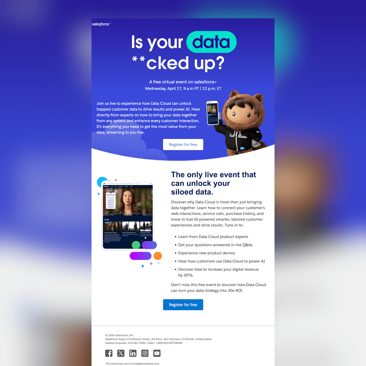
Salesforce

A Salesforce email with the tagline “Is your data **cked up?” and promoting a virtual event about unlocking a siloed data
Source: Email Love

Why I love their emails:

  • Expertly coded and designed
  • Looks fantastic on mobile and in dark mode
  • Engaging content for a B2B brand

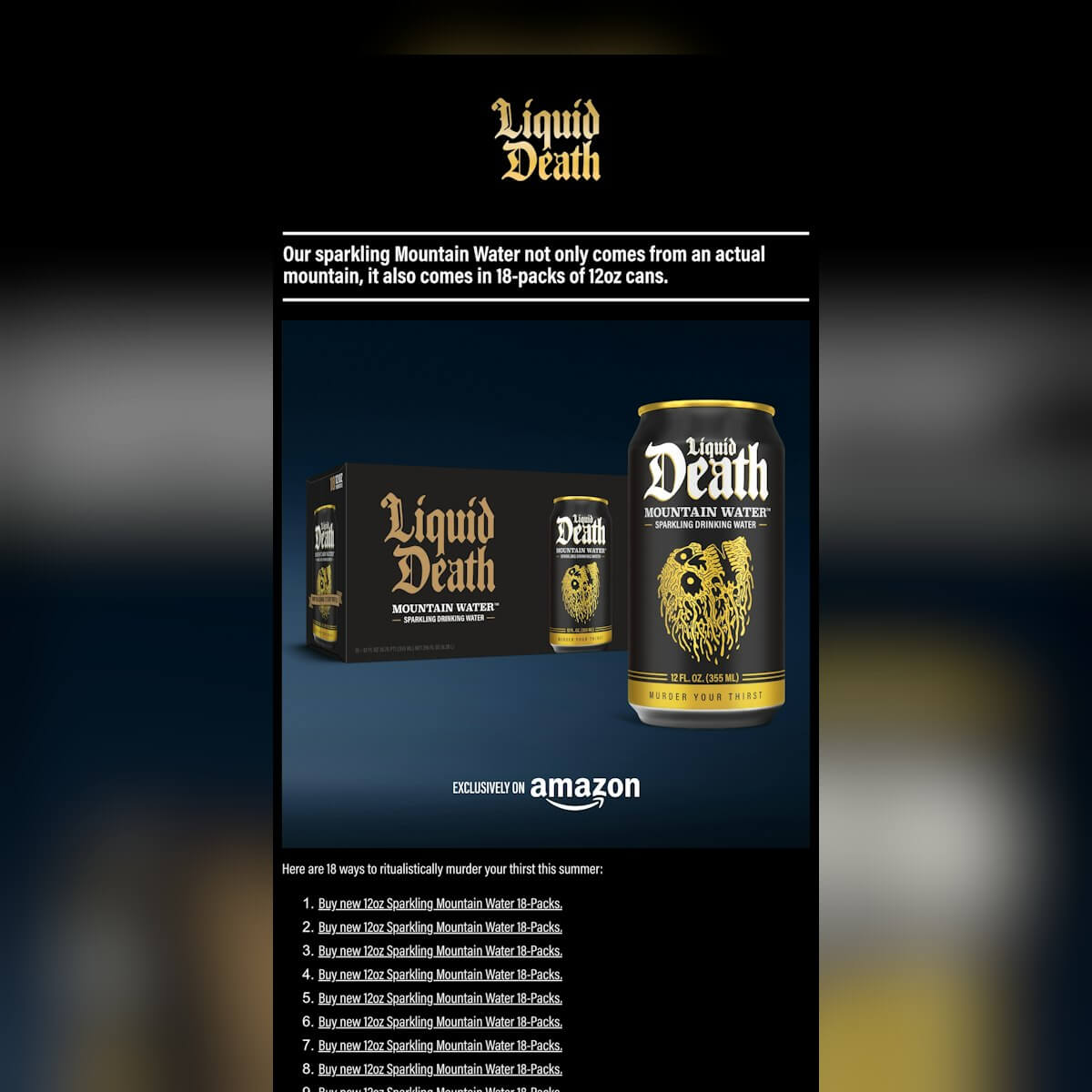
Liquid Death

A Liquid Death email with the tagline “Our sparkling Mountain Water not only comes from an actual mountain, it also comes in 18-packs or 12oz cans.” and 18 links to ways to buy this product
Source: Email Love
  • Dark color scheme that looks good in light and dark mode
  • Hilarious and unhinged subject lines and copy
  • Innovative use of animation

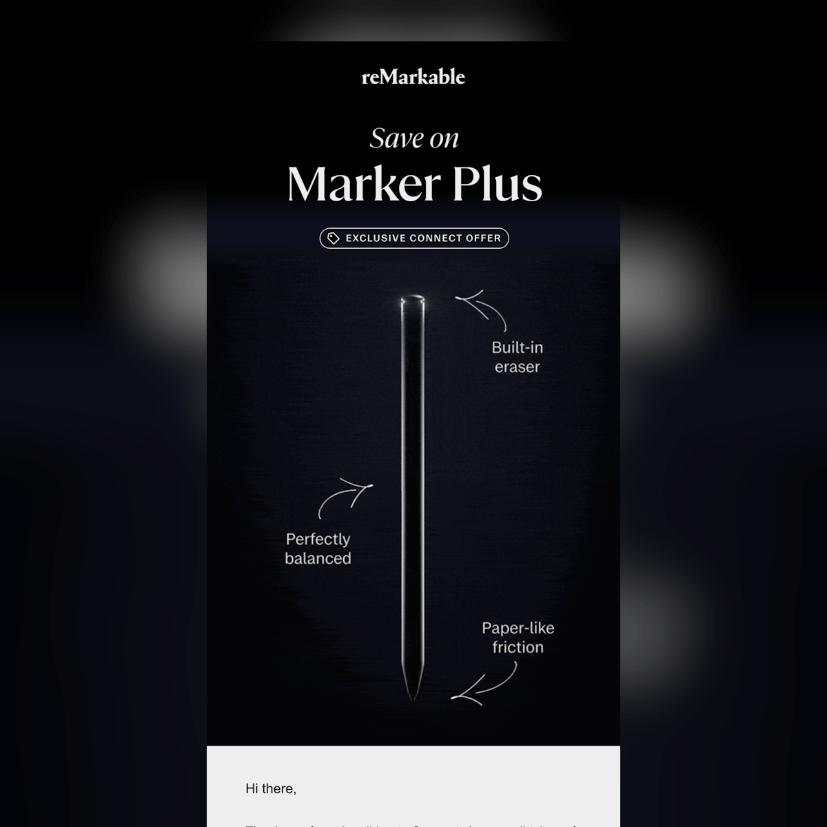
reMarkable

A reMarkable email with the tagline “Save on Marker Plus” and an outline of a marker with 3 of its advantages pointed out near the picture
Source: Email Love
  • Stunning email designs with loads of whitespace, thoughtful design patterns, and large fonts
  • HTML text is used for enhanced accessibility
  • Amazing photography and interesting content
02 August, 2024
Article by
Diana Kussainova
Writer, editor, and a nomad. Creating structured, approachable texts and helping others make their copies clearer. Learning and growing along the way. Interested in digital communications, UX writing, design. Can be spotted either in a bookshop, a local coffee place, or at Sephora. Otherwise probably traveling. Or moving yet again.
Visit Diana's
Latest Articles
Selzy Selzy Selzy Selzy