In his famous “The Design of Everyday Things” book, designer Dan Norman tells how irritated engineers and developers sometimes get when people choose or fail to choose products because of their aesthetics. The golden ratio and all, people are drawn to harmonious things that evoke pleasant emotions. Yet, good design is not (just) about how something looks. It’s about how you structure it and how it works. So don’t worry if the notion of design is alien to you and you think it’s too artistic. It has more to do with science than you might think.
In the case of emails, a well-designed message is not only aesthetically satisfying. It also ensures you reach your business objectives. A good design optimizes every metric there is from clicks to conversions. In one of his email design case studies, designer Andy Birchwood describes how he increased open rates 5 times and got 40% more clicks.
First, a bit of information about what makes email design unique. Creating email messages is different from developing websites and apps:
All in all, coding a website and coding an email are two alike but different things. That is why email designer and email developer are now different professions.
Now that you have a basic understanding of what email marketing design is about, let’s move on to the main part of this article: email design best practices.
The first thing to understand is, there are two major things that affect the design of an email:
Still, there are some general practices that can improve any email message. Let’s look at the most actionable ones.
A subject line is the first thing your readers see when they open up their email client or get a notification. Here’s what it looks like in Gmail, which is one of the most popular email clients out there:
A strong subject line is:
As the meaning goes, your subject line can be explicit or you can experiment with it and make it temptingly ambiguous so that your readers would want to find out what you mean. The tactic you choose largely depends on your audience. A subject line about shipping details, for example, performs best when it is most concrete while a promo message can be approached a bit more creatively.
Another point is the subject line’s ability to stand out among dozens of other messages your recipients get every day. Ways to make your subject lines more interesting include adding:
A preheader aka preview text is an optional line of text that appears after the subject line. This part is usually also instantly visible without opening the email.
Here’s what it looks like in the desktop version of Gmail:
A preheader can come in especially handy when you come up with a smart subject line that might not be very self-explanatory but you still want to keep it. In such a case, the preheader can be the Robin to your header’s Batman. To make the most of the preview text, don’t repeat the same meaning, but make it highlight and support the main point of your message instead.
You can improve on the preheader by:
How long should an email be? There’s no exact answer to this question. According to the report by AWeber, an average email consists of 434 words. However, earlier findings claim that the perfect email length is between 50 and 125 words. In the end, everything depends on your email type and target audience.
For example, take a look at this message from Headspace:
Now, here’s me scrolling through a typical The Marginalian newsletter:
The point is, it doesn’t matter how many words there are in your message. What matters is how relevant it is. Every word, every line should have a purpose. So, if you make the content simple and easy to digest, you won’t have to worry about its volume.
Also, a lot depends on how you structure your email. People don’t read every single word even when they subscribe to information-packed newsletters. The best-case scenario is they read headers and scan the text, more often than not they scan the headers only, so it’s not a good idea to send a wall of text. Instead, break it into smaller chunks and provide headings.
Here are a few extra suggestions on how to make your messages clearer:
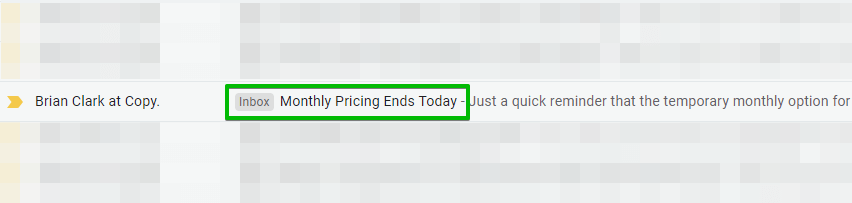
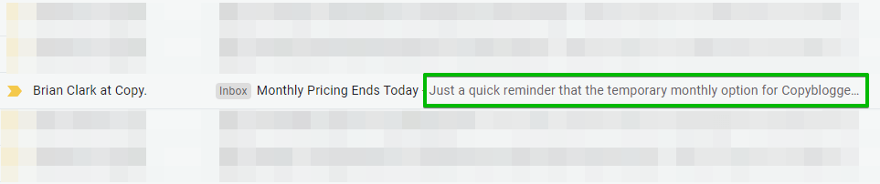
Now, let’s discuss visual hierarchy in more detail.
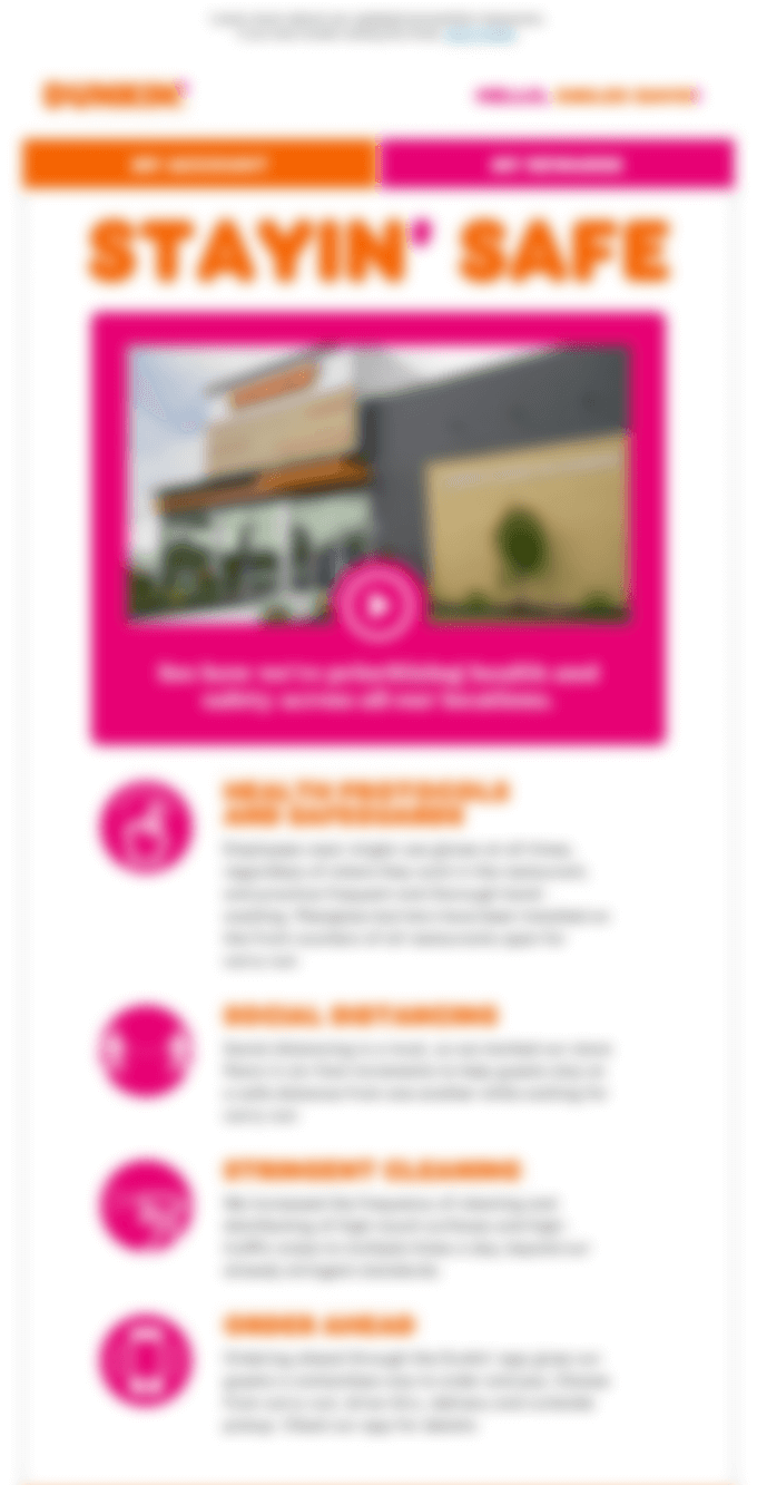
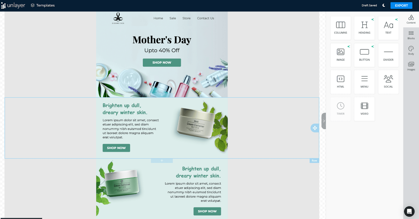
As mentioned earlier, in order for an email to be displayed properly on different devices, designers assemble the layouts using tables. This is what you’ll find in every ESP’s editor. So what you have to work with is a grid. But grids come in different varieties, so what composition you choose depends on your template’s goal. Some templates and layouts work with welcome emails, others are great for promoting a new product.
The layout is your message’s backbone so it’s essential to make it strong and balanced. You decide where the reader’s attention goes and you manage their journey along your message’s path. You have the power to highlight the information you think is important and motivate a user to perform a certain action.
Without a distinct visual hierarchy, a message feels cluttered, unorganized, and hard to digest. And the harder it is to understand what you want from a user, the less likely it is for them to actually perform the target action.
Here’s what you can do to add structure to your emails to make them more effective:
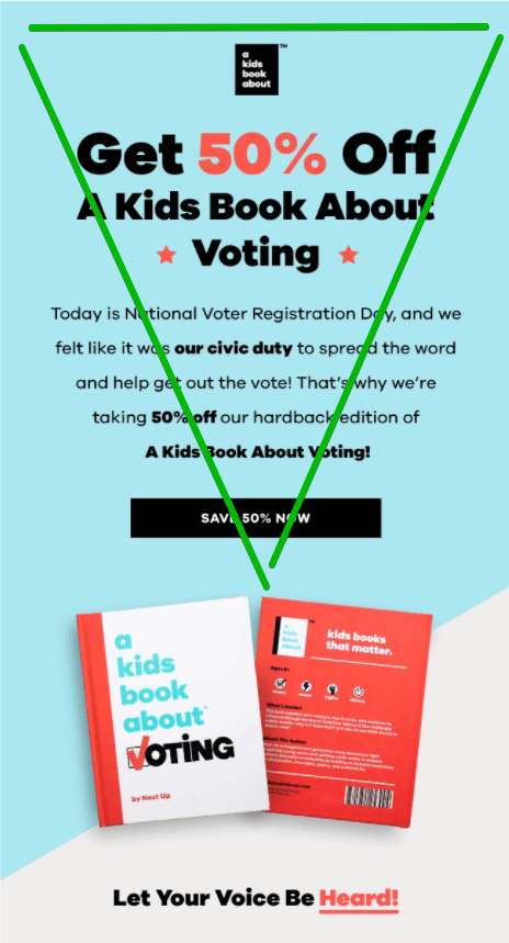
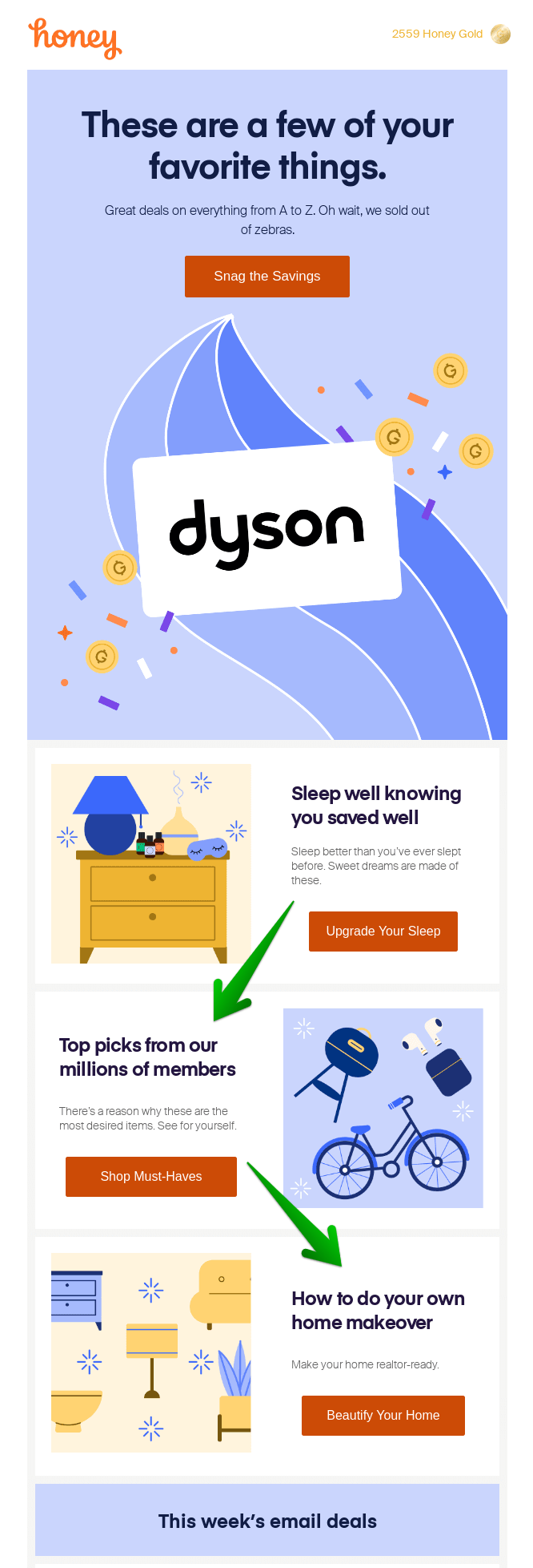
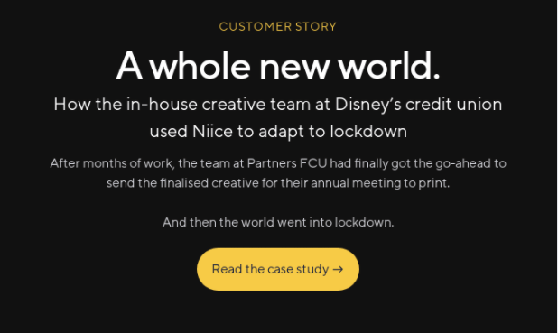
Here are a couple of examples.
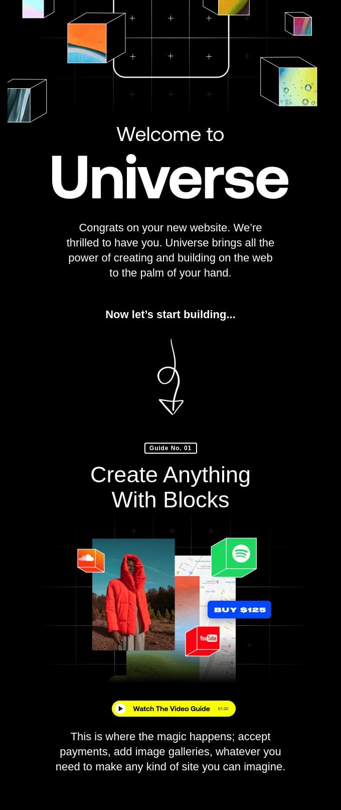
In the email below, Universe uses the most popular single-column layout when each element has its own line and even shows the direction with an arrow:
And here, Kids Book About uses the popular inverted pyramid layout when you build up until a user has nothing to do than to click a button:
In this email, Honey uses the same technique + places the rest of the content into a zig-zag layout that makes it easy for subscribers to scan the content:
When choosing the color scheme for your emails, choose your brand colors.
Emails are a part of your overall marketing strategy so they should be consistent in style with your other brand assets such as the company website and social media accounts. This way you’ll preserve the corporate style, and it would be easier for subscribers to recognize you in the incoming mail.
For example, can you guess what company this email is from?
It’s Dunkin’ Donuts, of course! Its trademark colors and fonts are unmistakable.
Images in an email should be rich, high-quality, compelling, fresh, and, most importantly, should serve a purpose.
Here are the two top reasons to use images in your emails:
Take a look at how Harry’s uses this in their cute email that combines a fun illustration with animation:
In the majority of articles about email marketing design, they’ll advise you against using stock photos. But we wouldn’t be so critical. But we do recommend you not to use cheesy photos with blank smiles, forced acting, unnatural poses, and situations, as well as overused, recognizable photos you frequently see in other brands’ marketing campaigns.
If you need some references, take a look at how Vince Vaughn, Dave Franco, and others teamed up with Getty Images to create a set of classic campy office photos as a part of a promo campaign for the Unfinished Business movie.
For example, this photo is from Unsplash, it’s stock, it’s free to use, and it looks totally fine:
We also recommend you to think in terms of value and not add images just because they are pretty or you think that a reader might consider your emails boring without them.
Personalization is when you use every bit of information you have about your subscribers for crafting rich valuable messages exactly for them. For example, do you know their shoe size is 6.5? Send a promo email with the last remaining 6.5 pairs and a discount. Noticed they don’t engage with your emails? Ask why. And, of course, if they have a birthday, congratulate them.
The best thing is, you can do it using email marketing automation. You just have to prepare chains of automated emails in advance and set up the conditions in your ESP’s personal account.
To personalize an email, email marketing platforms use substitutions — special email fields that get replaced by specific information about subscribers. The most popular option is to address a person by name in a message title or body. You can also mention the city, profession, position, role, and other variables in automated emails.
For example, this email from Fitbit consists entirely of personal information:
Mobile devices are the #1 environment for emails. According to Litmus, up to 46.2% of users checked emails on mobile devices in the first three quarters of 2021, making mobile the most popular reading environment. And this was the year of isolation and remote work boom when many people had the opportunity to be in front of their computers.
So make sure your message looks and works great on mobile by checking the following:
Before sending, check how your messages are displayed on different types of devices: whether all the content is visible and fits into the screen size, the layout is not broken, and images load quickly enough.
In Selzy, you can create a separate mobile version for your email. Hide blocks on mobile and show them on desktop (or vice versa), try out different content structures and layouts, customize the menu, add device-specific blocks like a “Call us” button.
Calls to action are a central part of any commercial email. After all, your primary goal is for users to click a button so you want to make it distinct. Best CTAs in emails are large, legible, contrasting against the background, and contain short, action-oriented texts.
Here, Niice does a great job of meeting all the said requirements:
A few more tips to improve your email CTAs:
It’s very easy to design a new font. You can do it yourself. What Font Is, a free font finder, lets you browse the catalog of 790K+ fonts. But their inventory is not 100% comprehensive, so there are millions of fonts available on the web.
The problem is, not every font is supported by email clients. Actually, there are just a handful of safe fonts available that every email client “understands”. Here they are:
If an email client doesn’t know a font, it will replace it with a safe one, and your designer vision might get altered. It doesn’t mean that every font outside of this list will be replaced, but it is still likely to happen. So it is a safer choice to work with safe fonts from the start. Also, ise no more than 1-2 of them in one message to avoid overwhelming a reader. Remember that the ease of reading and the overall impression of writing depend on the choice of fonts also.
In case you absolutely have to insert fonts that are not displayed by all email clients, you’ve got two options:
In this email, Sublimio decided to start their message with a graphic element that’s also a text:
Down in an email footer, you’ll likely find information about a company, the reason for receiving the message, and an Unsubscribe button.
It’s OK when people unsubscribe. They change their jobs, cities, and interests. What’s not OK is when they don’t have the opportunity to do it in a user-friendly way. For example, when the button is hidden, non-existent, or doesn’t work. In that case, the only way out for them is to throw an email into the spam folder — and this means a bad reputation for you as a sender.
The Unsubscribe button is a very important element that’s both the necessary requirement of professional ESPs like Selzy and a sign of respect towards your subscribers. In our previous article about list cleanup tips, we showed how giving people a clear way to opt-out of your messages helps to keep your lists in shape. It may sound like a bad idea, but making the Unsubscribe button visible is actually the right thing to do. It lets people who are not interested in you walk away without marking you as a spammer and causing potential trouble.
That’s why some companies make Unsubscribe buttons larger or double them as Template.net did:
Last but not least, test every bit of your design with email analytics. But first, ask yourself some questions like:
etc.
A/B testing can help you figure out what works best in your situation for converting more customers. There’s no other way to know than try and see. Send two emails (for example, one with blue buttons and one with red) and see which one your audience responds to best.
Just remember to test one feature at a time. Otherwise, you won’t be able to tell whether the increase in conversions is due to the blueness of the CTA or the clever way you placed the content.
There are two main ways to design an email, each with its checklist of benefits and drawbacks.
The easiest way to create an email is to use a drag-and-drop block editor that every major ESP has. There, you can choose a ready-made template or assemble a message from blocks from scratch.
➕ Putting together an email in a block editor is faster than doing it manually.
➕ Knowledge of HTML and CSS is optional.
➕ A layout made in a builder is more likely to look well in different clients.
➕ Most block editors allow you to create responsive emails that adapt to different screen sizes.
➕ It’s cheaper than hiring designers and developers who know HTML and CSS.
➖ It’s difficult to create an unusual design layout.
➖ You have less control over the desktop vs. mobile experience.
You can also create your own custom email design layout and later upload it to the editor.
➕ You can make complex and unusual layouts which is not always possible in the block editor.
➕ You can create very flexible templates and control every detail of how they adapt to different screen sizes.
➖ You need to have a good knowledge of HTML and CSS or hire someone who does.
➖ Writing code by hand takes longer than making an email in a block editor.
➖ It’s more expensive (if you have to hire a person to do it for you).
Here are some examples of popular email marketing design tools to help you create impressive and functional email designs:
Selzy has a drag-and-drop email design tool that allows you to design, optimize, and personalize your message. You can do it from scratch or use one of the fully responsive 100+ templates.
Our editor is similar to other ESPs’ software but has some features of its own. For example, you can work with either common blocks that have preset elements or empty blocks that only define the number and size of blocks. You can save blocks to use as templates, add or remove elements from the blocks, and more.
The platform’s functional image editor lets you edit images, apply filters, and add text to pictures. With built-in search, you can choose gifs from GIPHY, free stock images from Unsplash, Pexels, Pixabay, and videos from YouTube or Vimeo right inside the editor. AMP carousel block allows you to create interactive galleries. Plus you can also use AI to supercharge your email design workflow, edit HTML or import or edit your own code.
Pricing: You can try the block editor for free. The great part is that the email builder is also a part of all Selzy pricing plans, one of which is… Free.
Other popular pricing plans: Lite ($7/month if billed annually), Standard ($11/month if billed annually), Premium (from $220/month if billed annually).
Stripo is a popular drag-and-drop email builder. Its capabilities include the dynamic AMP support, as well as the Email Testing Tool that lets you preview your emails across 90+ popular devices and browsers. You can create a customizable library of modules and use them in other campaigns, saving time.
Pricing: Free, Basic ($150/year), Medium ($450/year), Pro ($950/year).
Beefree is a very user-friendly popular tool for creating emails. It offers a wealth of ready-made templates of various categories and integration with multiple SaaS apps including other ESPs like Mailchimp or SendinBlue.
Pricing: Free (Starter), Professional ($25/month if billed yearly), Business ($133.33/month if billed yearly), Enterprise (custom pricing).
Unlayer has re‑usable custom blocks, the ability to enhance and customize your emails using HTML, collaborate and share content with your team, and set up integration with email marketing platforms and other third-party platforms.
Pricing: Unlayer Studio: Free, Designer ($15/month if billed annually), Team ($30/month if billed annually); Unlayer Embed: Free, Startup ($149/month if billed annually), Business ($299/month if billed annually), Growth ($599/month if billed annually).
Blocks’ most notable feature is an AI assistant that generates images and text right within the platform. Other important features include integrations with popular email marketing platforms, HTML editor, collaboration, and more.
Pricing: Free, Personal ($16/month if billed annually), Advanced ($37/month if billed annually), Pro ($79/month if billed annually).
Email design matters because following its best practices ensures that your message not only looks great but fulfills its purpose, adding to the user’s experience with your brand. If it looks and flows well, the user journey is smooth from the moment they open an email to the moment they do what you want them to.
Follow the above practices to make your messages more:
There are two main ways to design an email:
If you opt for an email builder, there’s an array of tools you can use, both free and paid-for. Their basic model is the same but they differ in usability and features. Try and test to find out!
This article was originally published in September 2021 and was updated in May 2024 to make it more relevant and comprehensive.