


Key takeaways
- Browse abandonment emails are automated campaigns sent to users who visited a website but didn't add items to the cart or complete a purchase.
- Reasons for browse abandonment include distractions, lack of information, or not liking aspects of the product like price or shipping terms.
- Browse abandonment emails typically include reminders, product information, and incentives to bring users back.
- Email addresses for browse abandonment campaigns are obtained with user consent through sign-ups, account creation, or newsletter subscriptions.
Shoppers can stop browsing your store for many reasons — and the vast majority will leave at some point. Life simply gets in the way. And every abandonment case is a missed opportunity.
But that’s not the end of it! It can be surprisingly easy to get people back on the track with a properly set browse abandonment email campaign. It hits that sweet spot where intent is high but commitment is low, so the timing has to be just right.
Let’s find out how to catch the ones that got away and guide them back to your store. In this guide, you’ll learn what browse abandonment emails are, why they work, how to build them step-by-step in Selzy, and see 10+ real examples you can use for inspiration.
What is a browse abandonment email?
Everybody knows about abandoned carts and just how actionable abandoned cart flows can be for a business.
But there’s another, similar type of user behavior — browse abandonment. And there’s a dedicated triggered flow for it: browse abandonment emails.
Browse abandonment emails are automatic campaigns that brands send to users who visited those brands’ websites, browsed through the products, but for whatever reason didn’t put anything into the cart and didn’t make it all the way through to the purchase.
Think of it as digital window shopping.
People usually browse and leave without buying anything because:
- They got distracted.
- They didn’t find enough information about the product, so they became unsure.
- They didn’t like some aspects of the product. Most often the price, of course, but it might also be because of the size, color, shipping terms, etc.
Typically, these campaigns include reminders that users were browsing some products and more information about them. Like images and copy inviting to finish the process, sometimes paired with an incentive to reduce hesitation and bring shoppers back to the product page.
But you can go further if you want to create a campaign that truly pays off.
How do brands get email addresses of people who just browsed?
First, let’s address the technical side. How do you even get the email address of someone who has just browsed and is it at all legal?
It is.
But you can only get someone’s email address if they give it to you, of course, all following the rules of email compliance.
Permission is critical. If you start emailing people without consent, they are likely to consider your messages as spam which will harm your sender reputation and deliverability.
The usual way of getting a customer’s address is while they sign in to your e-commerce website or sign up for something, like a newsletter. Or they might leave their contact when creating an account or during checkout. The important thing is that they need to give consent to receive marketing emails from you.
For example, here’s our own banner offering to sign up for our FWD: by Selzy email marketing newsletter and blog digest (BTW, you’re seriously welcome to sign up right from this banner! The digest is very on-point and we only send it twice a month. Plus, you’ll get our free list-building mega guide):

Note a checkbox in its lower part with a line that reads “I agree that Selzy will process and secure my personal data in compliance with EU law and Privacy Policy. I agree to receive Selzy product updates and offers via email.” This is it.
You also need to either have them log-in on the website or set your cookies in such a way that the system is able to recognize them without a login.
So, if you have a trigger set up, the next time a person visits the product page they previously browsed, and you have a trigger set up, a campaign kicks in, because you already have their email from a previous interaction.
Why browse abandonment emails matter for marketers
Based on the information on why users abandon browsing, we can now see how such specialized email sequences can help:
| Reason | How browse abandonment emails help |
| Distraction | Quick reminder + link back |
| Lack of info | Add USPs, FAQs, specs |
| Didn’t like something | Alternatives, discounts, reassurance |
As you can see, every abandoned browsing session is a missed revenue opportunity. Need more to persuade? Here are some statistics:
- According to Omnisend’s report, in 2024, brands sent x2 more automated browse abandonment emails than the year before that.
- In the same report, they claim that the top three automation types of emails, including browse abandonment campaigns, make up 87% of all automated orders.
- Klaviyo found out that browse abandonment emails have a 0.96% conversion rate — 9.6x higher than the average email campaign.
In other words, it’s a great way to engage users in the middle of their journey and save on paid retargeting.
Browse abandonment vs. cart abandonment vs. product abandonment
Let’s also distinguish between different types of abandonment flows for the sake of clarity. In short, it’s basically the same thing but there are differences. So let’s find out these key differences, user intent behind each and when to use each type of email.
Cart abandonment
It happens when users place something in their carts but leave without completing their purchases.
Cart abandonment emails’ goal should be reminding about the already selected items and offering (incentives) to complete the buying process.
Browse abandonment
As we already found out, emails of this type trigger when users spend some time on your website but don’t add anything to their cart. Its main difference from cart abandonment flows is a larger audience.
The purpose of browse abandonment campaigns is to remind users about their experience on the website and gently push towards placing a product in the cart.
Product abandonment
It’s a form of browse abandonment, but more targeted and likely to convert. This type of campaign triggers when users visit specific product pages but don’t put them in the carts.
If you don’t have the resources to craft separate flows for specific products, you might consider creating such flows for specific product categories, for example.
These flows can overlap.
That’s right, abandoned cart users typically come from browsing, so they may receive abandonment emails or more than one type. However, the key difference is how distinct the messaging is for each type of email.
Cart abandonment emails should focus on urgency and conversion, while browse abandonment emails should encourage exploration and product discovery. By keeping their intents separate, you can better target and engage users based on specific actions.
Here’s a quick breakdown of how browse abandonment emails differ from cart and product abandonment emails:
| Type of flow | Audience volume | Primary goal | Focus | Best use case |
| Cart abandonment | Narrow (bottom-of-funnel) | Remind users of selected items and encourage checkout | Urgency, incentives, reassurance (e.g., free shipping, discounts) | Converting high-intent users ready to buy |
| Browse abandonment | Broad (mid-funnel) | Re-engage visitors and push them toward adding to cart | Personalized recommendations, gentle reminders | Re-capturing interested visitors who haven’t committed yet |
| Product abandonment | Medium (between browse and cart abandonment) | Nudge product-level interest toward purchase | Focus on viewed product, benefits, or alternatives | Targeting users who showed clear interest in a particular product |
10+ browse abandonment email examples that convert
-
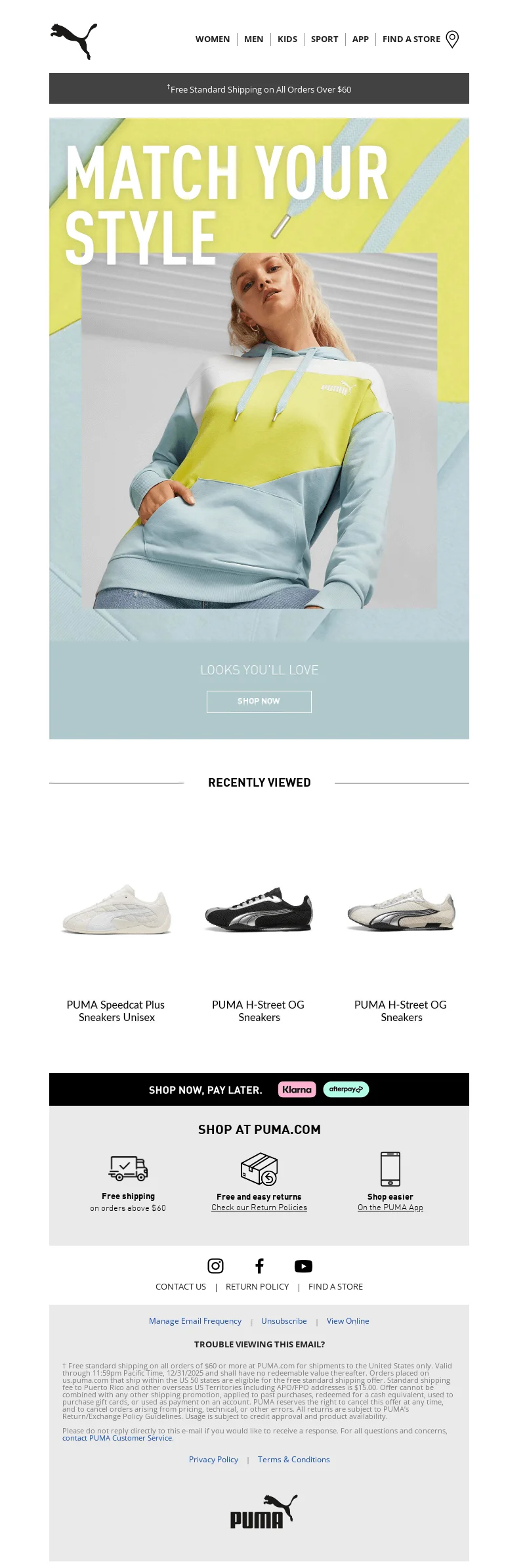
Puma — Being on-point
Let’s start with this short and sweet browse abandonment email from Puma — a sportswear and athletic apparel brand.
Why we like it
- The email is straightforward and keeps attention on a single action: returning to the product page.
- It uses a big bold and colorful visual that catches your attention from the get-go.
Caution: pay attention to design basics. While the visual is striking, the “Shop now” CTA gets somewhat lost because of contrast issues.
-
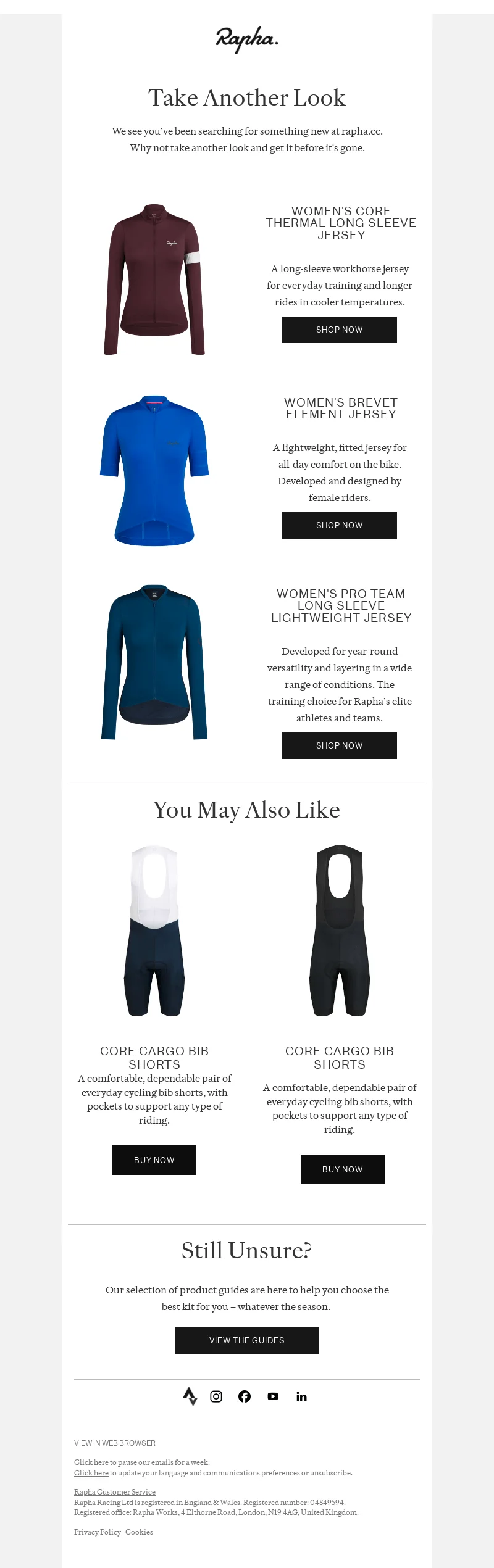
Rapha — Products’ USPs
Next in line is also a sportswear brand — Rapha, a British cycling brand known for its premium cycling apparel, accessories, and community.
Why we like it
- The email clearly focuses on USPs — it doesn’t just make a list of products previously viewed by a user, but adds a short description of each.
- It also reduces decision friction with a “You May Also Like” section for those who weren’t sure with their decision.
- And, as a last chord, and if you still aren’t sure about anything, the email offers to browse the product guides to help you select the items that are bound to work for you.
-
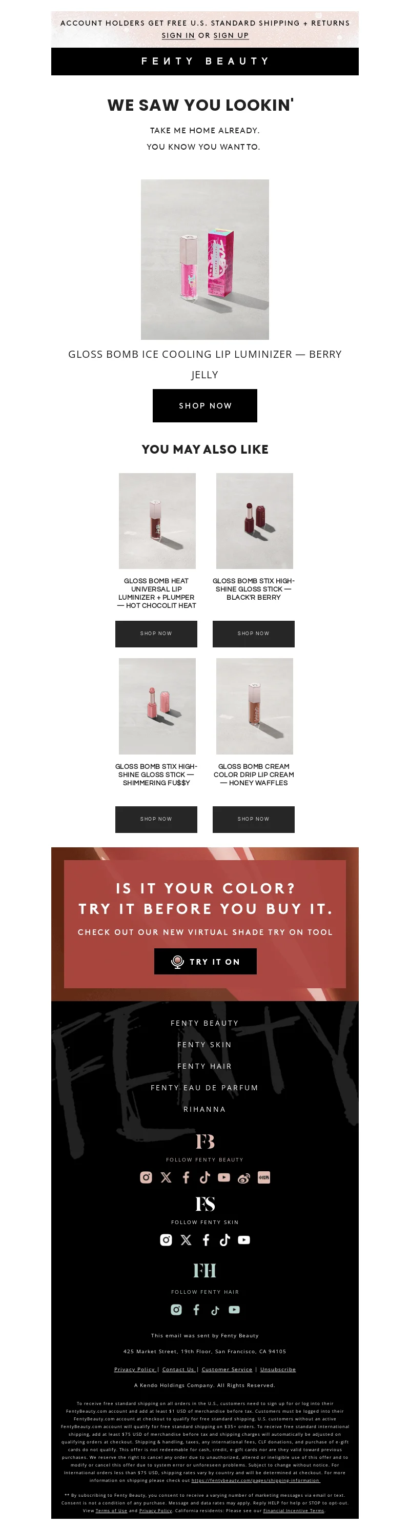
Fenty Beauty — Engaging language + Try it on
This browse abandonment email from Fenty Beauty — a cosmetics brand founded by Rihanna — is probably the most engaging on the list.
Why we like it
- The email starts with the basics — remind a subscriber that they previously were interested in a particular product. In this case, it’s Fenty Beauty’s Gloss Bomb Universal Lip Luminizer.
- It does it in a tongue-in-cheek but very sweet way.
- It goes on with some nice cross-selling of similar products.
- It features the brand’s new foundation shade finder tool — a great way to engage users even more and provide them with means to discover their perfect foundation match.
-
Kate Spade — Testimonials

Why we like it
- The layout stays easy to scan despite the amount of content.
- It offers a nice 10% discount on the previously browsed items.
- It provides some recommendations on similar products.
- It features user testimonials from the official brand’s website that build trust and credibility by providing social proof.
-
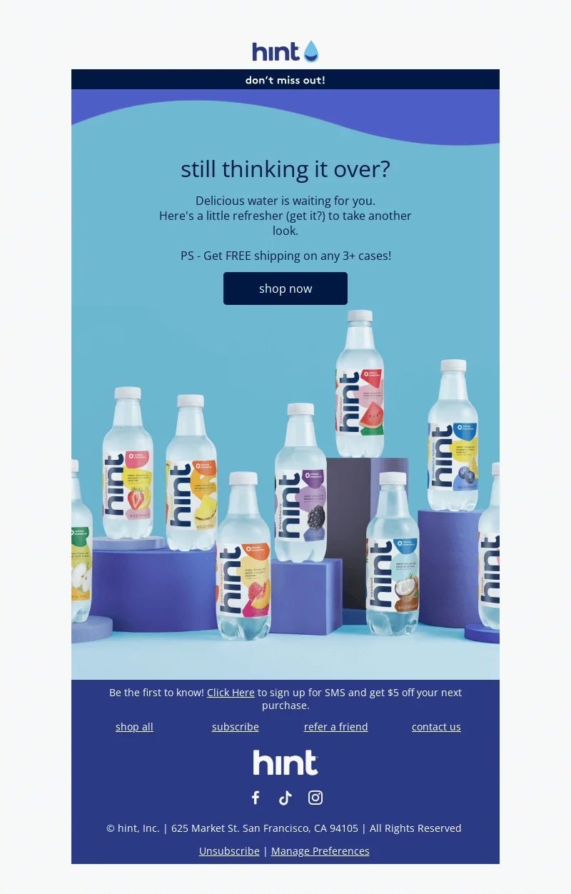
Hint — Minimalism
Let’s take a look at this email by Hint — a brand of fruit-infused, calorie-free water.
Why we like it
- The email is minimalist by focusing on essential content and removing clutter. The minimalist layout improves mobile readability and keeps attention on the CTA.
- As a small incentive, it offers a free shipping option on any 3+ cases.
- It features a visually appealing product photo that just sells you the essence of refreshment.
-
Elton Pepple — Brand’s story
Now it’s time for this elegant browse abandonment email by Elton Pepple — a luxury timepiece brand that specializes in minimalist watches for men and women.
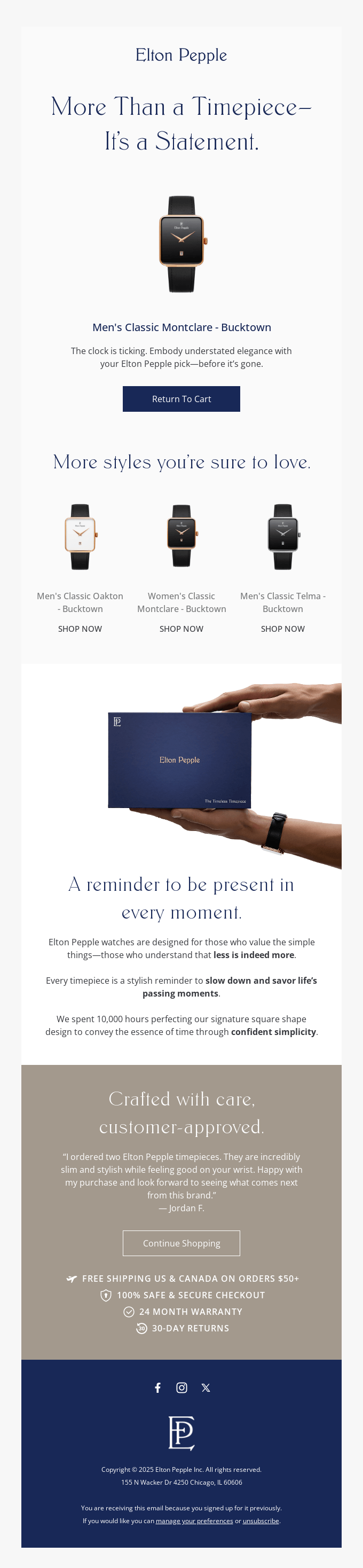
Why we like it
- The email does an excellent job at keeping up with the brand’s idea of luxury by creating this stylish and elegant email campaign. Even more, much of the email is dedicated to going deeper into brand’s values by featuring the whole “About us and our values” section.
- The CTA is very straightforward, offering a subscriber to get back to their cart and finish the purchase.
- It also has a testimonial which is especially important for high-end products.
- It features the brand’s USPs like 24 month warranty, free shipping options and others.
-
La Mer — Focus on mobile
La Mer is a luxury skincare brand known for its use of marine ingredients. It was founded in the 1960s and is now a part of The Estée Lauder Companies.

Why we like it
- Although this particular image is the example of a desktop version of their browse abandonment campaign, you can clearly see the mobile-first approach. It makes sure that the email is readable and functional for the majority of users.
- It offers 24/7 help from live chat experts if shoppers are unsure which product is right for them.
- It goes on about extra payment options for improved customer convenience.
-
Fellow — Focus on the product
Coffee time!
Fellow is a San Francisco-based brand that creates premium coffee equipment, known for combining innovative design with functionality.
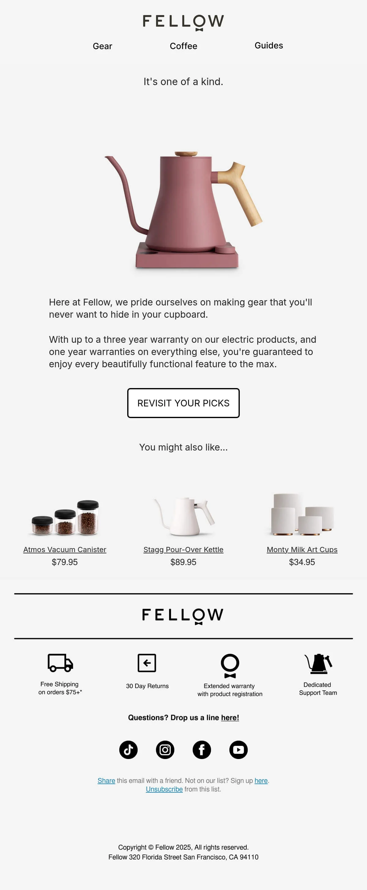
Why we like it
- The email is sleek and exquisite, just like the brand’s products. The email positions everyday coffee equipment as both functional and design-forward.
- The copy reminds of a brand’s USP — an up to three year warranty on electric products which is a strong selling point indeed.
- Like Elton Pepple, it ends the email with a discreet description of even more USPs as a 30 day return policy and a dedicated support team.
-
Soka Home — Being helpful
Soka Home is a furniture company that offers high-quality and stylish furniture with a commitment to eco-friendly and sustainable practices.
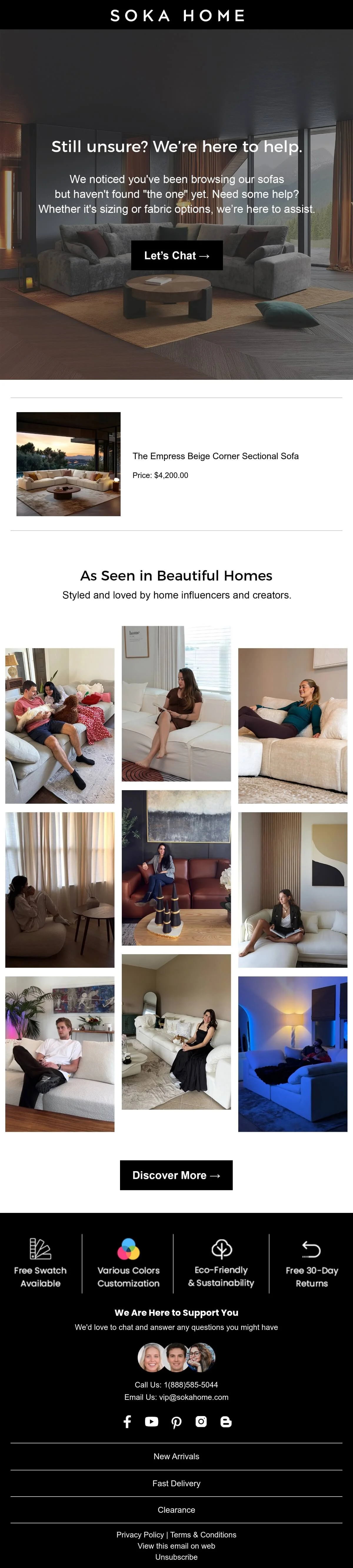
Why we like it
- Since the brand allows customers to customize pieces, from dimensions to materials, it extends their focus on client satisfaction by making the help offer a focus of their browse abandonment campaign. This way, it works on one of the major reasons for browser abandonment itself.
- It chooses a variety of product-featuring photos as social proof which is very illustrative and a great choice for a furniture brand.
-
YETI — Focus on visuals
YETI is an outdoor recreation brand that specializes in durable, high-end products like coolers, vacuum-insulated drinkware, bags, and accessories.

Why we like it
- The simple layout improves readability and keeps the focus on the product imagery.
- Apart from the product photos, it features a couple of incredibly engaging visuals that are just the best at creating this dreamy outdoor vibe.
-
Patagonia — Adding some humor
Patagonia is an apparel and outdoor gear company known for its sustainability initiatives and environmental activism. And also being creative!

Why we like it
- The email is just great with its simple but sweet little “Still hanging?” funny play-on-words. And if your brand allows it too, humor is one of best ways to capture attention, humanize a brand, and build an emotional connection.
- Thanks to the focus on the environment, the email doesn’t feel like trying to sell you the next new thing no matter what. It even offers the opportunity to buy used items.
Browse abandonment email subject lines
Effective browse abandonment subject lines are usually short, clear, and lightly personalized.
Some examples from real brands:
- Your browsed items are order-ready (Chewy)
- This has you written all over it (Beyond Yoga)
- This could be the start of something sweet (Hormbles Chormbles)
- Thanks for Visiting our Official Store (Mercedes-AMG PETRONAS F1 Team)
- Did you see something you liked? (OluKai)
- Stagg EKG Electric Kettle = an expert choice (Fellow)
- Your perfect timepiece is waiting—but not for long (Elton Pepple)
- Thanks for stopping by (Patagonia)
- It’s an “add to cart” kind of day (West Elm)
- [name], we found these options you might like! 🎯 (Neighbor)
- You have a great eye (vineyard vines)
- Why our customers choose us! (B R I G H T L A N D)
- Need a little inspiration? (Keeps Home)
- Still interested in Hollywood Sign via Canyon Drive? (AllTrails)
- Must-see deal 👀: 25% off Swash 1400. (Brondell)
- We noticed you checking out some very nice bottles ➺ But they’re going fast. (Sometimes Always)
- Still thinking it over? (Braun)
- Don’t Miss Out (Yeti)
- You left Beam Kids All-In-One Superpowder behind. (Beam)
- Look Again and Get 15% Off (rag & bone)
Browse abandonment email best practices
So let’s turn this “What we like” information in the form of an actionable list:
Capture emails before they leave
First, you need to actually collect and store those contacts.
- Add sign-up forms to your website and make sure they are simple, mobile-friendly, and visually aligned with your brand.
- Suggest leaving email addresses early.
- Offer incentives: discounts, giveaways, trial subscriptions, free consultations, white papers, etc.
Better yet, subscribe to our FWD:by Selzy email marketing digest and get our 21 surefire list growth tips worth subscribing for.
Craft a compelling subject line and preview text
Contacts you get from browse abandonment aren’t as engaged as those who already put something in their cart, so you need to be extra persuasive.
It’s a good idea to:
- Be short and on point.
- Spark a little curiosity.
- Give a call-to-action.
- Personalize.
- Be on brand.
- Run A/B tests.
- Use AI — for writing subject lines, creating A/B test versions, or just for brainstorming.
We have separate guides for email email subject lines that work and what is an email preview text, be sure to check them out too.
Use great visuals and persuasive copy
Again, browse abandonment audiences usually have lower purchase intent, so the main goal of such flows is to showcase the product as clearly and persuasively as possible within your available resources.
Focus on:
- The products (best sellers usually).
- The story behind the product.
- How it’s different from other brands’ offers.
- Your USP/UVP.
- Customer testimonials and other forms of social proof.
- Incentives: discounts, free shipping, limited-time offers.
Personalize the message based on browsing behavior
Since we are talking about email marketing, you can use all kinds of data to personalize your campaigns: geo (where are they from?) and behavioral (what did they do and where on the website?) data, demographics (how old are they?), level of engagement (did they make any purchases before or are they a first-time client?), etc. Let alone just addressing your customers by names, that’s a basic one.
When striving for better personalization, don’t overdo it. Be specific, but not so that your customers feel monitored.
Increase motivation to buy by offering discounts, highlighting limited stock, and explaining why it’s better to buy from you.
Add urgency without pressure
Add a clear call to action, but not too pushy.
Rather, invite your clients to return to their purchases with:
- “Continue shopping”.
- “Add to cart”.
- or “Place order”.
Keep design clean and mobile-friendly
That goes for every type of email campaign, but once again, put extra care into:
- Showcasing the products (best images possible).
- Keeping the structure simple and leading to the goal — encouraging shoppers to add products to cart.
- Making the layout clean enough so that it doesn’t distract users from getting more engaged with the product.
- Designing it mobile-first since the majority of users browse websites and read emails on mobile devices.
Set your flow: How many emails and when to send them?
Having got the contact, to avoid losing customers, you need to recognize when they’ve lost interest in the product and send them an initial reminder email.
Estimate the typical time between a shopper’s first product view and purchase. Use this time as a baseline and send the user an email after.
Don’t wait too long, though.
- Email 1: Soft reminder (30-60 minutes after browse).
- Email 2: Social proof & alternatives (24 hours later).
- Email 3 (optional): Urgency + incentive (48-72 hours later).
How it’s done: Building a high-converting browse abandonment flow
Now let’s get practical.
You can set your browse abandonment flows in Selzy, by setting up automation triggered by data from an external source (for example, your website).
This is how you do it:
- First, you make sure the CMS you’re using has a specialized plugin for tracking, storing and passing data about browse abandonments to an ESP like Selzy. Note that browse abandonment is similar in its essence to cart abandonment so a plugin that does one, can also do the other.
Popular e-commerce platforms like Shopify, WooCommerce, and Wix usually support browse abandonment tracking through built-in automation tools, apps, integrations, or webhooks.
Your CMS can then send browsing data to your ESP through webhooks, APIs, or automation platforms like Zapier.
- Then, you’ll need to create a new automation scenario and drag the API trigger block into the workspace — this trigger will launch your recovery sequence.
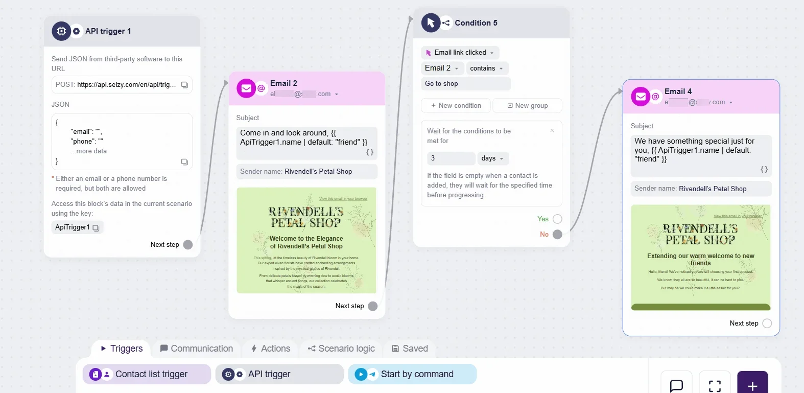
- Next, connect your website or store to Selzy by sending a POST request in JSON format to the unique URL generated by the trigger block.
This request must include at least the customer’s email address (and can also pass product lists, totals, names, promo codes, and more).
Here are detailed instructions on how you can connect some popular CMS to Selzy.
- Once the data is flowing, you can use it to personalize your cart abandonment emails with dynamic content.
Selzy supports Liquid, so you can pull variables directly from the incoming JSON — for example, automatically display the customer’s name or list every item they viewed.
This setup requires either a built-in integration or API triggers, so you may need your IT team to connect the systems (check out the API triggers article from our Help Center for more details).
Also, don’t hesitate to reach out to Selzy Support if you need guidance.

FAQ about browse abandonment emails
What is a browse abandonment email?
A browse abandonment email is an automated message sent to someone who viewed products on your website but left before adding anything to their cart. It helps reconnect with mid-funnel visitors who showed interest but didn’t commit yet.
Do I need user consent to send browse abandonment emails?
Yes. You can only send these emails to users who have explicitly agreed to receive marketing messages — typically when they create an account, log in, or subscribe to your newsletter.
When should I send a browse abandonment email?
Aim for 30-60 minutes after the browsing session to keep the product fresh in the user’s mind without feeling intrusive.
What should I include in a browse abandonment email?
A helpful reminder works best. Add:
- Images of the viewed products.
- Short descriptions or USPs.
- Product alternatives or “You may also like” recommendations.
- A clear, friendly CTA.
- Optional incentives like free shipping or discounts.
Can I personalize browse abandonment emails?
Yes — and personalization improves performance. Use browsing behavior, location, past purchases, or engagement level, but avoid going too granular to keep things from feeling intrusive.
How do I set up browse abandonment emails in Selzy?
Enable your CMS tracking plugin, connect it to Selzy via an API trigger, pass browsing data (email + viewed items), and use Liquid variables to display products dynamically in your automation flow.
 New and noteworthy on our blog
