Here it comes, the season of cold weather, roast turkey, crazy deals, and anxious marketers all over the world. Big or small, all businesses experience a surge in sales during the Thanksgiving weekend. Don’t miss the opportunity to create a stunning Black Friday campaign that will draw attention to your offers. And if you want some guidance or Black Friday email examples, read our article — learn about best practices and look at our selection of the best Black Friday emails loved by customers and experts.
Should you run a Black Friday campaign?
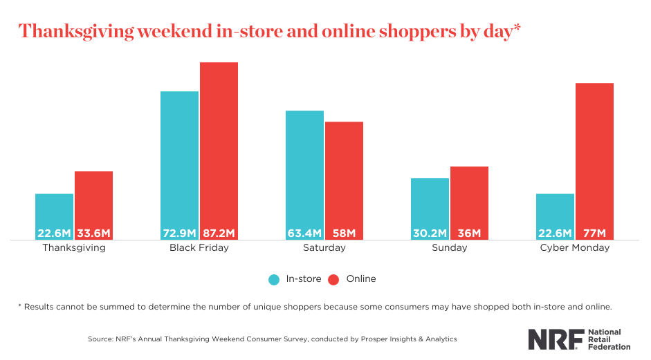
Black Friday is the first Friday after Thanksgiving which marks the beginning of the Christmas sales season. In the US, it’s the biggest sales day — in 2022, Americans spent $87.2 million on Black Friday online shopping alone. The annual NRF survey also confirms that during Thanksgiving Weekend, the largest number of in-store shoppers came on Black Friday.
The thing is, November is the time people start buying Christmas gifts — that’s why sales surge during this period. And if you want to boost your sales, a good Black Friday email marketing campaign can draw more attention to your deals and exclusive offers.
15 Black Friday emails that caught our eye
We’ve been in email marketing for a long time, and we’ve seen many Black Friday campaigns. Some of them were good, others were so-so. To learn what makes a good Black Friday campaign that gets you sales and happy customers, read our extensive Black Friday emails guide. But if you just need a little inspo, take a look at our selection of the best Black Friday emails — and learn why we loved them.
Orangewood: An outstanding offer
Why do people shop on Black Friday sales in the first place? Here’s what Finder has to say about it.
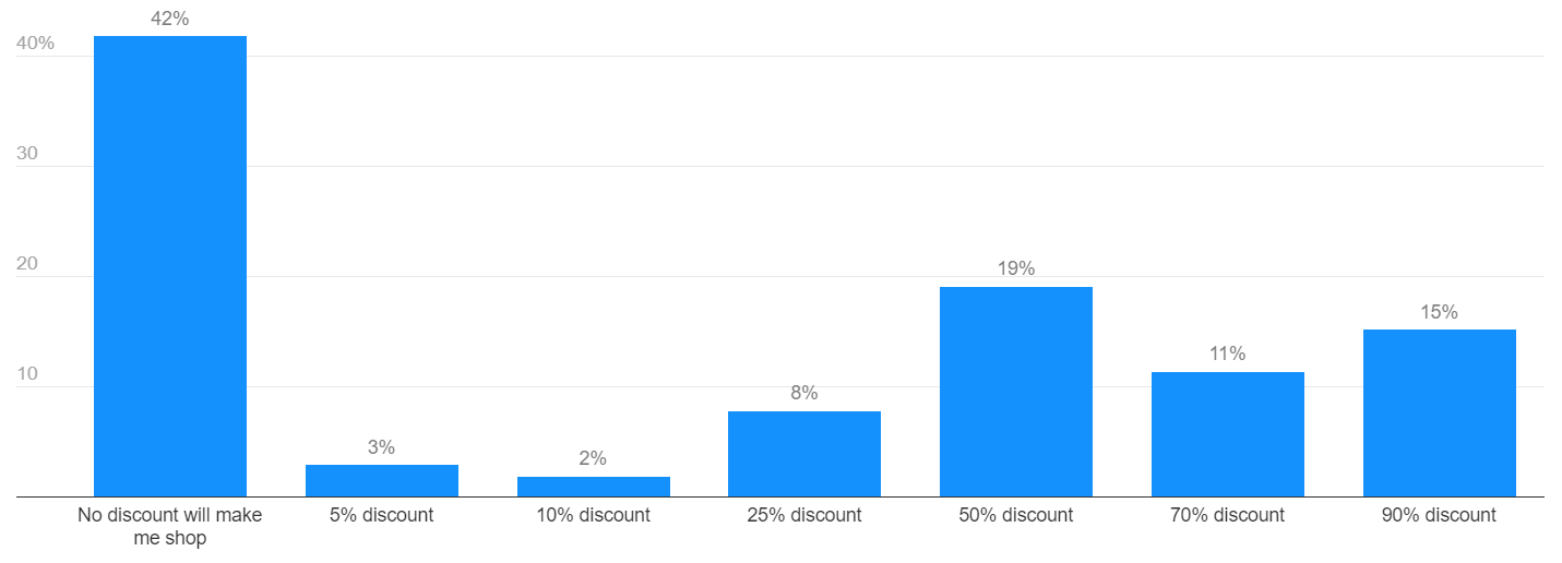
According to their 2021 survey of American consumers, 58% of people are ready to shop during Black Friday if the price is lucrative enough, with 50%, 90%, and 70% discounts in the top-3 of most common answers. The takeaway is, only big enough discounts attract customers — if you can’t drop prices by 90%, offer something else. For example, here’s a Black Friday email from Orangewood, a store that sells acoustic guitars, ukuleles, and accessories.
Orangewood offered free accessory kits for those who purchase guitars and redeem the promo code. It’s not just the “buy 1 get 1 free” model. Imagine how useful this is for aspiring guitarists who don’t know which extra items they need. That’s a great replacement for straight up discounts that give customers more value.
Chubbies: Schworts for your food coma
When it comes to Black Friday emails, it’s easy to underestimate the power of a copy that is more complex than “here’s the code, get 50% off everything”. It’s necessary to give all the information about your offer — but if you do more than that, you can increase loyalty, email engagement, and brand recognition. For example, this Black Friday campaign by Chubbies is on the more creative side. This men’s apparel brand that sells “proper length men’s shorts”, flannels, and other casual and athleisure clothes, launched a new “product” for the occasion:
One fun thing about this email is that it suggests the solution to the oddly specific problem — having eaten too much during Thanksgiving and needing a pair of comfortable pants. Not that this problem doesn’t exist but it’s so random it catches subscribers off-guard and creates a comic effect, along with a cringey new term, visual choices, and a Spaceballs reference. This approach to Black Friday email copies won’t suit all brands. However, if done well and in line with the brand’s values, personality, and target audience, such creative campaigns work wonders.
Bottle Rocket: Happy capitalism day!
Bottle Rocket is a small hot sauce business that focuses on fresh local ingredients, small batches, and all things natural and delicious. Their brand personality can be described as the one with attitude. They’re not afraid to call their Facebook page subscribers “hotties” or post food photography with suggestive captions like “i would f that pizza”.
This simple Black Friday campaign is well-aligned with their social media image:
The subject line is “all sauces are $6.90 each today”, as simple as it may be. We like this email because it’s laconic but still effective and it’s almost painfully self-aware — and we love a brand that doesn’t take itself seriously. This Black Friday email is a good example of how you can express your brand in marketing emails — the all-lowercase text and the informal delivery matches the tone of their social media posts.
Cards Against Humanity: Dear horrible friends…
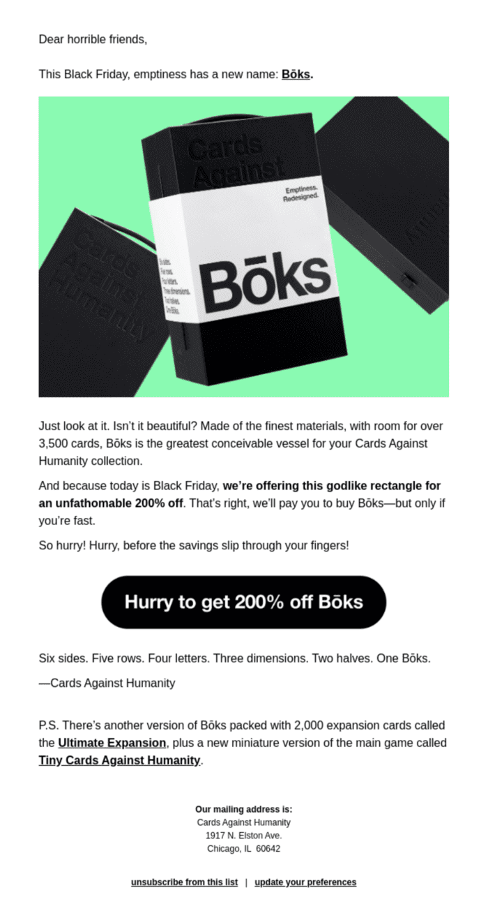
Cards Against Humanity is an adult board game that gained popularity thanks to obscene humor and satire. The game is a bit of an acquired taste — so is their brand. For example, this Black Friday email is borderline aggressive:
Well, maybe calling your subscribers “horrible friends” won’t work for every business — but it feels natural for a brand like Cards Against Humanity to use this language. But it’s not the reason why we like this email.
The best part is the CTA. We’re used to the idea that emails are supposed to give something valuable to customers, which implies that CTAs should describe what your customers will get for clicking the button. But Cards Against Humanity completely rejected the idea of a valuable CTA and straight up suggested customers giving money for nothing. Even better, they claimed that giving them $5 is somehow a once-in-a-lifetime opportunity. It’s actually a smart joke that subverts the idea of Black Friday itself — no matter how great the deal is, you still spend money, so how is that profitable to anyone but corporations? At least this email is honest.
Finally, being a little scandalous and unconventional in your email campaigns can do good for you in the future. This email is mentioned in many articles like this one — it’s basically a free promotion for your brand. Good job, Cards Against Humanity, we bought into it too.
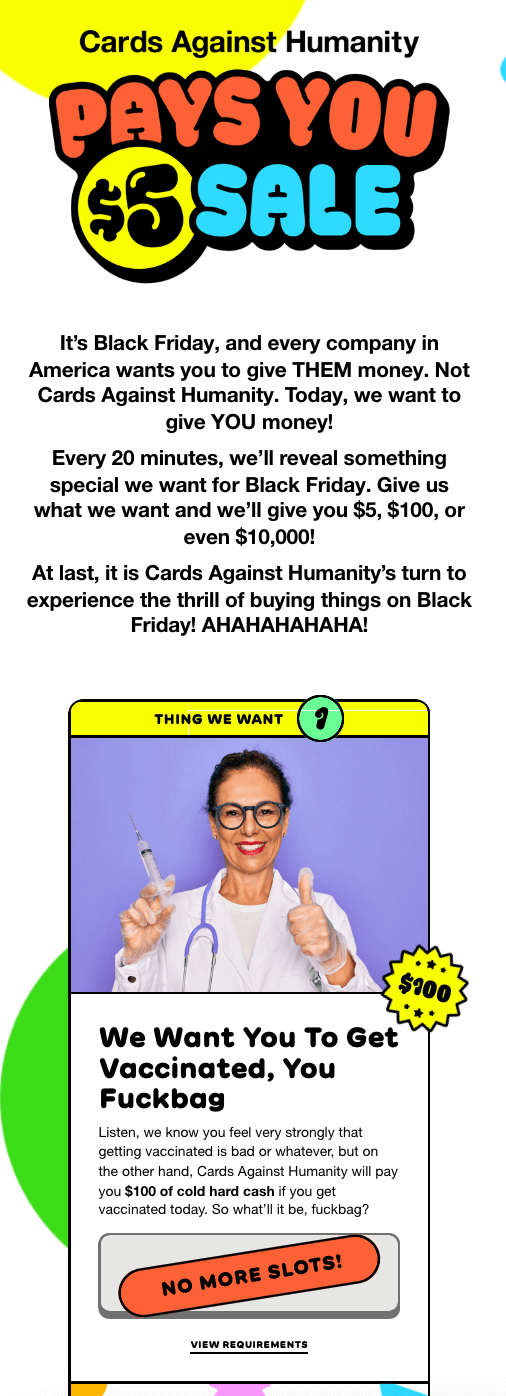
Speaking of unconventional, their subsequent Black Friday email marketing campaigns are just as great. For example, in 2021, the brand’s customers got an email with the subject line Cards Against Humanity Pays You $5. The design of this Black Friday campaign is completely different from the other one. Despite the subject being Black Friday, there is very little black in this email:
You’re probably wondering: how does this Black Friday marketing strategy work exactly? The button at the bottom of this email campaign led to a landing page where shoppers were asked to do a task to earn money. Tasks dropped every 20 minutes and amounted to a total of 27 ranging from getting vaccinated, advertising the Black Friday event landing page to sharing a dumb Netflix password. A very unusual e-commerce marketing strategy to say the least! But the brand’s customers were ready to cooperate, and the campaign was a success.
Where do you even go from here, right? Well, this marketing team knew exactly what to do with their 200% off sale or Race for Savings.
This email is full of a sense of urgency and redirects customers to — you guessed it — another landing page dedicated to another ingenious Black Friday marketing campaign event.
Vans: Gifts for every wallet
The previous campaigns are great — but you don’t have to be an anti-capitalist satirical comedian to make a good Black Friday email. For example, take a look at Vans. This popular skateboarding apparel brand came up with an awesome campaign without radical subversion:
You might think there’s nothing special about this email — but we like it for many reasons. Firstly, adding several links sorted by pricing is a great idea. Secondly, Vans frames Black Friday as a holiday similar to Christmas. Many apparel brands promote Black Friday as a rare opportunity and mostly use anxiety-inducing urgency tactics. Vans showed that you can make a decent campaign for the season without keeping customers on edge. Instead, you can show them how much fun it is, give them a holiday playlist, a little game to play, and a selection of gifts for every wallet.
Veil: It ain’t over yet!
Veil’s Black Friday campaign is a great example of how you should write email copies for small businesses. This company makes a very niche product — a perfume for eliminating the smell of cannabis. How can you even promote something so specific?
Take a look at this:
What we like about this email is that it doesn’t feel salesy. With its informal and emotional delivery, the use of slang words, and plain text emojis this email doesn’t look branded — it gives you the feeling of your friend inviting you for a giveaway. This e-commerce marketing tactic is great for small and niche businesses like Veil. Instead of aggressively promoting something, create the “human face” for your company and treat your customers like friends when it comes to content marketing. Since you’re already working for a small niche, increasing the revenue by growing the customer base is harder. But there’s a way out. Emails like this will help you create a small but extremely loyal community of customers who will come back for your product again and again.
What could make this Black Friday email campaign even better? Personalization in the email body or at least in the subject line. However, there are other ways to make your Black Friday email subject lines stand out.
The Citizenry: Black Friday but make it non-profit
The Citizenry is a hand-crafted house decor brand inspired by different cultures around the globe. The company’s values include fair trade, sustainability, and good work ethic.
It would be weird to write a typical Black Friday sales email for a business that cares about social justice. Here’s what they did instead:
The Citizenry didn’t do anything new — non-profit or anticapitalist Black Fridays have been done before. For example, O My Bag has their own Black Friday fund and REI has been closing their shops during the busiest shopping season for years, having made it a non-negotiable part of the brand policy in October 2022. However, we still like this campaign, and here’s why.
When it comes to socially conscious businesses, it’s often hard to believe such companies — but The Citizenry does practice what it preaches. And the Black Friday fund is one of many confirmations of their values. Another good thing is that they don’t just send money to a random charity organization — their goal is as specific as possible, they described it in great detail. It’s a very good tactic when you ask customers for a favor — they should know what they’re agreeing to.
Sweaty Belly: Wheel of Fortune!
Sweaty Belly is a British women’s gym clothing and accessories brand. Here’s what their 2021 Black Friday email campaign looked like:
This company launched a little Black Friday lottery on its website and used emails to draw more attention. They also suggested taking part in an offline scratch-off available at brick-and-mortar stores. Not only do we think that a little gambling as a Black Friday offer is a smart idea — but we also like how it was promoted. Sweaty Belly made an excellent design choice with the spinning wheel and little hints that show what customers can win — both discounts on certain categories and free items. This tactic entices subscribers to go check on the website and play, maybe even more than once to get a better prize. Just an invite to the lottery with no clear description and a simpler email design wouldn’t work as effectively.
HUF: An email from Pinterest
Here goes another email from an apparel business — meet HUF, a streetwear apparel from the UK. If you want to know how to make a tasteful and stylish email for a clothing store, ask them — or take a look at their Black Friday campaign:
Using the black-white-golden color scheme for Black Friday email is a little obsolete, especially if you want your marketing campaign’s design to stand out. This email from HUF is an awesome example of how you can make a beautiful and festive Black Friday campaign without overused tropes. A simple, minimalist layout and button design go well with neat high-quality images and photographs in the same warm and earthy palette. HUF is a streetwear brand — but this email looks luxurious thanks to smart picture choices. It’s like looking at a Pinterest board — pure visual satisfaction.
Elementor: B2Black Friday
When it comes to Black Friday, people mostly associate it with crazy discounts on clothes and gadgets. Should B2B companies join the party? Ask Elementor, a free WordPress website builder with a number of advanced paid options and tools. Here’s what they did for Black Friday:
What can you offer as a B2B service during the season? Elementor suggested a discount for their most expensive plans, targeting those customers who build websites for business purposes. A straightforward email copy and CTA, a stylish two-tone palette choice that puts a little twist on the baseline Black Friday campaign design, and a countdown GIF for some sense of urgency — that’s a great success recipe. Good job, Elementor!
Weird Fish: Black Fry-day
You may or may not like puns — but you’re going to love this Black Friday marketing email from the British apparel brand:
We like this email for many reasons. First things first, it’s a great use of puns — the “Fry-day” bit wouldn’t work for a brand that hasn’t got “fish” in its name. Even better, the joke is extended to “sizzling hot deals”, continuing the culinary metaphor.
Another good thing about this campaign is the email design. We like the cute little fish and the neon-on-black color choice. And this email is not just tasteful, it’s also functional — we appreciate links for clothes in different sizes, which is convenient for e-commerce customers.
Forever21: Black Friday with a twist
We already mentioned that the black-white-golden color scheme is overused in Black Friday emails. But what if you absolutely have to stick to design cliches? Look at this email by Forever21:
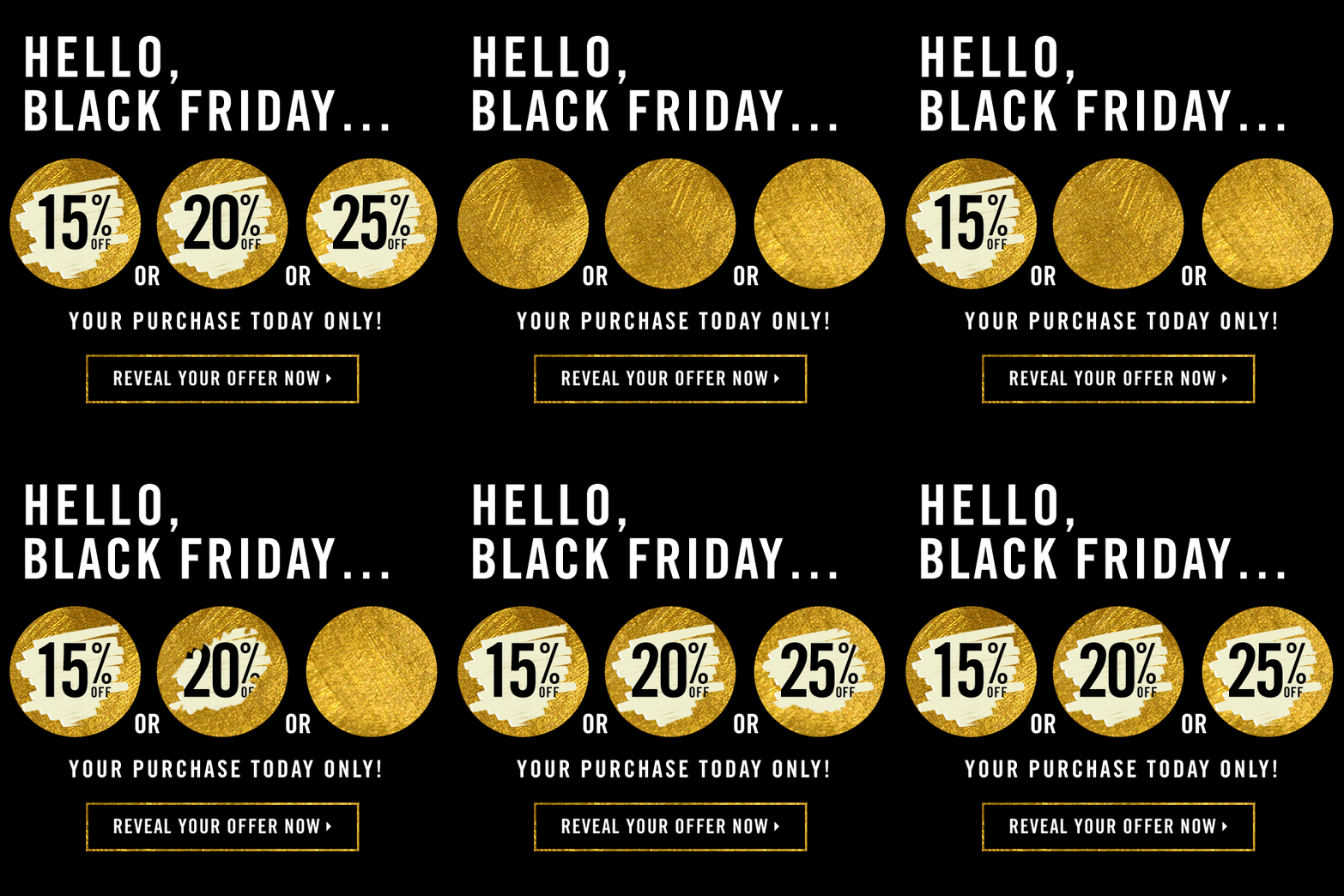
The takeaway is, if you have to use cliches, think of a unique delivery. For example, this Black Friday email uses a scratch-off visual that not only coincides with the lottery-like offer but also slightly subverts the design trope. Even better, it’s animated. GIFs in emails are a nice touch to the message because movement draws attention and tells a short story that adds extra meaning to your content copy.
Do you need more marketing inspiration? Check out our article on great Black Friday marketing campaigns to see creative and effective examples from different brands.
Carhartt: A blinding offer
Here’s another example of a great use of GIFs in a Black Friday campaign from Carhartt, a popular streetwear brand:
This neat, perfectly looped animation of raising blinds is a part of the email copy — when they rise, more text is revealed, and we like that integration. Another interesting detail is that this GIF creates a narrative — this email reveals that the sale has started, and, as the blinds raise, we get this information. Finally, like HUF, it’s an awesome example of a streetwear apparel brand that presents itself as a luxury brand — the minimalist design and the monochrome color palette are usually associated with high-end products.
Art of Play: Style is everything
Have you ever seen an email design so intricate you just can’t stop staring at it? Well, you are about to see one. Take a look at this great Black Friday campaign from Art of Play — a company selling toys, games, and other things designed to evoke a sense of wonder and curiosity:
This retro-feeling Black Friday email is just perfect. From warm, nostalgic colors to textured images, different fonts, and little plusses uniting different sections of the campaign — it’s full of details. It makes us excited for the brand’s next campaigns, what Cyber Monday email ideas will there be? From a marketing standpoint, this campaign drives urgency with the subject line and heading stating “Today Only”. Plus, at the bottom of the email is free shipping information pushing customers to shop one last time.
Grammarly: Make it thematic
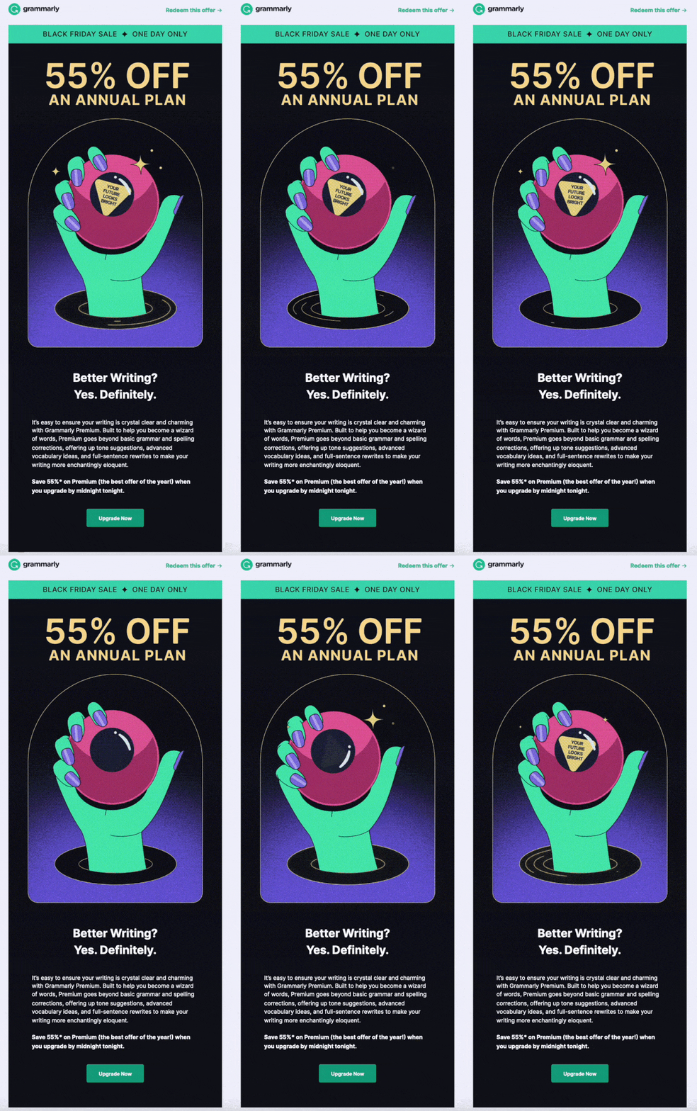
Some associate Black Friday with Christmas shopping and festivities. But you don’t have to stick to this image. You can draw inspiration for your campaign anywhere. Grammarly — a popular writing assistant — chose magic to promote 55% off an annual plan deal:
The banner of this campaign is a simple promotion of the Black Friday deal, but the most prominent part of this email is the banner GIF. A green hand appearing from a black portal shakes the magic 8 ball to reveal a message: Your future looks bright. The GIF makes the email recipients spend a little more time on the email to see the prediction, and this in turn motivates them to consider the offer. So this theme serves a practical purpose and not only an aesthetical one.
Want to see another magical thing? Check out our marketing Tarot predictions!
Wrapping up
Black Friday is a great opportunity to boost your sales and remind subscribers about your business with an email campaign. Even an email as simple as a brief offer description with a discount code will work. But these emails we selected show how creative you can be with sales campaigns. Experiment with design and stay away from basic templates, write unusual content copies, don’t be afraid to be funny, goofy, or ironic if it fits in your brand, or talk to your customers as if they were your friends. And who knows, maybe next year your email will be in listicles like this one 😉
This article was originally published in November 2022 and was updated in October 2023 to make it more relevant and comprehensive.


