


Key takeaways
- Landing pages are standalone web pages designed for specific marketing goals like sign-ups or purchases.
- They focus on driving a specific action, reducing distractions, and converting visitors into customers or subscribers.
- Landing pages differ from homepage and product pages in terms of goals, content, and navigation.
- Key elements of a high-converting landing page include a clear value proposition, focused call-to-action, visual hierarchy, trust signals, and lead capture elements.
I bet you’ve seen a landing page before, even if you didn’t realize that’s what it was called. Every time you sign up for a free trial or register for a webinar, chances are, you’re doing it on a landing page.
In this article, we’ll cover what exactly landing pages are, how they differ from other kinds of websites, why they’re so good at converting, and what elements to include in yours.
What is a landing page?
This section is all about the basics of landing pages and why they’re important to marketers.
Landing page definition in digital marketing
A landing page is a standalone web page created for a specific marketing goal. It’s typically designed to encourage one action: think sign up, download, register, buy, and so on.
Visitors usually arrive from email campaigns, paid ads, social media, and other sources.
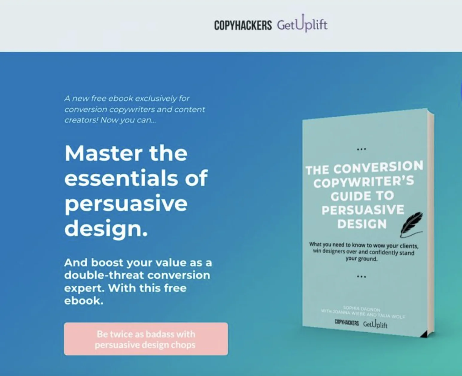
Unlike a regular website page, a landing page has a single focus. It also has fewer distractions or navigation options. Here’s a common example: a page offering a free e-book in exchange for an email address.
A landing page can be:
- Short-term (Black Friday offer, webinar registration, product launch).
- Long-term (free trial signup page, demo booking page, newsletter signup page).
The main purpose of a landing page
The main purpose of a landing page is to drive a specific action from visitors and focus on a single conversion goal. To put it simply, it basically has one job. This means removing any distracting elements that might pull attention elsewhere.
Here are a few core goals of landing pages:
- Encourage visitors to take a specific action.
- Focus attention on a single offer or goal.
- Generate leads, sales, signups, downloads, or registrations.
- Reduce distractions compared to a regular website page.
- Help convert visitors into customers or subscribers.
Landing page vs website page: What’s the difference?
Landing pages and web pages may look similar (landing pages ARE a kind of web pages after all!), but they serve different purposes. Unlike landing pages, web pages of other kinds often provide more information or many navigation paths.
Landing page vs homepage
You can think of a homepage as the main entry point to a website. It introduces the brand, company, product, or service. It also encourages visitors to explore the website.
Here’s how it compares to a landing page:
| Feature | Landing page | Homepage |
| Main goal | Convert visitors | Introduce the brand |
| Content | Focused on one offer | Covers many topics |
| Navigation | Minimal | Extensive |
| Best for | Campaigns and promos | General visitors |
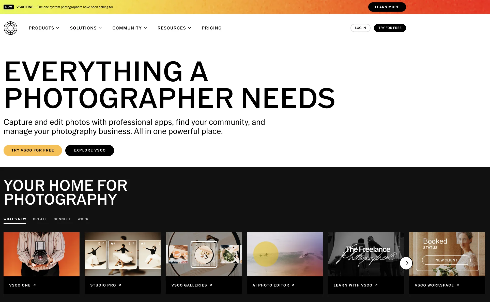
Let’s compare the two visually. I’m sure you’ve heard of photo editing software VSCO. Here’s their homepage. As you can see, a general visitor would be able to learn about VSCO and what it does from this page.
And here’s a landing page focusing on one single feature, VSCO One. I received a link to this page via email. There’s minimal navigation and the focus is on a single offer.
Landing page vs product page
Product pages are permanent parts of an e-commerce website. They help customers learn about a specific item before purchasing. Sounds a lot like a landing page, right? Wrong! Here are the main differences.
| Feature | Landing page | Product page |
| Main goal | Drive a specific action | Provide details about a product |
| Content | Focused on one offer | Product specifications, pricing, images, reviews |
| Navigation | Minimal | Part of an online store or website |
| Best for | Campaigns and promos | Helping shoppers evaluate a product |
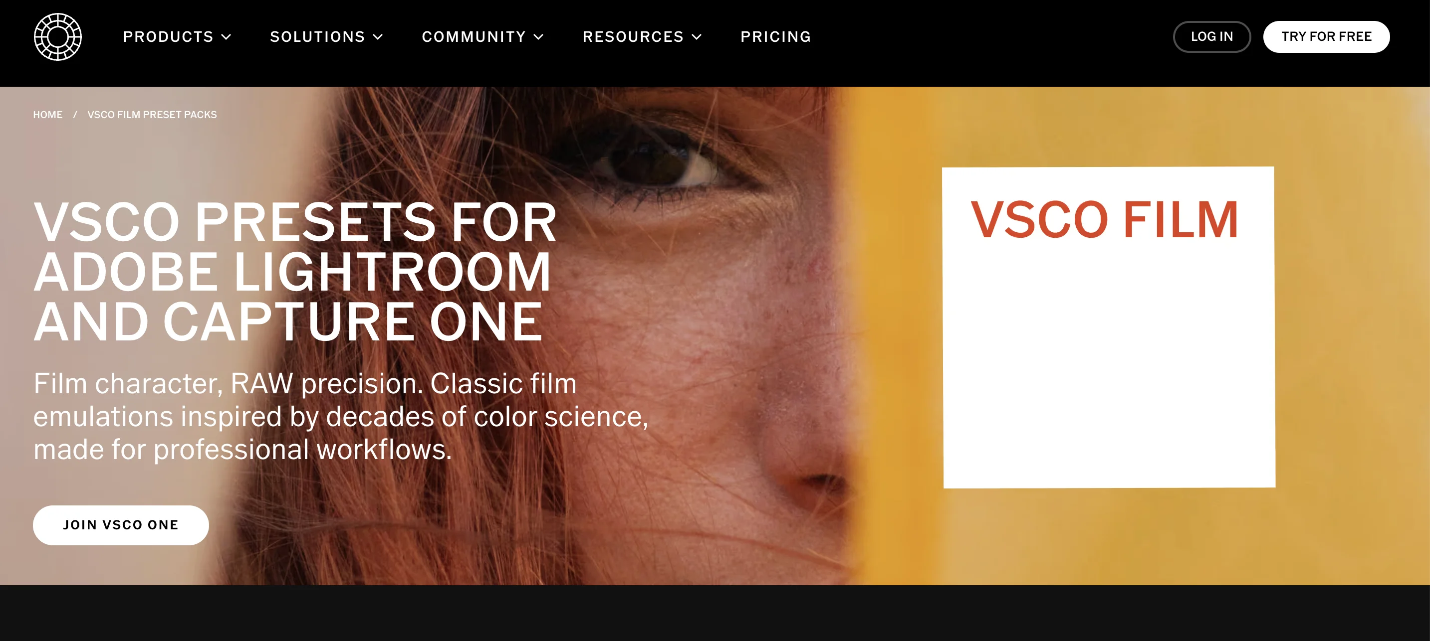
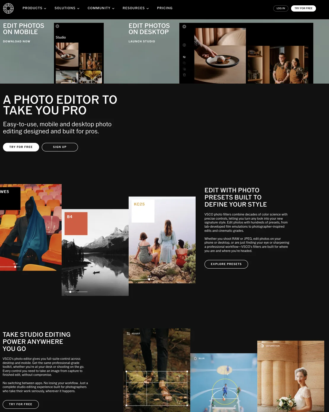
Let’s have a look at a product page from VSCO promoting its photo editor.
Unlike their landing page we saw earlier, this page is designed to explain and showcase a broader product, with multiple features, sections, and calls to action for visitors to explore.
Why landing pages focus on a single goal
So, to sum it all up, landing pages are designed around one desired action because having too many options can distract the visitor. A clear call to action makes it easier for visitors to decide what to do next. Fewer links and competing messages help keep attention on the offer. And here’s a little bonus: a single goal makes results easier to measure.
Why landing pages are important for marketing
Landing pages play an important role in many marketing campaigns. They can support several marketing goals like sales and lead generation, among others. Let’s have a look at some of the main reasons marketers use landing pages.
Higher conversion rates compared to regular pages
Since landing pages focus on one goal, they are often easier to optimize for conversions than general website pages. According to a report by Unbounce, the median landing page conversion rate across all industries was around 6.6%, based on 41,000 landing pages, 464 million visitors, and 57 million conversions. However, benchmarks vary a lot by industry, traffic source, offer, and page goal. For example, Unbounce reported a lower median conversion rate of 3.8% for SaaS landing pages, while email traffic to SaaS landing pages converted at a much higher median rate of 16.9%. So instead of treating one number as a universal target, use landing page benchmarks as a starting point for testing and optimization.
Real-world tests support this idea too. According to a test run by Instapage, visitors who clicked an ad and landed on a dedicated landing page converted nearly three times more often than those who were sent to the company’s homepage.
Better targeting for marketing campaigns
You don’t need to create a single landing page and call it a day. In fact, you can create different landing pages for different audience segments and traffic sources. This allows you to tailor messaging to the needs of specific customers and align the content of your page with your campaign goals. This can help you increase relevance and improve user experience through personalization. Also, you can test different messages for different audiences.
Improved tracking and performance measurement
The fact that landing pages are dedicated to a single goal makes it easy to track campaign performance. It’s easier to identify which channels drive the most conversions and to connect results to a specific campaign. Common metrics include conversion rate, form submissions, signups, purchases, cost per conversion, and bounce rate.
Landing pages are also really easy to run A/B tests on. You can test everything from headlines and CTAs to page design.
You can use what you learn to optimise future campaigns and gain a clearer understanding of your ROI.
Key elements of a high-converting landing page
If you’re building a landing page, and you want it to convert as much as possible, be sure to include the following elements.
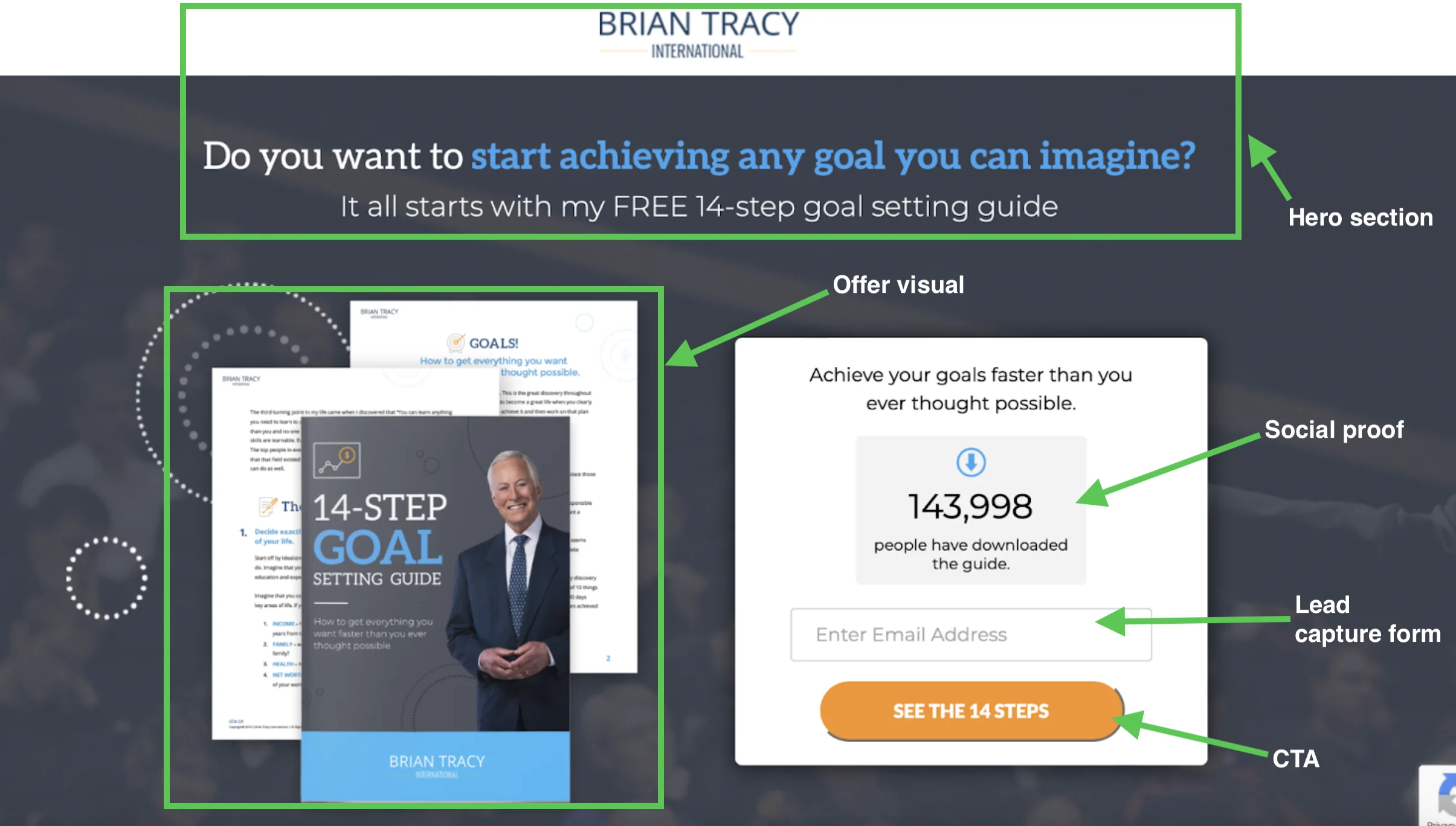
Clear value proposition and headline
The headline is often the first thing visitors see, so it should communicate immediately what the offer is.
Try to explain the main benefit and the outcome. Don’t get bogged down by details like company features, and instead focus on customer needs. Highlight key benefits using clear wording and easy messaging. Make sure the message on your landing page matches the source that brought visitors there, whether it’s an ad, an email, or a social media post.
Let’s imagine you’re writing landing page copy for an email service platform. An example of a weak value proposition would be, “The best marketing platform!”. Instead, try something like “Create and send email campaigns in minutes” to help visitors understand the benefit of your offer quickly.
Focused call-to-action (CTA)
A call-to-action (CTA) tells visitors what action to take. This means that the way you phrase it is important.
Make sure it’s clear and specific, and try to use action-oriented language. You don’t want to distract or confuse your visitors, so avoid using more than one primary CTA whenever possible.
Make the button easy to find. In general, ensure it aligns with the goal of your page.
Visual hierarchy and page layout
Make sure you organize content in a logical order. Guide visitors’ attention toward important information and make all crucial elements (like the headline and CTA) easy to spot. Break content into clear sections and try to avoid unnecessary elements and clutter. Support your message with images and design elements.
A basic landing page flow usually looks like this:
- Hero section with the main promise and CTA.
- Benefits that explain why the offer matters.
- Proof, examples, or visuals that make the offer easier to trust.
- Form or CTA that makes the next step obvious.
- Follow-up trust signals that reduce hesitation.
In terms of visual hierarchy, use larger text for headlines so they stand out. Use contrasting colors for CTA buttons and clear separation between sections. The layout should be clean and simple to ensure easy navigation throughout the page.
Make sure it’s optimized for mobile. This is where it gets interesting. According to Unbounce, mobile devices account for almost 83% of traffic, yet convert 8% lower than desktop. Because of this users tend to abandon landing pages that aren’t optimized for browsing on phones or tablets.
Trust signals and social proof
The purpose of those is to reduce doubt and push the visitor towards conversion. There are different types of social proof. They include customer reviews (like short quotes or star ratings), case studies, user counts (“10,000 businesses use our services….”), brand logos and ratings from websites like G2 or Trustpilot.
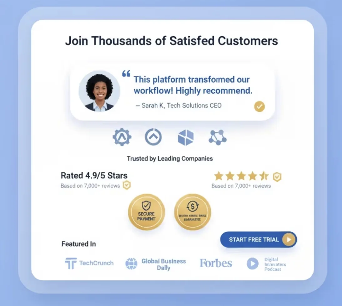
Consider using non-opinion trust signals as well. These include security badges (such as payment protection or GDPR compliance), a clear refund policy, “no credit card required” messaging, as well as clear and easy-to-find contact details.
Forms and lead capture elements
The goal here is to collect lead information without making the whole process feel like too much effort for the visitor. The main rule for forms is to keep them short. Fewer fields usually mean higher conversion rates. In most cases, asking for a name and email address is enough.
In terms of form design, make sure there’s a clear headline above the form (something like “Fill out the form to start your free trial”). Use simple labels and try to avoid jargon!
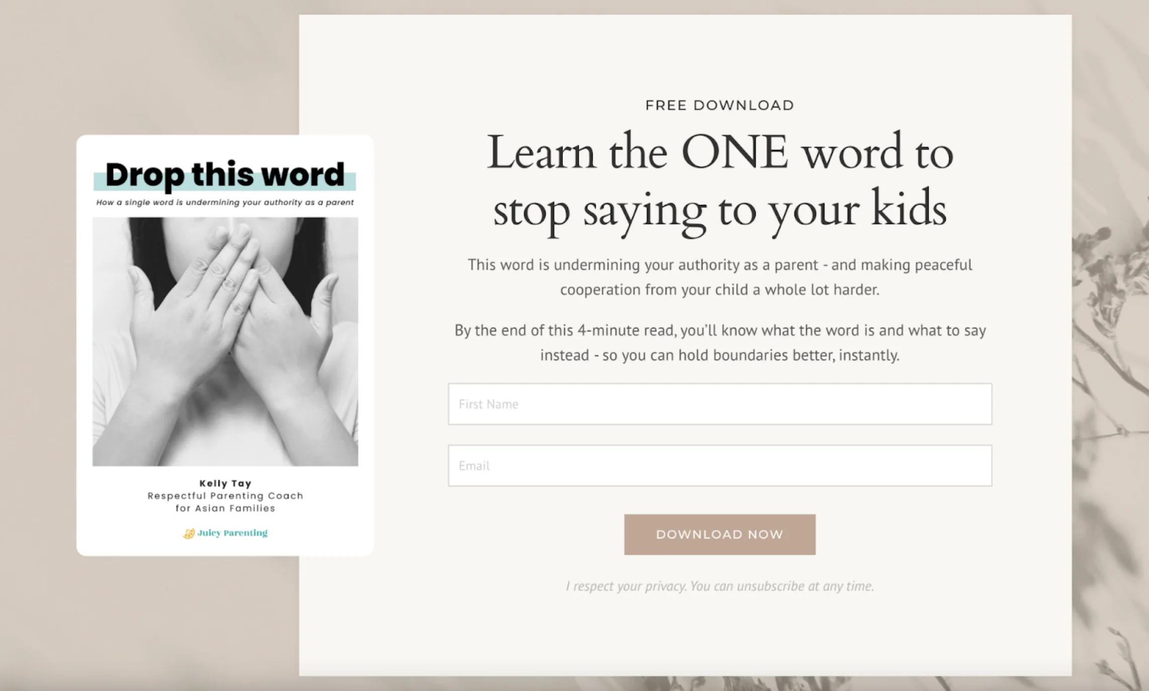
Don’t forget about checkbox opt-ins for email marketing consent. Last but not the least, make sure your form supports autofill options so everything feels seamless for the visitor.
| Element | Weak version | Stronger version |
| Headline | “Improve your marketing” | “Create your first email campaign in under 15 minutes” |
| CTA | “Submit” | “Download the free checklist” |
| Form | 8 required fields for a simple guide | Name and email only |
| Social proof | Generic “trusted by many” claim | Specific testimonial, review score, or recognizable customer logo |
| Visual | Decorative stock image | Product screenshot, offer preview, or image showing the result |
| Copy | Long feature list | Benefits tied to visitor pain points |
| Navigation | Full website menu with many links | Minimal or no navigation |
Common types of landing pages
Here are some of the most common types of landing pages you’ll see on the internet.
Lead generation landing pages
Lead generation is basically collecting contact information from a visitor, usually their email address and name, and sometimes their phone number. The goal isn’t to make a sale right away, but to get a lead you can follow up with later.
Lead generation landing pages usually offer something valuable (like a discount, guide, webinar, free trial and so on) for contact details. Think of it as visitors “paying” with their data instead of money.
The structure usually includes a clear offer, a short explanation of its value, a form, and a CTA button.
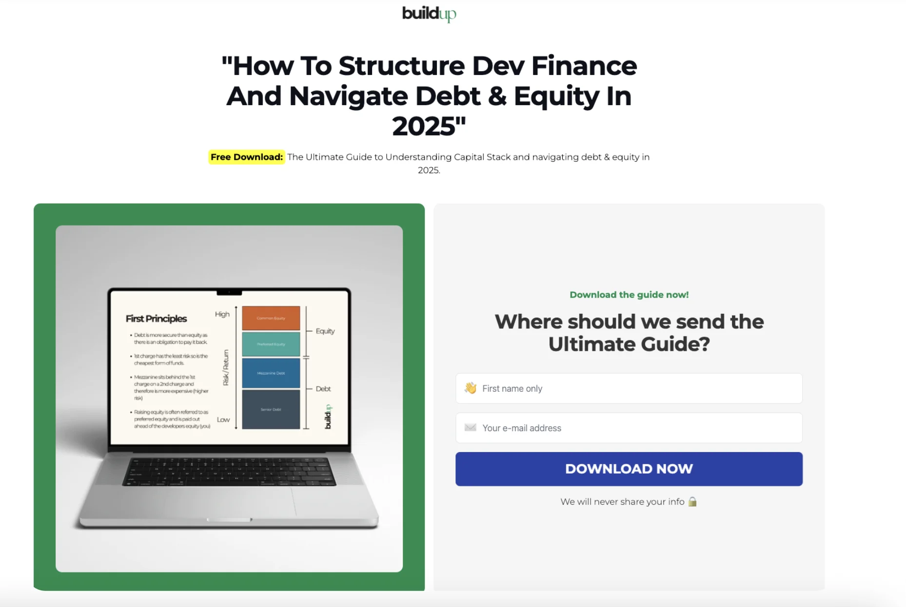
Common use cases include newsletter signup, guide downloads, discount codes for e-commerce and so on. They can be commonly found anywhere that offers something in exchange for contact details.
Click-through landing pages
This type of landing page “warms” the visitor up before sending them to another page. The aim here is not to capture data, but to get the click, so often there’s no form to fill out.
It works by explaining the offer in simple terms, building interest, and finally pushing the user to the final CTA button (like Buy Now or Continue).
A click-through landing page typically has a clear value proposition, a section highlighting the main benefits, visuals (such as product screenshots), trust signals, and one main CTA repeated a few times throughout the page.
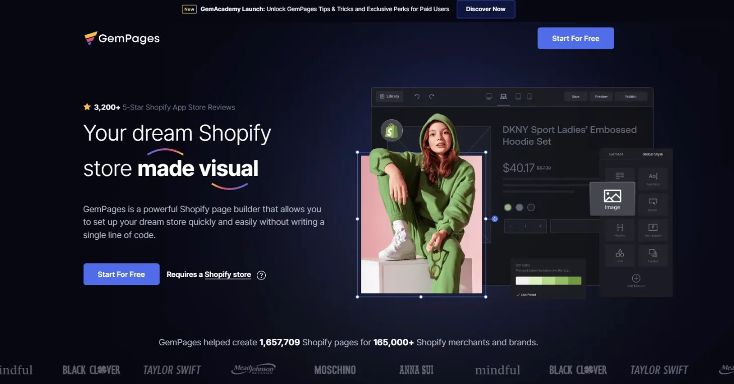
You can typically find these kinds of landing pages in e-commerce (product details before checkout), SaaS pricing pages, and affiliate marketing.
Sales landing pages
As the name may suggest, this type of landing page is built to directly sell a product or service. The goal is immediate purchase or sign-up with payment.
The goal is to guide the visitor from interest to decision to action. So, a sales landing page should focus on persuasion, not just info.
A sales landing page typically has a strong headline highlighting the offer and the expected outcome, benefits that focus on the user rather than just product features, clear pricing, CTA buttons (such as “Buy Now” or “Start Today”), urgency (for example, a limited-time offer), and trust signals. It often follows a simple structure: a problem, the solution, proof, and the details of the offer.

They’re commonly used in e-commerce product pages, SaaS paid plans and digital product launches.
Product launch landing pages
This kind of page introduces a new product or feature. The main goal is to build interest while also simultaneously driving early signups or purchases. It explains what’s new and why it matters, and creates hype and urgency around the release.
In a landing page like this, the bold announcement headline does a lot of the work (for example, “Introducing…” or “Now Live!”). It explains the product clearly, often using a problem-and-solution approach. It also features product visuals and key features (you don’t want to get too technical), an early access or waitlist CTA, and trust signals such as quotes from beta users or early adopters.
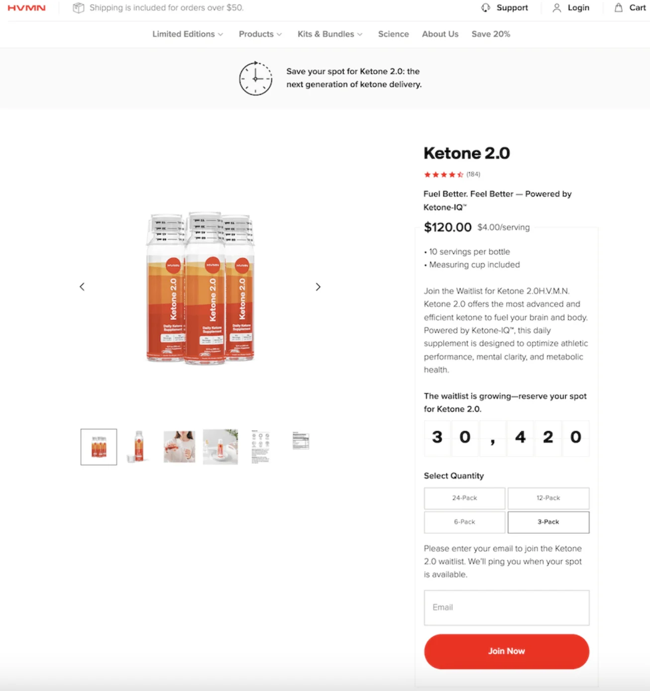
Common use cases include: SaaS feature drops, new apps, new physical products in e-commerce, or even major updates or redesigns.
Event or webinar registration pages
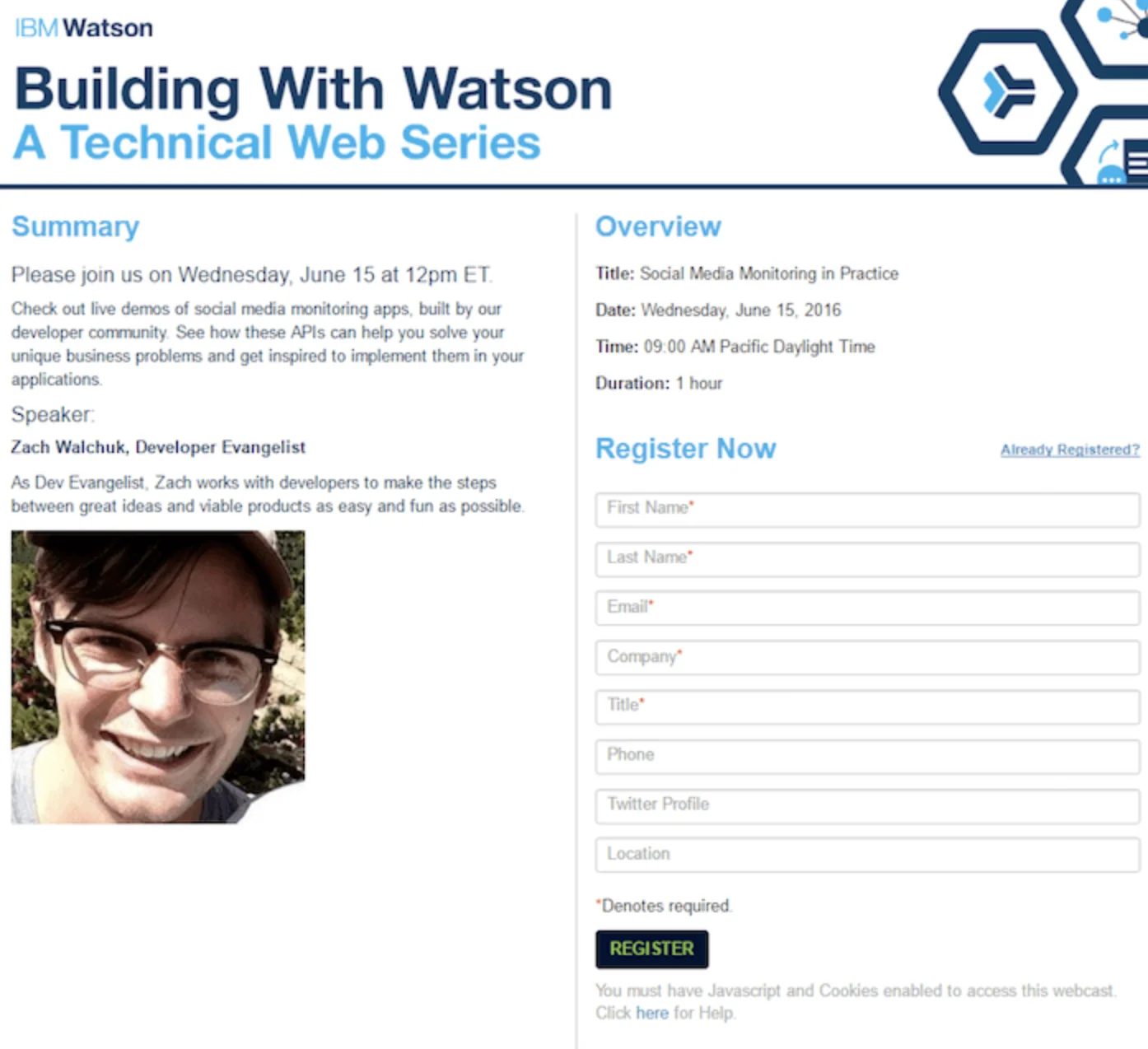
Again, this one is self-explanatory. These pages are used to get people to sign up for an event, online or offline. This includes seminars and webinars, workshops, live demos, conferences, and many other kinds of events.
The page explains what the event is about, convinces users it’s worth their time, and collects their registration details.
Key elements include the event title and topic, event information such as the date, time, and duration (important!), who the event is for, speaker information, the agenda, a registration form, and a CTA. It can also create urgency (for example, by highlighting limited seats) and remind visitors about the benefits of attending.
How to create a landing page that converts in 6 simple steps
You don’t need to build a complex website to create a useful landing page. Start with one goal, keep the offer clear, and follow this short checklist. For a deeper walkthrough, read our full guide on how to create a landing page.
- Define one clear conversion goal before writing copy or designing the page.
- Know your audience and match the page message to their intent.
- Write a strong headline that explains the main benefit quickly.
- Add one clear CTA and repeat it only where it helps the user move forward.
- Keep the design simple, scannable, and mobile-friendly.
- Test the headline, CTA, form, and layout, then improve the page based on results.
How landing pages are used in marketing campaigns
Here are the most common ways landing pages are used in marketing.
Landing pages for paid advertising
Landing pages for paid advertising are used when traffic comes from paid ads. The way this works: someone is scrolling on Google, they see an ad, they click on the ad, it takes them to the landing page.
Paid traffic costs money, which means that every click needs a good chance of turning into a conversion. A homepage is usually too general, whereas a landing page is focused on a specific offer and audience.
In this case, the landing page needs to match the message of the ad, so that there’s consistency between things promised in the ad and the page. So, these pages need to continue the offer from the ad while following the same best practices as any other landing page.
Landing pages for email marketing
In email marketing, landing pages are used when traffic comes from an email campaign. The main idea is to continue the message from your email on the landing page. The landing page is supposed to expand on what was promised in the email, to remove distractions, and to push towards one clear path (like downloading or signing up etc).
The contents of the landing page itself are similar to those used in other kinds of marketing campaigns. Additionally, try to personalize whenever possible.
It works because the user is already warmed up (such as when they opted in to receiving your emails) and they have higher intent than those who just happened upon an ad.

Landing pages for social media campaigns
These are used when traffic comes from social media posts or ads. A user clicks on a link on a post or story on Instagram, Facebook, or TikTok, for example, and lands on a dedicated page built for this specific campaign.
It’s similar to other kinds of landing pages, but here there’s an additional emphasis on mobile optimization because most users will be browsing on their mobile phones or tablets. Fast loading and easy scrolling are crucial.
Landing pages for organic search traffic
Organic search traffic is when a user clicks a non-paid result in Google or another search engine. The page ranks naturally because it’s relevant or SEO-optimized. There’s no direct cost per click as opposed to paid ads, which we already looked at earlier in this section.
So, landing pages are used in this instance when visitors come from search engines. They search a question or a problem, click on an organic result, and land on your page. The main idea here is to match search intent and answer exactly what the user is looking for.
These kinds of landing pages should provide direct and relevant info immediately and guide the user towards the next step. They should be keyword-focused, but still have natural content.
This strategy works because the user already has intent: they are actively searching for this info. The landing page just needs to satisfy their query and guide action.
Landing page best practices for better performance
Here are some tips and tricks to make sure your landing pages perform the best they can. We have already touched upon most of these, but we thought we’d reiterate!
- Keeping the page focused on one goal. Each landing page should have one objective. Everything on the page should support that single action. If you have many goals, you can create multiple landing pages to satisfy each of them.
- Reducing distractions and navigation. You don’t want anything pulling the user away, so remove any unnecessary links or menus. The fewer exit points the user has, the higher the chance of conversion.
- Using strong visual and copywriting techniques. Keep copy simple and benefit-focused rather than feature-heavy. Don’t forget about the importance of a good headline. Use visuals to support the understanding, make sure they’re not distracting. Finally, structure the content to make it scannable.
- Optimizing for mobile and page speed. Pages should load quickly and work smoothly. Otherwise, your visitors may get frustrated and abandon the page altogether.
Examples of when businesses should use landing pages
As you can see, different kinds of businesses use landing pages for many different types of marketing campaigns. But here’s what you can do to make your landing pages work even harder for you.
Landing pages in modern digital marketing
Modern websites don’t rely on one page for everything. Instead, they use multiple focused landing pages. In modern UX, landing pages are often built as dedicated campaign pages that match a specific audience, offer, or search intent. This replaces the old approach of sending all visitors to the homepage.
Different users arrive with different needs, and one generic page can’t serve all of them effectively.
Integration with email marketing
In 2026, it’s easier than ever to integrate your landing pages with your email marketing strategy. They’re often connected with email marketing tools and ESPs.
Email campaigns and landing pages work as one system. Email drives traffic and landing pages convert it. This integration matters because it keeps messaging consistent across the page and allows you to track the performance of your campaign end-to-end. It also makes it easier to segment and follow up with users.
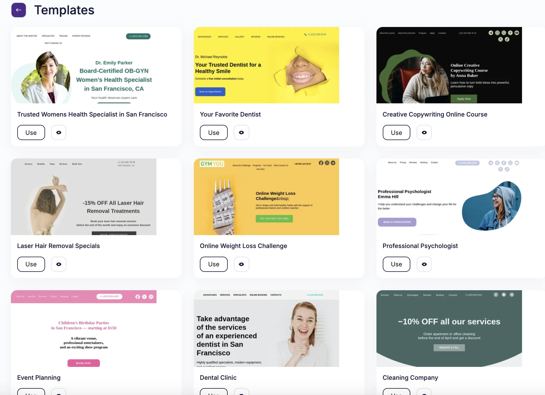
In fact, many ESPs offer landing page builders so you don’t need to use multiple tools improving speed and consistency. And Selzy is no exception. Check out our landing page builder. We’d be remiss if we didn’t show off our extensive library of landing page templates.

Role of landing pages in omnichannel campaigns
An omnichannel approach means using several marketing channels, like ads, social media, email, and even offline, in a connected way for a consistent customer experience.
Landing pages can act as a single point of conversion across many marketing channels. Users may arrive from emails, ads, search, or other sources. Regardless of where they come from, they can land on the same page with the same goal. This helps keep everything consistent, regardless of the channel that brought them there.
AI and personalization in landing page design
You don’t need to do everything by hand. AI can adapt landing pages based on user behavior. Different users can see different versions of the same dynamic landing page. Content is tailored to make it more relevant to them. AI can change headlines on offers based on user source or intent, can show different content based on whether it’s a new or a repeat visitor, recommend products based on behavior, and so on.
FAQ
What is a landing page in digital marketing?
A landing page is a standalone web page created for a specific marketing goal. It is designed to encourage one action, such as signing up, downloading, registering, or buying. Visitors usually arrive from email campaigns, paid ads, social media, or other sources.
How is a landing page different from a regular website page?
A landing page has a single focus and fewer distractions, while other website pages often provide more information and multiple navigation paths. Landing pages are built to convert visitors on one offer, whereas regular pages may serve broader purposes. This makes landing pages especially useful for campaigns and promotions.
What is the main purpose of a landing page?
The main purpose of a landing page is to drive a specific action from visitors. It should focus on one conversion goal and remove anything that might distract from it. Common goals include generating leads, sales, signups, downloads, or registrations.
When should a business use a landing page?
Businesses should use landing pages when they want to promote a specific offer or drive a particular action. They can be short-term, such as for a Black Friday offer, webinar registration, or product launch, or long-term, such as for a free trial, demo booking, or newsletter signup. They are especially effective for campaigns and promos.
What makes landing pages good at converting visitors?
Landing pages convert well because they concentrate attention on a single offer and reduce distractions. By limiting navigation and keeping the page focused, they make it easier for visitors to complete one desired action. This direct approach helps turn visitors into customers or subscribers.
 New and noteworthy on our blog