Standard email dimensions overview
Email is a great way to communicate with your customers. However, if you don’t format your emails correctly, they won’t get the attention they deserve. Using the right dimensions ensures that your content is properly aligned and displayed on any device, from smartphones to desktop screens. This improves your audience’s user experience and makes your emails look more professional thanks to improved readability and enhanced visual appeal.
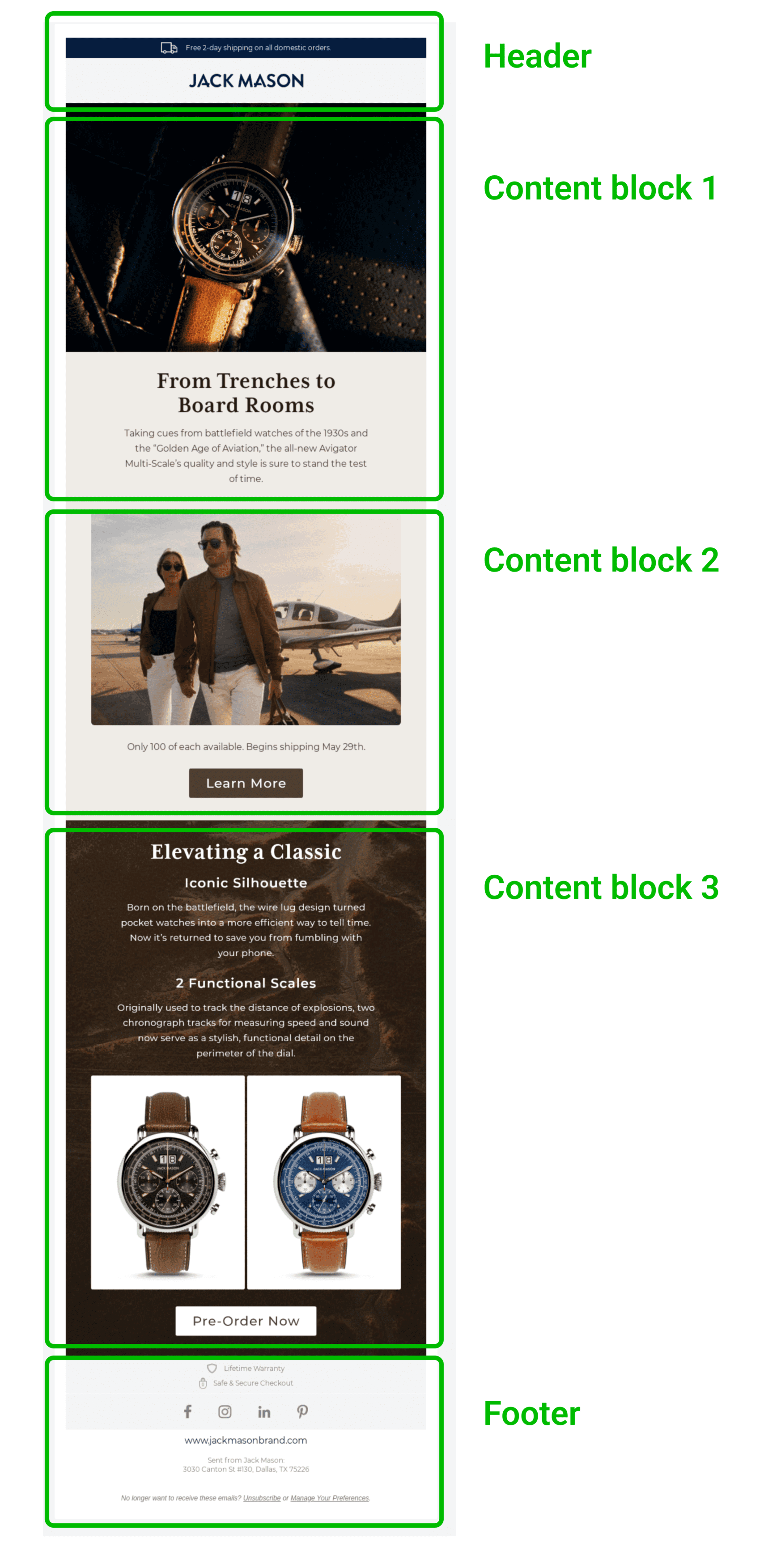
To understand how it works in more detail, let’s talk numbers. We will consider such parameters as width and height, block sizes, headings, content blocks, etc. Use the table below to quickly determine the ideal newsletter sizes:
| Ideal size | Maximum size | |
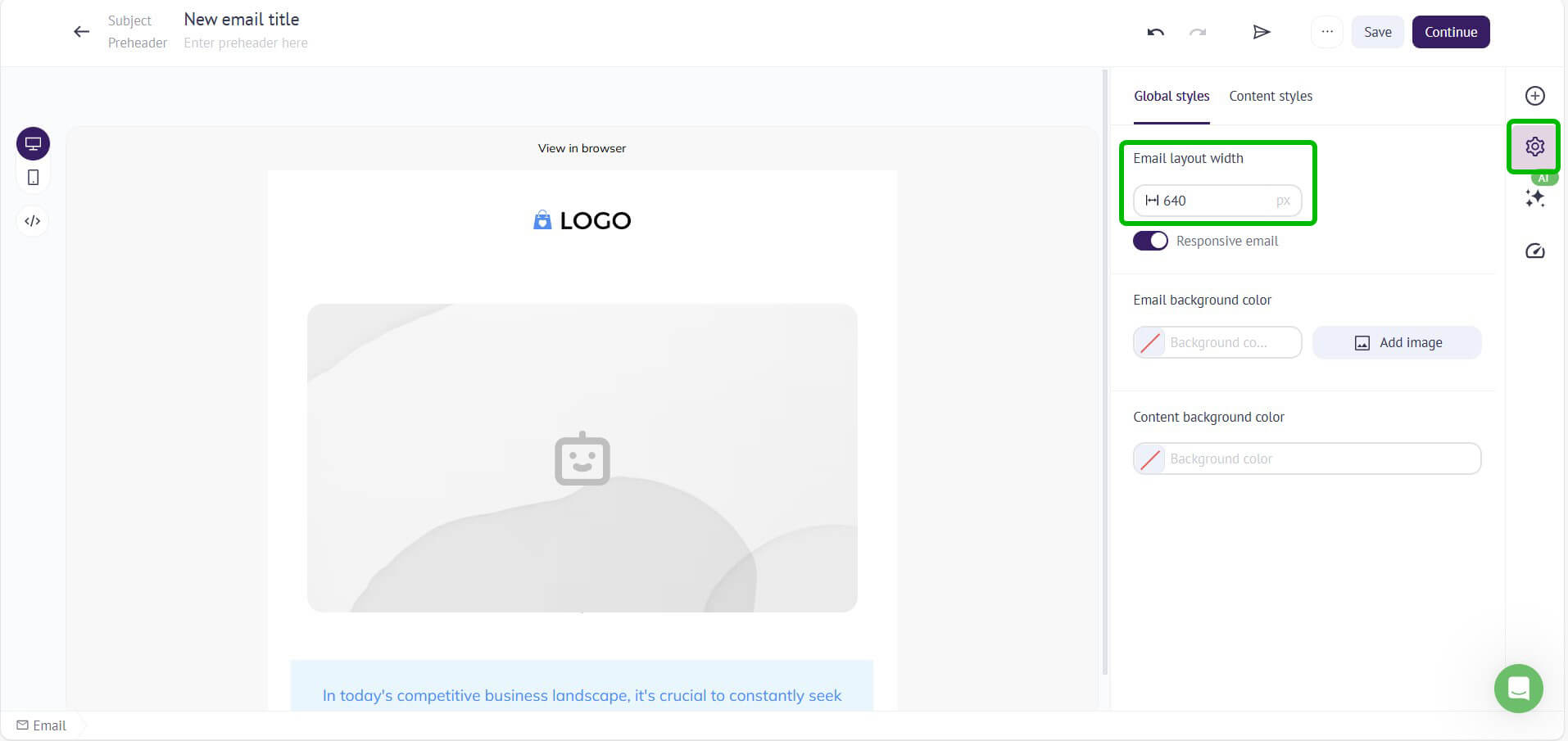
| Template width | 600-640 px (desktop) 320 px (mobile vertical) |
800 px (desktop)480 px (mobile horizontal) |
| Template height | 1500 px | 3000 px |
| Header (height) | 70 px | 200 px |
| Content blocks (total height) | 800 px | 1200 px |
| Footer size (height) | 100 px | 300 px |
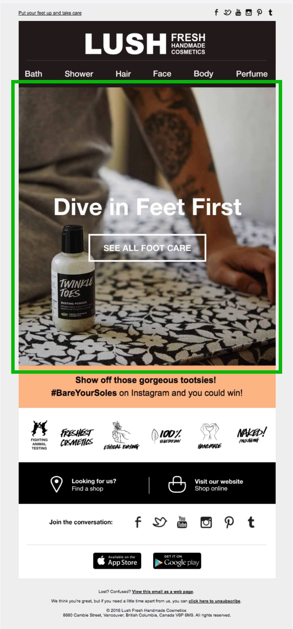
| Email banner | 600×730 px | 700×1730 px |
| CTA button | depends on the campaign | depends on the campaign |
| Image | 600×650 px (depends) 200 KB |
depends on the campaign 1 MB |
| GIF | 500 KB | 1 MB |
| Email file size | 75 KB | 102 KB |
In general, the ideal width for email templates is around 600-800 pixels. This allows for a comfortable reading experience on most devices and ensures that your content is not shortened or cut off on smaller screens. However, there is no one “best overall” size for an email, as the appropriate size depends on the specific goals of the campaign and email design.


