How To Craft a Perfect Direct Mail Design

How To Craft a Perfect Direct Mail Design
21 March, 2023 • ...
Irene Dmitrieva
by Irene Dmitrieva

Direct mail in a digital world is only for old people? Actually, no. In reality, it is still an effective way to reach out to customers and prospects of all ages. But it takes more than just a good copy and a piece of compelling design to create effective direct mail ads. To ensure the success of your direct mail campaigns, you should incorporate certain best practices. With the right know-how, you can craft the perfect pieces that will result in happy customers for your business. In this article, you’ll learn about some key direct mail design tips you should use for maximum success with every mailing.

What is direct mail and how can it benefit your business?

Direct mail is one of the oldest but still quite successful forms of marketing. It involves sending physical printed materials directly to potential customers. 

The most common types of direct mail are:

  • Brochures
  • Letters
  • Flyers
  • Newsletters
  • Catalogs
  • Greeting cards
  • Coupons, etc.

Direct mailing offers numerous advantages that can help your business succeed. Let’s take a look at some of these benefits.

You can reap a bountiful return on your investment, as the average campaign ROI for letter-sized envelopes is an impressive 112%.

You can easily track the success of your mail campaign. Create unique contact information for each mailer, such as a dedicated landing page or QR codes to simplify the process for subscribers. If you’re aiming to receive calls, implement a specific phone number to use only in connection with that particular message. 

Less competition. On average U.S. households only received 361 pieces of direct mail throughout 2021, a stark contrast from the 120+ emails they receive or send daily. Meaning that direct mail has far less rivalry with other companies vying for attention.

Direct mail has the potential to make a lasting impression. Unlike minimalist email design, direct mail can be complex and unique since it’s a real physical object. When people receive a tangible copy that sticks around — on their fridge door or table tops — they are more likely to remember your business when looking for similar products and services. But to truly captivate customers, direct mail needs something appealing — be it a $10 off coupon for a nearby pub or restaurant, an invitation to explore the new shopping mall in town, or even just a useful checklist sticker. As you’ll see from examples in this article, successful direct mail pieces are anything but “flat” or predictable.

When it comes to Account-Based Marketing (ABM) strategies, direct mail is a priceless tool. ABM is a joint effort of sales and marketing teams working together to create tailor-made experiences for valuable customers. Direct mail has a tangible quality that leaves an impact on the recipient. This idea was proven through a study, which found that physical materials hold greater meaning and allow for a better connection to the content presented. By sending direct mail to your clients, you can be sure that it will stay on their minds for longer periods. In turn, this increases their likelihood of responding and capitalizing on the offer. The ABM campaign examples that can be used to great success include custom packages that are sent directly to the target customer. These can contain your branded items or mini-catalogs or brochures of your products and services.

Tips for creating an effective direct mail design

Want to make sure you get the most out of your direct mail campaigns? Here are some top-notch design tips that will help you maximize success and ensure a high return on investment. Some of these guidelines will also be a great asset in creating your next email design, allowing you to maximize its potential.

Know your audience

Crafting a successful direct mail piece requires knowing your clients. It is no use sending out material to an indiscriminate bunch of people. Instead, determine your target audience and ensure that your message reaches the intended demographic. Once you have grasped the type and amount of information needed, suitable offers or images — only then can you begin designing something persuasive that works in tandem with your words.

For example, if you’re sending a mailing to seniors, you may want to choose a more traditional font and color palette. If you’re targeting millennials, on the other hand, you may want to use bold colors and modern fonts. With demographic in mind, it’s much easier to craft an effective design that resonates with your target audience.

Choose the perfect size and format

The format here refers to the type of material you send — menus, postcards, brochures, etc. There are several factors determining the format. To choose the right one for the job, answer these questions:

  • What information (and how much of it) do you need to include? If you want to showcase the new product, a brochure is a good option. But if you need to make a short announcement, opt for something smaller like a letter or a postcard.
  • What’s the occasion? If it’s the birthday of your customer, for example, a postcard would be fitting.
  • Who are you targeting? New customers or prospects may not expect a catalog from you right away.
  • What’s your budget? The bigger the mailing, the more expensive it is.  

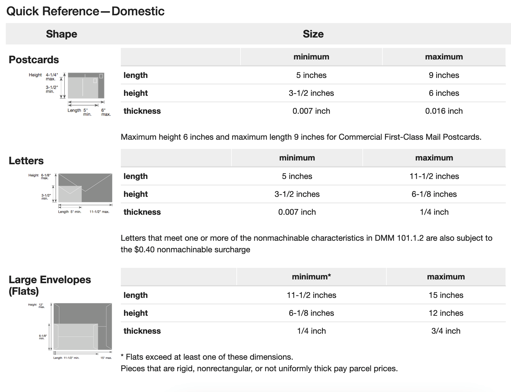
Direct mail can have different sizes depending on the type of mailing. You can see the USPS dimensions guidelines below. Note that “flats” here refers to magazines, newsletters, and large-sized envelopes.

USPS guidelines for dimensions for domestic mailings
Source: USPS

As long as you stay within these limits, the height and length can vary. Here are some typical dimensions for popular types of direct mail:

  • Postcards: standard (4″ x 6″), medium (5” x 7”), large (6” x 9”), or extra large (6” x 11”)
  • Letter envelopes: #10 (4.125” x 9.5”), monarch (3.875” x 7.5”), #9 (3.875” x 8.875”)
  • Insert sizes: for #10 (4” x 9.25”), for the monarch (3.75” x 7.25”), for #9 (3.75” x 8.675”)

When you mail prospects, keep in mind the effect of the size. A large postcard to announce a sale will bring far more attention than a smaller flier ever could. Larger prints increase the cost, though. So carefully consider your budget and messaging before deciding on the format.

Decide on the color scheme wisely

The colors you choose for your direct mail design have a big impact on how readers perceive it. The colors need to be inviting and create an overall pleasant aesthetic, as well as stand out from the rest of the mail pile. Stick to two or three main colors and use them consistently throughout the content to maintain uniformity.

Crafting creative mail with your brand’s colors increases recognition and recall among recipients. If they frequently see the distinctive tones and patterns, these will form strong associations with you.

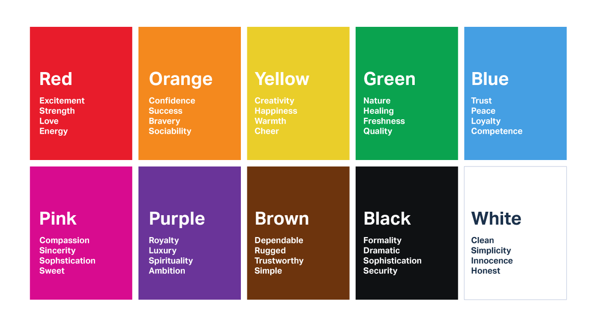
When selecting colors for your campaign, you can choose hues based on the emotions that they evoke. Here are some of the feelings associated with popular colors:

A scheme showing emotions associated with colors
Source: UserTesting

Research the images you use

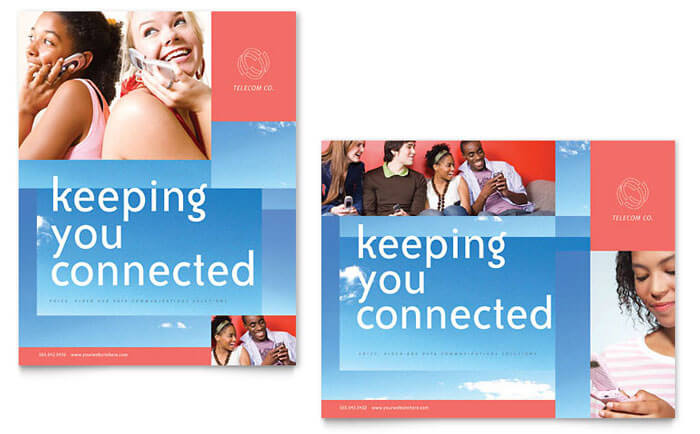
When it comes to selecting visuals for your copy, you have two choices: using stock images or taking your own photographs. Depending on the product or service you’re offering and its message, one option may be more suitable than the other. For instance, a wellness company might opt for a stock image of someone’s positive lifestyle: photos of people cycling outdoors with kids, traveling abroad, or simply enjoying dinner. Alternatively, tech companies might choose to arrange photoshoots capturing users interacting with their newest gadgets. This way, the brand can showcase how customers benefit from the device in real-life scenarios.

A postcard example for a communications company
Source: StockLayouts

When choosing your images, use high-resolution photos of at least 1200 dpi. Furthermore, it is always best to stay away from cluttered backgrounds and refrain from putting text directly on top of a photo as this will reduce readability.

Stick to your brand standards

Stay true to your brand’s identity. Make sure that all aspects of your logo, tagline, tone of voice, stylistic elements, and more remain consistent. It helps to make a memorable impression on the public and sets your business apart from the competition.

A Shopify direct mail example
Source: Who’s Mailing What!

Shopify used the company’s signature green hues for this mailing. On top of that, there’s a logo in the top left corner to amplify brand recognition.

Keep your copy concise

To make sure your copy is successful, be concise and straightforward. Concerning direct mail postcards, adhere to a heading followed by just a few sentences for the best results. Don’t forget about key elements like an offer, call-to-action (CTA), and contact information. For letters specifically — keep them limited to one page only.

This brochure is a prime example of what not to do:

An example of a failed brochure
Source: AKB design

It’s jam-packed with text and images, leaving no space for the reader to pause or engage. With this type of design, comprehension levels are drastically hindered, so avoid it at all costs.

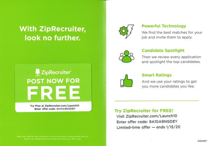
A direct mail example from ZipRecruiter
Source: Who’s Mailing What!

Personalize your direct mail pieces

How can you ensure that your direct mail pieces are pertinent and meaningful for clients? Use variable data printing (VDP) — a form of fast printing that allows marketers to tailor messages and designs to each individual. In other words, VDP makes every piece highly relevant.

By modifying content or pictures to fit the receiver’s interests and data, you can make your message more meaningful. This fosters a deeper connection with your mail piece, leading to increased response rates and returns on investment.

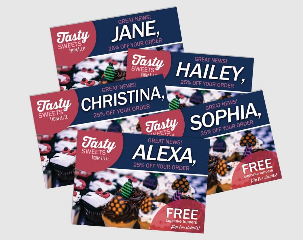
As an example, let’s take a retail candy store that wants to send out a “25% off order” offer. Through variable data printing, the business can personalize the design with the customer’s name in the discount message.

Coupons made with variable data printing
Source: Minuteman Press

Make use of white space

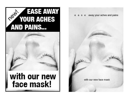
White space (or negative space) is a critical element of any direct mail design. White space refers to the blanks between various elements on your pieces such as your logo and CTA, not an actual color. This serves two purposes: drawing the recipients’ attention to important features and preventing overcrowding that could distract from these key components.

While both texts in the example are almost identical, one of them is more reader-friendly. On the right side, there is more white space which makes reading smoother. In contrast, its counterpart on the left has crowded visuals that make it uncomfortable to read.

An example of poor and good use of white space
Source: A List Apart & Our Authors

Thanks to the white space readers’ attention is focused on essential information like a sale or promotion. It also helps them comprehend the content more clearly while guiding their journey and giving certain sections greater weight.

Include an irresistible call-to-action

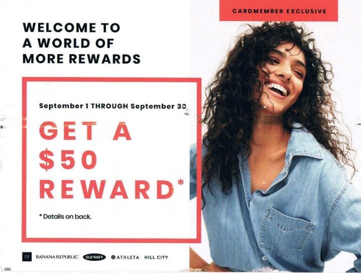
If you want to get noticed, don’t be afraid of being bold. Direct potential customers to the desired action with a large typeface, vivid font colors, and arrows or highlighted boxes.

Shorten the path to the next step — be it an address, phone number, or website. Adding personalization with a QR code, or tailored map conveys that you have the ideal solution for their specific needs.

A GAP direct mail piece with a prominent CTA
Source: Who’s Mailing What!

A/B test your designs

To ensure your design won’t fall flat, it’s time to test its efficacy. Set up A/B testing by crafting two mail pieces that have one altered element such as the copy, images, headlines, call-to-action (CTA), offer, colors, or fonts. Divide your audience in half, give each group a different mail version, and see which performs better. The results will serve as guidance for future campaigns.

Best direct mail designs for your inspiration

A direct mail campaign is sure to grab people’s attention and get them excited. These examples will give you the inspiration to create a successful, engaging direct mail design of your own.

Bold text

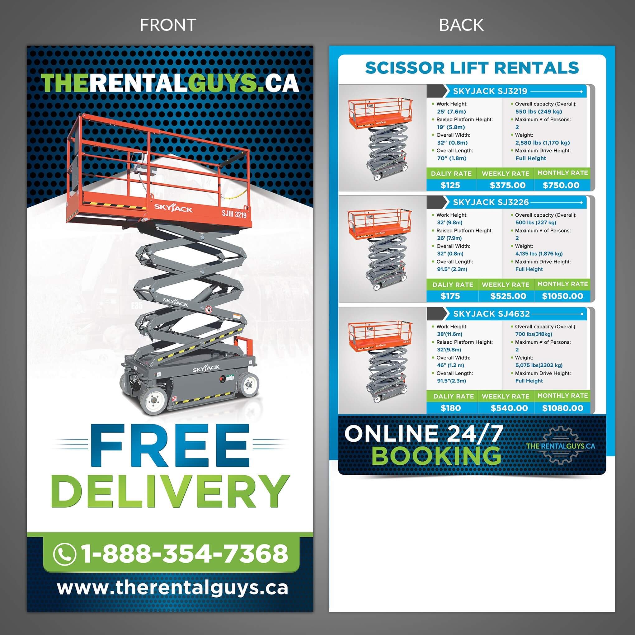
Let your message be the first thing a recipient notices when they receive your direct mail piece. TheRentalGuys.ca postcard ensures that its main marketing statement (free delivery) is the most noticeable. The company used bold fonts and captivating design elements which take up prominent space on the postcard.

Bold text in a postcard
Source: 99designs

Graphic design is an art, so striking a balance between bold text and complementing visuals is key. Don’t be tempted to go overboard with the typography. Instead, consider maintaining breathing space for your layout to achieve maximum impact.

Shaped text

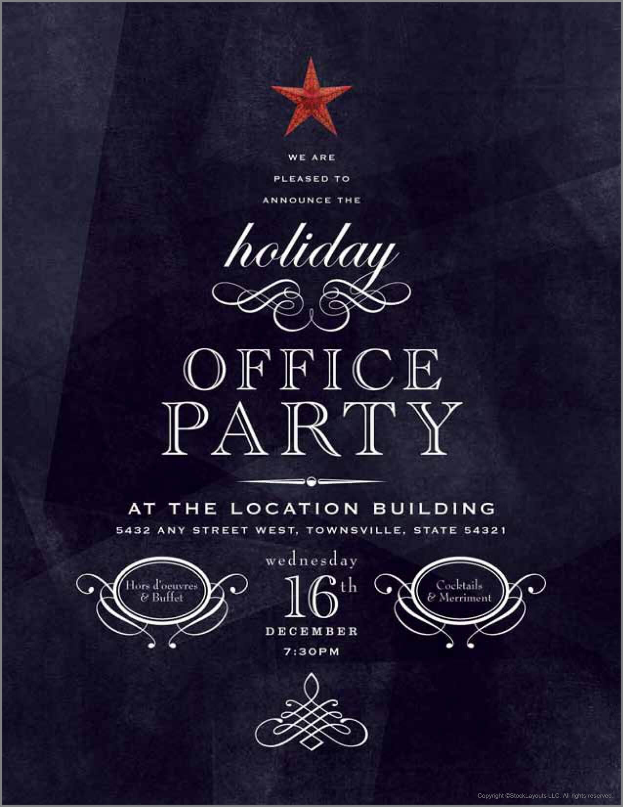
Catch attention with fun and creative shapes. Every Door Direct Mail’s office party invite illustrates how organizing text into a tree shape is an instant hit during the winter holidays.

The use of shaped text in a postcard
Source: Every Door Direct Mail

Think outside the box — from beer bottles to flowers, you can design all sorts of eye-catching visuals to make your direct mail piece stand out in someone’s mailbox. 

Die-cut design

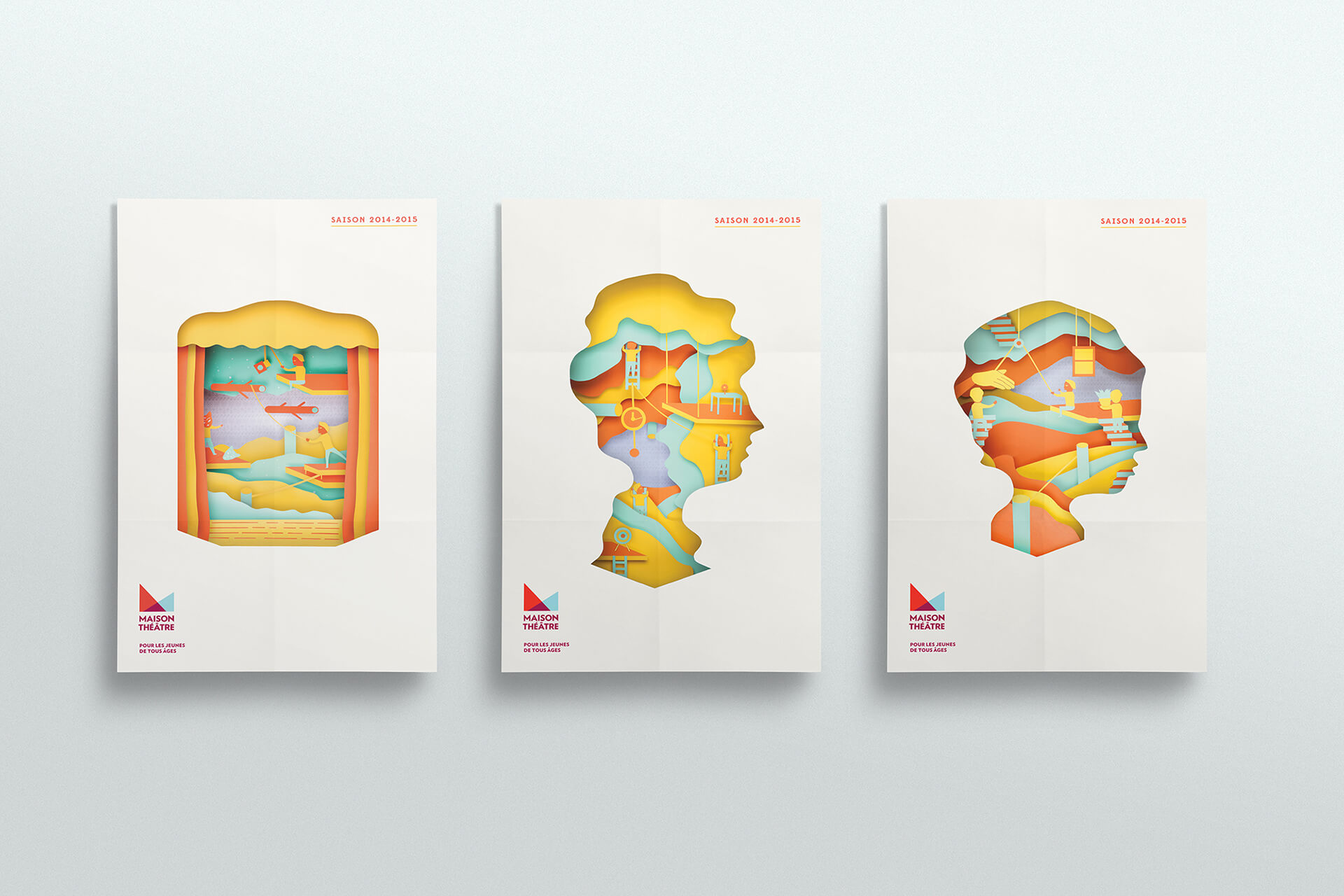
Brochures are an ideal way to promote your business through direct mail. Not only are they lightweight and cost-effective, but you can also make them even more eye-catching with die-cutting. This technique will make your mailing unique in look and texture. A custom design like this ensures that customers recognize the effort put into creating something special for them — one of many powerful direct mail ideas for promotion.

Die-cutting brochures example
Source: Behance

Interactive mail

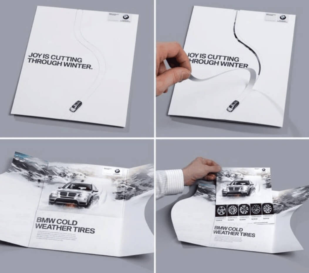
If you have the means, there’s no better way to establish a connection with your customer than through an interactive mail piece. Take this BMW example, for instance. Thanks to perforated paper customers make their own path on the wintery postcard which emphasizes that the company’s snow tires are both dependable and controllable. This envelope-mailer combo is truly ingenious.

Interactive postcard example
Source: Blue Print

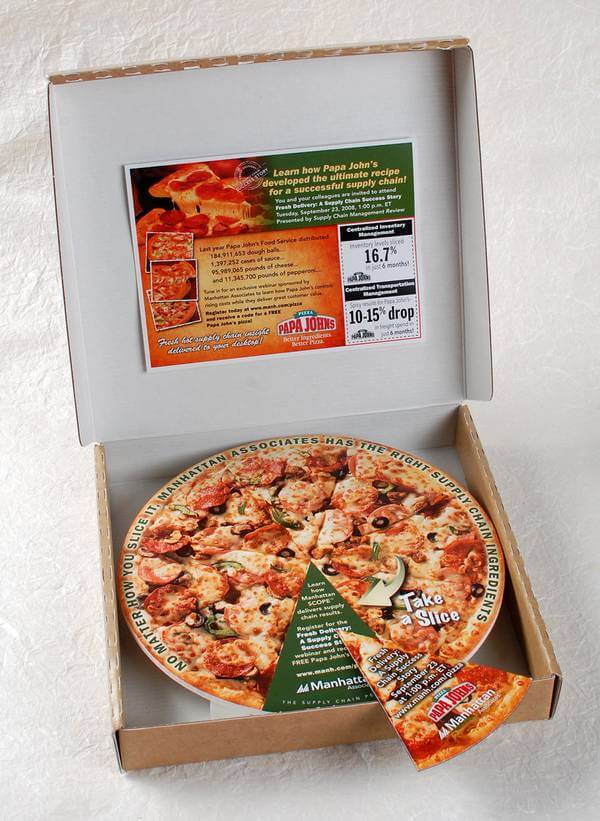
You can also imitate your product or product experience with unique direct mail pieces like this one:

A creative direct mail piece from Papa John’s
Source: Blue Print Direct Mail

Gift card

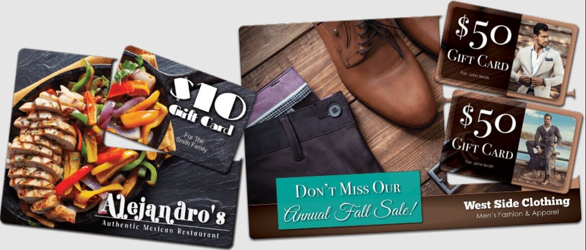
If you want to stand out from the crowd in direct mail, then just offering a coupon may not be enough. So why not go above and beyond with a unique idea? Try using a punch-out gift card which can give your customers an extra surprise. It looks like a part of the image yet it can be removed and used separately. This eye-catching combination is sure to get noticed and will set you apart from others.

Gift card mailers and plastic postcard example
Source: Mail It Direct

Conclusion

Direct mail is an age-old advertising technique that involves sending physical materials directly to customers. This can range from brochures and flyers to postcards, letters, or catalogs. 

It offers a variety of benefits for businesses, such as high ROI, the ability to track success, less competition than email marketing, and the potential to make a lasting impression on customers. 

When creating a direct mail piece, consider key design tips to maximize success with each mailing:

  • Choose colors that work well together and stay consistent throughout the content; this will create a unified brand identity. 
  • Research images carefully to ensure they represent your products or services effectively. 
  • Ensure the copy is concise and straightforward.
  • Personalize your mail using variable data printing to make it relevant for each recipient.  
  • Consider using negative space in your design for maximum impact. 
  • Include an enticing CTA that encourages customers to take action and don’t forget a map or QR code if required. 
  • Apply A/B testing to ensure optimal results from the campaigns.   

With all this in mind, you’ll be sure to get the most out of your direct mail pieces.

21 March, 2023
Article by
Irene Dmitrieva
As a marketing copywriter, I have experience creating compelling content for websites and social media posts. My background in market research helps me ensure that my copy is both on-brand and data-driven. I am excited to bring my skills and experience to Selzy team and help drive success for this company.
Visit Irene's
Selzy
Selzy
Selzy
Selzy
Selzy
Latest Articles
Selzy Selzy Selzy Selzy