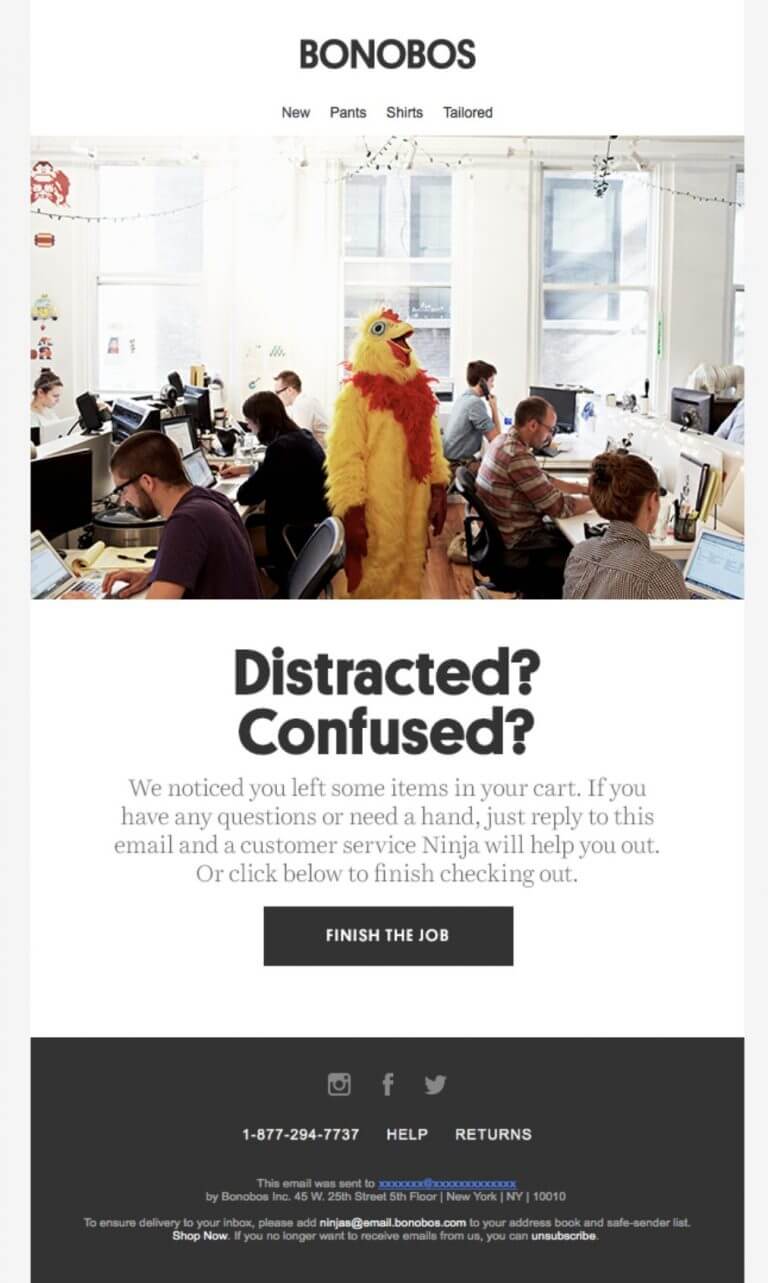
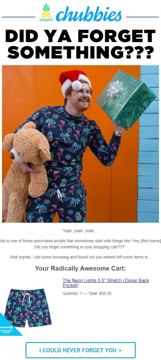
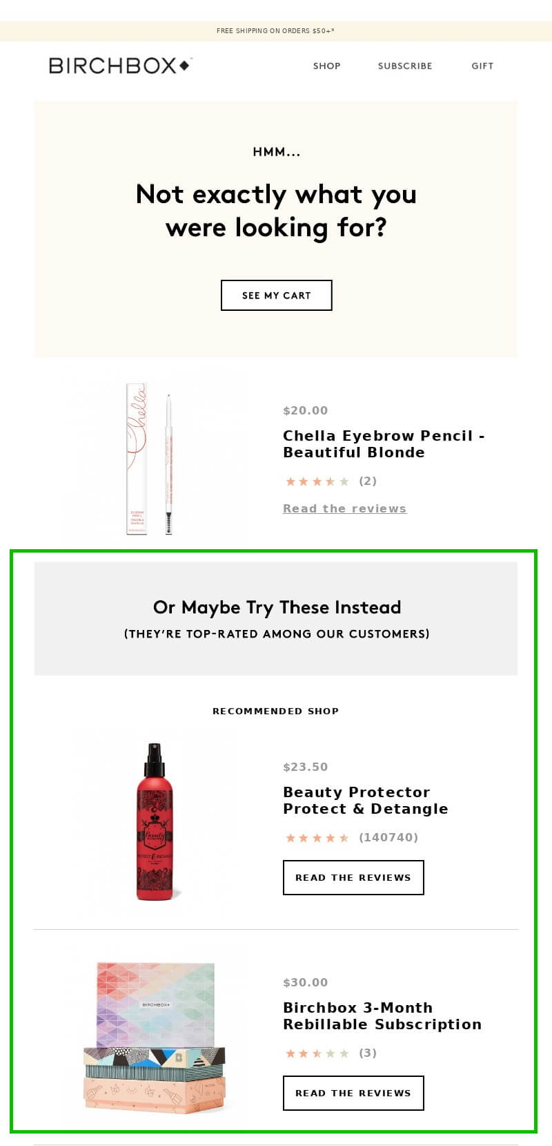
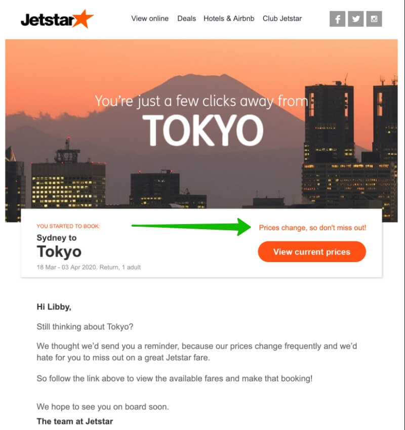
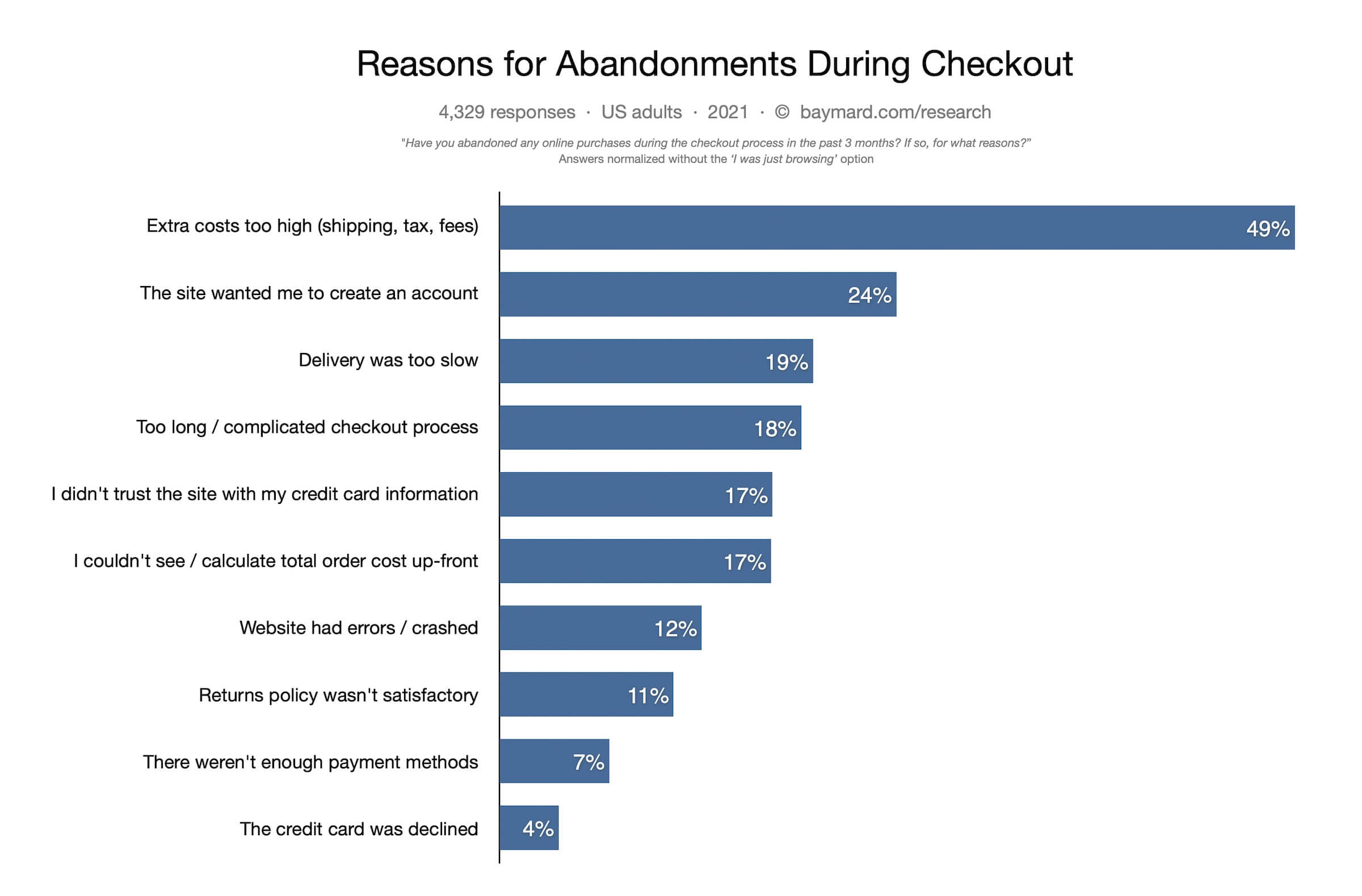
A very common thing in e-commerce: customers add items to carts but don’t check out. The abandonment rate usually varies between 60% and 85% across industries, meaning only 1-2 customers out of 5 end up purchasing. A company loses $3-4 for every acquired $1.
Baymard Institute estimates the average worldwide abandonment figure at 69.8%. Unfortunately, people abandon carts way too often but online entrepreneurs are used to it.
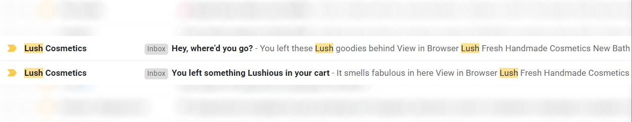
Fortunately though, abandoned cart emails help tackle the issue. They are automated emails sent to customers who put an item or items into the shopping cart but fail to check out.
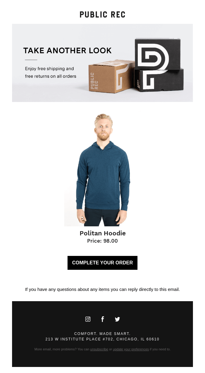
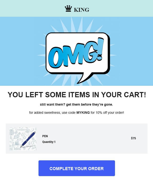
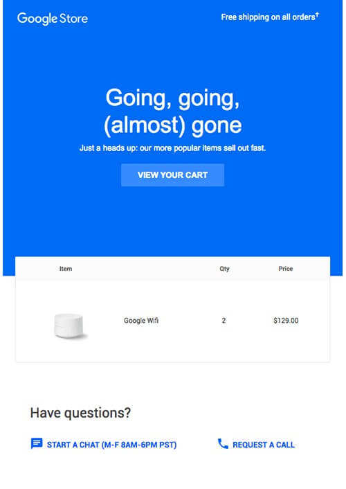
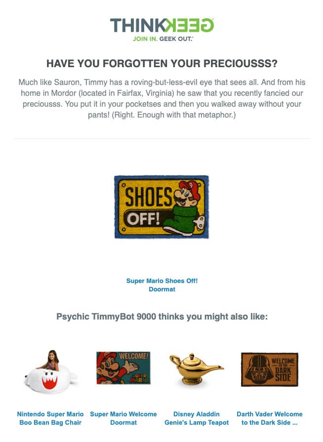
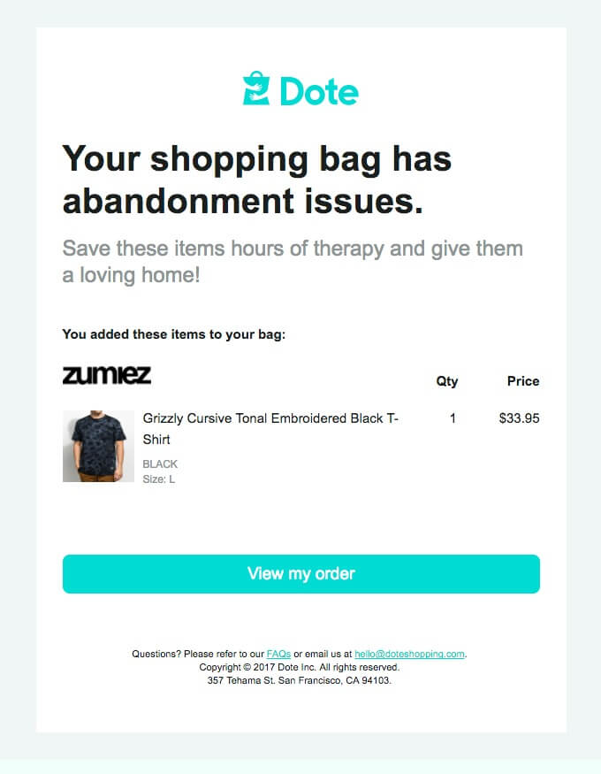
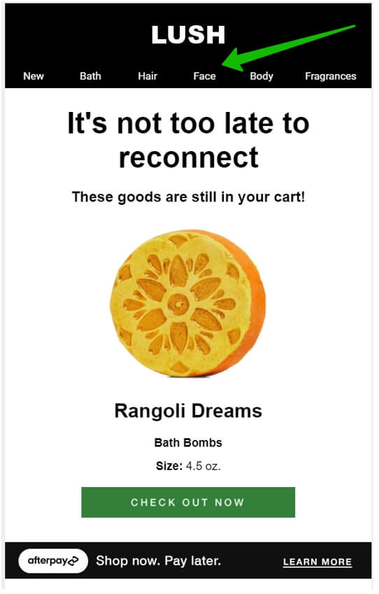
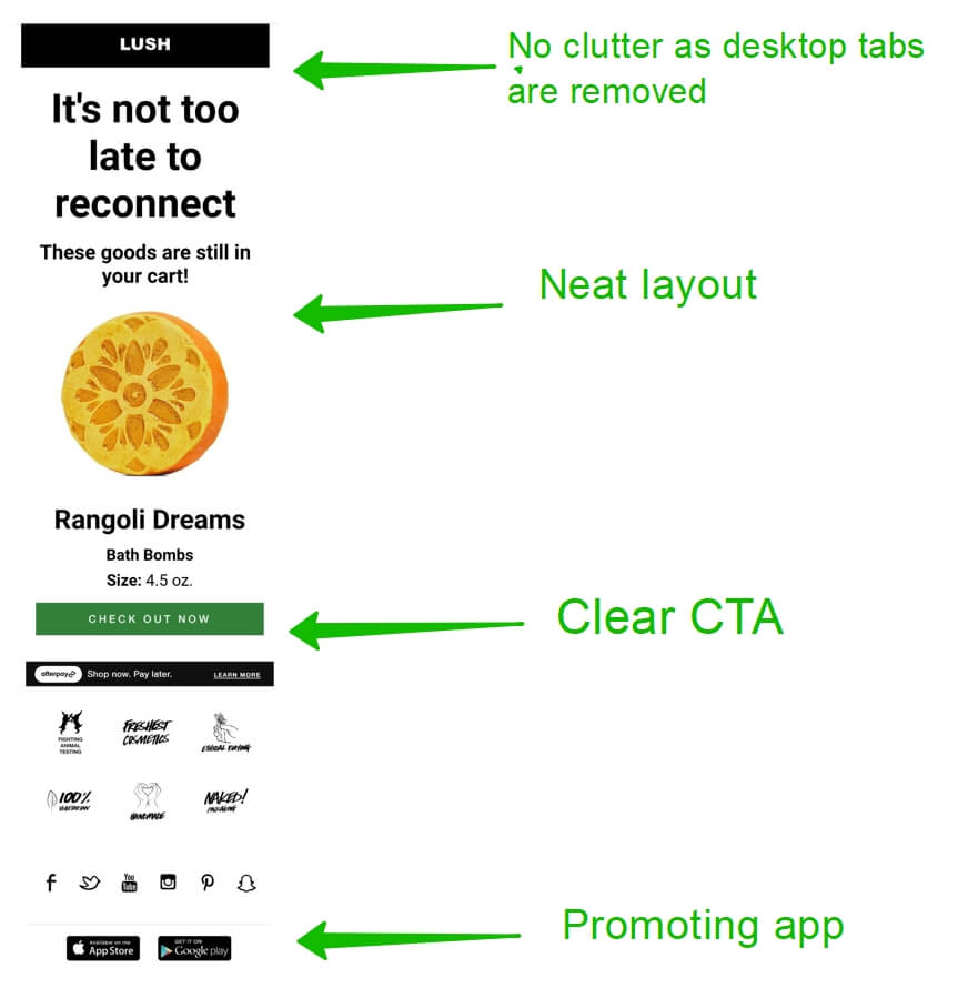
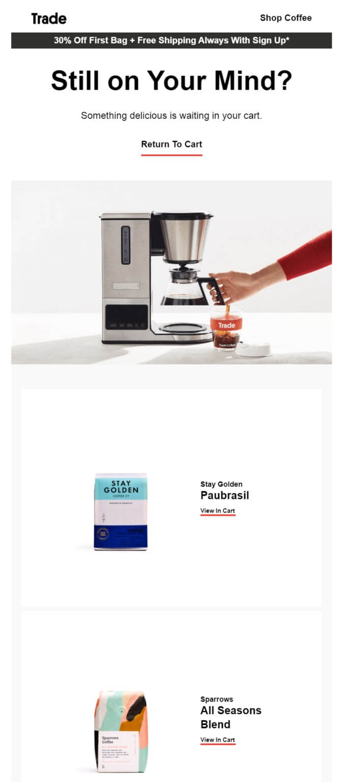
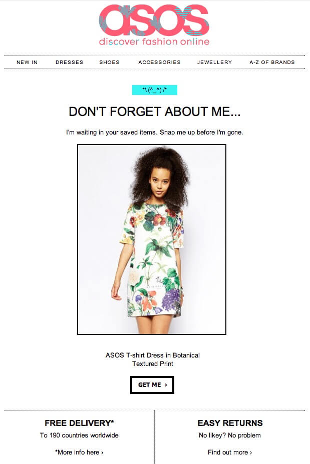
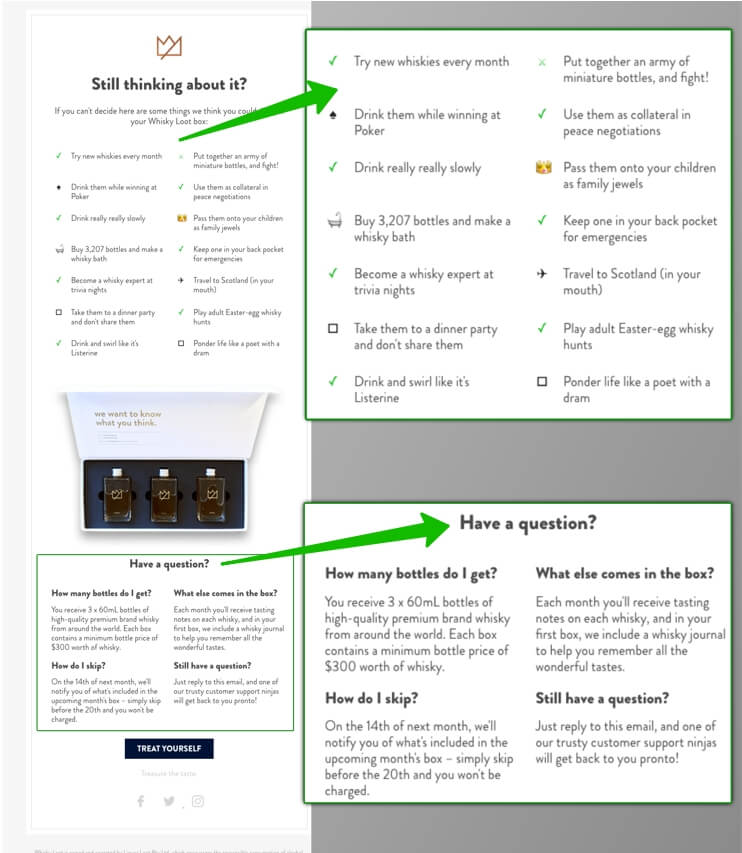
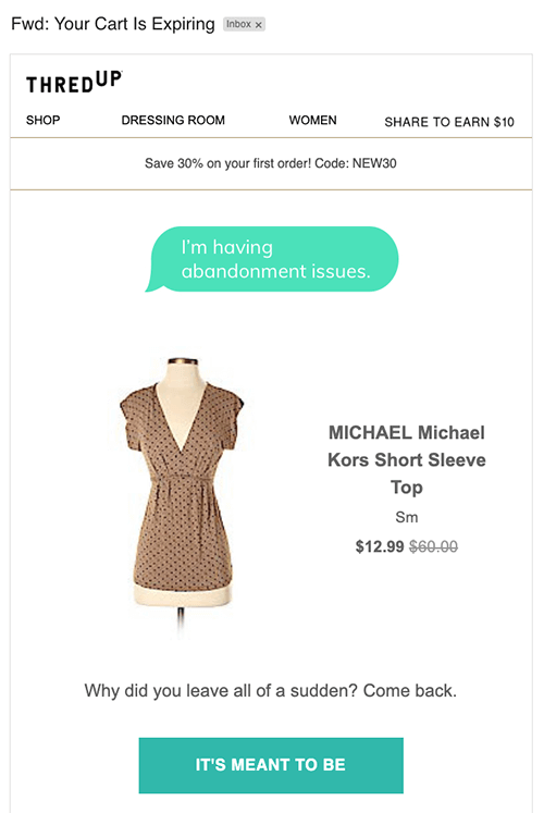
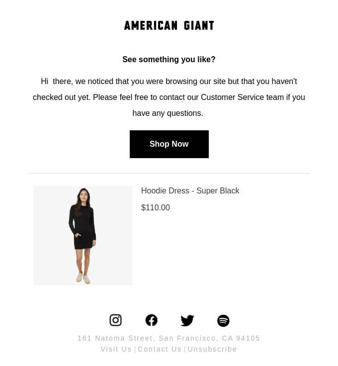
Here’s what the most basic abandoned cart email looks like: it reminds about the unfinished business, shows the product, contains a call to action, optionally offers extra benefits like free shipping.
Abandoned cart emails are a solid revenue generator as they convert like mad.
How so?
We looked at various data on open rates and CTR (including our study of 7 billion emails) in all emails and compared it with the same metrics in abandoned cart emails. We also found data on conversions which, in the context of abandoned cart emails, mean a completed purchase. As it turned out, abandoned cart emails trump average emails by all three parameters.
Average email | Abandoned cart email | |
Open rate | 17.57%1 | 42.3%2 |
Click-through rate | 1.7%1 | 8.49%2 |
Conversions | 1.33%2 | 10.7%3 |
Sources: 1. Constant Contact; 2. Barilliance; 3. Moosend
This shows that abandoned cart email is a killer tactic to recapture customers and drive conversions.
Be warned that despite the promising stats, an abandoned cart email is not a magic-wand strategy. It’s more like a pill when the cough is getting nasty: it will ease the pain but it is better to prevent the cough by putting on warm clothes.
It’s still preferable if customers complete purchases by themselves in one session. Let’s see why they often don’t.
Baymard wanted to know what makes shoppers quit the carts so they conducted a multichoice survey among US adults.
Extra costs related to shipping, tax and fees made people abandon carts 49% of the time. The obligation to create an account on a website (24%), slow delivery (19%), a complicated checkout process (18%) and a bunch of other reasons followed.
By fixing these issues, e-commerce retailers should increase sales and the overall user experience. But abandoned carts still won’t go away and that’s where abandoned cart emails come into play.
With an abandoned cart email what matters the most is how much time has passed since a customer quit the cart. Statistically, the best time here is one hour. In this case, the conversion rate reaches 6.33%.
Maybe a person got distracted and forgot to complete the purchase so it makes sense to act fast. This way, an abandoned cart email is a sign of good service, it acts as a friendly reminder.
Don’t wait for too long as conversions plummet soon after: 3.2% for emails sent 2-4 hours after a customer abandoned the cart and only 1.74% for an email sent after 24 hours. Read our article on the best time to send emails.
I abandoned a dozen carts on various websites and only received an abandoned cart email from three companies within 60 minutes. This goes to show that despite available statistics on the benefits of abandoned cart emails, it’s still an underrated technique.
Whatever email templates you use, a call to action button should be well designed so that it’s easy to see. Usually, a contrasting color is enough to make the CTA button stick out.
Some good and bad examples now. Look at this call to action button from King: easy to notice thanks to its size and color.
Now look at this one from Google Store. The CTA button is there but one has to try harder to spot it: it’s almost the same blue color as the background.
Check out this email from ThinkGeek. Creative copywriting, recommended products — great — but what does it want to achieve without a call to action? It’s an abandoned cart email but does it really look like one?
In short, a good call to action button:
The right words and the tone can give a customer a little nudge to complete the purchase. The writing can be formal or casual, humorous or serious — it depends on the relationship between the brand and its audience.
Have a look at this email from Dote.
Or look at the previous example above from ThinkGeek’s. The wording is an example of snappy Lord of the Rings-inspired copywriting that suits its audience.
The text also includes the non-content parts of emails: subject line and preheader. Here’s why they matter too.
64% of recipients base a decision to open an email on subject lines alone, as per Finances Online. Adding a preheader increases the open rate from 19.33% to 22.28% and the CTR from 2.23% to 3.32%.
In subject lines for an abandoned cart email you can use several templates to try to rekindle the interest.
Mobile is the king now — 41.6% of all emails worldwide are opened on mobile (Litmus data). That’s 1% more than webmail services like Gmail or Yahoo! Mail and a country mile ahead of the desktop (mobile’s 25.4% ahead).
Here are some of the best practices for email mobile optimization:
Here’s a good example from Lush. They don’t do anything fancy in the email for mobile. They merely take all the value from the desktop version and adapt it. Swipe to compare.
Now that we’ve laid down the crucial components of any abandoned cart email, let’s have a look at the content itself. Here are 6 strategies we believe you should try:
We, humans, value what other people say and we value more what other people say about things we like. Robert Cialdini put it too well in his classic book Influence: The Psychology of Persuasion:
“When we are uncertain, we are willing to place an enormous amount of trust in the collective knowledge of the crowd…Since 95% of the people are imitators and only 5% initiators, people are persuaded more by the actions of others than by any proof we can offer.”
Imitators, knowledge of the crowd, actions of others… sounds like you could use social proof to guide “uncertain” customers in an abandoned cart email.
For example, you can use a user rating or review as social proof. You can combine them both, just like Casper did here.
Some companies refer to authority as proof of why their product works. Reference to authority is, by the way, another certain way of persuasion as per Cialdini. Here’s Casper again with an example.
Be careful with authority-based examples though: reviews from real people often feel more authentic than those from other websites, especially partnered websites.
You can show a ziplock bag of coffee beans or you can show how coffee is made. Here, Trade Coffee uses a tidy photo of coffee in the making. As a customer, maybe I don’t even have a coffee machine but the beautiful photo creates an illusion. What is this — a perfect start to the morning or a coffee break at 1 pm? Whatever it is, it shows a story and stories attract us.
Clothing companies know all about it. You often see real people wearing clothes instead of those clothes lying on the floor. Asos doesn’t make their customers imagine what they’d look like in this dress — they show it.
While you don’t know the reasons why a customer opted out of a purchase, you can address potential objections. Even better if you know what customers raise concerns about the most.
Whisky Loot answers three possible concerns about their product in the Have a question? section and offers further help to those who haven’t found the right answer.
Whisky Loot also boasts an example of creative copywriting in the Still thinking about it part and how it can turn an email into a piece of art.
The call to action button is indispensable in abandoned cart emails but you can go further than the Go back to my cart type of CTA buttons.
Make one scroll up and see how Whisky Loot completes their email with a Treat yourself call to action button.
Here’s a solid example from Thredup that includes a playful It’s meant to be CTA button as part of their overall creative approach.
Bonobos urges customers not to buy or return to the cart but Finish the job.
More examples? Okay, one from Chubbies — I could never forget you
Notice one thing about all these examples: a creative CTA button is part of the overall creative approach to the text. A call to action like in the Chubbies email above would look weird in a more formal copy.
One warning: use words like “buy” or “pay” carefully, especially “pay”. These verbs sound too forceful for a customer who may have a hundred reasons not to pay.
You can use this precious email space to show other products. Clothes and shoes retailers are well aware of it. If a customer wants a pair of Vans but doesn’t check out, what if we try a different model or color?
You can also show a similar product and mix it with social proof. See how Birchbox picks a similarly-priced item to force a purchase.
It’s a rather common technique for various online retailers. Here’s an example from Forever 21. They show their customer that no matter how fast the items sell, they’re reserved for this particular customer for 24 hours.
An example from Jetstar. There’s no timer but a gentle reminder that prices change fast. That’s a smart tactic as people know that plane fares do go up towards the date of the flight.
The best way to organize abandoned cart emails is to make a sequence. According to a study, it is 63% more effective than a single abandoned cart email.
Why bother with the sequence, in the first place? Two good reasons:
More chances this email will be read. A customer may have multiple reasons to ignore the first email in the sequence. Maybe they got distracted or the email got lost in the inbox. It’s never too late to try again.
Rising benefits. Each new email changes not only in appearance but in extra benefits for a customer. Free shipping, discounts, promo codes can feature in an abandoned cart email as entrepreneurs try to persuade customers to shop.
A typical sequence consists of three automated emails. If a customer comes back to complete the purchase after one or two emails, the sequence stops.
Email 1 — 1remind. The first email in the sequence is a mere reminder about abandoned items. It’s possible that the need hasn’t gone away yet and the customer is still looking to buy.
Send this email no later than one hour after the customer’s last action on the website.
Email 2 — perk up the first email or add urgency. You can keep the content unchanged but use a new subject line or preheader. This way, it’s like you send a second reminder.
Here are the two emails I received from Lush, 24 hours apart. The first one (bottom one) was a mere reminder. For the second one (top one), they refreshed the subject line, adding a question into it.
Alternatively, you can try to force a purchase with a limited offer. Thus, you don’t just remind but try to speed up the customer.
This email typically goes 24-48 hours after the first one in the sequence.
Email 3 — offer a discount. This last email is the heavy artillery. It’s usually sent a few days after a customer abandoned the cart although some retailers send it within an hour as their first email.
H&M did exactly that, gracing my inbox with a 20% discount. Looks like now I’m only shopping with them through abandoned carts.
Remember, the final email is the last-ditch attempt to recapture a customer. Don’t throw discounts around into every email; customers will suss that out and start taking advantage.
🤔 How effective are abandoned cart emails? | 🧮 In terms of open rates, click-through rates and conversions they’re 2-3 times more effective than average emails |
🧱 What makes the best abandoned cart email? | ✅ Timing — it’s best to send this email within an hour
✅ A call to action — it must be well designed and easy to spot ✅ Copywriting — use one of several subject line templates, write a persuasive copy ✅ Mobile optimization — because most of the emails are opened on mobile devices |
🔎 What are the best abandoned cart email strategies? | 👪 Social proof — a powerful means of persuasion
🚴 Showing product in use — customers see how they can use it 🗿 Answering potential objections — maybe one of those objections is why the cart is still full 🛎 Using different CTAs — playful call to action buttons break the routine and engage with customers in a different way ☯ Offering alternatives — maybe customers hesitate because they haven’t found their ideal item yet ⌛ Create a sense of urgency — a deadline activates thinking |
🖋 How to create abandoned cart emails? | 🛠 You need to create a sequence of automated emails, three is enough: reminder (1), new subject line or sense of urgency (2), discount (3). Always leave discounts for the last email. |