While it doesn’t seem like something innovative, since it’s been on all the trends and prediction lists for years now, dark mode was still featured on 16 out of the 30+ lists I’ve analyzed.
So, is it any good, apart from catering to people who like all things dark (myself included)? According to a recent study, dark mode reduces eye fatigue quite a bit when users are in bright environments. And companies are seeing real benefits — Facebook and Instagram noticed users spend 15% more time on their platforms when dark mode is turned on.
Email marketers have been noticing dark mode growing demand too. For instance, SendView’s analysis shows that dark mode optimization in email campaigns doubled from 5.9% to 11% in less than a year. That’s a big change for something that might seem so niche.
For businesses working on their web design or email marketing, dark mode isn’t something you should completely ignore, since users might expect their favorite apps and random websites to work well in both light and dark settings, especially those who care about eye fatigue (and it certainly is a growing number).
-
Minimalism
Minimalism scored 15 mentions in our meta-analysis of all things UI/UX trends, and probably for a good reason.
Have you ever visited a website that had too much going on — buttons everywhere, flashy animations, text crammed into every corner. I bet it didn’t feel great. Same goes for trying a new app: with a complicated onboarding process, lots of items on the menu to choose from (all seem important) it makes it almost impossible to stay and master it I am definitely guilty of that, buying dozens of lifetime software deals every other month and then ending up not using them just because it’s too much going on in the app interface.
The phrase “less is more” might be a cliché, but in web design, it actually makes a lot of sense. For businesses working on their websites and marketing materials, minimalism can definitely enhance user experience. When your landing page focuses on one clear message instead of trying to say everything at once, users tend to understand your product better.
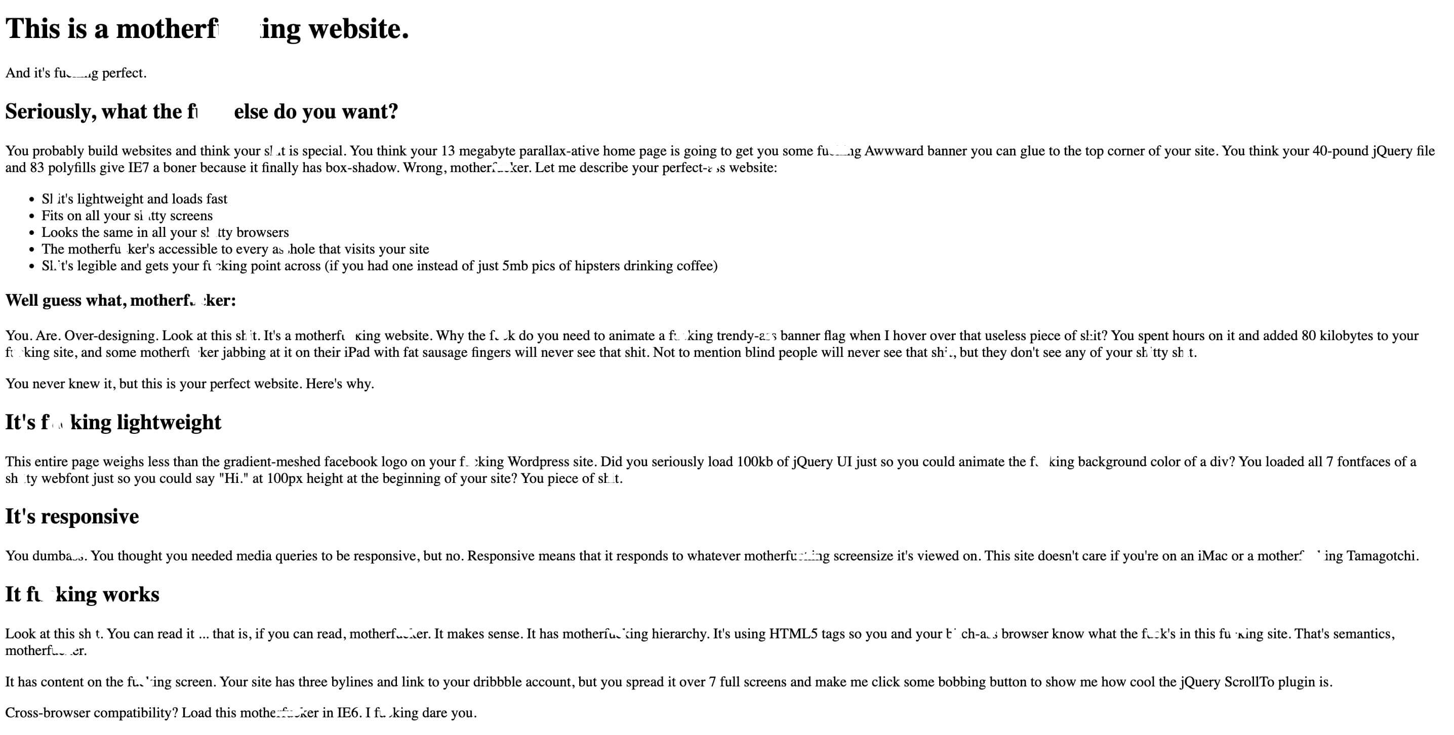
And while some might worry that minimalist design looks too simple it actually works. And here’s the proof, my favorite website on the web.