An Ultimate Guide to Plain Text Emails and When to Use Them

An Ultimate Guide to Plain Text Emails and When to Use Them
27 April, 2024 • ... • 416 views
Maria Bid
by Maria Bid

Thinking about using plain text emails to improve your marketing campaigns? This article is a good place to start. Here, we’ll explain the benefits of sending plain text emails, share proven tips on creating them, and explore some of the best plain text email examples.

What is a plain text email?

Plain text emails are emails that consist of text only. These emails don’t feature any type of email design elements such as graphics, CTA buttons, or hyperlinks. Also, plain text emails usually use basic fonts and black and white colors.

A plain text version of an email can be sent on its own, separately from the HTML-based one. However, you can also send the two versions together as a backup for email clients that don’t support HTML emails. Including plain text versions in HTML emails is called Multipurpose Internet Mail Extensions or MIME. When choosing between HTML and plain text, consider opting for MIME and also make sure you know all the main differences between HTML and plain text emails that may affect your choice. 

Below, we’ll explain why you might want to choose plain text formatting instead of, or along with, HTML.
Why use plain text email formatting

Plain text emails might look boring and, well, too plain. However, they have several important benefits over the more flashy HTML emails. Keep reading to learn how plain text can help you improve your email marketing campaigns and match your subscribers’ preferences.

Wider reach

Plain text emails generally have wider reach than HTML emails due to several factors such as accessibility, compatibility, and low risk of getting marked as spam. 

Some older versions of email clients and email service providers may not support interactive elements or images that are typically present in HTML emails. Sending plain text emails ensures that all your subscribers receive your email, whatever email client or ESP they use. 

Avoid getting marked as spam

Spammers usually use complex email formatting and HTML elements such as images to disguise malicious content in their emails. Since plain text emails don’t feature such elements, they are more likely to pass spam filters. 

Also, subscribers often prefer the plain text versions for a number of reasons such as simplicity, faster load times, and better compatibility across email clients. So, it is less likely for plain text emails to get marked as spam too. However, it is still necessary to run spam tests to monitor the effectiveness of your email campaign when sending plain text emails.

If you want to learn more about delivering your emails to the subscribers successfully, check out our article on how to stop emails from going to spam.

Better deliverability

Since plain text emails tend to avoid getting marked as spam, they usually reach the subscribers’ inboxes more often, which helps increase your overall email deliverability rates. 

If your subscribers use Gmail, plain text emails might also be more likely to get into the main inbox rather than into the “Promotions” tab.

Accessible on multiple devices

These days, subscribers access their inboxes from various gadgets, from smartwatches to desktops, — and plain text emails are compatible with any device. Each year, more and more users choose their phones to monitor their incoming emails. According to Litmus, 41.6% of emails were opened on mobile clients in 2021. 

Unlike HTML-based emails, the plain text ones are accessible on every screen size, email system, and with any email client, which makes them more user-friendly.

How do I make a plain text email?

So, you’ve learned what a plain text email is, and now it’s time to create one.

To make a plain text email from scratch, do the following:

  • Carefully think of the structure and style of your text to deliver your message successfully. 
  • Start your email with a greeting and include the name of the subscriber if possible.
  • Keep your text professional and avoid using informal language. 
  • Remember to proofread your plain text email before sending it.

Also, if you’re using an ESP, most of these tools generate an editable plain text version of  your HTML email, making the process even simpler. 

Tips for making a text-only email scannable

HTML emails have various visual elements that make them clearly structured, but plain text emails are harder to scan at a glance. However, you can still make them easy to read. Here’s how to make the most of your plain text email marketing campaigns.

Separate sections with clear headers

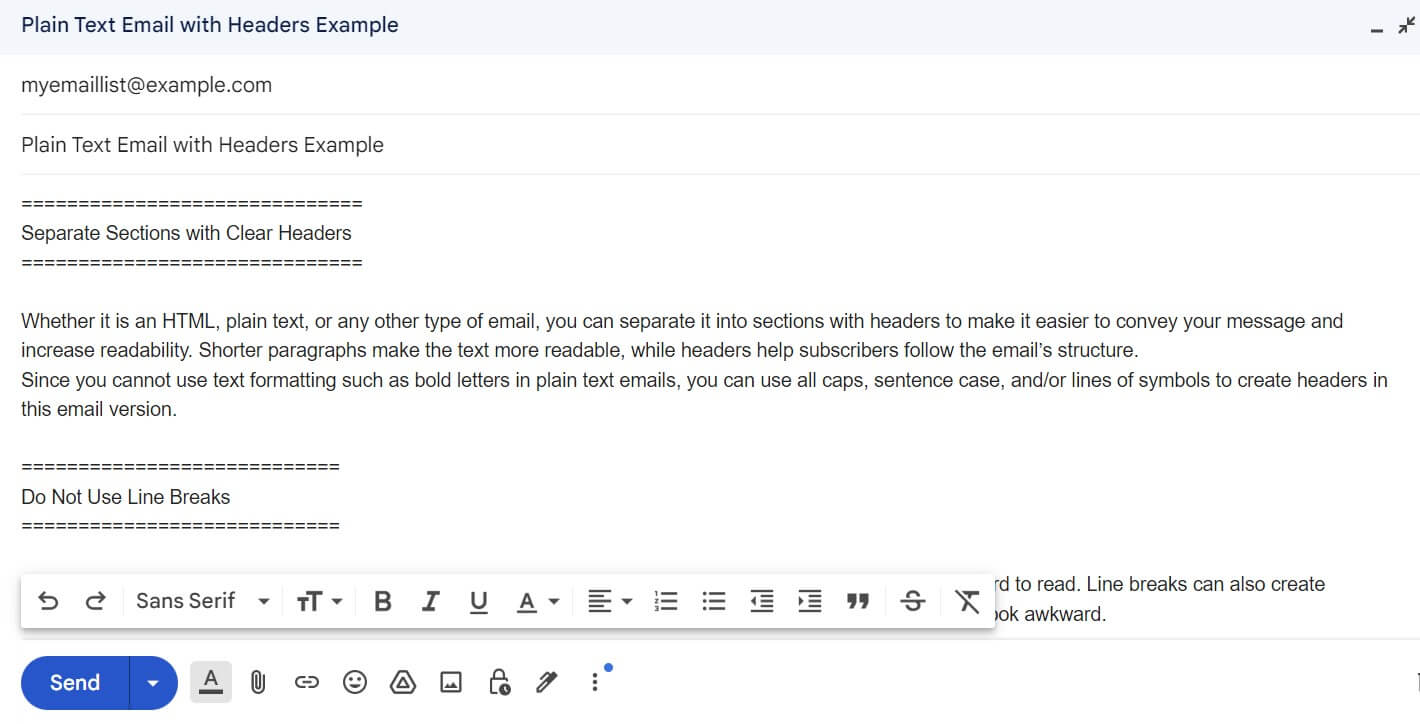
Whether it is an HTML, plain text, or any other type of email, you can separate it into sections with headers to make it easier to convey your message and increase readability. Shorter paragraphs make the text more readable, while headers help subscribers follow the email’s structure.

Since you cannot use text formatting such as bold letters in plain text emails, you can use all caps, sentence case, and/or lines of symbols to create headers in this email version.

An example of plain text email with clear headers

Do not use line breaks

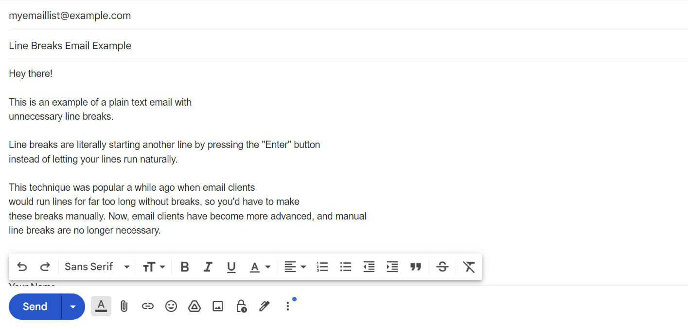
Using line breaks in a plain text email is not recommended because they can be distracting and make the text hard to read. Line breaks can also create accessibility issues for subscribers who use assistive technology, such as screen readers. Besides, they simply look awkward:  

An example of a plain text email with unnecessary line breaks

To make your plain text emails easier to read, try to avoid line breaks and separate your text into sections with headers instead.

Make use of bulleted lists

If your email text is lengthy, you can also use bullet points to create a clearer structure. Instead of writing long paragraphs or sentences, identify keywords and phrases for each one and make a list. This will help your subscribers quickly scan through the text without getting overwhelmed.

Think your CTAs through

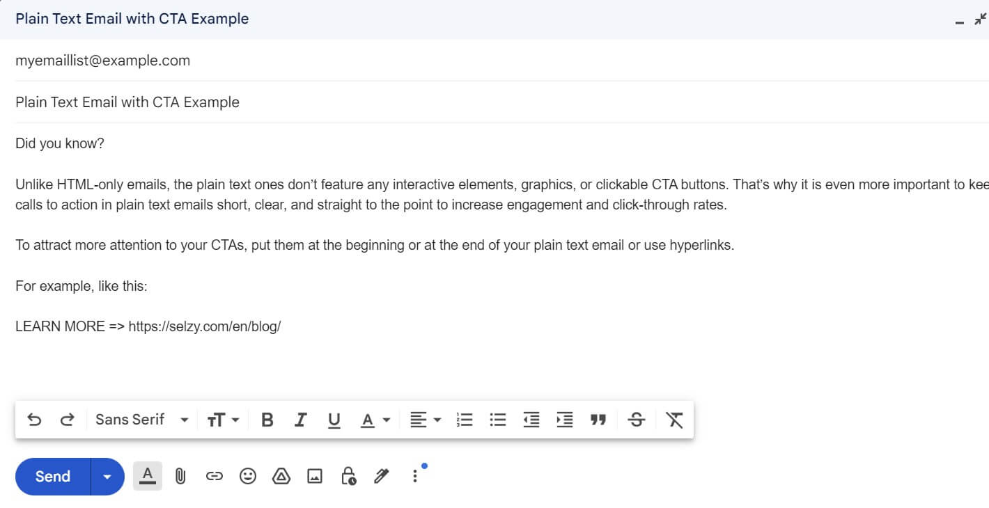
Unlike HTML-only emails, the plain text ones don’t feature any interactive elements, graphics, or clickable CTA buttons. That’s why it is even more important to keep calls to action in plain text emails short, clear, and straight to the point to increase engagement and click-through rates. 

To attract more attention to your CTAs, put them at the beginning or at the end of your plain text email or use hyperlinks.

An example of a plain text email with a clearly visible CTA

Avoid using too many links

Technically, you can’t use any hyperlinks in plain text emails at all. If you want to include a link, you can only add its URL as plain text. However, today, any minimalistic emails that don’t feature lots of HTML-based elements are often referred to as “plain text”. 

Whether you’re sending “real” plain text emails or plain text-styled ones, too many links in any of them can affect readability and trigger spam filters. So, try to include only the most relevant links to avoid overstuffing. It is also important to consider link placement to make links instantly visible to your subscribers.

Use white space wisely

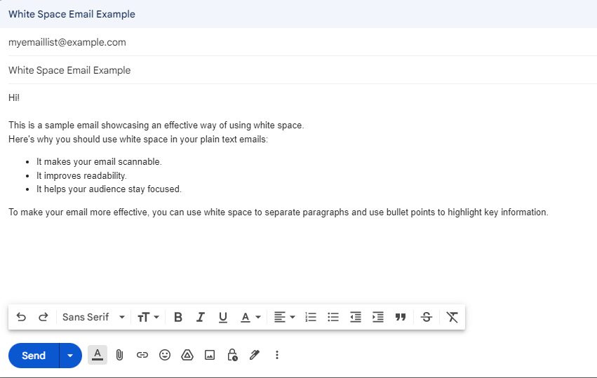
Another proven way to structure plain text emails is the usage of white space. Leaving white space between paragraphs can help readers stay focused and not get overwhelmed by big chunks of text. However, try not to overuse it too. Too much white space might cause the opposite effect and make your email harder to read.

Here’s an example of an effective way to use white space. In this email, it is used to separate paragraphs and make the text easily scannable.

A sample plain text email showcasing an effective way of using white space

Plain text email examples to learn from

Here, we’ve gathered some of the best plain text email examples. Take a look at them below and get some inspiration for your campaigns.

Maple Jeans

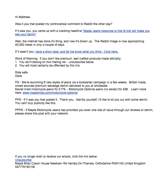
A plain text email from Maple Jeans reaching out to a person who posted their comment online
Source: Really Good Emails

In this individual plain text email by Maple Jeans, the brand is reaching out to a person whose post about the brand sparked controversy online. 

The email effectively uses white space and divides the message into smaller sections. Hyperlinks are organically integrated into the text, making it easier to read.

Cerami

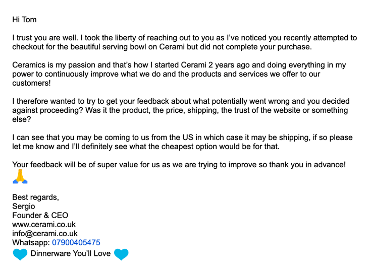
Cerami’s plain text email on an abandoned cart
Source: Rejoiner

In Cerami’s email, the brand contacts one of its clients on an abandoned item. Instead of sending a typical HTML version of an abandoned cart marketing email, the brand decided to politely ask for personal feedback in their email, which might help to learn about your subscribers’ preferences while not being too persistent.  

What makes this email stand out, however, is not only its careful wording but also clear structure. The text is divided into small paragraphs using white space and doesn’t feature any hyperlinks or CTAs but motivates engagement in a natural way instead.

Cocokind

A Cocokind’s plain text email on an abandoned cart
Source: Rejoiner

Cocokind’s plain text email is also reaching out to a customer who hasn’t finished checking out their order, and the brand also asks for feedback. 

However, the email actively uses hyperlinks and CTAs to offer a discount and motivate the customer to complete the purchase. The email also features the founder’s signature and contact information, so it feels more personal.

Alex Mill

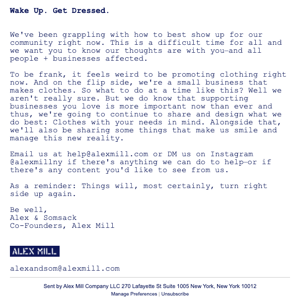
A plain text email by Alex Mill stating their position in a time of crisis
Source: Rejoiner

Alex Mill decided to use a plain text email to state their position in a time of crisis. The email doesn’t feature any CTAs, hyperlinks, or other engagement elements, but is rather serious and straight to the point. Yet despite that fact and the amount of text in this email, short paragraphs make it clear and easy to read.

Chubbies

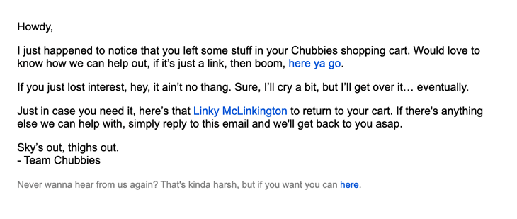
Chubbies’ plain text email on an abandoned cart
Source: Rejoiner

Chubbies also decided to use a plain text email version to check on a customer who hasn’t finished checking out their order. They effectively use hyperlinks to send the customer back to the order checkout. The email is also short and clear, so the customer is not overwhelmed with too much information.

Catherine Deane

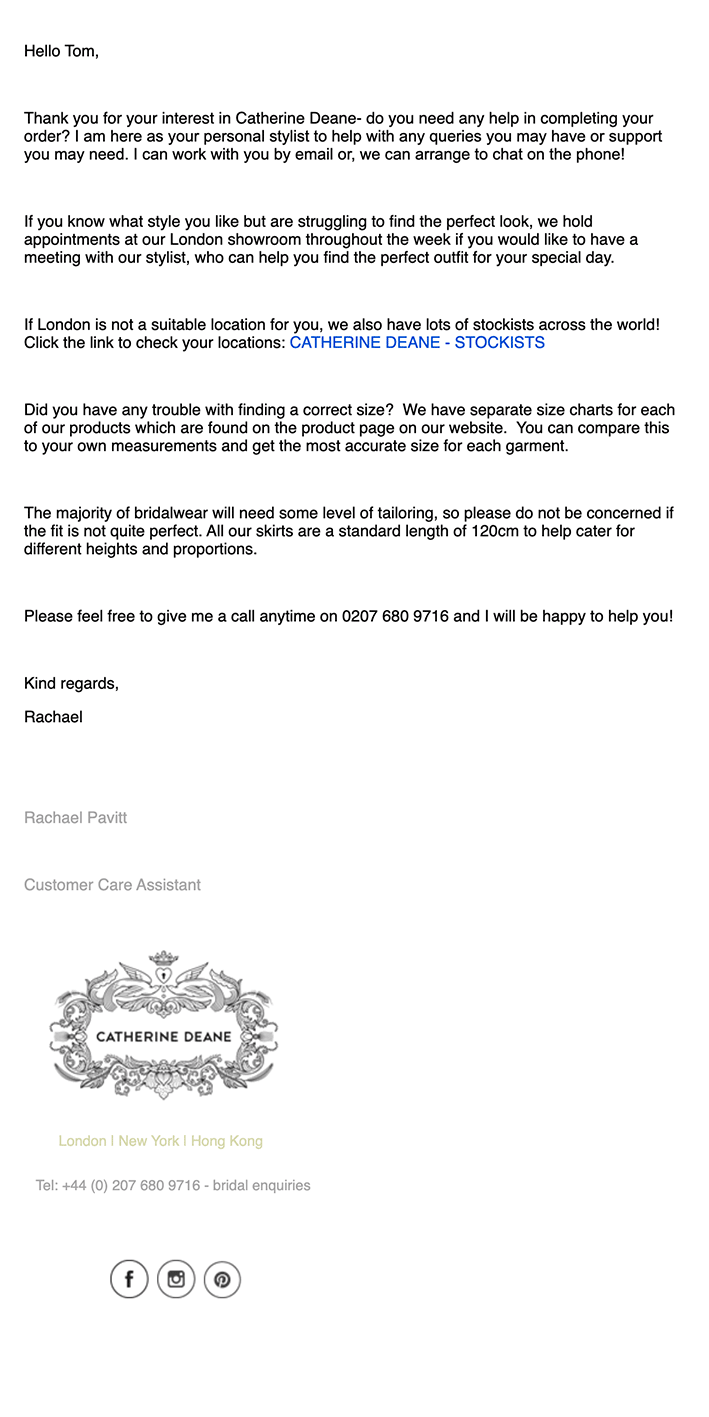
A plain text email from Catherine Deane offering help with completing an order
Source: Rejoiner

This email from Catherine Deane is all about offering help with completing an order. The email is quite lengthy; however, the shorter sections help stay focused while reading the text. The brand also provides contact information in the email, making it feel more personal.

Final thoughts

Both HTML and plain text emails can be beneficial for your email marketing campaigns. In most cases, marketers tend to prefer HTML ones; however, plain text emails have several benefits, such as the following:

  • They are a great way to increase your deliverability rates.
  • They can help reach a wider audience.
  • They allow you to get more personal with your customers.

To choose between the two versions, consider the topic and category of your email and carefully think of what goal you want to achieve. Using information, tips and examples from this article will help you make the most of plain text emails and make your email campaigns more versatile and effective.  

27 April, 2024
Article by
Maria Bid
A literature degree holder with a passion for writing. I have experience in creating various kinds of content, from newspaper articles to social media posts. Writing for Selzy, I hope to help people make the best of their experience with digital marketing. In my free time, I walk my dog, explore local coffee shops, and learn foreign languages.
Visit Maria's
Selzy
Selzy
Selzy
Selzy
Selzy
Latest Articles
Selzy Selzy Selzy Selzy