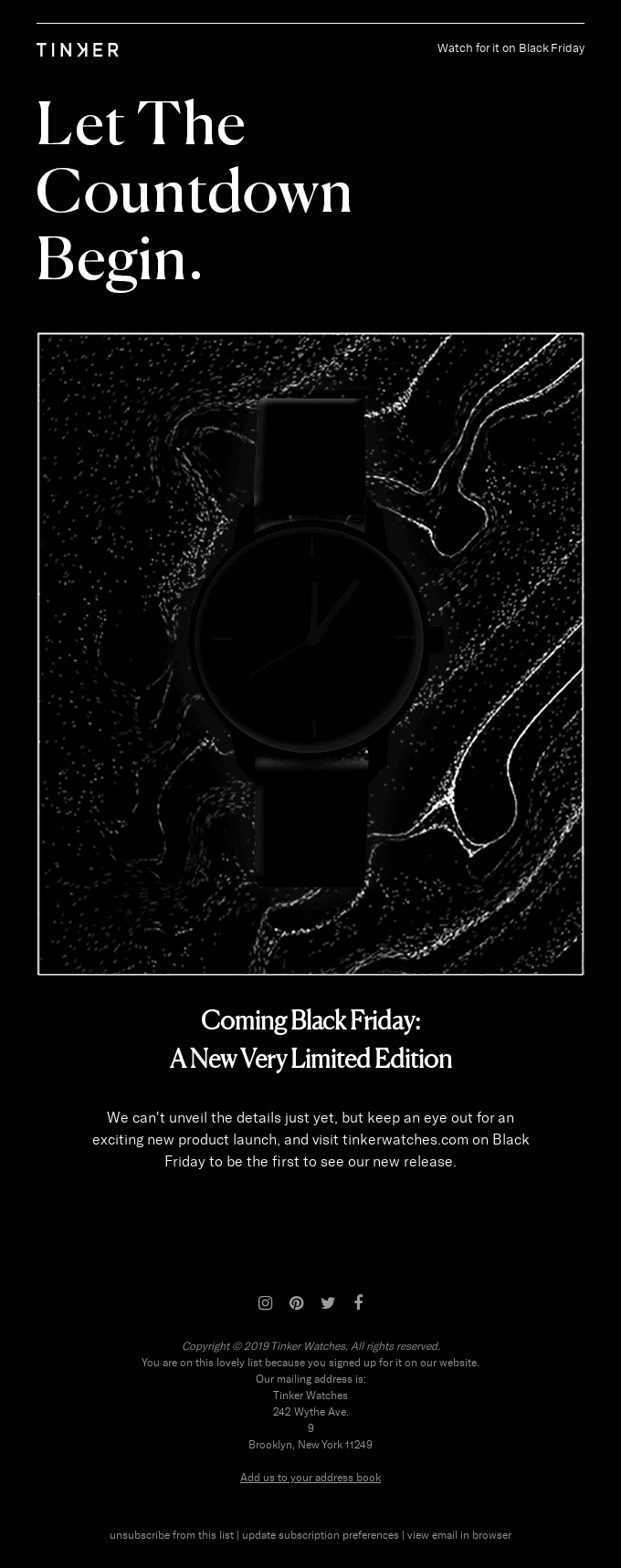
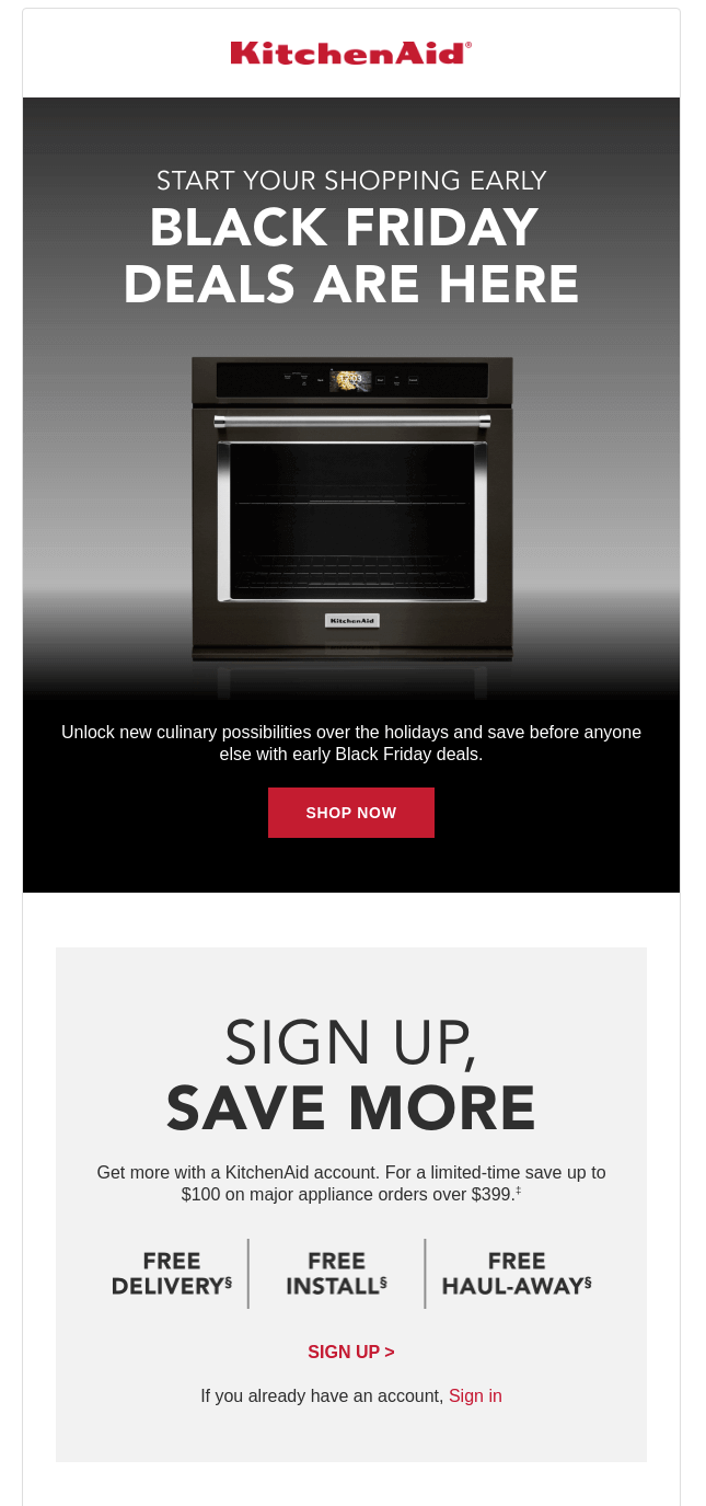
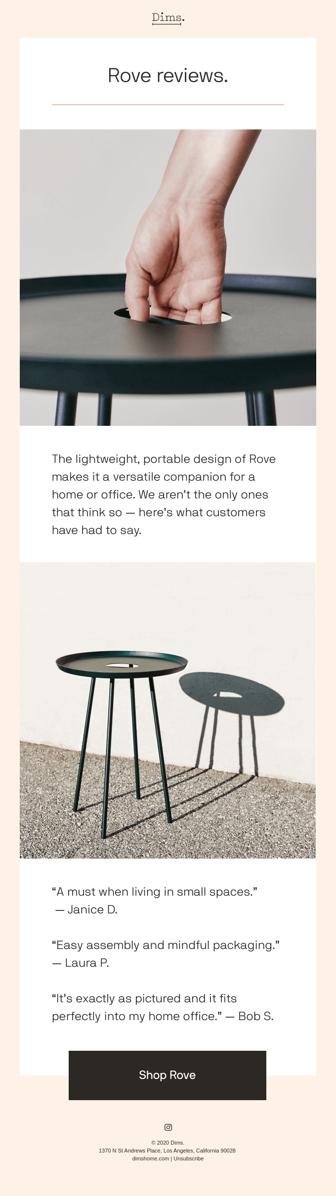
We live in the era of high-speed digitization and are caught up in the sheer volume of information we encounter every day. According to a study in Nature Communications by the Technical University of Denmark, our collective attention span is indeed narrowing, and this effect occurs across different domains – social media, books, movies, web searches, emails, etc. Therefore, a simple copy with a minimalist and responsive design is the most effective way to deliver a message, and this approach cannot be more relevant for your email marketing.
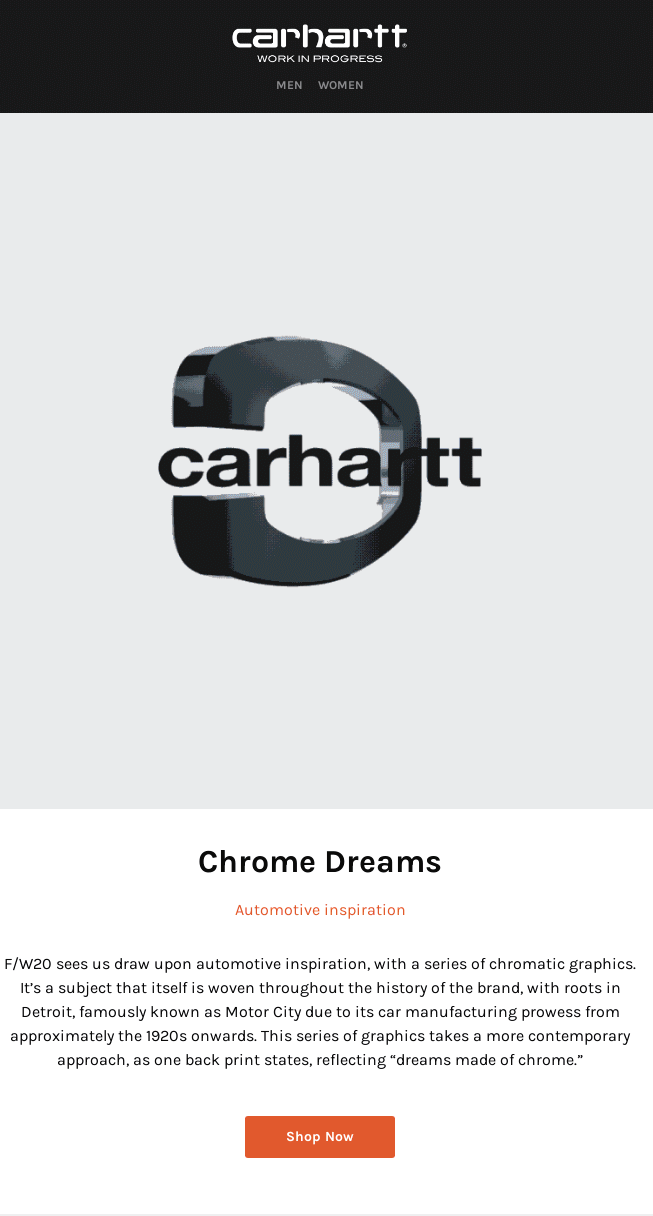
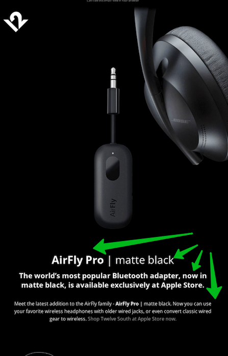
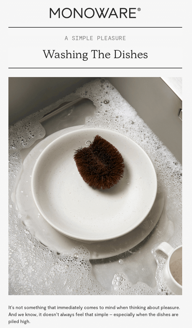
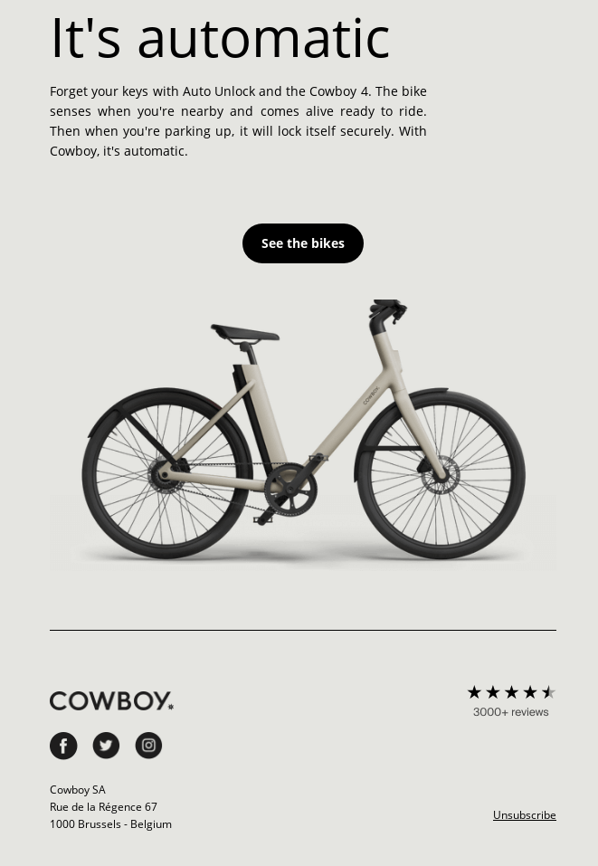
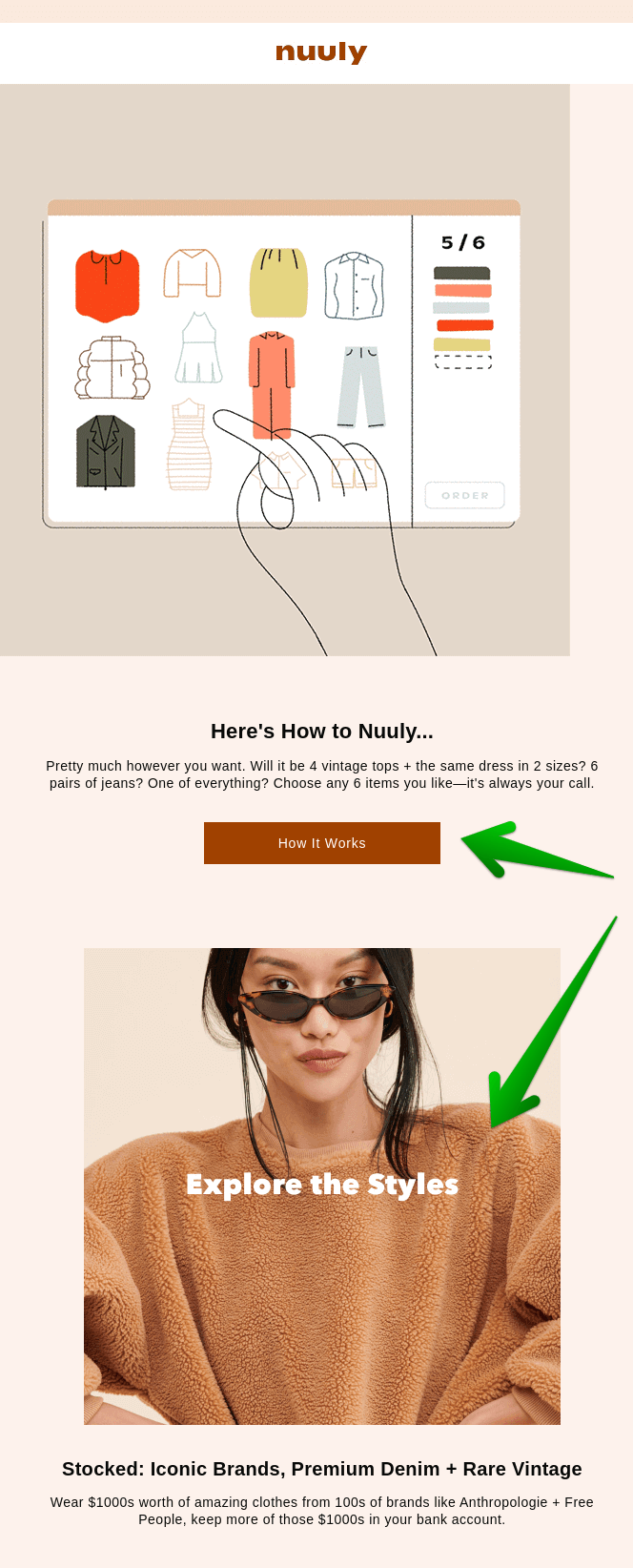
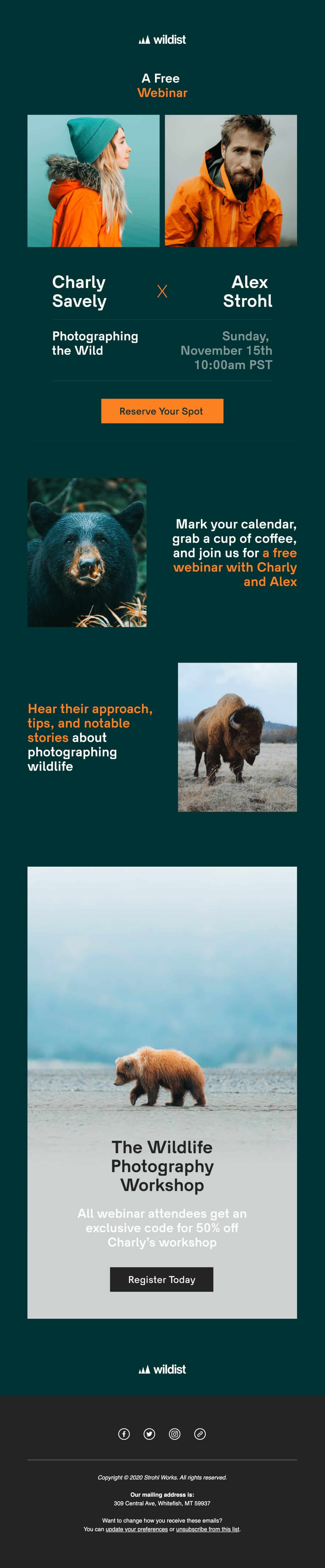
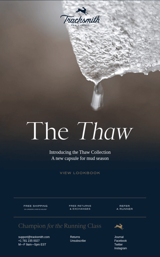
It may sound paradoxical, but if you want to stand out from the crowd of brightly colored and mostly cluttered email templates, you need to work out a classy minimalist layout with clean fonts, calm colors and simple copy or customize a ready-made one.
The practices of minimalism are based on eliminating unnecessary clutter to highlight what is really important. So, the less a person’s attention is distracted by different content elements in an email template, the clearer the main message of the newsletter will be. Isn’t that our goal as marketers?
Besides, in 2021 a total of 44.7% of users checked their emails on mobile devices, while a year before they preferred a desktop version, as Litmus research indicates. It means that the email template should be easy-to-navigate, as well as easy-to-read and responsive. Nobody would tolerate a long loading and overcomplicated email.
You can decide which parts deserve more readers’ attention and play with space, fonts and colors. It is easy to achieve with a minimalist email template.
Generally speaking, all the marketing practices are aimed at increasing sales and brand awareness for business. Quite often this idea is performed in an aggressive manner. As for email marketing, you might have seen the emails advertising various products or services on a colorful layout with many pictures, different fonts, exclamations and lots of text. Or sometimes there is so much information that you cannot get to the point of the email. Because of that people are reluctant to subscribe to newsletters. Well, there are different email design styles, which we have discussed and explained why it matters. Look at the example below:
At first sight, it is difficult to single out the message. We see too many different items: furniture, kitchen electronics, beauty products, plants… And now check out the next example below.
Quite a different one, right? We get attracted by stylish photos, elegant language and calm colors used in the template. This is an example of a minimalist email template.
Some elements of a marketing email template deserve more consumers’ attention than others. It is very important that your audience pays attention to the meaningful parts, so you should take into account the correct visual hierarchy. There are only a few seconds as we scroll down the pages, and such elements as the size of letters or blocks of texts, colors, repetitions, and white spaces help to convey your message.
To make your email stand out even more, consider incorporating eye-catching backgrounds from Freepik, a website that provides high-quality and visually appealing backgrounds that can help to make your email even more attention-grabbing. This will help to enhance the overall visual appeal of your email, making it more likely to be noticed by your audience and drive conversions.
Negative, or white space, is a key feature of minimalist design. First of all, it eradicates the sense of clutter, makes it easier to perceive the content and focuses customers’ attention. By the way, the practices of inserting whitespace don’t literally mean white – you can customize the layout in any background color.
Mixing fonts, varying in styles and size, can be very tricky. Minimalist email design advocates clean typography: it makes a template look tidy and aesthetic. Choose the fonts that correspond to your brand identity and stick to them in your campaigns – more tips in our email fonts guide. Besides, always make sure that the chosen fonts are rendered correctly on various devices.
Bright colors do not necessarily lead you to the anticipated result – a user’s attention may simply be confused and disorientated. Monochromatic colors are the best solution for any kind of email marketing purposes. But minimalism does not exclude using bright colors as it is: when used thoughtfully to draw attention to particular content details, and it corresponds to the brand style, then it is absolutely okay and it positively affects the conversion. Take into account the topic: if you are launching, for example, an Easter email campaign, the colors should be predominantly light.
Feel the difference:
Although this example can hardly be called a minimalistic email, bright fashion photos are at least compensated by simple fonts and backgrounds.
Simple email design eases readers’ experience. They should not figure out where the link or button is, the key message should be clear, while the email template itself should be easily scannable. As for the copy, remember that you can provide exhaustive information on your website, while the email should simply inform and attract, so do not overload it with minor details.
Great design with effective visuals is your undoubted competitive advantage. By leveraging the visuals, you can control the focus of the reader’s attention. Thus, you may highlight the product image, so that other visuals should not divert the subscribers’ eyes. This principle is the essence of the minimalist design.
You need to make it clear: why do you want to add this or another button to your email template? CTA (call-to-action) buttons should both meet the needs of the consumers and improve your marketing performance. If you add too many CTAs, the users get lost and don’t click at all.
The same frustrating experience takes place when there is no button, although it should be there. Try to walk in your users’ shoes and make a choice about where to put the CTAs for a comfortable user experience.
It is very important for business results to use a responsive design that renders on any device and screen. Otherwise, all the struggles that designers, copywriters, SEO experts and marketers have endured while creating a campaign and a beautiful minimalist template are in vain. You may use ready-made, editable, responsive templates from email services that have been tested on different devices and customize them with your stylish content. Besides, the majority of ready-made minimalist templates are crafted for mobile devices first, while desktop versions adjust to them.
An example of minimalistic email on mobile. Its desktop version looks the same, just wider, check it out. Source: Email Love
We should respect our subscribers’ time and get straight to the point. It doesn’t mean that you should deliberately write short emails, but you should write as short as possible, eliminating wordiness. In other words, the text must be as long as it needs to convey your message. Though, it can be quite challenging to write a short copy, than a longread!
This email announces the new collection and is aimed at redirecting to the website for further purchases. That is why the copy here is minimal.
Some service emails cannot be short just because of its subject, like policy changes, agreements updates and others.
Minimalism as a trend in design and marketing showed up as a response to a noisy, kitschy and aggressive advertising culture. Simple structures, clean typography, white space, and deliberate color scheme turn out to be more and more attractive in graphic design and visual art itself.
You can easily enhance your marketing performance by customizing your email templates to minimalistic standards. Follow these tips:
All newsletter examples are credited to Really Good Emails.