


What is a dark mode email and why you should use it
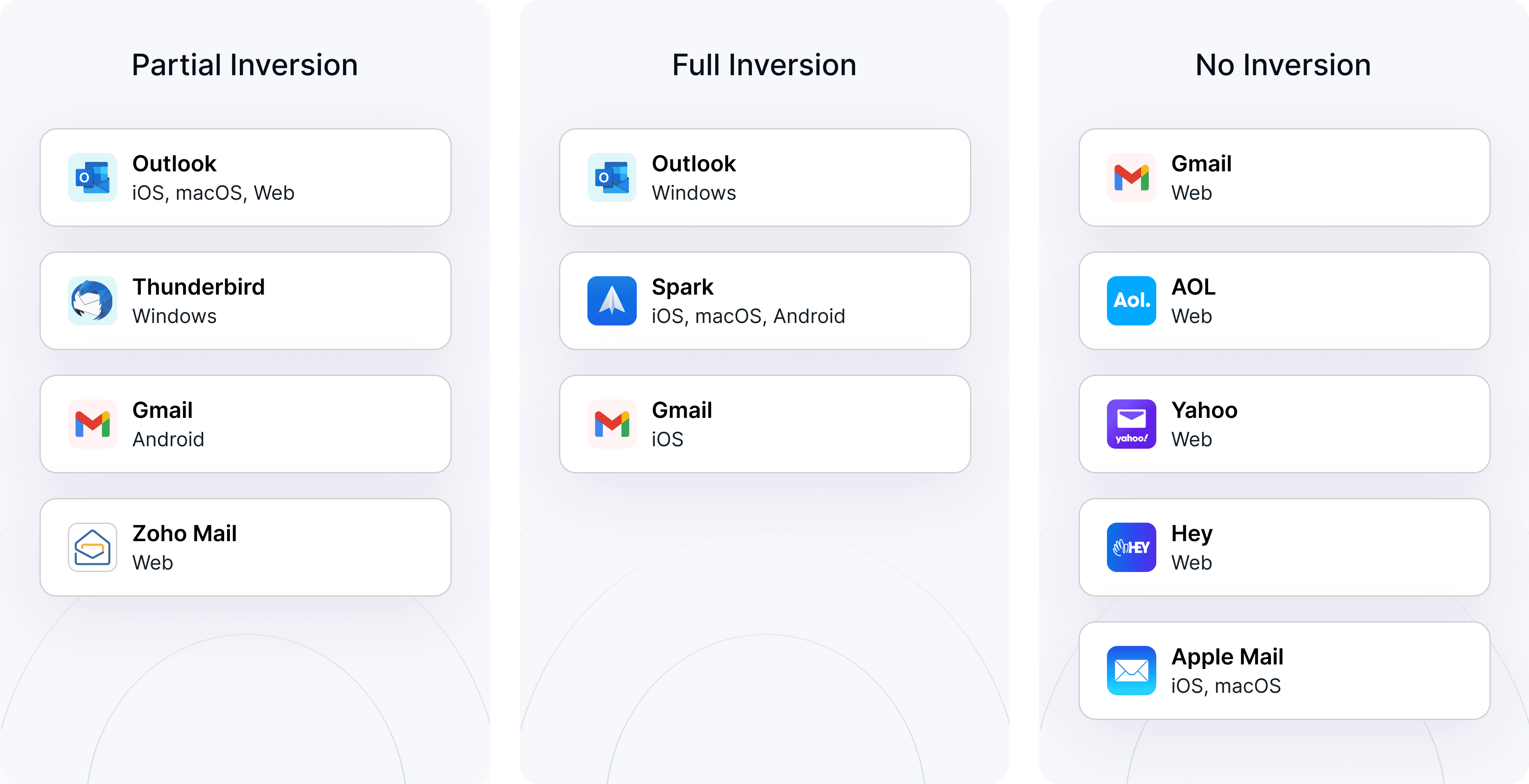
Dark mode email is one of the hottest digital design trends in recent years. It is a reversed color scheme in email clients like Google’s Gmail, Yahoo Mail, and others.
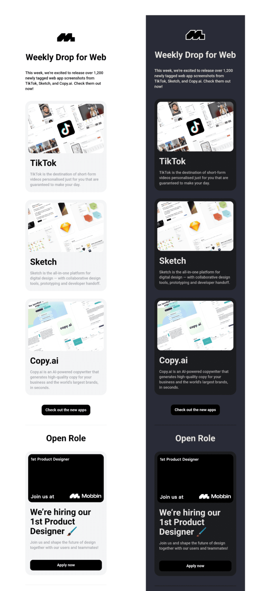
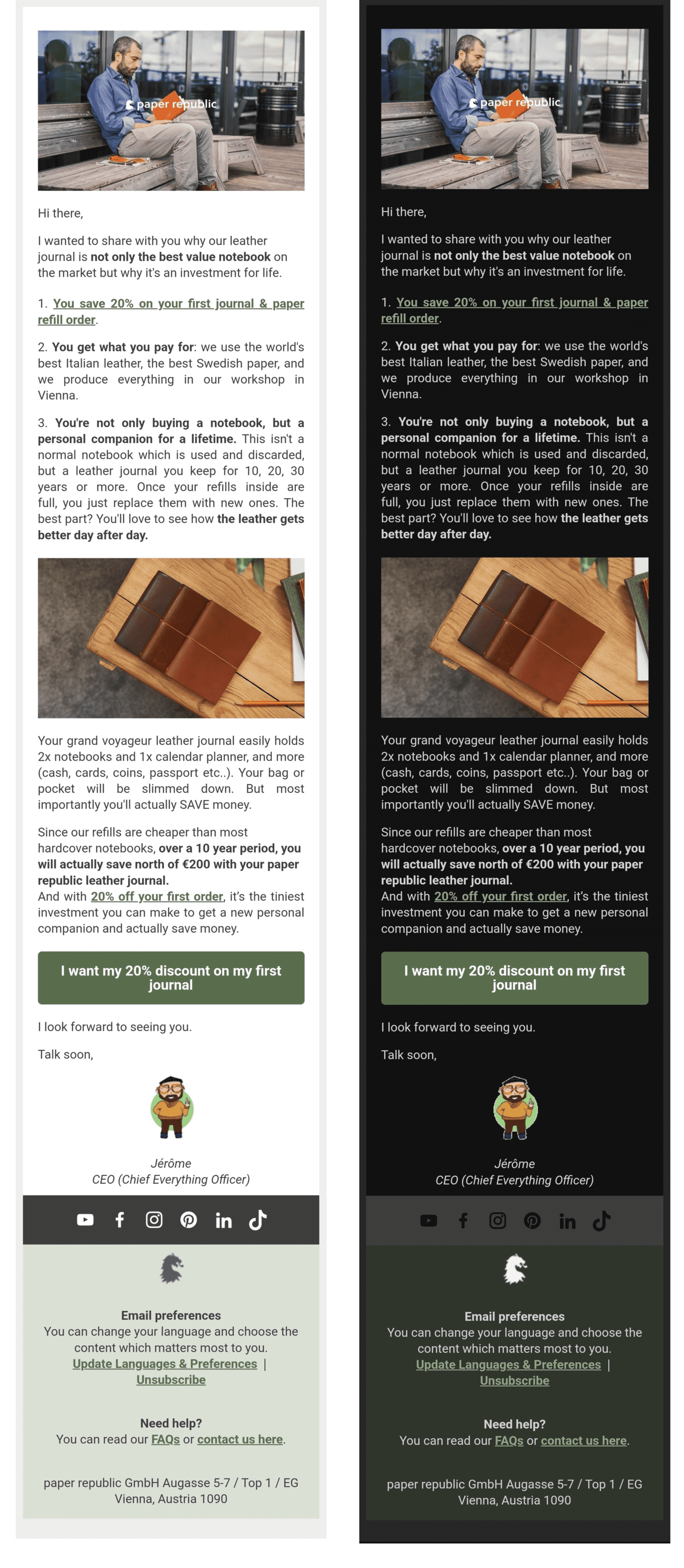
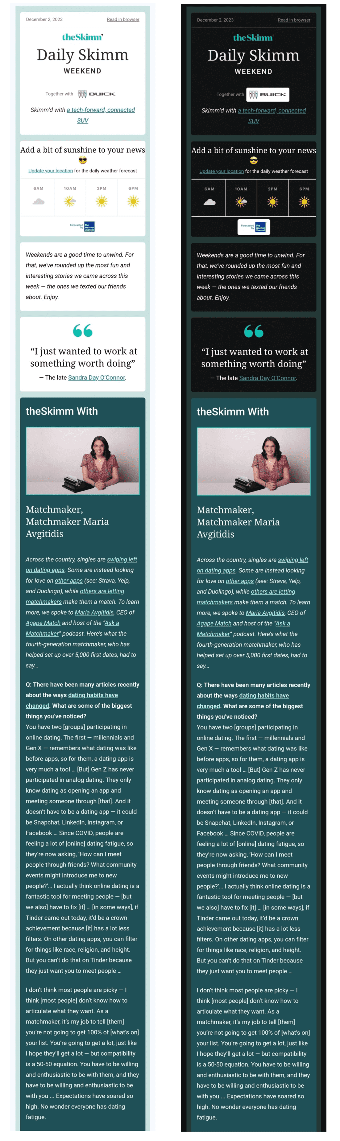
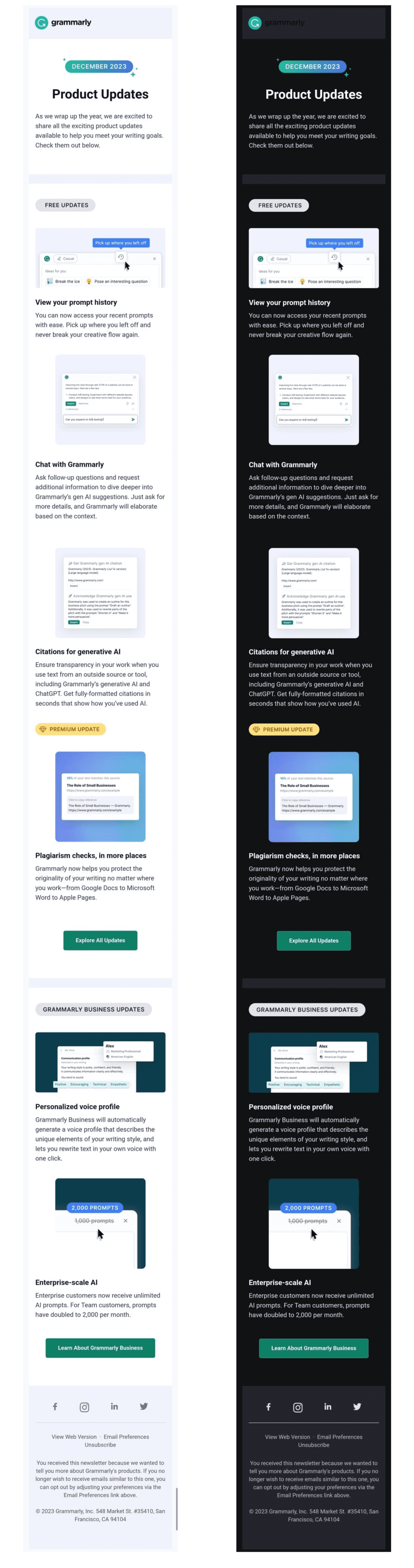
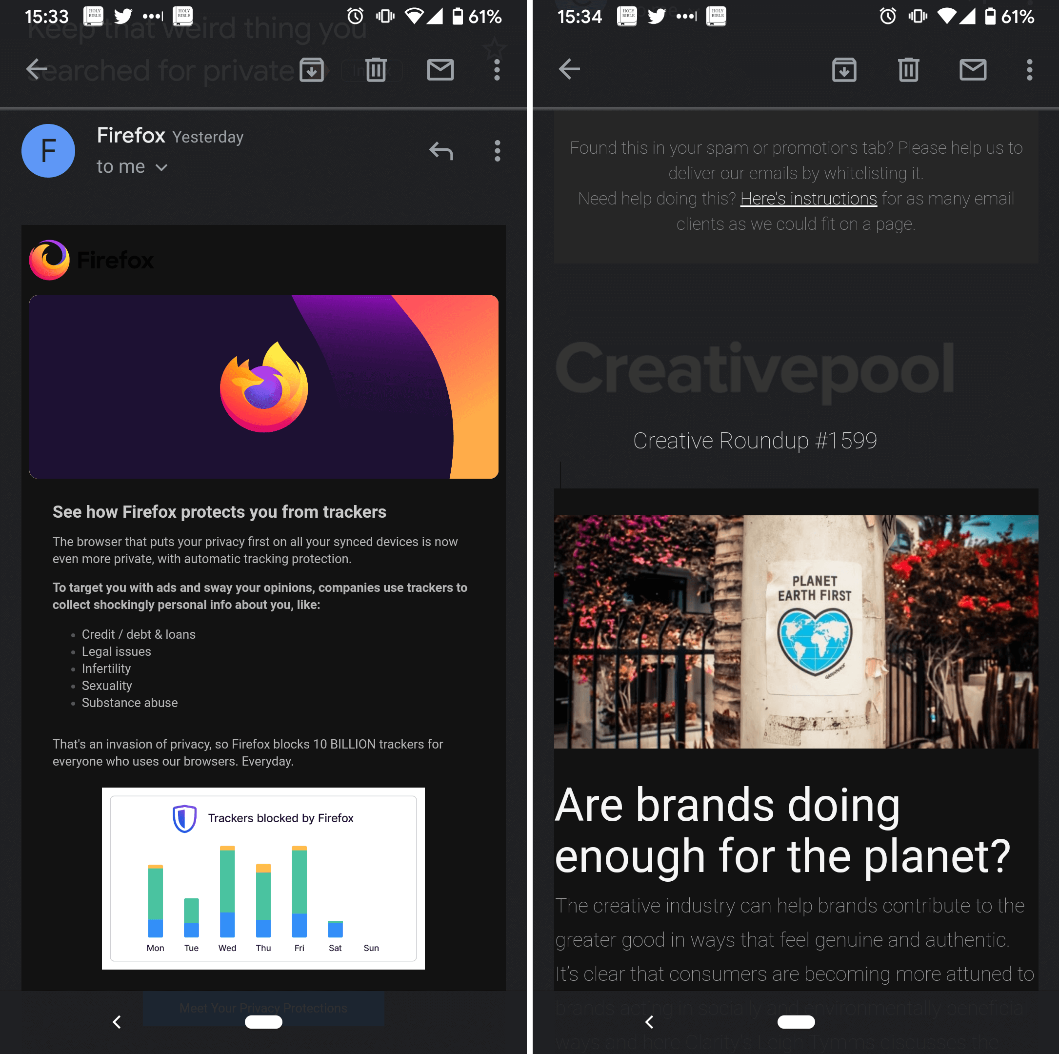
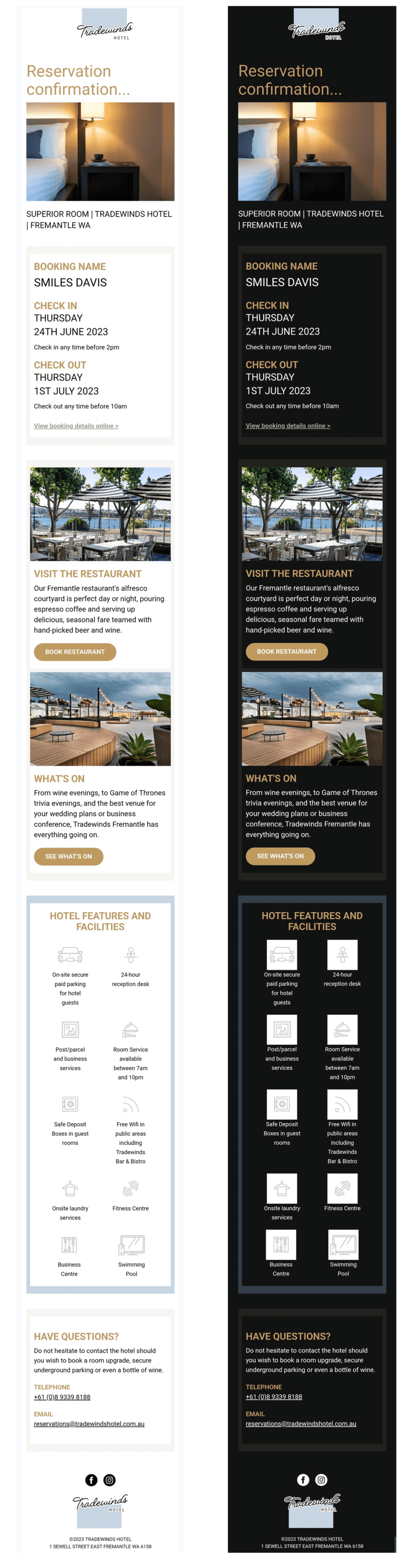
If your email originally had a white background and black text, and your subscribers have a dark mode setting on, the email might show up with a black background and white text. The specifics of the design flip largely depend on email clients, as you will see in the next section of this article. Here is an example of an email in both light and dark modes with partial inversion:

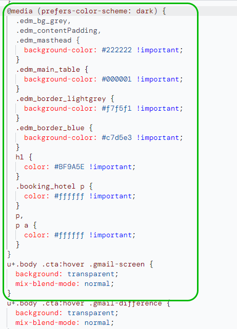
![An example of [data-ogsc] code used in an announcement email from Figma](https://selzy.com/en/blog/wp-content/uploads/2023/12/13-2.png)
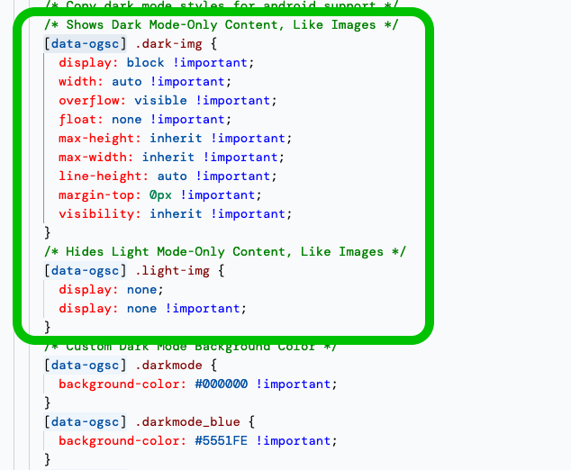
![An example of an email with the prefix [data-ogsc] used to make the email compatible with the dark mode in Android’s Gmail app](https://selzy.com/en/blog/wp-content/uploads/2023/12/14.png)