There are multiple ways to design a custom campaign template:
- Use an email builder and create an email from scratch. Selzy offers a powerful email builder to help you create beautiful emails that are responsive by default.
- Edit one of the numerous available templates. Selzy has over 100 templates, ready to use at no extra cost.
- Get coding services from a professional, by providing a professionally designed template or an email draft as an image file.
- Design and code an email yourself. This is not an easy task, as it requires some basic coding skills.
Selzy clients can order paid design services and get ready-to-send email templates. Just contact us and submit your design or draft in PNG or JPG formats.
This article will help you design, code, and optimize your emails. We also recommend you to show it to your designers and coders, if you decide to order a template from a freelancer.
Designing HTML email templates is not an easy task, since many today’s email clients do not t support content and formatting settings you see even on the most basic websites. For this reason, email design will never be as cool as website design. If your designer and coder are not familiar with the specifics of email design, they may end up using elements that are not displayed correctly in the emails, therefore spending hours fixing faulty designs.
Another consideration is that different email clients apply their own specific limitations. If an email looks good in a desktop browser, it doesn’t mean it will render properly in Outlook, The Bat! or on a mobile device.
The bulk of time spent on email design is focused on trying to make the email look like the initial design across all email clients, including the unconventional ones.
This article does not cover coding for AMP emails. When we write an article about AMP, we’ll add the link to it here.
Email design and layout requirements
The optimal email width is 600 pixels. This is the maximum email width recommended for all major inboxes. If a non-responsive email is wider than 600px, it shrinks to the screen width of a mobile device and becomes too difficult to read.
Emails are coded as tables, so each element occupies a rectangle or square area. Keep this in mind when designing your email templates, since elements cannot intersect or overlap in any way.
The maximum width for images is limited to 600 px — the width of the email. However, we recommend that you upload images twice the intended size and set the width attributes manually in the code. Otherwise the images will look blurry on iPhones, Macbooks, and other devices with high-resolution Retina screens. That said, keep in mind that Outlook will display images in their original size if you use CSS to style the image.
Do not use line breaks to adjust text alignment, as your email will be displayed across different screen sizes and the result may be messy. Instead, use non-breaking spaces ( ) to prevent words from dangling on the next line.
We don't recommend using gradient fill in email design. You may need to cut your banner into several content blocks to adapt it to responsive design. When your campaign is viewed on mobile devices, the content blocks will stack on top of each other and the gradient effect will certainly be distorted.
Technical requirements for campaign design
Table-based layouts
- Email blocks are not separated by
<div>, tags; instead, the markup is rendered inside the<table>tag. The main table consists of rows and cells. - Other tables are placed in individual content blocks: a cell for an image, a cell for a text block.
- Email clients don't recognize the
<button>, tag, so each button is also a table-cell of a given size and color with a text link inside. - This type of layout means abandoning many features of HTML and CSS. For example, it is impossible to overlay two email elements on top of each other, or add animations to buttons.
Universal HTML tags and attributes
Not all common HTML elements are supported in email clients. For example, Mail.ru and Outlook do not accept <header> and <footer>tags. However, there are universal tags and attributes you can safely use.
See the list of universally supported CSS and HTML features
Check compatibility for HTML and CSS features across email clients
Inline styles
All element styles must be declared as attributes inside the tag. Such a code looks cumbersome, but it’s a foolproof way to ensure your HTML campaign displays correctly across all email clients and browsers.
To optimize the coding process, check your HTML file with styles inside the <head> or <body> tags using an inliner tool.
Check out the free CSS inliner.
CSS Limitations
- Do not use short HEX color codes such as RED or #FFF. Always use full hexadecimal color codes, such as #bb0000.
- The attributes for the
<table>tag, such as border, cellpadding, and cellspacing, must be set to 0. Other values may not be interpreted correctly across email clients. - Do not use em units or percentages to set up the line-height attribute. Just use fixed pixel values to ensure your email renders as intended across all clients and devices.
- The line-height attribute must be specified for both the parent cell (this is essential for most web interfaces) and the
<span>tag (because Outlook ignores the line-height parameter specified for the cell). - The background in HTML emails is set through the background= and bgcolor= attributes for the
<table>and<td>tags. Gmail on Safari will ignore these attributes if you set them for other tags. - Not all email clients render CSS backgrounds. We recommend not using the background property and its subproperties such as background-image, background-visibility, or background-size.
- Refer to the Mailchimp website for the list of must-haves for any email: Client-specific CSS Styles.
Fonts
Web safe fonts render correctly in any email client, on any device. Below is a list of web safe fonts we recommend using in your emails:
- Arial,
- Tahoma,
- Verdana,
- Trebuchet MS,
- Georgia,
- Courier,
- Courier New,
- Times New Roman.
If you really need to use non-safe web fonts, make sure to specify an alternative — one of the standard web-safe fonts to use in case the client fails to render the intended font.
For example: font-family: Open Sans, Arial, sans-serif;
See the detailed guide to web fonts by Litmus.
To prevent web fonts breaking in Outlook, use a special media query for WebKit (the engine used by most modern browsers, including Safari, Chrome, Opera, and many others):
<style>
@import url(http://fonts.googleapis.com/css?family=Pacifico);
/* Set styles for all email clients */

h1 {...}
/* Set styles for email clients on WebKit */

@media screen and (-webkit-min-device-pixel-ratio:0) {
h1 {...}
}
It is crucial that you set the font family, font size and color attributes for each <td> table, otherwise an email client may ignore the chosen font. This rule must also be followed for any block elements that contain text, such as <p>, <h1>…<h5>, <div>.
Images, GIFs and videos
Unlike Gmail and Apple Mail, Outlook has images disabled by default, so in this section there are some tips how you can communicate a message to email recipients even when images do not display:
- All important content must always be communicated through text, not images.
- Always use alt-text for images. This way, users will be able to read what the image is about even if their email client doesn’t display them.
- While email clients render GIF animations flawlessly, Outlook doesn't play animated GIFs. The client simply displays the first frame of the animation. If you have a lot of corporate email addresses in your contact list, you may have to reconsider using GIFs or make sure to convey all the important information in the first frame of the GIF.
In the <img> tag, set the width and the thickness of the border to 0, as many email clients don't render the border. Be sure to use the display: block; property for your images, otherwise most email clients will add margins to the image.
There are no strict restrictions on the file size of images and GIFs, but the heavier they are, the longer it takes to load the email. Therefore, we recommend using images up to 100-200 kB and GIFs up to 1 MB in size. Heavy emails are more likely to end up in spam. At Selzy, we recommend keeping emails below 102 kB in size, as Gmail clips emails larger than 102 kB.
Unsafe code elements
Below is a list of elements you definitely should not add to your emails:
- JavaScript;
- Flash animations;
- Shortened URLs (such as short URLs created with bit.ly); they will work; however, email services may flag such campaigns as spam as spammers often shorten malicious URLs;
- Parallaxes.
Some of these elements, such as Flash animations and JavaScript, do not render in the campaign. Other elements might work, but using them significantly increases the chance of getting your emails sent to spam.
Note that the above guidelines do not apply to AMP email campaigns that support the JavaScript.
Responsive layouts
You can use media queries to make it more comfortable for users to read your emails on any device. Media queries are commands used to change attribute values depending on the screen size. You can use them to adjust font sizes, button colors, or the alignment of blocks and images, among other things.
Another consideration is creating responsive images. Here, all you need to do is to use the good old
— img {max-width: 100%;}.
Large banners may become unreadable if you design them to span the full width of a desktop window. In this case, it is better to hide the original image using media queries and display a different one as a background.
Dark themes
If you know that many contacts in your contact list use dark themes, try to take it into account when designing your emails.
So far, there is no single for designing dark theme emails, primarily because different email providers treat color schemes differently.
Email testing
The simplest way to preview your email across different email service providers is to send the email to your own email accounts by these providers, and to open it on different devices.
Always keep in mind that people view emails not only in their desktop browsers, but also in mobile and desktop email clients.
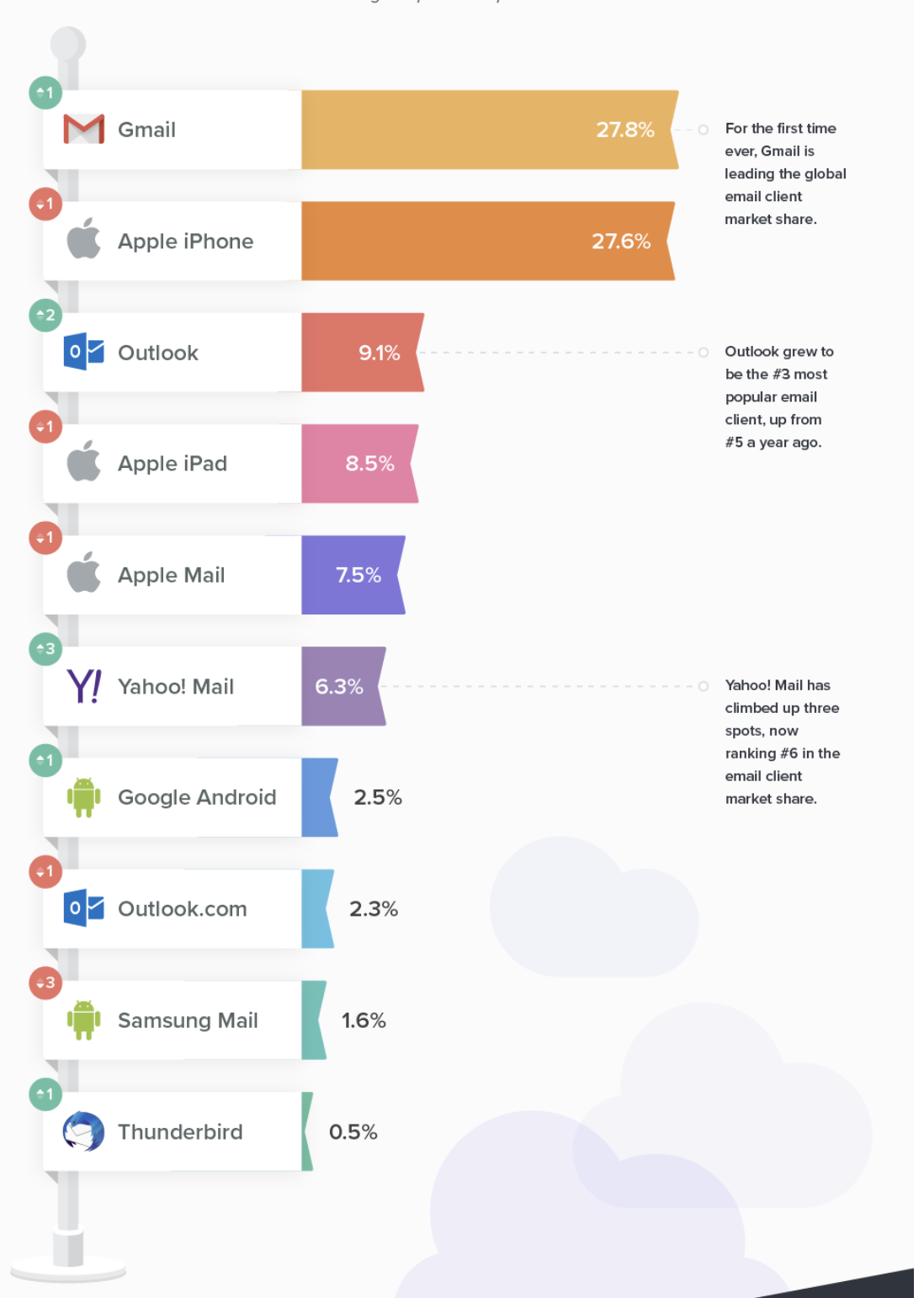
Here are the world's most popular email clients, according to a Litmus research, 2019. Use this list to understand which clients to test your emails with.

We do not recommend you to waste your energy on trying to achieve the perfect email view in all clients. Start with analyzing your contact database optimizing your email campaigns for the email service providers your subscribers are using.
You can also give a try to paid services and test the look of your emails across different resolutions and different email clients:
What to fix in email design to avoid the spam folder
- Always add an unsubscribe link.
- Add a permission reminder — a short text reminding users how you got their email address. Such as, “You’re receiving this email because you opted in for emails on our website…”
- Do not send emails that consist of a single large graphic file. Spam detection bots may recognize and delete such emails as they are often used by spammers. Make sure that your email has at least 1–2 paragraphs of text in it. This will reduce the risk of your campaigns being flagged as spam.
- Remove potentially malicious elements, such as ActiveX, JavaScript, VBScript, Java applets, Frames and iFrames, Meta Refresh, and external CSS. If you use such elements, email services may block your campaigns.
- Do not use redirects or shortened links. Email service providers do not want senders to hide links that users click on. Spammers and cybercriminals often use redirects and shorten URLs to send out malware or direct users to malicious websites. A similar problem may occur if you send out URLs as plain text without creating hyperlinks, and the link text doesn’t match the target address. Let’s say you write https://shop.com/product and enable conversion tracking with UTM tags. When users click on the link, the target URL will be different from the link text in the email. The target URL will be somewhat as follows: https://shop.com/product?utm_source=promo&utm_medium=email&utm_campaign=new_year_2020. An email service provider will assume that you’re misleading users and directing them to a different page. To avoid this, add links to text (“Buy a product”) or images (photos of products).
- Do not use large file attachments. Spammers often use email attachments to spread malware. Spam filters are suspicious of such campaigns and often block them. If you want to share a file with your contacts, it’s better to upload it to a file sharing service and send a link to the shared file instead of attaching it to an email.
- Make sure your design is not littered with colors. You can use 2-3 different colors, just don’t make them too flashy.
- Do not overuse capital letters and exclamation marks. There are many other ways to capture readers' attention: color blocks, images, indentations, buttons, and so on.
- Avoid spam trigger words. Spam filters regularly go through millions of emails and identify words and phrases that are most commonly used by spammers. If an email contains these words, it is likely to end up in spam. You may not be able to completely avoid using words like “buy” and “deals”, but try to include as few triggers as possible and replace at least some of them with synonyms. For more information, please refer to our list of spam trigger words.
If you have any questions or issues related to email design in Selzy, please contact Selzy Support Team. We are available via chat 24/7.


