Really Weird Emails: Selzy’s Choice of 10 Funny, Unconventional, and Creative Marketing Emails

Really Weird Emails: Selzy’s Choice of 10 Funny, Unconventional, and Creative Marketing Emails
27 January, 2024 • ... • 6183 views
Doris Day
by Doris Day

Emails can be immaculately designed, thought-provoking, and sales-driving — but what about the weirdos

Team Selzy loves and accepts emails in all their shapes and colors available on the market. That’s why we chose the 10 most unusual and oddly entertaining promotional emails that challenge all you know about email marketing. Prepare to be amused!

The Craft scene where 4 witches leave the bus, the dialog with the driver: “You girls watch out for those weirdos” - “We are the weirdos, mister”
Source: Giphy

Why become one of the weirdos?

Emails are an art form but a functional one: they should bring money to your business. Making a truly weird email takes not just creativity but also risk tolerance — what if it doesn’t work? What if you end up losing subscribers, generating no revenue off your insane high-concept campaign, or even getting spam complaints? 

We get it, sticking to classic proven recipes, clear subject lines and CTAs, and simpler email designs is a safer choice. However, here are the reasons why we’re all in for the weird email marketing campaigns:

  • They make you stand out. Your subscribers’ inboxes are probably flooded with dozens of cookie-cutter emails from other brands, all written like “Here’s your 30% off these products, buy now” and stuff like that. Such emails, although functional, turn out forgettable and ignored over time. But a weird email will get you remembered.
  • They have a viral potential. If you send a truly weird email, your subscribers will share it on social media, which is basically a free advertisement.
  • They’re just entertaining. Subscribers have no interest in opening branded emails unless they’re valuable to them — we repeated this idea in many articles. The thing is, value doesn’t always mean a money-saving deal: having fun is valuable as well. And if you keep your subscribers entertained, they’ll be more eager to open your emails, whether they have a delicious discount inside or not.

Now that you know the motivation behind outstanding and unusual emails, let’s take a look at our favorite weirdos.

Recess: The longer, the better

Recess is a brand of seltzers that work as a great alcohol replacement during Dry January or for any other occasion when you don’t crave booze. We’ve always loved their relaxed and consistent tone of voice and often included their emails in different inspo selections. But in this email, the company outdid itself:

Funny email from Recess featuring a very long cat and a message explaining that the designer’s cat snuck into the printer that has a longifier machine
Source: Rejoiner

Why we loved it: It could’ve been a regular salesy email, except for the, you know, cat incident — you can even see its remnants peeking out the cat’s loooooong body. But Recess did a clever postmodernist subversion of the promotional email trope. The thing is, the cat creates intrigue — you can’t read the full marketing copy but you become curious. So, what do you do? Go to the Recess website to learn more. And maybe buy something from them.

Graza: The subtle illusion of choice

Graza is a brand of high-quality extra virgin olive oil that has an interesting approach to emails. Their newsletter is fun and provides great content even for olive oil haters. This is their take on a block scheme that helps subscribers choose the right product. This trope is pretty popular — and it quickly got subverted by some brands for comedic purposes.

An email from Graza with a block scheme for easier choice and several questions for subscribers including “Do you have a mouth?”
Source: Email Love

Why we loved it: Right off the bat, Graza hits us with the absurd “Do you have a mouth?” question. They even give us the “No” option! However, you don’t get led to one of the two CTAs only if you don’t have a mouth or live with someone who does — or if you hate squeeze bottles. Also, the lines connecting question bubbles are intentionally convoluted. Either way, you have to order something, how cool is that?

Supply: The power of reverse psychology

In almost every holiday-themed article, we’ve been promoting the idea of starting promotional campaigns before the date X so your subscribers get enticed. There are many ways to warm your customers up for delicious Black Friday offers — here’s what Supply did:

Email from Supply telling subscribers not to buy anything now because Black Friday starts tomorrow
Source: Email Love

Why we loved it: With the bold subject line “STOP. Don’t buy from us today” and the format of a serious CEO message, this email truly perplexes subscribers — and subtly persuades them to buy stuff. Just don’t buy stuff right now, okay? It’s almost like the co-founder worries about our financial situation (more about getting as much money from us as possible but still).

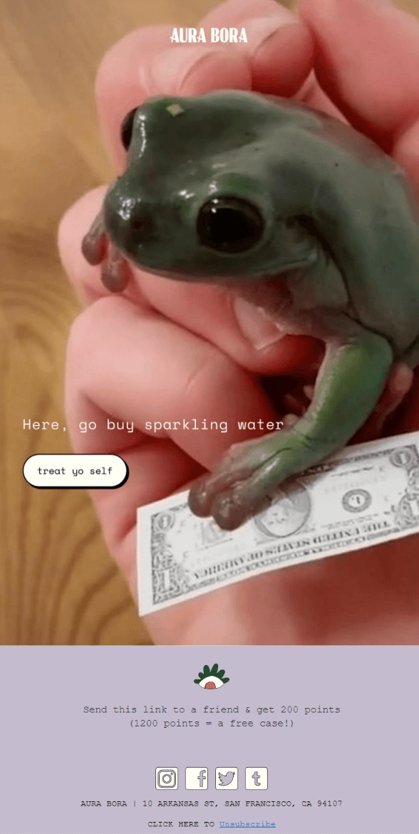
Aura Bora: Brevity is the soul of sales

NGL, we’ve been simping over Aura Bora’s emails for a while — and there’s no way we will stop! This brand of sparkling water has always been making creative and well-designed emails. The one we added to the list may not be the brightest and the boldest — but it’s definitely one of the weirdest…

A sales email from Aura Bora that features a picture of a frog holding a banknote, a very short copy, and a button with the “treat yo self” CTA
Source: Milled

Why we loved it: This promotional email doesn’t use any sophisticated tactics — it just says “go buy the product”, features a fun CTA, and shows us a cute frog picture. It’s stripped down and self-aware — and that’s why it works. Now, do you guys feel like treating “yo” selves?

Who Gives A Crap: What’s my name again?

First things first, a toilet paper brand promoting the product with hilarious emails full of bum jokes and stuff? We’re in! Like Aura Bora, Who Gives A Crap is one of our favorite companies email-wise — and, like the latter, it had a lot of potential candidates for our list of weirdos. We chose this one — just read the copy to see why.

An email from Who Gives A Crap that shares how company employees’ mothers mispronounce the company name, which is also a social proof email
Source: Milled

Why we loved it: It’s probably the most creative social proof email we’ve seen out there — notice how these mum quotes also include good reviews of the product made by… what’s it called, The Crappy Company? In this case, we don’t even care if these quotes are real or made up by a very smart creative copywriter — it’s fun to read, and that’s enough.

Duolingo: Beware of Duo’s wrath

We’ve mentioned Duolingo as a great example of retention email marketing — and, in one of their recent emails, the green owl outdid itself…

Email from Duolingo that shows 5 stages of Duo’s New Year resolutions and plays on 5 stages of grief

Why we loved it: This language app seems to feast on their meme fame thanks to the passive-aggressive tone of voice — and in their first email of 2024, the company brought this to the absurd. Now, passive aggression turns active! Duo’s “stages of New Year resolutions” play on the popular “5 stages of grief” concept — but the owl doesn’t seem to accept that some users don’t stick around. Now, please resume your Spanish classes, you don’t want to make Duo angry, right?

Peak Design: They call him Bird Legs…

Speaking of birds, here’s another email from Peak Design that features a character with faux bird legs — and also other weird people who are actually starring in a movie about Black Friday? We’re confused, just see it for yourself:

Black Friday email from Peak Design featuring the characters of a movie about Black Friday shot by the brand
Source: Really Good Emails

Why we loved it: It’s so random and confusing it draws attention, which is a good thing. It also both promotes and doesn’t promote the movie — didn’t they say the movie is for the company’s marketing team and not for us? At the same time, the email has a link to the trailer, so, it’s for us? Anyway, it’s up to subscribers to figure this out. We also love the minimalist layout that looks great and doesn’t overwhelm the reader.

J. Hannah Jewelry: A rad-ish jewelry collection

This email from J. Hannah Jewelry looks like a regular product release email — a salesy copy describing the new collection, accompanied by a CTA and bold product photography. It looks pretty normal, except for the aforementioned photos…

Email from J. Hannah Jewelry that announces a new collection and features product photos with jewelry pieces put on vegetables
Source: Milled

Why we loved it: Unlike other emails in our selection, this one’s weirdness is very subtle. After all, despite bejeweled vegetables, these photos are aesthetically pleasing — the lighting is on point, and they fit in the email design perfectly. Still, it’s a cabbage “wearing” a necklace, so that deserves a place in our weird selection.

Eve Sleep: A hypnotizing email

Eve Sleep is mostly pretty traditional in its marketing emails — although its consistent branding and cute sloth mascot deserve a shoutout. However, in this one, dedicated to World Sleep Day, the company tried something different. And it worked!

An Eve Sleep email for the World Sleep Day, featuring a written guided meditation session
Source: Milled

Why we loved it: Interactivity in emails can be hard to implement — so, enticing people to scroll down an email to reveal more breadcrumbs of content is a great solution if your technical capabilities are limited. This email allows you to have a couple of stress-free seconds in your work day, how cool is that? Just don’t fall asleep before getting to the actual marketing incentive.

Shinesty: The sensory nightmare of an email

Shinesty is a brand of goofy and kitschy underwear and apparel, so the company’s public personality is already a little unhinged, just like their designs. In this email, the personality in question shows a little too much even:

Email from Shinesty promoting a Christmas merch collection with a witty copy and overwhelmingly bright photos
Source: Milled

Why we loved it: This insanely bright email promoting goofy clothes is actually useful — it gives us pretty solid use cases for such questionable looks. If we weren’t instructed in so much detail, we would’ve worn this suit for a Christmas funeral! Jokes aside though, we love both the painfully bright pictures, the smart copy — and how self-aware the brand is in its promotion. Like, these are no red carpet looks, and a weird product deserves a weird promotion.

Bonus weirdness: MSCHF’s Email Capsule Collection

MSCHF (pronounced “mischief”) is an American art collective that puts out delightfully weird physical and digital art objects — for example, a cologne that smells like the WD-40 penetrating oil. And we were happy to learn that the collective paid attention to emails too!

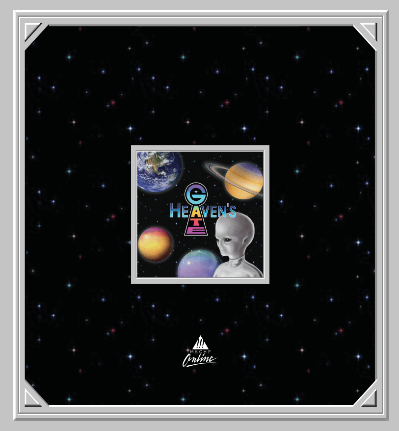
In 2021, MSCHF dropped the humorous Email Capsule Collection that features 5 email domains for personal use. These domains refer to Heaven’s Gate, which is an American cult that combines Christianity and ufology, a popular forum 4Chan, and other well-known offline and online phenomena. So, would you add a @thepiratebay.biz email address to your resume?

A screenshot from the Email Capsule Collection website featuring a logo of Heaven’s Gate cult, an image of an alien, stars, and planets

Why we loved it: Both the concept of funny custom email domains and the project’s website design bring us back to the Web 1.0 era, the time of fully customizable blog platforms (you could add background music to a MySpace profile!) and the total freedom of self-expression. Back in the 2000s, all the weird and wild forms of online self-presentation, including email addresses like [email protected] weren’t frowned upon. Meanwhile, now we choose pictures for Instagram by a color scheme compatible with other posts and use real names for email addresses and social media accounts instead of fun monikers. Isn’t that boring?

Should you craft a weird email for your brand?

Honestly, we have no idea! Subversive emails are not a good fit for every business — but if you think it is for yours, it may be worth trying. Who knows, maybe you’ll get into our next selection? However, there’s one thing we’re pretty sure about: weird or not, emails work wonders for growing your sales and nurturing a community of loyal customers.

And, as you may have noticed, we’re an email marketing service with many cool features like automated anti-spam check — we implemented it so your emails stay weird in a cool way not in a suspicious way. So, yeah, you know what we mean. Need to send some emails? Start for free with Selzy and bring all your weirdest ideas to life.

27 January, 2024
Article by
Doris Day
An experienced writer and editor with a degree in theoretical linguistics and a specialization in B2B/IT/SaaS marketing copy. I see my mission as an educator who explains complex phenomena using simple terms. My favorite show is "What We Do in the Shadows" and I usually spend my weekends somewhere in nature.
Visit Doris's
Selzy
Selzy
Selzy
Selzy
Selzy
Latest Articles
Selzy Selzy Selzy Selzy