What Is an Email Background Image and What’s the Point of Using It?

What Is an Email Background Image and What’s the Point of Using It?
12 September, 2022 • ... • 1301 views
Aida Kubatova
by Aida Kubatova

Background images are an excellent way to add a little extra visual flare to your emails. A solid understanding of email design’s best practices, such as how to pick background images, will stand your email marketing campaigns in good stead. In this article, we’ll focus on the value of using background images in your email campaigns and how to best use them.

What are background images?

A background email image is a picture that underpins all of the email template’s elements and serves an aesthetic purpose. That is why when using background images, it’s essential to choose an image that complements the email design.

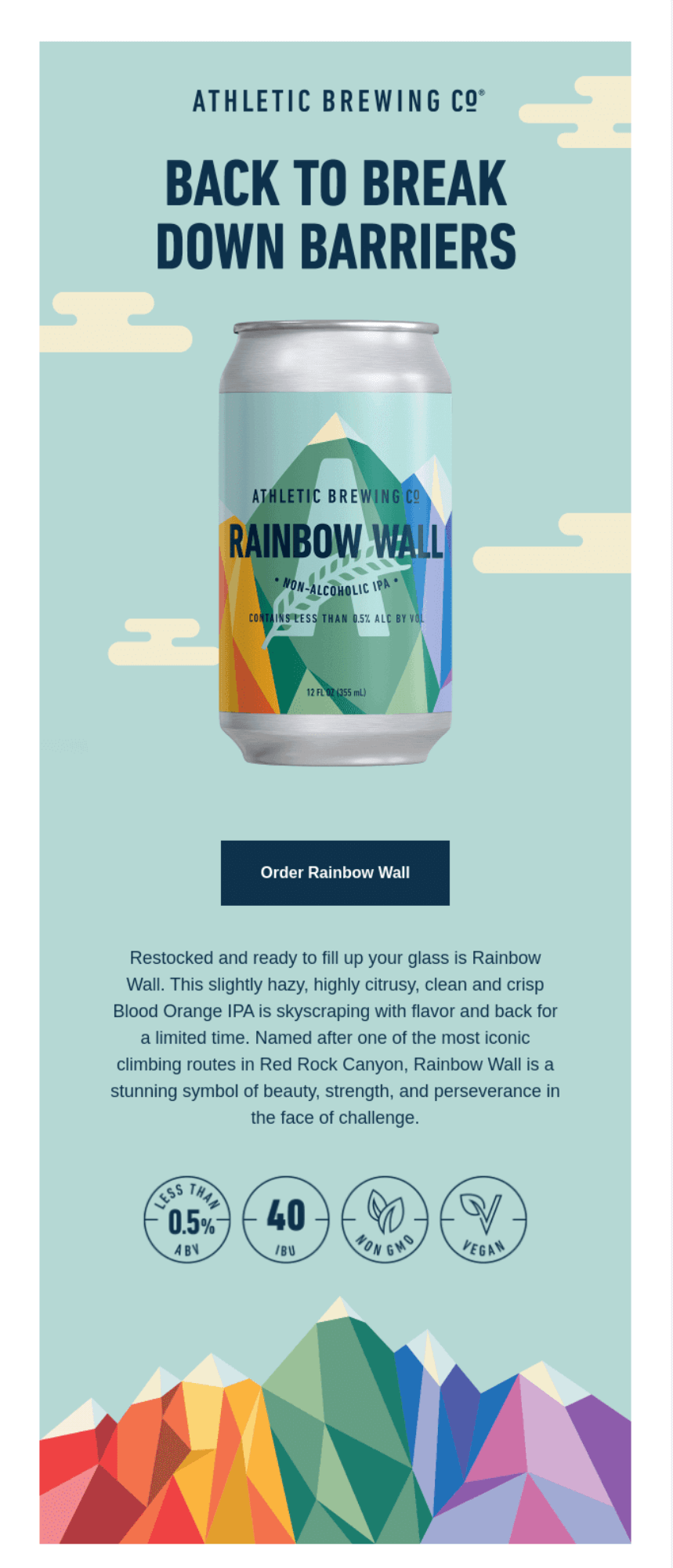
Here’s how it looks in an email:

pic
To match their new product design, Athletic Brewing Company used a soft teal background with complementing colorful shapes. Source: Really Good Emails

Why use background images?

Background images are an essential part of some email campaigns. They are often used to connect the header, logo, and footer of an email. However, they can also be used to create different effects, such as making a call-to-action stand out. They give us something to look at within the email’s content development – and help senders stand out in crowded inboxes. Here’s why else background images make it worth the hassle:

  • They add style and flare: background images are all about adding a touch of professionalism to your email campaign. They don’t need to be the primary focus but can complement your main image or provide continuity throughout the campaign. 
  • You can place content on top: unlike other images in emails, where the image fills the entire space, background images allow you to place different images, text, or calls-to-action (CTAs) within that same space.
  • Background images in your email campaigns ensure a higher deliverability rate.
  • They can help build interest in what you are promoting.
  • You can also establish trust by associating your image with a person, place, or idea.
  • Finally, you can make a lasting impression on your recipients — and they will remember more about what you are promoting. Images also help trigger memories associated with them.

Here are a couple of examples of using background images in an email campaign:

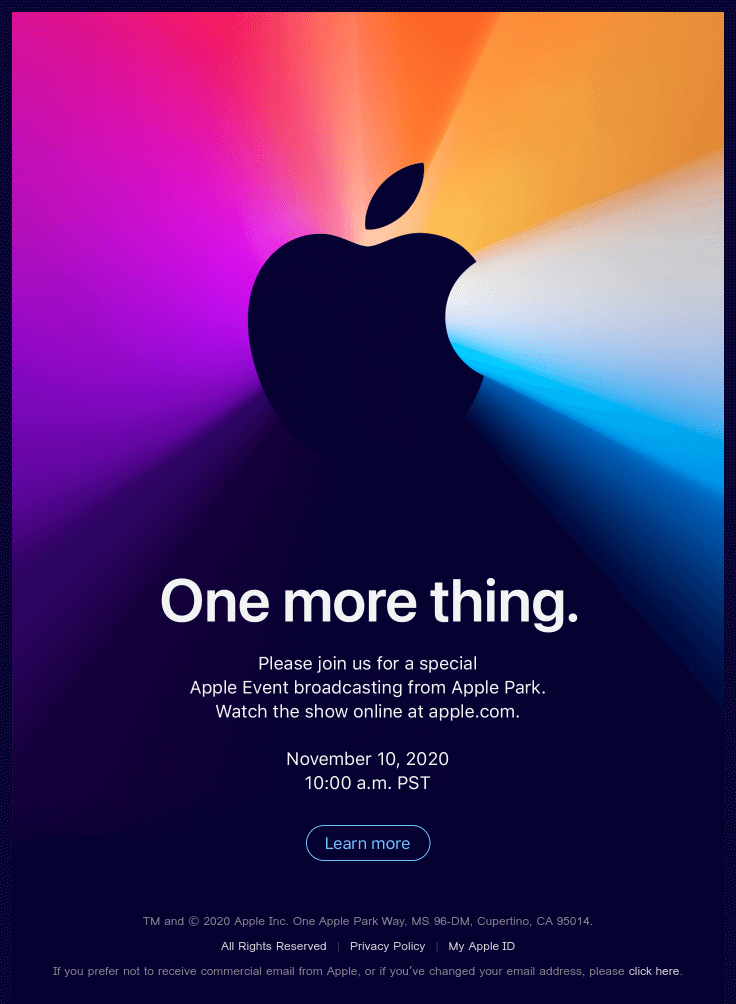
Apple’s email campaign to join the conference
These are some style and flare for you 😮😍 Source: Really Good Emails
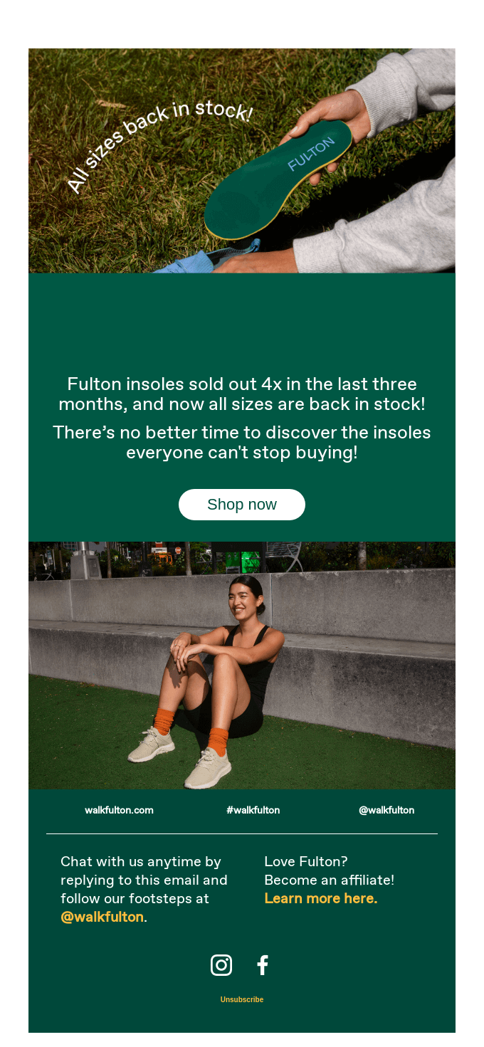
Fulton’s back in stock email campaign
Conversely, the background of this email is perfect at unobtrusively highlighting the main content. Source: Really Good Emails

Design recommendations

This is what you need to consider when deciding whether to implement background imagery in your email:

Contrast

It’s crucial to pay attention to contrasts so that all readers can understand the message you are getting across. Compare your image’s colors to the colors in your email body. 

There exist Web Content Accessibility Guidelines (WCAG 2.0) that are used by designers to make web content more accessible to people with disabilities and the general public. If you check the guidelines you’ll find out that their recommendations on the contrast ratio are that it’s at least 4.5:1 for normal text and 3:1 for large text. Use resources like online contrast checkers to determine what the ratio is in your particular case.

Spotify’s email on personalized stats
The ratios in this example are 2.58:1 and 2.74:1. Could’ve been better 🙂 Source: Really Good Emails

An email background image can be an effective way to add visual interest to an email without compromising readability. For example, Wepik has an AI for generating images from text, so you can create a unique, personalized background without having to design it yourself. This can be a great way to give your emails a personal touch, as well as helping to make your brand stand out.

Simplicity

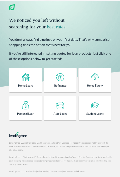
Keeping things simple is another way to ensure readability, especially in minimalist design. It can be challenging to understand the importance of any text you add to your image if the background is busy. Therefore, it is helpful to think of your background image as an addition rather than a feature.

Lending Tree’s email on best prices
Source: Really Good Emails

Solid color fallback

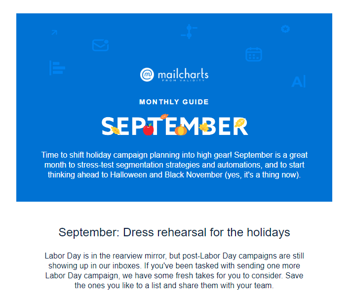
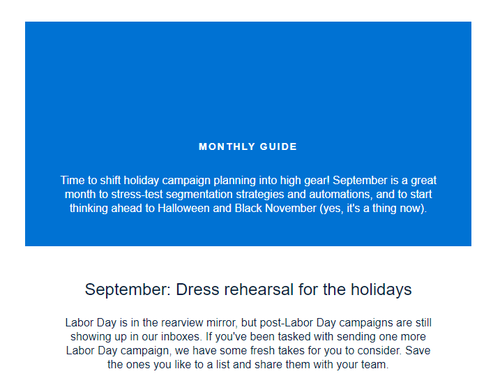
Design a solid color fallback because not all email clients will recognize background images. A solid color will still give subscribers who use email programs that won’t support your images aтn appropriate experience. A fallback color should complement your design and contrast nicely with its main elements.

Here’s an example of an email rendering with images on and images off:

Mailcharts email
Mailcharts email

Responsive background images

Responsive image techniques are used to display the right image based on the device’s resolution, position, screen size, orientation, and page layout. The image shouldn’t be stretched by the email client to fit the page layout, and downloading it shouldn’t consume too much time or bandwidth.

It is crucial to have responsive images since they allow us to deliver the optimal size, and the right image for the right screen size, enhance the user experience and speed up loading. To create a responsive image, you must have several variations of your image.

The setting for the HTML background image covers the table’s 640-pixel width, which is not responsive.

salesforce email campaign with responsive background
Source: Really Good Emails

Rather than specifying pixels or points, you can use a class to make the table’s width match the width of the device. For that, you’ll need to make the edits in an HTML editor.

To do this, add a class (for example, class = “width100px”) to the table and any other elements that need to be responsive, and include the matching CSS in the email’s head. This can be done as shown here:

@media screen and (max-device-width:640px), screen and (max-width:640px) {

.w100pc {

width: 100%!important;

min-width: 100%!important;

max-width: 1000px!important;

height: auto!important;

}

}

To make the background image responsive and 100% width, we can use the vw measurement and set the image width: 100vw.

Background attributes

Background attributes such as color, image, origin, size, and repeat method are all set at once using the background properties of CSS. The background image attribute of an element allows one or more backgrounds to be set. The background attribute also changes an HTML element’s background.

Background size

The background size CSS attribute lets you set the size of the background image of the element. The image can be enlarged, shrunk, or kept at its original size to match the available space. The background-color property is used to fill empty spaces when a background picture is not present. Background images with transparency or translucency will make the background color visible behind them.

Your background image’s ability to fill space can be adjusted using the background-size: attribute.

background-size: contain;

‘Contain’ directs the email client to fill the element the background picture is inside and maintain the image’s original size. A table with dimensions of 640 by 400 pixels will be filled using the dimensions from the example above.

background-size: cover;

‘Cover’ allows you to stretch a picture beyond its original size while still keeping it inside the element to guarantee that it completely covers it.

Background color

In order to control the background color in an email, use the HTML element bgcolor or the CSS style attribute background-color:

<td bgcolor=”#f4f4f4” style=”background-color: #f4f4f4;”> Content </td>

Background repeat

The background repeat attribute sets how the background image is repeated. It might be repeated (or not repeated at all) along the horizontal and vertical axes. To completely cover the background canvas, the picture is repeated as many times as necessary in the direction indicated. The final picture may be clipped if the image does not fit exactly once in the element.

Monday.com email campaign with repeat background
Source: Really Good Emails

Background position

You can use the background-position attribute to set the background image’s position within the parent element’s area. To achieve perfect positioning, you can use a single location (center) or multiple locations (top center).

Email client support for background images

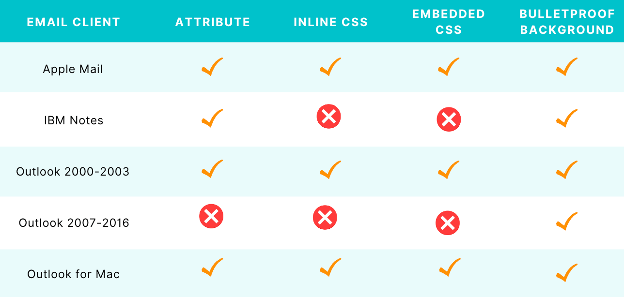
Speaking of support, some email clients make it technically impossible to display images accurately, as is the case with images in general (due to CSS property issues). Here’s a chart with information on which email clients support background images:

email client support for background images chart

Vector markup language

Vector Markup Language (VML) is a file format for two-dimensional vector graphics. Unlike HTML or JavaScript, VML is not a coding language in and of itself. It utilizes the XML coding system and is used to include 2D vector graphics (shapes) into an email (or web) design that may later be filled with colors, content, or other elements of your choice.

If you plan to use VML and any Microsoft-specific comments or code when setting up your email, make sure the appropriate HTML tag is present in the document’s head as follows.

<html xmlns=”http://www.w3.org/1999/xhtml” xmlns:v=”urn:schemas-microsoft

If all this sounds like a fuss…

We have your back: with Selzy’s email builder you can add a background image without doing a single line of code. Simply sign up, log in, and follow these simple steps:

  1. Click “Create a campaign”.
  2. Choose a template for your email — or create one from scratch.
  3. A block editor will appear — choose the “Settings” tab to add a background image.
  4. Toggle the “background image” setting on — and then either upload the image, pick one from the media gallery, or paste in a url with the picture (640 pixels is the optimal width).
  5. Choose whether you want your image fitted to screen, centered, or repeated.
  6. Don’t forget to pick a content area background color for those email clients which don’t support background images.
  7. You can then drag and drop any other blocks on top, be it text, images or CTAs: just choose whatever you need from the “Content” tab.
  8. Voila! Your email with a background image is ready for sending.

Key takeaways

Try adding email background images to your emails if you want to stand out from the crowd. We recommend using both an image and a pattern of shapes. This can help you differentiate your brand and make your emails more pleasant to your readers. Try these steps when adding background images to your email campaign:

  • Follow design recommendations on contrast, simplicity, and color.
  • Add image attributes.
  • Add the background color.

I hope this post will help you with adding background images. Good luck with your email campaign!

12 September, 2022
Article by
Aida Kubatova
Aida Kubatova is a content writer and digital marketing manager. She’s experienced in writing marketing articles for B2B SaaS blogs, newsletters, landing pages, case studies, and interviews. Every day, she creates useful content to help marketers around the world learn more about the latest news and trends. Aida also helps small startups to grow their audience using the power of community marketing and influencers.
Visit Aida's
Latest Articles
Selzy Selzy Selzy Selzy