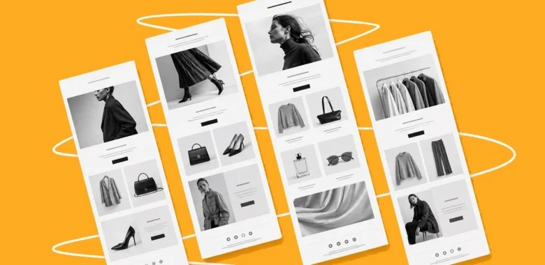


Fashion newsletters have to do more than announce a collection. They need to sell the look visually, keep the brand’s style recognizable, and give shoppers a clear next step, whether that means browsing a new drop, using a promo code, or returning to a product they already considered.
Fashion brands know this well: email is one of the few channels where a brand can combine product visuals, seasonal storytelling, offers, and customer data in one message.
In this article, we’ll look at newsletters from popular fashion brands and break down the tactics that make them work. The examples can inspire fashion marketers, clothing brand owners, and ecommerce teams building an effective email marketing strategy.
What makes a good fashion newsletter?
Strong fashion newsletters usually do five things well: they sell visually before the copy starts working, keep layouts easy to scan on mobile, make the CTA obvious, sound like the brand rather than a generic store, and match the message to the shopper’s stage.
That stage can be a welcome email, a collection launch, a seasonal sale, a cart or browse abandonment flow, a loyalty campaign, or a win-back message. The examples below show how different brands balance visuals, copy, offers, and brand identity.
The fashion pyramid of brands
Before we dwell on the actual newsletters, it is important to mention that all the existing fashion brands have a certain segmentation depending on their positioning and target audience. It is called a “fashion pyramid of brands”:
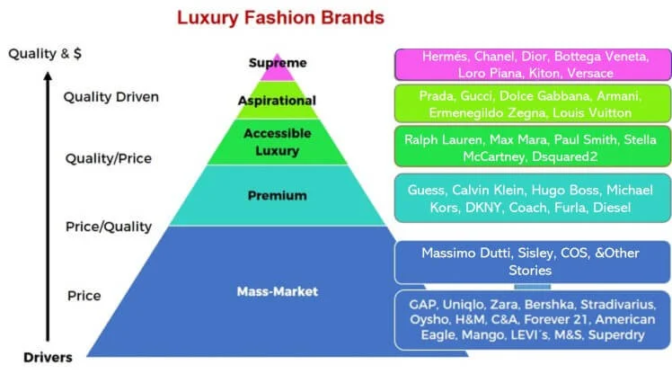
In many aspects, this pyramid resembles the famous Maslow’s hierarchy of needs. Mass-market brands located at the bottom cover basic needs, while luxury and aspirational brands are related to self-fulfillment desires.
We’ll observe a couple of brands from every category to learn the approaches they use in email marketing and see whether brand positioning influences the quality of their emails.
| Brand | Segment | Main tactic | What to copy |
| Mango | Mass-market | Category and product grouping | Use clear visual blocks for different shopper needs. |
| Uniqlo | Mass-market | Clean promo structure | Keep sales emails simple, scannable, and easy to act on. |
| H&M | Mass-market | Storytelling | Tie products to a narrative instead of only showing a discount. |
| Ralph Lauren | Accessible luxury & Premium | Luxury minimalism | Let brand atmosphere carry the message when visuals are strong. |
| Gucci | Luxury & Aspirational | Visual identity | Use strong art direction, but keep navigation and CTAs clear. |
| Bottega Veneta | Luxury & Aspirational | Cautionary example | Avoid image-only emails with a weak CTA or too little context. |
Mass-market
What we’ve noticed about mass-market brands is that they provide their customers with regular sales: that’s probably the core of their email marketing strategy. “10% off”, “Sale ends today”, “Grab your discount” –– are the most frequent email subject lines they’re using.
Let’s take a closer look at other tricks they have in their marketing toolbox.
Mango
Mango is an internationally recognized mass-market clothing brand offering accessible clothing for women, men, and children.
What we liked about it:
The brand leaves no one behind: they combine offers for women, men, and kids in a single newsletter. For every category, Mango decided to group the items according to trendy palettes and patterns.
It’s a lot of information for a single email, but the template allows that. The newsletter contains minimal text keeping things short and simple. Instead, the brand showcases its products, inviting you to visit the website and see more.
Uniqlo
Uniqlo is a Japanese brand known for its high-quality basic products sold at reasonable prices. Their designs are simple and classic, yet, they always strive for creative styling and innovative materials.
What we liked about it:
This is a classic example of Uniqlo emails. They send their offers quite often (every day or so) but thanks to its subtle and unobtrusive approach, they don’t seem pushy. A clean look, a matter-of-fact attitude, prominent CTAs — it’s what you need to make your emails well-organized and invitingly simple. Just like Uniqlo.
Bershka
Bershka brings the newest trends in menswear and womenswear to the youth. The team of professionals works to observe the newest trends and reconstruct them into modern styles for men, women, and teenagers.
What we liked about it:
In this email, Bershka unveils a new collection of dresses. The template is quite laconic and has a minimum of text: just vivid images of beautiful dresses with CTAs. The color scheme is calm and pleasant for the eye, creating an impression of a stylish and unobtrusive email. Beautiful to look at, easy to digest.
Zara
One of the most recognizable fashion retail brands in the world, Zara began as a family company in Spain in 1975. Zara’s key idea can be characterized in three words: beauty, clarity, and functionality.
What we liked about it:
Zara not only produces fashion clothing, but is also known for its perfumes, cosmetics, and home accessories. In this email, they notify subscribers about a soft matte foundation and concealer available in numerous tones for different skin colors. Zara perfectly highlights the universality of the product having invited models of different appearances. The newsletter is mostly visual, with a short abstract of the text. The photos give you a teaser of the campaign inviting you to enter, see more and buy. Due to vivid illustrations, the email looks emotional and stands out among other fashion newsletters.
COS
COS is a Swedish brand and part of the H&M Group. It’s streetwear known for being inexpensive, simple and of minimalistic style often featuring gender-neutral androgynous silhouettes.
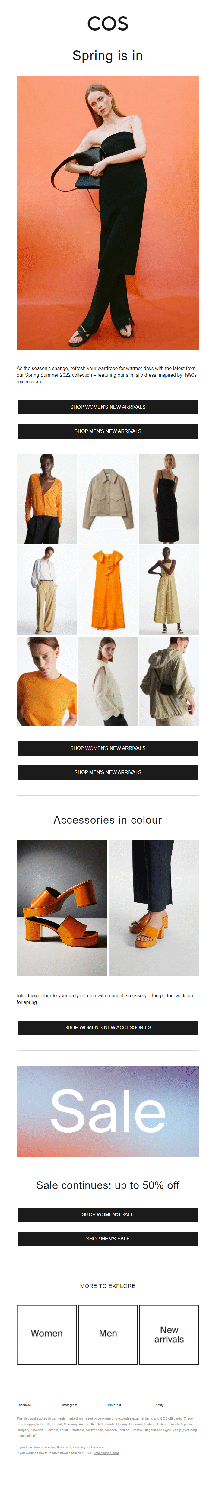
What we liked about it:
COS has chosen the most popular but surefire kind of design for their emails — a lot of white space, simple column structure, color accents, clear but unobtrusive CTAs — all along with modern design trends and their brand identity. What catches the eye is the GIF that shows the model up close and in full growth and big CTAs before the footer that invites you to explore both women’s and men’s collections. The email is on the verge of being too long because it contains not only a big hero picture but multiple images, CTAs and extra information about accessories and a sale but thanks to the minimalistic attitude it feels balanced.
H&M
H&M is one of the most recognizable global fashion brands. It is popular because it offers both basics and trend-led clothing at reasonable prices. What’s more, they position themselves as an ethical company by promoting sustainable practices and the brand is also famous for regular collaborations.
The majority of their emails are solid but just as basic with no real difference from other mass-market brands. Still, sometimes they send something interesting, like this example (it’s rather long but it’s a feature, not a bug):
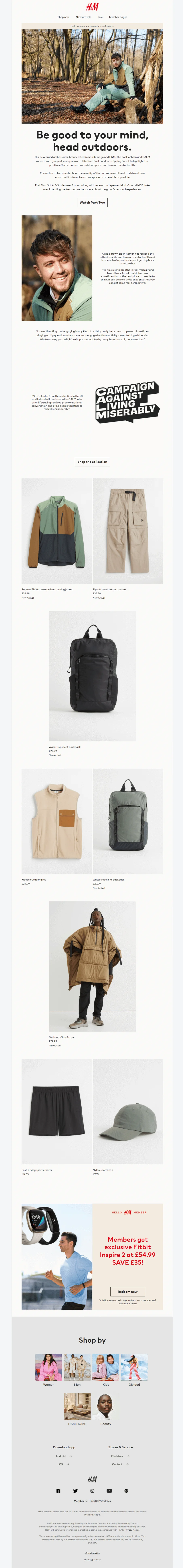
What we liked about it:
It’s not your regular email with sales and deals, it’s an example of storytelling in email marketing. The company has a goal to promote a new outdoor collection. So, they could’ve just sent a message with jackets and pants (and some 20% off) and that would be OK. Instead, they decided to tell a story about their newest ambassador and his views on mental health issues caused by the pandemic isolation. All during a hike through a forest and wearing H&M gear, of course. The rest is the pictures of clothing and accessories, a related offer, and their usual footer info.
GAP
GAP is known for its laid-back basics and classic denim. Having started their business as one humble shop selling jeans, it goes as something quintessentially American, unsophisticated but solid. And it looks like their email marketing is a bit unsophisticated as well.
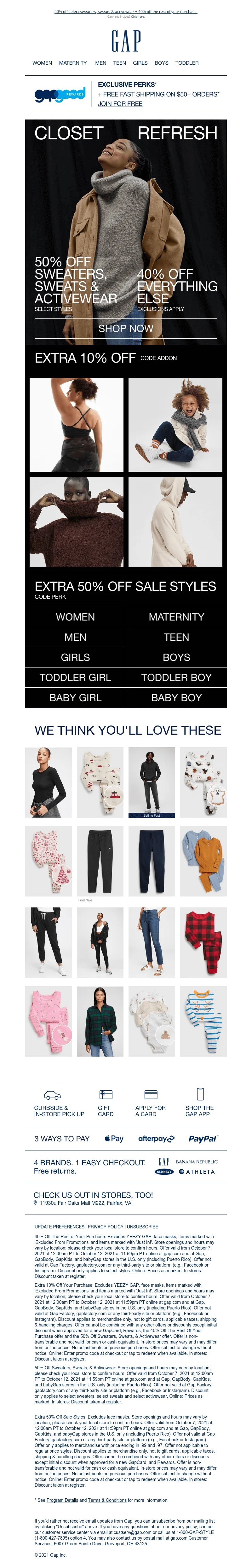
What we liked about it:
The email is OK, but not great. It’s close enough to efficient designs of recent times but feels like it’s lagging by a dozen years: too much information in one place is overwhelming and hard to read (a lengthy footer isn’t helping either), the texture is too uniform and lacks clear calls-to-action. What’s more, the mobile version of this email looks almost the same — imagine working your way through this 4-column structure with tiny images on your phone.
Marks and Spencer
It’s a major British multinational retailer that has been around since 1884. They specialize in clothing, products for home, and food. In 2014 they were called the UK’s most authentic brand. Nowadays the Marks & Spencer brand is just as powerful in the world as it’s ever been within the UK.
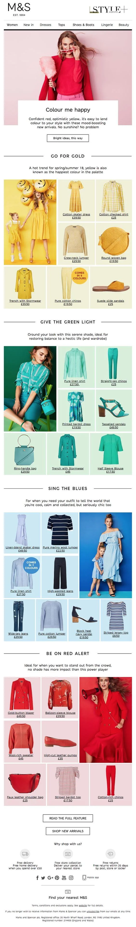
What we liked about it:
A fantastic use of shades and tones is the thing that immediately grabs your attention. They’ve combined sets of clothes by color, beautifully alternating one by one. But, as in the previous example by GAP, it may seem that the email is a bit overwhelmed and lots of multicolored items distract attention. It becomes hard to choose which set to look at.
Accessible luxury & Premium
The brands of this category combine the frequency of mass-market emails (one day –– one email) with a luxury and aspirational marketing approach: a non-intrusive display of new collections and very rare promotional activities. Let’s see what we can learn from them.
GUESS
This is an American brand of lifestyle clothing. This company was the first of a kind to come up with designer jeans initially for women followed by men’s items. Nowadays they have a wide range of products for men and women: from accessories to denim and footwear.
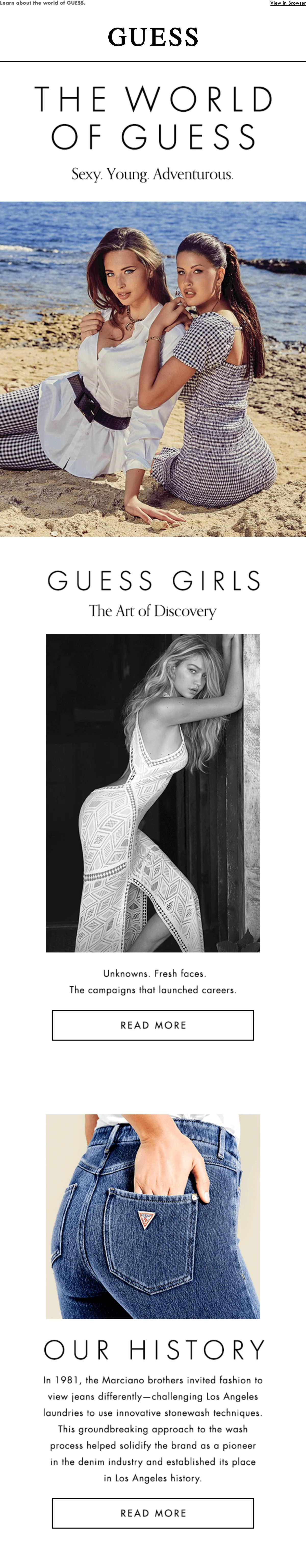
What we liked about it:
The newsletter by GUESS grabs the eye with high-quality images and a beautiful color palette from the offset. It is tidily done, with no extra details and distracting elements. To make the reader engaged, the marketers choose storytelling –– an email marketing technique that is not widely discussed among email marketers, yet performs well. Plus, what we especially liked is the absence of long pieces of text. Colorful images of styling ideas are accompanied by short descriptions with a good amount of white space to give the eye a break between looks.
DKNY
DKNY is a brand that borders on luxury and accessibility, having long been labeled as an “inbetweener” of sorts. Their designs are universal and practical, being simultaneously high-fashion and street-style and it’s evident from their emails.
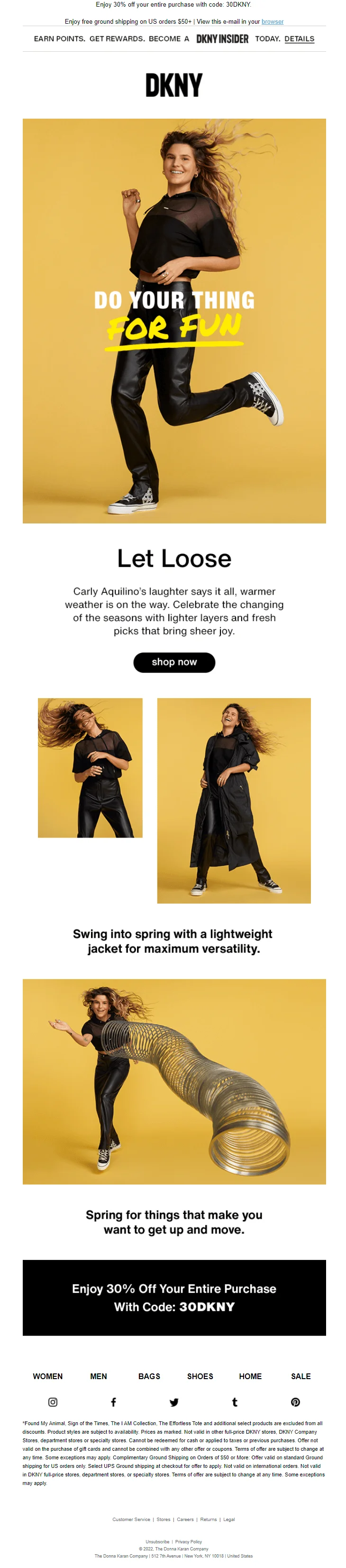
What we liked about it:
This email is part of DKNY’s Spring Summer 2022 Collection campaign and it features Carly Aquilino — an American comedian and actress. The goal of the campaign is to gather multifaceted talents in an attempt to promote positivity, humor, and joy in everyday life. The email looks bright and inspiring, shows several pieces of DKNY’s clothing in action, and even has a little play on words around spring. One extra benefit is a code for a 30% discount.
Ralph Lauren
In 1968, a young designer started his business –– it was a tiny showroom in the Empire State Building. No one imagined that in 50 years, it would turn into a brand that defines not just the American wardrobe, but the fundamental ways we understand fashion. Nowadays its influence has spread to communities and cultures in virtually every corner of the globe.
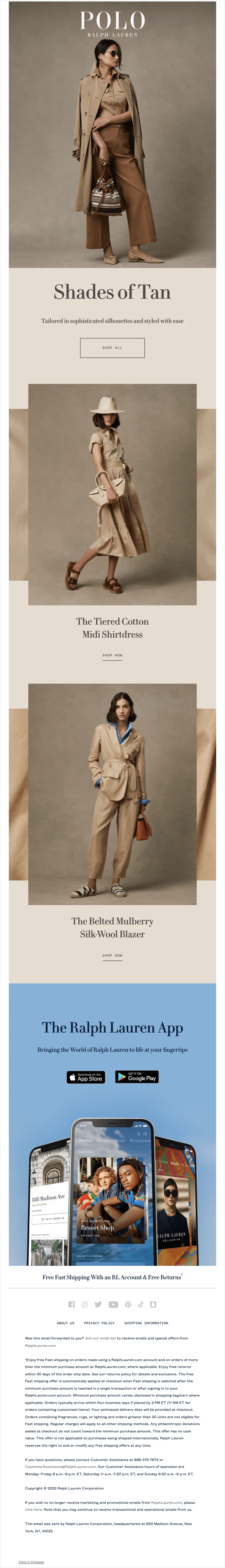
What we like about it:
The color palette of this newsletter is absolutely stunning: elegant beige looks discreet and expensive. There is almost no text –– just catchy headlines, but it seems that it would be redundant here. CTAs are not so obvious and look like the continuations of headlines. Neat and tidy, attractively simple email.
Luxury & Aspirational
The brands from this category send newsletters less frequently. We’ve subscribed to newsletters by Chanel, Hermès, Bottega Veneta, Armani, and Gucci, and noticed that the companies send far fewer newsletters when compared to mass-market brands. Probably, they stick to quality, not quantity? Let’s try to find out by observing newsletters by Hermès and Gucci.
Hermès
Hermès bags are among the most iconic luxury bags on the market: these are pure pieces of luxury starting from $4000 for an ordinary backpack. The brand is also well known for producing accessories and perfumes for men and women.

What we liked about it:
Pastel colors, muted tones, delicate lines, and streamlined minimalism look super-trending and chic in terms of visual aesthetics — pastels and beige are one of the hottest color trends of the moment. The message is clean and neatly structured and, like the rest of the emails from Hermès, it has an air of nostalgia thanks to the faded retro color palette and the typewriter font. All this exudes “quiet” and timeless luxury that has been and will be around for ages.
Gucci
Gucci is one of the most successful, thriving, and iconic luxury brands in the world. It’s innovative, yet makes timeless pieces, focused on its product quality, and never fails to conduct events that you can call special for sure.
Unlike Hermès, Gucci is certainly a “loud” luxury brand. It’s known for its extravagant and opulent designs, and the brand follows this rule in email marketing. This is their typical newsletter:
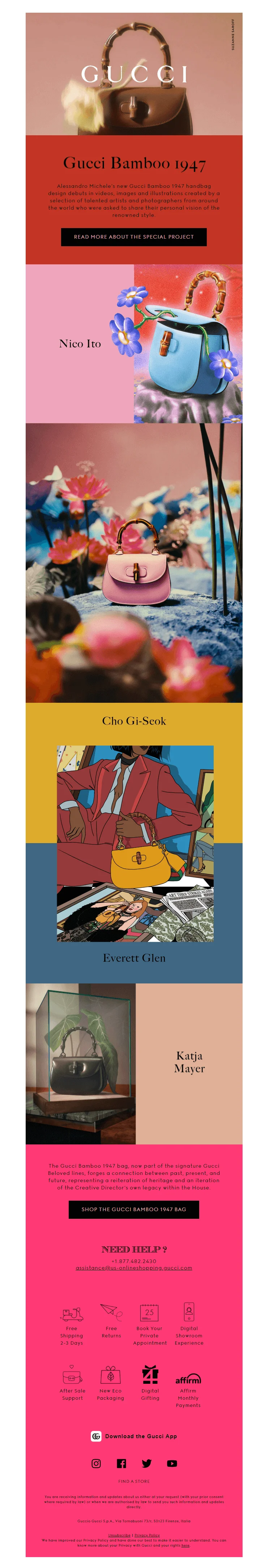
It’s as sophisticated and distinctive as their products, but for many, so many contrasting colors at once may look garish and even cheap, so we decided to take another Gucci email as the main example. This one:
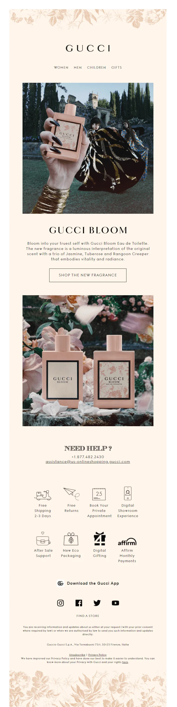
What we liked about it:
So we decided to pick an email that features a softer, muter, and more modern palette that looks almost like Hermès’ and goes along with the design of the featured product. Gucci is not afraid to break for a bit with their usual looks and try something new to step with the times.
It also has a good structure with a nice text/image ratio and a set of icons that draw the eye and facilitate navigation.
Chanel
The name of the brand has already become the synonym for elegant classics, glamor, and high-end clothing. The story of the company began in 1909, and since then it has transformed into a reputable fashion house, producing clothes, cosmetics, fragrances, and jewelry of the highest quality.
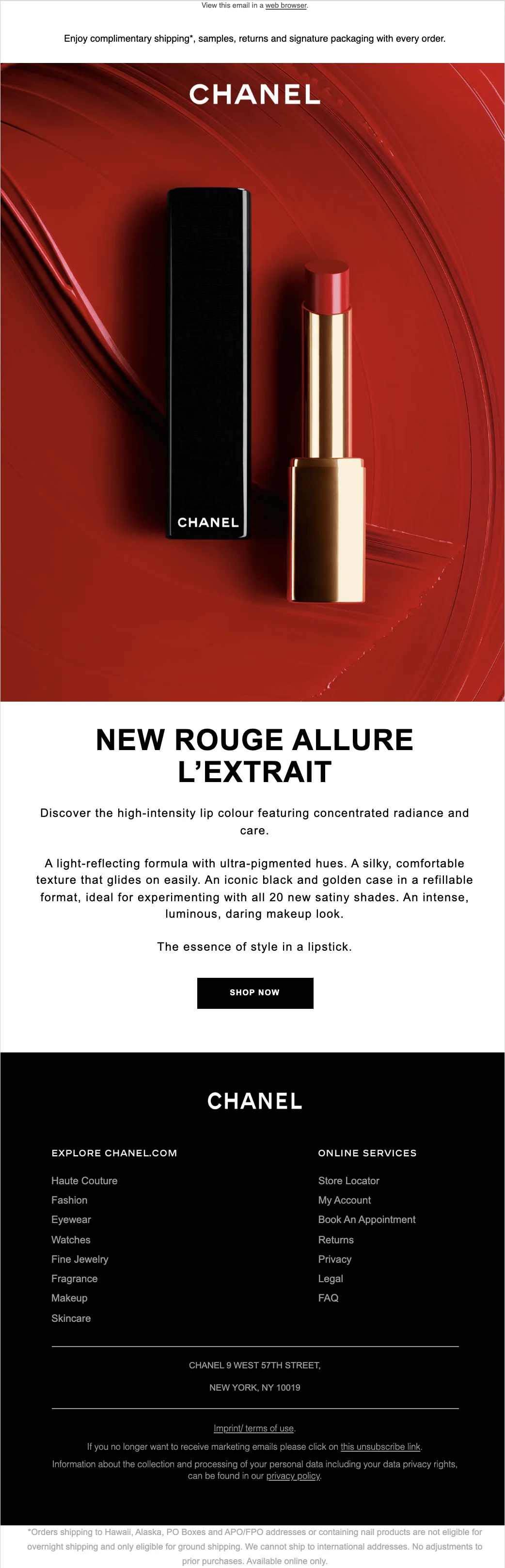
What we liked about it:
At first sight, the email seems to be very simple: a picture and a brief description. But this seemingly simple newsletter is not that simple –– if you take a closer look, we’ll notice a witty and laconic text, a clear and prominent CTA, and a juicy, outstanding photo of a lipstick. Creating such an email takes time, thought, and effort. A pure feast for the eyes!
Bottega Veneta
Bottega Veneta is an Italian fashion house most famous for its luxury handbags and accessories. The brand’s signature style is woven leatherwork called intrecciato. The products are of very high quality, but their email templates are… questionable.
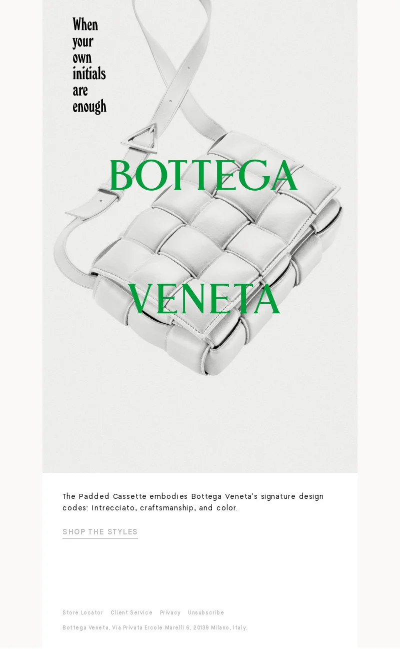
What we liked about it:
Actually, we didn’t. This is a typical example of their emails and it’s probably the worst on our entire list. On the one hand, it features a good photo that showcases their intrecciato, trademark typography, and looks fine at first glance. But on the other hand, it’s too short and doesn’t let you get a full idea of an offer. What’s even more dubious is that a picture takes too much space in relation to the overall email’s real estate, making it a target for spam filters and the design in general is not friendly to users with an inconspicuous CTA and absence of the View in the browser link.
How to use these examples in your own fashion emails
- Use mass-market examples for promo clarity: strong product blocks, obvious CTAs, and easy category navigation.
- Use premium examples for brand atmosphere: fewer elements, more white space, and a clear visual mood.
- Use luxury examples for restraint and art direction, but make sure the email still has enough context and a visible CTA.
- Treat weak examples as useful warnings: an image-heavy email can look stylish but still underperform if the offer is unclear.
- Before sending, test the email on mobile and check whether the main CTA is visible without extra effort.

Final thoughts
The most surprising finding was the fact that the quality of the newsletter does not depend on the place of a brand in the fashion pyramid –– a hierarchy of companies depending on their positioning and target audience. We’ve already noticed this tendency when observing the newsletters from famous musicians.
Probably, it happens because, for both luxury and mass-market brands, email is a core promotion channel. That’s why fashion newsletters are mostly neat, thought out, eye-pleasing, and pretty frequent. Mass-market brands send emails almost every day (it seems a bit excessive) offering numerous promotions, discounts, and new collections. Luxury and aspirational brands send newsletters less often: several emails a month, and that’s it.
In general, newsletters by clothing brands are an encyclopedia of effective email marketing strategies. So, no matter if you are a seasoned email marketer or a junior, e-commerce emails are a source of inspiration when it comes to design, brand voice, CTAs, and strategic campaign ideas.
