Creative Email Ideas and Examples From Your Favorite Brands

Creative Email Ideas and Examples From Your Favorite Brands
18 October, 2024 • ... • 343 views
Alexey Baguzin
by Alexey Baguzin

Brands see email campaigns as an opportunity to connect with their customers, speak to them directly — with no intermediaries. These brands get all sorts of creative with the emails they send, experimenting with layouts, subject lines, CTAs and whatnot.

This article is about email campaign ideas from the top brands — and how you can get more creative when crafting your campaign. But first, let’s go through some cornerstone elements of creative emails — with examples, of course.

Key elements of creative emails

Once you get campaign goals and audience segmentation out of the way, it’s time for your copywriters, designers and email marketers to put their heads together and hammer out the copy and layout for the upcoming campaign. Below we’ve rounded up the best practices to keep in mind.

Subject line

If you were a journalist writing for a newspaper, then the subject line would be the article’s title. The goal of the subject line is simple: get your subscribers to open the email. You want to stand out in a crowded inbox.

To achieve that, you should aim for a subject line that is:

  • Short: Omeda did a study on their own customers and discovered that under 20 characters is the best for open rates. What’s more, a lot of people will view your email from mobile, where a lengthy subject line will be simply cut off (more on that anon).
  • Truthful: don’t sell a pipe dream to your readers. Your email copy should deliver on the promise in the subject line.
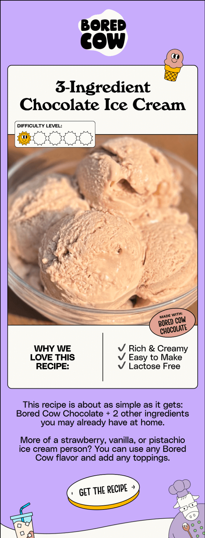
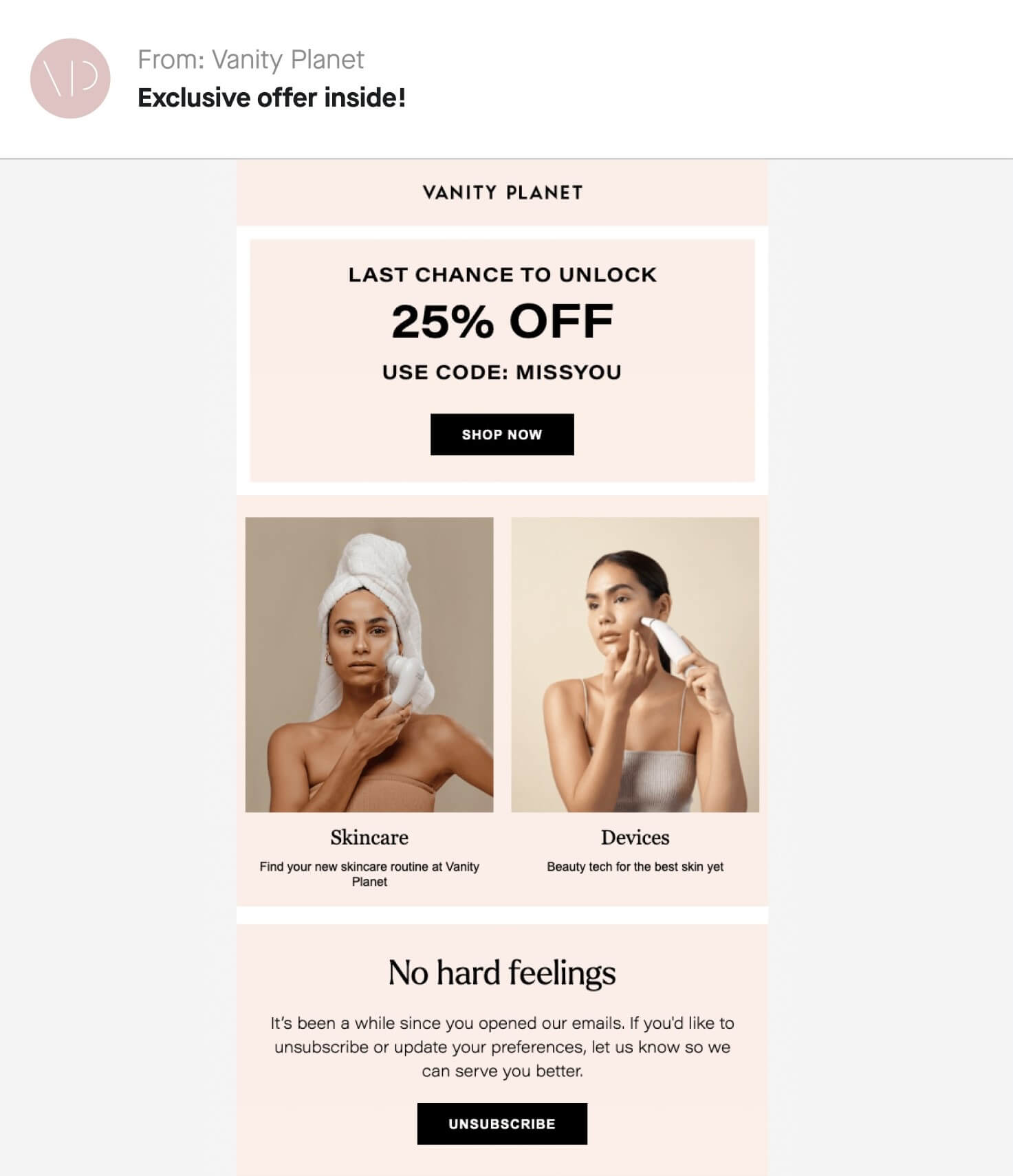
  • Beneficial: tell your readers what they stand to gain by opening the email. It’s not necessarily a discount or free shipping — it can be valuable info or entertaining content. Either something for the mind or for the soul.

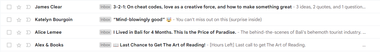
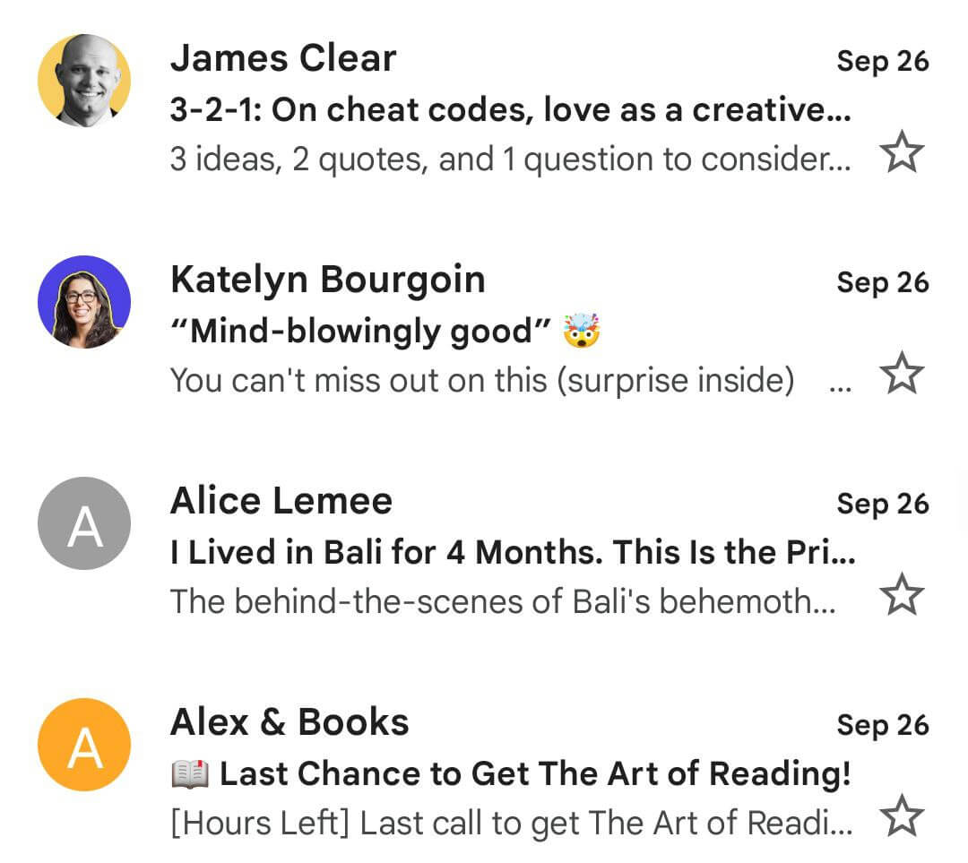
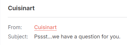
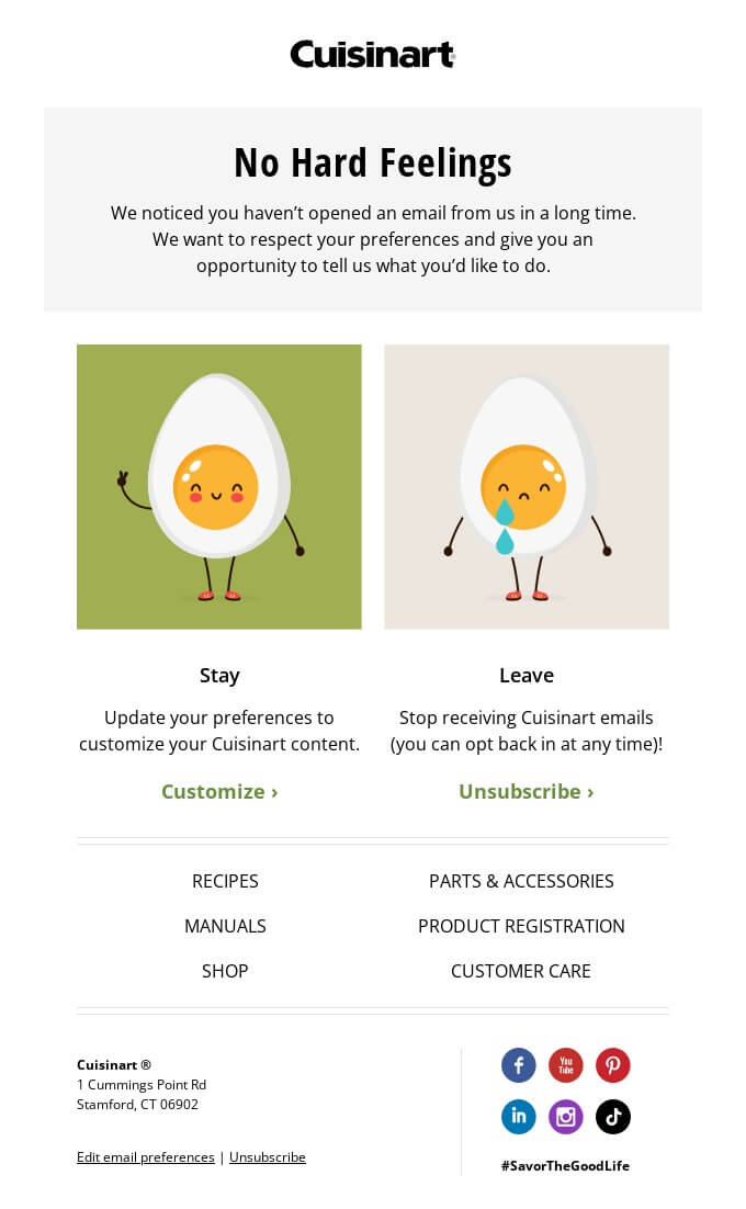
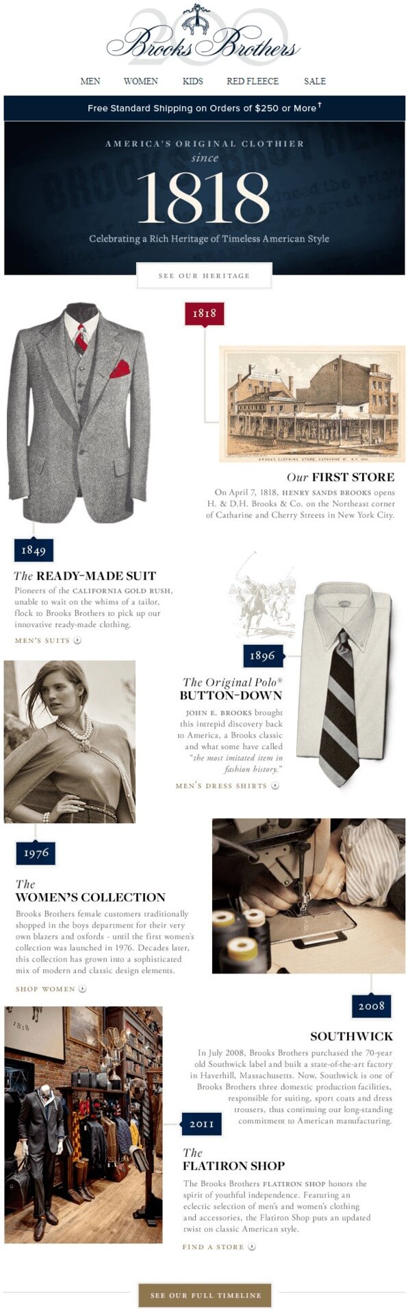
Below’s an example from my own inbox. Two of these emails go for the sales pitch, one is educational, and one is entertaining. I like number three especially because you wouldn’t normally associate Bali with a problem — and there definitely is one.

Four subject lines on desktop version from different senders: two salesy, one educational and one entertaining
How different subject lines look on the desktop version. Source: Gmail

By the way, here’s what it looks like on mobile: keep the character limit in mind. The juiciest subject line (number 3) gets cut off.

Four subject lines on mobile, two of them cut off
How different subject lines look on mobile. Source: Gmail

Preview text

The preview text shows up right after the subject line. Like the first paragraph in a newspaper article, it’s the most important bit of copy after the subject line. Don’t disregard this opportunity to further draw your readers in. If you do, the first few lines of text from the email will show up in its place.

These first lines will likely be a greeting + some kind of intro, which are crucial to the overall structure but not very interesting per se. You’ll do better by elaborating on the promise you tease in the subject line.

Below’s another example from my inbox — let’s look at what works and what doesn’t. I blurred a transactional email which has nothing interesting to show for it). I also included the mobile version on purpose, to demonstrate how preview text gets cut off.

Emails from the Hustle, Medium, James Clear and Marketing Brew — all with questionably interesting preview text
Marketing Brew looks the best of the bunch. Source: Gmail

I’ll be honest here: only Marketing Brew has caught my eye. While all four senders fail to stick to the character limit and get their preview text cut off, Marketing Brew at least does enough to spark interest.

A combination of a picture profile to foster trust, a short subject line, and a nod to a popular fad in the preview text that complements the subject line nicely. I would also read James Clear’s email, but only because I know it’s him, the email will likely be good and I can safely disregard the preview text — and even the subject line.

Medium Weekly sits comfortably at the bottom. No avi, a subject line cut off — and preview text which is mildly infuriating. No thought has gone into it: an opportunity missed to tease one of the better stories this week — or at least elaborate on the subject line.

Email design

Your email should look the part as well. Include some white space where the eye can rest from the text, use a color palette in line with your style guidebook — not to mention how you can pique your readers’ curiosity with graphics.

One of the examples I particularly enjoyed comes from Tinder. The brand included animated GIFs in the email copy — and you are instantly mesmerized.

Welcome email from Tinder with GIFs to make app setup easier and fun
Tinder’s animated welcome email. Source: Really Good Emails

Just a word of caution: your in-mail graphics should not contain important info — unless the info also shows up somewhere in the copy. If the images/videos fail to load, your readers might be at a loss what you want them to do.

Calls to action (CTAs)

These will vary based on the content of the email but one thing should remain constant: your CTAs should be clear. They should leave your readers in no doubt about what to do next.

All that being said, your CTAs don’t have to be dull. They can — and should be — in line with your email copy. If the copy is light-hearted and conversational, make your CTAs light-hearted and conversational. If your copy is graphic-heavy, leverage a CTA as another graphic element.

An example of a creative CTA comes courtesy of Bored Cow — a brand which makes and sells an alternative type of milk.

A chocolate ice cream recipe teaser and an unusual CTA from Bored Cow
Bored Cow’s CTA is crafted so well as part of the overall approach, it’s not even instantly obvious. Source: Really Good Emails

Email copy

You didn’t think we’d forget about the text of the email itself, did you? There are a lot of moving parts to consider when producing copy (such as your brand’s tone-of-voice), but there’s at least one thing that can be wholeheartedly recommended regardless of your niche: write as if you are addressing a single person — your close friend (if your tone of voice allows it).

You know you are writing for a large audience — but the audience is going to open your email one at a time. They’ll sense right away if you talk to them as if you are addressing a huge crowd: the email won’t seem personal, and it will be much harder to keep readers engaged if they don’t feel they are being addressed directly.

If you can wrap your text copy in a personal story that your readers can relate to, even better. Moving people on an emotional level is the ultimate goal: as the folk wisdom goes, people won’t remember what you did or said — but they will remember how you made them feel.

Here’s an example of how a marketing agency, Sublimio, announced the launch of their new website. As you read on, you are itching to know what it’s all about — the email is very far from being salesy. Sublimio even extended their sun analogy to useful links at the bottom.

Sublimio explaining how much of our lives revolves around the sun, announcing their new website in the process
Sublimio’s unusual approach to email copy. Source: Really Good Emails

Best examples of creative emails

Brands rely on the key elements mentioned above — and go beyond by implementing different techniques — to create memorable email campaigns. Let’s go over the creme de la creme, best email marketing campaigns — which you can draw inspiration from and stand out from the crowd.

A humorous welcome email

Bezar, a marketplace selling designer goods, sent the email below to their new subscribers.

An easy-to-follow welcome email from Bezar with five blocks of copy
Bezar’s welcome email written in a light-hearted conversational style. Source: Really Good Emails

Why it works: well, the first question that pops into your head: “How do you pronounce that?”. Bezar answers that question straight away — and with a healthy portion of humor. The company shows they are aware of how their readers think.

The email does several other things well:

  • It cleverly uses the white space to give your eyes a rest.
  • It implements clear CTAs, with benefits spelled out right underneath.
  • It places several items you might be interested in at its heart.
  • It has chunks of text you hardly notice — until you need some context. Then you find it right where you are looking for it.

The marketplace itself only lasted a year since its original launch in 2015, before it was bought by AHAlife Holdings — but I take my hat off for that email.

A gentle re-engagement email

Vanity Planet, a brand that specializes in skincare products, drops beautiful re-engagement emails.

A clean email from Vanity Planet which offers a discount if you return — but also makes it easy to unsubscribe.
A re-engagement email from Vanity Planet which makes it much easier to return. Source: Attentive

Why it works: a clear CTA, a tempting offer to rekindle your interest — and only the essentials if you really want to unsubscribe. If you are fed up with their emails, it’s easy for you to opt out.

However, Vanity Planet does a fine job of trying to pull you back in. The discount on offer is substantial — and you can’t really miss it. The copy itself is up-to-the-point and written in a friendly tone.

Why it might have flopped: The subject line — it’s too salesy. “Exclusive offer inside” with an exclamation mark is generic. It feels like something is being rammed down your throat. It’s a pity: the copy and visuals are clever enough to draw readers in. I do wonder what the open rates were (not to mention the re-engagement they were gunning for) with such a subject line though.

The subject line is why I like the example below, from Cuisinart, better.

Sender and subject line inside an email inbox
A clever subject line from Cuisinart which makes you want to open the email. Source: Really Good Emails
A short but sweet email from Cuisinart which aims to re-engage inactive subscribers
Cuisinart matches their subject line with great email copy, making it much harder to unsubscribe. Source: Really Good Emails

See what they did there? The subject line spikes your interest, taps into your innate curiosity. Even if you don’t remember who, in the name of God, Cuisinart are, and what they are doing in your inbox… What’s the question they want to ask you?

The rest of the text is clever too. Conversational tone, concise copy — and two smart CTAs. They’ll make you pause and think for sure — especially as the sad egg is so miserable you are now thinking about staying. I know I would.

A knock-it-out-of-the-park storytelling email

It takes a lot to get impressed nowadays but what the fashion brand Brooks Brothers did for their 100-anniversary email is exemplary in terms of storytelling.

Brooks Brothers produce a timeline of how their fashion brand evolved, making a timeline into a gripping story.
Brooks Brothers with a visually-stunning and easy-to-follow anniversary email. Source: Email Octopus

Why it works: the visuals and the timeline draw you in instantly. Your inner completionist kicks in: you want to find out how it ends. Even if you end up not reading the entire text, you’ll definitely scroll to the end for the sake of visuals.

Potential problems with it: if it is a simple educational/entertaining email aimed at celebrating a milestone, there are few issues. However, it might not work as a sales pitch: the CTAs are too obscure and it’s not clear what exactly Brooks Brothers are selling. 

However, with a bit of tinkering, this email can be reshaped to promote a new product, with all the previous historic accomplishments leading up to the present moment, the pinnacle — the new design, the cutting-edge product line.

A highly-personalized email

I couldn’t just pass this point by — and few brands do customized email campaigns better than Spotify.

Spotify shows how many songs you’ve listened to during the year — and invites you to learn more about your habits
Spotify Wrapped draws you in with bold colors and a curiosity hook. Source: Spotify

When you click the CTA, you are taken to the Spotify app, which details the artists you’ve listened to, for how long, etc. etc. But the email itself teases just enough to click the CTA and go to the app. And the app makes it easy to share your annual music tastes with friends.

Why it works: extreme personalization. While it might be unsettling to think all your data is being recorded and stored, moments of delight such as this are simply impossible without it. The email also taps into your curiosity. Who was your top artist? While the app itself produces a slideshow heavy on personalized storytelling.

Spotify Wrapped became so popular other brands started doing it. Such as the Fantasy Premier League (FPL) game — a knock-off from the English Premier League. The game went ahead and produced a breakdown of how your team fared during the season.

A highly-personalized season review from FPL, with number of points, overall rank and transfers made
Overview from Fantasy Premier League of how your season went. Source: FPL
A nickname for you from FPL with an explanation at the bottom
A nice touch from FPL as they give you a nickname based on your transfer activity and the outcome. Source: FPL
Overall number of points, gameweek average, highest and lowest scores and rank
A breakdown of your performance vs how other managers fared. Source: FPL

Yep, it’s numbers-heavy, but it still relies on personalization and feeling of nostalgia a lot. And gives you context on how well you did vs others.

Wrapping up

Creating a unique email marketing campaign becomes that much easier when you have inspirational examples to lean on — and know the anatomy of what goes into one.

Pay attention to your subject line, the preview text, the email copy, the overall design and the CTAs inside. A good rule of thumb is going easy on your subscribers: strike a conversational tone, don’t go too heavy on text, create stories to draw readers in, and don’t forget about the email’s visual design.

Email campaigns can be different — we’ve included some of the top examples on the market. Hopefully, these have given you enough to go on when you next sit down to craft a resonating email campaign of your own.

18 October, 2024
Article by
Alexey Baguzin
Alex has an master's in Journalism, a keen interest in eCommerce & email marketing and a background of writing articles dating back to 2015. He reads about copywriting in his spare time, watches Netflix and supports Arsenal. He's into rock of all sorts - most recently Muse.
Visit Alexey's
Selzy
Selzy
Selzy
Selzy
Selzy
Latest Articles
Selzy Selzy Selzy Selzy