Best Tips On How to Build an Email List

Best Tips On How to Build an Email List
24 September, 2021 • ... • 2557 views
Anastasia Igumnova
by Anastasia Igumnova

Believe it or not, everybody struggles to build a quality email list. In this article, we listed top email list building tips. It’s especially useful for those who are just starting to dig into the matter and care about the quality of their list.

Spoiler: at the end of the article you can download our huge and detailed Foolproof Guide To Email List Building. We worked on this baby for 3 months and it turned out to be the most thorough guide you’ve ever seen. Pinky promise.

The importance of email list building

Nearly half of the Earth’s population uses emails. According to Statista, by 2025 the number of email users is expected to reach 4.6 billion, compared to 4.4 billion social media users. Although it seems like everything is in social media now, the good old email still runs the world, huh? That makes it the most important reason to build an email list for your business. Here are some other ones.

Reasons to build an email list

  • Lists help you know your audience and segment it.
  • Email is personal communication that leads to long-lasting relationships.
  • Regular communication with clients is an extra reminder about your brand.
  • More independence from social media platforms beyond your control.
  • An extra instrument to assess your strategy and alter it if necessary.

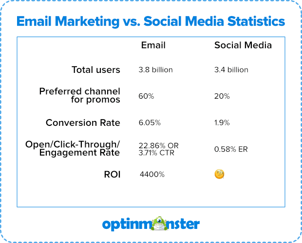
Check out the figures from 2019 by OptinMonster below:

optinmonster stats
Source (as of 2019): Optinmonster

What is a good email list?

So why care about your email lists when you can simply buy or compile those addresses and just start sending, right? Well, it’s trickier than you probably thought. Here are the must-haves of what can be called a quality email list.

Consent

When it comes to a good email list, consent matters the most. The list should be made up of people willing to receive your updates, newsletters, or campaigns.

Yes to “Do you want to subscribe?” = Happily ever after

If you buy a list of email addresses, download a database from social media, or take all the contacts from your inbox and start sending campaigns, your conversion rates may suffer and emails will most likely be sent to spam. This is why it is never a good idea unless your goal is to drive customers mad and get a furious reaction.

But why is buying a ready email list so bad?

spam
  1. People from such lists did not choose to receive them. It is annoying to get an email about something you don’t expect that isn’t even slightly relevant or interesting to you.
  2. A customer will send your email to “Spam” or file a complaint after which their email client will block you and your future campaigns will risk automatically ending up in a spam folder.
  3. You can be sued as spamming is illegal. “The CAN-SPAM Act, a law that sets the rules for commercial email, establishes requirements for commercial messages, gives recipients the right to have you stop emailing them, and spells out tough penalties for violations.

Ok, let’s say you followed all of the above, thoroughly gathered all your contacts yourself, and didn’t forget to get that consent from them. Can that be called a quality list? Not yet, and here’s why.

Automation, segmentation, and personalization

If you have a list of addresses and you just send campaigns manually to all of them at once, it is nearly impossible to achieve really good results. You need to work with your list in a smart way.

The Digital Marketing Institute published a compilation of 2020 trends in the ecommerce market. It seems that email marketing now shows a tendency to use more automation and personalization as powerful tools in the business.

Nearly all ESPs have tools that help you automate, segment, and personalize campaigns. Automation will save you plenty of time and it will also allow you to react in a blink of an eye to all your subscribers’ actions.

A personalized approach is the one to be used if you want to make sales, not just send emails. Let’s say, you do email marketing for an online lingerie store and you have products both for women and men. If you send an email announcing a new bra launch to everybody on the list, your male clients will get it, too. And if they get it, they will find it extremely irrelevant or even irritating, and mark you as spam. So next time, when you’ll want to announce a boxers sale for men, you will have much less relevant opens/clicks from your male clients.

If you segment by gender, this will never happen. By properly segmenting you can make sure that every client gets offered only what’s relevant to him/her. Segmentation is not limited to gender. You can segment by activity, last purchase, behavior, location, preferences, and many more criteria. In Selzy we have 70+ segmentation criteria.

The unsubscribe button struggle

We know, it’s so tempting to hide that unsubscribe button as far and deep in your emails as you possibly can. You obviously do not want your people to unsubscribe. What if we tell you that making an unsubscribe button obvious and clear is your key to a clean, high-quality email list?

Honesty from brands is crucial. Nowadays, when there’s so much competition for users’ attention among the brands, you can stand out by being that good and honest friend. The one that doesn’t force friendship and is always open to let you go if you wish to go.

That’s exactly why you should make an unsubscribe button obvious and clear for your recipients. Those who are not interested will go. Those who are still interested will stay and appreciate that you’re being so open about it. The last thing you want is annoyed customers desperately looking for that “Unsubscribe” button.
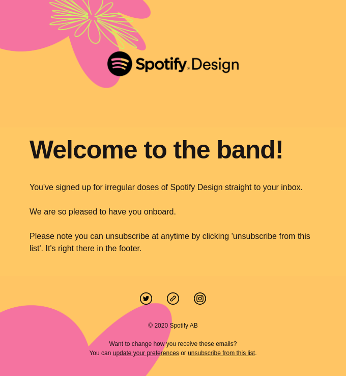
unsubscribe example from Spotify
Spotify does an amazing job of being very open about their unsubscribe option in their welcome email.

How to build an email list quickly and efficiently

Probably the first thing all beginning entrepreneurs do is browse for tips on how to build an email list in a quick and effective way. And the offer meets the demand: there is so much information on how to do it, that you might get lost in it. This is why we decided to put it in a nutshell for you.

The following ways might work separately, but in order to reach the maximum effect, when possible, try putting them up together like a puzzle. It will increase your chances of turning the results of your endeavor into more conversions and sales.

📝 Create simple subscribe opportunities on your website — opt-in forms

Subscription forms are a very efficient way to ask visitors to leave an email. Most email service providers have a tool that helps you create and customize a subscription form.

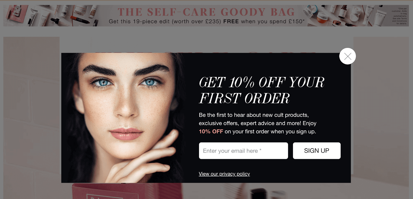
Simple subscription example
An example of a subscription form with a special incentive.

Subscription forms come in all shapes and sizes and can be embedded or come as pop-ups — floating bars, welcome mats, spin-to-wins, etc. We are going to talk about the most converting ones in our Foolproof Guide. No matter what sign-up form type you choose, there are several rules you should follow to make them bring you the highest conversion possible.

  • Make it compliant with your brand so it looks in line with the rest of the website.
  • Keep it short and simple. Do not put too many fields to give users a possibility to scan the info fast and to grab the gist in a matter of 2-3 seconds.
  • Include an image. Pop-ups with images convert better than pop-ups without images by 83.57%.
  • Give an incentive. Ideally, include a lead magnet. If you don’t have one, show the perks of being a subscriber.

Try exit-intent pop-ups

Omnisend claims that pop-ups perform 3 times better compared to embedded subscription forms. The purpose of an exit-intent pop-up is to make those who are leaving your website stay and reconsider for a second. There are even cases when exit-intent pop-ups showed an amazingly high visitors recovery percentage: check this case where Fastrack recovered 53% of abandoning visitors solely with the right exit-intent pop-up.

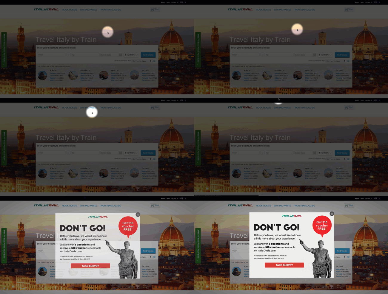
example of an exit-intent pop-up
Exit-intent is the strategy designed to keep the customer who intends to leave the website.

This list of 40 exit-intent pop-up tips from OptinMonster will help you master the skill of creating killer sign-up forms to keep the leaving subscribers at bay.

Avoid reCaptcha in your sign-up forms, it is really annoying. If it’s impossible to leave it out, use Google’s “I’m not a robot” one.

Simple captcha

🔔 Come Up With An Original CTA

The easiest way to obtain new customer contacts is just to ask for them. However, according to Marketo, 96% of your site’s visitors aren’t ready to buy. This means that you have to offer something the clients need or simply can’t resist.

Your sign-up form may be designed next to perfect, but it will still be doomed to fail without a decent CTA (call-to-action).

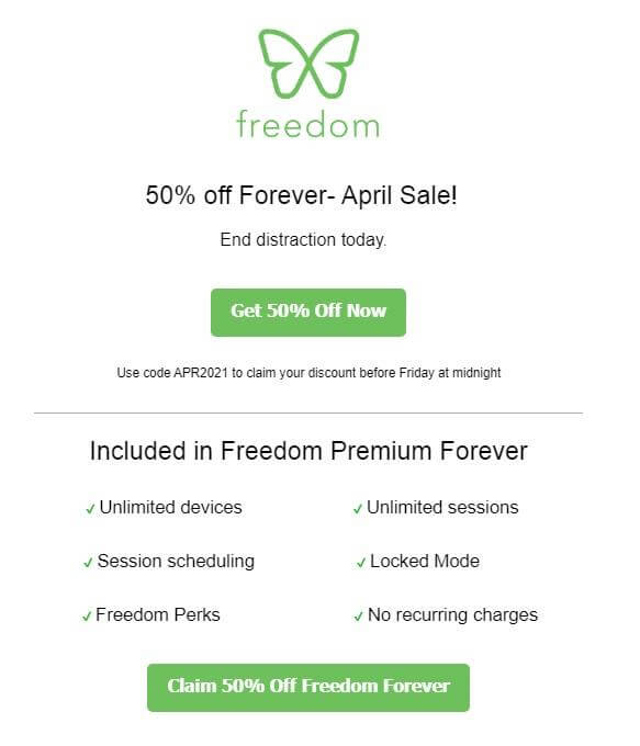
CTA example
The CTA green buttons offering a 50% discount contrast the white background. A great example of using urgency and greed for a call-to-action.

CTAs must be strong and irresistible to stimulate the desire to follow them. Be a CTA champ with the following tips we compiled for you:

  1. Think about your clients’ needs. Put yourself in the shoes of the customer, ask yourself “what do I want?” and embed it into the CTA.
  2. Verbs cry out for a client to act: buy, save, upgrade, create, start.
  3. According to Copyblogger, these 5 words are the most persuasive: you, free, because, instantly, new.
  4. Try to be creative but unique: use humor, and don’t copy-paste generic solutions. Come up with something appealing to your specific audience.
  5. No one likes to miss out — appealing to the sense of urgency is one of the strongest marketing strategies. Sales, limited offers, last-minute discounts all call to action. Countdown timers increase intensity.
  6. Buttons are more effective than links or long call-to-action sentences. Make sure it’s visible: use flashing buttons or colors that contrast against the background.
  7. Be concise: avoid the “Too Long Didn’t Read” reaction.
  8. Don’t forget to test your CTAs. This will provide an opportunity for trial and error, help you experiment, and find the best solutions. Try different CTAs at various parts of your website at different times to define which one works best for you.

🍋 Create squeeze pages

Squeeze pages are landing pages or pop-ups that collect emails from customers – literally to “squeeze” emails out of them.

The goal of these pages is to lure, attract, interest, and convince visitors to share their precious addresses. Creating the right squeeze page can pump up your conversion rates and increase the number of leads.

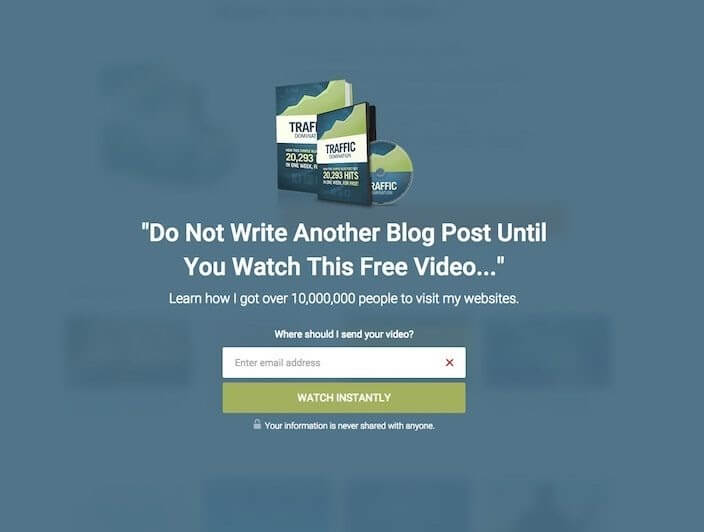
Incomediary squeeze page
An awesome IncomeDiary squeeze page

This IncomeDiary squeeze page is a perfect example: the headline content bumfuzzles you, the color of the CTA button is in line with the brand and stands out against the background. The disclaimer below the CTA ensures the safety of your data, and the text above the email field makes it almost impossible to refuse.

To do something similar, you want to use the best practice available. In this case, even aggressive methods come in handy. By aggressive we mean assertive and closing the door on escape, e.g., incentives, sales, discounts.

💡 Optimize your “About” page for conversions

First impressions are most lasting, which is why the “about” pages play a huge role in capturing the visitors’ attention and making them want to explore more.

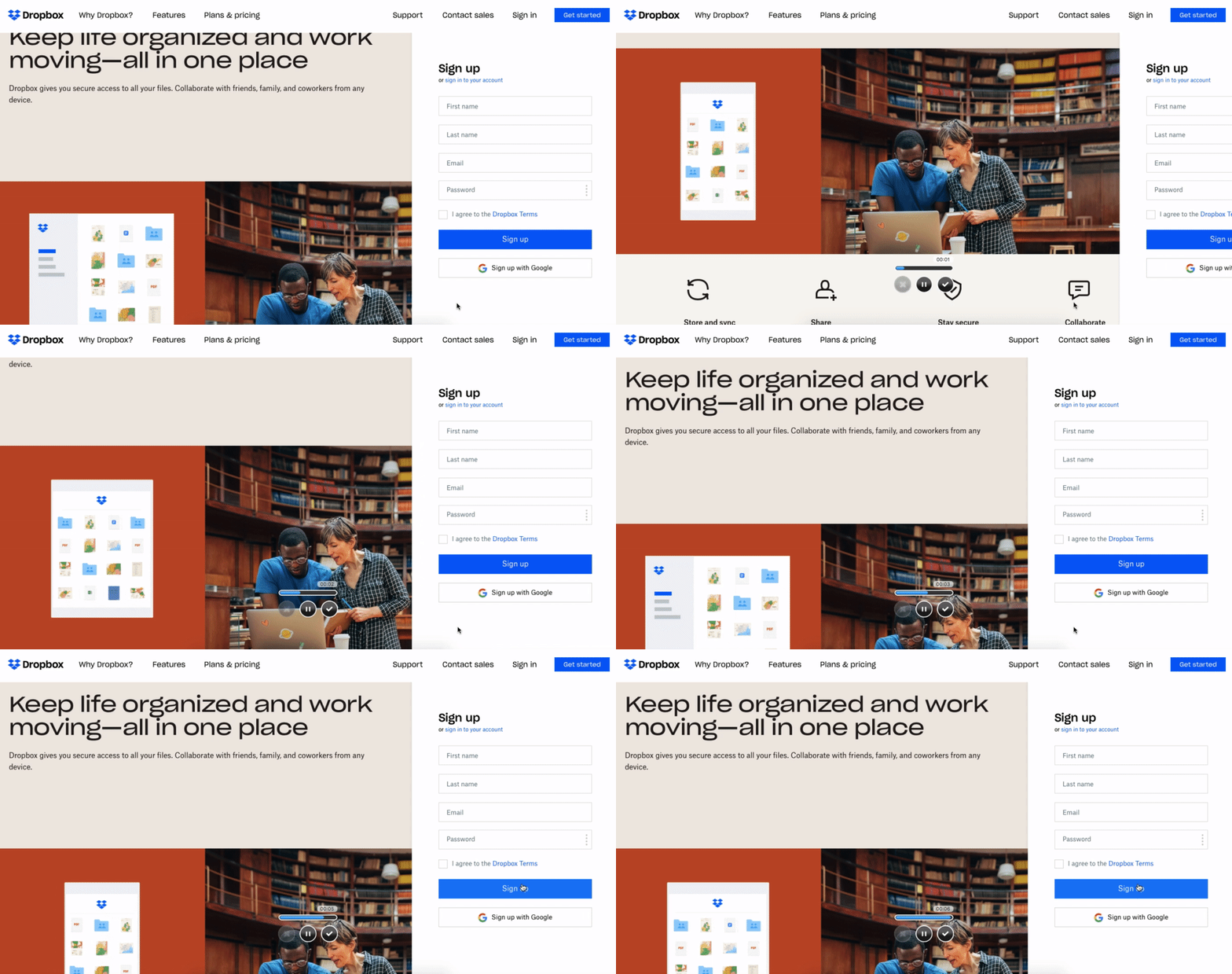
Dropbox About Us page
Dropbox offers to sign up on their “About Us” page

Of course, it is almost impossible to create a perfect landing page from the very start. First, you need to evaluate productivity, perform assessment testing, and figure out what needs to be improved as the sky is the limit here.

Landing page optimization means perfecting separate elements to maximize their effectiveness. In return, it will help achieve better financial results, attract more visitors, and improve the rate of conversions.

Here are a few insights recommended by Neil Patel on what to focus on to start your “About Us” page optimization:

  1. Make sure it includes your unique selling point and explains the benefit your product offers.
  2. Use an easy-to-navigate main menu and legible fonts.
  3. Use a strong headline with the mission statement.
  4. Don’t be afraid to use personal stories – it will help bring you and the potential leads closer from the very beginning.
  5. Make sure the page loads fast – no one likes waiting.

💎 Create compelling lead magnets

A lead magnet is an incentive that you offer your audience: a discount, giveaway, trial subscription, free consultation, etc. A good lead magnet can be an efficient instrument in generating those leads you need and building your email list.

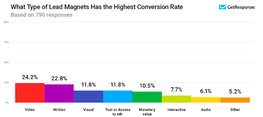
Based on a 2020 research by GetResponse, lead magnets using videos have the highest conversion rate of 24.2% followed by written lead magnets.

GetResponse lead magnets infographics
Source: GetResponse

Firstly, keep in mind that unless you identify and define the purpose and goal of your lead magnet, the probability of its success will be very low. Why do you need it and how can your clients benefit from it?

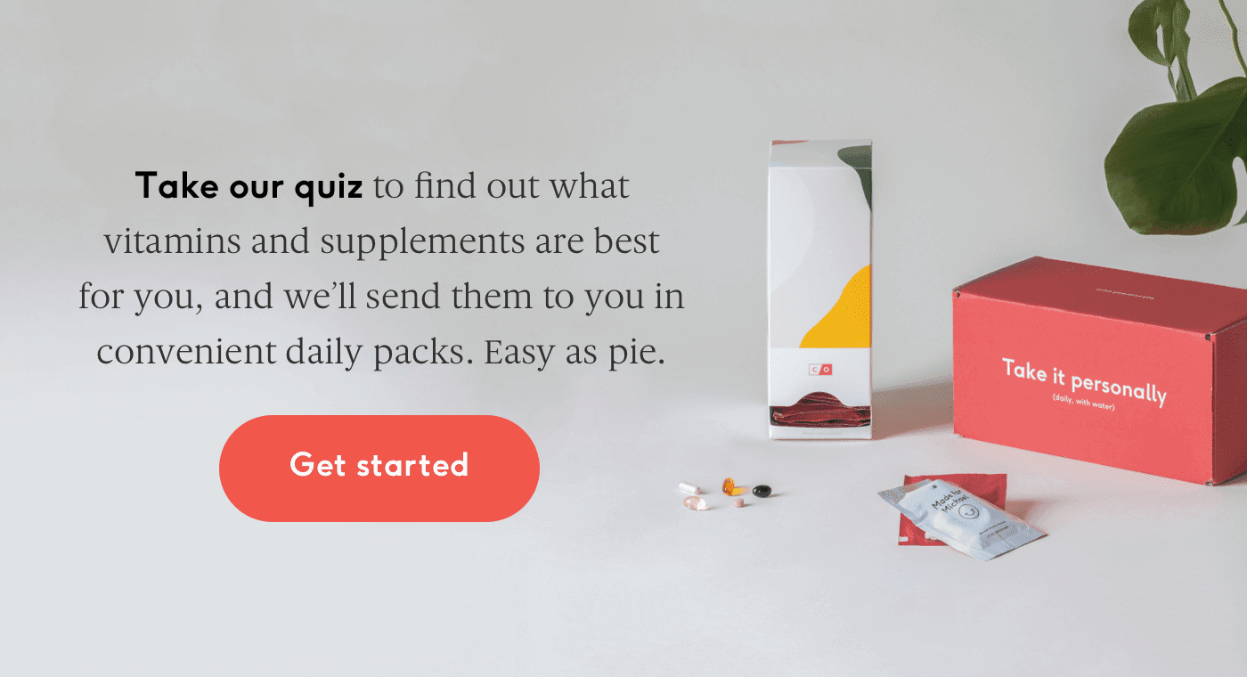
A quiz as a lead magnet
People are very reluctant to share their contact details unless they are offered something valuable in return. A quiz offer sounds tempting: everybody wants to get a personalized recommendation, especially at a cost of just leaving your email.

When creating a lead magnet your primary goal is to convince the customer that your focus is to solve THEIR problem, in a fast and efficient way.

Define who you are selling to, who your target audience is. Consider such factors as age, gender, social status. Occupation, interests, motivations, and goals matter too.

Make your proposition valuable. Put yourself in your customers’ shoes and try to figure out, would you buy if you were them?

Analyze what your competitors’ strategies are. Do not copy, but use their best practice for your benefit.

Be careful with the content and the choice of lead magnet type. Be bold and creative but respectful, and choose the type that matches your purpose more. Use any of the following baits to the target audience: a guide, report, free trial, demo, discount, giveaway, or a questionnaire.

🎮 Try Out Gamification

Human psychology makes us prone to like games, as they involve thought and motivation. Marketers caught wind of it long ago and started influencing users’ behavior with gamification.

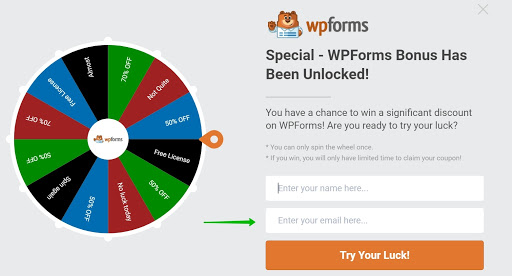
Gamification is a technology of applying elements of a game to game-unrelated concepts. A spin-to-win, a quest, a puzzle, or a badge are all examples of fun activities to motivate users to interact with a product or a service.

wpforms gamification
A spin-to-win pop-up from WPforms is a great example of gamification in sign-up forms. And… Did you just say a free license? Oh, I’m definitely leaving my email for this!

Core benefits of gamification for your email list:

  • Subscribers are engaged, entertained, and spend more time on the webpage.
  • Users enjoy the experience related to your product.
  • Gamification does not require complex algorithms.
  • People are more open to sharing their data in exchange for bonuses, prizes, badges, and new features.

Wrapping things up: the dos and don’ts of creating an email list

Now that you are fully equipped with tools that will bring in those hordes of subscribers, let’s review the best and worst practices of creating an email list. Because getting new leads is one thing but keeping them in, is another.

✅ Dos ⛔️ Don’ts
Get an email service provider Never buy an email list!
Use a sign-up form for subscribers to give their consent to receive emails from you Don’t use addresses from other databases, websites, or social networks
Apply the double opt-in to make sure the subscriber indeed wants to receive your emails Don’t email people whose consent you didn’t receive
Send a welcome email shortly after a client subscribed Don’t wait too long to do it
Segment your email list: use geolocation and timezone, gender, customer preferences, and behavioral patterns Don’t send generic emails to all the subscribers
Get personal – people appreciate the attention to their persona Don’t send generic emails to all the subscribers
Update your email lists regularly Don’t let the list go stale: email addresses change faster and more often than geographical ones
Use mailing campaigns analytics or reporting to assess the efficiency and understand what to improve Don’t ignore performance reports and analyses

The foolproof guide to growing your email list.

the foolproof guide to email list building

Here it is, just as promised. In the guide, we put under the microscope some of the perks discussed in this article, and so much more! It’s free to download, we will only ask for your email.

How is this guide special?

Most guides just list the ways. We went further and explained in detail how to make the most of each of them. Here’s what you’ll find:

  • 21 ways to grow an email list with carefully picked examples.
  • Tips on how to make the most of each way.
  • Research-based insights
24 September, 2021
Article by
Anastasia Igumnova
Digital nerd and bookworm.
Visit Anastasia's
Selzy
Selzy
Selzy
Selzy
Selzy
Latest Articles
Selzy Selzy Selzy Selzy