Email Preview Text Definitive Guide

Email Preview Text Definitive Guide
27 June, 2022 • ... • 2392 views
Irene Dmitrieva
by Irene Dmitrieva

To create a more enticing email, marketers might add additional text to the preview section of their emails. This is called “email preview” and it can be used by companies for customer engagement purposes. In this article, we define what exactly “email preview text” means in marketing terms, learn how you can add it in, and consider email preview text examples and best practices.

What is preview text?

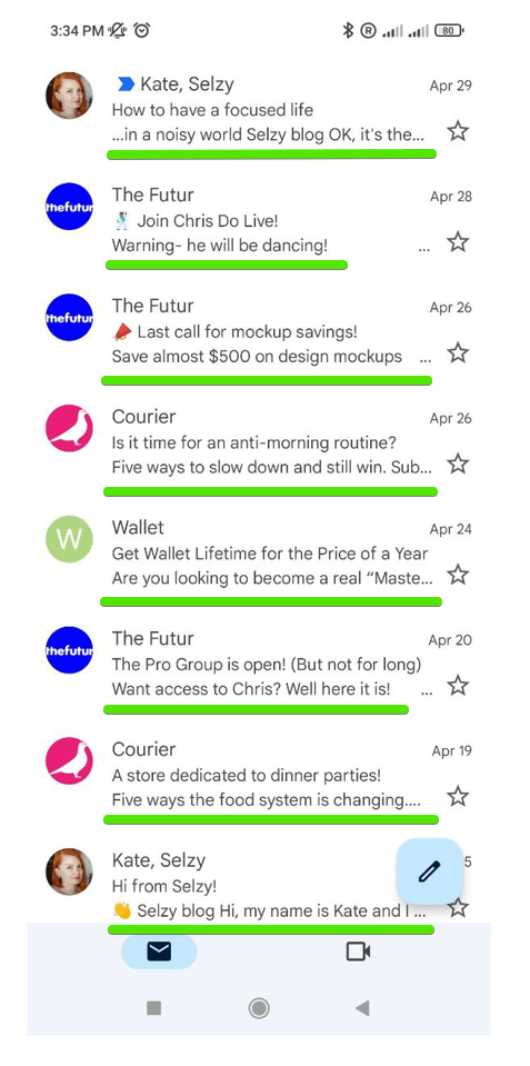
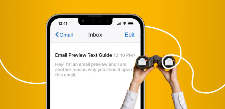
The preview text (sometimes called a preheader) is the brief bit of copy that follows the subject line of the message in the mailbox. It’s typically used to give recipients a taste of what’s inside the email and entice them to open it. 

Email preview text example

Custom previews allow you to control what appears in this space so that your emails are displayed the way you want them. Relevant previews encourage reader interaction. But the space is limited, so you should use it wisely by writing a custom message that signifies what’s in your inbox.

The difference between preheader and preview text in emails

Preheaders and previews are both pieces of text that appear before an email’s contents to give a brief overview. The one difference between them? It’s where you see this type of message. Previews show you what’s coming up in an email before opening it:

Preview text in email

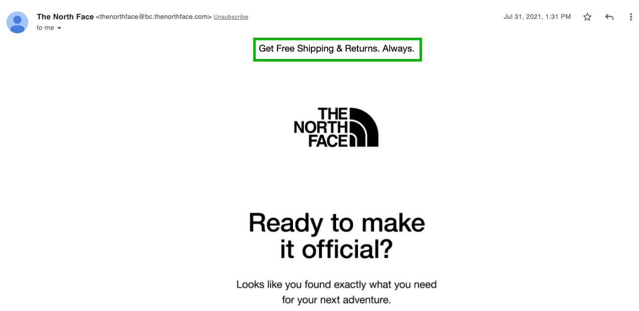
While preheaders give more info about the entire message as soon as they’re clicked on:

Preheader in the email

The preview and preheater are two closely related concepts. If you don’t set up separate previews, a preheader will automatically become part of the preview inbox message. This is why these concepts are intertwined.

A preview text can be a critical factor in getting readers to open and read your message. Emails with previews tend to have higher open and click-through rates than those without.

How to add it to your emails

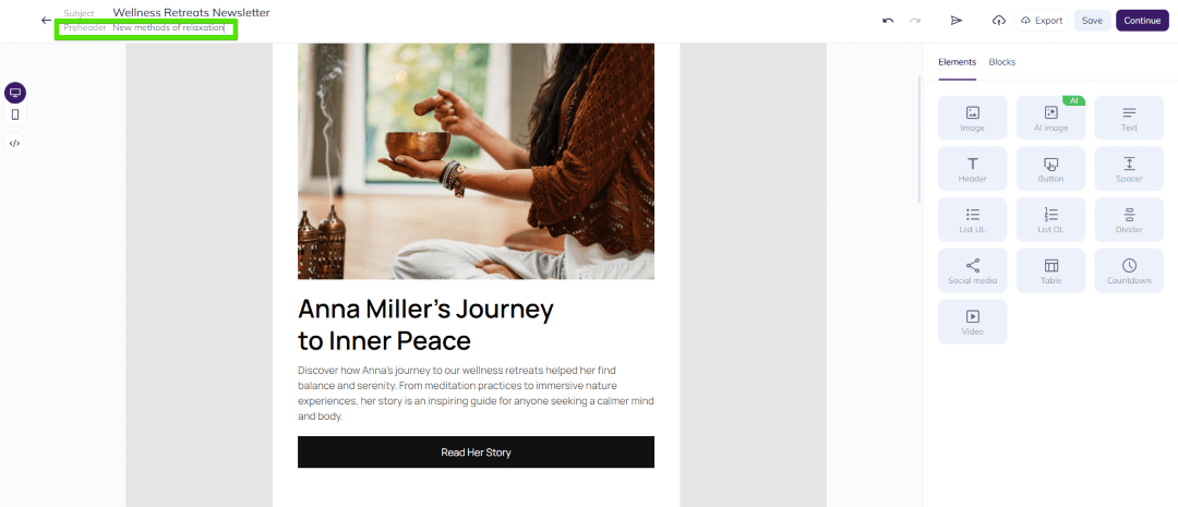
You can customize your previews with custom text in the email builder. For example, Selzy’s feature allows you to enter a preheader copy at the top of each message by placing the Text content block at the top and filling it with appropriate content. You can choose to make it visible or hidden.

How to add an email preview

We won’t describe all the steps here, since we wrote a detailed article on how to add preview text to your emails.

With no preview text, email clients and ESPs will pull different pieces of your message into the preview line. As a rule, they are usually taken from your first 150 characters (with spaces) and include any image captions that may be present.

Email preview text examples and best practices

To write a good preview, you need to make your email exciting. This means focusing on what will make them open the email and avoid giving too much info or describing details of an upcoming event.

Here are some examples and best practices for crafting great email previews:

Make preview text relevant to the subject line

Think about how your subject line and preview text work together. They should flow seamlessly from one into the other, like two halves of a whole. Your creativity is best spent here — feel free to use emojis or personalization to make sure that your emails stand out against others on people’s screens.

Clio’s email subject line and preview text form a complete sentence, making sure that recipients can understand the message at a glance. This clever strategy ensures that its emails are easy to read and comprehend.

Preview text completes the subject line

Put key terms at the beginning

One of the best things you can do to improve your previews is to put your most important keywords at the beginning. This will help people who are scanning their inboxes quickly to see what’s inside. Make sure that your keywords are relevant to your email content, and that they accurately describe what’s inside. 

So, the Dissolve company in its preview text from the first words makes it clear what content is waiting for their subscribers in its email.

Key terms at the beginning of the preview text

Don’t stuff your keywords in there just for the sake of it – this will only make your preview text sound spammy, and it will turn people off from reading your email.

Keep it short

Your email preview text should be short and sweet. Think of it as a mini headline about what’s coming next.

When sending an email, keep in mind how much preview text you’re allowed. The character limit for preview and displayed messages varies among email providers, but it’s best not to go over 90 characters so your recipient can see everything that was sent. Mobile users will need shorter previews as they have less screen estate on mobile devices.

Provide an incentive

If you want to get people excited about your email, don’t give away all of the important info in the subject line. Instead, play on their curiosity by writing a tease in the preview and leaving some details for them without revealing too much.

Teasing subscribers with just enough detail while still making it clear what’s inside can be an efficient approach that encourages recipients into opening emails when they’re already hooked.
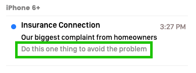
Teasing email contents with the preview text
Source: Email On Acid|Denver

The subject line of this email is designed to get people wondering what homeowners complain about the most. The preview leaves readers wanting more and makes them interested in opening up their inboxes.

Create a sense of urgency

If you want customers to buy your product now, you need to create a sense of urgency. This can be done by setting time limits, having limited supplies, or offering limited openings. By making your audience feel like they need to act fast, your message is more likely to be read.

A good incentive in the form of urgency is what makes people act quickly.

Urgency in the email preview text

In this example, the subject line promises that you’ll save 25% on your next purchase, and the preview text urges you to take advantage of the sale before it ends (this week only).

Spark curiosity

Curiosity is an emotion that can be useful for email marketing because it gets people thinking. If you leave your audience with unanswered questions, they may be more likely to try and find the answers themselves. This can be beneficial for your business as it encourages engagement.

Who doesn’t love getting a present? Everyone likes feeling thought of and appreciated.

Popflex email preview text
Source: Drip

Don’t skip the CTA

If the offer is compelling enough, it will be the reason people open the email. So instead of trying to be clever and mysterious, just give them the offer upfront and make them open the email with a clear call-to-action like in the example below:

Call-to-action in the preview text

Don’t forget to personalize it

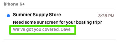
In previews, include personal details that will grab the reader’s attention and build trust. This could include their name, location, or recent actions or services received. By making your email more personal, you improve the chances that it will be opened and read.

Personalization in the preview text
Source: Email On Acid|Denver

The personalized nature of an email is key when it comes to creating upsell or abandoned cart emails.

Email preview text length for different email clients

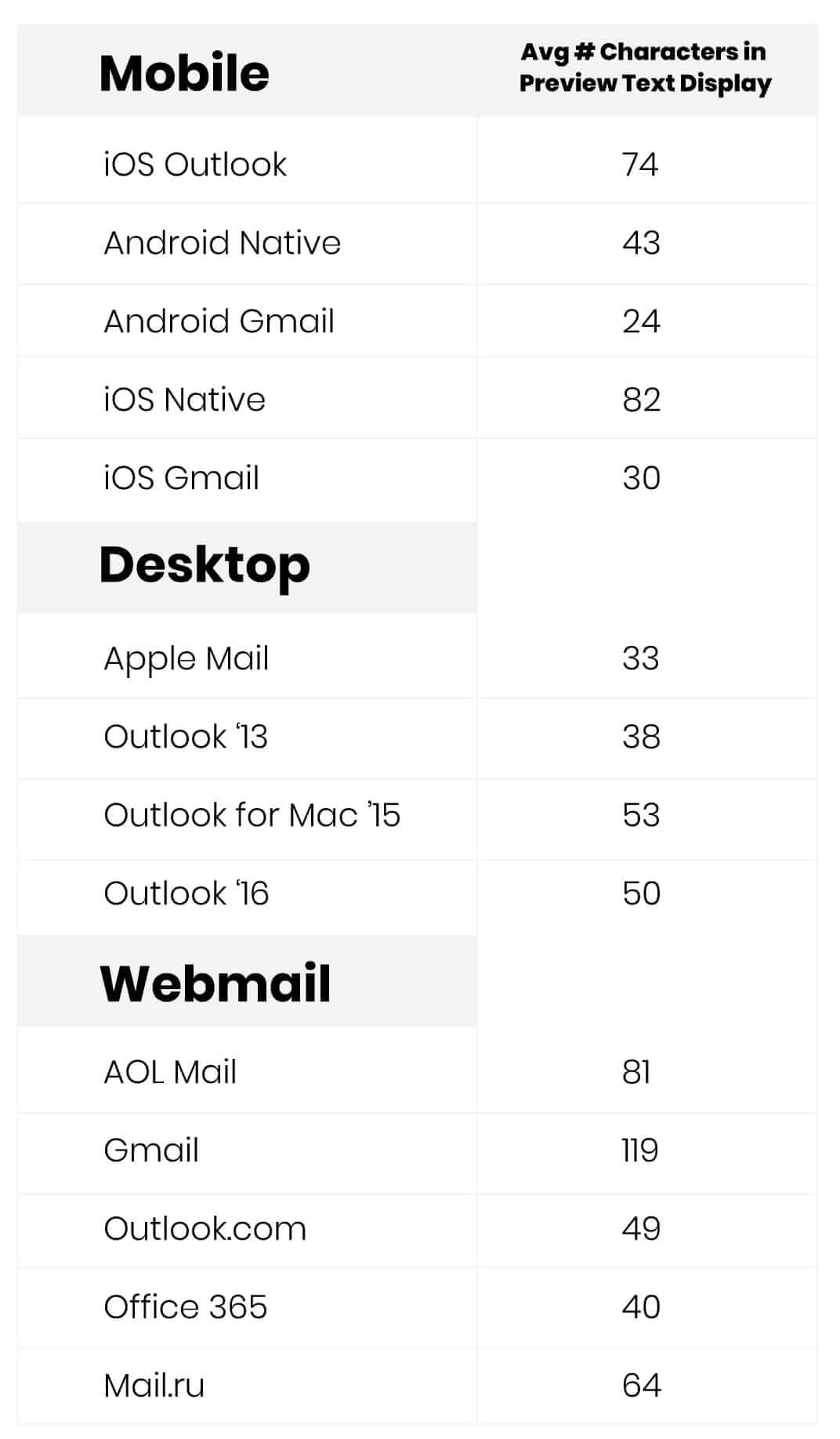
The way emails are displayed varies depending on the devices and email clients used. The length of the text preview and how it is displayed also varies depending on the email client.

Characters limit in email preview text
Source: Email On Acid|Denver

So it’s best to keep your previews brief, within 50-100 characters. This way, people on any device will be able to see your preview text and get a sense of what your email is about.

Subscribers can access your email on various devices and inboxes, so consider this fact when writing previews. Analytics can provide this data.

Wrapping up

Give your email marketing a makeover with engaging preview text that will keep people reading. The following types might come in handy: 

  1. Make sure your preview text is relevant to the subject line and includes important keywords.
  2. Keep your text concise, but not too short. Try aiming for about 50-100 characters when crafting the previews so that they are both informative and interesting.
  3. Play off of the subject line with the preheader. Give subscribers just enough information to tease them, without giving away too much, add a sense of urgency. This way, you can pique the curiosity of subscribers and make them more likely to open the email. 
  4. Personalize the preview text by including the subscriber’s name or other information you know about them. 
  5. Include a clear call to action so that readers know what they should do next.

What makes for a successful email? The answer is testing. A/B testing gives you an opportunity to compare your emails with different previews and subject lines to see which one performs best in terms of opens, clicks or any other KPIs that matter.

27 June, 2022
Article by
Irene Dmitrieva
As a marketing copywriter, I have experience creating compelling content for websites and social media posts. My background in market research helps me ensure that my copy is both on-brand and data-driven. I am excited to bring my skills and experience to Selzy team and help drive success for this company.
Visit Irene's
Selzy
Selzy
Selzy
Selzy
Selzy
Latest Articles
Selzy Selzy Selzy Selzy