Top Higher Education Email Ideas and Examples for Your Next Marketing Campaign

Top Higher Education Email Ideas and Examples for Your Next Marketing Campaign
31 October, 2022 • ... • 4480 views
Sara Kurczyńska
by Sara Kurczyńska

Let’s talk about educational emails. If it feels like a limiting niche, think again! There are many types of interesting email marketing campaigns that an educational institution could possibly launch. It’s all about using the right email templates and writing attention-grabbing content.

If you don’t know where to start, no worries. Here, you will find a short list of benefits of using educational email templates and their types. Aside from that, we will present you with a bunch of educational email examples and ideas. Checking them out is bound to provide you with some much-needed inspiration!

The benefits of using educational email templates

To begin with, let’s establish what educational email templates are. In short, they are pre-designed email layouts meant to be used by educational institutions. They can bring a plethora of benefits to the table. 

Here are some of the most important ones:

Increased productivity

Using email templates can help you save a lot of time. You won’t have to create an entire email layout from scratch every time. Instead, You just choose one that you like, fill it out, and hit the send button. Later, you can just re-use it.

Consistent branding

Another significant advantage of using email templates is that they help you maintain a consistent brand image. By consistently using the same color scheme, font, and logo, you make it easier for people to recognize your emails at first sight. This is vital if you want to establish a strong rapport with your target audience.

Reduced margin of error

When you create an email layout from scratch, there is always a chance that you will make a mistake. For example, you might make a typo or forget to add an important link in the header. On the other hand, when you use a template, the margin of error is significantly reduced. All you have to do is fill in the blanks, which leaves much less room for mistakes.

Improved subscriber experience

If you have never designed an email before, doing so from scratch might prove to be challenging. Luckily, using a template can help you create an email that looks professional and is easy to navigate. This is bound to have a positive impact on the recipient’s experience. To give an example, imagine that your template has a clearly visible call to action button. With such a button, the recipients of your emails will find it easier to make donations or sign up for guest lectures.

How do you find the perfect template?

To make sure you find the perfect template for your needs, take the following factors into consideration.

Design

Email template’s design is one of its most important aspects. It determines how easy it is to navigate your email and how visually appealing it is. With that in mind, make sure to choose a design that is both easy on the eyes. In addition, it should be compelling enough to make its recipients do what you want them to do, such as make a donation to your institution or sign up for a specific course.

Purpose

Before you start browsing through email templates, you need to have a clear idea of what you want to use it for. Do you want to send out a newsletter to let students know about a guest lecture? Or perhaps you want to launch a promotional campaign for a course that you’ve just launched? Once you know the purpose of an email, it will be much easier to find a template that meets your needs.

Features

Some email templates come with more features than others. For example, some might include social media buttons or a built-in unsubscribe function. As you can imagine, such features can come in handy. However, they are not a necessity. So, if you find a template that you like but it doesn’t have all the bells and whistles that you want, it’s still worth being taken into consideration!

Responsiveness

In 2021, 42.4% of emails were opened on mobile devices. For that reason, marketing emails should look good on any device. With that in mind, make sure to choose a responsive email template that adjusts to different screens.

Pricing

Last but not least, you need to take pricing into consideration. Some email templates are available for free, while others come with a price tag. Of course, you are free to choose whichever option you want. Just keep in mind that free email templates might not be as high-quality as the ones that you have to pay for.

Where can you find email templates?

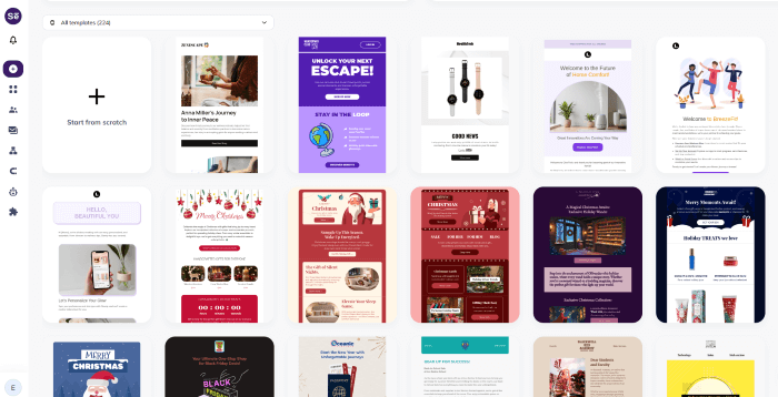
There are quite a few websites where you can find some high-quality templates. No matter what kind of theme or design you are looking for, you should be able to find it soon enough. If you don’t know where to start, consider checking out Selzy’s drag-and-drop email builder with 100+ free templates available:

Templates from Selzy’s drag-and-drop email builder

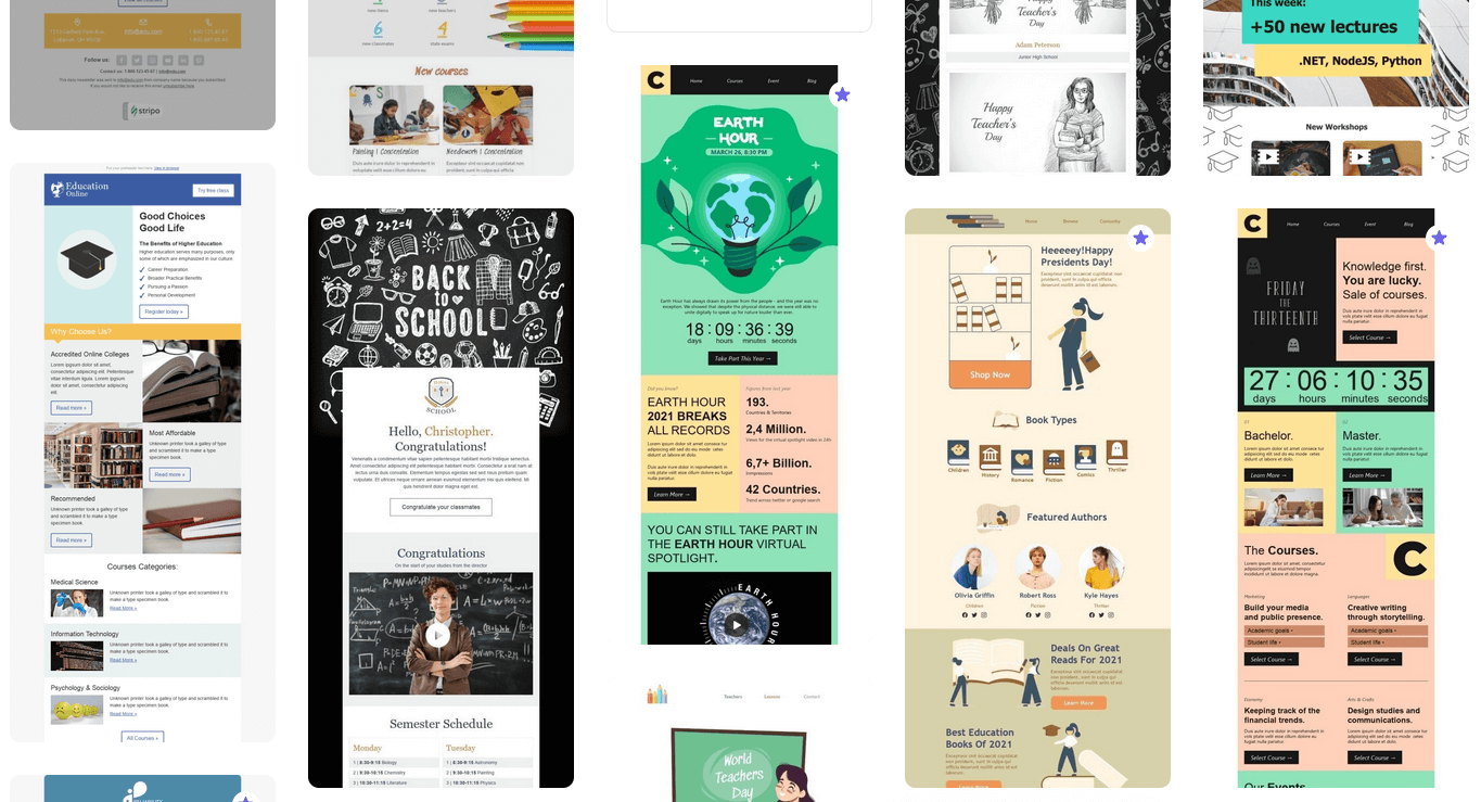
You can also find templates on Stripo — it’s a free and easy to use email template builder:

Templates that can be found at Stripo.email

Once you find a template that you like, you can export it and use it in Our software will help you customize it and put it to good use.

Educational email ideas

Now, if you’re just getting into email marketing for educational institutions, you might be feeling kind of lost. What should you write about? In case you need some help with that, here are a few interesting educational email ideas.

Admissions

If you want to attract new students, consider sending out an email about admissions. It is a great way to promote your institution and get people interested in what you have to offer. Just make sure to include all the necessary information, such as deadlines and requirements.

New courses

If your institution offers new courses, don’t hesitate to let people know about it! The email could include a general overview of a specific course. In addition, you could post a link to the course website in the email so that people can sign up for it immediately after receiving the email.

Events

In case you are organizing an event, such as a webinar or a conference, make sure to promote it via email. Include the date, time, and topic of the event, as well as a link to the registration page. You could also include a promotional video in the email to make it more engaging.

Fundraising

If you’re looking for ways to raise funds for something, be it a new building or a charity, email is a great way to do it. Ideally, an email should outline what the money is going towards and how people can donate. You could also include a link to a website where people can learn more about the fundraiser.

Discounts

Who doesn’t love a discount? If you want to promote your institution, consider offering a discount on tuition fees. Alternatively, if you’re selling online courses or course materials, you could write about an upcoming sale or send out a discount code.

Success stories

If you want to show off your institution in the best light possible, consider sharing student success stories. Include a photo of the student together with a short description of their stories.

Great educational email examples that you can learn from

Syracuse University

An email from Syracuse University
Source: Syracuse University

Sometimes, educational institutions need to ask for donations. One of the easiest ways to do it is to make an email marketing campaign out of it. That way, you can get a large number of people to make a donation without having to do much. All it takes is an email that is easy to navigate and attention-grabbing. For instance, it might contain a large call to action or a colorful banner.

Include a link to the official page of the fundraiser and an encouraging description of what the donations are going towards. Making a donation isn’t meant to be similar to a business transaction. Instead, it’s meant to make the donor feel appreciated and valued. Keep that in mind when writing fundraising email copy!

Skillshare

An email from Skillshare
Source: Really Good Emails

Skillshare is an online learning platform with numerous interesting courses taught by experts. Its newsletter includes weekly emails featuring the most popular classes and guides. 

The color scheme is quite attention-grabbing. The blue and orange background makes the content of the email stand out. Aside from that, it contains numerous calls to action, such as Learn more and Watch now, each one having a bright green background. Thanks to this email’s design, anyone who receives it will be more likely to check out the Skillshare blog or sign up for one of their courses.

University of the Pacific

An email from the University of the Pacific
Source: University of the Pacific

The University of the Pacific newsletter is divided into sections. As a result, it’s easy to navigate. Aside from that, it contains plenty of links both in the newsletter’s header and close to its bottom. The links lead to social media websites associated with the university, which helps grow the university’s social media presence.

While the color scheme is not that attention-grabbing, there are two orange-colored calls to action. They direct the recipient’s gaze towards interesting links, making the recipient more likely to check them out.

Montclair State University

An email from Montclair State University
Source: Montclair State University

What stands out about the newsletter above is how it starts. The recipients are greeted by a short story about a student being proposed to during her graduation ceremony. It makes the entire newsletter more human. On top of that, it contains a link to the university social media page, expanding the page’s reach.

Notably, the entire newsletter is divided into sections using both headers and colors. Each section is placed inside a dark-gray square. It makes the newsletter look more organized and visually pleasing, as well as easier to skim.

Stockholm University

An email from Stockholm University
Source: Stockholm University

The Stockholm University newsletter is very organized and easy on the eyes. Just like the Montclair State University newsletter, it separates different sections from one another by using orange and blue squares. It also encourages its readers to share the newsletter with friends and contains a direct link to the newsletter subscription page.

University of Oxford

An email from the University of Oxford
Source: University of Oxford

The newsletter above is not directed at students, but at teachers. It’s meant to be a quick reminder about upcoming admissions and registration deadlines. It achieves its goal with the help of a short admissions timeline. It might not be that aesthetically pleasing or advanced, but it gets the job done.  

Stanford University

An email from Stanford University
Source: Stanford University

The newsletter above is prepared by the information technology department of Stanford University. It’s supposed to help incoming and current students get the hang of the digital tools that university uses. Because of that, it contains links to guides and articles on the topic of cybersecurity. Moreover, it prompts the reader to register for a cybersecurity festival using a purple call-to-action button. 

The main advantage of such a newsletter is its simplicity. It’s not too long and not too short. As a result, the reader isn’t going to end up feeling overwhelmed by the sheer number of articles and stories that it contains.

Codecademy

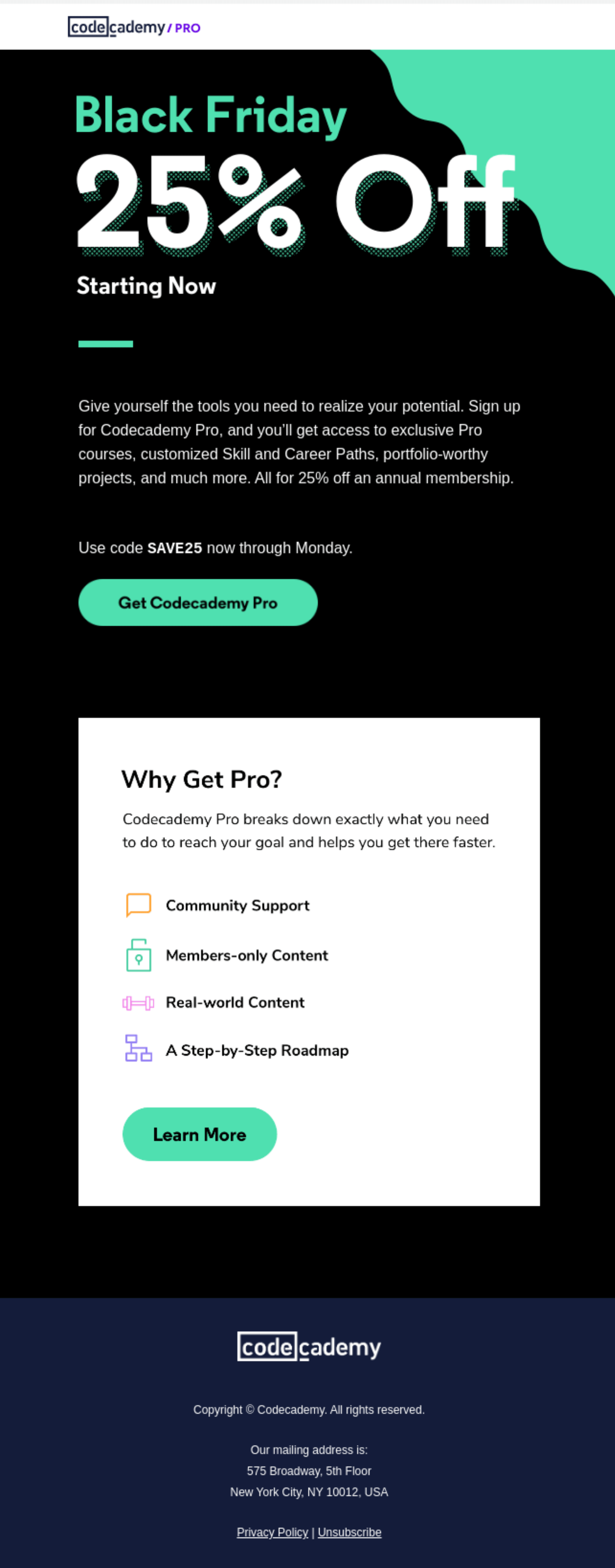
A Black Friday email from Codecademy
An email sent out to people who subscribed to the Codecademy newsletter. Source: Really Good Emails

Last but not least is an email from Codecademy, which is an online learning platform. As the name suggests, it’s meant to help people learn how to code. While you can complete the Codecademy courses for free, you could also pay for a pro membership. The main purpose of their email here is to encourage you to do so with the help of a Black Friday discount.

The way the discount is presented is pretty notable. Its rate is the largest thing in the entire email. Then, there’s a stark contrast between the white letters and the dark blue background. It’s pretty hard to miss and guaranteed to get the reader’s attention.

Then again, the discount makes it cheaper, but it’s not free. To convince the recipient to buy the pro membership, the email advertising it contains a succinct outline of its benefits.

In сonclusion

To sum things up, if you want your upcoming educational email marketing campaign to be easier to deal with, make sure to use email templates! Doing so has quite a few benefits, including increased productivity and brand consistency, reduced margin of error, and better client experience.

If you don’t know what to write about, check whether there are any upcoming events or courses that are worth advertising. Alternatively, you could write about admissions, fundraisers, or student success stories. It’s up to you!

Your first campaign might not be a tremendous success, and that’s perfectly fine. Treat it as a learning experience! 

31 October, 2022
Article by
Sara Kurczyńska
Sara Kurczyńska is an experienced content writer from Poznań, Poland. She enjoys writing about digital marketing, as well as playing video games and petting her fancy rats. In her spare time, you can find her birdwatching and taking long walks around the local parks and forests.
Visit Sara's
Latest Articles
Selzy Selzy Selzy Selzy