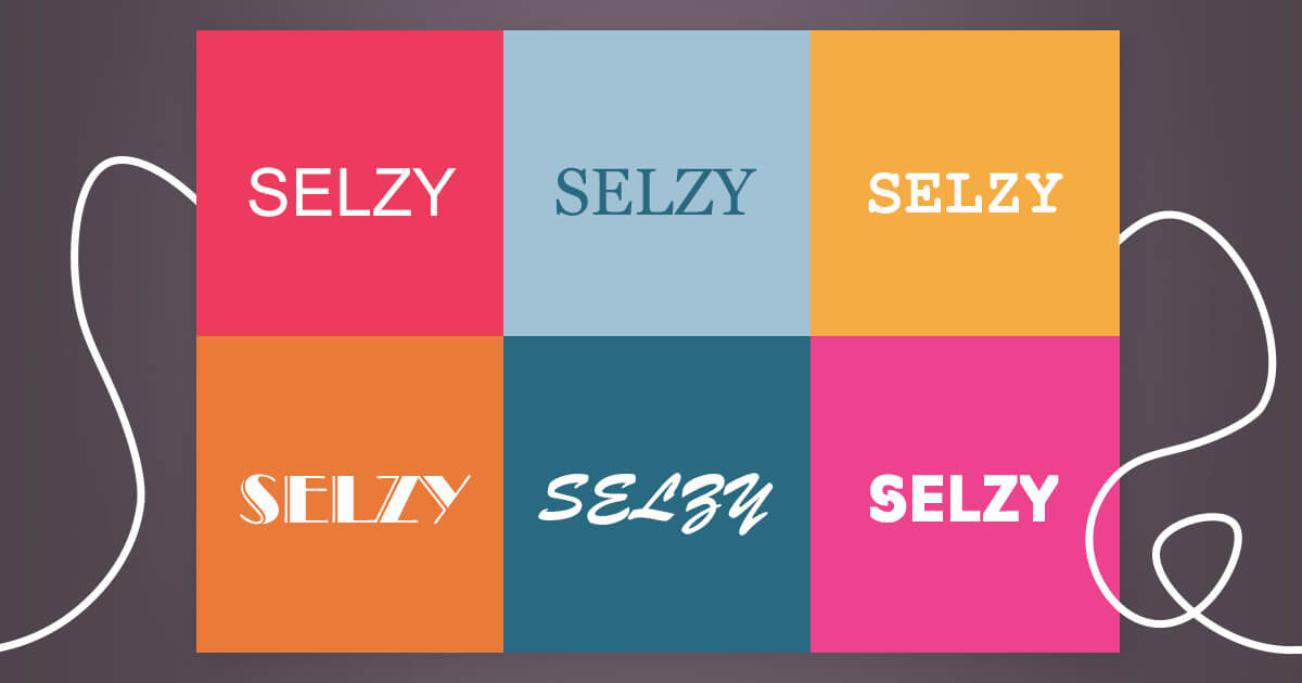
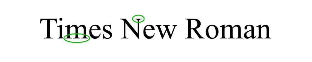
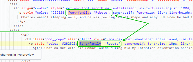
The font, its size, and the spacing between lines and letters all matter when it comes to how easy and convenient a piece of content is to read.
According to the study run by Benjamin Berman (it included a quiz, check it out) published in the New York Times in 2012, people’s trust in a statement would vary depending on which font was used to write it. So a fitting typography can make your newsletters seem more credible, set the right tone, create connection and build brand recognition. This opens an incredible opportunity to raise conversion rates, or on the contrary, drop them if the design is not done well.
When your readers open your email on their computers or mobile devices, their web browsers and email clients are “reading” that email’s code “telling” them which font to display. If a font isn’t available on a particular device, it gets substituted with a default font pre-installed on the device’s operating system.
Such a change can make your email design look different than you intended it to.
The issue with unavailable fonts is more likely to happen to users who use old hardware or have slower internet connection. The surefire way to avoid it is to use web-safe fonts.
Best web-safe fonts that work (almost) everywhere:
When choosing a font for an email, you need to make sure that it looks the same across all kinds of devices, whether it is a mobile, tablet, or desktop. Web-safe fonts are the best choice since most devices would have them installed, and they will display in the email the way you designed.
The choice of web fonts is larger, but, according to Litmus, they work in a few email clients only — Apple Mail, Outlook for Mac, and iOS. In others, including Gmail, Yahoo! Mail, Outlook Office 365, and so on, they won’t display and instead, a default web-safe font would appear. To account for this, make sure to include suitable web-safe fallback fonts in the email setting if you choose to use a web font.
Although web-safe fonts are always a good and safe choice, it is important to consider brand style and email design as well. Let’s take a look at what typefaces exist at all and where web-safe fonts fit.
In typography, serifs refer to small strokes at the end of vertical or horizontal lines of the letters. They may be big and obvious or small and barely noticeable.
One of the most common fonts, Times New Roman, is a serif font. Some other popular typefaces of this category are Garamond, Libre Baskerville, Courier, and Didot.
Typefaces without strokes at the end of their letterforms are called sans serif. Modern and minimalistic, they are very legible and are the best fonts for digital use.
Some of the popular sans serif fonts are Arial, Calibri, Helvetica, Franklin Gothic.
The typefaces of the script category are decorative and artistic, they imitate the handwriting with pen, brush or marker. These fonts are beautiful but not a good choice as a main font since they can be hard to read. However, they can make great fonts for a newsletter’s headline and subheadings, provided they fit the brand’s style.
The examples of script fonts are Liesel, Amarone, and Bayamo.
Display fonts is not a separate category, rather, it refers to fonts that are designed for short-form and often large-format usage, e.g. on billboards, posters, logotypes, book covers, headlines of printed magazines. They include typefaces from the serif, sans serif and script styles and can also be used as email fonts. They often have more eccentric and variable designs.
There are many typefaces created purely as display fonts, and there are also display versions of serif and other types.
Walbaum is an example of a purely display font:
Consider these guidelines when working on your next newsletter.
Each brand has its own tone of voice, and in every industry, there are typically expectations about how companies should present themselves. Fonts that work for a fashion industry won’t suit the medical industry, while formal and corporate-looking typefaces will look out of place in emails from a brand selling products for kids.
When choosing fonts, consider the industry, your brand’s style and voice, and keep it consistent with how your brand is presented in email campaigns and other marketing materials.
The type of font and its size are important factors that impact its readability. In general, sans serif fonts are more suited for the web because they are easier to read even when they are small size.
Why is this important? Often, the email font size can be 11-12 px, which is quite small on the desktop and hard to read on mobile. In addition, the subscribers will open the email on a variety of devices with different screen sizes and email clients. Decorative fonts might not be legible at this size and the readers might decide to just abandon the newsletter altogether.
So you may want to use the minimum font size of at least 16 px to make sure it is easy to read on any device. Ideally, choose a font that is clear even at 11 px, ensure the font-weight is decent and try to get a 1.15 line spacing.
In the example below, Courier uses 16 px font size in their newsletter to make sure it is easy to read at desktop and mobile alike:
You might want to consider customizing an existing font — Open/Libre Fonts allow you to legally modify them and use the results commercially. This option is simpler and cheaper than creating a font from scratch. If done well, a brand gets a unique and distinct typeface that can become a part of its personality.
It can be costly to hire a designer, but if there is already a customized font that your brand owns, consider using it in the newsletter as a headline or a banner. Also, since headlines usually use bigger font size than newsletter body text, there won’t be issues with readability in web browsers.
A/B split testing is the fastest way to eliminate guesswork and figure out what your audience likes. Then, you can optimize your email newsletters accordingly, and get a boost in engagement, click-through rate, and conversion rate.
Email A/B testing, also known as email split testing, is just a way to compare and evaluate two things to each other. It is simple in principle: from your whole list of subscribers, you pick a group of people, split it into two and send each a different version of an email. The email which receives the most opens and clicks (aka “the winning version”) will be sent out to the rest of your subscribers.
Some of the things you may want to A/B test include:
Notice how presence or absence of formatting changes the perception of an email. Jacob McMillan’s email looks slick and easy to read through, there is nothing that grabs the eye aside from the link in the end. Ryan Deiss’ catches the eye (and attention) in quite a few places due to his use of bold, italic and CAPS.
Headlines, titles and subheaders are short and bigger in size than the rest of the email, so they work well with decorative typefaces. Well-chosen display fonts can attract attention and convey a statement, while also looking good aesthetically.
The following fonts might be a good choice for a newsletter’s headline.
Teaser text, also called preheader text, can be used to compliment the headline and give the reader a deeper glimpse of what is inside the email. Its role is to increase readers’ interest and provoke them to read on. The font for this part should be smaller and lighter than the headline, but still bigger than the body text’s.
When it comes to email body text, the most important thing is to ensure it is easy to read.
Once again, consider sticking to the web-safe fonts for this part:
Cutlines are photo captions below an image that describe what that image is about, and they offer a great opportunity to communicate key ideas. Consider making them the same size as email body text or bigger, using bold or italic, or use a font that differs from the body copy.
A pull quote is a typographical technique where a piece of text from the article is reprinted in the same article or page, but with a different formatting. Print magazines and newspapers love to use it to add to visual appeal and catch the eye of the reader.
Blockquote (or block quotations) is also published as a separate paragraph or a block. Unlike a pull quote, it refers to some external citation that was not mentioned in the article. Block quotes are usually placed within the reader’s flow — like in the example below.
Pull quote and block quote techniques can be used to publish testimonials or highlight key ideas.
Since the point of the pull quote is to grab attention, the font for this part of an email needs to at least be bigger than the body’s text. It can use the same typeface as the email body text, but in italic or bold or in a different color.
In the example above, Sensey uses the font Roboto for headlines and email’s body text.
However, the pull quote is not a text — it is written straight on the image. This decision of Sensey’s team has its own benefits: they could use whatever font they wanted and could be sure that it looks the same on any device. At the same time, if the image does not display (due to slow internet connection or images being switched off) the email still can be read and understood without any issues.
Font selection plays a critical role in how the newsletter is perceived and as a result in the success of the marketing campaign. When choosing fonts, consider the following: