You don’t need to manually compare the performance of your sent campaigns and lists to check which of them have been most efficient. To do this, you can use a special analytics tool.
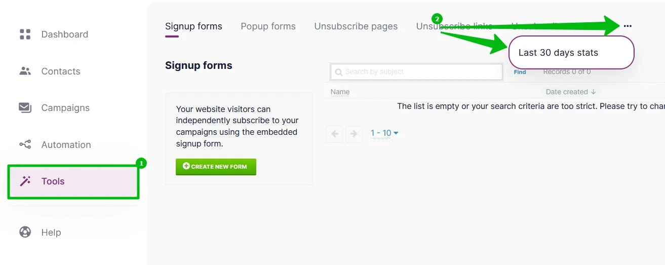
In the Menu, choose Tools — Last 30 Days Stats.
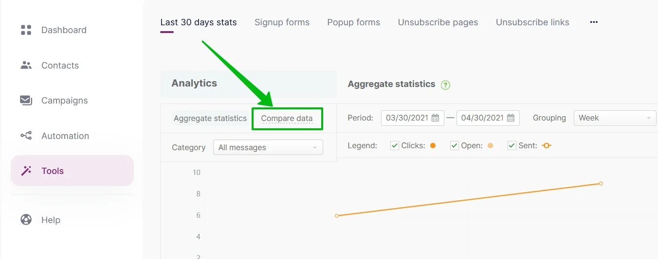
Go to the Compare Data tab.
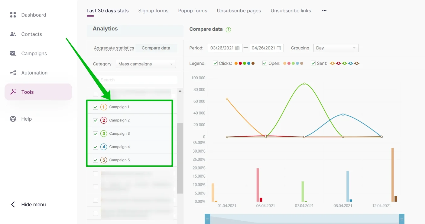
Click on the All Messages option and choose one of the available categories.
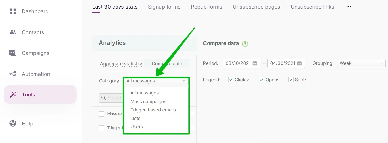
You can analyze data in one of the following categories:
- All messages — you compare the performance of different types of emails (for example, to compare the percent rate of opens between the Mass campaigns and the Trigger-based emails).
- Mass campaigns — you compare the performance of several campaigns (the campaigns for analysis are chosen from the list below).
- Trigger-based emails — you compare the performance of several trigger-based emails (the emails for analysis are chosen from the list below), which is quite useful to those who send such emails.
- Lists — you compare the performance of your campaigns in terms of the contact lists (the contact lists for analysis are chosen from the list below).
- Users — you compare the performance of your campaigns in terms of the account users (the users for analysis are chosen from the list below).
Choose the category needed and check (v) the campaigns or lists you would like to compare. The chosen elements will be marked with particular numbers and colors to be later represented in the chart on the right-hand side.
The maximum number of campaigns, or lists, or users to be compared in one chart is 5. The comparison of emails from different categories is unavailable. For example, you can’t compare an email from mass campaigns with a trigger-based email.
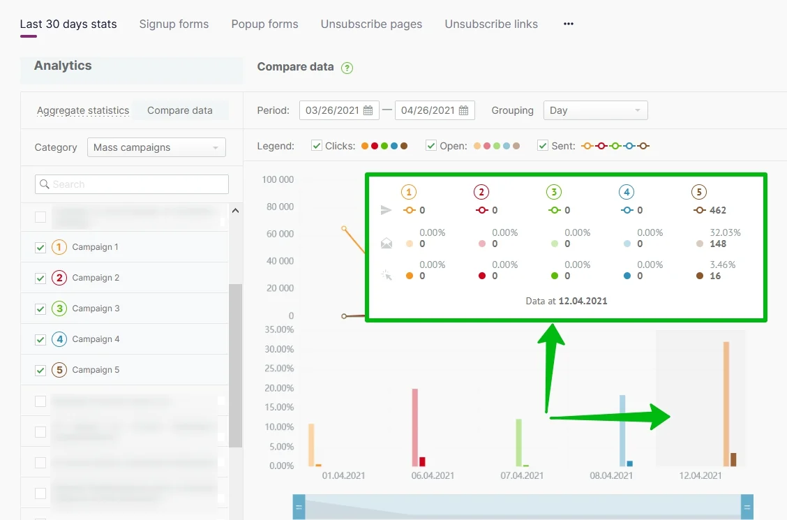
The upper chart shows the number of sent emails. The columns in the lower chart show the percent rate of opens and clicks. The chart shows that the campaigns number 2 and 5 were the most successful.
To learn the number of sent emails, opens, and clicks point the cursor at the needed period.
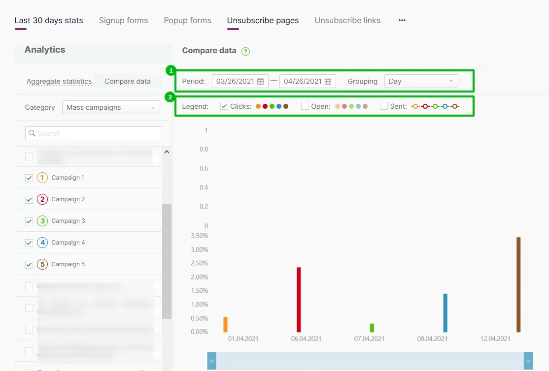
You can configure the chart so that it shows only the particular data:
- Choose the period and grouping.
- Check (v) the data to be represented in the chart. For example, we have chosen clicks only to be able to better compare the number of clicks in different campaigns.
To learn more about the display settings, read the article on Analyzing the Aggregate Statistics Over a Period.
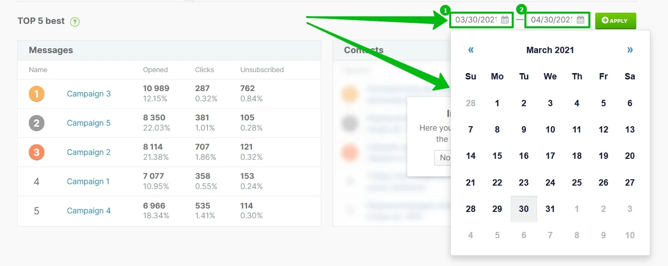
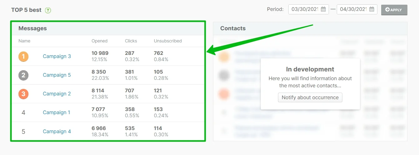
Besides, on the campaigns comparison page under the chart, you will find a block with Top-5 Best Emails over the chosen period. The email that has the largest number of opens gets to the top. Only the campaigns with more than 99 recipients are included.
To change the period for analysis, choose the needed dates and click on the Apply button.