Selzy Brand Book
Vision
Vision
We believe that every business deserves an equal opportunity to grow and to thrive
Mission
Mission
We make intelligence-driven marketing technologies affordable and accessible to companies of all sizes and segments
Manifesto
At Selzy, we create an ecosystem of easy-to-use marketing automation tools to help small and medium businesses grow and thrive. No matter whether you’re a small pet supply store or a large online educational platform, we are here to help you execute your marketing vision through the power of effective cutting-edge marketing solutions.
We value diversity and inclusion in our culture and product development, as they help our team to be more creative and better connect with our customers.
Selzy team is made up of professionals from around the world, thanks to our remote-first nature. We are more than just one company or one product – we go beyond to build a community on a global scale, following new work ethics
Values
They help drive every decision we make and every interaction we have with our clients even when no one is watching (especially when no one is watching)
-
/ 01
Lifelong learning
We value professionalism, but we appreciate studying and honing your skills even more. We believe that everyone has unique talents and abilities that should be nurtured and developed. That's why we make sure every member of our team knows their superpower and pumps it up.
-
/ 02
Self-initiated leadership
We feel motivated and able to set and achieve goals and choose solutions without requiring additional guidance or prompting from team leaders. We are committed to fostering a culture of autonomy and empowerment within our team, so that everyone can thrive and contribute their best. We are certain that confident and independent people are key to achieving business goals.
-
/ 03
Inclusion & Diversity
We are all different — in age, gender, ethnicity, religion, abilities, sexual orientation, and education level. But we truly believe that what makes us different also empowers us and gives us ideas and perspectives. We think that international products can only be made by a mix of individuals.
-
/ 04
Radical candor
We give feedback that's both kind and clear, specific and sincere, no matter what position someone holds in the company. This helps to boost our team engagement and collaboration, and keeps us competitive. We believe that providing honest and constructive feedback is essential to helping everyone on our team grow and succeed.
Who is our target customer?
Our customer
-
Small and medium businesses
-
Solopreneurs
-
General marketers with multiple roles
Tone of Voice
Tone of Voice
The tone of voice, or the tonality of Selzy, is how we communicate. This tonality should be used everywhere we interact with people — in social media, on the website, in mailings, and support.
We speak
We speak
-
Friendly
-
Plainspoken
-
Positive
-
Tactfully
Key principles of Selzy's communication
Key principles
-
#
Be useful
Explain a certain topic to the reader in a simple but comprehensive way.
-
#
Be concise
Keep your syntax simple, nice, and friendly. No complicated structures.
-
#
Be curious
Know the interests and proficiency level of the person to whom you’re writing.
-
#
Be interesting
Use storytelling, personal experiences, and emotional appeal.
-
#
Be clear
Avoid vague language, slang, jargon, and stamps.
-
#
Be responsive
Evaluate your customers’ reactions — ask their opinions and change, adapt, evolve.
-
#
Be authentic
Don’t include hot social topics in your communication just for the sake of it. To sound sincere, care about what your customers care about.
-
#
Be persuasive
Use only proven information. Confirm a certain fact with research, statistics, and verified sources.
Logo
Clear Space
A minimum area of surrounding space is required across all visual communication. The lowest exclusion zone must be relative to the size of the character ‘e’ of the wordmark.
Color variants
A purple or black logo should be used on a light background
A white logo should be used on a dark background
Incorrect usage

Do not re-create using any other typeface
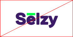
Do not change the size or position of the octothorpe and logotype
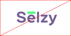
Do not change the transparency of the logo
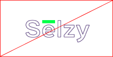
Do not change the transparency of the logo
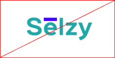
Do not use different colors

Do not use dropp shadows or any other effects
Do not distort the logo

Do not change the size or position of logotype
Colors
Primary Palette
-
Malachite
- hex#00FF47
- rgb0 255 71
- cmyk64 0 100 0
-
Cristalle
- hex#3B1B67
- rgb59 27 103
- cmyk94 100 25 13
-
Salomie
- hex#FFD87A
- rgb255 216 122
- cmyk0 17 60 0
-
Royal Blue
- hex#3367EE
- rgb51 103 283
- cmyk82 62 0 0
-
Nero
- hex#1F1F1F
- rgb31 31 31
- cmyk75 65 60 80
Secondary Palette
-
Deluge
- hex#8572AC
- rgb133 114 172
- cmyk56 59 5 0
-
Magnolia
- hex#F3EDFC
- rgb243 237 252
- cmyk5 8 0 0
-
Nile Blue
- hex#273D4B
- rgb39 61 75
- cmyk86 62 47 47
-
Charcoal
- hex#484848
- rgb72 72 72
- cmyk63 54 51 51
-
White smoke
- hex#EFEFEF
- rgb239 239 239
- cmyk7 5 6 0
Colors Rules
Can be used
Here is collection of suggested color parings. These colors work well on-top of each other and provide enough contrast for the reader.
-
Cristalle + Malachite
-
Salomie + Cristalle
-
Malachite + Royal Blue
-
Nile Blue + Gray
-
Magnolia + Cristalle
-
Nile Blue + Salomie
-
Salomie + Royal Blue
Can't be used
Here is color pairings to avoid ehen creating layouts. These colors don`t work well when text is applied on top of them.
-
Cristalle + Royal Blue
-
Salomie + Malachite
-
Malachite + Gray
-
Nile Blue + Royal Blue
-
Magnolia + Salomie
-
Nile Blue + Cristalle
-
Malachite + Nile Blue
Gradient
The gradient where created specifically for the backgrounds of key visual elements. They should not be used for text.
Consists of combines colors from primary palete.
Icons and illustrations
Icons
>44 px + wayfindings hand drawn linear icons. 1 px violet stroke with white/without fill
Illustration
Social media
Big linian icons combine with backgrounds
For web site
Used on dark backgrounds for illustration service proceses
Typograph
Typface 1
Mulish
ExtraBold. Line height 120–130% for headers and 140% for secondary headline.
ExtraBold.
- H1 – 44/130
- H2 – 36/130
- H3 – 24/130
- H4 – 18/140
- H1 – 32/140
- H2 – 16/130
- H3 – 22/130
Typface 2
Noto Sans
Regular. Line height 140–160% for body text and discriptions. For big buttons and line buttons we use line height 140%
Regular.
- Text big – 20/160
- Text – 18/160
- Text small – 16/140
- Button big – 20/140
- Button line – 18/140
- Caption – 14/160
- Text – 16/150
- Button line – 16/140
- Caption – 14/140


