Responsive email is the new black
With 50.1% of all Internet traffic accounting for mobile devices (Hootsuite), a responsive email is not a nice-to-have, but a necessity.
Don’t just adapt ― create!
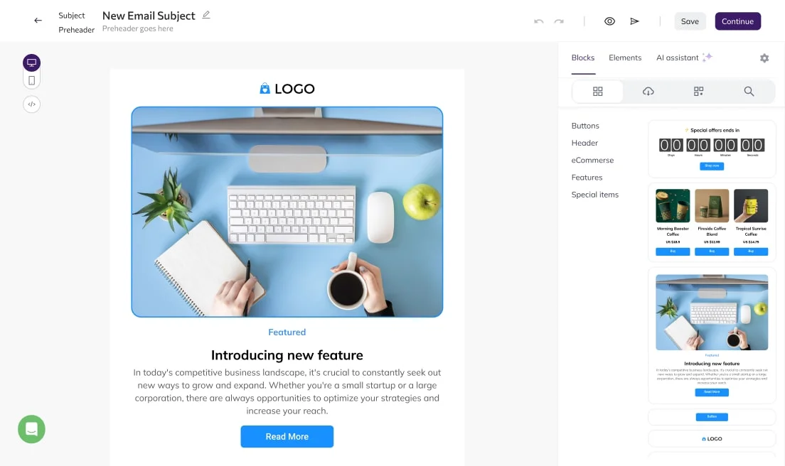
- Mobile-friendly? With Selzy, you can go much further than that. Play with email builder blocks to create a separate mobile version for your message. From images to content order – your message will look its best on any gadget.
Adapt it your way

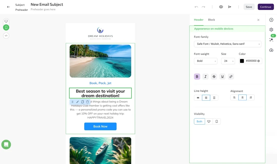
Image optimization
Adapt your visuals with a slide bar or apply the full image width to all devices. Immediately check how it looks in ‘Preview’ mode.

Hamburger menu
Customize the shape, colors, and size of the hamburger menu and its background. Immediately see how it looks as you change.

Product cards
Choose how you will show your products: one under another (default setting) or in a row of 2 or 3 (when you need your customers to have a clear overview on one screen).
Full support and protection аll along your journey
Device-specific blocks
Create device-specific blocks for all gadget options. For example, you can choose to display a ‘call us’ button block on a mobile device only, and a ‘go to store’ button block for desktop users.
User-friendly content order
Place your images above your buttons — the most user-friendly way of content sequence — on a mobile version with a special ‘Reverse Stack Order’ option. You can switch it on for those blocks where on the desktop a button is on the left, and a picture is on the right.
Lets users call/text you right from the email
Set up ‘call’ or ‘text’ button in just a few clicks
Add ‘call us’ or ‘text us’ if you prefer mobile users to call or text you directly from the email. Set up and customize these buttons in no time.
Try it
Transactional emails
Send millions of messages per hour and enjoy outstanding deliverability and user-friendly API with Selzy transactional emails tool.
Email analytics
See if your mobile version performs better than a desktop one with a comprehensive analytics tool by Selzy.
Bulk email
Send to thousands or millions, all the while staying relevant to each and every subscriber with Selzy free bulk email service.
Ready to send your first campaigns?
Get started for free. Scale up when you’re ready.
Try Selzy for free
 Free
Free
Free
Lite
Standard
Best deal
Enterprise
dedicated manager, performance boost and more
50,000+ customers can't be wrong...
Selzy is the easiest way to start selling with email — but don’t just take our word for it.
Read our customers’ success stories and see what they have to say 👉
“A true gem we discovered in a huge pile of email marketing software. Way more affordable than those big known brands, and it outperforms them! All we need for full blown email marketing campaigns.”
“The overview dashboard is something I really love, because of how easy it is to understand and the summary statistics of my overall opens, clicks and unsubscribe. The support desk is really great and quick to respond.”
“I sent the first (test) campaign in less than 5 minutes. How did Selzy get me? Pleasant dashboard, clear statistics, including the deliverability of emails from the campaign, send an email to contacts who haven't opened the message (with one click), simple import of contacts”
“Great buy! The builder covers everything, I was looking at the large array of design templates. The UX/UI is just smooth. Selzy makes Mailchimp look pale in comparison.”
“The best thing about Selzy is its ability to manage marketing emails with fantastic templates, simplifying the process.”
“Not kidding. Selzy is really good. their support is beyond excellent. Response time is less than 5 minutes. They staff is skilled. The ux/ui is amazing. I highly recommend everyone to use it. This company really knows what they are doing! In fact, this is one of the best LTD's I've bought in a while.”
“Selzy is cost effective to the max and it makes it clear how my list health is going. Also top of the line support. We are talking minutes no matter what time I pinged the chat.”
“I have been extremely satisfied with Selzy and would highly recommend it to anyone looking for a reliable and user-friendly email campaign management tool. The analytics and reporting tools are top-notch, providing detailed insights into the performance of my campaigns.”
“Great UI, super easy to use and navigate around. I really love the ease of use and the amazing and attractive templates it has that makes it so simple.”
“Create email campaigns super fast, and having my email list on different categories is awesome. Been using Selzy a lot, no complaints at all.”
“Instead of opting for larger platforms like Mailchimp or Constant Contact, which offer an abundance of unnecessary features and complex interfaces, I desired a more straightforward solution focused on email sending. After comparing various email marketing platforms like Sender, Sendpulse, and Mailerlite, I ultimately chose Selzy.”
“I can run a campaign easily. It’s an alternative solution to the CRM+Email marketing tool I use on a daily basis.”


Get round-the-clock support via chat, email, and phone
FAQ
Can I send the same message both to desktop and phones?
Yes. The content will always remain the same, regardless of the device. What differs, though, is how it appears on each particular screen. Using Selzy’s responsive templates, you can be sure it’ll stay consistent on any gadget, big or small.
Is it possible to create messages just for phones?
It sure is with the Selzy’s builder! With us, you can create gadget-specific versions of every message you send, making sure it fits how subscribers read it.
How do I make my messages responsive on Selzy?
Adapt every message and make it work everywhere. Start at device-specific blocks and buttons (calls and links), resize images, and go to reverse stack order to link buttons with proper images.
Is sending responsive emails free?
It is! Create a Selzy account, go to Campaigns and Emails. There, you can start from scratch or use some of our templates.
Why do I need responsive emails?
They ensure great performance of your message, no matter what device your readers use. Responsive HTML emails create better user experience, hence more trust in your brand.
Getting started with Selzy
New to Selzy?
These resources will help you get started.


Get the best possible result for all devices
Ensure the best experience for mobile and PC users alike.
Try it out